 |
||
|
ANDY WARHOL About This Work: Andy Warhol was an American artist who has always been a leading figure in the visual art movement known as Pop art. His works explore the relationship between artistic expression, celebrity culture and advertisement that flourished by the 1960’s. Andy Warhol’s Marilyn and Andy Warhol’s Soup Cans are some of the most recognized and collectible of his artworks. However, after the success of the Campbell’s Soup series in the early 1960’s, Warhol began creating screenprints focused mostly on movie star portraits including Marilyn Monroe, Elvis Presley, Elizabeth Taylor and Ingrid Bergman. The Ingrid Bergman Series is made up of three types of screen prints. The source images used for these portrait pieces include a publicity photo (Herself), and movie stills from her role in Casablanca (With Hat) and from the movie The Bell of St. Mary’s (The Nun). Of course, when we think of Ingrid Bergman, we think of her playing Ilsa, the long lost love interest of Rick, played by Humphrey Bogart. This important movie role is made even more dramatic in this iconic print. The strong color palette and the bright blue background are just striking, together with the deep and nostalgic expression on her face. Like the majority of his works, once again, this print is indicative of Warhol’s obsession with all things relating to fame, especially movie stars. For this reason, his artwork can also be considered as a sort of visual recording of the culture of his time. Pop Art marked an important new stage in the breakdown between high and low art forms. Warhol’s paintings from the early 1960’s were important in pioneering these developments, but it is arguable that the diverse activities of his later years were just as influential in expanding the implications of Pop Art into other spaces, and further eroding the borders between the worlds of high art and popular culture. Andy Warhol is now considered one of the most influential artists of the second half of the 20th century, who created some of the most recognizable images ever produced. |
Tag Archives: popart
WOW – Work Of the Week – Claes Oldenburg “Sculpture In The Form Of A Bicycle Saddle”
 |
||
|
CLAES OLDENBURG About This Work: Claes Oldenburg is an American sculptor, commonly associated with the Pop Art movement, who has always been at the forefront of the Conceptual and Pop Art art culture. Using familiar, everyday objects as his recurring theme, the artist developed his soft sculptures idea in 1957—a practice he would return to throughout his career. Many of Oldenburg’s works depict ‘mundane’ objects and, at first, they were ridiculed before being accepted by the art world – but they were also defined ‘brilliant’, due to the reaction that the pop artist brought to a ‘tired’ abstract expressionist period. Sculpture In The Form Of A Bicycle Saddle is a great example of Oldenburg’s personal way of making art. A saddle is just a saddle, but when carved in to a mountain, held in place by a sand box, it becomes something else and we can look at it in the form of a work of art. The way in which the sculpture is carved, the glossy ceramic, the base made of sand and wood, the strange position of the saddle itself: every element in this sculpture seems to decontextualize the object and help it to become estranged, so that we are finally able to look at it in a different perspective – as a work of art. Oldenburg has said himself that “If I didn’t think what I was doing had something to do with enlarging the boundaries of art, I wouldn’t go on doing it“. Oldenburg has exhibited extensively around the world and his works appear in almost every major international art museum. His famous oversized outdoor sculptures, done for civic and public purposes, changed the terrain of countless cities worldwide. To possess an edition or multiple from this great artist is a unique opportunity. |
WOW – Work Of the Week – Jim Dine “Zein Robe”
 |
||
|
JIM DINE About This Work: Jim Dine was born in Cincinnati, Ohio in 1935. He studied at the University of Cincinnati, the Boston Museum School, and in 1957 he received a bachelor of fine arts degree from Ohio University. In 1962 Dine’s work was included, along with Roy Lichtenstein, Andy Warhol, Ed Ruscha, Wayne Thiebaud and many more, in the historically important and ground-breaking New Painting of Common Objects, curated by Walter Hopps at the Norton Simon Museum. This exhibition is historically considered one of the first “Pop Art” exhibitions in America. Often associated with the Pop art movement, Jim Dine features everyday objects and imagery in his paintings, drawings, and prints. His works focuses on certain subject matter, bathrobes and hearts amongst them. However, unlike many Pop artists, he focuses on the autobiographical and emotive connotations of his motifs. Dine began painting bathrobes in 1964; some of them were titled or subtitled “self-portrait”. The bathrobe became a motif in his repertoire which he has returned to on many occasions, in prints as well as paintings. Though he claimed never to wear a bathrobe, nonetheless these are all, in a way, portraits and self-portraits. Zein Robe illustrates the enduring importance of the bathrobe motif in Dine’s work, a motif that he has been using over the years in countless printed works to depict mostly himself, but also his wife and people around him. This lithograph depicts a belted robe that features casual, painterly strokes, hand painted in deep reds and oranges. This robe, once again, represents the alias of a person. This robe faces us, with the invisible hands over the hips, affirming Zein’s presence and personality. After a 1984 trip to The Glyptothek in Munich, Jim Dine was inspired to create a series of figurative drawings based on Greek and Roman antiquities, the so-called Glyptotek Drawings. This project required a lot of technical work, a process that would ultimately end in the production of heliogravure prints. When elaborating the Glyptotek Drawings, Kurt Zein, a master printer in Vienna, was fundamental in the production of this project. An accomplished printmaker, Dine remains one the most famous American artists of today. His work is part of numerous public collections all over the world. He still lives and works in New York City. |
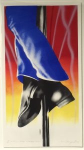
Work Of the Week – James Rosenquist “Firepole”
 |
||
|
JAMES ROSENQUIST About This Work: Born on November 29, 1933 in Grand Forks, ND, James Rosenquist attended the University of Minnesota, before earning a scholarship to the Art Students League in New York in 1955. James Rosenquist is one of the key figures in America’s Pop Art movement. Rosenquist takes fragmented, oddly disproportionate images and combines and overlaps them in his works to create visual stories, in the most abstract and provocative ways. Rosenquist’s paintings and prints are often made in unusual proportions and giant dimensions. For example, one of his prints, called Time Dust (1992), is thought to be the largest print in the world, measuring approximately 7 x 35 feet. In 1967, Rosenquist painted Firepole, a monumental mural commissioned for the American Pavilion at the Montreal World Exposition. This mural featured gargantuan blue-uniformed legs wrapped around a fireman’s pole. Firepole refers to Rosenquist’s idea “that it was unnecessary for U.S. to police the world or be the fireman of it“. Indeed, Rosenquist has always been very much involved with political and social issues of that time, especially criticizing the Vietnam war and the political positions of the US government in terms of global relationships and conflicts. Today Rosenquist is considered one of the greatest American artists still alive. |
Work Of the Week – Tom Wesselmann “Wildflower Bouquet”
 |
||
|
TOM WESSELMANN About This Work: Tom Wesselmann was born on February 23, 1931 in Cincinnati, OH. In New York, he started earning his living by working as a cartoonist for several journals and magazines as well as by teaching at a high school in Brooklyn. Even though he disagreed with being labeled a “Pop” artist, Wesselmann’s work is considered belonging to the Pop art movement. During his artistic career, he experimented with materials and imagery; both collage and sculpture found their way into his assemblages. When he was not working on stylized female nudes (these works are actually what he is best known for), common objects were the main theme of his art work. This is the case of this work of the week, Wildflower Bouquet. Wildflower Bouquet is one of Wesselmann’s famous so-called Steel Drawings. With the invention of the Steel Drawings, Wesselmann began to focus more on drawing for the sake of drawing. For the first time he was approaching art on a new basis, where the scribble was the final product. The drawings that would be transferred into steel were selected carefully and their crisp outlines resonated with the immediacy of a neon sign. The drawings were usually the preliminary sketches to his other works, like paintings or prints. However, when making a comparison between the same image done in two different media, for example a steel cut-out and a painting, one can notice how the artist subtly played changes on his formal language in the treatment of the outlines, or in the spaces in between. Wesselmann was also deeply influenced by Matisse, who had long been a source of inspiration for him. In the metal works, Wesselmann can be understood to have devised his own equivalent to the paper cut-outs that had marked Matisse’s equally bold and life-affirming last phase. The steel drawings represent Wesselmann’s best-known technical innovation. Wesselmann’s Steel Drawings caused both excitement and confusion in the art world. After acquiring a piece in 1985, the Whitney Museum of American Art wrote to Wesselmann asking why he had labeled the work a drawing and not a sculpture. His response was that while he considered it a pure drawing, it was “an example of life not necessarily being as simple as one might wish”. |
WOW – Work Of the Week – Jasper Johns “Voice 2”
 |
||
|
JASPER JOHNS About This Work: Born in Georgia in 1930 and raised in Allendale, South Carolina, Jasper Johns grew up wanting to be an artist. He studied briefly at the University of South Carolina before moving to New York in early 1950’s. Working in New York in the 1950s, Johns became part of a community of artists, including Robert Rauschenberg, that was seeking an alternative to the emotional nature of Abstract Expressionism. In the mid-1960’s, Johns executed a large painting and lithograph, both entitled Voice. He then returned to this theme in a very large, three-part painting called Voice 2, which he worked on from 1968 through 1971. With several different print versions of the canvas – this work, Voice 2, among them – Johns varied the colors and experimented with the placement of the rectangles making up each composition. The title of the work, which forms the imagery, can be read in a rotating cylindrical pattern. Johns has always been fascinated with numbers, letters and words. In this work, he plays with the letters of the word VOICE in a very personal way, superimposing the figures to create a multiple image, so that each time the eye adjusts to focus on a letter the spectator perceives a slightly different picture. These kind of works by Jasper Johns were extremely new to the museum goers and art lovers, especially at a time in which the art world was searching for new ideas. Johns is still one of most significant and influential American painters of the twentieth century, and also considered as one of the greatest printmakers of any era. |
WOW – Work Of the Week – Andy Warhol “Sidewalk FS II.304”
 |
||
|
ANDY WARHOL About This Work: Much has been said about Andy Warhol, his art and his decadent personality. Warhol’s fascination for fame and celebrities shows up in this work, that he masterfully simply calls Sidewalk. The image of this work is from a series of photographs taken by Andy Warhol himself. This image displays the handprints and signatures of Cary Grant, Judy Garland, Jack Nicholson and Shirley Temple, that are on the Hollywood Walk of Fame. |
WOW – Work Of the Week – Andy Warhol “Ingrid Bergman, The Nun FS.II 314”
 |
||
|
ANDY WARHOL About This Work: Andy Warhol was the most successful and highly paid commercial illustrator in New York even before he began to make art destined for galleries. Neverthless, his screenprinted images of Marilyn Monroe, soup cans, movie stars and sensational newspaper stories, quickly became synonymous with Pop Art. Pop Art marked an important new stage in the breakdown between high and low art forms. Warhol’s paintings from the early 1960s were important in pioneering these developments, but it is arguable that the diverse activities of his later years were just as influential in expanding the implications of Pop Art into other spaces, and further eroding the borders between the worlds of high art and popular culture. Andy Warhol is now considered one of the most influential artists of the second half of the 20th century, who created some of the most recognizable images ever produced. After the the success of the Campbell’s Soup Series in the early 1960s, indeed, Warhol began creating screenprints of movie star portraits including Marilyn Monroe, Elvis Presley, Elizabeth Taylor and Ingrid Bergman. The Ingrid Bergman Series is made up of three types of screen prints. The source images used for these portrait pieces include a publicity photo (Herself), and movie stills from her role in Casablanca (With Hat) and from the movie The Bell of St. Mary’s (The Nun). Of course, when we think of Ingrid Bergman, we think of her playing Ilsa, the long lost love interest of Rick, played by Humphrey Bogart. No one can ever forget Bergman standing on the runway, all teary eyed and wearing the famous hat, as Bogart makes her get on that plane. However, many people do not realize that the movie The Bell Of St. Mary’s was enormously popular, the highest-grossing movie of 1945 in the USA. In this movie, Ingrid Bergman is the leading female role and stars together with famous actor and singer Bing Crosby, who plays the unconventional Father Charles “Chuck” O’Malley, assigned to St. Mary’s parish. The parish includes a school building on the verge of being condemned; but the sisters of the parish feel that God will provide for them. Father O’Malley and the dedicated but stubborn Sister Superior, Mary Benedict (Ingrid Bergman), both wish to save the school, but they have different views and methods. This portrait of Ingrid Bergman in her most severe role is made even more dramatic in this iconic print. The vibrant color palette is made dynamic through Warhol’s exciting element of abstraction, the yellow lines making her figure and makeup pop, with her hands clasped in prayer and only sketched with yellow lines. Like the majority of his works, once again, this print is indicative of Warhol’s obsession with all things relating to fame, especially movie stars. For this reason, his artwork can also be considered as a sort of visual recording of the culture of his time. |
WOW – Work Of the Week – Robert Rauschenberg “Chow Bags Series”
  |
||
|
ROBERT RAUSCHENBERG About These Works: Robert Rauschenberg’s Chow Bags portfolio (1977) consists of six screen prints with graphite and plastic thread, each featuring a different domesticated animal. The prints are based on paper collages that Rauschenberg created from actual bags of animal feed manufactured by Ralston Purina (now Purina Mills), a company best known for its Dog Chow and Cat Chow brands. He chose the packaging for the less common feeds, based on bags for a livestock feed. They all share the distinctive red-and-white checkered pattern (except Monkey Chow, which has the green and white checkered pattern), made famous by Purina’s more familiar products. By incorporating this pattern and other prominent design elements of the bags, Rauschenberg’s Chow Bags call attention to the simultaneous familiarity and strangeness of Purina’s graphic identity. Photographs of the finished collages were used as the basis for the screen prints. Although Rauschenberg selectively cut and partially flattened the paper feed bags to create his collages, he retained their rectangular shape and allowed this form to dictate the overall configuration of each print. The bold, graphic renderings of the animals at the center of these works are surrounded by various arrangements of fainter transfer images such as flowers and leaves, cars stuck in traffic, Coca-Cola bottles, and a woman’s glossy, manicured finger. The resulting compositions present the animals gazing out as in traditional portraiture, playfully framed by colorful graphics and strong geometric shapes. After the silkscreen process, additional collage elements were applied to each print, including small pieces of fabric and plastic stitching that mimics the pull-strings used to open feed bags. The Chow Bags series was printed by Styria Studio in New York, and issued in an edition of 100. Rauschenberg was impressed by the history of Purina Mills. Founded by William Danforth in 1884, the company produced Purina Chow, a line of food for animals that prospered for well over a century. The name of the product has an explanation. The word Purina (from pure) was coined to describe the purity of the grain made by the Danforth mills, and Chow is the name that soldiers during World War I used to refer to food. The Chow Bags series embraces the very essence of what Robert Rauschenberg has been trying to capture and convey in his art, and in the Pop Art movement in general. Rauschenberg’s Chow Bags series seemingly embraced the post World War II manufacturing and media boom. His choice of Purina Chow as imagery is an enthusiastic endorsement of the capitalist market and the goods it circulated, while at the same time denotes an element of cultural critique, playing on the concept of consumerism that was at an all time high after the war, and also elevating the everyday to high art: tying the commodity status of the goods represented to the status of the art objects themselves. Which is exactly what the Pop Art movement is about. |
WOW – Work Of the Week – Robert Indiana “American Dream #5”
 |
||
|
ROBERT INDIANA About This Work: “Among the rain Robert Indiana is one of the original 6 American Pop artists who, back in the 1970s, literally changed the world of art. Subsequently, he moved to Vinalhaven, a place that has acquired an allure of almost mystical isolation, throughout the years. Here Indiana has retired from the world since 1978, although still actively working and producing art. In 1964, when he was still living in New York City, Indiana moved from his first place, a building called Coenties Slip, to a five-story building in the Bowery. In 1969, he began renting the upstairs of a building called “The Star of Hope”, in the island town of Vinalhaven, Maine, as a seasonal studio, from the photographer Eliot Elisofon. This place was wider and very functional for his big works. Half a century earlier, Marsden Hartley, the main source of inspiration for Indiana’s Hartley Elegies suite, had made his escape to the same island. When Elisofon died, Indiana moved in full-time. Indiana’s work often consists of bold, simple, iconic images, especially numbers and short words. His best known example is LOVE, used in countless paintings, prints and sculptures. American Dream #5 is not only referring specifically – through its title – to another painting by another major American painter, Charles Demuth, but it is also a pictorial hymn to a poem by William Carlos Williams, that inspired Demuth himself. Charles Demuth painted a work titled I Saw The Figure 5 In Gold, inspired by Williams’ poem The Great Figure. The poet, in turn, was inspired by seeing a fire truck passing down the street at full speed, with a big gold silhouette of a 5 on the background. One can clearly see the shades of gray that make stand out the other bright and strong colors. The geometrical shapes of stars and circles, and the progressive size of the figure 5, create an optical illusion of movement and speed, making the figure 5 pop and vibrate off the paper as the view stares at it. This chain of poetical and pictorial allusions is enriched in this work by a whole other chain of references to birth or death dates that form a web of intricate numerological references based on various coincidences: Demuth’s painting is dated 1928 – also the year of Indiana’s birth. Indiana’s painting is dated 1963 – also the year of Carlos Williams’ death. The succession of rows of three 5s suggests the figure 35: Demuth died in 1935. This succession of 5s is also describing the sudden progression of the firetruck in the poet’s experience. American Dream #5 itself is composed like a poem, and its cruciform shape remains Indiana’s unmistakable mark. The monosyllabic words like EAT, HUG, ERR, DIE, also belong to Indiana’s own poetry. Again, here autobiography occupies an important role as well: EAT & DIE refer to his mother’s last word before she died. American Dream #5 is Indiana’s most impressive and important work. The poetical, numerological, biographical associations embedded in this work make this jazzy though straightforward artwork one of the most complex works of Indiana’s career and in American Pop art. |