Roy Lichtenstein
Forms in Space
1985
Screenprint on Rives BFK paper
52 x 35 3/4 in.
Edition of 125
Pencil signed and numbered
About the work:
“I’m interested in portraying a sort of antisensibility that pervades society,”
Roy Lichtenstein was a pop artist whose works, in a style derived from comic strips, portray the trivialization of culture endemic in contemporary American life. Using bright, strident colors and techniques borrowed from the printing industry, he ironically incorporates mass-produced emotions and objects into highly sophisticated references to art history
Although, in the early 1960s, Lichtenstein was often casually accused of merely copying his pictures from cartoons, his method involved some considerable alteration of the source images. The extent of those changes, and the artist’s rationale for introducing them, has long been central to discussions of his work, as it would seem to indicate whether he was interested above all in producing pleasing, artistic compositions, or in shocking his viewers with the garish impact of popular culture.
This week’s Work of the Week! WOW! is an image of one of the most iconic symbols of the world. The American flag, to this day, carries a host of connotations and meanings that shift from individual to individual, making it the ideal subject for artists to interpret.
Jasper Johns was the first American artist to present viewers with the dichotomies embedded in the American flag, and over the years, others have followed suit, notably Roy Lichtenstein.
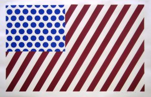
“Forms in Space” by Lichtenstein’s example of the American flag, that leaves open it’s interpretation to the viewer. Although it is bears an obvious resemblance to the American flag, the artist has toyed subtly with its formal makeup, slanting and upping the number of stripes and inverting the colors used in the upper left corner, replacing the flag’s iconic white stars with rows of simple blue ben-day dots placed against a white background. Despite these slight alterations, the blocks of uniform color and flat surface planes make the composition an easy one to take in at first glance, but the image could easily be part of a larger narrative.
It is clear that a statement is being made. While still expertly balanced in form and color, the elimination of certain details and addition of others are important in unifying Lichtenstein’s interpretation of the flag, providing it with formal structure. There remains, however, an element of agitation. The lines of the flag, usually horizontal are set at an angle; implying movement. When observing the work, an optical illusion occurs, and the flag seems to be stretching outward, expanding, inviting each of us to be more socially and politically aware.
Always experimenting with the boundaries of high and low art, this work exemplifies but also interrupts the fast paced consumption of the mass media imagery. The viewer is asked to to look closer and consider what is being represented. The statement that life reflects art and art reflects life rings true when considering Lichtenstein’s use of the most powerful American symbol. His inspiration is drawn from the real, everyday world.
