WOW! – Work of the Week – Roy Lichtenstein – Nude, from Brushstroke Figures


Roy Lichtenstein
Nude, from Brushstroke Figures
1989
Lithograph, Waxtype, Woodcut and Screenprint
56 1/4 x 32 1/2 in.
Edition of 60
Pencil signed, dated and numbered


About the work:

The Nude and the Brushstroke are two classic and timeless pillars of Art History. The Nude figure has been used throughout time in art to express the ideals of the female and male bodies. The theme might evoke Boticelli’s The Birth of Venus or Michelangelo’s David, masterpieces for their representation of anatomical proportions as well as the technical skill required to produce them. The Brushstroke can be deemed the most basic and central element in two-dimensional art, yet it is hardly the first technique that comes to mind when considering Pop Art.

Roy Lichtenstein, one of Pop Art greats, strove to leave as little a trace of his hand in his work. His works carry a distinctive, mechanical style derived from mass printing, leading to his name becoming synonymous with popular comic-book imagery, Ben-Day dots and a primary color palette. Ironically, Lichtenstein began his career exploring abstract expressionism, a movement he would revisit at great length.

Abstract expressionism employed the brushstroke as a vehicle to communicate feelings with spontaneous motion. Lichtenstein, who always approached his art-making with humor, turned the spontaneous brushstroke on its head.

In 1989, the artist released his Brushstroke Figures series, from which this week’s Work of the Week! (WOW!) Nude stems.

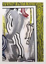
Nude, from Brushstroke Figures is a playful balance between Abstract Expressionism and Lichtenstein’s brand of Pop, making the techniques used to be the focal point of the work over the subject. The center piece of Nude is composed of brushstroke-like elements, depicted as though created with a brush. These strokes, however, are the complete opposite of the abstract expressionist stroke. They are a methodically planned artistic operation, a time-consuming task made to appear as if produced in an instant. The painterly-like strokes lend to the piece a dense abstract complexity, which emphasizes the brushstroke over the subject it is used to depict.

The work also carries the unmistakable trademark characteristics of a Lichtenstein: Ben-Day dots and slanted, alternating white and red lines, in addition to Lichtenstein’s interpretation of the brushstroke, simulated in a uniform color and flat finish.

Lichtenstein takes away from the subject matter through the painterly brushstrokes, but simultaneously brings our attention back to it through his use of the slanted red and white lines as a background. This feature has an optical effect of making the subject appear as though it is floating in a three-dimensional space, entirely detached from from its setting. Every element of this work is calculated and placed.

Lichtenstein was a was very innovative printmaker, and never shied away from experimenting. Nude, from Brushstroke Figures makes use of a variety of printing methods, lithography, woodcut, screenprinting, and waxtype, a process similar to screenprinting, where beeswax is used, rather than traditional printers ink. Lichtenstein experimented with materials to create more depth and interest, and in this case, asks the viewer to reconsider their preconceived notion of the nude.

WOW! – Work of the Week – Roy Lichtenstein – Forms in Space


Roy Lichtenstein
Forms in Space
1985
Screenprint on Rives BFK paper
52 x 35 3/4 in.
Edition of 125
Pencil signed and numbered
About the work:
 “I’m interested in portraying a sort of antisensibility that pervades society,”
Roy Lichtenstein was a pop artist whose works, in a style derived from comic strips, portray the trivialization of culture endemic in contemporary American life. Using bright, strident colors and techniques borrowed from the printing industry, he ironically incorporates mass-produced emotions and objects into highly sophisticated references to art history
Although, in the early 1960s, Lichtenstein was often casually accused of merely copying his pictures from cartoons, his method involved some considerable alteration of the source images. The extent of those changes, and the artist’s rationale for introducing them, has long been central to discussions of his work, as it would seem to indicate whether he was interested above all in producing pleasing, artistic compositions, or in shocking his viewers with the garish impact of popular culture.
This week’s Work of the Week! WOW! is an image of one of the most iconic symbols of the world. The American flag, to this day, carries a host of connotations and meanings that shift from individual to individual, making it the ideal subject for artists to interpret.
Jasper Johns was the first American artist to present viewers with the dichotomies embedded in the American flag, and over the years, others have followed suit, notably Roy Lichtenstein.
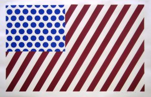
“Forms in Space” by Lichtenstein’s example of the American flag, that leaves open it’s interpretation to the viewer. Although it is bears an obvious resemblance to the American flag, the artist has toyed subtly with its formal makeup, slanting and upping the number of stripes and inverting the colors used in the upper left corner, replacing the flag’s iconic white stars with rows of simple blue ben-day dots placed against a white background. Despite these slight alterations, the blocks of uniform color and flat surface planes make the composition an easy one to take in at first glance, but the image could easily be part of a larger narrative.
It is clear that a statement is being made. While still expertly balanced in form and color, the elimination of certain details and addition of others are important in unifying Lichtenstein’s interpretation of the flag, providing it with formal structure. There remains, however, an element of agitation. The lines of the flag, usually horizontal are set at an angle; implying movement. When observing the work, an optical illusion occurs, and the flag seems to be stretching outward, expanding, inviting each of us to be more socially and politically aware.
Always experimenting with the boundaries of high and low art, this work exemplifies but also interrupts the fast paced consumption of the mass media imagery. The viewer is asked to to look closer and consider what is being represented. The statement that life reflects art and art reflects life rings true when considering Lichtenstein’s use of the most powerful American symbol. His inspiration is drawn from the real, everyday world.

“WOW! – Work of the Week – Roy Lichtenstein – Painting on Blue and Yellow Wall


Roy Lichtenstein
Painting on Blue and Yellow Wall
1984
Woodcut and lithograph
47 3/16 x 31 9/16 in.
Edition of 60
Pencil signed, dated and numbered

About the work:

“My work isn’t about form, it’s about seeing. I’m excited about seeing things, and I’m interested in the way I think other people saw things.”

Roy Lichtenstein was no overnight sensation, the art establishment in the early 60’s was not prepared to be faced with his then heretical blending of high and low art. Departing from the intellectual, nonfigurative style of Abstract Expressionism, Lichtenstein depicted everyday objects and drew inspiration from comics, advertisements, and children’s books. By integrating popular imagery into the realm of fine art, he invited viewers to recognize the world around them in his work. The use of parody and eye-popping comic images gives his creations a sense of familiarity that observers can relate to. 

Over the course of a month and half in 1984, at his studio in Southampton, Lichtenstein created a series of eight works entitled “Paintings.”The works are derived from collages which combined hand-painted and printed papers, a printed enlargement of unprimed canvas, directly painted brushstrokes and cut-out variations of the artist’s famous schematic image of an abstract brushstroke.

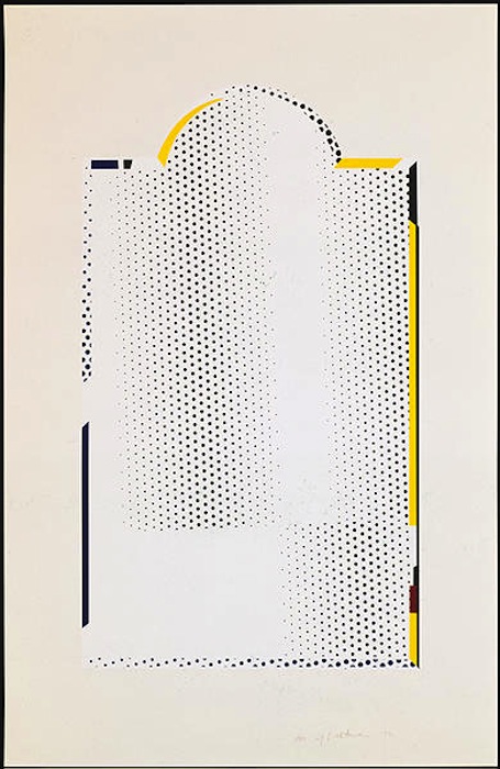
This week’s Work of the Week! WOW! is entitled Painting on Blue and Yellow Wall from the Paintings Series. This work is a parody and self parody made up of juxtapositions. It is the representation of an image and an image in itself, where “high art” and “low art” collide in a single setting. Painterly abstract expressionistic brushstrokes are interwoven with Lichtenstein’s own interpretation of abstract expressionist brushstrokes in a balanced composition. The positioning of the portrayed canvas is interesting in itself. The represented canvas is almost denied full attention as it competes with the vibrant yellow and blue wall-field of simulated wood grain. The frame of the depicted Abstract Expressionist image is unleveled and cropped. 

As a technique consistent with comics, the cropping of forms was a method Lichtenstein employed throughout his career. Based on the Gestalt theory of perception that incomplete forms are mentally completed by the perceiver, Painting on Blue and Yellow Wall encourages the viewer to complete the depicted frame. Surprisingly, cropping is also consistent with Abstract Expressionism. Edges of a work on canvas were often determined by stretching upon completion, thus cropping out the borders of a finished piece. Most importantly in the case ofPainting on Blue and Yellow Wall, the act of cropping is fundamentally “Pop,” as it insists on the object-quality of a work of art rather than the illusion of the work of art as a window on the world.

Painting on Blue and Yellow Wall embodies different ways of representing reality and is characteristic of the way Roy Lichtenstein’s art combines detached representation with dynamic perception. Lichtenstein’s art is much more demanding than it seems at first glance, he questions how we determine the way we view our surroundings. 

WOW! – Work of the Week – LICHTENSTEIN, Titled


Roy Lichtenstein
Titled
1996
Sreenprint on Coventry Rag paper
31 1/2 x 39 1/2 in
Edition of 175
Pencil signed, dated and numbered

About the work:

Roy Lichtenstein was the epitome of Pop art. His paintings are instantly recognizable through his use of Benday Dots, bold colors and thick lines. This recognition, as one of Pop Art’s Greats, came late in life for the artist. Lichtenstein knew he wanted to make a living from his artwork, but it wasn’t until his late 30’s that he was able to do so. Until that time, he supported himself mostly through teaching. When Leo Castelli took the artist under his wing and put together his first solo-show in 1962, Lichtenstein became an overnight sensation. The entire show had sold out before the opening night. 

Lichtenstein’s work reinvigorated the American art scene and altered the history of modern art. After his triumph at Castelli’s famed gallery, he went on to create a body of work of more than 5,000 paintings, prints, drawings, sculptures, murals and other objects celebrated for their wit and invention.

Most famously, Lichtenstein appropriated the Benday dots. The dots became a trademark device forever identified with the artist and Pop Art. In order to achieve the dots, the artist would use various kinds of stencils with perforated patterns that he would brush paint across, creating perfect circles void of brush strokes. 

Benday dot printing is a minute mechanical patterning used in commercial engraving consisting of small colored dots. The process is named after illustrator and printer Benjamin Henry Day Jr. who invented it in 1879. Originally, this technique was used in the printing of Pulp Comic Books in the 50’s and 60’s as an inexpensive way to create shading and secondary colors. Lichtenstein elevated a cheap, commercial printing process into fine art, managing to evoke strong emotions. 

This week’s Work of the Week! WOW! is Titled by Roy Lichtenstein. The print was produced for the 1996 election cycle for the effort “Artists for Freedom of Expression.” It was to benefit the candidates and organizations that supported federal funding of the arts. Sixteen of the nations most respected contemporary artists were solicited to donate work that would be sold to directly benefit the cause, among them were Chuck Close, Peter Haley, Jenny Holzer, Elsworth Kelly, Bruce Newman, Robert Rauschenberg and James Rosenquist. 

While Lichtenstein is known for his use of Benday dots, in this particular image, the style he uses is called Halftone. Benday dots are always the same size, Halftone dots on the other hand, are always the same color and vary in size and/or spacing and create a gradient or atmospheric perspective. In this work, the halftone dots become smaller in the distance, implying the vastness of the sea. 

With just a few simple, strategic swathes, Lichtenstein is able to suggest the features of a landscape. A think blue line represents the horizon while an undulating green one delineates the shore from the water. The sun is particularly interesting, a yellow monotone circle with a curious black crescent shape. Finally, the texture of the leaves and trees is fascinating, as thought the artist created the foliage with a paint filled sponge which brings to mind a more abstract style. 

WOW – Work Of the Week – Roy Lichtenstein “Reflections On Girl”

Reflections on Girl 2

Roy Lichtenstein
Reflections On Girl
1990
Lithograph, screenprint, relief and metalized PVC collage with embossing on mold-made Somerset paper
45 1/8 x 54 3/4 in.
Edition of 68

Pencil signed, dated and numbered

About This Work:

Pop art legend Roy Lichtenstein, born in Manhattan in October of 1923, began his studies in New York but finished at Ohio State University and thereafter began teaching at different universities, a profession he continued until 1964.
During that time well known art dealer Leo Castelli started displaying his works in his gallery. In 1962, Roy Lichtenstein had his first one-man show where the entire collection was purchased by collectors before the opening. Lichtenstein’s fame grew internationally from that point.

He became known for his bold colors, thick lines, and use of comic strips to influence his work. His very personal and unique style derived from comic strips which portray the trivialization of culture, endemic in contemporary American life. Using bright, strident colors and techniques borrowed from the printing industry, he ironically incorporates mass-produced emotions and objects into references to popular icons and art history.

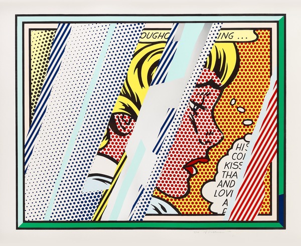
Lichtenstein has often explored the theme of Reflections, incorporating them in various paintings and several print series. In 1988 Lichtenstein began working on a group of Reflections paintings, in which the central image is partly obscured by reflective streaks, as if behind glass or reflected in a mirror.

This week’s work of the week, Reflections On Girl, is considered to be an iconic work. It is a perfect example of Lichtenstein’s style. A style made of primary colors – red, yellow and blue, heavily outlined in black. Instead of shades of color, he used the ben-day dot, a method by which an image is created, and its density of tone modulated, through the position and size of a myriad of dots during the printing process.

Lichtenstein used an image he found in an edition of the comic book Falling In Love as the basis for the female figure in this image. Lichtenstein seems to create an intentionally stylized and stereotypical image of a 1960’s beauty. In the original cartoon, text above the image read: ‘Fire seethed through my body … fanning … spreading’, while the girl’s thought-bubble reads, ‘H-He couldn’t kiss me that way and love someone else!‘.

Reflections On Girl is a very important print from a very important series by Lichtenstein. It has everything that one would want in a Lichtenstein work. The lines, the benday dots, the bright colors, the cartoonish girl figure, and the bubble letters.
It really does not get much better than this piece. 

WOW – Work Of the Week – Lichtenstein “Reflections On Minerva”

Reflections On Minerva

LICHTENSTEIN
Reflections On Minerva
1990
Lithograph, screenprint, relief and metalized PVC collage with embossing on mold-made Somerset paper
42 x 51 3/4 in.
Edition of 100

Pencil signed, dated and numbered

About This Work:

Pop Art draws upon the style and imagery of advertising and popular culture to challenge our preconceptions about the nature of art itself. Roy Lichtenstein not only was a New York Pop Art painter, but also one of the first American Pop artists to achieve widespread notoriety.

His very personal and unique style derived from comic strips which portray the trivialization of culture, endemic in contemporary American life. Using bright, strident colors and techniques borrowed from the printing industry, he ironically incorporates mass-produced emotions and objects into highly sophisticated references to art history. This is the case of Reflections On Minerva.

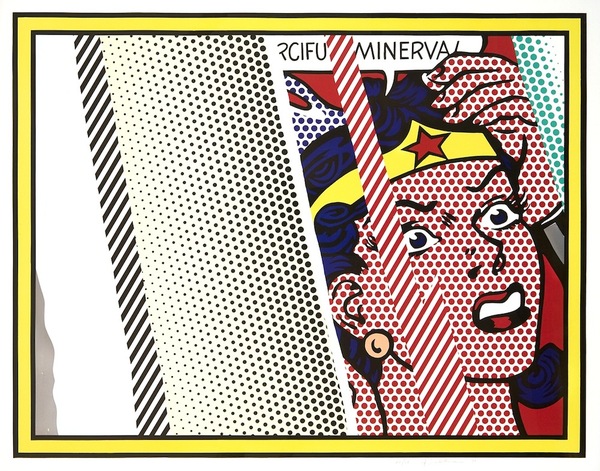
Lichtenstein has often explored the theme of Reflections, incorporating them in various paintings and several print series. In 1988 Lichtenstein began working on a group of Reflections paintings, in which the central image is partly obscured by reflective streaks, as if behind glass or reflected in a mirror.

Reflections On Minerva can be considered an iconic work, since it is a perfect example of Lichtenstein’s style. A style made of primary colors – red, yellow and blue, heavily outlined in black. Instead of shades of color, he used the ben-day dot, a method by which an image is created, and its density of tone modulated, through the position and size of a myriad of dots during the printing process.

The original source for this Reflections print was the November-December 1948 edition of the comic book ‘Wonder Woman’, illustrated by Harry G. Peter. The eponymous super-heroine is shown with a speech bubble exclaiming her catchphrase, ‘Merciful Minerva!’. Wonder Woman regularly invoked the Roman goddess Minerva, who was traditionally known as the goddess of wisdom but also encompassed the arts, trade, poetry, and later, war and power.

Despite the title of this work, Reflections On Minerva, the “reflections” are the real protagonists of this work. They are formed by portions of the print striped or dotted and layered upon the image of Minerva, which is drawn with the simple lines typical of comic strips. The theme of reflection is a very important one for Lichtenstein.

Other works by this artist:

Landscape With Boats

Landscape With Boats

Painting on Blue and Yellow Wall

Painting On Blue And Yellow Wall

Mirror 7

Mirror #7

WOW – Work Of the Week – Lichtenstein “Two Figures With Teepee”

Two Figures With Teepee

LICHTENSTEIN
Two Figures With Teepee
1980
Soft-ground etching, aquatint and engraving on mold-made Lana paper
23 5/8 x 20 5/8 in.
Edition of 32

Pencil signed, dated and numbered

About This Work:

When one thinks of Roy Lichtenstein, one does not think of American Indian Art. However, Lichtenstein was interested in the people of the Old West, particularly Native American Indians. Lichtenstein’s engagement with American Indian art is reflected in two periods: his earliest work and his Surrealist series of the late 1970’s-1980’s.

His interest in American Indian art began during the days of his childhood in New York, during several visits to the American Museum of Natural History. In 1950, he began a series of jokey takeoffs on heroic myths and legends. His interest was also partly stimulated by his experiences in Southampton during the late 1970s when he and his wife resided near a Shinnecock Indian reservation, and by the collections of friends such as Jasper Johns, Frank Stella and Donald Judd, all of whom were known to have acquired Native American blankets and other objects to use in their work.

Some of the themes that Lichtenstein used in his works are American Indian symbols, specific designs for mythical animals found on pottery and in books, and the hatched lines from Southwestern pottery, textiles and ceramics, just to name a few.

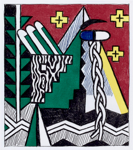
Lichtenstein’s Two Figures With Teepee is part of a series of six small intaglios, all of which are soft-ground etching, aquatint and engravings about the American Indian theme. This series was accompanied by another series of six woodcuts, larger in size and different in style. This particular phase of Lichtenstein’s American Indian-inspired work occurred from 1979 to 1981, long after he had established his familiar Pop style.

This work has a classic Native American palette formed by saturated reddish-brown, green, yellow and black pigments, with the mold-made Lana paper constituting the rest of the image. The tones refer to the earth and the colors that American Indians use for their textiles and handcrafted items.

In Two Figures With Teepee several important elements are present, all recalling the American Indians’ lifestyle and traditions: lightning-like zigzags and crosses symbolizing the four directions, arrow-like triangles, graphic patterns that symbolize wood and leather textures, and a strong component of geometrical abstraction through which the artist reshuffled, stripped and reworked the elements in the flat planes and geometry of Synthetic Cubism.

The first figure is formed by a blue eye with and eyebrow and a braid, like the long braids of the American Indian women. The second figure is formed by a squared eye – a type of eye that Lichtenstein often used for this series – and a group of feathers that resembles the typical American Indian headress, almost always decorated with feathers. Both figures make reference to the larger woodcut series.

Two Figures With Teepee is formally and iconographically very interesting, a perfect example of the spatial dislocation, proper of the Cubist movement, that unifies all the elements instead of dividing them. Some critics have also stated that the powerfully graphic nature of Native American art most likely appealed to Lichtenstein due to its visual similarity to his own style at this time.

Other works by this artist:

Landscape With Boats

Landscape With Boats

Mirror #7

Mirror #7

Painting On Blue And Yellow Wall

Painting On Blue And Yellow Wall

WOW! – Work of the Week – Roy Lichtenstein “Shipboard Girl” 9/28/15

Roy Lichtenstein, Shipboard Girl

Roy Lichtenstein
Shipboard Girl
1965
Offset lithograph
27 3/16  x 20 1/4 in.
Pencil signed
This work was not produced in a numbered edition.

About This Work:

Roy Lichtenstein, like many of his pop art contemporaries, was at first an abstract expressionist. Gradually, however, during the decade following his discharge from the army, he turned his attention increasingly to imagery drawn from such popular cultural sources as commercial advertising, romance and war comics, and cartooning in general.

Not only was Lichtenstein interested in the look of comic books, but also in the way they were produced. He carefully studied the way in which small dots of ink, known as Ben Day dots, were printed. He then enlarged these dots in his art to give his works the appearance of mechanically printed commercial products. Ben Day dots are the pattern of dots used in commercial printing to cheaply reproduce shading.

In the print Shipboard girl of 1965, we see Lichtenstein’s mature style in its rudimentary form. The image exemplifies all the qualities that his many paintings and prints of young women culled from romance comics exhibit — a girl, usually blonde, in extreme close-up, lips parted, her head tilted at an angle, with enormous, soft, liquid eyes, depicted at a moment of emotional climax.

Perhaps the woman in Shipboard girl is just enjoying the sun, or perhaps she is thinking of a shipboard romance that has soured.  The life bouy lounging in the background is a visual pun suggesting that she is longing for a boy to rescue her from the as-yet-unreached turbulent seas of love. This sly humor is characteristically Lichtenstein.

 What is salient about this work, however, is that here in its developmental stage, we have all the formal features which will come to characterize Lichtenstein’s subsequent output. Lichtenstein’s visual vocabulary, the characteristic elements of his style, are flat areas of unmodulated color, a schematized cartoon-like outline, the removal of anecdotal detail, and more importantly, the use of the Benday dots. Here we see him working towards a style which will become uniquely identifiable as his, and which ironically, over time and in its final formulation will replace the original in the very cartoon context from which it was derived.


About The Artist:

Roy Lichtenstein (October 27, 1923 – September 29, 1997) was a prominent American pop artist. His work defined the basic premise of pop art better than any other through parody.  Favoring the old-fashioned comic strip as subject matter, Lichtenstein produced hard-edged, precise compositions that documented while it parodied often in a tongue-in-cheek humorous manner.

In 1961, Lichtenstein began his first pop paintings using cartoon images and techniques derived from the appearance of commercial printing. This phase would continue to 1965, and included the use of advertising imagery suggesting consumerism and homemaking.  His first work to feature the large-scale use of hard-edged figures and Ben-Day dots was Look Mickey  in 1961.  This piece came from a challenge from one of his sons, who pointed to a Mickey Mouse comic book and said; “I bet you can’t paint as good as that, eh, Dad?”  

Lichtenstein had his first one-man show at the Castelli gallery in 1962; the entire collection was bought by influential collectors before the show even opened.  It was at this time, that Lichtenstein began to find fame not just in America, but worldwide.  His work featured thick outlines, bold colors and Ben-Day dots to represent certain colors, as if created by photographic reproduction.  However, rather than attempt to reproduce his subjects, his work tackled the way mass media portrays them.

In the 1970s and 1980s, his style began to loosen and he expanded on what he had done before.  His style was replaced with more surreal works.  His “mirror” paintings consist of sphere-shaped canvases with areas of color and dots.  Lichtenstein also created a series of still lifes (paintings that show inanimate objects) in different styles during the 1970s. In the 1980s and 1990s, Lichtenstein began to mix and match styles. Often his works relied on optical (relating to vision) tricks, drawing his viewers into a debate over the nature of “reality.”

Lichtenstein’s work is included in numerous museums, such as the Albright-Knox Art Gallery, Buffalo, NY; Art Institute of Chicago, Chicago; Denver Art Museum, Denver; Metropolitan Museum of Art, NY; Foundation Beyeler, Basel, Switzerland; Museum of Contemporary Art, Los Angeles, Museum of Modern Art, New York; National Gallery of Art, Washington D.C.; Philadelphia Museum of Art, Philadelphia; Solomon R. Guggenheim Museum, New York; Stedelijk Museum, Amsterdam; and Whitney Museum of American Art, New York. 

For more information and price please contact the gallery at info@gsfineart.com

WOW! – Work of the Week 8/24/15

Roy LichtensteinLandscape with Boats

Landscape with BoatsRoy Lichtenstein 
Landscape with Boats
1996
Lithograph and screenprint in colors on Lanaquarelle watercolor paper
27 7/8 x 58 1/8 in.
Edition of 60
Pencil signed, dated and numbered

About This Work:

In Roy Lichtenstein’s Landscapes in the Chinese Style, Lichtenstein’s engagement with the Chinese landscape tradition, in this case the Chinese tradition of the Song Dynasty, appears to reflect both light-hearted irony and a more somber appreciation for the beauty of the form.

Lichtenstein was greatly influenced by Edgar Degas’ 1944 exhibition at the Metropolitan Museum. He was struck by Degas’ ability to suggest the features of a landscape with just a few strategic swathes of gray, thus allowing an unformed, nebulous shape to stand for exacting form.

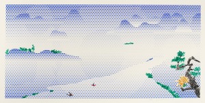
This work is first a landscape: you can see a little boat in the corner where two men are trying to find their way. It’s very moving because of the disproportionate scale between the sea and the figure. On the other hand, this image is really quite abstract, the shapes dramatically flowing around the space. It summarizes many of the issues that interested Lichtenstein throughout his career, particularly this tension between the figurative and the abstract.

Lichtenstein re-interpreted the traditional scenes and motifs using his own established methods and materials. He reflects on the harmony and balance of the ancient works through his unmistakable and edgy lexicon of modern visual effects.  Carefully stylized, Landscapes in the Chinese Style are formed with simulated Benday dots and block contours, rendered in hard, vivid color.  The overt irony of his earlier Pop works cedes to aestheticism and formal delicacy: the Benday dots do not mimic the arbitrary techniques of commercial illustration, but rather appear in cloud-like patches that express the effervescence of space and form, as in this dreamy, abstract work called Landscape with Boats.


About The Artist:

Roy Lichtenstein (October 27, 1923 – September 29, 1997) was a prominent American pop artist. His work defined the basic premise of pop art better than any other through parody.  Favoring the old-fashioned comic strip as subject matter, Lichtenstein produced hard-edged, precise compositions that documented while it parodied often in a tongue-in-cheek humorous manner. 

In 1961, Lichtenstein began his first pop paintings using cartoon images and techniques derived from the appearance of commercial printing. This phase would continue to 1965, and included the use of advertising imagery suggesting consumerism and homemaking.  His first work to feature the large-scale use of hard-edged figures and Ben-Day dots was Look Mickey  in 1961.  This piece came from a challenge from one of his sons, who pointed to a Mickey Mouse comic book and said; “I bet you can’t paint as good as that, eh, Dad?”  

Lichtenstein had his first one-man show at the Castelli gallery in 1962; the entire collection was bought by influential collectors before the show even opened.  It was at this time, that Lichtenstein began to find fame not just in America, but worldwide.  His work featured thick outlines, bold colors and Ben-Day dots to represent certain colors, as if created by photographic reproduction.  However, rather than attempt to reproduce his subjects, his work tackled the way mass media portrays them.

In the 1970s and 1980s, his style began to loosen and he expanded on what he had done before.  His style was replaced with more surreal works.  His “mirror” paintings consist of sphere-shaped canvases with areas of color and dots.  Lichtenstein also created a series of still lifes (paintings that show inanimate objects) in different styles during the 1970s. In the 1980s and 1990s, Lichtenstein began to mix and match styles. Often his works relied on optical (relating to vision) tricks, drawing his viewers into a debate over the nature of “reality.”

Lichtenstein’s work is included in numerous museums, such as the Albright-Knox Art Gallery, Buffalo, NY; Art Institute of Chicago, Chicago; Denver Art Museum, Denver; Metropolitan Museum of Art, NY; Foundation Beyeler, Basel, Switzerland; Museum of Contemporary Art, Los Angeles, Museum of Modern Art, New York; National Gallery of Art, Washington D.C.; Philadelphia Museum of Art, Philadelphia; Solomon R. Guggenheim Museum, New York; Stedelijk Museum, Amsterdam; and Whitney Museum of American Art, New York. 

For more information and price please contact the gallery at info@gsfineart.com

Opening Night at Art Aspen 2015

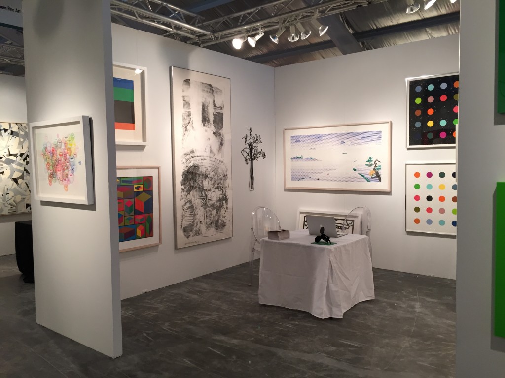
Gregg Shienbaum Fine Art is happy to announce a great opening night at Art Aspen 2015
The show will be open August 13th through August 16th
Come visit us at Booth B16

Art Aspen


Gregg Shienbaum Fine Art Booth B16 exhibiting at Art Aspen 2015

Gregg Shienbaum Fine Art Booth B16 exhibiting at Art Aspen 2015


Opening night at Art Aspen 2015

Opening night at Art Aspen 2015