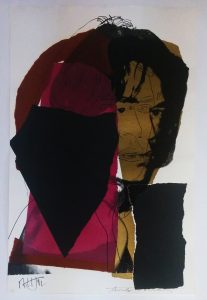
WOW! – Work of the Week – HIRST, Black Brilliant Utopia


Damien Hirst
Black Brilliant Utopia
2013
Inkjet, Glaze and Diamond Dust on Hahnemmuhle photo rag paper
34 x 28 in.
Edition of 50
Signed and numbered in ink

About the work:

“Pills are a brilliant little form, better than any minimalist art, they’re all designed to make you buy them… they come out of flowers, plants, things from the ground, and they make you feel good.” Damien Hirst

We live in a chemical world, where everything from pain to pleasure to survival itself can be shaped by legal and illegal drugs. Many people live on a daily cocktail of prescribed pharmaceuticals, and many others take unprescribed ones. Life seems to be muffled by medicine.

Damien Hirst, the “enfant terrible” of the Young British Artist movement has often made work around the seductive allure of pharmaceuticals. His cylindrical pills and medicine cabinets have become as synonymous with the artist as the formaldehyde shark. Even his instantly recognizable Spot paintings make strong reference to medications and their effects. Hirst, who has admitted to a ten year struggle with drug and alcohol abuse in the 90’s has a deep fascination with death and mortality, themes that are front and center in most of his works.

In his series of medicine cabinets and pills, Hirst taps into both the apprehension and awe that we experience when we come into contact with alluring products that have the power to soothe away our misery, pain and reality.

This week’s Work of the Week! WOW! is Black Brilliant Utopia, by Damien Hirst. The work references the ability of pills and medication to mesmerize yet instill fear in us. Through the brilliant, sparkling of the diamond dust, the artwork plays on the aspect of temptation. Our society is drawn, almost hypnotized by medication. The layout of the pills on the shelves conveys a sense of antiseptic orderliness with an unmistakeable pharmaceutical aesthetic. This calculated precision is reassuring, however the dark hues of the pills transmit an unnerving sentiment, which brings to mind the more dire aspects of a medicated society.

Hirst’s medicine cabinets project a certain Pop Art aesthetic. The object is familiar to consumers, and connects with the artist’s philosophical preoccupations of birth and death, and more importantly, a deep belief that art heals.

WOW! – Work of the Week – STELLA, Referendum ’70


Frank Stella
Referendum ’70
1970
Screenprint
40 x 40 in.
Edition of 200
Pencil signed, dated and numbered

About the work:

Frank Stella is an American painter and printmaker, noted for his work in the areas of minimalism and post-painterly abstraction.

Stella reacted against the expressive use of paint by most painters of the abstract expressionist movement, instead finding himself drawn towards the “flatter” surfaces of Barnett Newman’s work.  He began to produce works which emphasized the picture-as-object, rather than the picture as a representation of something in the physical world, or something in the artist’s emotional world.

From 1960 Stella began to produce paintings of shaped canvases in their presentation of regular lines of color separated by pinstripes.  During this time, he also began to experiment in a wider range of colors, and expressing an affinity with architecture in their monumentality, Stella also introduced curves into his works, marking the beginning of the Protractor series. 

Following a trip to the Middle East, Stella was very inspired by the way the cities’ circular paths interlaced and interweaved like snakes chasing their tails. With that thought it mind he created the Protractor Series. The Protractor series, deploys a vivid palette and composition consisting of rectangular shapes superimposed on curving and circular forms, in which there are three design groups—“interlaces,” “rainbows,” or “fans”—encompasses its surface patterning.  

This week’s Work of the Week! – (WOW!), Referendum ’70, is a screenprint based on Frank Stella’s Protractor paintings.  

Like many artists of his generation, Frank Stella was politically active and engaged. He participated in several fundraising efforts for which he would donate a complete printed edition to a cause.

Referendum ’70 was based on one of the causes Stella supported: Vietnam Referendum ’70, a Cambridge Massachusetts based anti-war coalition. The work was part of a strategy to help the organization raise funds to support political candidates who were opposed to the Vietnam war. 

Aesthetically, the “Referendum ’70” screenprint composition is related to the River of Ponds lithographs associated with theNewfoundland Series, which are variations of Stella’s famed protractor paintings from 1967-1970.

In this print, the squared and double squared formats of interlacing protractors create a psychological distancing. Although the dominant motifs of the Protractor series are circular or curvilinear, every shape is actually defined by pairs of horizontal and vertical lines that intersect at right angles; the gridded rectilinear pattern that is formed is superimposed over the decorative arcs. Through the device of the protractor and the use of an unusual color scheme, Stella brought abstraction and decorative pattern painting into congruence in a manner that challenged the conventions of both traditions.

About Vietnam Referendum ’70:

Vietnam Referendum ’70’s initial goal was to “let the people vote on war.” Originally, the committee dedicated itself to getting the 48,000 statewide signatures needed to force the Vietnam question on the fall ballot.  Maurice Donahue, President of the Massachusetts Senate, helped make this effort unnecessary by sponsoring a bill which passed the legislature authorizing the vote. The group, having indirectly achieved its first objective of getting the Vietnam war on the ballot by endorsing Donahue’s bill, shifted to campaigning for immediate withdrawal of troops.

Despite the efforts of the Vietnam Referendum ’70 and Stella’s participation in supporting the effort, the vote was non-binding, no action was legally required by any elected official, be it president Nixon or the Congress. The committee believed that “it will have scored a victory if it can show that no silent majority in favor of the war exists.”

WOW! – Work of the Week – WARHOL, John Wayne


Andy Warhol
John Wayne FS II.377, from Cowboys and Indians
1986
Screenprint on Lenox Museum Board
36 x 36 in.
Edition of 250, each piece is unique
Pencil signed and numbered

About the work:

JOHN WAYNE. . .  AMERICAN AS APPLE PIE

The saying “as American as apple pie” describes things that represent the best of American culture. People use this expression when talking about things like blue jeans, baseball, and rock-n-roll.

John Wayne is America!  For many, John Wayne aka “The Duke”, symbolizes some one who is a tough, macho, rugged, strong, a fighter, an army man, and a cowboy.

At 6 foot ’4 inches, and an athlete (played football at USC), John Wayne not only had the stature of rough and tough guy, but had the attitude to go along with it.

In his movies, his straight forward, tell it like it is, take no crap attitude resonated with Americans leading up to and during WWII.  He personified American toughness, and American values and ideals.  He was proud of America, and American was proud of him.

There is no artist better to illustrate iconic symbols than Andy Warhol.  Warhol had a knack for choosing figures and images that were uniquely iconic and symbolic to the world of the past, present, and future.

The genius of Warhol was that an iconic image, could say so much that nothing else but that image had to be on the canvas.  Marilyn Monroe is still relevant today, because Warhol immortalized her.  55 years after her death Marilyn is still seen as one of the biggest, if not the biggest sex symbol in the world.    

In this week’s Work of the Week (WOW), Warhol’s image of John Wayne staring at the viewer emotionless with an ever piercing gaze in a cowboy hat, and ‘kerchief around his neck, holding a gun, rugged and ready to shoot on a draw is is one we have seen time and time again in the movies.   But Warhol knew The Duke, will remain a fixture of the popular imagination for as long as the world is watching movies, and for good reason: He wasn’t so much an actor as a symbol of national identity and a point of American pride.

Wether it is a smug portrait of Mao, a Dollar Sign, the Electric Chair, or a Campbell’s soup can, Warhol’s inconic imagery depicted the times, defined a nation, democratized art, made a statement, and sealed his place in art history for ever.  The artist is as iconic as his art!

WOW! – Work of the Week – ALBERS, White Line Squares (Series II) XVI


Josef Albers
White Line Squares (Series II) XVI
1966
Lithograph
20 3/4 x 20 3/4 in.
27/125
Initialed in pencil, dated, numbered and titled

About the work:

“The perception of color is deceiving, we may perceive two different colors to look alike, or two equal colors to look different. This game of colors – the change of identity – is the object of my study.”
Josef Albers

Accomplished as a designer, photographer, typographer, and printmaker, Josef Albers is best known for his work as an abstract painter and color theorist. His approach to composition was very disciplined. He spent 26 years creating and mastering thousands of paintings and prints that make up his series “Homage to the Square.” Through this series, Albers explored chromatic interaction with nested squares. 

His works were always created using the same process: he painted mostly on Masonite, using a palette knife to prime the surface with layers of white gesso, then applying each oil color minimally for maximum effect. He would paint one coat of pure color directly to the canvas from the tube, unmixed, starting from the centre and working his way outwards, just as his father, a house painter, carpenter, plumber and general technician, had taught him – a technique that ‘catches the drips of paint and keeps cuffs clean’ he used to say.

He was known to meticulously list the specific manufacturer’s colors and varnishes he used on the back of each work, as if the colors were catalogued components of an optical experiment. Each painting in the series was composed of either three or four squares of solid planes of color nested within one another, in one of four different arrangements and in square formats. 

Despite their name, the Homages  seem to be less about squares within squares than about the infinite possibilities of the chromatic spectrum. Every last one is an exercise in visual juxtaposition, an exploration of the effect that colors have on the eye and on each other. The size and proportion and the number of the squares vary, but they are always offset towards the bottom of the frame  The arrangement of these squares is carefully calculated so that the color of each square optically alters the sizes, hues, and spatial relationships of the others, and this tricks the eye into a figurative response: they look like luminous corridors receding to a vanishing point.

Our Work Of the Week! WOWWhite Line Squares (series II) XVI is from the “Homage to the Square” series. Its color composition is comprised of three surrounding squares in colors cream, warm ochre light, and brown with a white line square in the middle square of ochre.  The ochre on either side of the thin white line is actually the same hue, however, the placement of the white line creates a shift in color on both sides so that the single color appears as two different colors. 

Albers wrote: “A white line within a color instead of as a contour may present a newly discovered effect: when the line is placed within a so-called “middle” color, even when the color is very evenly applied, it will make the one color look like two different shades or tints  of that color.”

An Interesting Note:  Transferring this idea to lithographs was a complicated process, because the white line was created by the unprinted paper. The square containing the white line could not therefore be printed over an underlying color area. Accordingly, the well known printmaker Kenneth Tyler devised a way to print on plates that accurately abutted one another with no overlap.

Having studied and later taught at the famed Bauhaus in Weimar, Germany prior to fleeing to the US, Albers’ work represents a transition between traditional European art and the new American art. It incorporates European influences from the Constructivists and the Bauhaus. His influence fell heavily on American artists of the late 1950s and the 1960s. Hard-Edge abstract painters drew on Albers’ use of  patterns and intense colors, while Op artists and conceptual artists further explored his interest in  perception. 

WOW! – Work of the Week – GOTTLIEB, White Ground Red Disk


Adolph Gottlieb
White Ground Red Disk
1966
Lithograph
29 1/2 x 21 1/2 in.
Edition of 50
Pencil signed, dated and numbered

About the work:

“To my mind certain so-called abstraction is not abstraction at all…on the contrary it is realism of our time.”
Adolph Gottlieb

Growing up during the Depression and maturing throughout the interwar period and rise of Hitler, the American painter and printmaker Adolph Gottlieb was committed to expressing authentic feeling in the face of the traumas of the world. Gottlieb established himself as a pioneer in the movement of Abstract Expressionism and worked actively against the dominating trends of regionalism and realism of the 30’s. He was close with many important artists of the time, Marc Rothko and Barnett Newman for example and together they sought to make American art more experimental 

Gottlieb’s work can be described as a reaction to the times in which he lived, and he is well known for three distinct periods or series. The first, which emerged during the second World War is the “Pictograph” series (1941-1951) comprised of loose grids with schematic forms. This was followed by the “Imaginary Landscape” period (1951-1957), which consisted of semi-abstract landscapes. And finally, his “Burst” period, which is his most famous and which he spent almost two decades exploring (1957-1974) revolved around variations of simplified representations of two shapes – a disc hovering above an explosion of calligraphic strokes. 

This week’s Work Of the Week! White Ground Red Disk is a prime example of his work from the Burst series. 

In the vertical “Bursts,” the series relies heavily on the juxtaposition of forms characterized by an underlining dualism. Gottlieb has brought together, in a single canvas the two poles of Abstract Expressionist painting—the Color Field and Action Painting (or Gestural Abstraction) schools—in a tense balance. 

Color Field painting emerged in the late 50’s, and is known for the use of simple geometric patterns and references landscape imagery and nature. The style is characterized primarily by fields of flat, solid color, creating areas of unbroken surface and a one-dimensional picture plane. The Color Field movement places less emphasis on  gesture , brushstrokes and action in favor of an overall consistency of form and process. In Color Field painting “color is freed from objective context and becomes the subject in itself.”

Action painting, on the other hand, is a style of painting in which paint is spontaneously dribbled, splashed or smeared onto the canvas, rather than being carefully applied. It emphasizes the physical act of painting itself as an essential aspect of the finished work or concern of its artist. The images do not portray objects or even specific emotions. Instead, they aim to touch the observer deep in the subconscious mind, tapping the collective sense of an archetypal visual language. This was done by the artist painting “unconsciously,” and spontaneously, creating a powerful arena of raw emotion and action, in the moment.

The dichotomy between the two forms in the work, the disk and the expressive strokes, led the way and formed the bridge for the geometric abstractionists and minimalists such as Frank Stella and Josef Albers. 

WOW! – Work of the Week – WESSELMANN, Still Life with Liz


Tom Wesselmann
Still Life with Liz
1993
Screenprint
59 1/2 x 57 in.
Edition of 90
Pencil signed and numbered

Tom Wesselmann never considered himself a Pop artist. He would point out that he made aesthetic use of everyday objects, rather than critique them as consumer objects. He once said: “I dislike labels in general and ‘Pop’ in particular, especially because it overemphasizes the material used. There does seem to be a tendency to use similar materials and images, but the different ways they are used denies any kind of group intention.”

The artist, however, was clearly in dialogue with his Pop predecessors and contemporaries, among them Lichtenstein and Warhol, with whom he shared an interest in the commodification of the female form and still life.

In addition to being widely known for his paintings of “The Great American Nude”, Tom Wesselmann was a master of the still life. The creation of settings in his works, as opposed to the representation of a lone object is primarily what sets him apart from the other pop artists, and the pop movement. He was a modern-day Matisse who made use of Pop imagery.

In this week’s Work Of the Week! (WOW), Still Life with Liz, Tom Wesselman is taking Andy Warhol’s Liz Taylor and placing it in his painting as nothing more than an object in a room,   He is creating a familiar and recognizable setting, in which you can imagine yourself walking into a home, and seeing a console with a vase positioned next to a painting.

By using Warhol’s Liz Taylor, Wesselmann is not only affirming Andy Warhol’s place in art history as a pop artist, but also using Warhol’s iconic pop art image as an everyday object, solidifying Andy Warhol’s artwork as a work of art.  In other words (in a reversed or opposite sort of way), Tom Wesselmann is applying the very same concept to his art work that Andy Warhol did.

Warhol took everyday objects and turned them into art.  We call his style of art “pop art’.  Tom Wesselmann took Warhol’s image of Liz Taylor and turned it into an everyday object by placing this image in his artwork.  The image of Liz in this still life is no different than a 7up bottle or a package of Wonder Bread in other still life works by Wesselmann.

Andy Warhol made Liz Taylor accessible by allowing us to hang her on our wall.  He is credited with democratizing art.  Tom Wesselmann affirms this concept showing us just that.  He has taken a pop art painting and turned it into a painting of pop art.

WOW! – Work of the Week – HINMAN, Triangles


Charles Hinman
Lavender Triangle
2012
Screenprint
38 x 38 in.
Edition of 15
Pencil signed, dated and numbered

Charles Hinman
Orange Triangle
2012
Screenprint
38 x 38 in.
Edition of 15
Pencil signed, dated and numbered

“My concept of my work is dynamic, never static. I think of my paintings as occupying a 6-dimensional space – the three dimensions of space and one each of time, light and color.”  Charles Hinman

Charles Hinman played a significant role in redefining the physical shape of paintings. His desire to break away from the traditional square or rectangular frame of painting lead him to the shaped canvas. In the 60’s several abstract minimalist artists were experimenting with new canvas shapes, but none drove the concept further than Hinman. His canvases were a form of hybrid between painting, sculpture and wall relief.

Until the early 1970s, Hinman examined the possibilities offered by this new medium: strongly protruding canvases, geometric and sensual profiles, color contrasts, color reflections on the adjacent wall, shadows, monochrome canvases.

Since working on primarily flat surfaces was not Charles Hinman’s primary medium, his exploration of print-making started only when he met master-printer Gary Lichtenstein. these two worked on numerous projects together. in 2012, they collaborated on a set of screenprints entitled Triangles, which is this week’s Work Of the Week – WOW.

Prints are 2 dimensional works, however, through his mastery of color, angles and shapes, Hinman is able to give Lavender Triangle and Orange Triangle the strong illusion of a 3rd dimension. On the flat surface of the paper, he applied bright colors, which cause an area to move forward, in contrast with darker colors that recede, which tricks the eye into believing the silkscreen has actual depth. The choice of adjacent colors causes a sensation of motion of the surfaces. The defining particularity of Hinman’s Triangle silkscreens are his focus on the illusion of space and suggested volume. As with his paintings, Hinman is able to apply 6 dimensional features to his prints as well.

WOW! – Work of the Week – WARHOL, Mick Jagger


                                             Mick Jagger FS II. 139  

                                               Mick Jagger FS II. 141


Andy Warhol
Mick Jagger FS II. 139
1975
Screenprint
43 1/2 x 29 in.
Edition of 250
Pencil signed and numbered, also signed by Mick Jagger

Andy Warhol
Mick Jagger FS II. 141
1975
Screenprint
43 1/2 x 29 in.
Edition of 250
Pencil signed and numbered, also signed by Mick Jagger

About the works:

“The thing that he seemed to be able to do was to capture society, whatever part of it he wanted to portray, pretty accurately. That’s one of the things artists do, is show people later on what it was like. If you want to be reminded of a certain period, you can look at what Andy was doing then. He was very much in tune with what was going on. Of course, he was criticized for that, for being sort of trendy. But I think some people’s great forte is being so in touch.”

Mick Jagger at the time of Andy Warhol’s passing

One was the world’s greatest pop artist, the other was the signer and face of one of the most successful bands in history. Andy Warhol and Mick Jagger met at a party in 1964, when the Rolling Stones were on their first US tour. At this time, both idols were rising to fame and establishing their images. The Rolling Stones were viewed as the dirty alternative to the clean-cut Beatles and art collectors may have viewed Andy Warhol in a similar way compared to other artists of the time, such as Wayne Thiebaud, Japer Johns and Roy Lichtenstein. 

The first collaboration between the two artists was for the iconic “Sticky Fingers” album cover in 1971. Today, it is regarded as one of modern music’s more striking pieces of graphic art. The album, which went to number one immediately in both the US and the UK, resulted in a long-lasting business and personal relationship between the two icons who had a great understanding of both art and commerce. 

sticky-fingers-460x460
                                 Sticky Fingers – album cover

Portraits became big business for Andy Warhol around the time of the album release. He was a modern-day portrait painter who could capture all the high society and celebrity personalities of the time, and Jagger, who embodied the sex, drugs and rock and roll world was the perfect subject. At the request of Seabird Editions Company in London, who offered to publish the screen prints, Andy Warhol created a series of 10 portraits of Mick Jagger.

In the summer of 1975, while Mick and his wife, Bianca where staying at Andy’s house in Montauk, Andy and Mick started work on the project. Andy took the photographs of Mick himself. All 10 of the final artworks were head and bare-chested torso shots of Jagger. Andy was interested in capturing the different emotions and personas of Mick; happy, thoughtful, seductive, tough, arrogant, etc. 

Once back in the studio, Andy created the screen prints from the photographs and added hand drawn stylized lines and color patches to enhance the mood of each piece. Both Andy Warhol and Mick Jagger signed the final prints as a savvy marketing move. Jagger’s audience was much larger than Warhol’s collector base, so having Mick’s signature would help increase exposure of his work. For Mick, the portraits would help enhance his image.

Today, the portraits are as iconic as the two men themselves, immortalizing a moment in time. 

WOW – Work of the Week – RAUSCHENBERG, Ape, from Stoned Moon


Robert Rauschenberg
Ape, from Stoned Moon
1970
Lithograph
46 x 38 in.
Edition of 46
Pencil signed, dated and numbered

About the work:

“The bird’s nest bloomed with fire and clouds. Softly largely slowly silently Apollo 11 started to move up. Then it rose being lifted on light. In its own joy wanting the earth to know it was going. Saturated, super-saturated, and solidified air with a sound that became your body. For that while, everything was the same material. Power over power, joy, pain, ecstasy, there was no inside, no out. Then bodily transcending a state of energy. Apollo 11 was airborne, lifting pulling everyone’s spirits with it.”
Rauschenberg’s account of the launch of the Apollo 11 mission

Acclaimed as the first postmodern artist and a forerunner of the Pop Art movement, Robert Rauschenberg, invited by NASA, traveled to Cape Canaveral in July 1969 to document the launch of the historic Apollo 11 mission, the first manned spaceflight to the moon’s surface. While in Cape Cape Canaveral Rauschenberg enjoyed unrestricted access at NASA’s Florida facilities. He roamed the buildings and adjacent landscape, met with astronauts and other personnel, and was granted full access to official NASA photographs and technical documents.

This trip profoundly impacted the artist, who came away from the experience energized and with a renewed sense of optimism after having been deeply disillusioned for several years by the course of the Vietnam War and the growing social unrest in the United States.

After the launch, Rauschenberg began work on the Stoned Moon series (1969–70).

Conceptually named from the idea of the alignment of a moon rock (or lunar stone), and a lithographic stone, the Stoned Moon was a series of 34 lithographs that juxtapose hand-drawn passages with imagery that pairs the lush Florida landscape with the and the region’s tourist highlights against the crisp industrial aesthetic of the space race: scenes of astronauts and complex machinery

The surfeit of indigenous birds populating the Stoned Moon lithographs speaks to the blurring of the natural and the manmade. These familiar symbols rein in the otherworldliness of Cape Canaveral, where gigantic sophisticated machines intrude upon a vast, sparse landscape. Now that humans’ capacity for flight definitively exceeded that of any natural flyer, was nature rendered obsolete?

The Stoned Moon lithographs reflect upon the binaries of think/feel, natural/manmade, bodily/immaterial, earthly/heavenly. Rauschenberg is able to situate popular countercultural tendencies alongside the nationalistic aims of NASA’s project without overtly addressing either.

The thirty-four Stoned Moon lithographs provides a singular account of the space program and humankind’s first lunar landing. Rauschenberg’s impressions contain a mixture of trepidation and wonder that conveys the technological and astronomical sublime. The immensity (quantified in just about any way: by ambition, financial commitment, the literal size of the rocket or distance to the moon) of the mission exceeded the capacity of photography’s limited scale.

Apollo 11 Mission

Apollo 11 was the spaceflight that landed the first humans on the Moon on July 20, 1969: Neil Armstrong and Buzz Aldrin. Armstrong was the first to step onto the lunar surface six hours later on July 21, and he uttered the now-famous words, “one small step for man, one giant leap for mankind.” Armstrong spent about two and a half hours outside the spacecraft, Aldrin slightly less. The third member of the mission, Michael Collins, piloted the command spacecraft alone in lunar orbit until Armstrong and Aldrin returned to the spaceship for the trip back to Earth. Launched by a Saturn V rocket from Kennedy Space Center in Merritt Island, Florida on July 16, Apollo 11 was the fifth manned mission of NASA’s Apollo program. Apollo 11 effectively ended the Space Race and fulfilled a national goal proposed in 1961 by the U.S. President John F. Kennedy in a speech before the U.S. Congress: “before this decade is out, of landing a man on the moon and returning him safely to the Earth.”

WOW – Work of the Week – WARHOL, Birmingham Race Riot


Andy Warhol
Birmingham Race Riot
1964
Screenprint
20 x 24 in.
Edition of 500

About the work:

WARNING:   THIS ARTICLE CONTAINS FOUL AND OFFENSIVE WORDS AND VIEWS THAT ARE USED TO PRESENT HISTORICALLY FACTUAL EVENTS ONLY!

THE WORDS AND VIEWS USED IN THIS ARTICLE DO NOT IN ANY WAY REPRESENT THE VIEWS OF GREGG SHIENBAUM FINE ART INC. OR ANYONE ASSOCIATED WITH GREGG SHIENBAUM FINE ART INC.

This week’s Work of the Week (WOW), Birmingham Race Riot is an example of Andy Warhol’s genius, that is often very subtle to the viewer.

Civil Rights photographer, Charles Moore published a photo-essay in Life Magazine covering the brutality black protesters were facing in Birmingham. One photo in particular of a young black protester being set upon by police dogs during the unrest, caught the attention of Andy Warhol, who at that moment was preparing for his first large-scale exhibit abroad, in Paris called “Death in America”
This exhibition consisted of paintings, of subjects such as car crashes, suicides, food poisoning, the electric chair, gangster funerals, and the Atom Bomb, later to become known as the Death and Disaster paintings.

Three of Moore’s photographs were of a dog attacking a black man and although the theme was not strictly “Death”, Warhol was sufficiently aware of their power to want to include them in his exhibition, consistent with his aim of showing the dark underside of the American Dream.  The image is forceful and requires no commentary as the tension, violence and fear are palpable.

In all, Warhol made some ten silkscreen paintings on the theme. They became known as his Race Riot paintings (counterfactually, in reality the images were of a peaceful march disrupted by police), and they represent Warhol’s only overtly political statement, although he himself insisted that Moore’s photographs had merely “caught his eye”.

People who truly understand Andy Warhol, and his art, immediately see the genius of the man and his work.  He never talked about about his artwork in a very serious manner.  Mistakenly described as “aloof”, Warhol took pleasure at that description, and played it up to the critics, and media. 

A perfect example of this, is the way he spoke about the Race Riot paintings. Not speaking about them as a historical, impactful, commentary on the events in American society of the time, but rather downplaying them as images that had merely “caught his eye”, is the exact genius of Andy Warhol.

Warhol did not have to describe his art, or lecture about his ideas, but rather, he preferred that his artwork did it for him.  The idea of turning this photograph of a historically tragic dark time in America, into a work of art, presupposes the importance of the discussion or debate, of that image.

The very fact that he took this image and made it a work of art, elevated the  importance of that image, and the importance of the discussion of this image, in social and political surroundings. 

Done in a very quite manner, but heard loudly all over the world.

The Birmingham Riot of 1963

Birmingham, Alabama     May 10, 1963 . . .

Negotiators for the city, local businesses, and the civil rights campaign had completed and announced the “Birmingham Truce Agreement.”

This agreement included city and business commitments for:

  • partial desegregation of fitting rooms, water fountains, and lunch counters in retail stores,
  • promises of economic advancement for black workers,
  • release of persons who had been arrested in demonstrations,
  • the formation of a Committee on Racial Problems and Employment.

In an afternoon press conference held at the Gaston Motel, where Dr. Martin Luther King Jr. and his team were staying, Rev. Fred Shuttlesworth read a version of the agreement, after which King declared a “great victory” and prepared to leave town. However, some white leaders, including the city’s powerful Commissioner of Public Safety Bull Connor, who had used dogs and firehoses against demonstrators, denounced the agreement and suggested that they might not enforce its provisions.

May 11, 1963 . . .

State troopers were withdrawing from Birmingham under orders from Governor George Wallace. Investigator Ben Allen had been alerted about a potential bombing of the Gaston Motel by a source within the KKK and recommended that these troops stay for a few more days.  Ben Allen’s warning was disregarded by state Public Safety Director Al Lingo, who said he could “take care of” the KKK threat.    Dr. Martin Luther King, Jr., left Birmingham for Atlanta, Georgia

KKK leaders from across the South were assembling in nearby Bessemer, Alabama for a rally. KKK Imperial Wizard Robert Shelton addressed the white crowd, urging rejection of “any concessions or demands from any of the atheist so-called ministers of the nigger race or any other group here in Birmingham. He also said that “Klansmen would be willing to give their lives if necessary to protect segregation in Alabama.” 

The rally ended at 10:15 pm.

At 8:08 pm that evening, the Gaston Motel received a death threat against Martin Luther King’s brother,  A.D.King.

10:45 pm.   A uniformed officer got out of his police car and placed a package near A. D. King’s front porch. The officer returned to the car. As the car drove away, someone threw a small object through the house’s window onto the sidewalk, where it exploded. The object created a small but loud explosion and knocked over bystander Roosevelt Tatum.

Tatum got up and moved toward the King house—only to face another, larger, blast from the package near the porch. This explosion destroyed the front of the house. Tatum survived and ran toward the back of the house, where he found A. D. King and his wife Naomi trying to escape with their five children.

Tatum told King that he had seen police deliver the bombs. King called the Federal Bureau of Investigation, demanding action against the local police department.

11:58 pm.   A  bomb thrown from a moving car detonated immediately beneath Room 30 at the Gaston Motel—the room where Dr. Martin Luther King had been staying. The Gaston Motel was owned by A. G. Gaston, a Black businessman who often provided resources to assist the Alabama Christian Movement for Human Rights. The motel bomb could be heard all over town. Also heard was the sound of white men repeatedly singing “Dixie”.

Bryan McFall of the FBI was expecting his KKK informant Gary Rowe to report at 10:30 pm, immediately after the end of the KKK rally. McFall searched in vain for Rowe until finding him at 3:00 am in the VFW Hall near the Gaston Motel. Rowe told McFall, his FBI handler, that Black Muslims had perpetrated a false flag bombing in order to blame the Klan. McFall was unconvinced. However, in submitting his final report to J. Edgar Hoover, head of the FBI, McFall did not identify the KKK as potentially responsible for the bombing, nor did he question the credibility of Rowe as an informant.

Contemporary historians widely believe that the bombing was carried out by four KKK members, including Gary Rowe and known bomber Bill Holt. Rowe was already suspected by the KKK to be a government informant, and other members may have compelled him to assist with the bombing in order to test his fidelity to the white supremacy cause.

Many black witnesses held police accountable for the bombing of the King house, and immediately began to express their anger. Some began to sing “We Shall Overcome,” while others began to throw rocks and other small objects. More people mobilized after the second blast.   Many of them were already frustrated with the strategy of nonviolence as espoused by Martin Luther King, and turned to violence, and began to riot.

A crowd of about 2,500 people had formed and was blocking police cars and fire trucks from the Gaston Motel area. A fire that started at an Italian grocery store spread to the whole block. As traffic started to move, Birmingham Police drove their six-wheeled armored vehicle down the street, spraying tear gas.

The United States government intervened with federal troops for the first time to control violence during a civil rights related riot. It was also the first time the government had used military troops independently of enforcing a court injunction, an action was considered controversial by Governor George Wallace and other Alabama whites. The bombings and police response were a pivotal event that contributed to President Kennedy’s decision to propose civil rights legislation to achieve relief of injustice. It was ultimately passed under President Lyndon B. Johnson as the Civil Rights Act of 1964.