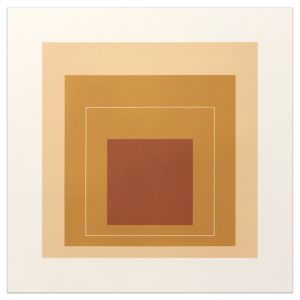
Josef Albers
White Line Squares (Series II) XVI
1966
Lithograph
20 3/4 x 20 3/4 in.
27/125
Initialed in pencil, dated, numbered and titled
About the work:
“The perception of color is deceiving, we may perceive two different colors to look alike, or two equal colors to look different. This game of colors – the change of identity – is the object of my study.”
Josef Albers
Accomplished as a designer, photographer, typographer, and printmaker, Josef Albers is best known for his work as an abstract painter and color theorist. His approach to composition was very disciplined. He spent 26 years creating and mastering thousands of paintings and prints that make up his series “Homage to the Square.” Through this series, Albers explored chromatic interaction with nested squares.
His works were always created using the same process: he painted mostly on Masonite, using a palette knife to prime the surface with layers of white gesso, then applying each oil color minimally for maximum effect. He would paint one coat of pure color directly to the canvas from the tube, unmixed, starting from the centre and working his way outwards, just as his father, a house painter, carpenter, plumber and general technician, had taught him – a technique that ‘catches the drips of paint and keeps cuffs clean’ he used to say.
He was known to meticulously list the specific manufacturer’s colors and varnishes he used on the back of each work, as if the colors were catalogued components of an optical experiment. Each painting in the series was composed of either three or four squares of solid planes of color nested within one another, in one of four different arrangements and in square formats.
Despite their name, the Homages seem to be less about squares within squares than about the infinite possibilities of the chromatic spectrum. Every last one is an exercise in visual juxtaposition, an exploration of the effect that colors have on the eye and on each other. The size and proportion and the number of the squares vary, but they are always offset towards the bottom of the frame The arrangement of these squares is carefully calculated so that the color of each square optically alters the sizes, hues, and spatial relationships of the others, and this tricks the eye into a figurative response: they look like luminous corridors receding to a vanishing point.
Our Work Of the Week! WOW – White Line Squares (series II) XVI is from the “Homage to the Square” series. Its color composition is comprised of three surrounding squares in colors cream, warm ochre light, and brown with a white line square in the middle square of ochre. The ochre on either side of the thin white line is actually the same hue, however, the placement of the white line creates a shift in color on both sides so that the single color appears as two different colors.
Albers wrote: “A white line within a color instead of as a contour may present a newly discovered effect: when the line is placed within a so-called “middle” color, even when the color is very evenly applied, it will make the one color look like two different shades or tints of that color.”
An Interesting Note: Transferring this idea to lithographs was a complicated process, because the white line was created by the unprinted paper. The square containing the white line could not therefore be printed over an underlying color area. Accordingly, the well known printmaker Kenneth Tyler devised a way to print on plates that accurately abutted one another with no overlap.
Having studied and later taught at the famed Bauhaus in Weimar, Germany prior to fleeing to the US, Albers’ work represents a transition between traditional European art and the new American art. It incorporates European influences from the Constructivists and the Bauhaus. His influence fell heavily on American artists of the late 1950s and the 1960s. Hard-Edge abstract painters drew on Albers’ use of patterns and intense colors, while Op artists and conceptual artists further explored his interest in perception.
