WOW! – Work of the Week – Victor Vasarely, Tri-Vega


Victor Vasarely

Tri-Vega

1975

Silkscreen on Arches Paper

33 1/4 x 30 1/8 in.

Pencil signed and numbered

“Movement does not rely on composition nor a specific subject, but on the apprehension of the act of looking, which by itself is considered as the only creator.”
—From Victor Vasarely’s Yellow Manifesto

We don’t always see what we think we see.

Saying that Victor Vasarely was ahead of his time is an understatement. Art historians credit Vasarely with creating some of the earliest examples of Op Art in the 1930s. He experimented with techniques decades before the establishment of the movement in the 60s, and is widely regarded as the “Father of the Op Art movement,”

“Op Art” is short for Optical Art, which was coined by Time Magazine in a 1964. It is a style known for creating optical illusions from extremely precise repeating patterns, interlocking shapes and vivid yet strictly defined color palettes.

The genre marked the first time in Art History that the Theory of Visual Perception would be systematically studied and applied by artists. In this theory, psychologists distinguish between two types of processes in perception; the first caused by our purely physical optical sense and the second by our subjectively learned world view. Op Art was therefore driven by artists who were interested in investigating various perceptual effects; effects that confuse and fascinate.

In 1968, Victor Vasarely started work on his hugely popular Vega Series. Vega is the brightest star in the constellation of Lyra and the fifth brightest star in the night sky. In this series, the artist manipulated the lines of square grids to create the illusion of bulges and depressions in perspective distortion.

This week’s Work Of the Week! WOW! is Tri-Vega.

In this work, Vasarely expertly draws his viewer into his geometric cosmos. In a grid-like composition, the picture plane appears to warp. A central form swells as a pronounced spherical distortion, and the viewer is given the feeling that the orb is either trying to break out of the surface or recede back inwards. In this case ambiguity arises, and our eye and brain oscillate between two possibilities. 

The feeling of movement and depth are created by Vasarely’s use of lines increasing in scale towards the center of the canvas. Vasarely’s masterful use of warm and cool colors across the field also serves to provide the viewer with the feeling of kinetic energy, depth and space. These optical games physically affect the viewer.

The Vega series is arguably Vasarely’s signature work. The results are timeless, exciting and innovative as they engage and captivate the viewer with depth perception and spatial distortion.

Vasarely truly created “an art for all.” An art that the viewer can appreciate without the knowledge of art history, an art in which the final image is the product of the viewer’s own eye without contemplation.

As Vasarely stated: “What is at stake is no longer the ‘heart’ but the retina, and the connoisseur has now become a study object for experimental psychology. Harsh contrasts, the unbearable vibration of complementary colors, the flickering of linear networks and per mutated structures…all these are elements in my work whose task is no longer to plunge the viewer into a sweet melancholy but to stimulate him.”

WOW! – Work of the Week – Alexander Calder, Seascape


Alexander Calder
Seascape
c. 1960
Lithograph
16 1/4 x 17 1/4 in.
Edition of 60
Pencil signed and numbered

About the work:

Despite hailing from a lineage of sculptors, Alexander Calder did not originally intend on becoming one himself. After high school, he enrolled at the Stevens Institute of Technology and graduated in 1919 with a degree in mechanical engineering. 

In June 1922, he found work as a mechanic on the passenger ship H. F. Alexander. The ship sailed from San Francisco to New York City, and Calder slept on deck. Early one morning, as the ship was just off the Guatemalan Coast, he witnessed both the sun rising in the East and the full moon setting on the opposite horizon. He described in his autobiography, “on a calm sea, off Guatemala, I saw the beginning of a fiery red sunrise on one side and the moon looking like a silver coin on the other.” This image remained with Calder, and would appear years later in his works.

Calder is known for his sculpture, however, he was also talented painter, engraver, and printmaker. Throughout the 1940s and 1950s, Calder produced gouache paintings depicting the same swirling, abstract forms found in his mobiles and stabiles. Numerous lithographs were produced from these paintings, and many of these works on paper were studies for his 3-dimensional works. 

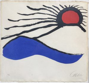
This week’s Work of the Week! WOW! is Seascape. Seascape is almost the perfect representation of the early morning scene Calder witnessed off the Guatemalan coast in 1922. The fiery red sun that Calder never forgot was still fresh in his mind almost 4 decades later. The bold colors and flat but soft shapes are distinctly representative of Calder’s visual lexicon and it is easy to imagine the forms balancing and swaying on a mobile. 

However, if Seascape served as a study, Calder had much grander plans for it than a mobile. 

In the 60’s, Calder was invited by the Mexican Cultural Olympiad Committee to produce a monumental stabile outside the “Estadio Azteca” (Aztec Stadium) in Mexico City. At over 84 feet high, his tallest creation, “El Sol Rojo” (The Red Sun) is a 3-dimensional replica of Seascape. The sculpture has remained at the stadium since its installation, greeting fans at the 1968 Olympic games, but also those attending the 1970 and 1986 World Cup finals. 

Views from different angles:

WOW! – Work of the Week – Barbara Kruger, You’re Right and You Know It


Barbara Kruger
You’re Right and You Know it
2010
Lithograph
9 x 24 in.
Edition of 200
Pencil signed, dated and numbered on verso

About the work:

Barbara Kruger’s art is instantly recognizable – photography overlaid with colored boxes filled with white bold face text. It’s not hard to miss, it’s direct and democratic – that’s why it’s brilliant. Borrowing the visual identity of advertising and fear-mongering tabloids, Kruger spreads visual messages that question systems of power.  Using the potent weapon of pure graphics and phrases from the lexicon of thought, Kruger’s art offers up powerfully distilled messages through word and image.

Like Warhol’s pop portraits, or Lichtenstein’s teary cartoon heroines, Kruger has a style which extends into mainstream popular, underground and digital culture. However, it’s not just the aesthetic of her work that is powerful – it’s its purpose.

Bold, philosophical, radical, subversive: her art focuses on decoding the social-psychological messages embedded in popular culture. Through marrying pictures to words, Kruger raises issues of power, politics, and challenges corruption, sexism and consumerism.

Much of her work calls attention to feminism.  However, Kruger does not want to have her work solely categorized as feminist art.   She states below:

“My work always deals with issues of how we are to one another, with issues of power and control, adoration and contempt.” One thing to note in today’s era of identity politics is that Kruger doesn’t define her art as political or feminist, believing such categorizations “only work to marginalize a practice.”

Kruger also rejects the term “slogan” when it comes to the text elements of her art. Her pieces should read more like the start of dialogues rather than simple take-it-or-leave-it statements. While her phrases may be short, they invite participation, rely on us to do the intellectual legwork. She prompts us to question the systems which rule our globalized world.

This week’s “Work of the Week! WOW!” is Barbara Kruger’s You’re Right and You Know It And So Should Everyone Else

Although Barbara Kruger does not view her work as purely feminist, she is very much an advocate for women’s rights on the basis of the equality of the sexes. In this piece, a close-up of a woman’s piercing and confidant gaze is matched with the bold, caps-locked typeface that reads “You’re right and you know it and so should everyone else.” The message is simple, powerful, and inspiring, making women feel confident, working to crack that glass ceiling.

At the same time, bringing and keeping the gender issue in the political arena relevant. Like many of Barbara Kruger’s works, there are multiple messages, and multiple intentions.

WOW! – Work of the Week – Keith Haring, Dog


Keith Haring
Dog
1981
Collage cut-out on paper
12 x 9 in.
Signed and dated in ink

About the work:

A leading figure of the American art scene of the eighties, Keith Haring embraced the world of art thanks to his father who was an amateur comics artist. By the time Haring moved to New York in 1978, he had already developed his style of simple outline drawing, inspired by his father, which would continue to be his s

ignature style throughout his career.

In New York City, Haring adopted and contributed to the downtown culture of Manhattan, tagging subway cars or East-Village buildings with Jean-Michel Basquiat along with other artists. While prolific in his street art endeavors, Keith Haring was much more than just a graffiti artist. His drawings, which feature seemingly simplistic, vividly-colored shapes are actually the product of a solid artistic and cultural education.

Haring attended the School of Visual Arts in NYC and in addition to art classes, he also took courses in semiotics. Semiotics is the study of signs and symbols and their use or interpretation. This discipline had a profound impact on Haring’s works. Haring combined his learnings with his contour drawing style, and created a visual lexicon of icons and symbol-like figures. These images, easily remembered and akin to a signature, became identifiers, characterizing  his work. 

Having started out capturing the New York City street culture in his art, his icons read like an urban, tribal language. However, as Haring matured, along with the influence of the New York art scene, Haring’s work became more intricate and more social / political. Everything in his works took on meaning. 

Aside from the Radiant Baby, Haring’s Dog is his most famous tag. The Dog, is portrayed in many different manners, and as an icon, generally has more than one explicit meaning or symbolism. 

This week’s Work of the Week! WOW! is Keith Haring’s Dog.  This work is a collage cut-out on gold foiled paper. It is a unique work inspired by Matisse’s cut-outs. One of the tallest of the giants on whose shoulders Haring set his feet was Matisse, who inspired his combinations of flat tints of color and his decomposition of planes-characteristics. Haring did a number of cut-outs and collages in this manner. This work is signed and dated ’81.

The Barking Dog, for example, can indicate action or suspicion. The Dog as a character, sometimes represented as a standing figure (combined with a human form), represents authoritarian government, abuse of power, police states, and oppressive regimes.

In addition to these two representations, the other dogs in the art of Keith Haring are all anthropomorphic. Certain Dogs are depicted dancing, laughing, DJing, etc. in these personifications, it is almost as though they take on the role of an alter ego of the artist. 

Throughout Art History, Dogs have been portrayed in paintings as the personification of fidelity. Dogs also imply loyalty, guidance, protection and love. As a student of semiotics, none of these implications would have been lost on haring and it is not surprising that this would be one of his most-used icons. 

WOW! – Work of the Week – Leon Polk Smith, Volair, from Constellation Series


Leon Polk Smith

Volair, from Constellation Series

1975

Screenprint

41 1/8 x 29 1/2 in.

Edition of 80

Pencil signed and numbered

About the work:

Considered one of the founders of the hard-edge style of abstract art, Leon Polk Smith rose to prominence in the 1960s with his distinctive shaped canvas series — the “Constellations”.

This week’s Work Of the Week (WOW!) is the 1975 screenprint Volair, from this important Constellations Series

It was in 1936, while attending Columbia University’s famed Teachers College, that Smith was introduced to the geometric works of contemporary European artists. The works of the Dutch artist Piet Mondrian caught his eye during his studies. He was deeply inspired by Mondrian’s aesthetics, if not fully convinced by the philosophy behind them. A pragmatic American in his approach, Smith took what he wanted from the aesthetic experience and discarded the theorizing.

However, it would be another few years before the influence of De Stijl, the movement inspired by Mondrian in which pure abstraction is achieved through form and color, clearly manifested itself in Smith’s work. His perceptions of artistic space led to a quest to make color and form one. This quest consisted of a series of intuitive decisions rather than the theoretical, ruminative creative process that preoccupied Mondrian and other members of the De Stijl group.

Smith established his key motif while perusing an athletic catalogue in the late 1940s. Examining the pencil drawings of baseballs and tennis balls in it, Smith began to imagine that from these simple shapes he could create a new kind of space.

As he described:

“It was flat and the same time it was curved. It was like a sphere. The planes seemed to move in every direction, as space does. And so I thought, maybe that is because that’s on the tondo. I’ve got to find out if that is true or not. I’ve got to do some on a rectangle to see if the form and the space still moved in every direction. And it did. So it was exciting to do a painting on a rectangle that seemed to have a curved surface. It was the first time, you see, that I had made an important step myself, or contribution in art.”

While his Minimalist peers during that time were shifting away from Modernism and rejecting relationality, Smith was wholeheartedly advancing the formal and rational elements of the Modernist tradition. By introducing a single curving line, Smith created two pictorial spaces, allowing for the interchangeability of positive and negative space. He developed his signature hard-edge style over the following decade, beginning with creating a series of paintings in which he explores the circle by developing a curvilinear shape within it using two colors, and later experimenting with more colors in oval, rectangular and square shapes.

By 1967, Smith’s circular explorations introduced additional panels and defined his shaped, multi-part “Constellation” series of paintings and drawings, among his most exuberant and inventive compositions.

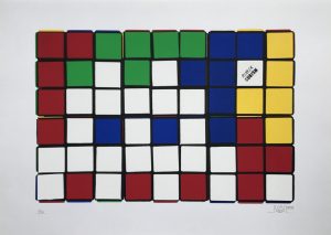
WOW! – Work of the Week – INVADER, Rubik Six Cubes


Invader
Rubik Six Cube (Blue/Yellow)
2009-2010
Screenprint
27 1/2 x 19 5/8 in.
Edition of 20
Pencil signed, dated and numbered

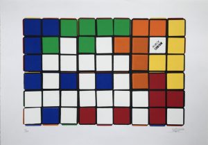
Invader
Rubik Six Cube (Orange/Yellow)
2009-2010
Screenprint
27 1/2 x 19 5/8 in.
Edition of 20
Pencil signed, dated and numbered


About the work:

Rubik’s Cubes are meant to be solved, right?   Wrong!!  

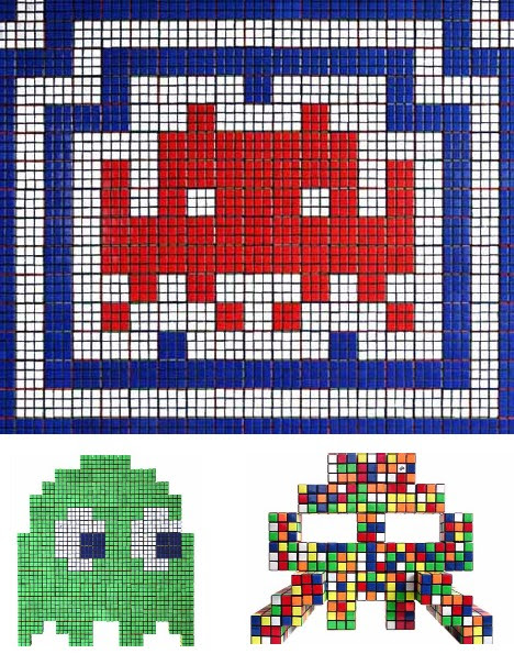
The art of cubing takes on a different meaning under the 8-bit eyes of Invader. Twisting dozens, even hundreds of Rubik’s Cubes into precise patterns of pixelated pointillism, Invader updates artistic techniques pioneered by Picasso, Duchamp, Seurat and others into a new and distinctly modern form: Rubikcubism.

Billed as the “Urban Seurat”, Invader is the pseudonym of a French urban artist, born in 1969, whose work is modeled on the crude pixellation of 1970s–1980s 8-bit video games. A graduate of the École des Beaux-Arts in Paris, Invader initially derived inspiration for his creations from video games from the late 1970s to early 1980s that he played when he was growing up, particularly characters from Space Invaders, from which he derived his name. Games of the era were made with 8-bit graphics, and so lend themselves well to his method of each tile representing one pixel.

Rubikcubism:

One of Invader’s most important innovations was Rubikcubism, a style of mosaic art that uses various Rubik’s Cube configurations to create extremely complex images.

While most try to solve the Rubik’s Cube, anonymous French Street-Artist, Space Invader has come up with another creative use for the toy. Since 2004, he has been using Rubik’s Cubes to create crude-pixelated pointillism artwork. Updating and modernizing a technique pioneered by Georges Seurat and Paul Signac, Invader named the movement: Rubikcubism, and has continued to experiment with the style ever since.

This week’s Work of the Week! (WOW!) is Invader’s Rubik Six Cube Series. These screenprints are made up of 6 cubes, all arranged in a specific manner to create an image. In the case of this series, Invader’s trademark Space-Invader, his most  iconic image of the 80’s is portrayed. Coming of age in the 80’s, much of Invader’s artistic identity revolves around the iconic imagery and pop culture of his youth.

Given the difficulty of solving a Rubik Cube, let alone attempting to create images, Invader uses a computer program to work out the precise disposition of the six colors for each image. He then manipulates the nine pixels for each Rubik’s Cube to give the required pattern.

Invader Rubiks_Art_                    Invader Rubiks_Art_2

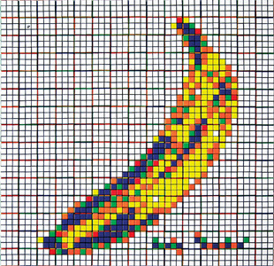
While this series is made up of the use of six cubes, some of Invader’s creations can use over 300 Cubes.  He has recreated “Masterpieces” where famous paintings by artists such as Delacroix, Warhol, Seurat, and Lichtenstein are given a work over. He has a series of Rubikcubism works entitled “Low Fidelity” based on iconic album art such as “Country Life” by Roxy Music, and The Velvet Underground & Nico.  He has also created a series of “Bad Men” where Invader reinterprets villains such as Osama bin Laden, Jaws and Al Capone.

Invader Rubiks_Art_3

All these works and themes are relative to pop culture, and to today’s world in which we live in, with a touch of nostalgia from his days as a youth.

What does Erno Rubik, the inventor of the Rubik’s Cube have to say about Invader’s use of his famous toy puzzle in his artworks?

When asked he says: “I’m glad the Cube is reaching new generations, who face it with fresh wonder, curiosity and enthusiasm.”   

WOW! – Work of the Week – WARHOL, Paramount, from Ads


Andy Warhol
Paramount, from Ads
1985
Screenprint on Lenox Museum Board
38 x 38 in.
Edition of 190
Pencil signed and numbered

About the work:

One of the last portfolios Andy Warhol would produce before his untimely death in 1987 was his renowned Ads series. The 10 prints that make up the series are based on some of the most popular and successful ad campaigns and logos from Andy Warhol’s lifetime. They are considered to be particularly important because of Warhol’s fascination with advertising, consumerism and commercialism, which were three major facets of his entire body of work. Having begun his artistic career in advertising, Andy Warhol, more than any other artist of his generation, understood how the reproduced image had come to reflect and shape contemporary life in America.

This week’s Work Of the Week! WOW! is Paramount. In this work, Andy Warhol masterfully depicts the snow-capped mountain in white, making the image pop out to the viewer. He also skillfully plays with the yellow, red and green coloring causing the word “Paramount” and the halo of stars to seem three-dimensional or animated. That Warhol chose Paramount over any other film studio is fitting in many ways.

It is well-known that Warhol was fascinated with stardom and fame. He loved being surrounded by the Hollywood elites. One of his most famed images is that of Marilyn Monroe, he was smitten with Liz Taylor, and even promoted his own “Warhol Superstars” such as Baby Jane Holzer, Edie Sedwick and Candy Darling, to name a few. Founded in 1912, Paramont Pictures, is the second oldest film studio in the US.  The story behind the Paramount logo is that each of the 22 original contracted actors and actresses of the studio was honored with one of the stars of the halo atop the mountain peak, which made them the original “movie stars.” There is no doubt that Andy Warhol, the man who coined the famous “15 minutes of fame” phrase, would have loved where the term “movie star” originated from.

The Paramount Logo as a portrait? : A Mysterious Connection

There is another, more personal and less well-known connection between Andy Warhol and the Paramount Pictures Company. In 1980, he met Jon Gould who was a 27 year old vice president of marketing at Paramount Pictures. Warhol was deeply infatuated with the film executive, and over the course of 5 years, the two shared a close bond that defied easy description. They lived together in Warhol’s townhouse until 1985. Jon Gould is the most photographed subject of Andy’s oeuvre, and while Andy created many portraits of him during their time together, those close to Warhol have insinuated that  the inclusion of the Paramount logo in the Ads series, may be considered an abstract portrait of the young man Andy cared for.

WOW! – Work of the Week – KOONS, Balloon Dog


Jeff Koons
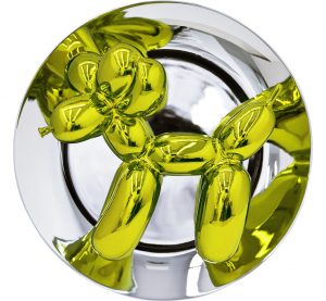
Balloon Dog (Yellow)
2015
Metallic Porcelain
10 1/2 x 10 1/2 x 5 in.
Edition of 2,300
Signed and numbered on verso

About the work:

Nov. 12, 2013 – Christie’s Post-War and Contemporary Art Evening Sale in New York City

Balloon Dog (Orange) by Jeff Koons  became the most expensive artwork by a living artist sold at auction.  The work sold for $58.4 million USD

The price topped Koons’s previous record of $33.7 million USD, and the record for the most expensive living artist, held by Gerhard Richter, whose 1968 painting, Domplatz, Mailand, sold for $37.1 million USD, at Sotheby’s on May 14, 2013.   Balloon Dog (Orange) was one of the first of the Balloon dogs to be fabricated, and had been acquired by Greenwich collector Peter Brant in the late 1990s.

____________________________________________________________

Jeff Koons derives inspiration from things you might find at a yard sale: inflatable plastic toys, vacuum cleaners, porcelain trinkets and other items not typically considered fine art. He is the epitome of Neo-Pop, a 1980s movement that looked to earlier Pop artists, particularly Warhol, for inspiration.

Since his emergence in the 1980s, Jeff Koons has blended the concerns and methods of Pop, Conceptual, and appropriation art with craft-making and popular culture to create his own unique iconography, often controversial and always engaging. His work explores contemporary obsessions with sex and desire; race and gender; and celebrity, media, commerce, and fame.

A self-proclaimed “idea man,” Koons hires artisans and technicians to make the actual works. For him, the hand of the artist is not the important issue: “Art is really just communication of something and the more archetypal it is, the more communicative it is.”

Jeff Koons’s artwork rarely inspires moderate responses, and this is one signal of the importance of his achievement. Focusing on some of the most unexpected objects as models for his work, Koons’s work eschews typical standards of “good taste” in art and zeroes in precisely on the vulnerabilities of hierarchies and value systems.

Art critic Christopher Knight writes, “He [Koons] turns the traditional cliché of the work of art inside out: rather than embodying a spiritual or expressive essence of a highly individuated artist, art here is composed from a distinctly American set of conventional middle-class values.”

This weeks Work of the Week (WOW!) is precisely a work of conventional middle class values.

Jeff Koons is best known for working with popular culture subjects and his reproductions of banal objects—such asballoon animals produced in stainless steel with mirror-finish surfaces.

His steel Balloon Dog sculptures, probably his best-known works, transpose an ephemeral childhood memory into an enduring form. His work looks cheap, but is expensive, an ingenious reversal of economic logic that forms the basis for his stunning commercial success.  Rather than offending the art snob, Koons has challenged top collectors to revise their notions of what fine art looks like.

His sculptures are not merely conceptual, but aesthetic, in ways that challenge us, especially those of us accustomed to fine art. Kitsch and high culture, religion and eroticism, weightlessness and mass are among the apparent opposites that mix and mingle in his work.

“Balloon Dog is a very optimistic piece, its a balloon that a clown would have maybe twist for you at a birthday party.  But at the same time there’s the profoundness of an archaic sculpture.  The piece has an interior life while the reflective exterior surface affirms the viewer through their reflection.”  – Jeff Koons

Koons is essentially a late twentieth-century incarnation of Marcel Duchamp. Like the French Conceptual artist who thought America’s bridges and plumbing her finest artworks, Koons strips industrially-made objects of their practical purpose and re-presents them as art.

WOW! – Work of the Week – WARHOL, Blackglama


Andy Warhol
Blackglama, from Ads
1985
Screenprint on Lenox Museum Board
40 x 40 in.
Unqiue
Authenticated and stamped by the Andy Warhol Foundation on verso

About the work:

WHAT BECOMES A LEGEND MOST?

One of the most famous advertising campaigns of the 20th century began in 1968: the series of full-page, black-and-white print ads for “Blackglama” furs. The campaign was an instant success thanks to the (at the time) new formula of combining a brilliant tag line, with a glamourous and famous icon to promote a luxury item.

“What becomes a Legend most?” is the memorable slogan for Blackglama furs.

Something that has always intrigued people about the brand name is: why the GLAMA in Blackglama, is not GLAMOUR? The whole campaign started when approximately 400 mink ranchers from the Great Lakes Mink Association (a.k.a. GLMA) were looking to revamp the image of their product. Ad executive, Jane Trahey of Jane Trahery Associates in NYC came up with the idea to incorporate the deep black color of the mink and the name of the association. Thus the name and the memorable slogan were born: “What becomes a Legend most?” (the “L” in legend was always capitalized).

Famed photographer Richard Avadon was brought on by the campaign to photograph the most important female celebrities of the time. In the first year alone, Lauren Bacall, Bette Davis and Judy Garland modeled for the brand. Every model was gifted an $8,000 Blackglama mink coat. Legend has it that Judy Garland left the studio without even bothering to have hers lined.

Here below we see Avadon’s contact sheet of Judy Garland posing in her Blackglama for the ad campaign

This week’s Work of the Week! WOW! is Blackglama, from Ads, featuring Judy Garland by Andy Warhol. Ever the observer of the times in which he lived, the artist, who began his career as a commercial illustrator in the 50’s was fascinated with the commercial world. Warhol glamorized and transformed celebrities and everyday objects like soup cans and Brillo Pads, into works of art. In the mid 1980’s he created one of his most sought after and iconic sets of screenprints: the Ads Series. Andy Warhol’s work explores the themes and the relationship between artistic expression, and the celebrity culture, advertisement, capitalism and consumerism that were prevalent at the time. The cultural force that was the Blackglama ad campaign fit perfectly into his philosophy and was a obvious choice to include into the Ads portfolio.

This particular version of Warhol’s Blackglama is a unique working proof, outside of the regular edition. It is much different from the one that we are most familiar with. In this work, the most notable difference is the background and the colors of Judy Garland herself. In the regular edition, the background is black and the color blue is the most prevalent for the mink, as well as her hair. In this working proof, there are more colors and the detail of Judy Garland’s face, hair and mink are more pronounced. The slogan at the top even has a slightly different hue.

Another noticeable difference is the size of this work. The regular edition Blackglama measures 38 x 38 in. This working proof measures 40 x 40 in. If you look closely at the bottom and left margins, you will see traces of regular edition coloring underneath this unique proof. Warhol did this quite often, working out different color arrangements and schemes until he got it just right.

These working proofs have become quite rare, hard to find and highly sought after. Each proof is different. Each proof is considered a unique work of art. This unique working proof of Blackglama is certified by the Andy Warhol foundation on the verso with its registration number. It is also accompanied with a letter of authenticity by the Andy Warhol Authentication Board.

WOW! – Work of the Week – LICHTENSTEIN, Titled


Roy Lichtenstein
Titled
1996
Sreenprint on Coventry Rag paper
31 1/2 x 39 1/2 in
Edition of 175
Pencil signed, dated and numbered

About the work:

Roy Lichtenstein was the epitome of Pop art. His paintings are instantly recognizable through his use of Benday Dots, bold colors and thick lines. This recognition, as one of Pop Art’s Greats, came late in life for the artist. Lichtenstein knew he wanted to make a living from his artwork, but it wasn’t until his late 30’s that he was able to do so. Until that time, he supported himself mostly through teaching. When Leo Castelli took the artist under his wing and put together his first solo-show in 1962, Lichtenstein became an overnight sensation. The entire show had sold out before the opening night. 

Lichtenstein’s work reinvigorated the American art scene and altered the history of modern art. After his triumph at Castelli’s famed gallery, he went on to create a body of work of more than 5,000 paintings, prints, drawings, sculptures, murals and other objects celebrated for their wit and invention.

Most famously, Lichtenstein appropriated the Benday dots. The dots became a trademark device forever identified with the artist and Pop Art. In order to achieve the dots, the artist would use various kinds of stencils with perforated patterns that he would brush paint across, creating perfect circles void of brush strokes. 

Benday dot printing is a minute mechanical patterning used in commercial engraving consisting of small colored dots. The process is named after illustrator and printer Benjamin Henry Day Jr. who invented it in 1879. Originally, this technique was used in the printing of Pulp Comic Books in the 50’s and 60’s as an inexpensive way to create shading and secondary colors. Lichtenstein elevated a cheap, commercial printing process into fine art, managing to evoke strong emotions. 

This week’s Work of the Week! WOW! is Titled by Roy Lichtenstein. The print was produced for the 1996 election cycle for the effort “Artists for Freedom of Expression.” It was to benefit the candidates and organizations that supported federal funding of the arts. Sixteen of the nations most respected contemporary artists were solicited to donate work that would be sold to directly benefit the cause, among them were Chuck Close, Peter Haley, Jenny Holzer, Elsworth Kelly, Bruce Newman, Robert Rauschenberg and James Rosenquist. 

While Lichtenstein is known for his use of Benday dots, in this particular image, the style he uses is called Halftone. Benday dots are always the same size, Halftone dots on the other hand, are always the same color and vary in size and/or spacing and create a gradient or atmospheric perspective. In this work, the halftone dots become smaller in the distance, implying the vastness of the sea. 

With just a few simple, strategic swathes, Lichtenstein is able to suggest the features of a landscape. A think blue line represents the horizon while an undulating green one delineates the shore from the water. The sun is particularly interesting, a yellow monotone circle with a curious black crescent shape. Finally, the texture of the leaves and trees is fascinating, as thought the artist created the foliage with a paint filled sponge which brings to mind a more abstract style.