Tag Archives: mustsee
WOW! – Work of the Week – Ed Ruscha, Main Street

Ed Ruscha
Main Street
1990
Lithograph
8 1/2 x 10 1/4 in.
Edition of 250
Pencil signed, dated and numbered
About the work:
Ed Ruscha can be called the Jack Kerouac of art. Since his first road trip from Oklahoma City to Los Angeles in 1956, West coast Pop artist Ed Ruscha has been influenced by themes and icons surrounding America. The drive, which he took with his life long friend, classical guitarist and composer Mason Williams took about three days in a 1950 Ford sedan.
At the time, Ruscha, who has since become an avid photographer, did not own a camera and the only record of the trip is a log that the artist has kept over the years. The two friends, who were still teenagers at the time, used the log to keep track of their expenses as they were trying to stick to a budget. The log tells the story of their journey. Ruscha has said: “My art, really my life, evolved out of that trip. […] The log took the place of photographs. I got a camera soon after arriving in L.A.” American landscapes and text are what the artist is best known for, both of which emerged from from his cross country experience.
This week’s Work of the Week! WOW! is Main Street, by Ed Ruscha.
“Main Street” is part of the iconography of American life.
The “Main Street of America” branding was used to promote U.S. Route 66 in its heyday. Main Street is a generic phrase used to denote a primary retail street of a village, town or small city.
In small towns across the United States, Main Street is not only the major road running through town but the site of all street life, a place where townspeople hang out and watch the annual parades go by. In the general sense, the term “Main Street” refers to a place of traditional values. However, in the America of later decades, “Main Street” represents the interests of everyday people and small business owners, in contrast with “Wall Street”, symbolizing the interests of large national corporations.
Ruscha treats words as visual compositions which are typically categorized between pop and conceptual art. Works feature a word with strong connotations and a powerful visual impact. Ruscha uses the multiplicity of meaning to encourage the viewer to consider all the subconscious connotations of the word. This could be expanded to an exploration of the subconscious meanings hidden in all forms of language. The words elicits a mixed response within the viewer in which preconceived ideas about the subject are confronted and either validated or challenged.
Noting the transformation of Main Streets in American cities from small “mom and pop” businesses, ice cream parlours, and public square gatherings, to big box stores, chain restaurants, and consumers jay walking across the street, while burying their heads in their cell phones, the words Main Street takes on a much diff erent meaning than it once did. Ruscha’s Main Street, not only takes us back to the days of nostalgia, but also to modern times where Main Street meets and flirts with Wall Street. Innocence and American values are overshadowed by greed and technology. Overshadowed is the key word, because not only is Ruscha’s Main Street a sign of modernism replacing the past, but it also implies a sense of hope, that one day the traces of the past will lead to a happy memory, and a wanting to inject the future with the values of the days of old.
Rather than simply painting a word, Ruscha considered the particular font that might add an elevated emotion to the meaning much like the way a poet considers a phrase. By painting a word as a visual, he felt he was marking it as offi cial, glorifying it as an object rather than a mere piece of text.
The typography of the words in Main Street sets this piece apart from the majority of his work because it is not done in “Boy Scout Utility Modern.” Inspired by the Hollywood sign, the artist invented “Boy Scout Utility Modern” in 1980, and uses it regularly in his works. In this case, rather, the font seems closer in nature to “Times.” “Times” is a classic font, designed for its legibility so it is an obvious choice for a representation of the most famous street name in America: Main Street. Main Street is an ode and textual portrait of an American symbol.
Ed Ruscha is fascinated with the streetscape as a subject matter, and over the span of his six-decade career, Ed Ruscha has shaped the way we see it – depicting gas stations, signs or continuous photographs of Hollywood Boulevard. His works convey a distinct and bold brand of Americana. Ruscha explains. “I take things as I find them. A lot of these things come from the noise of everyday life.”
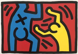
WOW! – Work of the Week – Keith Haring – Untitled C & D

WOW! – Work of the Week – Leon Polk Smith, Volair, from Constellation Series

Leon Polk Smith
Volair, from Constellation Series
1975
Screenprint
41 1/8 x 29 1/2 in.
Edition of 80
Pencil signed and numbered
About the work:
Considered one of the founders of the hard-edge style of abstract art, Leon Polk Smith rose to prominence in the 1960s with his distinctive shaped canvas series — the “Constellations”.
This week’s Work Of the Week (WOW!) is the 1975 screenprint Volair, from this important Constellations Series
It was in 1936, while attending Columbia University’s famed Teachers College, that Smith was introduced to the geometric works of contemporary European artists. The works of the Dutch artist Piet Mondrian caught his eye during his studies. He was deeply inspired by Mondrian’s aesthetics, if not fully convinced by the philosophy behind them. A pragmatic American in his approach, Smith took what he wanted from the aesthetic experience and discarded the theorizing.
However, it would be another few years before the influence of De Stijl, the movement inspired by Mondrian in which pure abstraction is achieved through form and color, clearly manifested itself in Smith’s work. His perceptions of artistic space led to a quest to make color and form one. This quest consisted of a series of intuitive decisions rather than the theoretical, ruminative creative process that preoccupied Mondrian and other members of the De Stijl group.
Smith established his key motif while perusing an athletic catalogue in the late 1940s. Examining the pencil drawings of baseballs and tennis balls in it, Smith began to imagine that from these simple shapes he could create a new kind of space.
As he described:
“It was flat and the same time it was curved. It was like a sphere. The planes seemed to move in every direction, as space does. And so I thought, maybe that is because that’s on the tondo. I’ve got to find out if that is true or not. I’ve got to do some on a rectangle to see if the form and the space still moved in every direction. And it did. So it was exciting to do a painting on a rectangle that seemed to have a curved surface. It was the first time, you see, that I had made an important step myself, or contribution in art.”
While his Minimalist peers during that time were shifting away from Modernism and rejecting relationality, Smith was wholeheartedly advancing the formal and rational elements of the Modernist tradition. By introducing a single curving line, Smith created two pictorial spaces, allowing for the interchangeability of positive and negative space. He developed his signature hard-edge style over the following decade, beginning with creating a series of paintings in which he explores the circle by developing a curvilinear shape within it using two colors, and later experimenting with more colors in oval, rectangular and square shapes.
By 1967, Smith’s circular explorations introduced additional panels and defined his shaped, multi-part “Constellation” series of paintings and drawings, among his most exuberant and inventive compositions.
WOW! – Work of the Week – ALBERS, White Line Squares (Series II) XVI
Josef Albers
White Line Squares (Series II) XVI
1966
Lithograph
20 3/4 x 20 3/4 in.
27/125
Initialed in pencil, dated, numbered and titled
About the work:
“The perception of color is deceiving, we may perceive two different colors to look alike, or two equal colors to look different. This game of colors – the change of identity – is the object of my study.”
Josef Albers
Accomplished as a designer, photographer, typographer, and printmaker, Josef Albers is best known for his work as an abstract painter and color theorist. His approach to composition was very disciplined. He spent 26 years creating and mastering thousands of paintings and prints that make up his series “Homage to the Square.” Through this series, Albers explored chromatic interaction with nested squares.
His works were always created using the same process: he painted mostly on Masonite, using a palette knife to prime the surface with layers of white gesso, then applying each oil color minimally for maximum effect. He would paint one coat of pure color directly to the canvas from the tube, unmixed, starting from the centre and working his way outwards, just as his father, a house painter, carpenter, plumber and general technician, had taught him – a technique that ‘catches the drips of paint and keeps cuffs clean’ he used to say.
He was known to meticulously list the specific manufacturer’s colors and varnishes he used on the back of each work, as if the colors were catalogued components of an optical experiment. Each painting in the series was composed of either three or four squares of solid planes of color nested within one another, in one of four different arrangements and in square formats.
Despite their name, the Homages seem to be less about squares within squares than about the infinite possibilities of the chromatic spectrum. Every last one is an exercise in visual juxtaposition, an exploration of the effect that colors have on the eye and on each other. The size and proportion and the number of the squares vary, but they are always offset towards the bottom of the frame The arrangement of these squares is carefully calculated so that the color of each square optically alters the sizes, hues, and spatial relationships of the others, and this tricks the eye into a figurative response: they look like luminous corridors receding to a vanishing point.
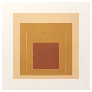
Our Work Of the Week! WOW – White Line Squares (series II) XVI is from the “Homage to the Square” series. Its color composition is comprised of three surrounding squares in colors cream, warm ochre light, and brown with a white line square in the middle square of ochre. The ochre on either side of the thin white line is actually the same hue, however, the placement of the white line creates a shift in color on both sides so that the single color appears as two different colors.
Albers wrote: “A white line within a color instead of as a contour may present a newly discovered effect: when the line is placed within a so-called “middle” color, even when the color is very evenly applied, it will make the one color look like two different shades or tints of that color.”
An Interesting Note: Transferring this idea to lithographs was a complicated process, because the white line was created by the unprinted paper. The square containing the white line could not therefore be printed over an underlying color area. Accordingly, the well known printmaker Kenneth Tyler devised a way to print on plates that accurately abutted one another with no overlap.
Having studied and later taught at the famed Bauhaus in Weimar, Germany prior to fleeing to the US, Albers’ work represents a transition between traditional European art and the new American art. It incorporates European influences from the Constructivists and the Bauhaus. His influence fell heavily on American artists of the late 1950s and the 1960s. Hard-Edge abstract painters drew on Albers’ use of patterns and intense colors, while Op artists and conceptual artists further explored his interest in perception.
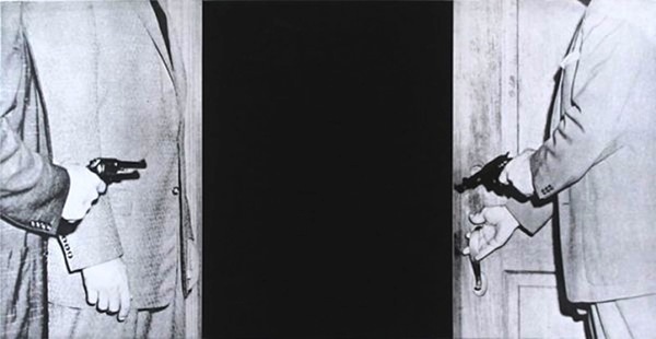
WOW – Work Of the Week – John Baldessari “Large Door”
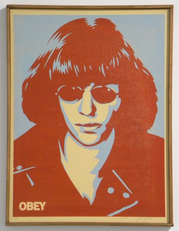
WOW – Work Of the Week – Shepard Fairey “Ramone Canvas”
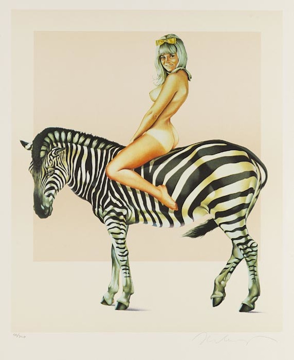
WOW – Work Of the Week – Mel Ramos “Zebra”
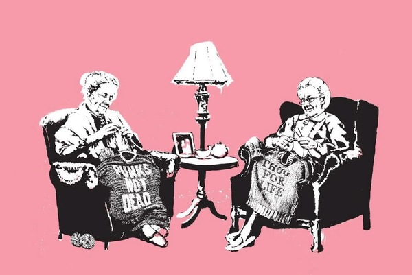
WOW – Work Of the Week – Banksy “Grannies”
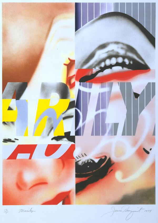
WOW – Work Of the Week – James Rosenquist “Marilyn”

