 Fulvio Bianconi
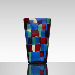
Pezzato Vase, Parigi, Model 1329
c. 1951
Polychrome patchwork glass
5 w x 4 1/2 d x 9 1/2 h in.
Signed Venini Italia to underside
About the work:
Fulvio Bianconi is one of the most important designers that generated the “Renaissance” of Venetian Murano glass-blowing art in the 20th century.
Bianconi was an innovator, focusing on pieces with sophisticated shapes, characterized by strong colors, designing striking works, some of which sum up the enthusiasm of the “fabulous” Fifties that would become icons of Murano glassmaking. He was the first glassmaker to portray human figures in glass, breaking with the long-held tradition of glass being perceived as a secondary material as far as artistic expression goes.
In 1946 he travelled many times to Murano to learn more about the art of glassmaking. Here he met Paolo Venini who, invited him to collaborate with his glassworks. From this collaboration the Figure della Commedia dell’Arte, the Tiepolos the Fazzoletto, the Sirene, the Pezzati and many others emerged.
New workmanship techniques of the glassmaking art and revision of the age-old ones were the subject of the creative research of Fulvio Bianconi. Molding movement and color into his glass pieces, Fulvio Bianconi established a totally up-to-date link with the history of Murano.
Before his innovations, glass had been used for utilitarian purposes. Bianconi pushed the limits of glassmaking in the traditional sense and material of glass itself by transforming it in both theory and practice. In his more than sixty years of artistic activity, he designed thousands of books, produced innumerous illustrations and paintings, and designed and created thousands of glass objects.
Bianconi was free to experiment with the formal qualities and potentials of glass as a fluid and organic medium. His earliest freelance work for Venini, which he not only designed but also cut and ground himself in order to become familiar with the medium, engages in a spontaneous aesthetic that intentionally and ironically protests against traditional values of perfect craftsmanship.
Fulvio Bianconi was one of the only glass designers who adapted trends in contemporary art into his work. There is an immediacy and flamboyancy in his aesthetic achieved through an improvised and freehand manipulation of glass while in the furnace. Rather than engage in the tradition of perfect repetition that had so long denoted artisanal excellence, Bianconi instead injected the individuality and expressivity of the artist’s hand into his glasswork designs. “The artistic glass,” wrote Bianconi, “must be unique, if it is repeated it loses its charm”. Though his idiosyncratic designs oftentimes brought him into direct conflict with the more restrained sensibilities of master Muranese glassworkers, it is exactly this freedom from traditional constraints that would lead Bianconi’s designs to have such a lasting influence.
An initial love for color and tendency towards abstraction would characterize the direction of Bianconi’s further creative evolution in the realm of glasswork. As he gained increasing confidence in his value as a designer, Bianconi reveled in the medium’s expressive potentials, and began to wholeheartedly utilize the luminosity of glass to develop intensely colorful displays that are almost painterly. Indeed, while form is always an essential part of Bianconi’s design, it is most often color that comes to the forefront as the true subject of his work.
This is particularly true of this week’s Work Of the Week (WOW!), which focuses on the Pezzato series, designed in 1950 and first displayed in the 1951 Triennale.
The Term “Pezzati” means spotted or patched, here, irregular patchworks of colored tesserae (small pieces of glass that form mosaics) are fused together to decorate and form the wall of the irregularly formed vase, in a seeming reference to both the theatricality of the harlequin’s outfit and Paul Klee’s work of the 1920’s and 1930’s.
This was a difficult technique, as each color has different properties, and they all have to be worked so that they get along with each other. To produce these Pezzati, the tesserae were first obtained from a cane flattened into a tape and cold-cut, and then arranged in a mosaic pattern on a fire stone. Once in the oven the effect of the heat welds the tesserae together forming a glass pattern, which then encloses into a cylinder shape to be worked into the final form, by blowing and hot-modeling.
For the Pezzati, Bianconi generally opted for unusual forms with flattened cross-sections, which were particularly irregular and characterized by soft lines, sometimes interrupted by constrictions and protrusions.
The Pezzati were proposed in 5 chromatic combinations, identified by the names of cities or continents: Paris, America, Stockholm, Istanbul and Venice. This Work Of the Week (WOW!) is from the Paris (Parigi) color scheme, composed of red, blue, green and clear tesserae. It is a prime example of Bianoni’s interest in color – bold and strong but calibrated. It also reveals his curiosity and innovative skills as well and his playful creative nature.
Fulvio Bianconi is a name well known to collectors of fine Italian glass. He designed many of the most important and original pieces associated with the mid 20th century Murano Italian glass, and the Pezzato pieces are among his most striking and sought after.

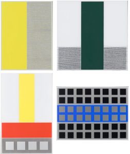
 John Baldessari
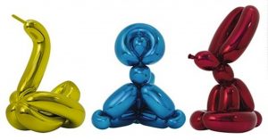

 Damein Hirst