WOW! – Work of the Week – Leon Polk Smith, Volair, from Constellation Series


Leon Polk Smith

Volair, from Constellation Series

1975

Screenprint

41 1/8 x 29 1/2 in.

Edition of 80

Pencil signed and numbered

About the work:

Considered one of the founders of the hard-edge style of abstract art, Leon Polk Smith rose to prominence in the 1960s with his distinctive shaped canvas series — the “Constellations”.

This week’s Work Of the Week (WOW!) is the 1975 screenprint Volair, from this important Constellations Series

It was in 1936, while attending Columbia University’s famed Teachers College, that Smith was introduced to the geometric works of contemporary European artists. The works of the Dutch artist Piet Mondrian caught his eye during his studies. He was deeply inspired by Mondrian’s aesthetics, if not fully convinced by the philosophy behind them. A pragmatic American in his approach, Smith took what he wanted from the aesthetic experience and discarded the theorizing.

However, it would be another few years before the influence of De Stijl, the movement inspired by Mondrian in which pure abstraction is achieved through form and color, clearly manifested itself in Smith’s work. His perceptions of artistic space led to a quest to make color and form one. This quest consisted of a series of intuitive decisions rather than the theoretical, ruminative creative process that preoccupied Mondrian and other members of the De Stijl group.

Smith established his key motif while perusing an athletic catalogue in the late 1940s. Examining the pencil drawings of baseballs and tennis balls in it, Smith began to imagine that from these simple shapes he could create a new kind of space.

As he described:

“It was flat and the same time it was curved. It was like a sphere. The planes seemed to move in every direction, as space does. And so I thought, maybe that is because that’s on the tondo. I’ve got to find out if that is true or not. I’ve got to do some on a rectangle to see if the form and the space still moved in every direction. And it did. So it was exciting to do a painting on a rectangle that seemed to have a curved surface. It was the first time, you see, that I had made an important step myself, or contribution in art.”

While his Minimalist peers during that time were shifting away from Modernism and rejecting relationality, Smith was wholeheartedly advancing the formal and rational elements of the Modernist tradition. By introducing a single curving line, Smith created two pictorial spaces, allowing for the interchangeability of positive and negative space. He developed his signature hard-edge style over the following decade, beginning with creating a series of paintings in which he explores the circle by developing a curvilinear shape within it using two colors, and later experimenting with more colors in oval, rectangular and square shapes.

By 1967, Smith’s circular explorations introduced additional panels and defined his shaped, multi-part “Constellation” series of paintings and drawings, among his most exuberant and inventive compositions.

WOW! – Work of the Week – KOONS, Balloon Dog


Jeff Koons
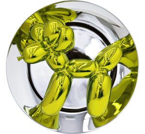
Balloon Dog (Yellow)
2015
Metallic Porcelain
10 1/2 x 10 1/2 x 5 in.
Edition of 2,300
Signed and numbered on verso

About the work:

Nov. 12, 2013 – Christie’s Post-War and Contemporary Art Evening Sale in New York City

Balloon Dog (Orange) by Jeff Koons  became the most expensive artwork by a living artist sold at auction.  The work sold for $58.4 million USD

The price topped Koons’s previous record of $33.7 million USD, and the record for the most expensive living artist, held by Gerhard Richter, whose 1968 painting, Domplatz, Mailand, sold for $37.1 million USD, at Sotheby’s on May 14, 2013.   Balloon Dog (Orange) was one of the first of the Balloon dogs to be fabricated, and had been acquired by Greenwich collector Peter Brant in the late 1990s.

____________________________________________________________

Jeff Koons derives inspiration from things you might find at a yard sale: inflatable plastic toys, vacuum cleaners, porcelain trinkets and other items not typically considered fine art. He is the epitome of Neo-Pop, a 1980s movement that looked to earlier Pop artists, particularly Warhol, for inspiration.

Since his emergence in the 1980s, Jeff Koons has blended the concerns and methods of Pop, Conceptual, and appropriation art with craft-making and popular culture to create his own unique iconography, often controversial and always engaging. His work explores contemporary obsessions with sex and desire; race and gender; and celebrity, media, commerce, and fame.

A self-proclaimed “idea man,” Koons hires artisans and technicians to make the actual works. For him, the hand of the artist is not the important issue: “Art is really just communication of something and the more archetypal it is, the more communicative it is.”

Jeff Koons’s artwork rarely inspires moderate responses, and this is one signal of the importance of his achievement. Focusing on some of the most unexpected objects as models for his work, Koons’s work eschews typical standards of “good taste” in art and zeroes in precisely on the vulnerabilities of hierarchies and value systems.

Art critic Christopher Knight writes, “He [Koons] turns the traditional cliché of the work of art inside out: rather than embodying a spiritual or expressive essence of a highly individuated artist, art here is composed from a distinctly American set of conventional middle-class values.”

This weeks Work of the Week (WOW!) is precisely a work of conventional middle class values.

Jeff Koons is best known for working with popular culture subjects and his reproductions of banal objects—such asballoon animals produced in stainless steel with mirror-finish surfaces.

His steel Balloon Dog sculptures, probably his best-known works, transpose an ephemeral childhood memory into an enduring form. His work looks cheap, but is expensive, an ingenious reversal of economic logic that forms the basis for his stunning commercial success.  Rather than offending the art snob, Koons has challenged top collectors to revise their notions of what fine art looks like.

His sculptures are not merely conceptual, but aesthetic, in ways that challenge us, especially those of us accustomed to fine art. Kitsch and high culture, religion and eroticism, weightlessness and mass are among the apparent opposites that mix and mingle in his work.

“Balloon Dog is a very optimistic piece, its a balloon that a clown would have maybe twist for you at a birthday party.  But at the same time there’s the profoundness of an archaic sculpture.  The piece has an interior life while the reflective exterior surface affirms the viewer through their reflection.”  – Jeff Koons

Koons is essentially a late twentieth-century incarnation of Marcel Duchamp. Like the French Conceptual artist who thought America’s bridges and plumbing her finest artworks, Koons strips industrially-made objects of their practical purpose and re-presents them as art.

WOW! – Work of the Week – WARHOL, Blackglama


Andy Warhol
Blackglama, from Ads
1985
Screenprint on Lenox Museum Board
40 x 40 in.
Unqiue
Authenticated and stamped by the Andy Warhol Foundation on verso

About the work:

WHAT BECOMES A LEGEND MOST?

One of the most famous advertising campaigns of the 20th century began in 1968: the series of full-page, black-and-white print ads for “Blackglama” furs. The campaign was an instant success thanks to the (at the time) new formula of combining a brilliant tag line, with a glamourous and famous icon to promote a luxury item.

“What becomes a Legend most?” is the memorable slogan for Blackglama furs.

Something that has always intrigued people about the brand name is: why the GLAMA in Blackglama, is not GLAMOUR? The whole campaign started when approximately 400 mink ranchers from the Great Lakes Mink Association (a.k.a. GLMA) were looking to revamp the image of their product. Ad executive, Jane Trahey of Jane Trahery Associates in NYC came up with the idea to incorporate the deep black color of the mink and the name of the association. Thus the name and the memorable slogan were born: “What becomes a Legend most?” (the “L” in legend was always capitalized).

Famed photographer Richard Avadon was brought on by the campaign to photograph the most important female celebrities of the time. In the first year alone, Lauren Bacall, Bette Davis and Judy Garland modeled for the brand. Every model was gifted an $8,000 Blackglama mink coat. Legend has it that Judy Garland left the studio without even bothering to have hers lined.

Here below we see Avadon’s contact sheet of Judy Garland posing in her Blackglama for the ad campaign

This week’s Work of the Week! WOW! is Blackglama, from Ads, featuring Judy Garland by Andy Warhol. Ever the observer of the times in which he lived, the artist, who began his career as a commercial illustrator in the 50’s was fascinated with the commercial world. Warhol glamorized and transformed celebrities and everyday objects like soup cans and Brillo Pads, into works of art. In the mid 1980’s he created one of his most sought after and iconic sets of screenprints: the Ads Series. Andy Warhol’s work explores the themes and the relationship between artistic expression, and the celebrity culture, advertisement, capitalism and consumerism that were prevalent at the time. The cultural force that was the Blackglama ad campaign fit perfectly into his philosophy and was a obvious choice to include into the Ads portfolio.

This particular version of Warhol’s Blackglama is a unique working proof, outside of the regular edition. It is much different from the one that we are most familiar with. In this work, the most notable difference is the background and the colors of Judy Garland herself. In the regular edition, the background is black and the color blue is the most prevalent for the mink, as well as her hair. In this working proof, there are more colors and the detail of Judy Garland’s face, hair and mink are more pronounced. The slogan at the top even has a slightly different hue.

Another noticeable difference is the size of this work. The regular edition Blackglama measures 38 x 38 in. This working proof measures 40 x 40 in. If you look closely at the bottom and left margins, you will see traces of regular edition coloring underneath this unique proof. Warhol did this quite often, working out different color arrangements and schemes until he got it just right.

These working proofs have become quite rare, hard to find and highly sought after. Each proof is different. Each proof is considered a unique work of art. This unique working proof of Blackglama is certified by the Andy Warhol foundation on the verso with its registration number. It is also accompanied with a letter of authenticity by the Andy Warhol Authentication Board.

WOW! – Work of the Week – LICHTENSTEIN, Titled


Roy Lichtenstein
Titled
1996
Sreenprint on Coventry Rag paper
31 1/2 x 39 1/2 in
Edition of 175
Pencil signed, dated and numbered

About the work:

Roy Lichtenstein was the epitome of Pop art. His paintings are instantly recognizable through his use of Benday Dots, bold colors and thick lines. This recognition, as one of Pop Art’s Greats, came late in life for the artist. Lichtenstein knew he wanted to make a living from his artwork, but it wasn’t until his late 30’s that he was able to do so. Until that time, he supported himself mostly through teaching. When Leo Castelli took the artist under his wing and put together his first solo-show in 1962, Lichtenstein became an overnight sensation. The entire show had sold out before the opening night. 

Lichtenstein’s work reinvigorated the American art scene and altered the history of modern art. After his triumph at Castelli’s famed gallery, he went on to create a body of work of more than 5,000 paintings, prints, drawings, sculptures, murals and other objects celebrated for their wit and invention.

Most famously, Lichtenstein appropriated the Benday dots. The dots became a trademark device forever identified with the artist and Pop Art. In order to achieve the dots, the artist would use various kinds of stencils with perforated patterns that he would brush paint across, creating perfect circles void of brush strokes. 

Benday dot printing is a minute mechanical patterning used in commercial engraving consisting of small colored dots. The process is named after illustrator and printer Benjamin Henry Day Jr. who invented it in 1879. Originally, this technique was used in the printing of Pulp Comic Books in the 50’s and 60’s as an inexpensive way to create shading and secondary colors. Lichtenstein elevated a cheap, commercial printing process into fine art, managing to evoke strong emotions. 

This week’s Work of the Week! WOW! is Titled by Roy Lichtenstein. The print was produced for the 1996 election cycle for the effort “Artists for Freedom of Expression.” It was to benefit the candidates and organizations that supported federal funding of the arts. Sixteen of the nations most respected contemporary artists were solicited to donate work that would be sold to directly benefit the cause, among them were Chuck Close, Peter Haley, Jenny Holzer, Elsworth Kelly, Bruce Newman, Robert Rauschenberg and James Rosenquist. 

While Lichtenstein is known for his use of Benday dots, in this particular image, the style he uses is called Halftone. Benday dots are always the same size, Halftone dots on the other hand, are always the same color and vary in size and/or spacing and create a gradient or atmospheric perspective. In this work, the halftone dots become smaller in the distance, implying the vastness of the sea. 

With just a few simple, strategic swathes, Lichtenstein is able to suggest the features of a landscape. A think blue line represents the horizon while an undulating green one delineates the shore from the water. The sun is particularly interesting, a yellow monotone circle with a curious black crescent shape. Finally, the texture of the leaves and trees is fascinating, as thought the artist created the foliage with a paint filled sponge which brings to mind a more abstract style. 

WOW! – Work of the Week – WARHOL, John Wayne


Andy Warhol
John Wayne FS II.377, from Cowboys and Indians
1986
Screenprint on Lenox Museum Board
36 x 36 in.
Edition of 250, each piece is unique
Pencil signed and numbered

About the work:

JOHN WAYNE. . .  AMERICAN AS APPLE PIE

The saying “as American as apple pie” describes things that represent the best of American culture. People use this expression when talking about things like blue jeans, baseball, and rock-n-roll.

John Wayne is America!  For many, John Wayne aka “The Duke”, symbolizes some one who is a tough, macho, rugged, strong, a fighter, an army man, and a cowboy.

At 6 foot ’4 inches, and an athlete (played football at USC), John Wayne not only had the stature of rough and tough guy, but had the attitude to go along with it.

In his movies, his straight forward, tell it like it is, take no crap attitude resonated with Americans leading up to and during WWII.  He personified American toughness, and American values and ideals.  He was proud of America, and American was proud of him.

There is no artist better to illustrate iconic symbols than Andy Warhol.  Warhol had a knack for choosing figures and images that were uniquely iconic and symbolic to the world of the past, present, and future.

The genius of Warhol was that an iconic image, could say so much that nothing else but that image had to be on the canvas.  Marilyn Monroe is still relevant today, because Warhol immortalized her.  55 years after her death Marilyn is still seen as one of the biggest, if not the biggest sex symbol in the world.    

In this week’s Work of the Week (WOW), Warhol’s image of John Wayne staring at the viewer emotionless with an ever piercing gaze in a cowboy hat, and ‘kerchief around his neck, holding a gun, rugged and ready to shoot on a draw is is one we have seen time and time again in the movies.   But Warhol knew The Duke, will remain a fixture of the popular imagination for as long as the world is watching movies, and for good reason: He wasn’t so much an actor as a symbol of national identity and a point of American pride.

Wether it is a smug portrait of Mao, a Dollar Sign, the Electric Chair, or a Campbell’s soup can, Warhol’s inconic imagery depicted the times, defined a nation, democratized art, made a statement, and sealed his place in art history for ever.  The artist is as iconic as his art!

WOW! – Work of the Week – ALBERS, White Line Squares (Series II) XVI


Josef Albers
White Line Squares (Series II) XVI
1966
Lithograph
20 3/4 x 20 3/4 in.
27/125
Initialed in pencil, dated, numbered and titled

About the work:

“The perception of color is deceiving, we may perceive two different colors to look alike, or two equal colors to look different. This game of colors – the change of identity – is the object of my study.”
Josef Albers

Accomplished as a designer, photographer, typographer, and printmaker, Josef Albers is best known for his work as an abstract painter and color theorist. His approach to composition was very disciplined. He spent 26 years creating and mastering thousands of paintings and prints that make up his series “Homage to the Square.” Through this series, Albers explored chromatic interaction with nested squares. 

His works were always created using the same process: he painted mostly on Masonite, using a palette knife to prime the surface with layers of white gesso, then applying each oil color minimally for maximum effect. He would paint one coat of pure color directly to the canvas from the tube, unmixed, starting from the centre and working his way outwards, just as his father, a house painter, carpenter, plumber and general technician, had taught him – a technique that ‘catches the drips of paint and keeps cuffs clean’ he used to say.

He was known to meticulously list the specific manufacturer’s colors and varnishes he used on the back of each work, as if the colors were catalogued components of an optical experiment. Each painting in the series was composed of either three or four squares of solid planes of color nested within one another, in one of four different arrangements and in square formats. 

Despite their name, the Homages  seem to be less about squares within squares than about the infinite possibilities of the chromatic spectrum. Every last one is an exercise in visual juxtaposition, an exploration of the effect that colors have on the eye and on each other. The size and proportion and the number of the squares vary, but they are always offset towards the bottom of the frame  The arrangement of these squares is carefully calculated so that the color of each square optically alters the sizes, hues, and spatial relationships of the others, and this tricks the eye into a figurative response: they look like luminous corridors receding to a vanishing point.

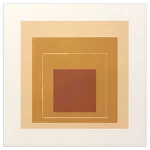
Our Work Of the Week! WOWWhite Line Squares (series II) XVI is from the “Homage to the Square” series. Its color composition is comprised of three surrounding squares in colors cream, warm ochre light, and brown with a white line square in the middle square of ochre.  The ochre on either side of the thin white line is actually the same hue, however, the placement of the white line creates a shift in color on both sides so that the single color appears as two different colors. 

Albers wrote: “A white line within a color instead of as a contour may present a newly discovered effect: when the line is placed within a so-called “middle” color, even when the color is very evenly applied, it will make the one color look like two different shades or tints  of that color.”

An Interesting Note:  Transferring this idea to lithographs was a complicated process, because the white line was created by the unprinted paper. The square containing the white line could not therefore be printed over an underlying color area. Accordingly, the well known printmaker Kenneth Tyler devised a way to print on plates that accurately abutted one another with no overlap.

Having studied and later taught at the famed Bauhaus in Weimar, Germany prior to fleeing to the US, Albers’ work represents a transition between traditional European art and the new American art. It incorporates European influences from the Constructivists and the Bauhaus. His influence fell heavily on American artists of the late 1950s and the 1960s. Hard-Edge abstract painters drew on Albers’ use of  patterns and intense colors, while Op artists and conceptual artists further explored his interest in  perception. 

WOW! – Work of the Week – GOTTLIEB, White Ground Red Disk


Adolph Gottlieb
White Ground Red Disk
1966
Lithograph
29 1/2 x 21 1/2 in.
Edition of 50
Pencil signed, dated and numbered

About the work:

“To my mind certain so-called abstraction is not abstraction at all…on the contrary it is realism of our time.”
Adolph Gottlieb

Growing up during the Depression and maturing throughout the interwar period and rise of Hitler, the American painter and printmaker Adolph Gottlieb was committed to expressing authentic feeling in the face of the traumas of the world. Gottlieb established himself as a pioneer in the movement of Abstract Expressionism and worked actively against the dominating trends of regionalism and realism of the 30’s. He was close with many important artists of the time, Marc Rothko and Barnett Newman for example and together they sought to make American art more experimental 

Gottlieb’s work can be described as a reaction to the times in which he lived, and he is well known for three distinct periods or series. The first, which emerged during the second World War is the “Pictograph” series (1941-1951) comprised of loose grids with schematic forms. This was followed by the “Imaginary Landscape” period (1951-1957), which consisted of semi-abstract landscapes. And finally, his “Burst” period, which is his most famous and which he spent almost two decades exploring (1957-1974) revolved around variations of simplified representations of two shapes – a disc hovering above an explosion of calligraphic strokes. 

This week’s Work Of the Week! White Ground Red Disk is a prime example of his work from the Burst series. 

In the vertical “Bursts,” the series relies heavily on the juxtaposition of forms characterized by an underlining dualism. Gottlieb has brought together, in a single canvas the two poles of Abstract Expressionist painting—the Color Field and Action Painting (or Gestural Abstraction) schools—in a tense balance. 

Color Field painting emerged in the late 50’s, and is known for the use of simple geometric patterns and references landscape imagery and nature. The style is characterized primarily by fields of flat, solid color, creating areas of unbroken surface and a one-dimensional picture plane. The Color Field movement places less emphasis on  gesture , brushstrokes and action in favor of an overall consistency of form and process. In Color Field painting “color is freed from objective context and becomes the subject in itself.”

Action painting, on the other hand, is a style of painting in which paint is spontaneously dribbled, splashed or smeared onto the canvas, rather than being carefully applied. It emphasizes the physical act of painting itself as an essential aspect of the finished work or concern of its artist. The images do not portray objects or even specific emotions. Instead, they aim to touch the observer deep in the subconscious mind, tapping the collective sense of an archetypal visual language. This was done by the artist painting “unconsciously,” and spontaneously, creating a powerful arena of raw emotion and action, in the moment.

The dichotomy between the two forms in the work, the disk and the expressive strokes, led the way and formed the bridge for the geometric abstractionists and minimalists such as Frank Stella and Josef Albers. 

WOW! – Work of the Week – WESSELMANN, Still Life with Liz


Tom Wesselmann
Still Life with Liz
1993
Screenprint
59 1/2 x 57 in.
Edition of 90
Pencil signed and numbered

Tom Wesselmann never considered himself a Pop artist. He would point out that he made aesthetic use of everyday objects, rather than critique them as consumer objects. He once said: “I dislike labels in general and ‘Pop’ in particular, especially because it overemphasizes the material used. There does seem to be a tendency to use similar materials and images, but the different ways they are used denies any kind of group intention.”

The artist, however, was clearly in dialogue with his Pop predecessors and contemporaries, among them Lichtenstein and Warhol, with whom he shared an interest in the commodification of the female form and still life.

In addition to being widely known for his paintings of “The Great American Nude”, Tom Wesselmann was a master of the still life. The creation of settings in his works, as opposed to the representation of a lone object is primarily what sets him apart from the other pop artists, and the pop movement. He was a modern-day Matisse who made use of Pop imagery.

In this week’s Work Of the Week! (WOW), Still Life with Liz, Tom Wesselman is taking Andy Warhol’s Liz Taylor and placing it in his painting as nothing more than an object in a room,   He is creating a familiar and recognizable setting, in which you can imagine yourself walking into a home, and seeing a console with a vase positioned next to a painting.

By using Warhol’s Liz Taylor, Wesselmann is not only affirming Andy Warhol’s place in art history as a pop artist, but also using Warhol’s iconic pop art image as an everyday object, solidifying Andy Warhol’s artwork as a work of art.  In other words (in a reversed or opposite sort of way), Tom Wesselmann is applying the very same concept to his art work that Andy Warhol did.

Warhol took everyday objects and turned them into art.  We call his style of art “pop art’.  Tom Wesselmann took Warhol’s image of Liz Taylor and turned it into an everyday object by placing this image in his artwork.  The image of Liz in this still life is no different than a 7up bottle or a package of Wonder Bread in other still life works by Wesselmann.

Andy Warhol made Liz Taylor accessible by allowing us to hang her on our wall.  He is credited with democratizing art.  Tom Wesselmann affirms this concept showing us just that.  He has taken a pop art painting and turned it into a painting of pop art.

WOW! – Work of the Week – HINMAN, Triangles


Charles Hinman
Lavender Triangle
2012
Screenprint
38 x 38 in.
Edition of 15
Pencil signed, dated and numbered

Charles Hinman
Orange Triangle
2012
Screenprint
38 x 38 in.
Edition of 15
Pencil signed, dated and numbered

“My concept of my work is dynamic, never static. I think of my paintings as occupying a 6-dimensional space – the three dimensions of space and one each of time, light and color.”  Charles Hinman

Charles Hinman played a significant role in redefining the physical shape of paintings. His desire to break away from the traditional square or rectangular frame of painting lead him to the shaped canvas. In the 60’s several abstract minimalist artists were experimenting with new canvas shapes, but none drove the concept further than Hinman. His canvases were a form of hybrid between painting, sculpture and wall relief.

Until the early 1970s, Hinman examined the possibilities offered by this new medium: strongly protruding canvases, geometric and sensual profiles, color contrasts, color reflections on the adjacent wall, shadows, monochrome canvases.

Since working on primarily flat surfaces was not Charles Hinman’s primary medium, his exploration of print-making started only when he met master-printer Gary Lichtenstein. these two worked on numerous projects together. in 2012, they collaborated on a set of screenprints entitled Triangles, which is this week’s Work Of the Week – WOW.

Prints are 2 dimensional works, however, through his mastery of color, angles and shapes, Hinman is able to give Lavender Triangle and Orange Triangle the strong illusion of a 3rd dimension. On the flat surface of the paper, he applied bright colors, which cause an area to move forward, in contrast with darker colors that recede, which tricks the eye into believing the silkscreen has actual depth. The choice of adjacent colors causes a sensation of motion of the surfaces. The defining particularity of Hinman’s Triangle silkscreens are his focus on the illusion of space and suggested volume. As with his paintings, Hinman is able to apply 6 dimensional features to his prints as well.

WOW – Work Of the Week – John Baldessari “Large Door”

Hegel s Cellar Portfolio -  Large Door

John Baldessari
Large Door
1986
Photogravure and aquatint on torn Rives BFK aper
20 x 38 in.
Edition of 35

Pencil signed and numbered

About This Work:

“Fingerprints and footprints can be repeated, and that’s why I make prints endlessly”  – John Baldessari

John Baldessari has created a formidable body of editions and artist’s books in his lifetime. His irreverent and playful prints require an intellectual workout as rigorous as any other medium in which he chooses to work.

A self-described “failed writer” who “builds with images the way a writer builds with words”, Baldessari’s work is concerned with the idea of visual information as signifier and a means of communication, combining stock imagery, colors, and text to create intricate and taut visual ambiguities. His aim is to create enough “tension” between found images in order to illicit questions and curiosity.

Using found photographs as source material – primarily stock images from early Hollywood films, newspaper photographs, and postwar advertising –  Baldessari was drawn to the generic nature of such images, their role in creating a shared visual culture, and the power they have to reveal subconscious thoughts and uncover the viewer’s “emotional baggage”.

In 1986, Baldessari created a series of 10 prints, to do just that. This series, entitled Hegel’s Cellar, used stock imagery in montages to examine Hegel’s theory of an “abyss (or cellar) as a psychic space where one preserve[s] images unconsciously” (Wendy Weitman in The Prints of John Baldessari: A Catalogue Raisonne 1971–2007, pp. 23-24).

The idea was brought out while Baldessari was in psychotherapy at the time, and he had started to let emotion (but not his own emotions) into his work. The presence of fear, anxiety, lust, horror, and other states was a new element, but their frequently jarring context was not; he was on the lookout for the unexpected associations generated by random images in close proximity.

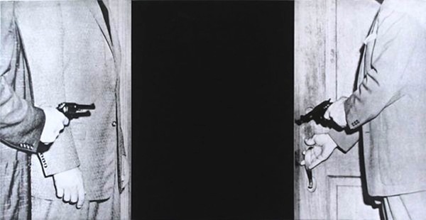
This week’s Work Of the Week (WOW) is Large Door, from Hegel’s Cellar.

Faced with the dilemma or option of either being killed or stepping into the abyss, represented by a large black rectangle of equal proportion as the men on both sides carrying pistols, Baldessari is challenging the viewer to fill in the blanks.