WOW! – Work of the Week – Frank Stella – Benjamin Moore Series


Frank Stella
Hampton Roads, from Benjamin Moore
1972
Lithograph
16 x 22 in.
Edition of 100
Pencil signed and numbered
Frank Stella
Palmito Ranch, from Benjamin Moore
1972
Lithograph
16 x 22 in.
Edition of 100
​Pencil signed and numbered

About the work:

Frank Stella is one of the most highly regarded post-war American artists still working today. He is a rule-breaker, interested in furthering the History of Art by constantly and deliberately taking us down new paths. 

Upon moving to New York after his studies at Princeton, Stella was first inspired by the Abstract Expressionists, but also by the ‘flat’ works of Barnett Newman. It was however, the paintings of Jasper Johns, exhibited at Leo Castelli’s famed gallery in 1958, that lead Stella to start using his now-trademark stripes as a compositional tool. The controlled minimalist works are among his most recognizable. Stella didn’t change the course of Art History simply through his study and use of a radically different style, he also approached diverse materials in a revolutionary way. 

Frank Stella’s first experience in painting was re-coating houses and boats, and he would continue to paint houses after his move to NY to make ends meet. Over the course of his 60-plus-year career, Stella would regularly revisit unmixed house and car paint in addition to using house-painter brushes. Stella’s process was documented in Hollis Frampton’s photo essay “The Secret World of Frank Stella” which showed the artist’s approach to canvas as being the same as he would a house – filling a space with increasingly proximate concentric lines. In his striped works, Frank Stella never used masking tape. He would never even measure out the lines, rather the works are free-hand.

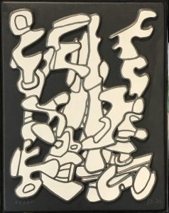
This week’s Work of the Week! WOW! is the Benjamin Moore Series. This series is one of Stella’s most iconic. Andy Warhol recognized the genius of Stella and purchased the complete set of originals himself.

All the titles of Stella’s works are significant. The Benjamin Moore Series makes reference to the type and brand of paint that was used in the creation of the works. The use of store-bought house paints is significant in that it roots his art in the post-war commodity culture. In naming the series after a company, he also explored the rise of advertising and branding. The titles of each individual piece are also important to note – they are all named after historical battles fought during the Civil War. 

The two works featured at Gregg Shienbaum Fine Art are Palmito Ranch and Hampton Roads. Both battles were of great significance. The Battle of Hampton Roads, often called either the Battle of the Monitor and Merrimack or the Battle of Ironclads, fought on March 9, 1862, was the most important naval battle of the Civil War from the perspective of naval development. It was History’s first duel between ironclad warships. The Battle of Palmito Ranch is regarded as the final battle of the war, fought May 12 and 13, 1865, on the banks of the Rio Grande in Texas. Despite that Robert Lee had surrendered a month prior to Ulysses Grant, the attack was ordered on the Confederate Army for unknown reasons. Anecdotes suggest that Union Colonel Theodore Barrett wanted to see combat before the end of the war. The names of Stella’s works are significant, loading abstract images with meaning. The complete series is a historical narrative composed of abstract works. 

The works in the series are among Stella’s most reductive compositions. It is the formal rather than the thematic matter that Stella engages in. The set plays with maze-like patterns, simple diagonals,  and understated and stacked compositions, where the painted line creates an even, horizontal rhythm. Stella shows us the environment of the battles of the Civil War with paint straight from a can – intense and flat. The saturated palette, measured proportions, and glowing presence are at once immediately vibrant and classically timeless.

As Adam D. Weinberg, director of the Whitney has said “Frank is a radical innovator who has, from the beginning, absorbed the lessons of art history and then remade the world on his own artistic terms. He is a singular American master.”

WOW! – Work of the Week – John Baldessari – I Saw It


John Baldessari
I Saw It
1997
Lithograph
17 3/8 x 14 3/8 in.
Edition of 100
Pencil signed, dated and numbered

About the work:

‘Why not give people what they understand most, which is the written word and the photograph.’ John Baldessari

For decades, John Baldessari has pioneered “conceptual art,” an art where it’s the idea that matters over the traditional cannons of aesthetics, techniques and materials. A chief claim of conceptualism is that skill is irrelevant and the idea from the artist’s head becomes art in the mind of the viewers as they try to figure out what they are seeing. The style is accepted as the extreme end of the highly intellectual avant-garde movement, which encompasses Cubism, Dadaism, Surrealism, Abstract Expressionism and Pop.

As one of the most influential artist’s working today, Baldessari has successfully removed his own hand from his works in order to couple text with pre-existing images. His commercial, static style allows the unornamented text and appropriated image to impact the viewer without distraction. Images and texts behave in similar ways, both using formulas to convey their messages. The juxtaposition of both narratives in Baldessari’s work acts as a dual and complimentary means of communication, very similar to the methods used in the press. However, contrary to the press, Baldessari’s unique interplay between two kinds of information is amusing, often creating riddles or jokes. 

This week’s Work of the Week! WOW! is I Saw It, which is a prime example of Baldessari’s tongue-in-cheek humor. 

In this work, the artist pairs the image of a light fixture with the all caps words “I SAW IT.” The image is not an illustration of the text below it. The text is instead used to make the full range of the image available to the viewer. It is only upon reading the text that the light fixture loses its common identity and function to become a UFO. The humor in Baldessari’s work is a result of the subjection of ordinary everyday objects which take on unexpected meanings and messages. 

John Baldessari is able to look beyond what is there, which opens the possibility for others to see things they normally wouldn’t. He avoids “good taste” and allows us to smile, if not laugh, through providing a new context. Just as the best humor is based on the unpredictable, the purpose of art, Baldessari has said, is to keep us “perpetually off-balance.”

Over the course of his career, Baldessari has been challenging audiences to reconsider the nature of art, with wit, humor and a captivating visual sense. And although he has played a crucial role in such major movements as conceptual art and appropriation art, perhaps his greatest contribution is “leveling the playing field,” encouraging viewers to take an active role in the construction of meaning.

WOW! – Work of the Week – Robert Motherwell – Harvest with Blue Bottom


Robert Motherwell
Harvest with Blue Bottom
1973
Lithograph with Collage
36 x 18 in.
Edition of 55
Pencil signed and numberedAbout the work:

Robert Motherwell is known as one of the most important and influential artists of the 20th century. In 1940, as a promising young painter, he moved from California to New York City, joined a group of artists (including Jackson Pollock, Willem de Kooning, Mark Rothko) and set out to change the face of American art. The artists renounced the prevalent American style, believing Realism depicted only the surface of American life. Motherwell was a key figure in the group to establish America’s first major original art style: Abstract Expressionism, or what he called the New York School, a movement that would place New York at the center of the international art world.

Strongly influenced by the European Surrealists, many of whom had emigrated to New York during World War II, the Abstract Expressionists sought to create essential images that revealed emotional truth and authenticity of feeling through the removal of the inessentials and showing only what was necessary.

Motherwell who was a fervent admirer of Matisse became a colorist seeking out earthy ochres, brilliant yellows and oranges, blues and violets. He also adopted the Matissian technique of collage, the most radical form of drawing developed in the twentieth century.

Motherwell’s collage works were not simply aesthetically pleasing forms and colors, but related to the world in some way. In his collages, he took a personal, lyrical approach, combining fragments of colored paper, labels, letters and stamps in evocative compositions. Incorporating material from his studio such as cigarette packets and labels, the works ultimately became records of his daily life.

This week’s Work of the Week! WOW! is Harvest with Blue Bottom, from the Summer Light series, in which Motherwell created elegantly playful collages. 

The Summer of Light series was made up of some of the most elaborate print-work that Motherwell produced during his career. Each piece was realized using lithography, collage and hand-ripping of different types of paper.  

Continuing a tradition established by Picasso and Braque of incorporating the detritus of daily life and its simple pleasures, the Summer Light series from 1973 integrates two of Motherwell’s favorite pastimes– drinking and smoking. 

The title of this image, Harvest with Blue Bottom, derives from the collaged element of the Ernte 23 cigarette label. “Ernte” is the German translation for harvest. The Summer Light series features six images of the Ernte 23 label and four of Château Latour wine labels. Practically, these materials were laying about his studio and were immediate and on hand, but invariably they were autobiographical, serving as a kind of documentation of his daily life and habits.

Although he is by no means an ”autobiographical” artist, it’s in his collages that fragments of his life reveal themselves. While viewing a collage retrospective of his in the 1970’s, he was ”astounded that, like Proust eating the madeleine, in these abstract compositions all kinds of personal memories would surface that I’d completely forgotten about – not about painting, but about my daily life, my marriage, where I was living at the time, or who I was particularly friendly with and so on. But the autobiography in them wouldn’t be clear to an outside person.” 

Beyond autobiographical, the Summer of Light series and all of the artist’s collage work take on the status of the artist’s own diary evoking intimate memories. 


WOW! – Work of the Week – Jean Dubuffet – Arborescences I & II


Dubuffet
Arborescences I
1972
Color screenprint relief on vacuum-formed plastic
12 3/8 x 9 5/8 in.
Edition of 75
Initialed, dated and numbered in ink
 Dubuffet
 Arborescences II
1972
Color screenprint relief on vacuum-formed  plastic
12 3/8 x 9 5/8 in.
Edition of 75
 Initialed, dated and numbered in ink
About the work:

Dubuffet: the prototype of the modern artist

Although he was well-educated, Jean Dubuffet came to reject his studies. Preferring to teach himself, the artist would base much of his artistic career on the readings of Dr. Hans Prinzhorn, who drew comparisons between the art of asylum inmates and that of children. Prinzhorn believed that it was savagery, or base animal instinct, that lead to universal harmony, arguing that it was the primal instinct, not intellectual theory or analysis, that connected all living things. 

Prinzhorn’s theories spoke directly to Jean Dubuffet who disliked authority and found mainstream culture to be “asphyxiating.” Frustrated by intellectual approaches to art, Dubuffet admired and collected the artwork of outsiders. He would champion the movements of Art Brut (meaning “raw”) and Art Informel (informal), aesthetics contrary to traditional standards, much to the dismay of the art-world elite. He sought to create an art free from scholarly concerns, and as a result, his work had a tendency to look like it was made by an amateur. Despite the child-like style of his works and his general disdain for the intellectual class, he was, early-on in his career, identified as “the most original painter to have come out of the Paris School since Miró.” 

It was certainly the paradox of Dubuffet’s career that he opposed the art establishment more forcefully than any artist, yet became one of the most esteemed visual innovators of the 20th century. 

In the early 1960s, he developed a radically new, graphic style, which he called “Hourloupe,” from which, this week’s Work of the Week! WOW! Arborescences I & II stem. 

The “Hourloupe” series began in 1962 and would preoccupy the artist until his death in 1985. The inspiration came from a chance doodle Dubuffet created while on the telephone. The style was composed of black fluid lines, tangles forming cells, some of which were filled with unmixed color which he limited to red, white, black and blue. 

Ever true to his dismissal of idealistic art, the Arborescence works are marked by a rebellious attitude toward the at-the-time dominant notions of high culture and beauty. Dubuffet’s embrace of so-called “low art,” and abandonment of traditional standards lead to what he believed to be a more authentic and humanistic approach to creating images. 

Dubuffet also departed from the use of traditional medium in his works. He placed an emphasis on texture and materiality which can be seen as an insistence on reality. The two Arborescences artworks are unique in that they are 3-dimensional works, screenprinted on vacuum-formed plastic. Vacuum forming was patented in 1950 as an industrial technology. It is a version of thermoforming where a sheet is heated to form and stretch against a mold by vacuum. At the time of the creation of these artworks, this process was still new and complex. 

In the History of Art, the 20th century marked a period of dramatic and fast-paced change. Invention, innovation and rupture of inherited models allowed for profound aesthetic revolutions of which Dubuffet was a leader and pioneer. 

“WOW! – Work of the Week – Roy Lichtenstein – Painting on Blue and Yellow Wall


Roy Lichtenstein
Painting on Blue and Yellow Wall
1984
Woodcut and lithograph
47 3/16 x 31 9/16 in.
Edition of 60
Pencil signed, dated and numbered

About the work:

“My work isn’t about form, it’s about seeing. I’m excited about seeing things, and I’m interested in the way I think other people saw things.”

Roy Lichtenstein was no overnight sensation, the art establishment in the early 60’s was not prepared to be faced with his then heretical blending of high and low art. Departing from the intellectual, nonfigurative style of Abstract Expressionism, Lichtenstein depicted everyday objects and drew inspiration from comics, advertisements, and children’s books. By integrating popular imagery into the realm of fine art, he invited viewers to recognize the world around them in his work. The use of parody and eye-popping comic images gives his creations a sense of familiarity that observers can relate to. 

Over the course of a month and half in 1984, at his studio in Southampton, Lichtenstein created a series of eight works entitled “Paintings.”The works are derived from collages which combined hand-painted and printed papers, a printed enlargement of unprimed canvas, directly painted brushstrokes and cut-out variations of the artist’s famous schematic image of an abstract brushstroke.

This week’s Work of the Week! WOW! is entitled Painting on Blue and Yellow Wall from the Paintings Series. This work is a parody and self parody made up of juxtapositions. It is the representation of an image and an image in itself, where “high art” and “low art” collide in a single setting. Painterly abstract expressionistic brushstrokes are interwoven with Lichtenstein’s own interpretation of abstract expressionist brushstrokes in a balanced composition. The positioning of the portrayed canvas is interesting in itself. The represented canvas is almost denied full attention as it competes with the vibrant yellow and blue wall-field of simulated wood grain. The frame of the depicted Abstract Expressionist image is unleveled and cropped. 

As a technique consistent with comics, the cropping of forms was a method Lichtenstein employed throughout his career. Based on the Gestalt theory of perception that incomplete forms are mentally completed by the perceiver, Painting on Blue and Yellow Wall encourages the viewer to complete the depicted frame. Surprisingly, cropping is also consistent with Abstract Expressionism. Edges of a work on canvas were often determined by stretching upon completion, thus cropping out the borders of a finished piece. Most importantly in the case ofPainting on Blue and Yellow Wall, the act of cropping is fundamentally “Pop,” as it insists on the object-quality of a work of art rather than the illusion of the work of art as a window on the world.

Painting on Blue and Yellow Wall embodies different ways of representing reality and is characteristic of the way Roy Lichtenstein’s art combines detached representation with dynamic perception. Lichtenstein’s art is much more demanding than it seems at first glance, he questions how we determine the way we view our surroundings. 

WOW! – Work of the Week – Kenny Scharf – Space Traveler


Kenny Scharf

Space Traveler

2011

Etching with hand-painting

45 3/4 x 55 5/8 in.

Edition of 20

Pencil signed and numbered

About the work:

Spontaneity and fun are the heart of Kenny Scharf’s artwork

Kenny Scharf moved to New York City in the late 1970s, and his work embodies the spirit of that time. It was a “golden age” that continued through the early 1980s, in which Pop, New Wave, graffiti and the urban art scene collided. During this explosive period the artist first learned to use spray paint, and master this newfound medium. He would bomb the length of Manhattan between his studio at PS1 in Queens and his home in the East Village, leaving the avenues covered with his characters.

Like his contemporaries Keith Haring and Jean-Michel Basquiat, Kenny was inspired by graffiti’s freedom and the direct connection street art gave him to people outside of the art world. “It was a natural reaction for us to take it to the streets and the nightclubs and let loose and not take yourself too seriously because that is stifling!” Kenny is driven by his belief that art should be appreciated for the experience. This is particularly obvious through his use of images of cartoonish figures.

This week’s Work Of the Week! WOW! is Space Traveler by Kenny Scharf. The piece reflects the impulse and speed of the artist working in the street, and the signature cartoon-like character whizzing through a cosmic galaxy is instantly recognizable. This trademark Cosmic Cavern image, created with what could be Day-Glo  or bright colored paint is a style that the artist started experimenting with in the 80’s.

The cartoon images expertly bring popular culture into the fine arts, and Scharf has been pushing the line between high and low art since his days spray-painting lower Manhattan. His true genius, however, lies in his ability to create a distinct, otherworldly color palette, as if looking inside a tremendous bubble made of candy colored beings. The work is playful, but make no mistake: This isn’t child’s play.

Scharf calls his art Pop Surrealism: “Surrealism is about the unconscious, and I feel my work is about the unconscious. The images come from the unconscious except that my unconscious is filled with pop imagery. My unconscious is pop, so therefore the art would be Pop-Surrealism.”

Space Traveler is a very large work.  It is an etching with hand painting.  A very small edition of only 20 pieces, each piece is unique.  The only printed part of the work is the black.  Every color on each different piece is all hand painted.

WOW! – Work of the Week – Daniel Arsham, Future Relic 03


Daniel Arsham
Future Relic 03
2015
Plaster and broken glass
5 1/2 x 5 x 2 1/2 in.
Edition of 400
Signed and numbered on label on box

About the work:


Remember the Future

“The future is something that contains the everyday – it contains the now. All the things we see here, in this space, will exist in the future.” Daniel Arsham


Obsessed with the fact that technological items become obsolete and are continuously replaced at an alarming rate, artist Daniel Arsham has created a complete mythology surrounding his “Future Relic” fossils. 


It was during a trip to Easter Island that Daniel Arsham came up with the idea of an archaeological excavation applied to the future. His “Future Relic” series centers around a world many years down the line, in which a major and transformative ecological shift has occurred.  


To create his fossils, the artist casts already forgotten pieces of technology to look like fragile artifacts. They are covered with tiny crack formations and have crumbling surfaces, disintegrating from disuse. All nine sculptures of the series are created from technological devices of the twentieth century.  Arsham says “the choice of the objects is very specific, I’m looking for things that are iconic that many people would recognize.”


The sculptures spurred Arsham to make video work based on the same premise, and thus his Future Relic film series was born. Each launch of a new “Future Relic” sculpture is augmented by a short movie. Through his use of film, the artist is able to build and share his complete story of the future surrounding these archeological artifacts. The sci-fi art series has featured many well-known actors such as Mahershala Ali, Arturo Castro, James Franco, Ronald Guttman, Matthew Maher, and Ethan Suplee


This week’s Work of the Week! WOW! is Future Relic 03. It is a plaster and broken glass cast Clock. Using a traditional mechanical alarm clock as the design mold, the plaster-clad object is representative of how the things we accrue ultimately perish. This launch, in 2015, was connected to his movie premier of the same name at the TriBeCa Film Festival. The movie was also presented at the 68th Cannes Film Festival in France. 


Through this chapter of “Future Relic 03,” we are able to visually understand the future that Arsham has imagined. The world as we know it today does not exist. “We all moved inland as the water rose” explains the protagonist Lona Rey. A cratered moon hangs in the sky, but with a sizable rectangular section excavated from its surface. The star of the movie is Juliette Lewis, a young woman searching for her scientist father who apparently went missing in his quest to save our Earth. About half way through the short, at minute 8:04, we see Lona as a little girl, up late at night, peering into her father’s study. On his desk, a brass Bulova mechanical alarm clock reads 8:30pm. 


In full commitment to the credibility of his “Future Relic” universe, Arsham has thoroughly combed through every detail. On the label of the box belonging to the artwork, he has included elements such as the excavation date and the longitude and latitude of the find. Another subtle detail that ties back into the movie is the faded logo on the box which is from the translator device Lona uses to speak with an Owl. 

Clock Packaging 2  Clock Packaging 1 3 Clock Label
     

Daniel Arsham is a true multi-disciplinarian. His work spans art, filmmaking, design, architecture and performance, with powerful themes woven into his narrative.


A link to the Future Relic 03 movie: https://www.youtube.com/watch?v=jWvnC0mGOGk

WOW! – Work of the Week – Alexander Calder, Seascape


Alexander Calder
Seascape
c. 1960
Lithograph
16 1/4 x 17 1/4 in.
Edition of 60
Pencil signed and numbered

About the work:

Despite hailing from a lineage of sculptors, Alexander Calder did not originally intend on becoming one himself. After high school, he enrolled at the Stevens Institute of Technology and graduated in 1919 with a degree in mechanical engineering. 

In June 1922, he found work as a mechanic on the passenger ship H. F. Alexander. The ship sailed from San Francisco to New York City, and Calder slept on deck. Early one morning, as the ship was just off the Guatemalan Coast, he witnessed both the sun rising in the East and the full moon setting on the opposite horizon. He described in his autobiography, “on a calm sea, off Guatemala, I saw the beginning of a fiery red sunrise on one side and the moon looking like a silver coin on the other.” This image remained with Calder, and would appear years later in his works.

Calder is known for his sculpture, however, he was also talented painter, engraver, and printmaker. Throughout the 1940s and 1950s, Calder produced gouache paintings depicting the same swirling, abstract forms found in his mobiles and stabiles. Numerous lithographs were produced from these paintings, and many of these works on paper were studies for his 3-dimensional works. 

This week’s Work of the Week! WOW! is Seascape. Seascape is almost the perfect representation of the early morning scene Calder witnessed off the Guatemalan coast in 1922. The fiery red sun that Calder never forgot was still fresh in his mind almost 4 decades later. The bold colors and flat but soft shapes are distinctly representative of Calder’s visual lexicon and it is easy to imagine the forms balancing and swaying on a mobile. 

However, if Seascape served as a study, Calder had much grander plans for it than a mobile. 

In the 60’s, Calder was invited by the Mexican Cultural Olympiad Committee to produce a monumental stabile outside the “Estadio Azteca” (Aztec Stadium) in Mexico City. At over 84 feet high, his tallest creation, “El Sol Rojo” (The Red Sun) is a 3-dimensional replica of Seascape. The sculpture has remained at the stadium since its installation, greeting fans at the 1968 Olympic games, but also those attending the 1970 and 1986 World Cup finals. 

Views from different angles:

WOW! – Work of the Week – Barbara Kruger, You’re Right and You Know It


Barbara Kruger
You’re Right and You Know it
2010
Lithograph
9 x 24 in.
Edition of 200
Pencil signed, dated and numbered on verso

About the work:

Barbara Kruger’s art is instantly recognizable – photography overlaid with colored boxes filled with white bold face text. It’s not hard to miss, it’s direct and democratic – that’s why it’s brilliant. Borrowing the visual identity of advertising and fear-mongering tabloids, Kruger spreads visual messages that question systems of power.  Using the potent weapon of pure graphics and phrases from the lexicon of thought, Kruger’s art offers up powerfully distilled messages through word and image.

Like Warhol’s pop portraits, or Lichtenstein’s teary cartoon heroines, Kruger has a style which extends into mainstream popular, underground and digital culture. However, it’s not just the aesthetic of her work that is powerful – it’s its purpose.

Bold, philosophical, radical, subversive: her art focuses on decoding the social-psychological messages embedded in popular culture. Through marrying pictures to words, Kruger raises issues of power, politics, and challenges corruption, sexism and consumerism.

Much of her work calls attention to feminism.  However, Kruger does not want to have her work solely categorized as feminist art.   She states below:

“My work always deals with issues of how we are to one another, with issues of power and control, adoration and contempt.” One thing to note in today’s era of identity politics is that Kruger doesn’t define her art as political or feminist, believing such categorizations “only work to marginalize a practice.”

Kruger also rejects the term “slogan” when it comes to the text elements of her art. Her pieces should read more like the start of dialogues rather than simple take-it-or-leave-it statements. While her phrases may be short, they invite participation, rely on us to do the intellectual legwork. She prompts us to question the systems which rule our globalized world.

This week’s “Work of the Week! WOW!” is Barbara Kruger’s You’re Right and You Know It And So Should Everyone Else

Although Barbara Kruger does not view her work as purely feminist, she is very much an advocate for women’s rights on the basis of the equality of the sexes. In this piece, a close-up of a woman’s piercing and confidant gaze is matched with the bold, caps-locked typeface that reads “You’re right and you know it and so should everyone else.” The message is simple, powerful, and inspiring, making women feel confident, working to crack that glass ceiling.

At the same time, bringing and keeping the gender issue in the political arena relevant. Like many of Barbara Kruger’s works, there are multiple messages, and multiple intentions.

WOW! – Work of the Week – Keith Haring, Dog


Keith Haring
Dog
1981
Collage cut-out on paper
12 x 9 in.
Signed and dated in ink

About the work:

A leading figure of the American art scene of the eighties, Keith Haring embraced the world of art thanks to his father who was an amateur comics artist. By the time Haring moved to New York in 1978, he had already developed his style of simple outline drawing, inspired by his father, which would continue to be his s

ignature style throughout his career.

In New York City, Haring adopted and contributed to the downtown culture of Manhattan, tagging subway cars or East-Village buildings with Jean-Michel Basquiat along with other artists. While prolific in his street art endeavors, Keith Haring was much more than just a graffiti artist. His drawings, which feature seemingly simplistic, vividly-colored shapes are actually the product of a solid artistic and cultural education.

Haring attended the School of Visual Arts in NYC and in addition to art classes, he also took courses in semiotics. Semiotics is the study of signs and symbols and their use or interpretation. This discipline had a profound impact on Haring’s works. Haring combined his learnings with his contour drawing style, and created a visual lexicon of icons and symbol-like figures. These images, easily remembered and akin to a signature, became identifiers, characterizing  his work. 

Having started out capturing the New York City street culture in his art, his icons read like an urban, tribal language. However, as Haring matured, along with the influence of the New York art scene, Haring’s work became more intricate and more social / political. Everything in his works took on meaning. 

Aside from the Radiant Baby, Haring’s Dog is his most famous tag. The Dog, is portrayed in many different manners, and as an icon, generally has more than one explicit meaning or symbolism. 

This week’s Work of the Week! WOW! is Keith Haring’s Dog.  This work is a collage cut-out on gold foiled paper. It is a unique work inspired by Matisse’s cut-outs. One of the tallest of the giants on whose shoulders Haring set his feet was Matisse, who inspired his combinations of flat tints of color and his decomposition of planes-characteristics. Haring did a number of cut-outs and collages in this manner. This work is signed and dated ’81.

The Barking Dog, for example, can indicate action or suspicion. The Dog as a character, sometimes represented as a standing figure (combined with a human form), represents authoritarian government, abuse of power, police states, and oppressive regimes.

In addition to these two representations, the other dogs in the art of Keith Haring are all anthropomorphic. Certain Dogs are depicted dancing, laughing, DJing, etc. in these personifications, it is almost as though they take on the role of an alter ego of the artist. 

Throughout Art History, Dogs have been portrayed in paintings as the personification of fidelity. Dogs also imply loyalty, guidance, protection and love. As a student of semiotics, none of these implications would have been lost on haring and it is not surprising that this would be one of his most-used icons.