Work of the Week! WOW! SHEPARD FAIREY – Love Unites


Shepard Fairey
Love Unites
2008
Screenprint
36 x 24 in.
Edition of 450
Pencil signed and numbered


About the work:

Shepard Fairey is a known activist. He became a household name in 2008 for the Hope image he created for then-candidate Obama. In California, on the same ballot that elected President Obama, Proposition 8 (commonly referred to as Prop 8), a state constitutional amendment, was passed. The passing of Prop 8 overturned the California Supreme Court’s ruling, from the same year, that same-sex couples “have a constitutional right to marry.” As an activist, Fairey became swiftly engaged in the cause to “Defend Equality.”

This week’s Work of the Week! WOW! is Love Unites.

Love Unites was specifically designed for the marriage equality movement called “Defend Equality” and became a symbol of the post-Proposition 8 struggle. The work was released by Shepard Fairey’s studio only 13 days after the November 4, 2008 vote, and just one day ahead of the rallies held in Hollywood and Highland. All of the proceeds from the sales were donated towards efforts to achieve marriage and LGBTQ equality. The image Fairey created was inspired by the work of Aaron Harvey, a campaign image to promote a “No” vote to Prop 8.

Aaron Harvey Campaign Poster

California first explicitly defined marriage as a state between a man and woman in 1977. In 2004, San Francisco Mayor Gavin Newsom allowed same-sex marriages in his city, which were subsequently annulled. This led to the May 2008 California Supreme Court ruling, by a 4-3 vote, that same-sex couples had the “constitutional right to marry,” which was overturned by Prop 8.

Numerous lawsuits, protests and demonstrations challenged the proposition’s validity. It wasn’t until August 4, 2010 that United States District Court Judge Walker, ruled in the case of Perry v. Schwarzenegger, that Prop 8 violated both the “due process” and “equal protection” clauses of the US Constitution. The appeals process continued the stay until February 7, 2012, when the Ninth Circuit Court of Appeals panel affirmed Walker’s ruling of Prop 8 to be unconstitutional.

Love Unites is the symbol of the almost 8 year process from the time that Mayor Newsom allowed same-sex marriages, through to the Appeals Court ruling the Prop 8 constitutional amendment void.

Work of the Week! WOW! Banksy – Grin Reaper (Red Reaper)


Banksy
Grin Reaper (Red Reaper)
2005
Screenprint
30 3/8 x 19 5/8 in.
Unique Artist Proof (A.P.) outside of the regular edition of 300
Pencil signed, dated and annotated A.P.

*Accompanied with a COA by Pest Control


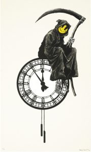
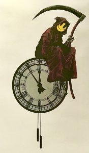
This week’s Work of the Week – WOW!!! is the Grin Reaper. Only this work is a rare one of a kind unique Artist’s Proof.

There are quite a few differences between this version of Banksy’s Grin Reaper, and the regular edition version. (See photos below). This version of Banksy’s Grin Reaper, is an extremely rare unique one of a kind screenprint.

The differences are:

– The Reaper’s cloak is red, instead of black

– His scythe is red, instead of black, and the blade has metallic silver highlights

– The clock is metallic silver, instead of white

– The Reaper’s bones (skeleton) is also silver instead of white

– There is a matching silver border around the print

– This work is untrimmed, and larger measuring 30 3/8 x 19 5/8 in. (77 x 50 cm)
– The regular edition is 27 1/2 x 17 5/8 in. (70 x 44 cm)

This work is certified authentic by Pest Control, and is even titled the “Red Reaper” on the COA. It is an Artist’s Proof (AP), outside of the edition.

This is a rare, unique, one of a kind print

Unique Artist Proof

Regular Edition of 300

Banksy’s “Grin Reaper” is one of the artist’s most iconic images. Banksy’s original regular edition print was first released in 2005, as an edition of 300 pieces, and existed as a graffiti piece on Old Street, London. The work was originally part of ‘pop up shop’ exhibitions by Banksy.

This screen print by Banksy shows a grim reaper, with a comical twist. The reaper holds his traditional scythe, and he is sitting, casually on the top of a clock. It is five minutes to midnight, presumably the reaper is awaiting for the clock to strike twelve, before enacting his grim duties! However, instead of the usual skeletal features associated with the reaper, his face has been replaced with a bright yellow smiley face.

This piece plays with the boundaries between good and evil, by taking a typical symbol of something ‘bad’ (the reaper) and countering that with something considered to be good… a smiley face. The bringer of Doom, is now perhaps, not so bad after all. Almost welcoming you to your fate.

WOW! – Work of the Week – Keith Haring – Fertility #2


Keith Haring
Fertility #2
1983
Silkscreen
42 x 50 in.
Edition of 100
Pencil signed, dated and numbered


Throughout his work, Keith Haring was never afraid to confront the socio-political challenges of his time. He was an outspoken and ardent activist against racism, homophobia, the apartheid in South Africa and AIDS.

Despite that Haring addressed difficult topics in his work, he always approached these subjects with high energy and optimism. He was heavily influenced by graffiti writers and street art in New York City, and created what would become his signature style, composed of the heavy use of line drawing, vivid colors, and simplified humanoid and geometric forms. These glyphs that could be read, like an urban, tribal language were accessible to all, and easy to take in by a wide audience.

“Art is something that liberates the soul, provokes the imagination and encourages people to go further.”

This week’s Work of the Week! WOW! is Keith Haring’s Fertility #2.

Fertility #2 is the second work in the Fertility Suite of 5 works. Created in day-glow pigments, the piece is exceptionally bright, which conveys a warm and happy message, and evokes the New York club scene that Keith Haring was a part of.

It is a work that captures both the mysteries of ancient civilization with the representation of the pyramid, but also the imagination of extra-terrestrial civilizations through the flying saucers. The pyramid was a common theme in Haring’s work, simultaneously referring to antiquity and symbolizing eternity. It is also connected to the hieroglyphic language that Haring employs throughout his body of work, and the notion that images are a universal language. The UFO on the other hand represents a cosmic energy and suggests supernatural forces or people who were situated outside of social norms. They always symbolize positive energy and empowerment.

Lines and circles have a darker connotation in Haring’s work, they refer to the lesions of HIV and AIDS victims. These threats are surrounding a pregnant woman who is in distress, agitating her arms, trying to get attention.   

Combined, what does all this imagery stand for?

In the 1980’s there was a high prevalence of HIV infection among pregnant women in Sub-Saharan Africa. It was a terrible epidemic that devastated vast regions. The 1980’s were characterized by an insufficient response (both in the US and abroad) by government leaders in response to the AIDS epidemic. Ronald Reagan, the US president at the time, did not address the issue until over 21,000 Americans had already perished from the virus. Haring was a staunch activist and leader in promoting awareness about the virus and Fertility #2 is a centerpiece in his fight in relation to the transmission of the virus from mother to child, a particularly common problem in southern Africa.

The lesions, or dashes and circles have infected all the land in his depiction of the African landscape, and the pregnant mother is terrified for her unborn child. Keith Haring, loved the hope and innocence of children inspired. To him, they represented a better humanity: color-blind, unprejudiced and caring, uncorrupted by greed and hatred towards others. This work represents the saving of children and human kind from the evils of illness and inactive leadership.

WOW! – Work of the Week – Shepard Fairey, Sedation Pill HPM


Shepard Fairey
Sedation Pill HPM
2013
HPM (hand-painted multiple), screenprint and mixed media collage on paper
40 x 30 in.
Edition of 10
Pencil signed and numbered


About the work:
IT TAKES THE SEDATION OF MILLIONS TO HOLD US BACK
It’s no secret, Shepard Fairey has always been open about controversial social and political topics, as evidenced in his artwork which promotes awareness of social issues. His aim in his work is to reawaken a sense of wonder about one’s environment.
This is exactly what this week’s Work Of the Week! WOW!, Sedation Pill HPM depicts. Shepard comments about this work, “The Sedation Pill print is inspired by the title of my favorite Public Enemy album “It Takes A Nation Of Millions To Hold Us Back”. I think the biggest problem in America is the indifference and complacency about important issues that results from much of the population being perpetually hypnotized by conspicuous consumption, social media, entertainment, and self-medication. Using sedation and escapism for relief from the rat race might make us less aware (blissfully ignorant) but also less empowered to improve our role within the rat race… a vicious cycle of cause and effect.”
However, something very interesting about this work, that many may not notice until pointed out is the influence of another social and political activist artist.
Fairey’s Sedation Pill could have been crafted 50 years ago by famed Pop artist Robert Indiana.
Using words like Stay Alert and Eyes Open as imagery to effectively convey his message, and of course the title of the work “It takes the sedation of millions to hold us back”. Fairey, creatively taking a page from Indiana’s playbook, not only uses words, but also positions them along side of geometric forms and shapes, and effective fonts to emphasize not only the word but its connotations.
Indiana brilliantly understood that words would not be enough. He had to pair them with form, shape, color, and draw the viewer in by making the work visually optical, and kinetic. Shepard Fairey did all this with Sedation Pill.
If the influence of Robert Indiana is not obvious to the viewer just on the merits of the work itself, well then Fairey let us know by adding the number 5 at the top right and bottom left of the work.
In 1963, Indiana paintied “The Figure 5”, owned by the National Museum of American Art, Smithsonian Institution, in Washington D.C.

Shepard Fairey, Sedation Pill HPM (detail)
Robert Indiana, The Figure 5

“I had seen a large retrospective of Demuth’s work and was mightily impressed. So I got off on that subject. I used the Demuth painting as a theme and, not liking to do those kinds of things, I decided to make the painting an homage to Demuth because I’m very fond of his work. There were five paintings all related to that particular theme, and those words simply came from earlier works. Some of my first word paintings were, for instance, just “EAT” “DIE”. And “EAT” “DIE” of course stem from the fact that the last word that my mother said before she died was “Eat.” But it relates to other aspects of the American scene. To complement “EAT” “DIE”– one really couldn’t go on doing that forever – I thought of the supplementary idea of “HUG” “ERR.” “HUG” was a family word for giving affection and so forth, and so it began to suggest covering some of the more formal aspects of life — existence and love and survival and sin and what have you.” — Robert Indiana
Sedation Pill HPM is a Hand Painted Multiple. This means that the entire paper that the work is printed on is all made of collaged elements of newspaper, torn stenciled patterns on paper, that Fairey is so well known for. Once the collaged paper is created, the image is then silkscreened on top of the paper. The torn elements of paper create a raw or rough look, as if this work was pasted on a wall on top of other previous works that had been there and have a worn or weathered look. After the silkscreen is placed on top Fairey then goes back and hand paints on top of the silkscreen, and margins.


WOW! – Work of the Week – Keith Haring, Dog


Keith Haring
Dog
1981
Collage cut-out on paper
12 x 9 in.
Signed and dated in ink

About the work:

A leading figure of the American art scene of the eighties, Keith Haring embraced the world of art thanks to his father who was an amateur comics artist. By the time Haring moved to New York in 1978, he had already developed his style of simple outline drawing, inspired by his father, which would continue to be his s

ignature style throughout his career.

In New York City, Haring adopted and contributed to the downtown culture of Manhattan, tagging subway cars or East-Village buildings with Jean-Michel Basquiat along with other artists. While prolific in his street art endeavors, Keith Haring was much more than just a graffiti artist. His drawings, which feature seemingly simplistic, vividly-colored shapes are actually the product of a solid artistic and cultural education.

Haring attended the School of Visual Arts in NYC and in addition to art classes, he also took courses in semiotics. Semiotics is the study of signs and symbols and their use or interpretation. This discipline had a profound impact on Haring’s works. Haring combined his learnings with his contour drawing style, and created a visual lexicon of icons and symbol-like figures. These images, easily remembered and akin to a signature, became identifiers, characterizing  his work. 

Having started out capturing the New York City street culture in his art, his icons read like an urban, tribal language. However, as Haring matured, along with the influence of the New York art scene, Haring’s work became more intricate and more social / political. Everything in his works took on meaning. 

Aside from the Radiant Baby, Haring’s Dog is his most famous tag. The Dog, is portrayed in many different manners, and as an icon, generally has more than one explicit meaning or symbolism. 

This week’s Work of the Week! WOW! is Keith Haring’s Dog.  This work is a collage cut-out on gold foiled paper. It is a unique work inspired by Matisse’s cut-outs. One of the tallest of the giants on whose shoulders Haring set his feet was Matisse, who inspired his combinations of flat tints of color and his decomposition of planes-characteristics. Haring did a number of cut-outs and collages in this manner. This work is signed and dated ’81.

The Barking Dog, for example, can indicate action or suspicion. The Dog as a character, sometimes represented as a standing figure (combined with a human form), represents authoritarian government, abuse of power, police states, and oppressive regimes.

In addition to these two representations, the other dogs in the art of Keith Haring are all anthropomorphic. Certain Dogs are depicted dancing, laughing, DJing, etc. in these personifications, it is almost as though they take on the role of an alter ego of the artist. 

Throughout Art History, Dogs have been portrayed in paintings as the personification of fidelity. Dogs also imply loyalty, guidance, protection and love. As a student of semiotics, none of these implications would have been lost on haring and it is not surprising that this would be one of his most-used icons. 

WOW! – Work of the Week – INVADER, Rubik Six Cubes


Invader
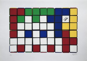
Rubik Six Cube (Blue/Yellow)
2009-2010
Screenprint
27 1/2 x 19 5/8 in.
Edition of 20
Pencil signed, dated and numbered

Invader
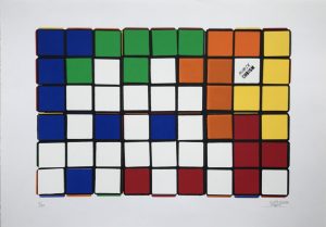
Rubik Six Cube (Orange/Yellow)
2009-2010
Screenprint
27 1/2 x 19 5/8 in.
Edition of 20
Pencil signed, dated and numbered


About the work:

Rubik’s Cubes are meant to be solved, right?   Wrong!!  

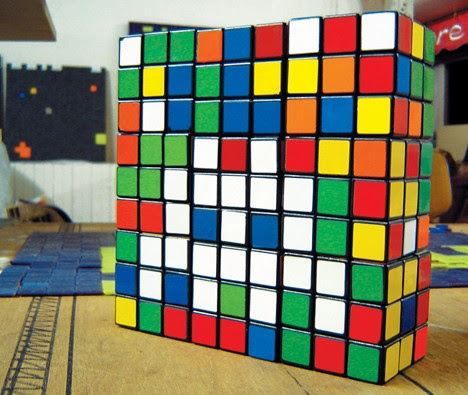
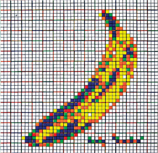
The art of cubing takes on a different meaning under the 8-bit eyes of Invader. Twisting dozens, even hundreds of Rubik’s Cubes into precise patterns of pixelated pointillism, Invader updates artistic techniques pioneered by Picasso, Duchamp, Seurat and others into a new and distinctly modern form: Rubikcubism.

Billed as the “Urban Seurat”, Invader is the pseudonym of a French urban artist, born in 1969, whose work is modeled on the crude pixellation of 1970s–1980s 8-bit video games. A graduate of the École des Beaux-Arts in Paris, Invader initially derived inspiration for his creations from video games from the late 1970s to early 1980s that he played when he was growing up, particularly characters from Space Invaders, from which he derived his name. Games of the era were made with 8-bit graphics, and so lend themselves well to his method of each tile representing one pixel.

Rubikcubism:

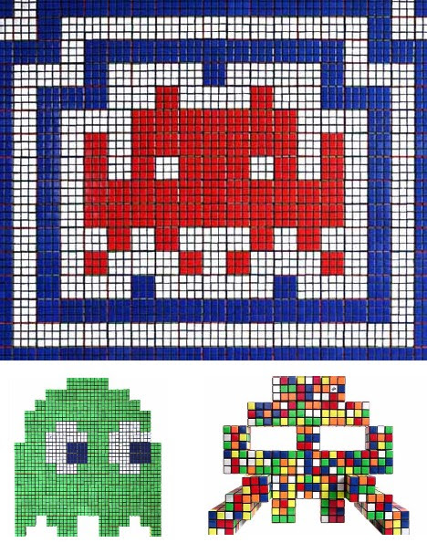
One of Invader’s most important innovations was Rubikcubism, a style of mosaic art that uses various Rubik’s Cube configurations to create extremely complex images.

While most try to solve the Rubik’s Cube, anonymous French Street-Artist, Space Invader has come up with another creative use for the toy. Since 2004, he has been using Rubik’s Cubes to create crude-pixelated pointillism artwork. Updating and modernizing a technique pioneered by Georges Seurat and Paul Signac, Invader named the movement: Rubikcubism, and has continued to experiment with the style ever since.

This week’s Work of the Week! (WOW!) is Invader’s Rubik Six Cube Series. These screenprints are made up of 6 cubes, all arranged in a specific manner to create an image. In the case of this series, Invader’s trademark Space-Invader, his most  iconic image of the 80’s is portrayed. Coming of age in the 80’s, much of Invader’s artistic identity revolves around the iconic imagery and pop culture of his youth.

Given the difficulty of solving a Rubik Cube, let alone attempting to create images, Invader uses a computer program to work out the precise disposition of the six colors for each image. He then manipulates the nine pixels for each Rubik’s Cube to give the required pattern.

Invader Rubiks_Art_                    Invader Rubiks_Art_2

While this series is made up of the use of six cubes, some of Invader’s creations can use over 300 Cubes.  He has recreated “Masterpieces” where famous paintings by artists such as Delacroix, Warhol, Seurat, and Lichtenstein are given a work over. He has a series of Rubikcubism works entitled “Low Fidelity” based on iconic album art such as “Country Life” by Roxy Music, and The Velvet Underground & Nico.  He has also created a series of “Bad Men” where Invader reinterprets villains such as Osama bin Laden, Jaws and Al Capone.

Invader Rubiks_Art_3

All these works and themes are relative to pop culture, and to today’s world in which we live in, with a touch of nostalgia from his days as a youth.

What does Erno Rubik, the inventor of the Rubik’s Cube have to say about Invader’s use of his famous toy puzzle in his artworks?

When asked he says: “I’m glad the Cube is reaching new generations, who face it with fresh wonder, curiosity and enthusiasm.”   

WOW – Work of the Week – INVADER, Hypnosis


Invader
Hypnosis
2011
Woodcut
9 7/8 x 11 7/8 in.
Artist’s Proof, edition of 50
Pencil signed, numbered and dated

About This Work:

“Little by little, I organized a detailed process by which I explore international densely populated urban areas and “invade” them.”

Invader is the pseudonym of a French urban artist, born in 1969, whose work is modeled on the crude pixellation of 1970s–1980s 8-bit video games. He took his name from the 1978 arcade game Space Invaders, and much of his work is composed of square ceramic tiles inspired by video game characters.

Although he prefers to remain incognito, and guards his identity carefully, his distinctive creations can be seen in many highly-visible locations in more than 75 cities in 33 countries. He documents each intervention in a city as an “Invasion”, and has published books and maps of the location of each of his street mosaics.

Invader likes tiles for their robustness and permanence.  Video games of the era were constructed with 8-bit graphics, and so it lends themselves well to the mosaic treatment, with each tile representing one pixel.

“In my own eyes, they are the perfect icons of our time, a time where digital technologies are the heartbeat of our world. As these creatures are made of pixels they are in some sorts ready-made for tile reproduction. Finally, their names are literally predestined for the project I have pioneered: they are “Space Invaders!”

Invader’s idea is to bring the virtual world into reality.  He sees himself as a hacker of public space, spreading a virus of mosaics;[the streets are his canvas, his invasions are gifts to the city and its people. One can see many things in it, but it refers to the early days of digital and the video game.

His first mosaic was installed in the mid 1990s in his home city. It was a sleeper for several years before the full “invasion” program was conceived in 1996.  This was the first wave of the “invasion”.  By 1998, it had spread to 31 other cities in France.

Today, 77 cities have been invaded, 2,692 Space Invaders placed comprising some 1.5 million ceramic tiles; 19 invasion maps have been published.  He has invaded New York five times, Miami twice, and Hong Kong on three separate occasions.

This week’s Work of the Week (WOW) is called Hypnosis.

In this work, Invader channels the work of the Norwegian painter and printmaker, Edvard Munch.  Munch was greatly influenced by the German Expressionists in the early 20th century.  Many artist in this genre used the woodblock process in print form, to capture the angst of the times.

Hypnosis is a woodblock print done is Munch’s German Expressionist style. Here we see Munch’s typical figure and his familiar wavy lined background. The work is very dark, as is the work of the German Expressionists.  We see the effects of war through the eyes of these artists.

Here is where Invader starts to have fun with this work.  He uses the dark, depressed like image of Munch’s work, and inputs his space invader figures  making this work fun. However, upon further examination, we see the play on the idea that the space invaders are invading these villagers or the village.

This is, and has always been his concept, THE INVASION.  This is a great example of an extreme and obvious invasion.

WOW – Work Of the Week – Shepard Fairey “Ramone Canvas”

Ramone Canvas

Shepard Fairey
Ramone Canvas
2002
Screenprint on canvas
24 x 18 in.
Artist’s Proof (A.P.)

Pencil signed and numbered

About This Work:

“Most of my heroes don’t appear on stamps or in art galleries.  No matter how much I love art, or try to convince myself of its relevance in society the fact remains that music is a lot cooler and way more able to reach people’s hearts and minds”  – Shepard Fairey

Music has always had a huge influence on pop culture. Every generation had a defining genre of music.  Music, like art speaks volumes about the times in which we live in. Just as art, music is constantly changing.  Shepard Fairey’s brand of art is Street Art. Real street art touches upon the pulse of the everyday person, whose perception of what art is about is not in a museum, but rather on the street. Music touches the everyday person, much like the street art of Shepard Fairey and his contemporaries.

Society emulates musicians, society hums their music, society sings their lyrics. Fairey’s art is an extension of what music does to society. His work talks about the social, environmental, political, and every day issues that concern the everyday person.

His work became more widely known in the 2008 U.S. presidential election, specifically his Barack Obama “Hope” poster. The New Yorker art critic Peter Schjeldahl called the poster “the most efficacious American political illustration since ‘Uncle Sam Wants You‘”.

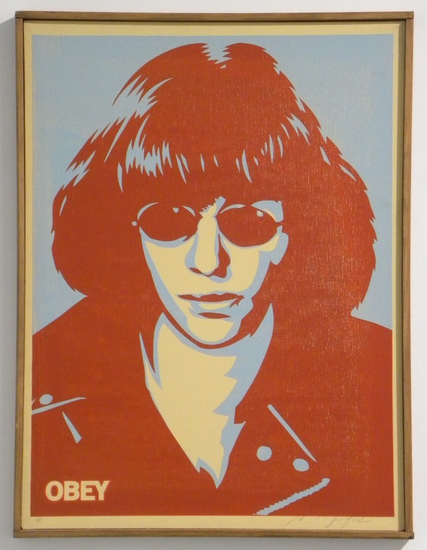
This week’s Work Of the Week (WOW) is a very rare silkscreen on canvas of one of Shepard Fairey’s favorite Punk Rock icons, Joey Ramone. The Ramone Canvas as it has come to be known, was done in 2002. There are only 2 of these pieces ever made, plus 1 AP (artist’s proof) and 1 PP (printer’s proof).

Needless to say, this work is extremely rare.

In 2002 – 2003 Fairey produced a Punk Pioneers suite. The first piece of this series was Joey Ramone, lead singer of the Ramones. Despite others that had come before him setting the stage for the punk rock genre, such as Iggy Pop or the Stooges, the Ramones, according to Fairey “really set the wheels in motion” in the realm of punk music.

The other icons in Punk Pioneers suite are Johnny Rotten, Joe Strummer, Glenn Danzig, Henry Rollins, and Ian MacKaye. However, the only work on canvas was of Joey Ramone. All the other icons were silkscreen on paper and in an edition of 300.

The whereabouts of the 2 editioned Ramone Canvas are unknown. The printer’s proof has been found, and archived, but has a tear to the canvas. Thus, leaving the Artist’s Proof left, which belongs to Gregg Shienbaum Fine Art, the only known work in mint condition.

WOW – Work Of the Week – Banksy “Grannies”

Grannies close up

Banksy
Grannies
2006
Screenprint
19 3/4 x 27 1/2 in.
Edition of 150

Pencil signed and numbered; accompanied with COA by PEST Control

About This Work:

Banksy is a British street artist and activist who, despite worldwide fame, has maintained anonymity. Although details of the artist’s life are largely unknown, it is thought that Banksy was born in Bristol more or less around 1974, and started his career in this city as a graffiti artist. 

Whether plastering cities with his trademark gangsta rat, painting imagined openings and building hotels in the West Bank barrier in Israel, or stenciling “we’re bored of fish” above a penguins’ zoo enclosure, Banksy creates street art with an irreverent wit and an international reputation that precedes his anonymous identity. “TV has made going to the theatre seem pointless, photography has pretty much killed painting” he says, “but graffiti has remained gloriously unspoilt by progress”.

Banksy’s work features striking and humorous images, occasionally combined with slogans. The message is usually anti-war, anti-capitalist or anti-establishment. Subjects often include rats, apes, policemen, soldiers, children, and the elderly.
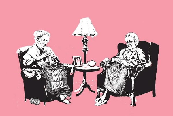
As all Banksy fans know, the artist can be extremely edgy, political, satirical, and in the case of this Work Of the Week, Grannies, humorous as well. A humor that plays upon the evident contrast and contradiction that lays in the image of two old, extremely British ladies knitting sweaters that say PUNK IS NOT DEAD or THUG FOR LIFE.

Banksy’s works need no explanation. Through his crafted signature and his immediately identifiable graphic style, he critically examines contemporary issues of consumerism, political authority, terrorism, and the status of art and its display. Grannies is another perfect example of how Banksy’s work can be thought-provoking, intense, shocking, intriguing and funny.

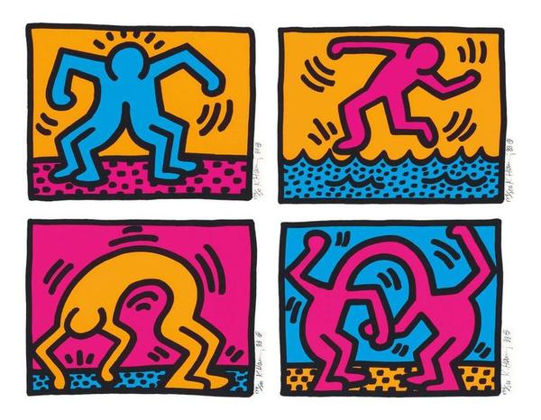
WOW – Work Of the Week – Keith Haring “Pop Shop II”

Pop Shop II quad

Keith Haring
Pop Shop II
1988
Silkscreen
12 x 15 in. each
Edition of 200; matched number set

Pencil signed, dated and numbered

This must be sold as a set of 4 only.

About This Work:

Keith Haring was born on May 4, 1958 in Reading, Pennsylvania. He started developing a love for drawing at a very early age, learning basic cartooning skills from his father and from the popular culture around him, such as Dr. Seuss and Walt Disney.
Upon graduation from high school, Haring moved to New York City and enrolled in the School of Visual Arts.
In New York, Haring found a thriving alternative art community that was developing outside the gallery and museum system, in the downtown streets, the subways, the clubs and former dance halls. Here he became friends with fellow artists Kenny Scharf and Jean-Michel Basquiat, as well as other musicians, performance artists and graffiti writers, all together forming the New York art community. Haring was swept up in the energy and spirit of this scene and began to organize and participate in exhibitions and performances at Club 57 and other alternative venues.

Though many associate the artist Keith Haring with his seemingly innocuous images of barking dogs, crawling babies, beating hearts and flying saucers, his work often tackled social justice issues – from nuclear proliferation, to AIDS, to the environment to racial and income inequality.

In April 1986, Haring opened his first Pop Shop, a retail store in Soho selling T-shirts, toys, posters, buttons and magnets bearing his images.
Haring considered the shop to be an extension of his work, intended to allow people greater access to his work, at a lower cost. The shop received criticism from many in the art world, however Haring remained committed to his desire to make his artwork available to an audience as wide as possible, and received strong support for his project from friends, fans and mentors, including Andy Warhol. This is the origin of the Pop Shop series, that at the time could be acquired for what could be considered an affordable price back then, and that now are one of his most iconic and recognized works.

Pop Shop prints were released as a set of four individual pieces or one quad of the different images.
This work of the week is called Pop Shop II, a set of four individual works, all pencil signed and all matching numbers.
Haring was a child of Pop. In his Pop Shops, he used his iconic symbols and characters in a playful and joyful way, with bright colors and bold contours of cartoonish figures.

While his human figures generally depict people and players in society, human figures depicted upside-down, like the one in Pop Shop II, are usually B-boys and B-girls, the dancers of hip-hop, doing the iconic move in which they spin on their head. Figures contorting in backbends or jumps are also depictions of break dancers, some of the most iconic cultural figures of the New York City of the 1980’s.

In the Pop Shops, Keith Haring always kept imagery accessible and easy to understand, in order to grab the eyes and minds of viewers and get them both to enjoy themselves and to engage with important concerns.
Haring’s genius was his ability to communicate very directly, very immediately through his chosen symbols and iconography. The joyfulness and a wonderful lightheartedness in his work, is a message of his vision and strong hope of a better world to come.