Work of the Week! WOW! Frank Stella – Racetrack, Agua Caliente


Frank Stella
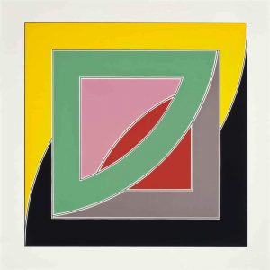
Agua Caliente, from Race Track Series
1972
Screenprint
21 5/8 x 81 1/2 in.
Edition of 75
Pencil signed and numbered


About the work:

Frank Stella is an aficionado of racing of all kinds and on multiple occasions has incorporated this passion into his work. Of the different racing related series he has created, one of the most widely recognized is the Racetrack Series. This series of three prints was inspired by famous horse race tracks in California and Mexico.

This week’s Work of the Week! WOW! from the Racetrack Series is Agua Caliente.

The Agua Caliente track is located in Baja California, Mexico, approximately 4 miles from the US border. The facility was built in 1929, at the height of Prohibition and start of the Great Depression. The racetrack was attached to a casino and hotel, a resort which was very popular among wealthy Americans, including the Hollywood elite since drinking and gambling was illegal in the US. In 1935, Mexican President Lazaro Cardenas outlawed gambling, which closed down the resort and casino, however the racetrack continued to operate for many years.

Agua Caliente was the site of several horse racing firsts, such as starting gates, safety helmets, and “pick-6” wagering. “Pick-6” wagers require bettors to pick the winning horse in 6 consecutive races, no easy task but, multiple horses can be selected for each race. The more horses selected, however, the more expensive the bet.

Legendary horses, Phar Lap and Seabiscuit competed and won at the track in 1932 and 1938 respectively, both regarded as symbols of hope during the Great Depression. Today, the racetrack is still in operation, but hosts daily greyhound races as opposed to horse races.

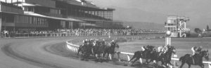
Stella’s minimalist approach depicts Agua Caliente with 3 boldly-colored ellipses representing a bird’s eye view of the track. Despite that the work is minimalist, it is created in a large scale, measuring 81 1/8 inches across, adding to the impact of the geometric beauty.

Work of the Week! WOW! FRANK STELLA – Polar Coordinates VII Hand-Painted Trial Proof


Frank Stella
Polar Coordinates VII (hand-painted trial proof)
1980
Mixed media – lithograph and screenprint in colors with hand-coloring in tempera, acrylic metallic paint, gouache and crayon
38 x 38 1/2 in.
Unique
Pencil signed & dated


About the work:

Frank Stella is widely known for his concern with geometry, precision and rationality that characterize Minimalism. By the late 1970’s, his work had evolved to become more complex with visible brushstrokes and experimentation with combinations of shapes, colors and printing techniques. Despite his progression towards more dynamic work, the grid base of Stella’s earlier creations remained an integral element of his style.

This week’s Work of the Week! WOW! is Polar Coordinate for Ronnie Peterson – VII, a hand-painted, mixed media unique work, of which only 5 unique pieces were ever made.

The Polar Coordinates series is dedicated to his friend Ronnie Peterson who was a Swedish auto racer. During the time Stella was working on the series, Ronnie Peterson died at the Grand prix at Monza in September 1978. The theme of racing is one that would appear again in Stella’s Circuits series and Race Track series.

In his reinterpretation of the polar coordinates, Stella activates the graph paper to become lively and vibrant, a spinning energy evocative of the momentum of racing.

The title of the series stems from mathematical polar coordinates graph paper, which consists of lines emanating from a central point. Each print from the Polar Coordinates series was created from multiple layers of screenprinting and lithography. The lithographic plates determined the grids, outlines of the shapes and rapid line drawing in the form of superimposed netting. Photoscreens created from washes and crayon drawings on Myalr were used for the tonal backgrounds and flatter colors, including the metallic inks and GitterFlex.

This hand-painted mixed media version, available from Gregg Shienbaum Fine Art, differs from the regular edition in various ways. Firstly, the metallic silver is hand-applied by the artist without certain of the superimposed lithographic rapid line drawing elements. Secondly, the two bisected quatrefoils which create the image, are hand-painted in different colors and with differing elements of rapid line drawing. In some instances, Stella removed some of the rapid line drawing and in other instances added them to this image. These mixed-media hand-painted versions were Stella’s color trial proofs and studies that eventually led to the regular edition of Polar Coordinate VII.

An interesting addition to the series and further tribute to Ronnie Peterson is a BMW which was hand painted by Stella in 1979 as a custom work for another race car driver and close friend, Peter Gregg.

WOW! – Work of the Week – Frank Stella – Jasper’s Dilemma


Frank Stella
Jasper’s Dilemma, from Jasper’s Dilemma
1973
Offset Lithograph
16 x 22 in.
Edition of 100
Pencil signed and numbered


About the work:

Frank Stella defiantly departed from Abstract Expressionism through a complete restructuring of the idea of painting. He revolutionized the field and inspired changes still felt today.

This week’s Work of the Week! WOW! is Stella’s Jasper’s Dilemma, an homage to fellow artist Jasper Johns who he admired greatly.

Jasper’s Dilemma is formed of two “mitered” mazes as Stella called them. Mitered joints are joints that are beveled, usually at a 45 degree angle to form a corner, such as standard picture frame edges. Both mazes seem identical in structure, divided into 4 triangles whose points don’t quite meet at the center, however, the colored maze spirals outward in a counter-clockwise path from the center and the black, while the black and white maze follows a clockwise route.

Stella eliminated subjectivity in his work through using arbitrary mathematical measurements, forcing the viewer to think about the relationship between color and form. Johns on the other hand, created compositions of recognizable items, closing the gap between the object and its representation, transforming an object into art.

Johns would often create a work in color, then reexamine it in shades of grey. This “dilemma” is posed in Stella’s tributary work (which holds both the representation in color and in grey), between the “seduction of the spectrum against the rigors of the grey scale.” The title of this work and its color scheme make explicit reference to Johns’s statement that the more he worked in color, the more he saw gray.

For Johns, the use of grey was a means to think about color through its absence. Johns initially used grey tones as a statement of skepticism or anticipation, but it evolved into a profound examination of the meaning of color itself. Grey was the most appropriate hue with which to present “conceptual” art since it is less stimulating, allowing for more space for ideas.

In removing color, the artists refocus the viewer’s attention to consider the means of representation, over what is represented and, to consider how does something come to have meaning, rather than what does it mean.

WOW! – Work of the Week – Frank Stella – Benjamin Moore Series


Frank Stella
Hampton Roads, from Benjamin Moore
1972
Lithograph
16 x 22 in.
Edition of 100
Pencil signed and numbered
Frank Stella
Palmito Ranch, from Benjamin Moore
1972
Lithograph
16 x 22 in.
Edition of 100
​Pencil signed and numbered

About the work:

Frank Stella is one of the most highly regarded post-war American artists still working today. He is a rule-breaker, interested in furthering the History of Art by constantly and deliberately taking us down new paths. 

Upon moving to New York after his studies at Princeton, Stella was first inspired by the Abstract Expressionists, but also by the ‘flat’ works of Barnett Newman. It was however, the paintings of Jasper Johns, exhibited at Leo Castelli’s famed gallery in 1958, that lead Stella to start using his now-trademark stripes as a compositional tool. The controlled minimalist works are among his most recognizable. Stella didn’t change the course of Art History simply through his study and use of a radically different style, he also approached diverse materials in a revolutionary way. 

Frank Stella’s first experience in painting was re-coating houses and boats, and he would continue to paint houses after his move to NY to make ends meet. Over the course of his 60-plus-year career, Stella would regularly revisit unmixed house and car paint in addition to using house-painter brushes. Stella’s process was documented in Hollis Frampton’s photo essay “The Secret World of Frank Stella” which showed the artist’s approach to canvas as being the same as he would a house – filling a space with increasingly proximate concentric lines. In his striped works, Frank Stella never used masking tape. He would never even measure out the lines, rather the works are free-hand.

This week’s Work of the Week! WOW! is the Benjamin Moore Series. This series is one of Stella’s most iconic. Andy Warhol recognized the genius of Stella and purchased the complete set of originals himself.

All the titles of Stella’s works are significant. The Benjamin Moore Series makes reference to the type and brand of paint that was used in the creation of the works. The use of store-bought house paints is significant in that it roots his art in the post-war commodity culture. In naming the series after a company, he also explored the rise of advertising and branding. The titles of each individual piece are also important to note – they are all named after historical battles fought during the Civil War. 

The two works featured at Gregg Shienbaum Fine Art are Palmito Ranch and Hampton Roads. Both battles were of great significance. The Battle of Hampton Roads, often called either the Battle of the Monitor and Merrimack or the Battle of Ironclads, fought on March 9, 1862, was the most important naval battle of the Civil War from the perspective of naval development. It was History’s first duel between ironclad warships. The Battle of Palmito Ranch is regarded as the final battle of the war, fought May 12 and 13, 1865, on the banks of the Rio Grande in Texas. Despite that Robert Lee had surrendered a month prior to Ulysses Grant, the attack was ordered on the Confederate Army for unknown reasons. Anecdotes suggest that Union Colonel Theodore Barrett wanted to see combat before the end of the war. The names of Stella’s works are significant, loading abstract images with meaning. The complete series is a historical narrative composed of abstract works. 

The works in the series are among Stella’s most reductive compositions. It is the formal rather than the thematic matter that Stella engages in. The set plays with maze-like patterns, simple diagonals,  and understated and stacked compositions, where the painted line creates an even, horizontal rhythm. Stella shows us the environment of the battles of the Civil War with paint straight from a can – intense and flat. The saturated palette, measured proportions, and glowing presence are at once immediately vibrant and classically timeless.

As Adam D. Weinberg, director of the Whitney has said “Frank is a radical innovator who has, from the beginning, absorbed the lessons of art history and then remade the world on his own artistic terms. He is a singular American master.”

WOW! – Work of the Week – STELLA, Referendum ’70


Frank Stella
Referendum ’70
1970
Screenprint
40 x 40 in.
Edition of 200
Pencil signed, dated and numbered

About the work:

Frank Stella is an American painter and printmaker, noted for his work in the areas of minimalism and post-painterly abstraction.

Stella reacted against the expressive use of paint by most painters of the abstract expressionist movement, instead finding himself drawn towards the “flatter” surfaces of Barnett Newman’s work.  He began to produce works which emphasized the picture-as-object, rather than the picture as a representation of something in the physical world, or something in the artist’s emotional world.

From 1960 Stella began to produce paintings of shaped canvases in their presentation of regular lines of color separated by pinstripes.  During this time, he also began to experiment in a wider range of colors, and expressing an affinity with architecture in their monumentality, Stella also introduced curves into his works, marking the beginning of the Protractor series. 

Following a trip to the Middle East, Stella was very inspired by the way the cities’ circular paths interlaced and interweaved like snakes chasing their tails. With that thought it mind he created the Protractor Series. The Protractor series, deploys a vivid palette and composition consisting of rectangular shapes superimposed on curving and circular forms, in which there are three design groups—“interlaces,” “rainbows,” or “fans”—encompasses its surface patterning.  

This week’s Work of the Week! – (WOW!), Referendum ’70, is a screenprint based on Frank Stella’s Protractor paintings.  

Like many artists of his generation, Frank Stella was politically active and engaged. He participated in several fundraising efforts for which he would donate a complete printed edition to a cause.

Referendum ’70 was based on one of the causes Stella supported: Vietnam Referendum ’70, a Cambridge Massachusetts based anti-war coalition. The work was part of a strategy to help the organization raise funds to support political candidates who were opposed to the Vietnam war. 

Aesthetically, the “Referendum ’70” screenprint composition is related to the River of Ponds lithographs associated with theNewfoundland Series, which are variations of Stella’s famed protractor paintings from 1967-1970.

In this print, the squared and double squared formats of interlacing protractors create a psychological distancing. Although the dominant motifs of the Protractor series are circular or curvilinear, every shape is actually defined by pairs of horizontal and vertical lines that intersect at right angles; the gridded rectilinear pattern that is formed is superimposed over the decorative arcs. Through the device of the protractor and the use of an unusual color scheme, Stella brought abstraction and decorative pattern painting into congruence in a manner that challenged the conventions of both traditions.

About Vietnam Referendum ’70:

Vietnam Referendum ’70’s initial goal was to “let the people vote on war.” Originally, the committee dedicated itself to getting the 48,000 statewide signatures needed to force the Vietnam question on the fall ballot.  Maurice Donahue, President of the Massachusetts Senate, helped make this effort unnecessary by sponsoring a bill which passed the legislature authorizing the vote. The group, having indirectly achieved its first objective of getting the Vietnam war on the ballot by endorsing Donahue’s bill, shifted to campaigning for immediate withdrawal of troops.

Despite the efforts of the Vietnam Referendum ’70 and Stella’s participation in supporting the effort, the vote was non-binding, no action was legally required by any elected official, be it president Nixon or the Congress. The committee believed that “it will have scored a victory if it can show that no silent majority in favor of the war exists.”

WOW – Work Of the Week – Frank Stella “Sinjerli Variation IV”

Sinjerli Variation IV

Frank Stella
Sinjerli Variation IV
1977
Lithograph and screenprint
32 x 42 1/2
Edition of 100

Pencil signed and numbered

About This Work:

Frank Stella (b. 1936), an American minimalist and geometric abstract expressionist is known for producing works emphasizing the picture as object rather than as representation. He has said: “a picture is a flat surface with paint on it – nothing more.” Stella’s works do not have a clear reference to the world, they are compositions of the basics of the elements of art and geometry. Color, line, and form are what inspire him. 

The Sinjerli Variation Series of six lithographs, was published in 1977 by Petersburg Press in New York, seven years after the artist’s first retrospective at MoMA. Aged 41, at the time, he was the youngest artist to receive such an honor. 

The Sinjerli Series is derived from Stella’s original painting Sinjerli I of the Protractor Series, dated from 1967 to 1970. The inspiration of the Protractor Series, in addition to the names of the works, came from the circular shape of cities from the ancient civilizations of Asia Minor. Sinjerli was a city of the Ancient Anatolian people of the Hittite Empire, which reached its height in the 14th century BC. It is located at the foothills of the Anti-Taurus Mountains of southern Turkey. The fortified citadel of Sinjerli was outlined by an almost perfect double walled circle, which connected with the geometric inspiration of Stella’s body of work.

Each Sinjerli variation is composed of two semi-circles, or protractors and positioned to the left of the sheet, slightly lower than midlevel. Each lithograph is composed of elaborate patterns of intersecting circular forms, arranged in a manner that removes any indication of depth. While at first, the form is seemingly symmetrical, the interweaving of the arcs also gives the illusion of unending line-work. 

For the series, Stella made use of bright and vibrant colors. The hues are not tinted as a flat application, but rather have a painterly texture and this result was accomplished by a three-step process. The first step required the deposition of a toned ground, the result of a broadly drawn plate, also known as “full crayon.” Secondly, a looser, textured drawing was applied, the “smear crayon.” Finally, the finishing touch was a high gloss glaze, named “loose crayon.”

Today, Frank Stella continues to live and work in Manhattan and commutes to his studio in Rock Tavern, NY on the weekdays. His most recent retrospective took place at the Whitney in NYC from October 30, 2015 to February 7, 2016.

WOW – Work Of the Week – Frank Stella “Del Mar”

Del Mar 2 2

FRANK STELLA
Del Mar, from Race Track Series
1972
Screenprint
20 1/4 x 80 in.
Edition of 75

Pencil signed, dated and numbered

About This Work:

Frank Stella first emerged on the scene in the late 1950s, when his Minimalist Black Paintings heralded a new era in postwar art. In the years since then, he has worked consistently in series, pioneering new approaches to form, color, narrative, and abstraction with innovative paintings, prints, sculptures and architectural installations.

Stella moved to New York in 1958, after his graduation at Princeton University. He still lives and works in New York, and he is one of the most well-regarded postwar American painters still working today.

In 1970, at the age of 34, Frank Stella became the youngest artist ever to receive a full-scale retrospective exhibition at the Museum of Modern Art, New York. He received a second retrospective at the same institution in 1987 — an unprecedented occurrence in the museum’s history.

The story of Stella’s artistic development is the story of ever-increasing visual complexity. When he burst upon the art world at the end of 1959, it was with a series of large rectangular canvases painted entirely in a dull black enamel. The surface of each painting consisted of a simple geometric pattern — uniform chevrons, for example, or interlocking rectangles — that was formed by thin, slightly wavering lines of unpainted canvas. There was no color, no contrast of forms or materials, no illusionistic depth or drawing. As Stella put it in an often-quoted interview from 1964, in those paintings “what you see is what you see”.

Stella creates abstract artworks that bear no pictorial illusions or psychological or metaphysical references.

He began to produce works which emphasized the picture-as-object, rather than the picture as a representation of something, be it something in the physical world, or something in the artist’s emotional world.

His controlled colors, flat surfaces and rigid forms are once again the main features of his Race Track Series.  This work, as well as his others from this period of Stella’s career, can be seen to have inaugurated the Minimalist movement in art. Stella’s attempt to pare down painting, to purge it of extraneous gesture, warmth, and emotion made his work appear almost as a species of anti-painting, an inversion of everything that painting stood for and expressed.

Del Mar is part of a set of three large-scale, oblong prints, from the Race Track Series. These screen prints are named after two horse-racing tracks in Los Angeles, titled “Del Mar” and “Los Alamitos”, and one in Mexico, titled “Agua Caliente”.

Printed on heavy rag paper, the centered, concentric tracks receive their visual immediacy and variety from lively color harmonies, saturated deposits of inks and contrasts of matte, glossy and standard ink surfaces.

With a career extended across more than half a century, Stella both holds an important place in the history of American art and maintains contemporary relevance as his work continues to influence younger generations of artists.

The art market has seen an increase in demand and in auction prices in the print work of Frank Stella over the last few years. Much of this is due to the nature and importance of his work conceptually as a response to the art movement before him.

His retrospective at the Whitney Museum of American Art in New York earlier this year, and the fact that he is 80 years old, have also brought more attention to his print work as well.
The art world will never see another Frank Stella again.

WOW! – Work of the Week 8/10/15

Frank Stella, Telluride

Frank Stella,     Telluride, from Copper Series,     1970

Frank Stella, Telluride, from Copper Series, 1970


Frank Stella
Telluride, from Copper Series
1970
Lithograph in colors on Arjomari paper
16 x 22 in.
Edition of 75
Pencil signed and numbered

About This Work:

Frank Stella’s seven Copper Series prints are based on his Copper Series paintings of 1960-61. Titles of the individual works refer to towns near the San Juan Mountains in Colorado which had active copper and silver mines at the turn of the century, but whose reserves have since been depleted. Like his Aluminum Series prints, the lithographic inks and over-varnishes of the Copper Series were printed on paper that was first screenprinted.

The other 6 works of the Copper Series are titled Creede I, Creede II, Lake City, Pagosa Springs, Ouray and Ophir.


About Frank Stella:

Frank Stella is an American painter and printmaker, significant in the art movements of minimalism and post-painterly abstraction.

He is one of the most well-regarded postwar American painters still working today. Notably, he is heralded for creating abstract paintings that bear no pictorial illusions or psychological or metaphysical references in twentieth-century painting.

Early visits to New York art galleries influenced his artist development, and his work was influenced by the abstract expressionism of Jackson Pollock and Franz Kline.  Upon moving to New York City, he reacted against the expressive use of paint by most painters of the abstract expressionist movement, instead finding himself drawn towards the “flatter” surfaces of Barnett Newman’s work and the “target” paintings of Jasper Johns. He began to produce works which emphasized the picture-as-object, rather than the picture as a representation of something, be it something in the physical world, or something in the artist’s emotional world.

“A picture is a flat surface with paint on it – nothing more”.

Many of Stella’s works are created by simply using the path of the brush stroke, very often using common house paint, in which regular bands of paint were separated by very thin pinstripes of unpainted canvas.  Stella’s art was recognized for its innovations before he was twenty-five.

In the 1960s, Stella began to use a wider range of colors, typically arranged in straight or curved lines. Later he began his Protractor Series (71) of paintings, in which arcs, sometimes overlapping, within square borders are arranged side-by-side to produce full and half circles painted in rings of concentric color.

In 1970, The Museum of Modern Art in New York presented a retrospective of Stella’s work, making him the youngest artist to receive one.  During the 1970’s Stella introduced relief into his art, which he came to call “maximalist” painting for its sculptural qualities.  It is ironic that these paintings were completely, the opposite of what had brought him fame, the decade before.  His work also became more three-dimensional to the point where he started producing large, free-standing metal pieces, which, although they are painted upon, might well be considered sculpture.

In the 1980’s & 1990’s, the increasingly deep relief of Stella’s paintings gave way to full three-dimensionality, with sculptural forms derived from cones, pillars, French curves, waves, and decorative architectural elements.  In the 1990s, Stella began making free-standing sculpture for public spaces and developing architectural projects.

Stella’s work was included in several important exhibitions that defined 1960s art, among them the Solomon R. Guggenheim Museum’s The Shaped Canvas (1965) and Systemic Painting (1966). His art has been the subject of several retrospectives in the United States, Europe, and Japan.

For more information and price please contact the gallery at info@gsfineart.com