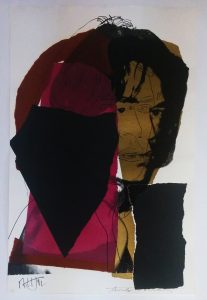
Andy Warhol About the work: One of the last portfolios Andy Warhol would produce before his untimely death in 1987 was his renowned Ads series. The 10 prints that make up the series are based on some of the most popular and successful ad campaigns and logos from Andy Warhol’s lifetime. They are considered to be particularly important because of Warhol’s fascination with advertising, consumerism and commercialism, which were three major facets of his entire body of work. Having begun his artistic career in advertising, Andy Warhol, more than any other artist of his generation, understood how the reproduced image had come to reflect and shape contemporary life in America. This week’s Work Of the Week! WOW! is Paramount. In this work, Andy Warhol masterfully depicts the snow-capped mountain in white, making the image pop out to the viewer. He also skillfully plays with the yellow, red and green coloring causing the word “Paramount” and the halo of stars to seem three-dimensional or animated. That Warhol chose Paramount over any other film studio is fitting in many ways. It is well-known that Warhol was fascinated with stardom and fame. He loved being surrounded by the Hollywood elites. One of his most famed images is that of Marilyn Monroe, he was smitten with Liz Taylor, and even promoted his own “Warhol Superstars” such as Baby Jane Holzer, Edie Sedwick and Candy Darling, to name a few. Founded in 1912, Paramont Pictures, is the second oldest film studio in the US. The story behind the Paramount logo is that each of the 22 original contracted actors and actresses of the studio was honored with one of the stars of the halo atop the mountain peak, which made them the original “movie stars.” There is no doubt that Andy Warhol, the man who coined the famous “15 minutes of fame” phrase, would have loved where the term “movie star” originated from. The Paramount Logo as a portrait? : A Mysterious Connection There is another, more personal and less well-known connection between Andy Warhol and the Paramount Pictures Company. In 1980, he met Jon Gould who was a 27 year old vice president of marketing at Paramount Pictures. Warhol was deeply infatuated with the film executive, and over the course of 5 years, the two shared a close bond that defied easy description. They lived together in Warhol’s townhouse until 1985. Jon Gould is the most photographed subject of Andy’s oeuvre, and while Andy created many portraits of him during their time together, those close to Warhol have insinuated that the inclusion of the Paramount logo in the Ads series, may be considered an abstract portrait of the young man Andy cared for. |
Tag Archives: prints
WOW! – Work of the Week – WARHOL, Blackglama
Andy Warhol
Blackglama, from Ads
1985
Screenprint on Lenox Museum Board
40 x 40 in.
Unqiue
Authenticated and stamped by the Andy Warhol Foundation on verso
About the work:
WHAT BECOMES A LEGEND MOST?
One of the most famous advertising campaigns of the 20th century began in 1968: the series of full-page, black-and-white print ads for “Blackglama” furs. The campaign was an instant success thanks to the (at the time) new formula of combining a brilliant tag line, with a glamourous and famous icon to promote a luxury item.
“What becomes a Legend most?” is the memorable slogan for Blackglama furs.
Something that has always intrigued people about the brand name is: why the GLAMA in Blackglama, is not GLAMOUR? The whole campaign started when approximately 400 mink ranchers from the Great Lakes Mink Association (a.k.a. GLMA) were looking to revamp the image of their product. Ad executive, Jane Trahey of Jane Trahery Associates in NYC came up with the idea to incorporate the deep black color of the mink and the name of the association. Thus the name and the memorable slogan were born: “What becomes a Legend most?” (the “L” in legend was always capitalized).
Famed photographer Richard Avadon was brought on by the campaign to photograph the most important female celebrities of the time. In the first year alone, Lauren Bacall, Bette Davis and Judy Garland modeled for the brand. Every model was gifted an $8,000 Blackglama mink coat. Legend has it that Judy Garland left the studio without even bothering to have hers lined.
Here below we see Avadon’s contact sheet of Judy Garland posing in her Blackglama for the ad campaign
This week’s Work of the Week! WOW! is Blackglama, from Ads, featuring Judy Garland by Andy Warhol. Ever the observer of the times in which he lived, the artist, who began his career as a commercial illustrator in the 50’s was fascinated with the commercial world. Warhol glamorized and transformed celebrities and everyday objects like soup cans and Brillo Pads, into works of art. In the mid 1980’s he created one of his most sought after and iconic sets of screenprints: the Ads Series. Andy Warhol’s work explores the themes and the relationship between artistic expression, and the celebrity culture, advertisement, capitalism and consumerism that were prevalent at the time. The cultural force that was the Blackglama ad campaign fit perfectly into his philosophy and was a obvious choice to include into the Ads portfolio.
This particular version of Warhol’s Blackglama is a unique working proof, outside of the regular edition. It is much different from the one that we are most familiar with. In this work, the most notable difference is the background and the colors of Judy Garland herself. In the regular edition, the background is black and the color blue is the most prevalent for the mink, as well as her hair. In this working proof, there are more colors and the detail of Judy Garland’s face, hair and mink are more pronounced. The slogan at the top even has a slightly different hue.
Another noticeable difference is the size of this work. The regular edition Blackglama measures 38 x 38 in. This working proof measures 40 x 40 in. If you look closely at the bottom and left margins, you will see traces of regular edition coloring underneath this unique proof. Warhol did this quite often, working out different color arrangements and schemes until he got it just right.
These working proofs have become quite rare, hard to find and highly sought after. Each proof is different. Each proof is considered a unique work of art. This unique working proof of Blackglama is certified by the Andy Warhol foundation on the verso with its registration number. It is also accompanied with a letter of authenticity by the Andy Warhol Authentication Board.
WOW! – Work of the Week – LICHTENSTEIN, Titled
Roy Lichtenstein
Titled 1996 Sreenprint on Coventry Rag paper 31 1/2 x 39 1/2 in Edition of 175 Pencil signed, dated and numbered |
About the work:
Roy Lichtenstein was the epitome of Pop art. His paintings are instantly recognizable through his use of Benday Dots, bold colors and thick lines. This recognition, as one of Pop Art’s Greats, came late in life for the artist. Lichtenstein knew he wanted to make a living from his artwork, but it wasn’t until his late 30’s that he was able to do so. Until that time, he supported himself mostly through teaching. When Leo Castelli took the artist under his wing and put together his first solo-show in 1962, Lichtenstein became an overnight sensation. The entire show had sold out before the opening night.
Lichtenstein’s work reinvigorated the American art scene and altered the history of modern art. After his triumph at Castelli’s famed gallery, he went on to create a body of work of more than 5,000 paintings, prints, drawings, sculptures, murals and other objects celebrated for their wit and invention.
Most famously, Lichtenstein appropriated the Benday dots. The dots became a trademark device forever identified with the artist and Pop Art. In order to achieve the dots, the artist would use various kinds of stencils with perforated patterns that he would brush paint across, creating perfect circles void of brush strokes.
Benday dot printing is a minute mechanical patterning used in commercial engraving consisting of small colored dots. The process is named after illustrator and printer Benjamin Henry Day Jr. who invented it in 1879. Originally, this technique was used in the printing of Pulp Comic Books in the 50’s and 60’s as an inexpensive way to create shading and secondary colors. Lichtenstein elevated a cheap, commercial printing process into fine art, managing to evoke strong emotions.
This week’s Work of the Week! WOW! is Titled by Roy Lichtenstein. The print was produced for the 1996 election cycle for the effort “Artists for Freedom of Expression.” It was to benefit the candidates and organizations that supported federal funding of the arts. Sixteen of the nations most respected contemporary artists were solicited to donate work that would be sold to directly benefit the cause, among them were Chuck Close, Peter Haley, Jenny Holzer, Elsworth Kelly, Bruce Newman, Robert Rauschenberg and James Rosenquist.
While Lichtenstein is known for his use of Benday dots, in this particular image, the style he uses is called Halftone. Benday dots are always the same size, Halftone dots on the other hand, are always the same color and vary in size and/or spacing and create a gradient or atmospheric perspective. In this work, the halftone dots become smaller in the distance, implying the vastness of the sea.
With just a few simple, strategic swathes, Lichtenstein is able to suggest the features of a landscape. A think blue line represents the horizon while an undulating green one delineates the shore from the water. The sun is particularly interesting, a yellow monotone circle with a curious black crescent shape. Finally, the texture of the leaves and trees is fascinating, as thought the artist created the foliage with a paint filled sponge which brings to mind a more abstract style.
WOW! – Work of the Week – STELLA, Referendum ’70
Frank Stella Referendum ’70 1970 Screenprint 40 x 40 in. Edition of 200 Pencil signed, dated and numbered About the work: Frank Stella is an American painter and printmaker, noted for his work in the areas of minimalism and post-painterly abstraction. Stella reacted against the expressive use of paint by most painters of the abstract expressionist movement, instead finding himself drawn towards the “flatter” surfaces of Barnett Newman’s work. He began to produce works which emphasized the picture-as-object, rather than the picture as a representation of something in the physical world, or something in the artist’s emotional world. From 1960 Stella began to produce paintings of shaped canvases in their presentation of regular lines of color separated by pinstripes. During this time, he also began to experiment in a wider range of colors, and expressing an affinity with architecture in their monumentality, Stella also introduced curves into his works, marking the beginning of the Protractor series. Following a trip to the Middle East, Stella was very inspired by the way the cities’ circular paths interlaced and interweaved like snakes chasing their tails. With that thought it mind he created the Protractor Series. The Protractor series, deploys a vivid palette and composition consisting of rectangular shapes superimposed on curving and circular forms, in which there are three design groups—“interlaces,” “rainbows,” or “fans”—encompasses its surface patterning. This week’s Work of the Week! – (WOW!), Referendum ’70, is a screenprint based on Frank Stella’s Protractor paintings. Like many artists of his generation, Frank Stella was politically active and engaged. He participated in several fundraising efforts for which he would donate a complete printed edition to a cause. Referendum ’70 was based on one of the causes Stella supported: Vietnam Referendum ’70, a Cambridge Massachusetts based anti-war coalition. The work was part of a strategy to help the organization raise funds to support political candidates who were opposed to the Vietnam war. Aesthetically, the “Referendum ’70” screenprint composition is related to the River of Ponds lithographs associated with theNewfoundland Series, which are variations of Stella’s famed protractor paintings from 1967-1970. In this print, the squared and double squared formats of interlacing protractors create a psychological distancing. Although the dominant motifs of the Protractor series are circular or curvilinear, every shape is actually defined by pairs of horizontal and vertical lines that intersect at right angles; the gridded rectilinear pattern that is formed is superimposed over the decorative arcs. Through the device of the protractor and the use of an unusual color scheme, Stella brought abstraction and decorative pattern painting into congruence in a manner that challenged the conventions of both traditions. About Vietnam Referendum ’70: Vietnam Referendum ’70’s initial goal was to “let the people vote on war.” Originally, the committee dedicated itself to getting the 48,000 statewide signatures needed to force the Vietnam question on the fall ballot. Maurice Donahue, President of the Massachusetts Senate, helped make this effort unnecessary by sponsoring a bill which passed the legislature authorizing the vote. The group, having indirectly achieved its first objective of getting the Vietnam war on the ballot by endorsing Donahue’s bill, shifted to campaigning for immediate withdrawal of troops. Despite the efforts of the Vietnam Referendum ’70 and Stella’s participation in supporting the effort, the vote was non-binding, no action was legally required by any elected official, be it president Nixon or the Congress. The committee believed that “it will have scored a victory if it can show that no silent majority in favor of the war exists.” |
WOW! – Work of the Week – WARHOL, John Wayne
Andy Warhol John Wayne FS II.377, from Cowboys and Indians 1986 Screenprint on Lenox Museum Board 36 x 36 in. Edition of 250, each piece is unique Pencil signed and numbered About the work: JOHN WAYNE. . . AMERICAN AS APPLE PIE The saying “as American as apple pie” describes things that represent the best of American culture. People use this expression when talking about things like blue jeans, baseball, and rock-n-roll. John Wayne is America! For many, John Wayne aka “The Duke”, symbolizes some one who is a tough, macho, rugged, strong, a fighter, an army man, and a cowboy. At 6 foot ’4 inches, and an athlete (played football at USC), John Wayne not only had the stature of rough and tough guy, but had the attitude to go along with it. In his movies, his straight forward, tell it like it is, take no crap attitude resonated with Americans leading up to and during WWII. He personified American toughness, and American values and ideals. He was proud of America, and American was proud of him. There is no artist better to illustrate iconic symbols than Andy Warhol. Warhol had a knack for choosing figures and images that were uniquely iconic and symbolic to the world of the past, present, and future. The genius of Warhol was that an iconic image, could say so much that nothing else but that image had to be on the canvas. Marilyn Monroe is still relevant today, because Warhol immortalized her. 55 years after her death Marilyn is still seen as one of the biggest, if not the biggest sex symbol in the world. In this week’s Work of the Week (WOW), Warhol’s image of John Wayne staring at the viewer emotionless with an ever piercing gaze in a cowboy hat, and ‘kerchief around his neck, holding a gun, rugged and ready to shoot on a draw is is one we have seen time and time again in the movies. But Warhol knew The Duke, will remain a fixture of the popular imagination for as long as the world is watching movies, and for good reason: He wasn’t so much an actor as a symbol of national identity and a point of American pride. Wether it is a smug portrait of Mao, a Dollar Sign, the Electric Chair, or a Campbell’s soup can, Warhol’s inconic imagery depicted the times, defined a nation, democratized art, made a statement, and sealed his place in art history for ever. The artist is as iconic as his art! |
WOW! – Work of the Week – ALBERS, White Line Squares (Series II) XVI
Josef Albers
White Line Squares (Series II) XVI
1966
Lithograph
20 3/4 x 20 3/4 in.
27/125
Initialed in pencil, dated, numbered and titled
About the work:
“The perception of color is deceiving, we may perceive two different colors to look alike, or two equal colors to look different. This game of colors – the change of identity – is the object of my study.”
Josef Albers
Accomplished as a designer, photographer, typographer, and printmaker, Josef Albers is best known for his work as an abstract painter and color theorist. His approach to composition was very disciplined. He spent 26 years creating and mastering thousands of paintings and prints that make up his series “Homage to the Square.” Through this series, Albers explored chromatic interaction with nested squares.
His works were always created using the same process: he painted mostly on Masonite, using a palette knife to prime the surface with layers of white gesso, then applying each oil color minimally for maximum effect. He would paint one coat of pure color directly to the canvas from the tube, unmixed, starting from the centre and working his way outwards, just as his father, a house painter, carpenter, plumber and general technician, had taught him – a technique that ‘catches the drips of paint and keeps cuffs clean’ he used to say.
He was known to meticulously list the specific manufacturer’s colors and varnishes he used on the back of each work, as if the colors were catalogued components of an optical experiment. Each painting in the series was composed of either three or four squares of solid planes of color nested within one another, in one of four different arrangements and in square formats.
Despite their name, the Homages seem to be less about squares within squares than about the infinite possibilities of the chromatic spectrum. Every last one is an exercise in visual juxtaposition, an exploration of the effect that colors have on the eye and on each other. The size and proportion and the number of the squares vary, but they are always offset towards the bottom of the frame The arrangement of these squares is carefully calculated so that the color of each square optically alters the sizes, hues, and spatial relationships of the others, and this tricks the eye into a figurative response: they look like luminous corridors receding to a vanishing point.
Our Work Of the Week! WOW – White Line Squares (series II) XVI is from the “Homage to the Square” series. Its color composition is comprised of three surrounding squares in colors cream, warm ochre light, and brown with a white line square in the middle square of ochre. The ochre on either side of the thin white line is actually the same hue, however, the placement of the white line creates a shift in color on both sides so that the single color appears as two different colors.
Albers wrote: “A white line within a color instead of as a contour may present a newly discovered effect: when the line is placed within a so-called “middle” color, even when the color is very evenly applied, it will make the one color look like two different shades or tints of that color.”
An Interesting Note: Transferring this idea to lithographs was a complicated process, because the white line was created by the unprinted paper. The square containing the white line could not therefore be printed over an underlying color area. Accordingly, the well known printmaker Kenneth Tyler devised a way to print on plates that accurately abutted one another with no overlap.
Having studied and later taught at the famed Bauhaus in Weimar, Germany prior to fleeing to the US, Albers’ work represents a transition between traditional European art and the new American art. It incorporates European influences from the Constructivists and the Bauhaus. His influence fell heavily on American artists of the late 1950s and the 1960s. Hard-Edge abstract painters drew on Albers’ use of patterns and intense colors, while Op artists and conceptual artists further explored his interest in perception.
WOW! – Work of the Week – GOTTLIEB, White Ground Red Disk
Adolph Gottlieb White Ground Red Disk 1966 Lithograph 29 1/2 x 21 1/2 in. Edition of 50 Pencil signed, dated and numbered About the work: “To my mind certain so-called abstraction is not abstraction at all…on the contrary it is realism of our time.” Growing up during the Depression and maturing throughout the interwar period and rise of Hitler, the American painter and printmaker Adolph Gottlieb was committed to expressing authentic feeling in the face of the traumas of the world. Gottlieb established himself as a pioneer in the movement of Abstract Expressionism and worked actively against the dominating trends of regionalism and realism of the 30’s. He was close with many important artists of the time, Marc Rothko and Barnett Newman for example and together they sought to make American art more experimental Gottlieb’s work can be described as a reaction to the times in which he lived, and he is well known for three distinct periods or series. The first, which emerged during the second World War is the “Pictograph” series (1941-1951) comprised of loose grids with schematic forms. This was followed by the “Imaginary Landscape” period (1951-1957), which consisted of semi-abstract landscapes. And finally, his “Burst” period, which is his most famous and which he spent almost two decades exploring (1957-1974) revolved around variations of simplified representations of two shapes – a disc hovering above an explosion of calligraphic strokes. This week’s Work Of the Week! White Ground Red Disk is a prime example of his work from the Burst series. In the vertical “Bursts,” the series relies heavily on the juxtaposition of forms characterized by an underlining dualism. Gottlieb has brought together, in a single canvas the two poles of Abstract Expressionist painting—the Color Field and Action Painting (or Gestural Abstraction) schools—in a tense balance. Color Field painting emerged in the late 50’s, and is known for the use of simple geometric patterns and references landscape imagery and nature. The style is characterized primarily by fields of flat, solid color, creating areas of unbroken surface and a one-dimensional picture plane. The Color Field movement places less emphasis on gesture , brushstrokes and action in favor of an overall consistency of form and process. In Color Field painting “color is freed from objective context and becomes the subject in itself.” Action painting, on the other hand, is a style of painting in which paint is spontaneously dribbled, splashed or smeared onto the canvas, rather than being carefully applied. It emphasizes the physical act of painting itself as an essential aspect of the finished work or concern of its artist. The images do not portray objects or even specific emotions. Instead, they aim to touch the observer deep in the subconscious mind, tapping the collective sense of an archetypal visual language. This was done by the artist painting “unconsciously,” and spontaneously, creating a powerful arena of raw emotion and action, in the moment. The dichotomy between the two forms in the work, the disk and the expressive strokes, led the way and formed the bridge for the geometric abstractionists and minimalists such as Frank Stella and Josef Albers. |
WOW! – Work of the Week – WESSELMANN, Still Life with Liz
Tom Wesselmann Still Life with Liz 1993 Screenprint 59 1/2 x 57 in. Edition of 90 Pencil signed and numbered |
Tom Wesselmann never considered himself a Pop artist. He would point out that he made aesthetic use of everyday objects, rather than critique them as consumer objects. He once said: “I dislike labels in general and ‘Pop’ in particular, especially because it overemphasizes the material used. There does seem to be a tendency to use similar materials and images, but the different ways they are used denies any kind of group intention.”
The artist, however, was clearly in dialogue with his Pop predecessors and contemporaries, among them Lichtenstein and Warhol, with whom he shared an interest in the commodification of the female form and still life.
In addition to being widely known for his paintings of “The Great American Nude”, Tom Wesselmann was a master of the still life. The creation of settings in his works, as opposed to the representation of a lone object is primarily what sets him apart from the other pop artists, and the pop movement. He was a modern-day Matisse who made use of Pop imagery.
In this week’s Work Of the Week! (WOW), Still Life with Liz, Tom Wesselman is taking Andy Warhol’s Liz Taylor and placing it in his painting as nothing more than an object in a room, He is creating a familiar and recognizable setting, in which you can imagine yourself walking into a home, and seeing a console with a vase positioned next to a painting.
By using Warhol’s Liz Taylor, Wesselmann is not only affirming Andy Warhol’s place in art history as a pop artist, but also using Warhol’s iconic pop art image as an everyday object, solidifying Andy Warhol’s artwork as a work of art. In other words (in a reversed or opposite sort of way), Tom Wesselmann is applying the very same concept to his art work that Andy Warhol did.
Warhol took everyday objects and turned them into art. We call his style of art “pop art’. Tom Wesselmann took Warhol’s image of Liz Taylor and turned it into an everyday object by placing this image in his artwork. The image of Liz in this still life is no different than a 7up bottle or a package of Wonder Bread in other still life works by Wesselmann.
Andy Warhol made Liz Taylor accessible by allowing us to hang her on our wall. He is credited with democratizing art. Tom Wesselmann affirms this concept showing us just that. He has taken a pop art painting and turned it into a painting of pop art.
WOW! – Work of the Week – HINMAN, Triangles
Charles Hinman Lavender Triangle 2012 Screenprint 38 x 38 in. Edition of 15 Pencil signed, dated and numbered Charles Hinman |
“My concept of my work is dynamic, never static. I think of my paintings as occupying a 6-dimensional space – the three dimensions of space and one each of time, light and color.” Charles Hinman
Charles Hinman played a significant role in redefining the physical shape of paintings. His desire to break away from the traditional square or rectangular frame of painting lead him to the shaped canvas. In the 60’s several abstract minimalist artists were experimenting with new canvas shapes, but none drove the concept further than Hinman. His canvases were a form of hybrid between painting, sculpture and wall relief.
Until the early 1970s, Hinman examined the possibilities offered by this new medium: strongly protruding canvases, geometric and sensual profiles, color contrasts, color reflections on the adjacent wall, shadows, monochrome canvases.
Since working on primarily flat surfaces was not Charles Hinman’s primary medium, his exploration of print-making started only when he met master-printer Gary Lichtenstein. these two worked on numerous projects together. in 2012, they collaborated on a set of screenprints entitled Triangles, which is this week’s Work Of the Week – WOW.
Prints are 2 dimensional works, however, through his mastery of color, angles and shapes, Hinman is able to give Lavender Triangle and Orange Triangle the strong illusion of a 3rd dimension. On the flat surface of the paper, he applied bright colors, which cause an area to move forward, in contrast with darker colors that recede, which tricks the eye into believing the silkscreen has actual depth. The choice of adjacent colors causes a sensation of motion of the surfaces. The defining particularity of Hinman’s Triangle silkscreens are his focus on the illusion of space and suggested volume. As with his paintings, Hinman is able to apply 6 dimensional features to his prints as well.
WOW! – Work of the Week – WARHOL, Mick Jagger
Mick Jagger FS II. 139
Mick Jagger FS II. 141
Andy Warhol Mick Jagger FS II. 139 1975 Screenprint 43 1/2 x 29 in. Edition of 250 Pencil signed and numbered, also signed by Mick Jagger Andy Warhol About the works: “The thing that he seemed to be able to do was to capture society, whatever part of it he wanted to portray, pretty accurately. That’s one of the things artists do, is show people later on what it was like. If you want to be reminded of a certain period, you can look at what Andy was doing then. He was very much in tune with what was going on. Of course, he was criticized for that, for being sort of trendy. But I think some people’s great forte is being so in touch.” Mick Jagger at the time of Andy Warhol’s passing One was the world’s greatest pop artist, the other was the signer and face of one of the most successful bands in history. Andy Warhol and Mick Jagger met at a party in 1964, when the Rolling Stones were on their first US tour. At this time, both idols were rising to fame and establishing their images. The Rolling Stones were viewed as the dirty alternative to the clean-cut Beatles and art collectors may have viewed Andy Warhol in a similar way compared to other artists of the time, such as Wayne Thiebaud, Japer Johns and Roy Lichtenstein. The first collaboration between the two artists was for the iconic “Sticky Fingers” album cover in 1971. Today, it is regarded as one of modern music’s more striking pieces of graphic art. The album, which went to number one immediately in both the US and the UK, resulted in a long-lasting business and personal relationship between the two icons who had a great understanding of both art and commerce. ![]() Sticky Fingers – album cover
Portraits became big business for Andy Warhol around the time of the album release. He was a modern-day portrait painter who could capture all the high society and celebrity personalities of the time, and Jagger, who embodied the sex, drugs and rock and roll world was the perfect subject. At the request of Seabird Editions Company in London, who offered to publish the screen prints, Andy Warhol created a series of 10 portraits of Mick Jagger. In the summer of 1975, while Mick and his wife, Bianca where staying at Andy’s house in Montauk, Andy and Mick started work on the project. Andy took the photographs of Mick himself. All 10 of the final artworks were head and bare-chested torso shots of Jagger. Andy was interested in capturing the different emotions and personas of Mick; happy, thoughtful, seductive, tough, arrogant, etc. Once back in the studio, Andy created the screen prints from the photographs and added hand drawn stylized lines and color patches to enhance the mood of each piece. Both Andy Warhol and Mick Jagger signed the final prints as a savvy marketing move. Jagger’s audience was much larger than Warhol’s collector base, so having Mick’s signature would help increase exposure of his work. For Mick, the portraits would help enhance his image. Today, the portraits are as iconic as the two men themselves, immortalizing a moment in time. |