 |
||
|
ROBERT INDIANA About This Work: With his calculated use of specific words and numbers – the elements on which most of his work is based on, Robert Indiana’s art is often very complex, introspective, intellectual and cerebral. Indiana captures the complexity of life in the enigmatic intricacies of his compositions. He is a Pop artist but, from this particular point of view, he can also be considered fully conceptual for his hermetic style, which represents a little more than a way stop from the “lack of message and superficiality” of the Pop Art movement. Although the complexity of the meaning and the aesthetic of his work is simple and timeless, mathematics or geometry are the most important elements of inspiration both for his work and his life. Indiana’s art seems to state that his reasons and themes can not be contested, since he bases his work on such logical and unbiased elements. When talking about the aspect of the works, we can not ignore the role that colors play in his compositions. They vibrate to attract each other into a reconciliation of opposite forces. Indiana likes to create endless variations of his works and early themes, experimenting with different color schemes and compositional formats to achieve a wide range of visual and emotional effects. Bright colors, often basic and primary, and the use of words, make his artworks almost monotonous to the eye, but there is plenty of significance underneath. The beauty of Indiana’s is the beauty of taking one’s time to quietly look at something that is not new, but just part of someone’s daily life. It is the beauty of balance and harmony, contemplation and knowledge, the beauty of pure reflections translated in conceptual images. Robert Indiana’s Love Cross embodies all these concepts and features. His choice of the word “Love” recalls his memories of the motto “God is Love“, that he saw emblazoned on the Christian Science church of his youth. Containing both a universal meaning and a visually concise quality, “LOVE” provides him with the perfect synthesis of word and image. The Love Cross was made as an announcement for Indiana’s first one-man museum show at the Institute of Contemporary Art in Philadelphia, the City of Brotherly Love. The theme of Love has achieved recognition as universally familiar as the star and the cross (other two recurring elements in Indiana’s work), eventually becoming the most famous artwork by Indiana who, for this reason, has even been called “the man who invented Love“. This work reflects the artist’s involvement with the formal concerns of the Sixties abstraction, like the use of large areas of pure color, visual power of optical effects, serialization and consciousness of the edge. Indiana’s long-standing involvement with sculptural forms is clear in this cross-shaped work. A cross that is also, not by chance, symmetrical. Furthermore, since the square was his favorite symbol and a square is like a cross with extended borders, it is not difficult to imagine that this shape has been choose for a specific stylistic reason. This non-figurative composition is formed by the symbol/word LOVE, reflected in all the directions. The razor-sharp, hard-edge rigid lines help the viewer to focus not only on the red words, but also on the blue spaces between the letters, which create a visual pattern themselves. Indiana captures the complexity of life itself with simple lines, letters or numbers and flat colors. He helps us to decode life by emphasizing the most important things in it – like love. |
Tag Archives: modernart
WOW – Work Of the Week – Basquiat “Hollywood Africans In Front Of The Chinese Theater With Footprints Of Movie Stars”
 |
||
|
JEAN-MICHEL BASQUIAT Hollywood Africans In Front Of The Chinese Theater With Footprints Of Movie Stars1983/201523 color screenprint38 1/2 x 84 in.Artist’s Proof (A.P.) of 15Certified authentic, signed, dated and numbered on verso by Lisane Basquiat and Jeanine Heriveaux of the Jean-Michel Basquiat Estate
About This Work: In less than a decade the painter Jean-Michel Basquiat went from being a teenage graffiti writer to an international art star; he was dead of a drug overdose at age twenty-seven. A legend in his own lifetime. Basquiat’s meteoric success and overnight burnout were an instant art-world myth; his brief career spanned the giddy ’80s art boom and epitomized its outrageous excess, from its art dealers to its drug dealers, from its clubs to its galleries, from Madonna to Warhol. Basquiat was very fearful of the unfavorable racial reality in America, and saw himself as in no small amount of danger. These feelings often presented themselves in Basquiat’s work, which was typically socially and politically charged. His paintings were highly symbolic in nature and often focused on what he saw as intrinsic dichotomies, such as the wealthy versus the impoverished or integration versus segregation. The subject of this impressive artwork is related to the widely known 1983 artwork Hollywood Africans, currently owned by the Whitney Museum of American Art. It depicts Basquiat with friends, the artists Toxic and Rammellzee. Toxic is the figure on the left, Rammellzee is the central face (as it can be seen by the green letters RMLZ on top of the head) and Basquiat is the right figure, as it can also be deduced from the typical shape of Basquiat’s hair. Hollywood Africans represents a commentary on the stereotyping and marginalizing of African Americans in the entertainment industry. This theme led these three artists to coin the term and refer to themselves as the “Hollywood Africans”. Furthermore, this is a very current theme, it has even been the controversy of last night’s Oscars ceremonies, where several black actors and actresses have emphasized the necessity of equal rights and wages in the movie industry. In this work, Basquiat challenges the art world by merging academic and “primitive” through his neo-expressionist style, which is recognizable by some stylistic choices: for example, when he chooses to represent his teeth not by drawing them but by writing the word TEETH, which is graphically very similar to what can be a a set of teeth. We can also notice his typical calligraphy, tough gesture and shrill colors. This is a very important work. It is a very large, moving, biographical, historical account based on the artist’s life and the recurrent issues that surrounded him during his time, and which continue to linger on in today’s time.  Jean-Michel Basquiat, Hollywood Africans, 1983, acrylic and oil stick on canvas, 84 1/16 x 84 in.  NBA all star of the Miami Heat and renown art collector Amare Stoudemire with Basquiat’s Hollywood Africans In Front Of The Chinese Theater With Footprints Of Movie Stars in his new Miami home.
|
WOW! – Work Of the Week – Tom Wesselmann “Blonde Vivienne”
 |
||
|
TOM WESSELMANN About This Work: Considered by many to be a Pop artist, Tom Wesselmann would rather be called an artist of the post-Matisse era. His works recall Matisse, in a contemporary setting. It’s not hard to understand why categorizing Wesselmann is difficult. The use of erotic images against familiar backgrounds in his work, clean lines and the feel of kitsch exemplifies Pop art, but Wesselmann really never felt like his artwork was part of this artistic movement. Many people know Wesselmann for his nudes. He spent his whole life trying to paint and capture the Great American Nude. However, according to him, he was never able to achieve his goal. He started the Great American Nude series in 1961, where the nude becomes a depersonalized sex symbol set in a commonplace environment. As we can see by Blonde Vivienne, he emphasizes the woman’s hair, mouth neck collar and nipples of her breast, while the rest of the body is usually depicted in flat, unmodulated color or – this is the case – as an empty or negative space. The background is painted in the positive, supplies context and accentuates the negative. There are many different nudes by this artist but they all have one thing in common: when Wesselmann depicts a nude he is not clearly and loudly representing a subject, but he is alluding to and “sketching” a situation, a little gesture or a moment in time. The artist wants us to read into the situation and draw a conclusion for ourselves. Is the Blonde Vivienne sleeping? Is she feeling some kind of pleasure or is she just resting on the couch? The observer is free to choose a personal interpretation of the subject. This also may be the reason why he was so interested in the spaces in and around his drawings. He shifts the focus and scale of the standing objects around a nude; these objects are relatively small in relation to the nude, but sometimes they become major, even dominant elements. To add more mystery, every work is also painted at a particular and/or an unusual angle or point of view. By focusing on the situation, the angle and the details of the background, the viewer is able to imagine what the subject is going through or feeling. For example, in this particular work the viewer is looking at the Blonde Vivienne through a peephole, giving us a sort of voyeuristic point of view. Thus, Blonde Vivienne is a perfect example of showcasing the complexities of a Wesselmann painting. Pop elements occupying space in the positive giving focus to a Matisse like, modern day Odalisque in the negative, captured at a particular view or moment in time, causing the viewer to put it all into one context that he or she can envision for themselves. For more information and price please contact the gallery at info@gsfineart.com |
Gregg Shienbaum Fine Art will participate at Ink Miami Fair 2015
| Gregg Shienbaum Fine Art is proud to announce its participation at Ink Miami Art Fair 2015 | |||
| The show will be open December 2 to 6 | |||
| Come visit us at Booth 160 |
Click here for Miami Ink Art Fair press release
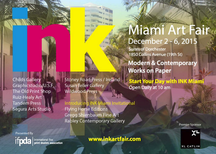
Pictures and news from the Fair will be coming soon!
Admission Hours:
Wednesday 11:00 am to 5:00 pm
Thursday 10:00 am to 5:00 pm
Friday 10:00 am to 7:00 pm
Saturday 10:00 am to 7:00 pm
Sunday 10:00 am t 3:00 pm
For any information or to know what we will be showing at the Fair, please send us an email at info@gsfineart.com or call us at 305 456 5478


WOW! – Work of the Week
Alexander Calder, Pinwheel

Alexander Calder Pinwheel c.1970
Alexander Calder
Pinwheel
c. 1970
Lithograph
62 x 46 in.
Edition of 30
This piece is pencil signed and numbered.
About This Work:
Alexander Calder is best known for creating mobiles—sculptures composed of abstract shapes moving through spaces. Many of his lithographs can be seen as studies of movement for his mobiles, as well as the capturing of movement for his stabiles — stationary sculptures. Pinwheel is one of the larger prints Calder made to view and chronicle how the shapes would move on the mobile from an anterior view. With the primary colored shapes starting in one place and moving to an alternative axis only when the other shapes were in a particular place in space.
About Alexander Calder:
In a time of constant artistic upheaval, Alexander Calder’s aesthetic revolution concerned itself with a somewhat taboo topic in the art world — fun. His prolific and passionate output brought with it a humor and sense of play unlike any before. From a wire animal the size of a match box to a fountain filled with mercury to a seventy foot representation of a man in metal, Calder ignored the formal structures of art and in so doing redefined what art could be.
Born in 1898 in Philadelphia, Calder came from a family of artists. Both his father and grandfather were well-known sculptors, and his mother was a painter. Throughout his young life, Calder was more interested in mechanics and engineering than art. After graduating high school he attended the Stevens Institute of Technology, receiving his degree in 1919. Within a short while, however, his creative energies turned toward art and he enrolled in the Art Student’s League in New York. Working as a freelance illustrator, Calder began to paint and sculpt. Soon after his first one man show in New York, Calder left for Paris.
It was then that he began work on one of his most famous projects, the “Calder Circus”. The “Circus” was a miniature reproduction of an actual circus. Made from wire, cork, wood, cloth and other easily found materials, the “Circus” was a working display that Calder would show regularly. A mix between a diorama, a child’s toy, and a fair game, Calder’s “Circus” found many eager fans among the avant-garde. One of the methods used to create the “Circus” was the bending of wire to form realistic figures. Drawn to the ease and simplicity of it, Calder began to make wire portraits. A combination of a line drawing and of sculpture, these instant portraits represented a new possibility in three dimensional art.
By the early 1930s Calder had brought his “Circus” to the United States and back, and was living in Paris off the proceeds of his regular performances. While regularly fixing and adding to the “Circus”, Calder began to show and work on wire and wood sculpture as well as painting. It was around this time that he became interested in the work of the Surrealist painter Joan Miró and the modernist painter Piet Mondrian. Both men had gone beyond abstraction and were making paintings of colors and shapes with no direct reference to the outside world. Enthusiastic about this embrace of form and color, Calder began to make moving sculptures in a similar vane.
Beginning with painted aluminum and wire, Calder created motored objects that could move to create different visual effects. In a short while, however, he realized that the mechanized movement didn’t have the fluidity or the surprise he wanted in his work. He decided to let them hang and have the wind or a slight touch begin their movement. When the experimental French artist Marcel Duchamp saw them, he named them “mobiles” (a pun on the French for “to move” and “motive”). These new sculptures, arranged by the chance operations of the wind, went against everything that sculpture had been. They were not monumental, nor were they sober. They were simply about form and color and the joy in creating both. So, in his early thirties Alexander Calder had not only found a project he would continue for the rest of his life, he had created a unique form of art, the mobile.
In 1933, Calder and his wife, Louisa James, moved to Roxbury, Connecticut, where they would spend the rest of their lives. Working on hundreds of small mobiles, Calder became interested in making large, more substantial works as well. Using similar colorful abstract forms, he made giant metal structures whose shapes and colors stood out bravely in both rural and urban settings. Known as “stabiles,” these works often had a similar whimsical quality to the smaller kinetic pieces. By the time of his first major show at the Museum of Modern Art in 1943, Calder’s quiet revolution was known internationally. Throughout the 1940s and 1950s he was commissioned to create site specific “stabiles” and had major retrospectives in a number of cities including Amsterdam, Berne, and Rio de Janiero.
By 1970, Calder had reached the height of his fame. He had worked regularly creating thousands upon thousands of objects—everything from jewelry to children’s toys to major monuments for the Lincoln Center in New York and UNESCO in Paris. That same year his gifts were honored again with a comprehensive show at the Guggenheim Museum and a smaller one at the Museum of Modern Art. In 1976, Alexander Calder died. Throughout his life, his commitment to creating work free from the pretensions of the art world and accessible to all, never stopped him from making exquisitely beautiful and important sculpture. In a century that saw the forms of art and literature reinvented regularly, Alexander Calder stands out as one of the great pioneers of his time. Adapted from PBS.