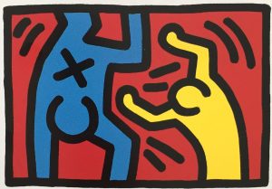
WOW! – Work of the Week – Keith Haring – Fertility #2


Keith Haring
Fertility #2
1983
Silkscreen
42 x 50 in.
Edition of 100
Pencil signed, dated and numbered


Throughout his work, Keith Haring was never afraid to confront the socio-political challenges of his time. He was an outspoken and ardent activist against racism, homophobia, the apartheid in South Africa and AIDS.

Despite that Haring addressed difficult topics in his work, he always approached these subjects with high energy and optimism. He was heavily influenced by graffiti writers and street art in New York City, and created what would become his signature style, composed of the heavy use of line drawing, vivid colors, and simplified humanoid and geometric forms. These glyphs that could be read, like an urban, tribal language were accessible to all, and easy to take in by a wide audience.

“Art is something that liberates the soul, provokes the imagination and encourages people to go further.”

This week’s Work of the Week! WOW! is Keith Haring’s Fertility #2.

Fertility #2 is the second work in the Fertility Suite of 5 works. Created in day-glow pigments, the piece is exceptionally bright, which conveys a warm and happy message, and evokes the New York club scene that Keith Haring was a part of.

It is a work that captures both the mysteries of ancient civilization with the representation of the pyramid, but also the imagination of extra-terrestrial civilizations through the flying saucers. The pyramid was a common theme in Haring’s work, simultaneously referring to antiquity and symbolizing eternity. It is also connected to the hieroglyphic language that Haring employs throughout his body of work, and the notion that images are a universal language. The UFO on the other hand represents a cosmic energy and suggests supernatural forces or people who were situated outside of social norms. They always symbolize positive energy and empowerment.

Lines and circles have a darker connotation in Haring’s work, they refer to the lesions of HIV and AIDS victims. These threats are surrounding a pregnant woman who is in distress, agitating her arms, trying to get attention.   

Combined, what does all this imagery stand for?

In the 1980’s there was a high prevalence of HIV infection among pregnant women in Sub-Saharan Africa. It was a terrible epidemic that devastated vast regions. The 1980’s were characterized by an insufficient response (both in the US and abroad) by government leaders in response to the AIDS epidemic. Ronald Reagan, the US president at the time, did not address the issue until over 21,000 Americans had already perished from the virus. Haring was a staunch activist and leader in promoting awareness about the virus and Fertility #2 is a centerpiece in his fight in relation to the transmission of the virus from mother to child, a particularly common problem in southern Africa.

The lesions, or dashes and circles have infected all the land in his depiction of the African landscape, and the pregnant mother is terrified for her unborn child. Keith Haring, loved the hope and innocence of children inspired. To him, they represented a better humanity: color-blind, unprejudiced and caring, uncorrupted by greed and hatred towards others. This work represents the saving of children and human kind from the evils of illness and inactive leadership.

WOW! – Work of the Week – Ed Rushca – Bliss Bucket


Ed Ruscha
Bliss Bucket
2010
Lithograph
28 3/4 x 28 in.
Edition of 50
Pencil signed, dated and numbered

About the work:
One of the most important postwar artists, Ed Ruscha came into prominence during the 1960s pop art movement. First recognized for his associations to graphic design and commercial art, Ruscha became admired for his mediations on word and image, where a word literally becomes an object.
Language has often invaded the visual arts during the past century, but no other artist uses it the way Ruscha does. His early paintings are not pictures of words but words treated as visual constructs. “I like the idea of a word becoming a picture, almost leaving its body, then coming back and becoming a word again,” he once said. “I see myself working with two things that don’t even ask to understand each other.”
This weeks WORK OF THE WEEK – WOW!!! is Bliss Bucket, a snowcapped mountain scene, bearing the words, with his self invented font.
Since the late 1990s the mountain has become one of Ruscha’s most consistent motifs. He produces classic mountains, taken either from images of the Himalayas or from his own imagination.
Ruscha has said, ‘It’s not a celebration of nature. I’m not trying to show beauty. The concept came to me as a logical extension of the landscapes that I’ve been painting for a while – horizontal landscapes, flatlands, the landscape I grew up in. Mountains like this were only ever a dream to me; they meant Canada or Colorado. I’m not really painting mountains, but an idea of mountains. picturing some kind of unobtainable bliss or glory … tall, dangerous, beautiful.”
He has used these epic backdrops to support a range of ambiguous or bland phrases such as this one here. The deliberately neutral typeface in this work has now become his trademark font, with squared off letters recalling those in the Hollywood sign. He describes it as ‘no-style’ or Boy Scout Utility Modern’
Actually, the words aren’t so much written on top of the depiction of the mountain as inscribed within the work, the crisp lettering clear, clean and as virgin as the snow itself. Each word has the momentous authority of an alp; they shout, as though to start an avalanche.
Ruscha would stumble upon these words, considering them to be his own version of Duchampian readymades. When the words began to invade his mountain paintings the result was boldly striking and beautifully absurd. The mountains receded to the background while statements such as BLISS BUCKET threw themselves at the front of the plane with big, look-at-me lettering making it impossible not to enjoy these clever combinations.
Inspired by the text based works of fellow Pop artists Jasper Johns and Robert Rauschenberg, Ruscha pursued a lifelong artistic exploration into the formal elements of printed text and its fluid relationship to the visual image. By culling words, images and phrases that have been imprinted in his memory and that are found in mass media (print culture, advertising billboards, etc.), his work often serves as a visual encyclopedia of American culture. These symbols of consumer culture are as deeply rooted in the American vernacular as the mountains Ruscha paints.
His clever word associations pop off brightly colored canvases daring the viewer to react. For Ruscha words are also images, in that they provoke the imagination of the viewer.
Ruscha’a mounting paintings speak to how commercialism and consumerism are slowly encroaching on the natural world. This work is about before and after and the passage of time. The presence of commercialism and consumerism is unnatural and harsh, yet they accurately reflect the effect that our consumer driven culture has on the dwindling unspoiled natural world.
Mass media, billboards, and megastores are empires in their own right and have left an indelible imprint on our world. The unblemished views of these pristine monuments are slowly being encroached upon by sprawling suburban strip malls and colossal super stores. “The buildings violate the beauty of these mountains,” The abstraction with which he renders is classic Ruscha – he doesn’t give us too much but just enough to trigger our imaginations and associations. The subtlety of this rendering allows this painting to leave a far more substantial imprint on the viewer and make a much stronger statement on the condition of our world.

WOW! – Work of the Week – Shepard Fairey, Sedation Pill HPM


Shepard Fairey
Sedation Pill HPM
2013
HPM (hand-painted multiple), screenprint and mixed media collage on paper
40 x 30 in.
Edition of 10
Pencil signed and numbered


About the work:
IT TAKES THE SEDATION OF MILLIONS TO HOLD US BACK
It’s no secret, Shepard Fairey has always been open about controversial social and political topics, as evidenced in his artwork which promotes awareness of social issues. His aim in his work is to reawaken a sense of wonder about one’s environment.
This is exactly what this week’s Work Of the Week! WOW!, Sedation Pill HPM depicts. Shepard comments about this work, “The Sedation Pill print is inspired by the title of my favorite Public Enemy album “It Takes A Nation Of Millions To Hold Us Back”. I think the biggest problem in America is the indifference and complacency about important issues that results from much of the population being perpetually hypnotized by conspicuous consumption, social media, entertainment, and self-medication. Using sedation and escapism for relief from the rat race might make us less aware (blissfully ignorant) but also less empowered to improve our role within the rat race… a vicious cycle of cause and effect.”
However, something very interesting about this work, that many may not notice until pointed out is the influence of another social and political activist artist.
Fairey’s Sedation Pill could have been crafted 50 years ago by famed Pop artist Robert Indiana.
Using words like Stay Alert and Eyes Open as imagery to effectively convey his message, and of course the title of the work “It takes the sedation of millions to hold us back”. Fairey, creatively taking a page from Indiana’s playbook, not only uses words, but also positions them along side of geometric forms and shapes, and effective fonts to emphasize not only the word but its connotations.
Indiana brilliantly understood that words would not be enough. He had to pair them with form, shape, color, and draw the viewer in by making the work visually optical, and kinetic. Shepard Fairey did all this with Sedation Pill.
If the influence of Robert Indiana is not obvious to the viewer just on the merits of the work itself, well then Fairey let us know by adding the number 5 at the top right and bottom left of the work.
In 1963, Indiana paintied “The Figure 5”, owned by the National Museum of American Art, Smithsonian Institution, in Washington D.C.

Shepard Fairey, Sedation Pill HPM (detail)
Robert Indiana, The Figure 5

“I had seen a large retrospective of Demuth’s work and was mightily impressed. So I got off on that subject. I used the Demuth painting as a theme and, not liking to do those kinds of things, I decided to make the painting an homage to Demuth because I’m very fond of his work. There were five paintings all related to that particular theme, and those words simply came from earlier works. Some of my first word paintings were, for instance, just “EAT” “DIE”. And “EAT” “DIE” of course stem from the fact that the last word that my mother said before she died was “Eat.” But it relates to other aspects of the American scene. To complement “EAT” “DIE”– one really couldn’t go on doing that forever – I thought of the supplementary idea of “HUG” “ERR.” “HUG” was a family word for giving affection and so forth, and so it began to suggest covering some of the more formal aspects of life — existence and love and survival and sin and what have you.” — Robert Indiana
Sedation Pill HPM is a Hand Painted Multiple. This means that the entire paper that the work is printed on is all made of collaged elements of newspaper, torn stenciled patterns on paper, that Fairey is so well known for. Once the collaged paper is created, the image is then silkscreened on top of the paper. The torn elements of paper create a raw or rough look, as if this work was pasted on a wall on top of other previous works that had been there and have a worn or weathered look. After the silkscreen is placed on top Fairey then goes back and hand paints on top of the silkscreen, and margins.


WOW! – Work of the Week – Robert Indiana, American Dream #2


Robert Indiana
American Dream #2
1982
Screenprint on four separate sheets
26 3/4 x 26 3/4 each
77 1/2 x 77 1/2 overall
Edition of 100
Pencil signed, dated and numbered


About the work:
On Saturday, May 19, 2018 Robert Indiana passed away due to respiratory failure. He will be missed but his art and legacy will live on
“There have been many American SIGN painters, but there never were any American sign PAINTERS”. This sums up Robert Indiana’s position in the world of contemporary art. He has taken the everyday symbols of roadside America and made them into brilliantly colored geometric pop art. In his work he has been an ironic commentator on the American scene. Both his graphics and his paintings have made cultural statements on life and, during the rebellious 1960’s, pointed political statements as well.
Born Robert Clark in New Castle, Indiana, in 1928, he adopted the name of his native state as a pseudonymous surname early in his career. What Indiana calls “sculptural poems”, his work often consists of bold, simple, iconic images, especially numbers and short words like “EAT”, “HUG”, and “LOVE”. Rather than using symbols from the mass media, Indiana makes images of words that focus on identity. Using them in bold block letters in vivid colors, he has enticed his viewers to look at the commonplace from a new perspective.
Despite his unique methods, several important aspects of Indiana’s works clearly identify him as a Pop artist. He manages to give a direct and honest description of American culture while appearing cool and uninvolved, much as Warhol did by simply reproducing images of superstars and soup can labels.
However, what distinguishes Indiana from his “Pop” colleagues is the depth of his personal engagement with his subject matter. Indiana’s works all speak to the vital forces that have shaped American culture in the late half of the 20th century: personal and national identity, political and social upheaval and stasis, the rise of consumer culture, and the pressures of history. He uses his art it to both celebrate and criticize the national way of life.
In 1961, Indiana began a series titled the American Dream, a recurring theme in his work, which along with his other famous stenciled-text images—most notably LOVE—he has used to both celebrate and criticize American life.
The American Dream is the cornerstone of Indiana’s mature work. The roots of this powerful concept pervaded the artist’s Depression-era childhood, as well as the social and political aspirations of the United States during his formative years as an artist (1940s-1960s). It was the theme of his first major painting sold to The Museum of Modern Art in 1961. He recalls, “The first two or three dreams (there were 9 American Dream paintings in total), I would say were cynical. I was really being very critical of certain aspects of the American experience. “Dream” was used in an ironic sense.
This week’s Work of the Week! WOW! is Robert Indiana’s American Dream #2, a 4 piece set of screenprints each hung in a diamond shape, to form a 1 piece larger diamond shape.
Indiana saw the American Dream as “broken. . .no longer in effect for us and for lots of others.” In 1960, Indiana began applying highly saturated color to his geometric paintings. By the end of the year, he was adding words to them. Three of the four panels in American Dream #2 have the words EAT, JACK, and JUKE. Despite how simple Indiana’s verbal-visual amalgams seem, they contain multiple layers of meaning; deciphering them is akin to unraveling a conceptually complex puzzle.
In this work, the words suggest multiple references—for example, the word JUKE is associated with the greed of gambling and the fraud of “tilting” or cheating the pinball machine. Thus the imagery of casino tokens which gives a false promise and fantasy of American prosperity while also acknowledging the
failures of American ethics.
JACK may refer to John F. Kennedy, the great hope for America at the time, but very flawed in deed.“I think 1962 was the last year that Jack Kennedy lived, so that usually Jack refers to the president. However, if we want to keep consistent, in ’52 I met someone named Jack Curtis, who became an important friend in my life, and so it has a dual meaning.”
By presenting familiar words in new ways, he asks the viewer to reevaluate assumptions and emotions associated with those words. For example, no longer does the word “EAT” simply describe an act, but a whole set of social conditions and practices associated with that act. Viewers might see the intimacy of eating and its central role in family, community, and romantic rituals or they might understand the negative aspects of eating in a society where high-fat and gluttonous diets are the norm.
The word EAT also goes back much further and fills a large part of his life, EAT was the last word that Robert Indiana’s mother said before she died. She told him to be sure to eat.
As a child during the Depression, Indiana’s father left his mother, and in order to support him, and herself, his mother opened a restaurant, and so for several years things like eat signs also were a prominent part of Indiana’s life. The EAT aspect of this work is also a personal thing. It’s autobiographical.
What this work demonstrates, once again, is Indiana’s considerable style as a graphic designer whose manipulation of words, symbols, colors and spaces, can be pleasing and provocative. His designs reverberate, their elements bouncing off one other in dynamic relationships as they comment on the ups and downs of American life, his own included.
Robert Indiana provided an example of how to create work that was both deeply personal and universal, work with a clear message that could also be open to interpretation, work that spoke of its own time and reflected on contemporary events, but also carried a message to future generations.
The “painter of signs”, paints “signs of the times.”

WOW! – Work of the Week – Ed Ruscha, Main Street


Ed Ruscha
Main Street
1990
Lithograph
8 1/2 x 10 1/4 in.
Edition of 250
Pencil signed, dated and numbered


About the work:

Ed Ruscha can be called the Jack Kerouac of art. Since his first road trip from Oklahoma City to Los Angeles in 1956, West coast Pop artist Ed Ruscha has been influenced by themes and icons surrounding America. The drive, which he took with his life long friend, classical guitarist and composer Mason Williams took about three days in a 1950 Ford sedan.

At the time, Ruscha, who has since become an avid photographer, did not own a camera and the only record of the trip is a log that the artist has kept over the years. The two friends, who were still teenagers at the time, used the log to keep track of their expenses as they were trying to stick to a budget. The log tells the story of their journey. Ruscha has said: “My art, really my life, evolved out of that trip. […] The log took the place of photographs. I got a camera soon after arriving in L.A.” American landscapes and text are what the artist is best known for, both of which emerged from from his cross country experience.

This week’s Work of the Week! WOW! is Main Street, by Ed Ruscha.

“Main Street” is part of the iconography of American life.
The “Main Street of America” branding was used to promote U.S. Route 66 in its heyday. Main Street is a generic phrase used to denote a primary retail street of a village, town or small city.

In small towns across the United States, Main Street is not only the major road running through town but the site of all street life, a place where townspeople hang out and watch the annual parades go by. In the general sense, the term “Main Street” refers to a place of traditional values. However, in the America of later decades, “Main Street” represents the interests of everyday people and small business owners, in contrast with “Wall Street”, symbolizing the interests of large national corporations.

Ruscha treats words as visual compositions which are typically categorized between pop and conceptual art. Works feature a word with strong connotations and a powerful visual impact. Ruscha uses the multiplicity of meaning to encourage the viewer to consider all the subconscious connotations of the word. This could be expanded to an exploration of the subconscious meanings hidden in all forms of language. The words elicits a mixed response within the viewer in which preconceived ideas about the subject are confronted and either validated or challenged.

Noting the transformation of Main Streets in American cities from small “mom and pop” businesses, ice cream parlours, and public square gatherings, to big box stores, chain restaurants, and consumers jay walking across the street, while burying their heads in their cell phones, the words Main Street takes on a much diff erent meaning than it once did. Ruscha’s Main Street, not only takes us back to the days of nostalgia, but also to modern times where Main Street meets and flirts with Wall Street. Innocence and American values are overshadowed by greed and technology. Overshadowed is the key word, because not only is Ruscha’s Main Street a sign of modernism replacing the past, but it also implies a sense of hope, that one day the traces of the past will lead to a happy memory, and a wanting to inject the future with the values of the days of old.

Rather than simply painting a word, Ruscha considered the particular font that might add an elevated emotion to the meaning much like the way a poet considers a phrase. By painting a word as a visual, he felt he was marking it as offi cial, glorifying it as an object rather than a mere piece of text.

The typography of the words in Main Street sets this piece apart from the majority of his work because it is not done in “Boy Scout Utility Modern.” Inspired by the Hollywood sign, the artist invented “Boy Scout Utility Modern” in 1980, and uses it regularly in his works. In this case, rather, the font seems closer in nature to “Times.” “Times” is a classic font, designed for its legibility so it is an obvious choice for a representation of the most famous street name in America: Main Street. Main Street is an ode and textual portrait of an American symbol.

Ed Ruscha is fascinated with the streetscape as a subject matter, and over the span of his six-decade career, Ed Ruscha has shaped the way we see it – depicting gas stations, signs or continuous photographs of Hollywood Boulevard. His works convey a distinct and bold brand of Americana. Ruscha explains. “I take things as I find them. A lot of these things come from the noise of everyday life.”

WOW! – Work of the Week – Keith Haring – Untitled C & D


Keith Haring
Untitled C
1987
Lithograph
11 x 14 3/4 in.
Edition of 100
Pencil signed, dated and numbered
Keith Haring
Untitled D
1987
Lithograph
11 x 14 3/4 in.
Edition of 100
Pencil signed, dated and numbered

About the work:
1987
The nation of South Africa was in a state of emergency. Serious political violence had arisen over Apartheid and the National Party had won an election, yet again.
41,027 people had died of AIDS complications in America, and another 71,176 people were diagnosed with the disease. After 6 years of silence, then-president Ronald Reagan finally used the word “AIDS” in public for the first time.
Crack-cocaine incidents in the US had increased to 94,000 from 23,500 only 2 years prior – a 300% jump.
_______________________________
Keith Haring’s work sums up New York cool. He was friends with Madonna, Andy Warhol, David Bowie, among many others who represented the 80’s culture boom. By the start of the decade, the artist had developed a fresh aesthetic, with roots in punk, hip-hop and graffiti. His strong lexicon of caricature-like images in flat, bold colors, are so deceivingly simple and joyful that it is easy to be blinded to its political and activist content.
Keith Haring was a fierce and tireless socio-political activist throughout his life, and had a rational of intervention and standing up for oppressed communities. He was opposed to the institutionalized racial segregation in South Africa, fought for increased sexual education for the gay population in the face of the AIDS epidemic and was determined to raise awareness of the effects of crack-cocaine which ravaged the disenfranchised black society of the US.
This week’s Work of the Week! WOW! is Untitled C & D, from the untitled suite of 4 lithographs created in 1987. This suite was purposely done as a lithograph and not a silkscreen, the dimensions of the works are slightly smaller, and the edition size is smaller. It is limited to only 100 pieces. This was done so as not to be confused with the Pop Shop series, which were released on a more commercialized level. As with the vast majority of Haring’s work, this 4 piece suite of lithograph references deep commentary on societal unease.
Throughout Keith Haring’s work, the image of a television represents the mass media. The character depicted in Untitled C is on TV covering his eyes. At first, the saying “See no evil,” comes to mind. This is quite the opposite. Haring wants us to open our eyes and speak out against these evil atrocities, and not to cover our eyes, or turn a blind eye to it. Thanks to Haring’s repetitive use of symbols referencing different ailments of society, we know what he is critiquing.
In Untitled D, the yellow character seems to be tossing, or pushing away, another figure in blue that bears an X on his belly. The X is symbolic of the crack-cocaine epidemic that ravaged mostly impoverished segments of the country. Today, it is widely accepted that this particular pandemic was ignored by the media, at the time, in light of the people it was affecting. This is something that Haring was acutely aware of, and through this work, he gently provides a humanizing context that not only speaks to the situation, but also to his position.
Despite being one of the most influential and sought after artists of the 20th century, Keith Haring always remained true to his beliefs and humanity. He used his voice and platform for those who needed a supporter and champion. Untitled C & D are a clear wake-up call to the public to be aware of the problems society at large. This is what Haring’s art was about, it is not only colorful, whimsical characters that makes people smile. His entire body of work spoke volumes of the socio-political issues plaguing the world at the time.

WOW! – Work of the Week – Julian Opie – Walking Statuettes


Julian Opie
Walking Statuettes
2017
Series of seven hand-painted statuettes
Various sizes
Edition of 30
Signed and numbered


“I don’t invent or imagine things, just notice and record them.”
Julian Opie is a master in the reductive style. He expertly captures the essence and individuality of each of his subjects with minimal line-work and flat, solid colors. His highly stylized works can be characterized as a blend of Pop Art, Minimalism with contemporary sensibility that capture the world around us precisely.
Employing a variety of media and technologies, Opie distills everyday experiences into concise but evocative renditions, and his clean, thickly outlined figures have made an iconic impression on the contemporary art world.
Opie’s figures are typically drawn from photographs of people walking in the streets. He has admittedly gone through hundreds of pictures of passers-by and picks a select few to draw, which he saves as a palette of characters to use for his creations. According to the artist, each personage gives him surprises and opportunities to create individuality, that he could not invent, such as clothing or hairstyles. He then arranges them back into a crowd, and, like any crowd on the street, the composition is made up of strangers who walk distractedly, never interacting with one another. By making groups of walkers, Opie
composes a street crowd.
This week’s Work of the Week! WOW! is Walking Statuettes.
These 7 Walking Statuettes displayed together form exactly that, a group of walkers forming a “street or sidewalk crowd”
Opie’s inspiration for his statuettes stemmed from his grandfather’s walnut and leather desk, upon which, as a child, items sat at his eye-level – Bakelite lamps and stone pen holders, leather-bound books and glass bottles of ink. These items turned the desk into their own surface. In turn, the Walking Statuettes by Opie, turn their surface into a pavement, such as a busy road populated with people checking their phones and shifting their balance and bags. His creations are models, stand-ins, that can be placed and played with.
Julian Opie observes people closely, and like a caricaturist, he has a formidable eye for foibles idiosyncrasies and character. The paradox is that he renders these nuances in a flattened, abstract style that seems at first glance to be uniform and cold, yet, each statuette seems individual and real.
The entire series of resin statuettes are hand-painted front and back. Each statuette stands approximately 14 -16 inches in height, and 5 – 8 inches wide individually. Each figurine features the artist’s signature and edition number on the bottom of each figurine. Arrange them anyway you like to create your own street scene.
Drawing influence from classical portraiture, as well as public life in today’s modern society, the artist connects the clean visual language of modern life, with the fundamentals of art history. His themes have been described as “engagement with art history, use of new technology, obsession with the human body.”

WOW! – Work of the Week – James Rosenquist – Sky Hole, from Welcome to the Water Planet


James Rosenquist
Sky Hole, from Welcome to the Water Planet
1989
Pressed Paper Pulp in colors wth lithographic collage on Rives BFK and TGL handmade paper
106 x 65 in.
Edition of 56
Pencil signed, dated, titled and numbered

About the work:
“I’m the one who gave steroids to Pop art”
James Rosenquist
James Rosenquist’s larger than life brand of Pop is not the literal Pop Art of Warhol, Lichtenstein or Indiana. Rosenquist’s work, seemingly irrational owed a debt to Surrealism through large-scale, mysterious pictorial combinations. As his works evolved, he continued to employ a juxtaposition of elements and materials, creating complex compositions as a means of exploring design and narrative. His work from the 1980s through to the end of his career is still on steroids – vibrantly colorful, abstract compositions that explore perceptions of time and space, in addition to our environment.
In the mid-1970s, Rosenquist moved his studio from Manhattan to Aripeka, Florida where his aesthetic was affected by the flora and fauna of his new surroundings. His interests shifted from the culture of consumerism to an exploration of humankind’s place in the environment. The lusher paintings of the ’80s suit their time with their candied colors. Rosenquist, in short, is one of the few former pop artists whose work continues unabatedly to have something to say. However, unlike most political art, Rosenquist’s work seems non-polemical at first, and that is the source of its power.
This week’s Work of the Week! WOW! is from the series Welcome to the Water Planet – Sky Hole.
The series came to be after Ken Tyler of Tyler Graphics Ltd (TGL) invited Rosenquist to work at his new purpose-built workshop at Mount Kisco in upstate New York. Rosenquist, who started his career as a billboard artist, was always drawn to larger than life size compositions, accepted the offer when Tyler promised him that he would provide handmade paper as big as the artist could imagine. For the project, Tyler devised a huge deckle box to make hand-made papers about 60 by 120 inches, including a giant printing press for lithography and etching measuring 120 by 240 inches.
Tyler had a deep seeded interest in hand-made papers and started experimenting with Pulp Paper projects in the 70’s, working on projects with Rauschenberg, Kelly and Hockney, among others, and by the time work started with Rosenquist, he had brought paper works to new heights in terms of scale, color and texture.
This blended perfectly with James Rosenquist’s desire to develop his idea of an image of slow-heating popcorn tied together with his concerns about the state of planet Earth – the only water planet known in existence in the universe at the time. Rosenquist included imagery that evoked the colorful and sensual riches of the earth and brilliant flora from Florida, set within a wondrous star-lit universe. ‘We all live on the water planet’, the artist stated in an interview. Rosenquist’s series of paper works were intended to act both as a celebration and a warning to what might happen to our planet.
The first idea that came to form for Sky Hole was birds of paradise approaching the water planet. The image was deconstructed into its component parts, made with curved lines of cross-hatching that would then be printed in color lithography. These lithographic elements form a collage that is laid on the brilliantly colored paper pulp sheet. The separate colors were made by filling different moulds with paper pulp placed on top of the large sheets of handmade paper. The method, was one of trial and error.
At the initial stages of the project, the method of using metal moulds, or ‘cookie cutters’, resulted in problems with translating Rosenquist’s designs into paper form due to inconsistencies of the pulp paper. But, always seeking to experiment and innovate, Tyler was able to perfect the system while Rosenquist developed the templates for each piece. For the large areas of graded color, impossible to achieve using mould shapes, Tyler proposed the use of a spray gun, used for applying stucco to walls in houses, which could spray the gradations of color across the pulp on which the lithographic elements were collaged. The technique was successful and resulted in a look of apparent spontaneity and effortlessness, contrary to the hours of preparation and a technique born of experimentation.
The collaboration between the artist and master printmaker created revolutionary works, Rosenquist, himself noting that ‘The wonderful thing about paper pulp is the color. If you take a magnifying glass, you’ll see a little fuzz rising like smoke off the surface of this handmade paper – like doing giant watercolors and letting this watercolor seep together at the perfect moment …’

WOW! – Work of the Week – Roberto Matta – Hours of the Day


8am

8pm

10pm

Roberto Matta
Hours of the Day Series
1975
Etching with aquatints
25 x 36 in.
Edition of 125
Pencil signed and numbered
About the work:
“I am interested only in the unknown and I work for my own astonishment.”
Roberto Matta
Chilean-born artist Roberto Matta was an international figure whose worldview represented a synthesis of European, American, and Latin American cultures of the 20th century. He was a classically trained architect and moved to Paris in the early 30s to apprentice with famed modernist Le Corbusier. During his two-year tutorship, he met and developed friendships with many of the leading international writers and artists who had made Paris the intellectual capital after World War I.
By 1937, he had moved away from architecture to focus solely on visual arts and became an important member of the Surrealist group. The movement was focally concerned with releasing the potential of the unconscious mind and was acutely disdained with the rational world. While he certainly shared stylistic and intellectual similarities with the Surrealist group, Matta was never able to completely reconcile his strong social conscience with the movement’s inward-looking practices. Instead, Matta balanced his interest in the human psyche with an active engagement with the external world. In the process, he provided early and crucial inspiration for the Abstract Expressionists during the War years, when he lived and worked in New York. Matta eventually broke with both groups to pursue a highly personal artistic vision.
This week’s Work of the Week! WOW! is Matta’s ‘Hours of the Day’ series.
Each work in the series is rich with Matta’s classic visual lexicon of blended abstraction, figuration, and multi-dimensional space, forming complex and cosmic landscapes inhabited by anthropomorphic figures. This particular style of Matta’s has been called inscape. Inscape works represent and evoke the human psyche in visual form, as filtered through the writings of Freud and the psychoanalytic view that the mind is three-dimensional.
Each landscape in the series is representative of each hour of the day. This is masterfully accomplished through the different lighting, meant to capture time passing. The etchings are works of expert control, exuberant with color and inventiveness. Although more joyful than many of his earlier works, they continue the artist’s exploration of duality.
Matta’s artistic oeuvre overflows with persistent oppositions: structured architecture and vast cosmos, figuration and abstraction, scientific inquiry and invisible imaginings, social consciousness and interior reflection—all of these complex, sometimes contrary, impulses stem from his international education spanning three continents and a career rich with encounters and friendships.
Matta’s artistic legacy was also a deeply personal one, as four of his six children became notable artists as well. Most celebrated among his progeny was the contemporary artist Gordon Matta-Clark, who followed in his fathers footsteps by creating socially conscious work with a distinctively architectural bent.

WOW! – Work of the Week – John Baldessari – Money with Space Between


John Baldessari
Money with Space Between
1994
Lithograph and screenprint on 2 panels
48 x 22 in. each
Edition of 45
Pencil signed and numbered
About the work:
John Baldessari is often endearingly referred to as “the guy that puts dots over people’s faces.” He is considered the godfather of conceptualism, having made a career out of defying expectations. Over 50 years, his inquisitive approach to making art has expanded the parameters of what we consider to be “art.” His work certainly succeeds in making people stop, look and reflect rather than simply taking it in passively. His sharp insights into the nature of perception and relationships between images are engaging, highlighted by his trademark deadpan humor.
Baldessari pledged, in a 1970 groundbreaking work “I will not make anymore boring art.” This pledge was addressed to both his viewers but also to himself. He has remained true to his word, never shying away from new media, allowing his works to always retain a freshness and relevance that many younger artists struggle to match. Through his experimentations, he became responsible for the way many artists use appropriation in their work today. Kruger, Sherman and Salle are among the many that cite him as an influence. He is a giant of contemporary art.
This week’s Work of the Week! WOW! is named Money with Space Between.
Baldessari has spent his entire life living and working in California. It is therefore not surprising that much of his works incorporate Hollywood film stills and other cinematic imagery. The artist never addresses the source of his images, considering the copy itself the true source. Money with Space Between has all the visual and narrative qualities of a film still – an action is taking place between two men dressed in suits, their faces obscured by Baldessari’s famous dots.
Baldessari came upon colored stickers on produce at grocery stores and found the simple method of demarkation and concealment fascinating. The dots hide from view areas of interest and force the viewer to refocus their attention on other elements. In placing dots over the faces of the two men in Money with Space Between, the action that taking place – an exchange of money – becomes the focal point. Through eliminating all additional information, such as the expressions on the protagonist’s faces, Baldessari gives the viewer the freedom to interpret the situation and make their own assumptions.
Despite that the dots can be challenging or startling to the viewer, this is not a work that requires deep reflection. It is simple and straightforward. The title says it all: money with space between. What is complex about this work is the presentation. There are specific instructions on how to frame the piece, provided by artist. Both panels are framed separately. The top and bottom margins are 2 1/2 inches wide, the left margin on panel A (the left panel), is 1 1/2 inches wide, and the right margin 1/2 an inch wide. Conversely, panel B is a mirror opposite, the left margin being 1/2 inches and the right margin 1 1/2 inches. The frame itself is specified to be a black matte finish, with the face measuring 3/4 in, and 2 inches deep. The space between the two sheets (not the frames) is to measure 4 1/2 inches. When looking at the work as a whole, the specifications of the framework create an illusion of it being one whole piece, as opposed to two separate panels.
In a 2013 interview with David Salle, Baldessari said: “I go back and forth between wanting to be abundantly simple and maddeningly complex. I always compare what I do to the work of a mystery writer—like, you don’t want to know the end of the book right away. What a good writer does is give you false clues. You go here, no, that’s not right; you go here, no, that’s not right, and then … I much prefer that kind of game. But then you get tired of yourself and you just want to be forthright.” In Money with Space Between Baldessari manages to capture both simplicity and complexity in a manner that is truly unique to him.