Work of the Week! WOW! Tom Wesselmann – Monica Lying on One Elbow


Tom Wesselmann
Monica Lying on One Elbow
1986-1998
Alkyd oil on cutout steel
8 x 13 in.
Edition of 25
Signed and numbered on verso


About the work:

Considered by many to be a Pop artist, Tom Wesselmann would rather be called an artist of the post-Matisse era, according to his wife Claire. His works recall Matisse, in a contemporary setting.

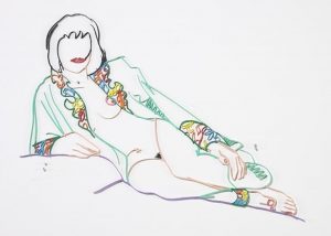
Nothing can be truer, as evidence by this week’s Work of the Week! WOW! Monica Lying on One Elbow with Robe by Tom Wesselmann is a steel cut out painted alkyd oils created in 1986, and the edition was completed in 1997. We can see how it can be compared to Matisse’s Odalisques.

In the 80’s, Wesslemann started toying with the idea of capturing the spontaneity of his sketches, complete with false lines and errors, and realize them in the permanence of metal. He called these cut outs “Steel Drawings”. When the first steel cut was realized, Wesselmann commented, “I anticipated how exciting it would be for me to get a drawing back in steel. I could hold it in my hands. I could pick it up by the lines, off the paper. It was so exciting. It was like suddenly I was a whole new artist.”

Odalisques were the most popular subject of Matisse’s Nice period, during the 1920s. They appear in diverse poses in innumerable canvases: reclining, lounging, seated, or standing, frequently with their arms raised or folded behind the head. Dressed or semi-dressed in exotic attire, they are placed against a decorative background of richly patterned fabrics and oriental rugs and surrounded by oriental accoutrements. Matisse’s primary model for these depictions, from 1920 to 1927, was Henriette Darricarrière, a young woman skilled in the arts of ballet, piano, violin, and painting who lived near Matisse’s studio.

The model’s sculpturesque body, languorously stretching across a couch, exudes sensuality and carnality, enhanced by her seductive attire or painterly patterned backgrounds. The mood is clearly palpable. Yet, contemplating the work, one gets the impression that the artist somehow distanced himself from the erotic content of the picture while leaving the excitement of recognition to the viewer.

All this can be said of Wesselmann’s images of Monica, who was Tom Wesselmann’s favorite muse. This steel drawing cut out, Monica Lying on One Elbow with Robe, is a modern day Odalisque.

Here the viewer is drawn to Monica, by her seductive reclining position, and her half opened robe, exposing just enough, suggesting sensuality. Leaving no attention to detail behind, Wesselmann goes through great length to make sure that Monica’s robe is a full of little details such as the multicolored flowers on the lapels, and cuffs. This can be thought of as a contemporary tip of the hat to Matisse’s patterned backgrounds in his painting.

It is this detail that makes this particular steel cut the most rare and desirable of all the editioned steel cutouts. Monica Lying on One Elbow with Robe is considered the most sought after steel cut.

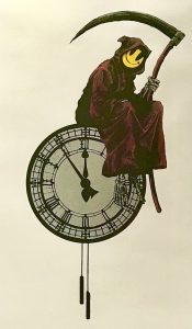
Work of the Week! WOW! Banksy – Grin Reaper (Red Reaper)


Banksy
Grin Reaper (Red Reaper)
2005
Screenprint
30 3/8 x 19 5/8 in.
Unique Artist Proof (A.P.) outside of the regular edition of 300
Pencil signed, dated and annotated A.P.

*Accompanied with a COA by Pest Control


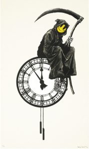
This week’s Work of the Week – WOW!!! is the Grin Reaper. Only this work is a rare one of a kind unique Artist’s Proof.

There are quite a few differences between this version of Banksy’s Grin Reaper, and the regular edition version. (See photos below). This version of Banksy’s Grin Reaper, is an extremely rare unique one of a kind screenprint.

The differences are:

– The Reaper’s cloak is red, instead of black

– His scythe is red, instead of black, and the blade has metallic silver highlights

– The clock is metallic silver, instead of white

– The Reaper’s bones (skeleton) is also silver instead of white

– There is a matching silver border around the print

– This work is untrimmed, and larger measuring 30 3/8 x 19 5/8 in. (77 x 50 cm)
– The regular edition is 27 1/2 x 17 5/8 in. (70 x 44 cm)

This work is certified authentic by Pest Control, and is even titled the “Red Reaper” on the COA. It is an Artist’s Proof (AP), outside of the edition.

This is a rare, unique, one of a kind print

Unique Artist Proof

Regular Edition of 300

Banksy’s “Grin Reaper” is one of the artist’s most iconic images. Banksy’s original regular edition print was first released in 2005, as an edition of 300 pieces, and existed as a graffiti piece on Old Street, London. The work was originally part of ‘pop up shop’ exhibitions by Banksy.

This screen print by Banksy shows a grim reaper, with a comical twist. The reaper holds his traditional scythe, and he is sitting, casually on the top of a clock. It is five minutes to midnight, presumably the reaper is awaiting for the clock to strike twelve, before enacting his grim duties! However, instead of the usual skeletal features associated with the reaper, his face has been replaced with a bright yellow smiley face.

This piece plays with the boundaries between good and evil, by taking a typical symbol of something ‘bad’ (the reaper) and countering that with something considered to be good… a smiley face. The bringer of Doom, is now perhaps, not so bad after all. Almost welcoming you to your fate.

Work of the Week! WOW! In Memory of Mel Ramos


California Pop Icon, Mel Ramos has passed away at the age of 83 of heart failure, on Sunday Oct. 14, 2018.

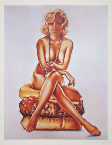
As a tribute to Mel Ramos, this week’s Work of the Week! WOW! is Verna Burger, Ramos’ first print, created in 1965.

Mel Ramos
Verna Burger
1965
Lithograph
21 1/2 x 17 in.
Edition of 500
Pencil signed and numbered


About the work:

Few things are more appealing to a man than a sexy seductive pinup model and a good old fashion cheeseburger.

In his own way, Mel Ramos, a pioneer of American Pop Art on the west coast, captured American thought, fervor, and society of the times.

To the outsider looking in, Ramos’ art was nothing more than a hot naked woman coming out of an unwrapped candy bar, lying with an exotic animal, or in this case, sitting on a cheeseburger. However to the insider, Mel Ramos’ art is the juxtaposition of naked women with larger than life commercial products, and represents issues of the times.

The 1950’s and 1960’s brought innovation, and commercialization, tied with consumerism to America, and on the flip side brought a break with traditional values and a loss of innocence, a “breaking out of its shell” if you will. The birth of television, and movies, helped bring about both consumerism, and sexuality to the forefront of every American.

Advertisements shaped our culture of what society “needs” and “wants”. The rise of pinup calendars, Playboy Magazine, and the Hollywood sex symbols in the movies, shaped our youth, moving them forward into a more rebellious and break from traditional thinking as a society as a whole.

Many of the Pop Artists, like Johns, Rauschenberg, Rosenquist, and Lichtenstein, all painted about the same topics as Ramos, but Mel Ramos’ art was more direct, and less abstract. There was no room for interpretation. It was what it was! And that is perhaps why Ramos never achieved the same level of appreciation of fame as his contemporaries. However, Ramos was one of 12 artists, along with Andy Warhol, and Roy Lichtenstein, in the Los Angeles County Museum, of the Arts 1963 Pop art show that showcased the burgeoning new movement.

Verna Burger is the prime example of Ramos’ brand of Pop. The work has all the allure of a pinup with the vintage 1960’s look and sexual undertones. There is a delicate femininity to Verna in the way she is seated, playing with a long string of pearls and her 1960’s inspired bob hairdo. While the sex appeal is obvious, it is more coquettish than images we may see today.

Mel Ramos’ work did evolve to be more flashy or showy over the years, but Verna Burger brings viewers back to different era and represents the epitome of what Ramos collectors are after: a style of subtle suggestiveness and innuendo, paired with a commercial product that is nostalgic of a different time.

WOW! – Work of the Week – Lawrence Schiller – Marilyn Monroe Birthday Cake


Lawrence Schiller
Marilyn Monroe Birthday Cake
1962-2007
Silver Gelatin Print
30 x 40 in.
Edition of 75
Signed and numbered in ink


About the work:

Lawrence Schiller began shooting Marilyn in 1960 on the set of “Let’s Make Love” when he was just 23 years old and he would be among those who took the very last stills of the actress.

As a model, Schiller has recounted, the Monroe was very easy to photograph, a “dream subject.” Their first time working together, she even coached him, saying: “That’s not the best angle for me. If you go over there the light will be better.” She knew what to do and understood light, as though she were both the shooter and subject.

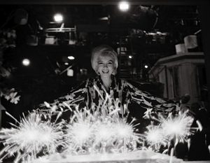
This week’s Work of the Week! WOW! is Lawrence Schiller’s iconic photograph Marilyn Monroe Birthday Cake.

Marilyn Monroe celebrated her last birthday on June 1, 1962 with the cast and crew of her final movie “Something’s Got to Give” in which she costarred with Dean Martin.

Three weeks prior to that, on May 17th, 1962, during the shooting of the movie she showed up and completed all her scenes by noon in order to secretly fly out to New York and sing “happy birthday” to President Kennedy on May 19th. Fox studios would then sue the actress for breach of contract. Despite the suit, filming continued, even on Marilyn’s birthday.

Marilyn Monroe Birthday Cake was shot on set after a day of filming. Fox studios did not even so much as give Marilyn her birthday cake, which was purchased by her stand in. The actress, smiling broadly in front of the cake topped with sparkling candles commands all the attention. Set lights, ladders and props in the background are barely visible yet symbolic of the personal and professional turmoil of Marilyn Monroe’s life.

The actress was fired from the movie one week later on June 8th and Fox sued her again in an attempt to recover damages. Two months later, on August 5th, she would be found dead, in her home, at the age of 36.

Marilyn Monroe Birthday Cake, which was purchased directly from Lawrence Schiller was released in 2007, the 45th anniversary of her passing. It comes with the hardcover book by the photographer documenting this photo shoot.

WOW! – Work of the Week – Robert Rauschenberg – Soviet/American Array VI


Robert Rauschenberg
Soviet/American Array
1988-1990
Intaglio in 16 colors on Saunders paper
88 1/2 x 52 in.
Edition of 59
Pencil signed and numbered


About the work:

Robert Rauschenberg was endlessly curious, creative and politically-minded. He is one of most influential artists of the post-war era and is credited with a revival and redefinition of printmaking. His aesthetic strategy included assemblage and collage of images of the everyday world, the juxtaposition of which, enhances their effects on each other to form a narrative.

Rauschenberg used his art as a means to depict political experiences of the time, which in turn allowed him to process them internally. Much of his political work is not only a meditation on the state of the nation but also on the state of the nation in relationship to the world.

For a conscientious citizen like Rauschenberg, who served in World War II, the overwhelming rise of the Cold War between post-war superpowers America and Soviet Union could not be ignored. He later explained that he had felt assaulted by current events. His resolution to this was undertaking and fostering cultural exchange through his ROCI (Rauschenberg Overseas Culture Interchange) initiative. Among his projects for the initiative was the Soviet/American Array series.

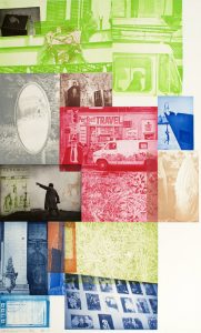
This week’s Work of the Week! WOW! is Soviet/American Array VI.

For Rauschenberg, current events directed his thinking and emotions of the time. Despite seemingly different worlds on opposite sides of the Iron Curtain, Soviet/American Array VI reveals a surprising display of visual similarities across the Cold War divide. The piece was most likely inspired by Russia poet Andrei Voznesensky’s 1981 work entitled “Russian-American Romance:”

In my land and yours they do hit the hay
and sleep the whole night in a similar way.
There’s the golden Moon with a double shine.
It lightens your land and it lightens mine.
At the same low price, that is for free,
there’s the sunrise for you and the sunset for me.
The wind is cool at the break of day,
it’s neither your fault nor mine, anyway.
Behind your lies and behind my lies
there is pain and love for our Motherlands.
I wish in your land and mine some day
we’d put all idiots out of the way.

This work interweaves images of American life and Soviet life through the intaglio process in 16 colors. The work is very large, standing 88 1/2 in. high by 52 in. wide and was done in a very limited edition of 59 pieces. Some images are obvious such as the silhouette of a statue of Lenin and other, less recognizable images were taken from Rauschenberg’s travels throughout the Soviet Union and America. What is most interesting about the work is how difficult it is to discern which images represent the USSR and which represent the U.S.A.

In this piece Rauschenberg turns images from the two Cold War nations, which stressed their differences for over forty years, into a montage of an inextricably interconnected life, neither Soviet nor American, but an array of both.

Rauschenberg’s effort was to break through the pain. He stated in 1989: “My goal is to open people’s eyes to the surrounding reality, to deepen mutual understanding between people and to aspire for peace.” The aim of these works was “to shake people awake,” to the fact that despite ideological differences, people across the world are not all that different.

WOW! – Work of the Week – Jeff Koons – Balloon Animals


Jeff Koons
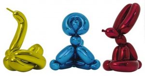
Balloon Animals – Swan, Monkey & Rabbit
2017
Porcelain with metallic finish
Dimensions vary, see below
Edition of 999
Signed and numbered on bottom of each piece
$100,000 for the set of 3
Swan 8 1/4 x 9 1/2 x 6 3/8 in.
Monkey 9 7/8 x 15 3/8 x 8 1/4 in.
Rabbit 11 1/2 x 8 1/4 x 5 1/2 in.


About the work:

Jeff Koons has cemented his position as the heir of the Pop Art movement by creating works that play with banal and familiar objects from our everyday lives through industrial methods. Koons’ reproductions of balloon animals are amongst some of his most recognizable pieces. The works reflect an element of childhood play and disposable culture but in an art-form meant to last.

This week’s Work of the Week! WOW! is Koons’ set of three porcelain, metallic finished Balloon Animals – the Swan, the Bunny and the Monkey.

Koons’ ballon animals tap into our memories and our emotions, in the eerily familiar and trustworhty form of a party favor. They are a symbol of our youth and they toy with our inner child’s fascination with a structure that is temporary. The emotional reaction that many of us have to an object that reminds us so vividly of the magic and charm of childhood is palpable, yet these are objects that one would never think of as a work of art.

Like his idol Andy Warhol, Jeff Koons has mastered the practice of taking a concept or idea and transforming it. Koons’ works are conceptual, and while they may prove challenging to grasp, they have definite aesthetic qualities and are subjected to intense attention to detail.

The balloon animals are intrinsically optimistic works. They remind the viewer of a birthday party or a clown, but to the artist they are also representative of life. As a viewer, we obviously observe the outermost elements of a work, yet, there is an interior to the work, a void full of air. To Koons, the interior of the piece is important, because it is just like the inflatable balloon animals of our youth, neither can exist without the air forming the interior element. It also symbolizes us individually, since as living beings we inhale air. To Koons, the act of inhaling air is life.

WOW! – Work of the Week – Andy Warhol – Dollar Sign FS II.278


Andy Warhol
Dollar Sign FS II.278
1982
Screenprint on Lenox Museum Board
19 5/8 x 15 5/8 in.
Edition of 60 unique works
Pencil signed and numbered


About the work:

Power, Greed, Wealth, Success, Strength, Capitalism, Consumerism, Materialism; what symbol represents all these better than the US $ (Dollar Sign)?

“It’s all about the Benjamins!!!”

This weeks Work Of the Week (WOW!) is Andy Warhol’s Dollar Sign ($), FS II 278. When it comes to a symbol of a world currency, none is more iconic the the US $ (Dollar Sign). No one thinks of the British Pound, the Euro, or the Yen. It is the US Dollar, and the dollar sign $, that is known and desired all over the world.

Art is always a extension and representation of the times. Andy Warhol began creating money imagery as early as the 1950’s. After WWII, America had solidified her position, strength, and power in the world. Here at home, America was entering the most financially sound period in her short history. Americans were experiencing a modern industrial revolution in manufacturing, home buying was at the highest level in history, television was new and advertisements were pitching the latest and greatest to a ripe audience, who for the first time had money to buy, and the growing middle class was the strongest it has ever been. American was flying high, and money was flowing.

The pop artists saw this, and their art reflected exactly what was going on. Jasper Johns’ American flag was an artistic symbol of patriotism. Robert Rauschenberg’s photo-journalistic style artistically documented the times, and Roy Lichtenstein, Robert Indiana, James Rosenquist, and Andy Warhol used their advertising backgrounds to create art that represented the influx of money, capitalism, consumerism that the American culture was experiencing at the time.

Yet it is timeless, just as it rang true over 50 years ago, it holds true today. Warhol’s Dollar Sign ($), is not just a cool image that was meant to hang behind the desk of some important CEO. It’s a statement. It’s an abstract statement, or concept if you will, on what money represents, and how this tiny piece of paper rules the world, (for better or for worse). Abstract in the sense that Warhol does not come right out and list the positives and negatives of money, he leaves that up to the viewer to form his or her own interpretations. To some who see the genius of Warhol it may seem deeper that what is looks like on the surface, and to some it may seem simple or obvious. But after all, Warhol’s take on Pop Art is in many ways, overstating the obvious.

WOW! – Work of the Week – Fulvio Bianconi – Pezzato Vase, Model 1329


Fulvio Bianconi
Pezzato Vase, Parigi, Model 1329
c. 1951
Polychrome patchwork glass
5 w x 4 1/2 d x 9 1/2 h in.
Signed Venini Italia to underside


About the work:

Fulvio Bianconi is one of the most important designers that generated the “Renaissance” of Venetian Murano glass-blowing art in the 20th century.

Bianconi was an innovator, focusing on pieces with sophisticated shapes, characterized by strong colors, designing striking works, some of which sum up the enthusiasm of the “fabulous” Fifties that would become icons of Murano glassmaking. He was the first glassmaker to portray human figures in glass, breaking with the long-held tradition of glass being perceived as a secondary material as far as artistic expression goes.

In 1946 he travelled many times to Murano to learn more about the art of glassmaking. Here he met Paolo Venini who, invited him to collaborate with his glassworks. From this collaboration the Figure della Commedia dell’Arte, the Tiepolos the Fazzoletto, the Sirene, the Pezzati and many others emerged.

New workmanship techniques of the glassmaking art and revision of the age-old ones were the subject of the creative research of Fulvio Bianconi. Molding movement and color into his glass pieces, Fulvio Bianconi established a totally up-to-date link with the history of Murano.

Before his innovations, glass had been used for utilitarian purposes. Bianconi pushed the limits of glassmaking in the traditional sense and material of glass itself by transforming it in both theory and practice. In his more than sixty years of artistic activity, he designed thousands of books, produced innumerous illustrations and paintings, and designed and created thousands of glass objects.

Bianconi was free to experiment with the formal qualities and potentials of glass as a fluid and organic medium. His earliest freelance work for Venini, which he not only designed but also cut and ground himself in order to become familiar with the medium, engages in a spontaneous aesthetic that intentionally and ironically protests against traditional values of perfect craftsmanship.

Fulvio Bianconi was one of the only glass designers who adapted trends in contemporary art into his work. There is an immediacy and flamboyancy in his aesthetic achieved through an improvised and freehand manipulation of glass while in the furnace. Rather than engage in the tradition of perfect repetition that had so long denoted artisanal excellence, Bianconi instead injected the individuality and expressivity of the artist’s hand into his glasswork designs. “The artistic glass,” wrote Bianconi, “must be unique, if it is repeated it loses its charm”. Though his idiosyncratic designs oftentimes brought him into direct conflict with the more restrained sensibilities of master Muranese glassworkers, it is exactly this freedom from traditional constraints that would lead Bianconi’s designs to have such a lasting influence.

An initial love for color and tendency towards abstraction would characterize the direction of Bianconi’s further creative evolution in the realm of glasswork. As he gained increasing confidence in his value as a designer, Bianconi reveled in the medium’s expressive potentials, and began to wholeheartedly utilize the luminosity of glass to develop intensely colorful displays that are almost painterly. Indeed, while form is always an essential part of Bianconi’s design, it is most often color that comes to the forefront as the true subject of his work.

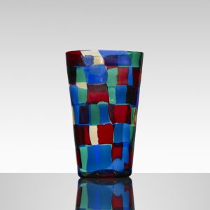
This is particularly true of this week’s Work Of the Week (WOW!), which focuses on the Pezzato series, designed in 1950 and first displayed in the 1951 Triennale.

The Term “Pezzati” means spotted or patched, here, irregular patchworks of colored tesserae (small pieces of glass that form mosaics) are fused together to decorate and form the wall of the irregularly formed vase, in a seeming reference to both the theatricality of the harlequin’s outfit and Paul Klee’s work of the 1920’s and 1930’s.

This was a difficult technique, as each color has different properties, and they all have to be worked so that they get along with each other. To produce these Pezzati, the tesserae were first obtained from a cane flattened into a tape and cold-cut, and then arranged in a mosaic pattern on a fire stone. Once in the oven the effect of the heat welds the tesserae together forming a glass pattern, which then encloses into a cylinder shape to be worked into the final form, by blowing and hot-modeling.

For the Pezzati, Bianconi generally opted for unusual forms with flattened cross-sections, which were particularly irregular and characterized by soft lines, sometimes interrupted by constrictions and protrusions.

The Pezzati were proposed in 5 chromatic combinations, identified by the names of cities or continents: Paris, America, Stockholm, Istanbul and Venice. This Work Of the Week (WOW!) is from the Paris (Parigi) color scheme, composed of red, blue, green and clear tesserae. It is a prime example of Bianoni’s interest in color – bold and strong but calibrated. It also reveals his curiosity and innovative skills as well and his playful creative nature.

Fulvio Bianconi is a name well known to collectors of fine Italian glass. He designed many of the most important and original pieces associated with the mid 20th century Murano Italian glass, and the Pezzato pieces are among his most striking and sought after.

WOW! – Work of the Week – James Rosenquist – 1, 2, 3 Outside


James Rosenquist
1, 2, 3 Outside
1971
6 color lithograph with embossing and debossing
40 1/2 x 31 in.
Edition of 70
Pencil signed, dated, titled and numbered


About the work:

“Popular culture isn’t a freeze-frame; it is images zapping by in rapid-fire succession, which is why collage is such an effective way of representing contemporary life. The blur between images creates a kind of motion in the mind.”

James Rosenquist is best known for his colossal collage paintings of enigmatically juxtaposed fragmentary images. These images, brought together and enlarged overwhelm the viewer,  through their sheer scale which makes them difficult to discern at first glance. They are mostly fragments of enlarged, photo-realistic images done in the advertising style of the emergence of consumer culture in America during the 1960’s. This is no accident, Rosenquist started out his career as a billboard painter, and was among this first of the classic pop-artists to directly address the persuasive powers of advertising, highlighting the omnipresence of ads.

This week’s Work of the Week! WOW! is Rosenquist’s 1, 2, 3 Outside

1, 2, 3 Outside was originally painted in 1963 in a manner that denies each of the three panels immediate recognition due to the scale of each fragmented image, so enlarged that they are each removed from their original context. This is where Rosenquist’s fascination with subliminal persuasion through advertising becomes evident. Each image is artistically packaged based on defining characteristics and incorporates as much visual imagery as possible onto the picture plane. Together, however, they form a bombardment of information without any kind of visual relief.

The imagery is on such a monumental scale that it gives the impression that it is coming straight at the viewer and suggests a strong socio-economic commentary, implying that the work itself is a starting point for deeper reflection. “I wanted the space to be more important than the imagery,” James Rosenquist said. “I wanted to use images as tools.”

Rosenquist used generic imagery, no brand names, and created a new kind of picture. He described the effect: “People can remember their childhood, but events from four or five years ago are in a never-never land. That was the imagery I was concerned with—things that were a little bit familiar but not things you feel nostalgic about. Hot dogs and typewriters—generic things people sort of recognize.” Rosenquist reminds us to observe more intently and become more self-reflective, taking our time with the experience of looking.

As such, 1, 2, 3 Outside exemplifies Rosenquist’s contribution to Pop art: grand scale, fragmented composition that encompass an amalgamation of consumer imagery and evokes visual memory flashes of consciousness.

“WOW! – Work of the Week – Jesus Rafael Soto – Screenprints A, B, C & D from the Jai-Alai Series


Jesus Rafael Soto
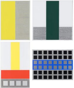
Screenprints A, B, C & D from the Jai-Alai Series
1969
Screenprint on Perspex
24 1/4 x 19 1/2 in. each
Edition of 300
Signed and numbered, etched in perspex


Jésus Rafael Soto was a defining figure of both the Optical Art and Kinetic Sculpture movements. He was an acclaimed artist in his native Venezuela, having graduated from the Escuela de Bellas Artes y Artes Aplicadas in Caracas, and moved to Paris after the Second World War to undertake research in constructivist art. He participated in a groundbreaking exhibit at the Denise René Gallery in Paris called Le Mouvement. René’s guiding principle was that art must invent new paths in order to exist. And Soto’s art does just that.

He explored the phenomenological effects between two-dimensional and three-dimensional planes, fully engaging his viewers from every angle. He was a master at removing all subjectivity linked to personal taste, employing strictly geometric forms, squares, straight lines and primary colors, with a focus on the depiction of relationships between and movement of objects, rather than the objects themselves.

This week’s Work of the Week! WOW! is Soto’s Screenprints A, B, C & D from the Jai-Alai Series

The series takes its title from a sport in which the players and the ball remain in continuous motion, involving the ball to bounce off a walled space by accelerating it to high speeds with a hand-held device called a cesta. This continual movement transforms the relationship between space and time and are characteristics of the series that Soto explored in a conscious way. In naming the series Jai-Alai, the artist is allowing the viewer to understand his artistic research, by identifying the source. Just as in the process of observing the sport firsthand, each and every vantage point is equally as valid as it is important, and Soto has translated these distinct views into the artwork. The game does not occur from a single lens or fixed point of view, and neither does the art. It requires a process of moving through multiple states of time and space.

Working with flat lines of color and abstract geometric form, the artist stimulates optical effect through the manipulation of color theory and the dynamic between background and foreground, turing the viewer into a spectator from many different angles.

As one of the most intriguing artistic minds of his day, Jésus Rafael Soto’s quest for aesthetic representation of the immaterial, rejection of the figurative and use of traditional geometric form resulted in not only a career marked with ingenuity and success, but also of a wholly fresh and interactive experience for the viewer of his kinetic works.