Andy Warhol, Alfred Hitchcock
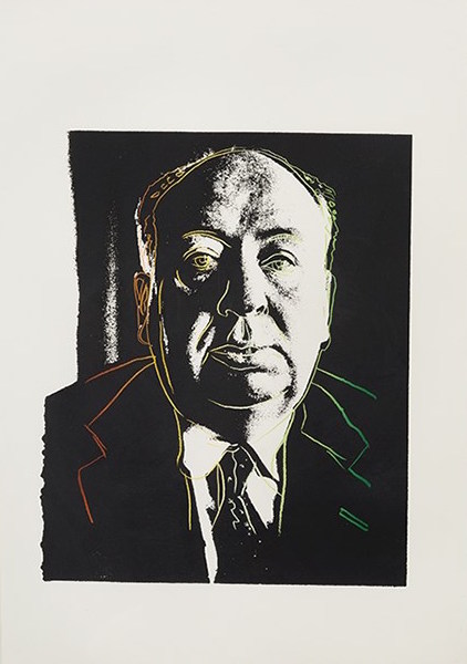
Andy Warhol, Alfred Hitchcock, 1983
Andy Warhol
Alfred Hitchcock
1983
Unique color screenprint
30 1/2 x 20 3/4 in.
Authenticated by The Andy Warhol Foundation and stamped by The Andy Warhol Estate on verso
About This Work:
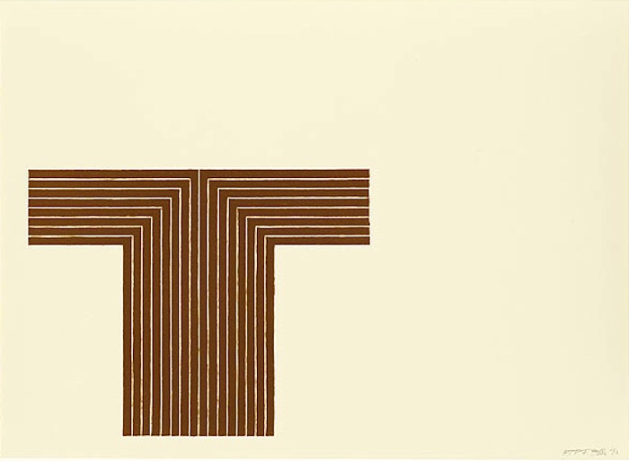
This work is a unique proof, based on a publicity photograph of the famed film director, Alfred Hitchcock. It is part of one of Warhol’s many commissioned projects, all of which reflect his avid interest in advertising and celebrity images. Warhol was asked to create the image for the Vanity Fair, March 1983 article, “The Trouble with Alfred” by Walter Clemons. The article’s basis detailed the contradictory sentiments of the director, which Warhol was able to illustrate by contrasting a black and white image of the director with gradated colored lines outlining his distinct round face and suit and tie. This unique proof however was not the final image selected by Vanity Fair for the magazine spread.
Warhol also made quite a few paintings with Alfred Hitchcock as his portrait subject. Warhol’s portraits of Hitchcock have been described by Christie’s as “a variation on the doubled self-image that Hitchcock played with in his title sequence, layering his own expressive line-drawing over the director’s silhouette, suggesting the mischievous defacement of graffiti as much as the canonization of a hero through the timelessness of the inscribed profile.” There is an apparent duality motif in all of Warhol’s renderings of the director as seen by Hitchcock’s stoic demeanor and monochrome complexion with Warhol’s playful sarcasm in the details of his tie.
At first thought, it would seem Warhol and Hitchcock had little in common. Rather they both directed films, but more over, began as visual artists – Warhol as a commercial illustrator and Hitchcock creating illustrations for title cards in silent movies. Much like Warhol’s artworks, Hitchcock’s films are renowned for their accessibility as well as their complexity. Viewers enjoy both as entertainment, while critics and scholars study both as layered works of cinematic and visual artistry. The concept of duality also pertains to themselves. Warhol and Hitchcock created public personas – Warhol as the vunderkind of the New York art scene and Hitchcock as ‘The Master of Suspense,’ but both were rather private men. Such contradiction comments on their two poles of creative energy as both the artist and the artwork. in this work, Warhol is able to show us through a unique gaze, Hitchcock himself as the masterpiece.
About The Artist:
He was one of the most enigmatic figures in American art. His work became the definitive expression of a culture obsessed with images. He was surrounded by a coterie of beautiful bohemians with names like Viva, Candy Darling, and Ultra Violet. He held endless drug- and sex-filled parties, through which he never stopped working. He single-handedly confounded the distinctions between high and low art. His films are pivotal in the formation of contemporary experimental art and pornography. He spent the final years of his life walking around the posh neighborhoods of New York with a plastic bag full of hundred dollar bills, buying jewelry and knick knacks. His name was Andy Warhol, and he changed the nature of art forever.
Andy Warhol was born Andrew Warhola on August 6, 1928, in Pittsburgh. He received his B.F.A. from the Carnegie Institute of Technology, Pittsburgh, in 1949. That same year, he moved to New York, where he soon became successful as a commercial artist and illustrator. During the 1950s, Warhol’s drawings were published in Glamour and other magazines and displayed in department stores. He became known for his illustrations of I. Miller shoes. In 1952, the Hugo Gallery in New York presented a show of Warhol’s illustrations for Truman Capote’s writings.
During this time, Warhol had also been working on a series of pictures separate from the advertisements and illustrations. It was this work that he considered his serious artistic endeavor. Though the paintings retained much of the style of popular advertising, their motivation was just the opposite. The most famous of the paintings of this time are the thirty-two paintings of Campbell soup cans. With these paintings, and other work that reproduced Coca-Cola bottles, Superman comics, and other immediately recognizable popular images, Warhol was mirroring society’s obsessions. Where the main concern of advertising was to slip into the unconscious and unrecognizably evoke a feeling of desire, Warhol’s work was meant to make the viewer actually stop and look at the images that had become invisible in their familiarity. These ideas were similarly being dealt with by artists such as Jasper Johns, Roy Lichtenstein, and Robert Rauschenberg — and came to be known as Pop Art.
Throughout the late 1950s and 1960s, Warhol produced work at an amazing rate. He embraced a mode of production similar to that taken on by the industries he was mimicking, and referred to his studio as “The Factory.” The Factory was not only a production center for Warhol’s paintings, silk-screens, and sculptures, but also a central point for the fast-paced high life of New York in the ’60s. Warhol’s obsession with fame, youth, and personality drew the most wild and interesting people to The Factory throughout the years. Among the regulars were Mick Jagger, Martha Graham, Lou Reed, and Truman Capote. For many, Warhol was a work of art in himself, reflecting back the basic desires of an consumerist American culture. He saw fame as the pinnacle of modern consumerism and reveled in it the way artists a hundred years before reveled in the western landscape. His oft-repeated statement that “every person will be world-famous for fifteen minutes” was an incredible insight into the growing commodification of everyday life.
By the mid-’60s, Warhol had become one of the most famous artists, in the world. He continued, however, to baffle the critics with his aggressively groundbreaking work. His paintings were primarily concerned with getting the viewer to look at something for longer than they otherwise would.
Throughout the ’70s and ’80s, Warhol produced hundreds of portraits, mostly in silk screen. His images of Liza Minnelli, Jimmy Carter, Albert Einstein, Elizabeth Taylor, and Philip Johnson express a more subtle and expressionistic side of his work.
Following routine gall bladder surgery, Andy Warhol died February 22, 1987. After his burial in Pittsburgh, his friends and associates organized a memorial mass at St. Patrick’s Cathedral in New York that was attended by more than 2,000 people.
For more information and price please contact the gallery at info@gsfineart.com


