Congratulations to Ahol Sniffs Glue!
Vimeo says: “Biscayne World is among the world’s best videos”
Click here or on the picture to read the full article
Click here or on the picture to read the full article

Click here or on the picture to read the full article
For inquiries on Ahol Sniffs Glue artworks, contact the gallery at info@gsfineart.com
 |
||
|
ROBERT INDIANA About This Work: With his calculated use of specific words and numbers – the elements on which most of his work is based on, Robert Indiana’s art is often very complex, introspective, intellectual and cerebral. Indiana captures the complexity of life in the enigmatic intricacies of his compositions. He is a Pop artist but, from this particular point of view, he can also be considered fully conceptual for his hermetic style, which represents a little more than a way stop from the “lack of message and superficiality” of the Pop Art movement. Although the complexity of the meaning and the aesthetic of his work is simple and timeless, mathematics or geometry are the most important elements of inspiration both for his work and his life. Indiana’s art seems to state that his reasons and themes can not be contested, since he bases his work on such logical and unbiased elements. When talking about the aspect of the works, we can not ignore the role that colors play in his compositions. They vibrate to attract each other into a reconciliation of opposite forces. Indiana likes to create endless variations of his works and early themes, experimenting with different color schemes and compositional formats to achieve a wide range of visual and emotional effects. Bright colors, often basic and primary, and the use of words, make his artworks almost monotonous to the eye, but there is plenty of significance underneath. The beauty of Indiana’s is the beauty of taking one’s time to quietly look at something that is not new, but just part of someone’s daily life. It is the beauty of balance and harmony, contemplation and knowledge, the beauty of pure reflections translated in conceptual images. Robert Indiana’s Love Cross embodies all these concepts and features. His choice of the word “Love” recalls his memories of the motto “God is Love“, that he saw emblazoned on the Christian Science church of his youth. Containing both a universal meaning and a visually concise quality, “LOVE” provides him with the perfect synthesis of word and image. The Love Cross was made as an announcement for Indiana’s first one-man museum show at the Institute of Contemporary Art in Philadelphia, the City of Brotherly Love. The theme of Love has achieved recognition as universally familiar as the star and the cross (other two recurring elements in Indiana’s work), eventually becoming the most famous artwork by Indiana who, for this reason, has even been called “the man who invented Love“. This work reflects the artist’s involvement with the formal concerns of the Sixties abstraction, like the use of large areas of pure color, visual power of optical effects, serialization and consciousness of the edge. Indiana’s long-standing involvement with sculptural forms is clear in this cross-shaped work. A cross that is also, not by chance, symmetrical. Furthermore, since the square was his favorite symbol and a square is like a cross with extended borders, it is not difficult to imagine that this shape has been choose for a specific stylistic reason. This non-figurative composition is formed by the symbol/word LOVE, reflected in all the directions. The razor-sharp, hard-edge rigid lines help the viewer to focus not only on the red words, but also on the blue spaces between the letters, which create a visual pattern themselves. Indiana captures the complexity of life itself with simple lines, letters or numbers and flat colors. He helps us to decode life by emphasizing the most important things in it – like love. |
 |
||
|
JEAN-MICHEL BASQUIAT Hollywood Africans In Front Of The Chinese Theater With Footprints Of Movie Stars1983/201523 color screenprint38 1/2 x 84 in.Artist’s Proof (A.P.) of 15Certified authentic, signed, dated and numbered on verso by Lisane Basquiat and Jeanine Heriveaux of the Jean-Michel Basquiat Estate
About This Work: In less than a decade the painter Jean-Michel Basquiat went from being a teenage graffiti writer to an international art star; he was dead of a drug overdose at age twenty-seven. A legend in his own lifetime. Basquiat’s meteoric success and overnight burnout were an instant art-world myth; his brief career spanned the giddy ’80s art boom and epitomized its outrageous excess, from its art dealers to its drug dealers, from its clubs to its galleries, from Madonna to Warhol. Basquiat was very fearful of the unfavorable racial reality in America, and saw himself as in no small amount of danger. These feelings often presented themselves in Basquiat’s work, which was typically socially and politically charged. His paintings were highly symbolic in nature and often focused on what he saw as intrinsic dichotomies, such as the wealthy versus the impoverished or integration versus segregation. The subject of this impressive artwork is related to the widely known 1983 artwork Hollywood Africans, currently owned by the Whitney Museum of American Art. It depicts Basquiat with friends, the artists Toxic and Rammellzee. Toxic is the figure on the left, Rammellzee is the central face (as it can be seen by the green letters RMLZ on top of the head) and Basquiat is the right figure, as it can also be deduced from the typical shape of Basquiat’s hair. Hollywood Africans represents a commentary on the stereotyping and marginalizing of African Americans in the entertainment industry. This theme led these three artists to coin the term and refer to themselves as the “Hollywood Africans”. Furthermore, this is a very current theme, it has even been the controversy of last night’s Oscars ceremonies, where several black actors and actresses have emphasized the necessity of equal rights and wages in the movie industry. In this work, Basquiat challenges the art world by merging academic and “primitive” through his neo-expressionist style, which is recognizable by some stylistic choices: for example, when he chooses to represent his teeth not by drawing them but by writing the word TEETH, which is graphically very similar to what can be a a set of teeth. We can also notice his typical calligraphy, tough gesture and shrill colors. This is a very important work. It is a very large, moving, biographical, historical account based on the artist’s life and the recurrent issues that surrounded him during his time, and which continue to linger on in today’s time.  Jean-Michel Basquiat, Hollywood Africans, 1983, acrylic and oil stick on canvas, 84 1/16 x 84 in.  NBA all star of the Miami Heat and renown art collector Amare Stoudemire with Basquiat’s Hollywood Africans In Front Of The Chinese Theater With Footprints Of Movie Stars in his new Miami home.
|
 |
||
|
TOM WESSELMANN About This Work: Considered by many to be a Pop artist, Tom Wesselmann would rather be called an artist of the post-Matisse era. His works recall Matisse, in a contemporary setting. It’s not hard to understand why categorizing Wesselmann is difficult. The use of erotic images against familiar backgrounds in his work, clean lines and the feel of kitsch exemplifies Pop art, but Wesselmann really never felt like his artwork was part of this artistic movement. Many people know Wesselmann for his nudes. He spent his whole life trying to paint and capture the Great American Nude. However, according to him, he was never able to achieve his goal. He started the Great American Nude series in 1961, where the nude becomes a depersonalized sex symbol set in a commonplace environment. As we can see by Blonde Vivienne, he emphasizes the woman’s hair, mouth neck collar and nipples of her breast, while the rest of the body is usually depicted in flat, unmodulated color or – this is the case – as an empty or negative space. The background is painted in the positive, supplies context and accentuates the negative. There are many different nudes by this artist but they all have one thing in common: when Wesselmann depicts a nude he is not clearly and loudly representing a subject, but he is alluding to and “sketching” a situation, a little gesture or a moment in time. The artist wants us to read into the situation and draw a conclusion for ourselves. Is the Blonde Vivienne sleeping? Is she feeling some kind of pleasure or is she just resting on the couch? The observer is free to choose a personal interpretation of the subject. This also may be the reason why he was so interested in the spaces in and around his drawings. He shifts the focus and scale of the standing objects around a nude; these objects are relatively small in relation to the nude, but sometimes they become major, even dominant elements. To add more mystery, every work is also painted at a particular and/or an unusual angle or point of view. By focusing on the situation, the angle and the details of the background, the viewer is able to imagine what the subject is going through or feeling. For example, in this particular work the viewer is looking at the Blonde Vivienne through a peephole, giving us a sort of voyeuristic point of view. Thus, Blonde Vivienne is a perfect example of showcasing the complexities of a Wesselmann painting. Pop elements occupying space in the positive giving focus to a Matisse like, modern day Odalisque in the negative, captured at a particular view or moment in time, causing the viewer to put it all into one context that he or she can envision for themselves. For more information and price please contact the gallery at info@gsfineart.com |
 |
||
|
CLAES OLDENBURG About This Work: Claes Oldenburg is an American sculptor, best known for his public art installations typically featuring very large replicas of everyday objects. This beautiful drawing represents a typewriter eraser, a recurring object in Oldenburg’s work. Why a typewriter eraser? Many of Oldenburg’s works depict mundane objects and, at first, they were ridiculed before being accepted by the art world – but they were also defined “brilliant”, due to the reaction that the pop artist brought to a “dull” abstract expressionist period. Oldenburg creates a distinctive order of objects. First, they are things made and utilized by human beings. Used, out-of-date or simply banal, they look rescued from oblivion by the artist. Isolated in a landscape or interior space and inflated in size, they are vulnerable giants. But they are not actual objects elevated to the status of art in the Duchampian tradition of the readymade. While recreating objects, Oldenburg alters their specifics, transforming them through changes in material, scale, context and exaggerations of forms that lend them more than one identity. A typewriter becomes also a tornado. When turned up right we see the eraser rolling towards us with the whiskers rustling in the air resembling a tornado. In this particular drawing of the typewriter eraser we see the subject in motion sweeping down the street like a tornado. Drawings like this are rare “little gems”, hard to find and representative of the soul of Oldenburg’s objects. Oldenburg’s drawings are continuous files of ideas from which major themes have developed. Drawings that he devotes to sculptural projects, imagined or real, appear as “proposals”. These drawings have an anecdotal character in cases where the sculpture is placed in new contexts. They chronicle the further adventures of a subject and track the creative and artistic process of this great artist. This drawing can be considered a generative tool for the large scale Typewriter Eraser, Scale X, constructed in 1999 and now located at the National Gallery Of Art Sculpture Garden, in Washington D.C. |
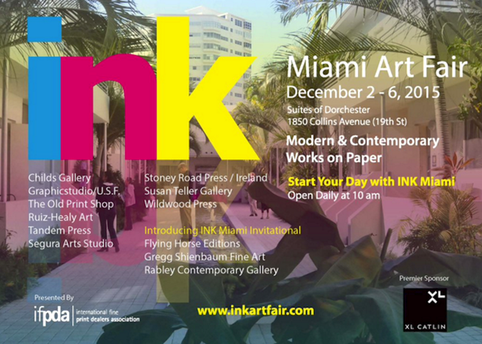
| Gregg Shienbaum Fine Art is proud to announce its participation at Ink Miami Art Fair 2015 | |||
| The show will be open December 2 to 6 | |||
| Come visit us at Booth 160 |
Click here for Miami Ink Art Fair press release


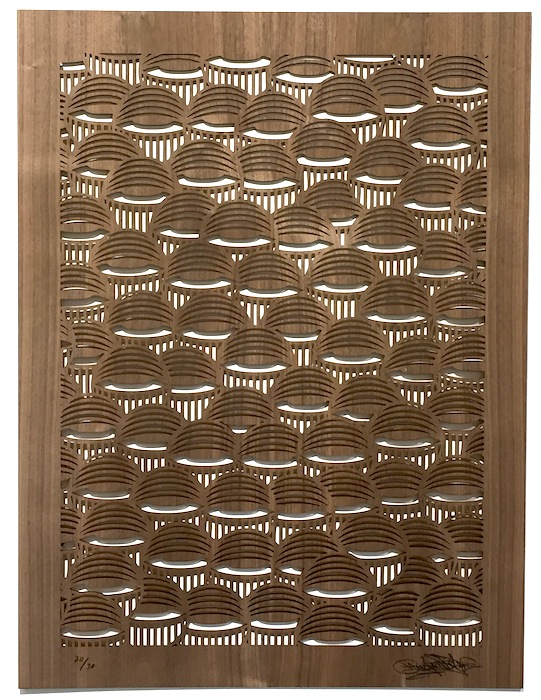
Gregg Shienbaum Fine Art is pleased to present its first edition with Miami Artist Ahol Sniffs Glue.
Limited to only 30 pieces and is laser cut on walnut wood.
The Eye Pattern is cut out all the way through. So what ever the background color of the wall you choose to hang it on is the color the eyes will be. It can also be framed as well.
We did not want to do a regular print on paper, we wanted to do something more unique and more substantial.
The details of this new edition are below as well as photos of the work and of Ahol signing the piece.
* please note that the grain of the wood varies from piece to piece.

 Keith Haring
Untitled (Free South Africa #2)
1985
Lithograph
32 x 40 in.
Edition of 60
Signed, dated and numbered in pencil
__
ABOUT THIS WORK:
Though many associate the artist Keith Haring with his seemingly innocuous images of barking dogs, crawling babies, beating hearts and flying saucers, his work often tackled social justice issues – from nuclear proliferation, to AIDS, to the environment to racial and income inequality. He was very political and engaged in many of the relevant questions and issues of his time and talked about heavy themes such as racism and apartheid, which Haring tirelessly rallied against— notably printing and distributing 20,000 “Free South Africa” posters in Central Park in 1985.
This work, titled Free South Africa #2, is part of a trilogy which shows us the relationship between black and white people (actually black majority and white minority) in South Africa, during years of repression and inequality, when racial segregation was the rule: it was called “apartheid” (literally “separation”). The black figure in this picture is bigger than the white one, symbolizing the great disparity between the black majority and a few white people that had the power to rule the country during those years. To convey the inequality of the white minority’s powerful grasp on the black majority, the white figure has tied a rope around the black man’s neck. To show hope and signs of defeat, Haring depicts the gigantic black figure, crushing or stomping out this inequality, marked by a red X.
The figures are placed within the rectangle with Haring’s typical balance and sense of the space, the relationship between the busy and the empty space in the image is tempered, despite of the too different sizes of the figures. The lines stemming from the figures inform us of the movement and the rage of the black man and the worry and inevitable destiny of the white figure, who is about to be crushed.
Using the words of Julia Gruen, a friend of Haring’s and executive director of the Keith Haring Foundation, “…we can feel that image really in the simplest possible way spoke to a kind of political activism. . . It’s really about fighting against oppression. It’s about bucking the system. It’s about questioning authority”.
Haring’s genius was his ability to communicate very directly, very immediately through his chosen symbols and iconography, he could reduce a work to the fewest forms possible to make his point, and racism was an issue that was of paramount concern to Haring. Activism was at the heart of his artistic practice. This is something that is often forgotten or overlooked because the typical whimsical images that have saturated pop culture, and are the ones that are easiest for the masses to consume. However, the joyfulness and a wonderful lightheartedness in his work, is a message of his vision and strong hope of a better world to come.
ABOUT THE ARTIST:
Keith Haring found a thriving alternative art community that was developing outside the gallery and museum system, in the downtown streets, the subways and spaces in clubs and former dance halls. Here he became friends with fellow artists Kenny Scharf and Jean-Michel Basquiat, as well as the musicians, performance artists and graffiti writers that comprised the burgeoning art community. Haring was swept up in the energy and spirit of this scene and began to organize and participate in exhibitions and performances at Club 57 and other alternative venues.
Haring was able to push his own youthful impulses toward a singular kind of graphic expression based on the primacy of the line.
In 1980, Haring found a highly effective medium that allowed him to communicate with the wider audience he desired, when he noticed the unused advertising panels covered with matte black paper in a subway station. He began to create drawings in white chalk upon these blank paper panels throughout the subway system. Between 1980 and 1985, Haring produced hundreds of these public drawings in rapid rhythmic lines, sometimes creating as many as forty “subway drawings” in one day. This seamless flow of images became familiar to New York commuters, who often would stop to engage the artist when they encountered him at work. The subway became, as Haring said, a “laboratory” for working out his ideas and experimenting with his simple lines.
Between 1980 and 1986, Haring achieved international recognition and participated in numerous group and solo exhibitions. His first solo exhibition in New York, held at the Tony Shafrazi Gallery in 1982, was immensely popular and received critical acclaim. During this period, he participated in highly renowned international survey exhibitions such as Documenta 7 in Kassel Germany, the São Paulo Biennial and the Whitney Biennial. Haring completed numerous public projects in the first half of the 80’s.
Throughout his career, Haring devoted much of his time to public works, which often carried social messages. He produced more than 50 public artworks between 1982 and 1989, in dozens of cities around the world, many of which were created for charities, hospitals, children’s day care centers and orphanages
Haring was diagnosed with AIDS in 1988. Haring enlisted his imagery during the last years of his life to speak about his own illness and generate activism and awareness about AIDS.
During a brief but intense career that spanned the 1980s, Haring’s work was featured in over 100 solo and group exhibitions. By expressing universal concepts of birth, death, love, sex and war, using a primacy of line and directness of message, Haring was able to attract a wide audience and assure the accessibility and staying power of his imagery, which has become a universally recognized visual language of the 20th century.
Keith Haring died of AIDS related complications at the age of 31 on February 16, 1990.
Since his death, he has been the subject of several international retrospectives. The work of Keith Haring can be seen today in the exhibitions and collections of major museums around the world.
Ellsworth Kelly – Blue Green Black Red

Ellsworth Kelly
Blue Green Black Red
1971
Offset lithograph
29 3/4 x 27 1/4 in.
Edition of 100
Pencil signed & numbered
About This Work:
For more than fifty years, Ellsworth Kelly has worked to refine elements of the observed world into rigorous abstraction with a bold clarity and elegance. “My work has always been about vision, the process of seeing,” he notes. “Each work of art is a fragment of a larger context… . I’ve always been interested in things that I see that don’t make sense out of context, that lead you into something else.”
Maintaining a persistent focus on the dynamic relationships between shape, form and color, Kelly challenges viewers’ conceptions of space. He intends for viewers to experience his artwork with instinctive, physical responses to the work’s structure, color, and surrounding space, rather than with contextual or interpretive analysis.
His flat, immaculate compositions of pure line, simple forms, and saturated, unmodulated color are, in essence, found images, distillations of architectural details, shadows, plants, and other subtle forms that often might be overlooked. The contour of a leaf, the arch of a bridge and its reflection in water, and the soft curve of a hillside seen from the road have inspired paintings, sculptures, and prints alike. His art work represent a subjective interpretation of reality, rather than a descriptive copy of it.
Kelly’s arrangement of the complementary colors, which work to intensify one another at their intersections, is also an essential component of the work. In the 1971 lithograph Blue, Green, Black, and Red rectangles are laid, one on top of the other, in arrangements that suggest fragments of a remembered landscape. Perhaps it is several stories of a building, or perhaps a billboard looked, from a certain angle, or the way a shadow once fell.
Ordinary memories such as these, Kelly has said, prompt many of his works. ”As we move, looking at hundreds of different things, we see many different kinds of shapes. Roofs, walls, ceilings are all rectangles, but we don’t see them that way. In reality they’re very elusive forms. The way the view through the rungs of a chair changes when you move even the slightest bit – I want to capture some of that mystery in my work.”
About The Artist:
“I have worked to free shape from its ground, and then to work the shape so that it has a definite relationship to the space around it; so that it has a clarity and a measure within itself of its parts (angles, curves, edges and mass); and so that, with color and tonality, the shape finds its own space and always demands its freedom and separateness.” – Ellswoth Kelly
Ellsworth Kelly is an American painter, sculptor, and printmaker associated with Hard-edge painting, Color Field painting and the Minimalist school. His works demonstrate unassuming techniques emphasizing the simplicity of form.
Although Kelly can now be considered an essential innovator and contributor to the American abstraction art movement, he was not always seen in such a positive light. It was hard for many to find the connection between Kelly’s art and the dominant stylistic trends For Example, observing how light fragmented on the surface of water, he painted Seine (1950), made of black and white rectangles arranged by chance.
He created a new freedom of painterly expression. He began working in extremely large formats and explored the concepts of seriality and monochrome paintings. As a painter he worked in an exclusively abstract mode. By the late 1950s his painting stressed shape and planar masses (often assuming non-rectilinear formats). His work of this period also provided a useful bridge from the vanguard American geometric abstraction of the 1930s and early 1940s to the Minimalism and reductive art of the mid-1960s and 1970s.
Kelly has distilled his palette and introduced forms never before. He starts with a rectangular canvas that he carefully paints with many coats of white paint; a shaped canvas, usually painted in a single bright color, is placed on top. The quality of line seen in his paintings and in the form of his shaped canvases is very subtle. The use of form and shadow, as well as the construction and deconstruction of the visible implies perfection.
For more information and price please contact the gallery at info@gsfineart.com

