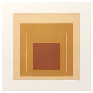
WOW! – Work of the Week – ALBERS, White Line Squares (Series II) XVI


Josef Albers
White Line Squares (Series II) XVI
1966
Lithograph
20 3/4 x 20 3/4 in.
27/125
Initialed in pencil, dated, numbered and titled

About the work:

“The perception of color is deceiving, we may perceive two different colors to look alike, or two equal colors to look different. This game of colors – the change of identity – is the object of my study.”
Josef Albers

Accomplished as a designer, photographer, typographer, and printmaker, Josef Albers is best known for his work as an abstract painter and color theorist. His approach to composition was very disciplined. He spent 26 years creating and mastering thousands of paintings and prints that make up his series “Homage to the Square.” Through this series, Albers explored chromatic interaction with nested squares. 

His works were always created using the same process: he painted mostly on Masonite, using a palette knife to prime the surface with layers of white gesso, then applying each oil color minimally for maximum effect. He would paint one coat of pure color directly to the canvas from the tube, unmixed, starting from the centre and working his way outwards, just as his father, a house painter, carpenter, plumber and general technician, had taught him – a technique that ‘catches the drips of paint and keeps cuffs clean’ he used to say.

He was known to meticulously list the specific manufacturer’s colors and varnishes he used on the back of each work, as if the colors were catalogued components of an optical experiment. Each painting in the series was composed of either three or four squares of solid planes of color nested within one another, in one of four different arrangements and in square formats. 

Despite their name, the Homages  seem to be less about squares within squares than about the infinite possibilities of the chromatic spectrum. Every last one is an exercise in visual juxtaposition, an exploration of the effect that colors have on the eye and on each other. The size and proportion and the number of the squares vary, but they are always offset towards the bottom of the frame  The arrangement of these squares is carefully calculated so that the color of each square optically alters the sizes, hues, and spatial relationships of the others, and this tricks the eye into a figurative response: they look like luminous corridors receding to a vanishing point.

Our Work Of the Week! WOWWhite Line Squares (series II) XVI is from the “Homage to the Square” series. Its color composition is comprised of three surrounding squares in colors cream, warm ochre light, and brown with a white line square in the middle square of ochre.  The ochre on either side of the thin white line is actually the same hue, however, the placement of the white line creates a shift in color on both sides so that the single color appears as two different colors. 

Albers wrote: “A white line within a color instead of as a contour may present a newly discovered effect: when the line is placed within a so-called “middle” color, even when the color is very evenly applied, it will make the one color look like two different shades or tints  of that color.”

An Interesting Note:  Transferring this idea to lithographs was a complicated process, because the white line was created by the unprinted paper. The square containing the white line could not therefore be printed over an underlying color area. Accordingly, the well known printmaker Kenneth Tyler devised a way to print on plates that accurately abutted one another with no overlap.

Having studied and later taught at the famed Bauhaus in Weimar, Germany prior to fleeing to the US, Albers’ work represents a transition between traditional European art and the new American art. It incorporates European influences from the Constructivists and the Bauhaus. His influence fell heavily on American artists of the late 1950s and the 1960s. Hard-Edge abstract painters drew on Albers’ use of  patterns and intense colors, while Op artists and conceptual artists further explored his interest in  perception. 

WOW! – Work of the Week – GOTTLIEB, White Ground Red Disk


Adolph Gottlieb
White Ground Red Disk
1966
Lithograph
29 1/2 x 21 1/2 in.
Edition of 50
Pencil signed, dated and numbered

About the work:

“To my mind certain so-called abstraction is not abstraction at all…on the contrary it is realism of our time.”
Adolph Gottlieb

Growing up during the Depression and maturing throughout the interwar period and rise of Hitler, the American painter and printmaker Adolph Gottlieb was committed to expressing authentic feeling in the face of the traumas of the world. Gottlieb established himself as a pioneer in the movement of Abstract Expressionism and worked actively against the dominating trends of regionalism and realism of the 30’s. He was close with many important artists of the time, Marc Rothko and Barnett Newman for example and together they sought to make American art more experimental 

Gottlieb’s work can be described as a reaction to the times in which he lived, and he is well known for three distinct periods or series. The first, which emerged during the second World War is the “Pictograph” series (1941-1951) comprised of loose grids with schematic forms. This was followed by the “Imaginary Landscape” period (1951-1957), which consisted of semi-abstract landscapes. And finally, his “Burst” period, which is his most famous and which he spent almost two decades exploring (1957-1974) revolved around variations of simplified representations of two shapes – a disc hovering above an explosion of calligraphic strokes. 

This week’s Work Of the Week! White Ground Red Disk is a prime example of his work from the Burst series. 

In the vertical “Bursts,” the series relies heavily on the juxtaposition of forms characterized by an underlining dualism. Gottlieb has brought together, in a single canvas the two poles of Abstract Expressionist painting—the Color Field and Action Painting (or Gestural Abstraction) schools—in a tense balance. 

Color Field painting emerged in the late 50’s, and is known for the use of simple geometric patterns and references landscape imagery and nature. The style is characterized primarily by fields of flat, solid color, creating areas of unbroken surface and a one-dimensional picture plane. The Color Field movement places less emphasis on  gesture , brushstrokes and action in favor of an overall consistency of form and process. In Color Field painting “color is freed from objective context and becomes the subject in itself.”

Action painting, on the other hand, is a style of painting in which paint is spontaneously dribbled, splashed or smeared onto the canvas, rather than being carefully applied. It emphasizes the physical act of painting itself as an essential aspect of the finished work or concern of its artist. The images do not portray objects or even specific emotions. Instead, they aim to touch the observer deep in the subconscious mind, tapping the collective sense of an archetypal visual language. This was done by the artist painting “unconsciously,” and spontaneously, creating a powerful arena of raw emotion and action, in the moment.

The dichotomy between the two forms in the work, the disk and the expressive strokes, led the way and formed the bridge for the geometric abstractionists and minimalists such as Frank Stella and Josef Albers. 

WOW! – Work of the Week – WESSELMANN, Still Life with Liz


Tom Wesselmann
Still Life with Liz
1993
Screenprint
59 1/2 x 57 in.
Edition of 90
Pencil signed and numbered

Tom Wesselmann never considered himself a Pop artist. He would point out that he made aesthetic use of everyday objects, rather than critique them as consumer objects. He once said: “I dislike labels in general and ‘Pop’ in particular, especially because it overemphasizes the material used. There does seem to be a tendency to use similar materials and images, but the different ways they are used denies any kind of group intention.”

The artist, however, was clearly in dialogue with his Pop predecessors and contemporaries, among them Lichtenstein and Warhol, with whom he shared an interest in the commodification of the female form and still life.

In addition to being widely known for his paintings of “The Great American Nude”, Tom Wesselmann was a master of the still life. The creation of settings in his works, as opposed to the representation of a lone object is primarily what sets him apart from the other pop artists, and the pop movement. He was a modern-day Matisse who made use of Pop imagery.

In this week’s Work Of the Week! (WOW), Still Life with Liz, Tom Wesselman is taking Andy Warhol’s Liz Taylor and placing it in his painting as nothing more than an object in a room,   He is creating a familiar and recognizable setting, in which you can imagine yourself walking into a home, and seeing a console with a vase positioned next to a painting.

By using Warhol’s Liz Taylor, Wesselmann is not only affirming Andy Warhol’s place in art history as a pop artist, but also using Warhol’s iconic pop art image as an everyday object, solidifying Andy Warhol’s artwork as a work of art.  In other words (in a reversed or opposite sort of way), Tom Wesselmann is applying the very same concept to his art work that Andy Warhol did.

Warhol took everyday objects and turned them into art.  We call his style of art “pop art’.  Tom Wesselmann took Warhol’s image of Liz Taylor and turned it into an everyday object by placing this image in his artwork.  The image of Liz in this still life is no different than a 7up bottle or a package of Wonder Bread in other still life works by Wesselmann.

Andy Warhol made Liz Taylor accessible by allowing us to hang her on our wall.  He is credited with democratizing art.  Tom Wesselmann affirms this concept showing us just that.  He has taken a pop art painting and turned it into a painting of pop art.

WOW! – Work of the Week – HINMAN, Triangles


Charles Hinman
Lavender Triangle
2012
Screenprint
38 x 38 in.
Edition of 15
Pencil signed, dated and numbered

Charles Hinman
Orange Triangle
2012
Screenprint
38 x 38 in.
Edition of 15
Pencil signed, dated and numbered

“My concept of my work is dynamic, never static. I think of my paintings as occupying a 6-dimensional space – the three dimensions of space and one each of time, light and color.”  Charles Hinman

Charles Hinman played a significant role in redefining the physical shape of paintings. His desire to break away from the traditional square or rectangular frame of painting lead him to the shaped canvas. In the 60’s several abstract minimalist artists were experimenting with new canvas shapes, but none drove the concept further than Hinman. His canvases were a form of hybrid between painting, sculpture and wall relief.

Until the early 1970s, Hinman examined the possibilities offered by this new medium: strongly protruding canvases, geometric and sensual profiles, color contrasts, color reflections on the adjacent wall, shadows, monochrome canvases.

Since working on primarily flat surfaces was not Charles Hinman’s primary medium, his exploration of print-making started only when he met master-printer Gary Lichtenstein. these two worked on numerous projects together. in 2012, they collaborated on a set of screenprints entitled Triangles, which is this week’s Work Of the Week – WOW.

Prints are 2 dimensional works, however, through his mastery of color, angles and shapes, Hinman is able to give Lavender Triangle and Orange Triangle the strong illusion of a 3rd dimension. On the flat surface of the paper, he applied bright colors, which cause an area to move forward, in contrast with darker colors that recede, which tricks the eye into believing the silkscreen has actual depth. The choice of adjacent colors causes a sensation of motion of the surfaces. The defining particularity of Hinman’s Triangle silkscreens are his focus on the illusion of space and suggested volume. As with his paintings, Hinman is able to apply 6 dimensional features to his prints as well.

WOW! – Work of the Week – WARHOL, Mick Jagger


                                             Mick Jagger FS II. 139  

                                               Mick Jagger FS II. 141


Andy Warhol
Mick Jagger FS II. 139
1975
Screenprint
43 1/2 x 29 in.
Edition of 250
Pencil signed and numbered, also signed by Mick Jagger

Andy Warhol
Mick Jagger FS II. 141
1975
Screenprint
43 1/2 x 29 in.
Edition of 250
Pencil signed and numbered, also signed by Mick Jagger

About the works:

“The thing that he seemed to be able to do was to capture society, whatever part of it he wanted to portray, pretty accurately. That’s one of the things artists do, is show people later on what it was like. If you want to be reminded of a certain period, you can look at what Andy was doing then. He was very much in tune with what was going on. Of course, he was criticized for that, for being sort of trendy. But I think some people’s great forte is being so in touch.”

Mick Jagger at the time of Andy Warhol’s passing

One was the world’s greatest pop artist, the other was the signer and face of one of the most successful bands in history. Andy Warhol and Mick Jagger met at a party in 1964, when the Rolling Stones were on their first US tour. At this time, both idols were rising to fame and establishing their images. The Rolling Stones were viewed as the dirty alternative to the clean-cut Beatles and art collectors may have viewed Andy Warhol in a similar way compared to other artists of the time, such as Wayne Thiebaud, Japer Johns and Roy Lichtenstein. 

The first collaboration between the two artists was for the iconic “Sticky Fingers” album cover in 1971. Today, it is regarded as one of modern music’s more striking pieces of graphic art. The album, which went to number one immediately in both the US and the UK, resulted in a long-lasting business and personal relationship between the two icons who had a great understanding of both art and commerce. 

sticky-fingers-460x460
                                 Sticky Fingers – album cover

Portraits became big business for Andy Warhol around the time of the album release. He was a modern-day portrait painter who could capture all the high society and celebrity personalities of the time, and Jagger, who embodied the sex, drugs and rock and roll world was the perfect subject. At the request of Seabird Editions Company in London, who offered to publish the screen prints, Andy Warhol created a series of 10 portraits of Mick Jagger.

In the summer of 1975, while Mick and his wife, Bianca where staying at Andy’s house in Montauk, Andy and Mick started work on the project. Andy took the photographs of Mick himself. All 10 of the final artworks were head and bare-chested torso shots of Jagger. Andy was interested in capturing the different emotions and personas of Mick; happy, thoughtful, seductive, tough, arrogant, etc. 

Once back in the studio, Andy created the screen prints from the photographs and added hand drawn stylized lines and color patches to enhance the mood of each piece. Both Andy Warhol and Mick Jagger signed the final prints as a savvy marketing move. Jagger’s audience was much larger than Warhol’s collector base, so having Mick’s signature would help increase exposure of his work. For Mick, the portraits would help enhance his image.

Today, the portraits are as iconic as the two men themselves, immortalizing a moment in time. 

WOW – Work of the Week – RAUSCHENBERG, Ape, from Stoned Moon


Robert Rauschenberg
Ape, from Stoned Moon
1970
Lithograph
46 x 38 in.
Edition of 46
Pencil signed, dated and numbered

About the work:

“The bird’s nest bloomed with fire and clouds. Softly largely slowly silently Apollo 11 started to move up. Then it rose being lifted on light. In its own joy wanting the earth to know it was going. Saturated, super-saturated, and solidified air with a sound that became your body. For that while, everything was the same material. Power over power, joy, pain, ecstasy, there was no inside, no out. Then bodily transcending a state of energy. Apollo 11 was airborne, lifting pulling everyone’s spirits with it.”
Rauschenberg’s account of the launch of the Apollo 11 mission

Acclaimed as the first postmodern artist and a forerunner of the Pop Art movement, Robert Rauschenberg, invited by NASA, traveled to Cape Canaveral in July 1969 to document the launch of the historic Apollo 11 mission, the first manned spaceflight to the moon’s surface. While in Cape Cape Canaveral Rauschenberg enjoyed unrestricted access at NASA’s Florida facilities. He roamed the buildings and adjacent landscape, met with astronauts and other personnel, and was granted full access to official NASA photographs and technical documents.

This trip profoundly impacted the artist, who came away from the experience energized and with a renewed sense of optimism after having been deeply disillusioned for several years by the course of the Vietnam War and the growing social unrest in the United States.

After the launch, Rauschenberg began work on the Stoned Moon series (1969–70).

Conceptually named from the idea of the alignment of a moon rock (or lunar stone), and a lithographic stone, the Stoned Moon was a series of 34 lithographs that juxtapose hand-drawn passages with imagery that pairs the lush Florida landscape with the and the region’s tourist highlights against the crisp industrial aesthetic of the space race: scenes of astronauts and complex machinery

The surfeit of indigenous birds populating the Stoned Moon lithographs speaks to the blurring of the natural and the manmade. These familiar symbols rein in the otherworldliness of Cape Canaveral, where gigantic sophisticated machines intrude upon a vast, sparse landscape. Now that humans’ capacity for flight definitively exceeded that of any natural flyer, was nature rendered obsolete?

The Stoned Moon lithographs reflect upon the binaries of think/feel, natural/manmade, bodily/immaterial, earthly/heavenly. Rauschenberg is able to situate popular countercultural tendencies alongside the nationalistic aims of NASA’s project without overtly addressing either.

The thirty-four Stoned Moon lithographs provides a singular account of the space program and humankind’s first lunar landing. Rauschenberg’s impressions contain a mixture of trepidation and wonder that conveys the technological and astronomical sublime. The immensity (quantified in just about any way: by ambition, financial commitment, the literal size of the rocket or distance to the moon) of the mission exceeded the capacity of photography’s limited scale.

Apollo 11 Mission

Apollo 11 was the spaceflight that landed the first humans on the Moon on July 20, 1969: Neil Armstrong and Buzz Aldrin. Armstrong was the first to step onto the lunar surface six hours later on July 21, and he uttered the now-famous words, “one small step for man, one giant leap for mankind.” Armstrong spent about two and a half hours outside the spacecraft, Aldrin slightly less. The third member of the mission, Michael Collins, piloted the command spacecraft alone in lunar orbit until Armstrong and Aldrin returned to the spaceship for the trip back to Earth. Launched by a Saturn V rocket from Kennedy Space Center in Merritt Island, Florida on July 16, Apollo 11 was the fifth manned mission of NASA’s Apollo program. Apollo 11 effectively ended the Space Race and fulfilled a national goal proposed in 1961 by the U.S. President John F. Kennedy in a speech before the U.S. Congress: “before this decade is out, of landing a man on the moon and returning him safely to the Earth.”

WOW – Work of the Week – BASQUIAT, Rinso


Jean-Michel Basquiat
Rinso
1983
Screenprint on wove paper
40 x 40 in.
Edition of 85
Pencil signed by Gerard Basquiat and stamped by the Jean-Michel Basquiat estate on verso, numbered in pencil on front

About the work:

Art or Black Art?

Reluctant to involve himself in black politics, and despite Jean-Michel Basquiat’s own insistence that his work be evaluated in the context of all art, and himself in the context of all artists, critics have consistently focused upon race in his works, making it almost impossible to separate the artwork, and the artist from his message.

Basquiat’s work is known for its primitivist motives, combining anatomical diagrams, commercial art, Black pop cultural history and figures, charged phrases and words, and representations of the body in an emotional and psychologically explosive mixture. His use of bright colors and his line drawings brought to life his experiences in the urban landscapes.

Jean-Michel Basquiat was born in Brooklyn in 1960.  His mother was of Afro-Puerto Rican descent, his father was Haitian. He grew up in a middle class family, and in a middle class environment.  But Basquiat sought to conceal his less than underprivileged background, by not wanting to create artwork that had any reference to black disempowerment, however, the opposite seems to have been more the case. 

Basquiat himself observed: “I get my facts from books, stuff on atomizers, the blues, ethyl alcohol, geese in the Egyptian style … I put what I like from them in my paintings.”   However, other influences for Basquiat also included the work of Picasso, African masks, children’s art, hip-hop and jazz. The outcome itself has been described as a type of visual syncopation, or “eye rap.”

His paintings are both childlike and menacing, described as “raw”. Frenzied assemblages of crudely drawn figures, symbols like arrows, grids and crowns, recurring words in bold and vibrant colors, and depictions of violence and racial subjugation cover his canvases that is more often than not concealed beneath the competing interpretations that circulate about Basquiat as a figure.  This irony is one that has been applied to the situation of Basquiat himself in relation to a white-dominated art industry.

Borrowing elements of everyday language (brand names, trade marks, consumer clichés, political and racial slogans, etc.), Basquiat created juxtapositions that reveal latent power structures, whose realignment in turn produces ironies suggesting a fundamental arbitrariness within the institutions of social discourse. 

This week’s Work Of the Week (WOW), Rinso, a classic racist metaphor is exposed in the form of a reference to a popular washing powder. The words NEW RINSO(c), appearing above and beside three stylized renderings of Negroes, seem to point towards the word SLOGAN(c) in the centre of the artwork, which in turn gives on to an actual slogan-1950 RINSO: THE GREATEST DEVELOPMENT IN SOAP HISTORY-with an arrow pointing to the words WHITEWASHING ACTION at the bottom. In case the viewer misses the implications of this text, or the possible references to the violence of the 1950s civil rights movements, the words NO SUH, NO SUH written on the left of the work serve to lessen any ambiguity

Inevitably, it seems, these subjects became less and less distinguishable from the autobiographical elements Basquiat worked into his paintings. Success for Basquiat was always fraught with contradictions.  There is no doubt that such criticisms were fueled by the fact that Basquiat was the first black American artist to achieve international fame.  Not to play the role of noble savage or idiot savant could only reveal, to the art establishment, that Jean-Michel Basquiat would assume the position of a successful American artist, usually reserved for whites.  

Basquiat refused this role, even if at times he could be said to have exploited it. He was resented for his success, trivialized and slandered by critics. He sought fame, and like many who have achieved it, he found himself isolated in an often hostile and unpredictable environment.

Other works by Jean-Michel Basquiat available in the gallery:

WOW – Work of the Week – OPIE, Professional Series I


Professionals 2

Julian Opie
Professional Series I
2014
Inkjet on lenticular, presented in aluminum framed specified by the artist
Edition of 50
signed and numbered on label on verso

Sizes are varied, specified below:
Professional Series I – Banker
34 3/8 x 24 in.
Professional Series I – Detective
33 1/2 x 22 in.
Professional Series I – Lawyer
32 7/8 x 19 in.
Professional Series I – Nurse
32 3/8 x 20 1/4 in.
Professional Series I – Student
32 3/4 x 20 1/2 in.

About the work:

Julian Opie is a master in the reductive style in that he still manages to capture the essence and individuality of each of his subjects. His works depict the world around us sharply, truly and timelessly

The Professional Series 1, is no exception, Julian Opie observes people closely, and like a caricaturist, he has a formidable eye for foibles, idiosyncrasies and character. The paradox is that he renders these nuances in a flattened, abstract style that seems at first glance to be uniform and cold. 

In his Professional Series 1, people are portrayed in the classic Opie style, with bold black outlines, colorful clothes and no facial details at all. And yet, each professional seems individual and real. 

Professional Series 1 is printed on lenticular panels, in which a sequence of drawings are combined on tiny lenses so that as you move, you see them move. Stand still and the picture is still. Move and it is animated. These animated lenticular drawings richly analyze the nature of movement. 

WOW – Work of the Week – KAWS, Warm Regards


KAWS
Warm Regards
2005
Screenprint
20 x 16 in.
Edition of 200
Pencil signed and numbered

About This Work:

“When I’m making work, I’m always thinking how can I communicate within these avenues [of art] to make those bridges for kids and pull them out of their holes into other worlds?”

– Brian Donnelly aka KAWS

Brian Donnelly aka KAWS is a is a pop artist and designer who started his career as a graffiti artist in New York. moving on to subvertising.  Subvertising is a portmanteau of subvert and advertising. It refers to the practice of making spoofs or parodies of corporate and political advertisements.  Subvertisements may take the form of a new image or an alteration to an existing image or icon, often in a satirical manner.
It cuts through the hype and glitz of our mediated reality and, momentarily, reveals a deeper truth within.

Fascinated with how cartoon shows, such as The Simpsons or Sponge Bob Square Pants, can have such an impact on people’s lives and minds, Kaws’ imagery are subverts of American Icons and cartoon characters.  They are universally understood and go above and beyond language and culture.
The Kimpsons
The Kimpsons
For example, Kaws has a painted a series called The Kimpsons a subvert of the popular cartoon The Simpsons. Kaws explains that he “found it weird how infused a cartoon could become in people’s lives; the impact it could have, compared to regular politics.

This week’s Work Of the Week (WOW), Warm Regards is another example of a subvertisement that speaks to society’s use of emojis, as an every day visual language, in which people communicate and express emotions and feelings.  Emojis have replaced our words.  Can we write a story with emojis?  Can we read a book filled with emojis?  Is that what’s next?

Kaws’ point is further brought out by the specific use of one emoji in particular, the Poop emoji, with a very witty title, Warm Regards.  It is left up to your interpretation.   The simplicity of this image of just the emoji centrally located on the paper, with Kaws’ iconic “XX” for eyes really says it all.

The effectiveness of this simplistic style to make a statement about society is not one that we have not seen before.  Kaws‘ artistic idol is Andy Warhol.  Warhol’s use of a single pop image on a canvas or sheet of paper, to convey a message on society was not only groundbreaking, but also extremely effective in getting its point across.

A few perfect examples of this are the Electric Chair, Mao and Marilyn
One simple image, can say some many things.
Warm Regards 2    Andy Warhol - MM Pink

KAWS – Warm Regards                                           Andy Warhol – Marliyn Monroe – FS II.31 

Kaws not only recognizes this, but employs this technique with admiration, as he carries the torch continuing to create art in a manner that speaks volumes about the world and its societies.

WOW – Work Of the Week – John Baldessari “Large Door”

Hegel s Cellar Portfolio -  Large Door

John Baldessari
Large Door
1986
Photogravure and aquatint on torn Rives BFK aper
20 x 38 in.
Edition of 35

Pencil signed and numbered

About This Work:

“Fingerprints and footprints can be repeated, and that’s why I make prints endlessly”  – John Baldessari

John Baldessari has created a formidable body of editions and artist’s books in his lifetime. His irreverent and playful prints require an intellectual workout as rigorous as any other medium in which he chooses to work.

A self-described “failed writer” who “builds with images the way a writer builds with words”, Baldessari’s work is concerned with the idea of visual information as signifier and a means of communication, combining stock imagery, colors, and text to create intricate and taut visual ambiguities. His aim is to create enough “tension” between found images in order to illicit questions and curiosity.

Using found photographs as source material – primarily stock images from early Hollywood films, newspaper photographs, and postwar advertising –  Baldessari was drawn to the generic nature of such images, their role in creating a shared visual culture, and the power they have to reveal subconscious thoughts and uncover the viewer’s “emotional baggage”.

In 1986, Baldessari created a series of 10 prints, to do just that. This series, entitled Hegel’s Cellar, used stock imagery in montages to examine Hegel’s theory of an “abyss (or cellar) as a psychic space where one preserve[s] images unconsciously” (Wendy Weitman in The Prints of John Baldessari: A Catalogue Raisonne 1971–2007, pp. 23-24).

The idea was brought out while Baldessari was in psychotherapy at the time, and he had started to let emotion (but not his own emotions) into his work. The presence of fear, anxiety, lust, horror, and other states was a new element, but their frequently jarring context was not; he was on the lookout for the unexpected associations generated by random images in close proximity.

This week’s Work Of the Week (WOW) is Large Door, from Hegel’s Cellar.

Faced with the dilemma or option of either being killed or stepping into the abyss, represented by a large black rectangle of equal proportion as the men on both sides carrying pistols, Baldessari is challenging the viewer to fill in the blanks.