 |
||
|
MARILYN MINTER About This Work: Marilyn Minter (born in 1948) is an American contemporary photographer/artist. Marilyn Minter has been a part of the New York art scene since the late 1970s. Her artistic career started with a series of now celebrated photographic studies of her drug-addicted mother while she was still a student in Florida. Starting from the 1990s, she started to gradually refine her style and imagery so that, while still suggesting some kind of sexual undercurrent, her photographs and paintings seem equally to breathe the atmosphere of high fashion and contemporary glamour. For over three decades, Marilyn Minter has produced lush paintings, photographs, and videos that vividly manifest our culture’s complex and contradictory emotions around the feminine body and around the concept of beauty, by bringing into sharp, critical focus the power of desire. Prism is a refined version of Minter’s early works, which despite still having pornographic undertones, exudes a sense of glamour and high-fashion. Through this work, one can see how Marilyn Minter both celebrates and criticizes glamour. By depicting these sexy red lips, with shiny jewels and sparkling glitters, that reflect light, she is portraying the complexities of glamour. This work not only depicts glamour, but also what glamour “feels like”. Marilyn Minter has been the subject of numerous solo exhibitions and group exhibitions all over the worlds. In April 2015 Marilyn Minter opened her first major retrospective in the Museum of Contemporary Art Houston. This exhibition contains works that Minter had developed from 1976 to 2013. Perfectly suited, the exhibit was titled Pretty/Dirty. |
Tag Archives: fineart
Ahol Sniffs Glue New Print Release “REDRUM”
|
GREGG SHIENBAUM FINE ART is proud to present its second editioned work with Miami Artist AHOL SNIFFS GLUE |
||
 |
||
|
Limited to only 50 pieces. This new work titled “REDRUM” is in the style of Abstract Expressionism. Highly influenced by this movement, Ahol breaks away from his well known style of the “classic pattern”. In this screenprint the viewer can see the brush strokes of raw emotion poured into the work. This print is a very meaningful work to the artist. It is his first screenprint on paper published with Gregg Shienbaum Fine Art, and it is a work that depicts his feelings about the state of our nation and the world. Ahol’s Eyeballs represent the eyes of the working class. Usually seen in his typical pattern, Ahol paints these eyes to let the everyday working class person know that he is with them. Painted on walls, cars, canvas, and anywhere he can, Ahol throws up a shout out to the regular guy, just going through the daily grind, of just making it to survive. REDRUM (Murder spelled backwards), depicts the sad state of the killings in our communities, here at home, and around the world. Innocent victims being shot down for just trying to get by, and live their lives. Whether it is everyday working people in our streets and communities, law enforcement, people at a night club, or a someone overseas. This new screenprint by Ahol depicts the chaos, the turbulence, the anger, and the sadness of what is going on in our neighborhoods. Painted in fluorescent red ink, to symbolize the blood spilled, and running through our streets, this expressionistic style allows for more artistic freedom that the Ahol has been wanting to achieve. This style not only portrays the tension, and whirlwind of emotions that effect the people and the community, but also gives us a sense of the artist’s pure inner feelings. This new style has more of a free flowing quality, that shows the artist’s emotion, growth, depth, and dimension.
GREGG SHIENBAUM FINE ART IS PLEASED TO BE PART OF THIS The details of this new edition are below.
Ahol Sniffs Glue signing the REDRUM screenprints.  Ahol Sniffs Glue in front of his work REDRUM
Click HERE to see the video of Ahol signing the screenprints.
|


WOW – Work Of the Week – John Baldessari “Person On Horse And Person Falling From Horse (With Audience)”
%20stock.jpg "Intersection Series (Person On Horse Person Falling From Horse with Audience) stock") |
||
|
JOHN BALDESSARI About This Work: Known as the Godfather of Conceptual Art, John Baldessari has defied formalist categories by working in a variety of media — creating films, videotapes, prints, photographs, texts, drawings, and multiple combinations of these. In his use of media imagery, Baldessari is a pioneer “image appropriator”, and as such has had a profound impact on post-modern art production. Born on June 17, 1931 in National City, CA, John Baldessari has been instrumental in the West Coast art scene. His artwork has influenced a generation of conceptual artists like Cindy Sherman, Barbara Kruger, David Salle and many other younger artists. He may be best known as the artist that “Put dots over people’s faces”, but through his diverse practice that includes paintings, sculpture, and installations, the artist shaped the Conceptual Art landscape. By blending photography, painting, and text, Baldessari’s work examined the plastic nature of artistic media while offering commentary on our contemporary culture. What John Baldessari does, is he fuses photography, montage, painting and text to create complex compositions that explore the several interpretations of cultural iconography. He sources his wide range imagery from the larger visual world, primarily finding inspiration in advertising and film. This work, Person On Horse And Person Falling From Horse (With Audience), from the Intersection Series, is a perfect example of the manner in which Baldessari deconstructs found images of action and perception stereotypes of the mass media. This series features contrasting collaged images enclosed in rectangles and juxtaposed, each one with a different theme and title. The superposition of several image sections results in a complete “cinematic” sequence: under the eyes of two applauding spectators a cowboy falls from his horse, while the Indians remains firmly in power. In order to subvert common associations, John Baldessari brings one’s attention to minute details, absurd juxtapositions, and obscured or fragmented portions of such imagery. His artistic process focuses on the perception and interpretation of visual elements and text, while often employing irony to make playful assertions about how meanings and interpretations are formed. The Intersection Series work blends photographic materials such as these film stills, which Baldessari takes out of their original context, and rearranges their form. We have also attached a link to a video Called the “History of John Baldessari”. It is a 5 minute video narrated by muscian Tom Waits. It is very entertaining, informative, and very funny!!! Please have a look and enjoy! |
WOW – Work Of the Week – Alexander Calder “Our Unfinished Revolution” Portfolio
 |
||
|
ALEXANDER CALDER About This Work: Alexander Calder (1898 – 1976) is one of the most celebrated artists of the 20th century. Subsequently, upon moving to Paris in 1926, Calder began creating large-scale mechanical installations of intricate circus scenes, featuring wire sculptures with moving parts that he would operate over a two-hour performance session. Building off of his so-called Cirque Calder, he began sculpting portraits and figures out of wire, and received critical attention, exhibiting these works in gallery shows in New York, Paris, and Berlin. While in Paris, he befriended several important Abstract artists, including Joan Miró and Piet Mondrian, and was invited to join the group Abstraction-Création in 1931. Many of Calder’s works on paper and his printwork are studies, tests and theories about his sculptures. As Calder’s sculptures moved into the realm of pure abstraction in the early 1930s, so did his works on paper and prints. The thin lines used to define figures in the earlier prints and drawings began delineating groups of geometric shapes, often in motion. This work from the portfolio Our Unfinished Revolution, is a two-dimensional insight into Calder’s three-dimensional world. Alexander Calder has had several retrospectives, and, among many other awards, was honored with the Presidential Medal of Freedom and the Bicentennial Artist Award from the Whitney Museum of American Art in New York City in 1976. The Guggenheim Museum showed a retrospective of his work in 1964. |
WOW – Work Of the Week – Robert Indiana “American Dream #5”
 |
||
|
ROBERT INDIANA About This Work: “Among the rain Robert Indiana is one of the original 6 American Pop artists who, back in the 1970s, literally changed the world of art. Subsequently, he moved to Vinalhaven, a place that has acquired an allure of almost mystical isolation, throughout the years. Here Indiana has retired from the world since 1978, although still actively working and producing art. In 1964, when he was still living in New York City, Indiana moved from his first place, a building called Coenties Slip, to a five-story building in the Bowery. In 1969, he began renting the upstairs of a building called “The Star of Hope”, in the island town of Vinalhaven, Maine, as a seasonal studio, from the photographer Eliot Elisofon. This place was wider and very functional for his big works. Half a century earlier, Marsden Hartley, the main source of inspiration for Indiana’s Hartley Elegies suite, had made his escape to the same island. When Elisofon died, Indiana moved in full-time. Indiana’s work often consists of bold, simple, iconic images, especially numbers and short words. His best known example is LOVE, used in countless paintings, prints and sculptures. American Dream #5 is not only referring specifically – through its title – to another painting by another major American painter, Charles Demuth, but it is also a pictorial hymn to a poem by William Carlos Williams, that inspired Demuth himself. Charles Demuth painted a work titled I Saw The Figure 5 In Gold, inspired by Williams’ poem The Great Figure. The poet, in turn, was inspired by seeing a fire truck passing down the street at full speed, with a big gold silhouette of a 5 on the background. One can clearly see the shades of gray that make stand out the other bright and strong colors. The geometrical shapes of stars and circles, and the progressive size of the figure 5, create an optical illusion of movement and speed, making the figure 5 pop and vibrate off the paper as the view stares at it. This chain of poetical and pictorial allusions is enriched in this work by a whole other chain of references to birth or death dates that form a web of intricate numerological references based on various coincidences: Demuth’s painting is dated 1928 – also the year of Indiana’s birth. Indiana’s painting is dated 1963 – also the year of Carlos Williams’ death. The succession of rows of three 5s suggests the figure 35: Demuth died in 1935. This succession of 5s is also describing the sudden progression of the firetruck in the poet’s experience. American Dream #5 itself is composed like a poem, and its cruciform shape remains Indiana’s unmistakable mark. The monosyllabic words like EAT, HUG, ERR, DIE, also belong to Indiana’s own poetry. Again, here autobiography occupies an important role as well: EAT & DIE refer to his mother’s last word before she died. American Dream #5 is Indiana’s most impressive and important work. The poetical, numerological, biographical associations embedded in this work make this jazzy though straightforward artwork one of the most complex works of Indiana’s career and in American Pop art. |
WOW – Work Of the Week – Andy Warhol “Portraits Of The Artists”
 |
||
|
ANDY WARHOL About This Work: Andy Warhol was the most successful and highly paid commercial illustrator in New York even before he began to make art destined for galleries. Neverthless, his screenprinted images of Marilyn Monroe, soup cans, and sensational newspaper stories, quickly became synonymous with Pop Art. Pop Art marked an important new stage in the breakdown between high and low art forms. Warhol’s paintings from the early 1960s were important in pioneering these developments, but it is arguable that the diverse activities of his later years were just as influential in expanding the implications of Pop Art into other spaces, and further eroding the borders between the worlds of high art and popular culture. Andy Warhol is now considered one of the most influential artists of the second half of the 20th century, who created some of the most recognizable images ever produced. Warhol was part of a very exclusive group of artists that the famous and influential New York dealer, Leo Castelli, represented. In 1967 Warhol created Portraits of the Artists, a work that depicts the portraits of 10 artists chosen and represented by Castelli. Sticking with Warhol’s signature style of repetition, he multiplied the artists’ portraits ten times in ten different colors on 3-D polystyrene boxes, each measuring at approximately 2 x 2 inches. The 100 boxes totaled to approximately 20” x 20” when lined up. The artists include Robert Morris, Jasper Johns, Roy Lichtenstein, Larry Poons, James Rosenquist, Frank Stella, Lee Bontecou, Donald Judd, Robert Rauschenberg and Andy Warhol himself. Warhol used the power of the portrait to bring forth the idea of America’s infatuation with celebrity, and the effects of the celebrity in our culture. Pop culture was not only just about Coca Cola bottles, Campbell’s Soup Cans, and Brillo boxes, but also about taking TV, film, music, or literary personalities and exploiting the concept of celebrity. What a better way to pay homage and respect to the most important artists of the time by having Andy Warhol create a work of art that said so much about the artist’s influence on our culture, with just their portraits. No words were needed. The use of repetition is also typical of Andy Warhol. Warhol used silkscreen as his medium of choice. It served as a way to remove the hand of the artist in art, a concept Marcel Duchamp introduced to the art world in the early part of the century. Warhol’s biggest influence in art was Duchamp. Repetition also allowed the artists to further their concepts, by reaching a greater amount of people. Printmaking was the best way to achieve this. By making multiples of a work, more people can own the work, sell the work, and are exposed to the work. It was this marketing that led to Andy Warhol becoming a celebrity himself. |
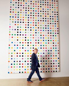
Damien Hirst rejoins Gagosian
Click here or on the picture to read the full article
WOW! – Work of the Week – Ellsworth Kelly “Blue Green Black Red” 10/13/15
Ellsworth Kelly – Blue Green Black Red

Ellsworth Kelly
Blue Green Black Red
1971
Offset lithograph
29 3/4 x 27 1/4 in.
Edition of 100
Pencil signed & numbered
About This Work:
For more than fifty years, Ellsworth Kelly has worked to refine elements of the observed world into rigorous abstraction with a bold clarity and elegance. “My work has always been about vision, the process of seeing,” he notes. “Each work of art is a fragment of a larger context… . I’ve always been interested in things that I see that don’t make sense out of context, that lead you into something else.”
Maintaining a persistent focus on the dynamic relationships between shape, form and color, Kelly challenges viewers’ conceptions of space. He intends for viewers to experience his artwork with instinctive, physical responses to the work’s structure, color, and surrounding space, rather than with contextual or interpretive analysis.
His flat, immaculate compositions of pure line, simple forms, and saturated, unmodulated color are, in essence, found images, distillations of architectural details, shadows, plants, and other subtle forms that often might be overlooked. The contour of a leaf, the arch of a bridge and its reflection in water, and the soft curve of a hillside seen from the road have inspired paintings, sculptures, and prints alike. His art work represent a subjective interpretation of reality, rather than a descriptive copy of it.
Kelly’s arrangement of the complementary colors, which work to intensify one another at their intersections, is also an essential component of the work. In the 1971 lithograph Blue, Green, Black, and Red rectangles are laid, one on top of the other, in arrangements that suggest fragments of a remembered landscape. Perhaps it is several stories of a building, or perhaps a billboard looked, from a certain angle, or the way a shadow once fell.
Ordinary memories such as these, Kelly has said, prompt many of his works. ”As we move, looking at hundreds of different things, we see many different kinds of shapes. Roofs, walls, ceilings are all rectangles, but we don’t see them that way. In reality they’re very elusive forms. The way the view through the rungs of a chair changes when you move even the slightest bit – I want to capture some of that mystery in my work.”
About The Artist:
“I have worked to free shape from its ground, and then to work the shape so that it has a definite relationship to the space around it; so that it has a clarity and a measure within itself of its parts (angles, curves, edges and mass); and so that, with color and tonality, the shape finds its own space and always demands its freedom and separateness.” – Ellswoth Kelly
Ellsworth Kelly is an American painter, sculptor, and printmaker associated with Hard-edge painting, Color Field painting and the Minimalist school. His works demonstrate unassuming techniques emphasizing the simplicity of form.
Although Kelly can now be considered an essential innovator and contributor to the American abstraction art movement, he was not always seen in such a positive light. It was hard for many to find the connection between Kelly’s art and the dominant stylistic trends For Example, observing how light fragmented on the surface of water, he painted Seine (1950), made of black and white rectangles arranged by chance.
He created a new freedom of painterly expression. He began working in extremely large formats and explored the concepts of seriality and monochrome paintings. As a painter he worked in an exclusively abstract mode. By the late 1950s his painting stressed shape and planar masses (often assuming non-rectilinear formats). His work of this period also provided a useful bridge from the vanguard American geometric abstraction of the 1930s and early 1940s to the Minimalism and reductive art of the mid-1960s and 1970s.
Kelly has distilled his palette and introduced forms never before. He starts with a rectangular canvas that he carefully paints with many coats of white paint; a shaped canvas, usually painted in a single bright color, is placed on top. The quality of line seen in his paintings and in the form of his shaped canvases is very subtle. The use of form and shadow, as well as the construction and deconstruction of the visible implies perfection.
For more information and price please contact the gallery at info@gsfineart.com
WOW! – Work of the Week – Clandestine Culture “I Came Back” 10/05/15
Clandestine Culture, I Came Back
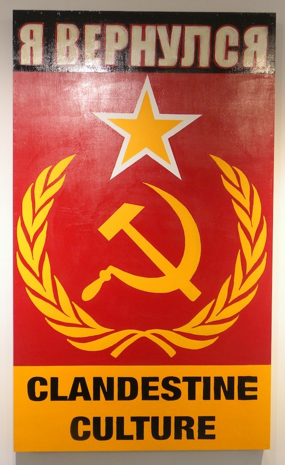
Clandestine Culture
я вернулся, (I CAME BACK)
2014
Acrylic on Wood
81 x 48
Signed on verso
About This Work:
This work titled “I Came Back” or “я вернулся” (in Russian), by Miami Street Artist CLANDESTINE CULTURE,could not be more relevant today then ever before. “For those 25 years of age or younger, the Soviet Union symbol of the Hammer and Sickle, mean nothing. There is an age group that has never seen that symbol, or even knew of a Soviet Union” says the artist.
What this work represents is exactly what the artist wants that age group, 25 years or younger, to understand. That message is that history repeats itself. Painted in 2014, during Russia’s invasion into Crimea, and aggressive military intervention in Ukraine, this painting forewarns the world of what is to come. Russian President Putin flexes his political muscles, and lets the world know that he, and Russia are coming back. They are not the weakened Russia, that perhaps the world sees them as.
Fast forward to 2015, and we see President Putin is at it again, aligning himself with Syria, and positioning his stronghold in the Middle East. Showing that Russia is still a “super power”, and standing up to America
Painted in the old Soviet Union colors of red and gold, this painting is rather simple, but very powerful in its message. Depicting the iconic Hammer and Sickle, with star and olive branches as the main focal point, they symbol says it all. The words “I Came back” written in Russian lets us know, that this is a message about the present, and a warning about the future.
This is exactly what street art intends to do. Historically, street art has always contained a social, a political, and an environmental message. The art challenges the viewer to react not only to the artwork, but to the substantive issues, and surroundings that is being discussed.
Make no mistake, Street Art is not just pretty paintings on a wall. That would be simply called a mural. Street Art is much more important than that. Street Art has substance, context, and a concept. Whether it is Haring talking about AIDS, or Apartheid, Basquiat discussing issues of racism, drugs, and struggle of daily life, or Banksy’s witty paradoxical installations and wall drawings, Street Art has become a depiction and a reaction to the world most important issues, and struggles. Its “in your face” style, is arguably the most reactionary art movement that the art world has yet to witness.
Never before has an art movement, been so literal, and purposeful. Like his predecessors Haring and Basquiat, and his contemporaries Banksy and Shepard Fairey, CLANDESTINE CULTURE focuses on the world’s issues around us, and challenges us to acknowledge, question, and react.
About The Artist:
The artist chooses to remain anonymous. He hits the street with his face and head completely covered. He believes that the painting and the message is more important then the artist. He uses everyday people, images and words, to show that in the end, we are all part of one world wide culture…A CLANDESTINE CULTURE
For more information and price please contact the gallery at info@gsfineart.co
WOW! – Work of the Week – Roy Lichtenstein “Shipboard Girl” 9/28/15
Roy Lichtenstein, Shipboard Girl

Roy Lichtenstein
Shipboard Girl
1965
Offset lithograph
27 3/16 x 20 1/4 in.
Pencil signed
This work was not produced in a numbered edition.
About This Work:
Roy Lichtenstein, like many of his pop art contemporaries, was at first an abstract expressionist. Gradually, however, during the decade following his discharge from the army, he turned his attention increasingly to imagery drawn from such popular cultural sources as commercial advertising, romance and war comics, and cartooning in general.
Not only was Lichtenstein interested in the look of comic books, but also in the way they were produced. He carefully studied the way in which small dots of ink, known as Ben Day dots, were printed. He then enlarged these dots in his art to give his works the appearance of mechanically printed commercial products. Ben Day dots are the pattern of dots used in commercial printing to cheaply reproduce shading.
In the print Shipboard girl of 1965, we see Lichtenstein’s mature style in its rudimentary form. The image exemplifies all the qualities that his many paintings and prints of young women culled from romance comics exhibit — a girl, usually blonde, in extreme close-up, lips parted, her head tilted at an angle, with enormous, soft, liquid eyes, depicted at a moment of emotional climax.
Perhaps the woman in Shipboard girl is just enjoying the sun, or perhaps she is thinking of a shipboard romance that has soured. The life bouy lounging in the background is a visual pun suggesting that she is longing for a boy to rescue her from the as-yet-unreached turbulent seas of love. This sly humor is characteristically Lichtenstein.
What is salient about this work, however, is that here in its developmental stage, we have all the formal features which will come to characterize Lichtenstein’s subsequent output. Lichtenstein’s visual vocabulary, the characteristic elements of his style, are flat areas of unmodulated color, a schematized cartoon-like outline, the removal of anecdotal detail, and more importantly, the use of the Benday dots. Here we see him working towards a style which will become uniquely identifiable as his, and which ironically, over time and in its final formulation will replace the original in the very cartoon context from which it was derived.
About The Artist:
Roy Lichtenstein (October 27, 1923 – September 29, 1997) was a prominent American pop artist. His work defined the basic premise of pop art better than any other through parody. Favoring the old-fashioned comic strip as subject matter, Lichtenstein produced hard-edged, precise compositions that documented while it parodied often in a tongue-in-cheek humorous manner.
In 1961, Lichtenstein began his first pop paintings using cartoon images and techniques derived from the appearance of commercial printing. This phase would continue to 1965, and included the use of advertising imagery suggesting consumerism and homemaking. His first work to feature the large-scale use of hard-edged figures and Ben-Day dots was Look Mickey in 1961. This piece came from a challenge from one of his sons, who pointed to a Mickey Mouse comic book and said; “I bet you can’t paint as good as that, eh, Dad?”
Lichtenstein had his first one-man show at the Castelli gallery in 1962; the entire collection was bought by influential collectors before the show even opened. It was at this time, that Lichtenstein began to find fame not just in America, but worldwide. His work featured thick outlines, bold colors and Ben-Day dots to represent certain colors, as if created by photographic reproduction. However, rather than attempt to reproduce his subjects, his work tackled the way mass media portrays them.
In the 1970s and 1980s, his style began to loosen and he expanded on what he had done before. His style was replaced with more surreal works. His “mirror” paintings consist of sphere-shaped canvases with areas of color and dots. Lichtenstein also created a series of still lifes (paintings that show inanimate objects) in different styles during the 1970s. In the 1980s and 1990s, Lichtenstein began to mix and match styles. Often his works relied on optical (relating to vision) tricks, drawing his viewers into a debate over the nature of “reality.”
Lichtenstein’s work is included in numerous museums, such as the Albright-Knox Art Gallery, Buffalo, NY; Art Institute of Chicago, Chicago; Denver Art Museum, Denver; Metropolitan Museum of Art, NY; Foundation Beyeler, Basel, Switzerland; Museum of Contemporary Art, Los Angeles, Museum of Modern Art, New York; National Gallery of Art, Washington D.C.; Philadelphia Museum of Art, Philadelphia; Solomon R. Guggenheim Museum, New York; Stedelijk Museum, Amsterdam; and Whitney Museum of American Art, New York.
For more information and price please contact the gallery at info@gsfineart.com