Keith Haring
Untitled C
1987
Lithograph
11 x 14 3/4 in.
Edition of 100
Pencil signed, dated and numbered
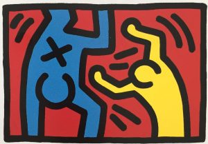
Keith Haring
Untitled D
1987
Lithograph
11 x 14 3/4 in.
Edition of 100
Pencil signed, dated and numbered
About the work:
1987
The nation of South Africa was in a state of emergency. Serious political violence had arisen over Apartheid and the National Party had won an election, yet again.
41,027 people had died of AIDS complications in America, and another 71,176 people were diagnosed with the disease. After 6 years of silence, then-president Ronald Reagan finally used the word “AIDS” in public for the first time.
Crack-cocaine incidents in the US had increased to 94,000 from 23,500 only 2 years prior – a 300% jump.
______________________________
Keith Haring’s work sums up New York cool. He was friends with Madonna, Andy Warhol, David Bowie, among many others who represented the 80’s culture boom. By the start of the decade, the artist had developed a fresh aesthetic, with roots in punk, hip-hop and graffiti. His strong lexicon of caricature-like images in flat, bold colors, are so deceivingly simple and joyful that it is easy to be blinded to its political and activist content.
Keith Haring was a fierce and tireless socio-political activist throughout his life, and had a rational of intervention and standing up for oppressed communities. He was opposed to the institutionalized racial segregation in South Africa, fought for increased sexual education for the gay population in the face of the AIDS epidemic and was determined to raise awareness of the effects of crack-cocaine which ravaged the disenfranchised black society of the US.
This week’s Work of the Week! WOW! is Untitled C & D, from the untitled suite of 4 lithographs created in 1987. This suite was purposely done as a lithograph and not a silkscreen, the dimensions of the works are slightly smaller, and the edition size is smaller. It is limited to only 100 pieces. This was done so as not to be confused with the Pop Shop series, which were released on a more commercialized level. As with the vast majority of Haring’s work, this 4 piece suite of lithograph references deep commentary on societal unease.
Throughout Keith Haring’s work, the image of a television represents the mass media. The character depicted in Untitled C is on TV covering his eyes. At first, the saying “See no evil,” comes to mind. This is quite the opposite. Haring wants us to open our eyes and speak out against these evil atrocities, and not to cover our eyes, or turn a blind eye to it. Thanks to Haring’s repetitive use of symbols referencing different ailments of society, we know what he is critiquing.
In Untitled D, the yellow character seems to be tossing, or pushing away, another figure in blue that bears an X on his belly. The X is symbolic of the crack-cocaine epidemic that ravaged mostly impoverished segments of the country. Today, it is widely accepted that this particular pandemic was ignored by the media, at the time, in light of the people it was affecting. This is something that Haring was acutely aware of, and through this work, he gently provides a humanizing context that not only speaks to the situation, but also to his position.
Despite being one of the most influential and sought after artists of the 20th century, Keith Haring always remained true to his beliefs and humanity. He used his voice and platform for those who needed a supporter and champion. Untitled C & D are a clear wake-up call to the public to be aware of the problems society at large. This is what Haring’s art was about, it is not only colorful, whimsical characters that makes people smile. His entire body of work spoke volumes of the socio-political issues plaguing the world at the time.