WOW! – Work of the Week – Daniel Arsham, Future Relic 03


Daniel Arsham
Future Relic 03
2015
Plaster and broken glass
5 1/2 x 5 x 2 1/2 in.
Edition of 400
Signed and numbered on label on box

About the work:


Remember the Future

“The future is something that contains the everyday – it contains the now. All the things we see here, in this space, will exist in the future.” Daniel Arsham


Obsessed with the fact that technological items become obsolete and are continuously replaced at an alarming rate, artist Daniel Arsham has created a complete mythology surrounding his “Future Relic” fossils. 


It was during a trip to Easter Island that Daniel Arsham came up with the idea of an archaeological excavation applied to the future. His “Future Relic” series centers around a world many years down the line, in which a major and transformative ecological shift has occurred.  


To create his fossils, the artist casts already forgotten pieces of technology to look like fragile artifacts. They are covered with tiny crack formations and have crumbling surfaces, disintegrating from disuse. All nine sculptures of the series are created from technological devices of the twentieth century.  Arsham says “the choice of the objects is very specific, I’m looking for things that are iconic that many people would recognize.”


The sculptures spurred Arsham to make video work based on the same premise, and thus his Future Relic film series was born. Each launch of a new “Future Relic” sculpture is augmented by a short movie. Through his use of film, the artist is able to build and share his complete story of the future surrounding these archeological artifacts. The sci-fi art series has featured many well-known actors such as Mahershala Ali, Arturo Castro, James Franco, Ronald Guttman, Matthew Maher, and Ethan Suplee


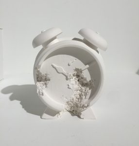
This week’s Work of the Week! WOW! is Future Relic 03. It is a plaster and broken glass cast Clock. Using a traditional mechanical alarm clock as the design mold, the plaster-clad object is representative of how the things we accrue ultimately perish. This launch, in 2015, was connected to his movie premier of the same name at the TriBeCa Film Festival. The movie was also presented at the 68th Cannes Film Festival in France. 


Through this chapter of “Future Relic 03,” we are able to visually understand the future that Arsham has imagined. The world as we know it today does not exist. “We all moved inland as the water rose” explains the protagonist Lona Rey. A cratered moon hangs in the sky, but with a sizable rectangular section excavated from its surface. The star of the movie is Juliette Lewis, a young woman searching for her scientist father who apparently went missing in his quest to save our Earth. About half way through the short, at minute 8:04, we see Lona as a little girl, up late at night, peering into her father’s study. On his desk, a brass Bulova mechanical alarm clock reads 8:30pm. 


In full commitment to the credibility of his “Future Relic” universe, Arsham has thoroughly combed through every detail. On the label of the box belonging to the artwork, he has included elements such as the excavation date and the longitude and latitude of the find. Another subtle detail that ties back into the movie is the faded logo on the box which is from the translator device Lona uses to speak with an Owl. 

Clock Packaging 2  Clock Packaging 1 3 Clock Label
     

Daniel Arsham is a true multi-disciplinarian. His work spans art, filmmaking, design, architecture and performance, with powerful themes woven into his narrative.


A link to the Future Relic 03 movie: https://www.youtube.com/watch?v=jWvnC0mGOGk

WOW! – Work of the Week – Victor Vasarely, Tri-Vega


Victor Vasarely

Tri-Vega

1975

Silkscreen on Arches Paper

33 1/4 x 30 1/8 in.

Pencil signed and numbered

“Movement does not rely on composition nor a specific subject, but on the apprehension of the act of looking, which by itself is considered as the only creator.”
—From Victor Vasarely’s Yellow Manifesto

We don’t always see what we think we see.

Saying that Victor Vasarely was ahead of his time is an understatement. Art historians credit Vasarely with creating some of the earliest examples of Op Art in the 1930s. He experimented with techniques decades before the establishment of the movement in the 60s, and is widely regarded as the “Father of the Op Art movement,”

“Op Art” is short for Optical Art, which was coined by Time Magazine in a 1964. It is a style known for creating optical illusions from extremely precise repeating patterns, interlocking shapes and vivid yet strictly defined color palettes.

The genre marked the first time in Art History that the Theory of Visual Perception would be systematically studied and applied by artists. In this theory, psychologists distinguish between two types of processes in perception; the first caused by our purely physical optical sense and the second by our subjectively learned world view. Op Art was therefore driven by artists who were interested in investigating various perceptual effects; effects that confuse and fascinate.

In 1968, Victor Vasarely started work on his hugely popular Vega Series. Vega is the brightest star in the constellation of Lyra and the fifth brightest star in the night sky. In this series, the artist manipulated the lines of square grids to create the illusion of bulges and depressions in perspective distortion.

This week’s Work Of the Week! WOW! is Tri-Vega.

In this work, Vasarely expertly draws his viewer into his geometric cosmos. In a grid-like composition, the picture plane appears to warp. A central form swells as a pronounced spherical distortion, and the viewer is given the feeling that the orb is either trying to break out of the surface or recede back inwards. In this case ambiguity arises, and our eye and brain oscillate between two possibilities. 

The feeling of movement and depth are created by Vasarely’s use of lines increasing in scale towards the center of the canvas. Vasarely’s masterful use of warm and cool colors across the field also serves to provide the viewer with the feeling of kinetic energy, depth and space. These optical games physically affect the viewer.

The Vega series is arguably Vasarely’s signature work. The results are timeless, exciting and innovative as they engage and captivate the viewer with depth perception and spatial distortion.

Vasarely truly created “an art for all.” An art that the viewer can appreciate without the knowledge of art history, an art in which the final image is the product of the viewer’s own eye without contemplation.

As Vasarely stated: “What is at stake is no longer the ‘heart’ but the retina, and the connoisseur has now become a study object for experimental psychology. Harsh contrasts, the unbearable vibration of complementary colors, the flickering of linear networks and per mutated structures…all these are elements in my work whose task is no longer to plunge the viewer into a sweet melancholy but to stimulate him.”

WOW! – Work of the Week – Alexander Calder, Seascape


Alexander Calder
Seascape
c. 1960
Lithograph
16 1/4 x 17 1/4 in.
Edition of 60
Pencil signed and numbered

About the work:

Despite hailing from a lineage of sculptors, Alexander Calder did not originally intend on becoming one himself. After high school, he enrolled at the Stevens Institute of Technology and graduated in 1919 with a degree in mechanical engineering. 

In June 1922, he found work as a mechanic on the passenger ship H. F. Alexander. The ship sailed from San Francisco to New York City, and Calder slept on deck. Early one morning, as the ship was just off the Guatemalan Coast, he witnessed both the sun rising in the East and the full moon setting on the opposite horizon. He described in his autobiography, “on a calm sea, off Guatemala, I saw the beginning of a fiery red sunrise on one side and the moon looking like a silver coin on the other.” This image remained with Calder, and would appear years later in his works.

Calder is known for his sculpture, however, he was also talented painter, engraver, and printmaker. Throughout the 1940s and 1950s, Calder produced gouache paintings depicting the same swirling, abstract forms found in his mobiles and stabiles. Numerous lithographs were produced from these paintings, and many of these works on paper were studies for his 3-dimensional works. 

This week’s Work of the Week! WOW! is Seascape. Seascape is almost the perfect representation of the early morning scene Calder witnessed off the Guatemalan coast in 1922. The fiery red sun that Calder never forgot was still fresh in his mind almost 4 decades later. The bold colors and flat but soft shapes are distinctly representative of Calder’s visual lexicon and it is easy to imagine the forms balancing and swaying on a mobile. 

However, if Seascape served as a study, Calder had much grander plans for it than a mobile. 

In the 60’s, Calder was invited by the Mexican Cultural Olympiad Committee to produce a monumental stabile outside the “Estadio Azteca” (Aztec Stadium) in Mexico City. At over 84 feet high, his tallest creation, “El Sol Rojo” (The Red Sun) is a 3-dimensional replica of Seascape. The sculpture has remained at the stadium since its installation, greeting fans at the 1968 Olympic games, but also those attending the 1970 and 1986 World Cup finals. 

Views from different angles:

WOW! – Work of the Week – Barbara Kruger, You’re Right and You Know It


Barbara Kruger
You’re Right and You Know it
2010
Lithograph
9 x 24 in.
Edition of 200
Pencil signed, dated and numbered on verso

About the work:

Barbara Kruger’s art is instantly recognizable – photography overlaid with colored boxes filled with white bold face text. It’s not hard to miss, it’s direct and democratic – that’s why it’s brilliant. Borrowing the visual identity of advertising and fear-mongering tabloids, Kruger spreads visual messages that question systems of power.  Using the potent weapon of pure graphics and phrases from the lexicon of thought, Kruger’s art offers up powerfully distilled messages through word and image.

Like Warhol’s pop portraits, or Lichtenstein’s teary cartoon heroines, Kruger has a style which extends into mainstream popular, underground and digital culture. However, it’s not just the aesthetic of her work that is powerful – it’s its purpose.

Bold, philosophical, radical, subversive: her art focuses on decoding the social-psychological messages embedded in popular culture. Through marrying pictures to words, Kruger raises issues of power, politics, and challenges corruption, sexism and consumerism.

Much of her work calls attention to feminism.  However, Kruger does not want to have her work solely categorized as feminist art.   She states below:

“My work always deals with issues of how we are to one another, with issues of power and control, adoration and contempt.” One thing to note in today’s era of identity politics is that Kruger doesn’t define her art as political or feminist, believing such categorizations “only work to marginalize a practice.”

Kruger also rejects the term “slogan” when it comes to the text elements of her art. Her pieces should read more like the start of dialogues rather than simple take-it-or-leave-it statements. While her phrases may be short, they invite participation, rely on us to do the intellectual legwork. She prompts us to question the systems which rule our globalized world.

This week’s “Work of the Week! WOW!” is Barbara Kruger’s You’re Right and You Know It And So Should Everyone Else

Although Barbara Kruger does not view her work as purely feminist, she is very much an advocate for women’s rights on the basis of the equality of the sexes. In this piece, a close-up of a woman’s piercing and confidant gaze is matched with the bold, caps-locked typeface that reads “You’re right and you know it and so should everyone else.” The message is simple, powerful, and inspiring, making women feel confident, working to crack that glass ceiling.

At the same time, bringing and keeping the gender issue in the political arena relevant. Like many of Barbara Kruger’s works, there are multiple messages, and multiple intentions.

WOW! – Work of the Week – Keith Haring, Dog


Keith Haring
Dog
1981
Collage cut-out on paper
12 x 9 in.
Signed and dated in ink

About the work:

A leading figure of the American art scene of the eighties, Keith Haring embraced the world of art thanks to his father who was an amateur comics artist. By the time Haring moved to New York in 1978, he had already developed his style of simple outline drawing, inspired by his father, which would continue to be his s

ignature style throughout his career.

In New York City, Haring adopted and contributed to the downtown culture of Manhattan, tagging subway cars or East-Village buildings with Jean-Michel Basquiat along with other artists. While prolific in his street art endeavors, Keith Haring was much more than just a graffiti artist. His drawings, which feature seemingly simplistic, vividly-colored shapes are actually the product of a solid artistic and cultural education.

Haring attended the School of Visual Arts in NYC and in addition to art classes, he also took courses in semiotics. Semiotics is the study of signs and symbols and their use or interpretation. This discipline had a profound impact on Haring’s works. Haring combined his learnings with his contour drawing style, and created a visual lexicon of icons and symbol-like figures. These images, easily remembered and akin to a signature, became identifiers, characterizing  his work. 

Having started out capturing the New York City street culture in his art, his icons read like an urban, tribal language. However, as Haring matured, along with the influence of the New York art scene, Haring’s work became more intricate and more social / political. Everything in his works took on meaning. 

Aside from the Radiant Baby, Haring’s Dog is his most famous tag. The Dog, is portrayed in many different manners, and as an icon, generally has more than one explicit meaning or symbolism. 

This week’s Work of the Week! WOW! is Keith Haring’s Dog.  This work is a collage cut-out on gold foiled paper. It is a unique work inspired by Matisse’s cut-outs. One of the tallest of the giants on whose shoulders Haring set his feet was Matisse, who inspired his combinations of flat tints of color and his decomposition of planes-characteristics. Haring did a number of cut-outs and collages in this manner. This work is signed and dated ’81.

The Barking Dog, for example, can indicate action or suspicion. The Dog as a character, sometimes represented as a standing figure (combined with a human form), represents authoritarian government, abuse of power, police states, and oppressive regimes.

In addition to these two representations, the other dogs in the art of Keith Haring are all anthropomorphic. Certain Dogs are depicted dancing, laughing, DJing, etc. in these personifications, it is almost as though they take on the role of an alter ego of the artist. 

Throughout Art History, Dogs have been portrayed in paintings as the personification of fidelity. Dogs also imply loyalty, guidance, protection and love. As a student of semiotics, none of these implications would have been lost on haring and it is not surprising that this would be one of his most-used icons. 

WOW! – Work of the Week – WARHOL, Paramount, from Ads


Andy Warhol
Paramount, from Ads
1985
Screenprint on Lenox Museum Board
38 x 38 in.
Edition of 190
Pencil signed and numbered

About the work:

One of the last portfolios Andy Warhol would produce before his untimely death in 1987 was his renowned Ads series. The 10 prints that make up the series are based on some of the most popular and successful ad campaigns and logos from Andy Warhol’s lifetime. They are considered to be particularly important because of Warhol’s fascination with advertising, consumerism and commercialism, which were three major facets of his entire body of work. Having begun his artistic career in advertising, Andy Warhol, more than any other artist of his generation, understood how the reproduced image had come to reflect and shape contemporary life in America.

This week’s Work Of the Week! WOW! is Paramount. In this work, Andy Warhol masterfully depicts the snow-capped mountain in white, making the image pop out to the viewer. He also skillfully plays with the yellow, red and green coloring causing the word “Paramount” and the halo of stars to seem three-dimensional or animated. That Warhol chose Paramount over any other film studio is fitting in many ways.

It is well-known that Warhol was fascinated with stardom and fame. He loved being surrounded by the Hollywood elites. One of his most famed images is that of Marilyn Monroe, he was smitten with Liz Taylor, and even promoted his own “Warhol Superstars” such as Baby Jane Holzer, Edie Sedwick and Candy Darling, to name a few. Founded in 1912, Paramont Pictures, is the second oldest film studio in the US.  The story behind the Paramount logo is that each of the 22 original contracted actors and actresses of the studio was honored with one of the stars of the halo atop the mountain peak, which made them the original “movie stars.” There is no doubt that Andy Warhol, the man who coined the famous “15 minutes of fame” phrase, would have loved where the term “movie star” originated from.

The Paramount Logo as a portrait? : A Mysterious Connection

There is another, more personal and less well-known connection between Andy Warhol and the Paramount Pictures Company. In 1980, he met Jon Gould who was a 27 year old vice president of marketing at Paramount Pictures. Warhol was deeply infatuated with the film executive, and over the course of 5 years, the two shared a close bond that defied easy description. They lived together in Warhol’s townhouse until 1985. Jon Gould is the most photographed subject of Andy’s oeuvre, and while Andy created many portraits of him during their time together, those close to Warhol have insinuated that  the inclusion of the Paramount logo in the Ads series, may be considered an abstract portrait of the young man Andy cared for.

WOW! – Work of the Week – KOONS, Balloon Dog


Jeff Koons
Balloon Dog (Yellow)
2015
Metallic Porcelain
10 1/2 x 10 1/2 x 5 in.
Edition of 2,300
Signed and numbered on verso

About the work:

Nov. 12, 2013 – Christie’s Post-War and Contemporary Art Evening Sale in New York City

Balloon Dog (Orange) by Jeff Koons  became the most expensive artwork by a living artist sold at auction.  The work sold for $58.4 million USD

The price topped Koons’s previous record of $33.7 million USD, and the record for the most expensive living artist, held by Gerhard Richter, whose 1968 painting, Domplatz, Mailand, sold for $37.1 million USD, at Sotheby’s on May 14, 2013.   Balloon Dog (Orange) was one of the first of the Balloon dogs to be fabricated, and had been acquired by Greenwich collector Peter Brant in the late 1990s.

____________________________________________________________

Jeff Koons derives inspiration from things you might find at a yard sale: inflatable plastic toys, vacuum cleaners, porcelain trinkets and other items not typically considered fine art. He is the epitome of Neo-Pop, a 1980s movement that looked to earlier Pop artists, particularly Warhol, for inspiration.

Since his emergence in the 1980s, Jeff Koons has blended the concerns and methods of Pop, Conceptual, and appropriation art with craft-making and popular culture to create his own unique iconography, often controversial and always engaging. His work explores contemporary obsessions with sex and desire; race and gender; and celebrity, media, commerce, and fame.

A self-proclaimed “idea man,” Koons hires artisans and technicians to make the actual works. For him, the hand of the artist is not the important issue: “Art is really just communication of something and the more archetypal it is, the more communicative it is.”

Jeff Koons’s artwork rarely inspires moderate responses, and this is one signal of the importance of his achievement. Focusing on some of the most unexpected objects as models for his work, Koons’s work eschews typical standards of “good taste” in art and zeroes in precisely on the vulnerabilities of hierarchies and value systems.

Art critic Christopher Knight writes, “He [Koons] turns the traditional cliché of the work of art inside out: rather than embodying a spiritual or expressive essence of a highly individuated artist, art here is composed from a distinctly American set of conventional middle-class values.”

This weeks Work of the Week (WOW!) is precisely a work of conventional middle class values.

Jeff Koons is best known for working with popular culture subjects and his reproductions of banal objects—such asballoon animals produced in stainless steel with mirror-finish surfaces.

His steel Balloon Dog sculptures, probably his best-known works, transpose an ephemeral childhood memory into an enduring form. His work looks cheap, but is expensive, an ingenious reversal of economic logic that forms the basis for his stunning commercial success.  Rather than offending the art snob, Koons has challenged top collectors to revise their notions of what fine art looks like.

His sculptures are not merely conceptual, but aesthetic, in ways that challenge us, especially those of us accustomed to fine art. Kitsch and high culture, religion and eroticism, weightlessness and mass are among the apparent opposites that mix and mingle in his work.

“Balloon Dog is a very optimistic piece, its a balloon that a clown would have maybe twist for you at a birthday party.  But at the same time there’s the profoundness of an archaic sculpture.  The piece has an interior life while the reflective exterior surface affirms the viewer through their reflection.”  – Jeff Koons

Koons is essentially a late twentieth-century incarnation of Marcel Duchamp. Like the French Conceptual artist who thought America’s bridges and plumbing her finest artworks, Koons strips industrially-made objects of their practical purpose and re-presents them as art.

WOW! – Work of the Week – STELLA, Referendum ’70


Frank Stella
Referendum ’70
1970
Screenprint
40 x 40 in.
Edition of 200
Pencil signed, dated and numbered

About the work:

Frank Stella is an American painter and printmaker, noted for his work in the areas of minimalism and post-painterly abstraction.

Stella reacted against the expressive use of paint by most painters of the abstract expressionist movement, instead finding himself drawn towards the “flatter” surfaces of Barnett Newman’s work.  He began to produce works which emphasized the picture-as-object, rather than the picture as a representation of something in the physical world, or something in the artist’s emotional world.

From 1960 Stella began to produce paintings of shaped canvases in their presentation of regular lines of color separated by pinstripes.  During this time, he also began to experiment in a wider range of colors, and expressing an affinity with architecture in their monumentality, Stella also introduced curves into his works, marking the beginning of the Protractor series. 

Following a trip to the Middle East, Stella was very inspired by the way the cities’ circular paths interlaced and interweaved like snakes chasing their tails. With that thought it mind he created the Protractor Series. The Protractor series, deploys a vivid palette and composition consisting of rectangular shapes superimposed on curving and circular forms, in which there are three design groups—“interlaces,” “rainbows,” or “fans”—encompasses its surface patterning.  

This week’s Work of the Week! – (WOW!), Referendum ’70, is a screenprint based on Frank Stella’s Protractor paintings.  

Like many artists of his generation, Frank Stella was politically active and engaged. He participated in several fundraising efforts for which he would donate a complete printed edition to a cause.

Referendum ’70 was based on one of the causes Stella supported: Vietnam Referendum ’70, a Cambridge Massachusetts based anti-war coalition. The work was part of a strategy to help the organization raise funds to support political candidates who were opposed to the Vietnam war. 

Aesthetically, the “Referendum ’70” screenprint composition is related to the River of Ponds lithographs associated with theNewfoundland Series, which are variations of Stella’s famed protractor paintings from 1967-1970.

In this print, the squared and double squared formats of interlacing protractors create a psychological distancing. Although the dominant motifs of the Protractor series are circular or curvilinear, every shape is actually defined by pairs of horizontal and vertical lines that intersect at right angles; the gridded rectilinear pattern that is formed is superimposed over the decorative arcs. Through the device of the protractor and the use of an unusual color scheme, Stella brought abstraction and decorative pattern painting into congruence in a manner that challenged the conventions of both traditions.

About Vietnam Referendum ’70:

Vietnam Referendum ’70’s initial goal was to “let the people vote on war.” Originally, the committee dedicated itself to getting the 48,000 statewide signatures needed to force the Vietnam question on the fall ballot.  Maurice Donahue, President of the Massachusetts Senate, helped make this effort unnecessary by sponsoring a bill which passed the legislature authorizing the vote. The group, having indirectly achieved its first objective of getting the Vietnam war on the ballot by endorsing Donahue’s bill, shifted to campaigning for immediate withdrawal of troops.

Despite the efforts of the Vietnam Referendum ’70 and Stella’s participation in supporting the effort, the vote was non-binding, no action was legally required by any elected official, be it president Nixon or the Congress. The committee believed that “it will have scored a victory if it can show that no silent majority in favor of the war exists.”

WOW! – Work of the Week – ALBERS, White Line Squares (Series II) XVI


Josef Albers
White Line Squares (Series II) XVI
1966
Lithograph
20 3/4 x 20 3/4 in.
27/125
Initialed in pencil, dated, numbered and titled

About the work:

“The perception of color is deceiving, we may perceive two different colors to look alike, or two equal colors to look different. This game of colors – the change of identity – is the object of my study.”
Josef Albers

Accomplished as a designer, photographer, typographer, and printmaker, Josef Albers is best known for his work as an abstract painter and color theorist. His approach to composition was very disciplined. He spent 26 years creating and mastering thousands of paintings and prints that make up his series “Homage to the Square.” Through this series, Albers explored chromatic interaction with nested squares. 

His works were always created using the same process: he painted mostly on Masonite, using a palette knife to prime the surface with layers of white gesso, then applying each oil color minimally for maximum effect. He would paint one coat of pure color directly to the canvas from the tube, unmixed, starting from the centre and working his way outwards, just as his father, a house painter, carpenter, plumber and general technician, had taught him – a technique that ‘catches the drips of paint and keeps cuffs clean’ he used to say.

He was known to meticulously list the specific manufacturer’s colors and varnishes he used on the back of each work, as if the colors were catalogued components of an optical experiment. Each painting in the series was composed of either three or four squares of solid planes of color nested within one another, in one of four different arrangements and in square formats. 

Despite their name, the Homages  seem to be less about squares within squares than about the infinite possibilities of the chromatic spectrum. Every last one is an exercise in visual juxtaposition, an exploration of the effect that colors have on the eye and on each other. The size and proportion and the number of the squares vary, but they are always offset towards the bottom of the frame  The arrangement of these squares is carefully calculated so that the color of each square optically alters the sizes, hues, and spatial relationships of the others, and this tricks the eye into a figurative response: they look like luminous corridors receding to a vanishing point.

Our Work Of the Week! WOWWhite Line Squares (series II) XVI is from the “Homage to the Square” series. Its color composition is comprised of three surrounding squares in colors cream, warm ochre light, and brown with a white line square in the middle square of ochre.  The ochre on either side of the thin white line is actually the same hue, however, the placement of the white line creates a shift in color on both sides so that the single color appears as two different colors. 

Albers wrote: “A white line within a color instead of as a contour may present a newly discovered effect: when the line is placed within a so-called “middle” color, even when the color is very evenly applied, it will make the one color look like two different shades or tints  of that color.”

An Interesting Note:  Transferring this idea to lithographs was a complicated process, because the white line was created by the unprinted paper. The square containing the white line could not therefore be printed over an underlying color area. Accordingly, the well known printmaker Kenneth Tyler devised a way to print on plates that accurately abutted one another with no overlap.

Having studied and later taught at the famed Bauhaus in Weimar, Germany prior to fleeing to the US, Albers’ work represents a transition between traditional European art and the new American art. It incorporates European influences from the Constructivists and the Bauhaus. His influence fell heavily on American artists of the late 1950s and the 1960s. Hard-Edge abstract painters drew on Albers’ use of  patterns and intense colors, while Op artists and conceptual artists further explored his interest in  perception. 

WOW! – Work of the Week – GOTTLIEB, White Ground Red Disk


Adolph Gottlieb
White Ground Red Disk
1966
Lithograph
29 1/2 x 21 1/2 in.
Edition of 50
Pencil signed, dated and numbered

About the work:

“To my mind certain so-called abstraction is not abstraction at all…on the contrary it is realism of our time.”
Adolph Gottlieb

Growing up during the Depression and maturing throughout the interwar period and rise of Hitler, the American painter and printmaker Adolph Gottlieb was committed to expressing authentic feeling in the face of the traumas of the world. Gottlieb established himself as a pioneer in the movement of Abstract Expressionism and worked actively against the dominating trends of regionalism and realism of the 30’s. He was close with many important artists of the time, Marc Rothko and Barnett Newman for example and together they sought to make American art more experimental 

Gottlieb’s work can be described as a reaction to the times in which he lived, and he is well known for three distinct periods or series. The first, which emerged during the second World War is the “Pictograph” series (1941-1951) comprised of loose grids with schematic forms. This was followed by the “Imaginary Landscape” period (1951-1957), which consisted of semi-abstract landscapes. And finally, his “Burst” period, which is his most famous and which he spent almost two decades exploring (1957-1974) revolved around variations of simplified representations of two shapes – a disc hovering above an explosion of calligraphic strokes. 

This week’s Work Of the Week! White Ground Red Disk is a prime example of his work from the Burst series. 

In the vertical “Bursts,” the series relies heavily on the juxtaposition of forms characterized by an underlining dualism. Gottlieb has brought together, in a single canvas the two poles of Abstract Expressionist painting—the Color Field and Action Painting (or Gestural Abstraction) schools—in a tense balance. 

Color Field painting emerged in the late 50’s, and is known for the use of simple geometric patterns and references landscape imagery and nature. The style is characterized primarily by fields of flat, solid color, creating areas of unbroken surface and a one-dimensional picture plane. The Color Field movement places less emphasis on  gesture , brushstrokes and action in favor of an overall consistency of form and process. In Color Field painting “color is freed from objective context and becomes the subject in itself.”

Action painting, on the other hand, is a style of painting in which paint is spontaneously dribbled, splashed or smeared onto the canvas, rather than being carefully applied. It emphasizes the physical act of painting itself as an essential aspect of the finished work or concern of its artist. The images do not portray objects or even specific emotions. Instead, they aim to touch the observer deep in the subconscious mind, tapping the collective sense of an archetypal visual language. This was done by the artist painting “unconsciously,” and spontaneously, creating a powerful arena of raw emotion and action, in the moment.

The dichotomy between the two forms in the work, the disk and the expressive strokes, led the way and formed the bridge for the geometric abstractionists and minimalists such as Frank Stella and Josef Albers.