Gallery News

WOW! – Work of the Week – Ed Ruscha – Stranger


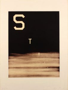
Ed Ruscha
Stranger
1983
Lithograph
30 X 22 1/2 in.
Bon à Tirer (B.A.T.), from an Edition of 7
Pencil signed and annotated B.A.T.

About the work:

“Huh? Wow!”

Language has often be inserted into visual art, yet no other artist uses it the way Ed Ruscha (roo-SHAY) does. His works are not pictures of words but words treated as visual compositions. “I like the idea of a word becoming a picture, almost leaving its body, then coming back and becoming a word again,” he once said.

Through his textual works, the artist has made his mark in a universe somewhere between Pop and Conceptual art. Over his six-decade-long career, critics have always had trouble classifying Ruscha because his oeuvre doesn’t fall into any predisposed category. As with Andy Warhol and Roy Lichtenstein, his East Coast counterparts, Ed Ruscha’s artistic training in Los Angeles was rooted in commercial art. Ruscha’s style and subject matter, however, and the deadpan humor with which he executed them truly set him apart. 

This week’s Work of the Week! WOW! is Ruscha’s Stranger, dating from 1983. It is a prime example of the techniques and style of the artist, and is part of a series of artworks of words over sunsets and night skies (which many refer to as landscapes) that Rsucha started producing in the early 80’s.

This particular example is the B.A.T. (bon à tirer, which translates as “good to pull”). The B.A.T. is the final trial proof, the one that the artist has approved, telling the printer that this is the way he wants the edition to look. Bon à tirer means ready for press.  

The edition size of this work is extremely small of only 7 pieces produced. To have the B.A.T. is very rare.  

Set against the backdrop of a dark night, the word “stranger” is depicted in an all-caps lettering of Ed Ruscha’s own invention named ”Boy Scout Utility Modern.” The font is a boldface print type with squared-off curves. Inspired by the truncated edges of the Hollywood sign, the typeface is transformed as letters take the place of characters on a stage, hovering in middle distance with a three-dimensionality all their own. The result? Images that land somewhere between clarity and mystery, symbol and signifier, art and poetry.

In using “stranger” as a visual, with a newly created typeface, the artist glorified it as an object rather than a mere piece of text, thus dignifying “stranger” as an object, bestowed with iconic status.

The influence of Hollywood and advertising are ever-present in the work of this LA artist and Stranger is no exception. This is highlighted in the way Ruscha placed his subject, covering the overall space of the plane. His bold “stranger” floats on a vast background, and mimics the opening screen of movies or fleeting glimpses of roadside billboards that must catch an audience’s attention in one compelling instant. The cinematic perspective of “Stranger” has a dramatic, raked perspective which can be traced to classic Hollywood black-and-white films. This unique diagonal positioning of the letters is disruptive and encourages the viewer to look at something ordinary in a different light. 

The words Ruscha chooses for his creations have a multiplicity of meaning, which push the viewer to consider each connotation of the word. What is the first meaning that comes to mind when faced with the word “stranger?” It can be read as either noun or adjective. This ambiguity adds to the power of the work. Ruscha has always insisted that he never intends to instruct his audience, there is no hidden agenda, leaving each of us free to interpret the word. 

Ruscha has said that “Art has to be something that makes you scratch your head,” but it doesn’t need to take itself too seriously either. His works are as playful as they are thought provoking. According to the artist, there is a simple rule for distinguishing between bad and good art. Bad art makes you say ‘Wow! Huh?’ Good art makes you say ‘Huh? Wow!’ It’s a good rule. ‘Huh? Wow!’ is most revealing when considered in terms of Ruscha’s own work. When observing his work in that context, the ‘Huh? Wow!” is what makes his art so enduringly great.

WOW! – Work of the Week – Jean Dubuffet – Arborescences I & II


Dubuffet
Arborescences I
1972
Color screenprint relief on vacuum-formed plastic
12 3/8 x 9 5/8 in.
Edition of 75
Initialed, dated and numbered in ink
 Dubuffet
 Arborescences II
1972
Color screenprint relief on vacuum-formed  plastic
12 3/8 x 9 5/8 in.
Edition of 75
 Initialed, dated and numbered in ink
About the work:

Dubuffet: the prototype of the modern artist

Although he was well-educated, Jean Dubuffet came to reject his studies. Preferring to teach himself, the artist would base much of his artistic career on the readings of Dr. Hans Prinzhorn, who drew comparisons between the art of asylum inmates and that of children. Prinzhorn believed that it was savagery, or base animal instinct, that lead to universal harmony, arguing that it was the primal instinct, not intellectual theory or analysis, that connected all living things. 

Prinzhorn’s theories spoke directly to Jean Dubuffet who disliked authority and found mainstream culture to be “asphyxiating.” Frustrated by intellectual approaches to art, Dubuffet admired and collected the artwork of outsiders. He would champion the movements of Art Brut (meaning “raw”) and Art Informel (informal), aesthetics contrary to traditional standards, much to the dismay of the art-world elite. He sought to create an art free from scholarly concerns, and as a result, his work had a tendency to look like it was made by an amateur. Despite the child-like style of his works and his general disdain for the intellectual class, he was, early-on in his career, identified as “the most original painter to have come out of the Paris School since Miró.” 

It was certainly the paradox of Dubuffet’s career that he opposed the art establishment more forcefully than any artist, yet became one of the most esteemed visual innovators of the 20th century. 

In the early 1960s, he developed a radically new, graphic style, which he called “Hourloupe,” from which, this week’s Work of the Week! WOW! Arborescences I & II stem. 

The “Hourloupe” series began in 1962 and would preoccupy the artist until his death in 1985. The inspiration came from a chance doodle Dubuffet created while on the telephone. The style was composed of black fluid lines, tangles forming cells, some of which were filled with unmixed color which he limited to red, white, black and blue. 

Ever true to his dismissal of idealistic art, the Arborescence works are marked by a rebellious attitude toward the at-the-time dominant notions of high culture and beauty. Dubuffet’s embrace of so-called “low art,” and abandonment of traditional standards lead to what he believed to be a more authentic and humanistic approach to creating images. 

Dubuffet also departed from the use of traditional medium in his works. He placed an emphasis on texture and materiality which can be seen as an insistence on reality. The two Arborescences artworks are unique in that they are 3-dimensional works, screenprinted on vacuum-formed plastic. Vacuum forming was patented in 1950 as an industrial technology. It is a version of thermoforming where a sheet is heated to form and stretch against a mold by vacuum. At the time of the creation of these artworks, this process was still new and complex. 

In the History of Art, the 20th century marked a period of dramatic and fast-paced change. Invention, innovation and rupture of inherited models allowed for profound aesthetic revolutions of which Dubuffet was a leader and pioneer. 

“WOW! – Work of the Week – Roy Lichtenstein – Painting on Blue and Yellow Wall


Roy Lichtenstein
Painting on Blue and Yellow Wall
1984
Woodcut and lithograph
47 3/16 x 31 9/16 in.
Edition of 60
Pencil signed, dated and numbered

About the work:

“My work isn’t about form, it’s about seeing. I’m excited about seeing things, and I’m interested in the way I think other people saw things.”

Roy Lichtenstein was no overnight sensation, the art establishment in the early 60’s was not prepared to be faced with his then heretical blending of high and low art. Departing from the intellectual, nonfigurative style of Abstract Expressionism, Lichtenstein depicted everyday objects and drew inspiration from comics, advertisements, and children’s books. By integrating popular imagery into the realm of fine art, he invited viewers to recognize the world around them in his work. The use of parody and eye-popping comic images gives his creations a sense of familiarity that observers can relate to. 

Over the course of a month and half in 1984, at his studio in Southampton, Lichtenstein created a series of eight works entitled “Paintings.”The works are derived from collages which combined hand-painted and printed papers, a printed enlargement of unprimed canvas, directly painted brushstrokes and cut-out variations of the artist’s famous schematic image of an abstract brushstroke.

This week’s Work of the Week! WOW! is entitled Painting on Blue and Yellow Wall from the Paintings Series. This work is a parody and self parody made up of juxtapositions. It is the representation of an image and an image in itself, where “high art” and “low art” collide in a single setting. Painterly abstract expressionistic brushstrokes are interwoven with Lichtenstein’s own interpretation of abstract expressionist brushstrokes in a balanced composition. The positioning of the portrayed canvas is interesting in itself. The represented canvas is almost denied full attention as it competes with the vibrant yellow and blue wall-field of simulated wood grain. The frame of the depicted Abstract Expressionist image is unleveled and cropped. 

As a technique consistent with comics, the cropping of forms was a method Lichtenstein employed throughout his career. Based on the Gestalt theory of perception that incomplete forms are mentally completed by the perceiver, Painting on Blue and Yellow Wall encourages the viewer to complete the depicted frame. Surprisingly, cropping is also consistent with Abstract Expressionism. Edges of a work on canvas were often determined by stretching upon completion, thus cropping out the borders of a finished piece. Most importantly in the case ofPainting on Blue and Yellow Wall, the act of cropping is fundamentally “Pop,” as it insists on the object-quality of a work of art rather than the illusion of the work of art as a window on the world.

Painting on Blue and Yellow Wall embodies different ways of representing reality and is characteristic of the way Roy Lichtenstein’s art combines detached representation with dynamic perception. Lichtenstein’s art is much more demanding than it seems at first glance, he questions how we determine the way we view our surroundings. 

WOW! – Work of the Week – Kenny Scharf – Space Traveler


Kenny Scharf

Space Traveler

2011

Etching with hand-painting

45 3/4 x 55 5/8 in.

Edition of 20

Pencil signed and numbered

About the work:

Spontaneity and fun are the heart of Kenny Scharf’s artwork

Kenny Scharf moved to New York City in the late 1970s, and his work embodies the spirit of that time. It was a “golden age” that continued through the early 1980s, in which Pop, New Wave, graffiti and the urban art scene collided. During this explosive period the artist first learned to use spray paint, and master this newfound medium. He would bomb the length of Manhattan between his studio at PS1 in Queens and his home in the East Village, leaving the avenues covered with his characters.

Like his contemporaries Keith Haring and Jean-Michel Basquiat, Kenny was inspired by graffiti’s freedom and the direct connection street art gave him to people outside of the art world. “It was a natural reaction for us to take it to the streets and the nightclubs and let loose and not take yourself too seriously because that is stifling!” Kenny is driven by his belief that art should be appreciated for the experience. This is particularly obvious through his use of images of cartoonish figures.

This week’s Work Of the Week! WOW! is Space Traveler by Kenny Scharf. The piece reflects the impulse and speed of the artist working in the street, and the signature cartoon-like character whizzing through a cosmic galaxy is instantly recognizable. This trademark Cosmic Cavern image, created with what could be Day-Glo  or bright colored paint is a style that the artist started experimenting with in the 80’s.

The cartoon images expertly bring popular culture into the fine arts, and Scharf has been pushing the line between high and low art since his days spray-painting lower Manhattan. His true genius, however, lies in his ability to create a distinct, otherworldly color palette, as if looking inside a tremendous bubble made of candy colored beings. The work is playful, but make no mistake: This isn’t child’s play.

Scharf calls his art Pop Surrealism: “Surrealism is about the unconscious, and I feel my work is about the unconscious. The images come from the unconscious except that my unconscious is filled with pop imagery. My unconscious is pop, so therefore the art would be Pop-Surrealism.”

Space Traveler is a very large work.  It is an etching with hand painting.  A very small edition of only 20 pieces, each piece is unique.  The only printed part of the work is the black.  Every color on each different piece is all hand painted.

WOW! – Work of the Week – Daniel Arsham, Future Relic 03


Daniel Arsham
Future Relic 03
2015
Plaster and broken glass
5 1/2 x 5 x 2 1/2 in.
Edition of 400
Signed and numbered on label on box

About the work:


Remember the Future

“The future is something that contains the everyday – it contains the now. All the things we see here, in this space, will exist in the future.” Daniel Arsham


Obsessed with the fact that technological items become obsolete and are continuously replaced at an alarming rate, artist Daniel Arsham has created a complete mythology surrounding his “Future Relic” fossils. 


It was during a trip to Easter Island that Daniel Arsham came up with the idea of an archaeological excavation applied to the future. His “Future Relic” series centers around a world many years down the line, in which a major and transformative ecological shift has occurred.  


To create his fossils, the artist casts already forgotten pieces of technology to look like fragile artifacts. They are covered with tiny crack formations and have crumbling surfaces, disintegrating from disuse. All nine sculptures of the series are created from technological devices of the twentieth century.  Arsham says “the choice of the objects is very specific, I’m looking for things that are iconic that many people would recognize.”


The sculptures spurred Arsham to make video work based on the same premise, and thus his Future Relic film series was born. Each launch of a new “Future Relic” sculpture is augmented by a short movie. Through his use of film, the artist is able to build and share his complete story of the future surrounding these archeological artifacts. The sci-fi art series has featured many well-known actors such as Mahershala Ali, Arturo Castro, James Franco, Ronald Guttman, Matthew Maher, and Ethan Suplee


This week’s Work of the Week! WOW! is Future Relic 03. It is a plaster and broken glass cast Clock. Using a traditional mechanical alarm clock as the design mold, the plaster-clad object is representative of how the things we accrue ultimately perish. This launch, in 2015, was connected to his movie premier of the same name at the TriBeCa Film Festival. The movie was also presented at the 68th Cannes Film Festival in France. 


Through this chapter of “Future Relic 03,” we are able to visually understand the future that Arsham has imagined. The world as we know it today does not exist. “We all moved inland as the water rose” explains the protagonist Lona Rey. A cratered moon hangs in the sky, but with a sizable rectangular section excavated from its surface. The star of the movie is Juliette Lewis, a young woman searching for her scientist father who apparently went missing in his quest to save our Earth. About half way through the short, at minute 8:04, we see Lona as a little girl, up late at night, peering into her father’s study. On his desk, a brass Bulova mechanical alarm clock reads 8:30pm. 


In full commitment to the credibility of his “Future Relic” universe, Arsham has thoroughly combed through every detail. On the label of the box belonging to the artwork, he has included elements such as the excavation date and the longitude and latitude of the find. Another subtle detail that ties back into the movie is the faded logo on the box which is from the translator device Lona uses to speak with an Owl. 

Clock Packaging 2  Clock Packaging 1 3 Clock Label
     

Daniel Arsham is a true multi-disciplinarian. His work spans art, filmmaking, design, architecture and performance, with powerful themes woven into his narrative.


A link to the Future Relic 03 movie: https://www.youtube.com/watch?v=jWvnC0mGOGk

WOW! – Work of the Week – Victor Vasarely, Tri-Vega


Victor Vasarely

Tri-Vega

1975

Silkscreen on Arches Paper

33 1/4 x 30 1/8 in.

Pencil signed and numbered

“Movement does not rely on composition nor a specific subject, but on the apprehension of the act of looking, which by itself is considered as the only creator.”
—From Victor Vasarely’s Yellow Manifesto

We don’t always see what we think we see.

Saying that Victor Vasarely was ahead of his time is an understatement. Art historians credit Vasarely with creating some of the earliest examples of Op Art in the 1930s. He experimented with techniques decades before the establishment of the movement in the 60s, and is widely regarded as the “Father of the Op Art movement,”

“Op Art” is short for Optical Art, which was coined by Time Magazine in a 1964. It is a style known for creating optical illusions from extremely precise repeating patterns, interlocking shapes and vivid yet strictly defined color palettes.

The genre marked the first time in Art History that the Theory of Visual Perception would be systematically studied and applied by artists. In this theory, psychologists distinguish between two types of processes in perception; the first caused by our purely physical optical sense and the second by our subjectively learned world view. Op Art was therefore driven by artists who were interested in investigating various perceptual effects; effects that confuse and fascinate.

In 1968, Victor Vasarely started work on his hugely popular Vega Series. Vega is the brightest star in the constellation of Lyra and the fifth brightest star in the night sky. In this series, the artist manipulated the lines of square grids to create the illusion of bulges and depressions in perspective distortion.

This week’s Work Of the Week! WOW! is Tri-Vega.

In this work, Vasarely expertly draws his viewer into his geometric cosmos. In a grid-like composition, the picture plane appears to warp. A central form swells as a pronounced spherical distortion, and the viewer is given the feeling that the orb is either trying to break out of the surface or recede back inwards. In this case ambiguity arises, and our eye and brain oscillate between two possibilities. 

The feeling of movement and depth are created by Vasarely’s use of lines increasing in scale towards the center of the canvas. Vasarely’s masterful use of warm and cool colors across the field also serves to provide the viewer with the feeling of kinetic energy, depth and space. These optical games physically affect the viewer.

The Vega series is arguably Vasarely’s signature work. The results are timeless, exciting and innovative as they engage and captivate the viewer with depth perception and spatial distortion.

Vasarely truly created “an art for all.” An art that the viewer can appreciate without the knowledge of art history, an art in which the final image is the product of the viewer’s own eye without contemplation.

As Vasarely stated: “What is at stake is no longer the ‘heart’ but the retina, and the connoisseur has now become a study object for experimental psychology. Harsh contrasts, the unbearable vibration of complementary colors, the flickering of linear networks and per mutated structures…all these are elements in my work whose task is no longer to plunge the viewer into a sweet melancholy but to stimulate him.”

WOW! – Work of the Week – Alexander Calder, Seascape


Alexander Calder
Seascape
c. 1960
Lithograph
16 1/4 x 17 1/4 in.
Edition of 60
Pencil signed and numbered

About the work:

Despite hailing from a lineage of sculptors, Alexander Calder did not originally intend on becoming one himself. After high school, he enrolled at the Stevens Institute of Technology and graduated in 1919 with a degree in mechanical engineering. 

In June 1922, he found work as a mechanic on the passenger ship H. F. Alexander. The ship sailed from San Francisco to New York City, and Calder slept on deck. Early one morning, as the ship was just off the Guatemalan Coast, he witnessed both the sun rising in the East and the full moon setting on the opposite horizon. He described in his autobiography, “on a calm sea, off Guatemala, I saw the beginning of a fiery red sunrise on one side and the moon looking like a silver coin on the other.” This image remained with Calder, and would appear years later in his works.

Calder is known for his sculpture, however, he was also talented painter, engraver, and printmaker. Throughout the 1940s and 1950s, Calder produced gouache paintings depicting the same swirling, abstract forms found in his mobiles and stabiles. Numerous lithographs were produced from these paintings, and many of these works on paper were studies for his 3-dimensional works. 

This week’s Work of the Week! WOW! is Seascape. Seascape is almost the perfect representation of the early morning scene Calder witnessed off the Guatemalan coast in 1922. The fiery red sun that Calder never forgot was still fresh in his mind almost 4 decades later. The bold colors and flat but soft shapes are distinctly representative of Calder’s visual lexicon and it is easy to imagine the forms balancing and swaying on a mobile. 

However, if Seascape served as a study, Calder had much grander plans for it than a mobile. 

In the 60’s, Calder was invited by the Mexican Cultural Olympiad Committee to produce a monumental stabile outside the “Estadio Azteca” (Aztec Stadium) in Mexico City. At over 84 feet high, his tallest creation, “El Sol Rojo” (The Red Sun) is a 3-dimensional replica of Seascape. The sculpture has remained at the stadium since its installation, greeting fans at the 1968 Olympic games, but also those attending the 1970 and 1986 World Cup finals. 

Views from different angles:

WOW! – Work of the Week – Barbara Kruger, You’re Right and You Know It


Barbara Kruger
You’re Right and You Know it
2010
Lithograph
9 x 24 in.
Edition of 200
Pencil signed, dated and numbered on verso

About the work:

Barbara Kruger’s art is instantly recognizable – photography overlaid with colored boxes filled with white bold face text. It’s not hard to miss, it’s direct and democratic – that’s why it’s brilliant. Borrowing the visual identity of advertising and fear-mongering tabloids, Kruger spreads visual messages that question systems of power.  Using the potent weapon of pure graphics and phrases from the lexicon of thought, Kruger’s art offers up powerfully distilled messages through word and image.

Like Warhol’s pop portraits, or Lichtenstein’s teary cartoon heroines, Kruger has a style which extends into mainstream popular, underground and digital culture. However, it’s not just the aesthetic of her work that is powerful – it’s its purpose.

Bold, philosophical, radical, subversive: her art focuses on decoding the social-psychological messages embedded in popular culture. Through marrying pictures to words, Kruger raises issues of power, politics, and challenges corruption, sexism and consumerism.

Much of her work calls attention to feminism.  However, Kruger does not want to have her work solely categorized as feminist art.   She states below:

“My work always deals with issues of how we are to one another, with issues of power and control, adoration and contempt.” One thing to note in today’s era of identity politics is that Kruger doesn’t define her art as political or feminist, believing such categorizations “only work to marginalize a practice.”

Kruger also rejects the term “slogan” when it comes to the text elements of her art. Her pieces should read more like the start of dialogues rather than simple take-it-or-leave-it statements. While her phrases may be short, they invite participation, rely on us to do the intellectual legwork. She prompts us to question the systems which rule our globalized world.

This week’s “Work of the Week! WOW!” is Barbara Kruger’s You’re Right and You Know It And So Should Everyone Else

Although Barbara Kruger does not view her work as purely feminist, she is very much an advocate for women’s rights on the basis of the equality of the sexes. In this piece, a close-up of a woman’s piercing and confidant gaze is matched with the bold, caps-locked typeface that reads “You’re right and you know it and so should everyone else.” The message is simple, powerful, and inspiring, making women feel confident, working to crack that glass ceiling.

At the same time, bringing and keeping the gender issue in the political arena relevant. Like many of Barbara Kruger’s works, there are multiple messages, and multiple intentions.

WOW! – Work of the Week – Keith Haring, Dog


Keith Haring
Dog
1981
Collage cut-out on paper
12 x 9 in.
Signed and dated in ink

About the work:

A leading figure of the American art scene of the eighties, Keith Haring embraced the world of art thanks to his father who was an amateur comics artist. By the time Haring moved to New York in 1978, he had already developed his style of simple outline drawing, inspired by his father, which would continue to be his s

ignature style throughout his career.

In New York City, Haring adopted and contributed to the downtown culture of Manhattan, tagging subway cars or East-Village buildings with Jean-Michel Basquiat along with other artists. While prolific in his street art endeavors, Keith Haring was much more than just a graffiti artist. His drawings, which feature seemingly simplistic, vividly-colored shapes are actually the product of a solid artistic and cultural education.

Haring attended the School of Visual Arts in NYC and in addition to art classes, he also took courses in semiotics. Semiotics is the study of signs and symbols and their use or interpretation. This discipline had a profound impact on Haring’s works. Haring combined his learnings with his contour drawing style, and created a visual lexicon of icons and symbol-like figures. These images, easily remembered and akin to a signature, became identifiers, characterizing  his work. 

Having started out capturing the New York City street culture in his art, his icons read like an urban, tribal language. However, as Haring matured, along with the influence of the New York art scene, Haring’s work became more intricate and more social / political. Everything in his works took on meaning. 

Aside from the Radiant Baby, Haring’s Dog is his most famous tag. The Dog, is portrayed in many different manners, and as an icon, generally has more than one explicit meaning or symbolism. 

This week’s Work of the Week! WOW! is Keith Haring’s Dog.  This work is a collage cut-out on gold foiled paper. It is a unique work inspired by Matisse’s cut-outs. One of the tallest of the giants on whose shoulders Haring set his feet was Matisse, who inspired his combinations of flat tints of color and his decomposition of planes-characteristics. Haring did a number of cut-outs and collages in this manner. This work is signed and dated ’81.

The Barking Dog, for example, can indicate action or suspicion. The Dog as a character, sometimes represented as a standing figure (combined with a human form), represents authoritarian government, abuse of power, police states, and oppressive regimes.

In addition to these two representations, the other dogs in the art of Keith Haring are all anthropomorphic. Certain Dogs are depicted dancing, laughing, DJing, etc. in these personifications, it is almost as though they take on the role of an alter ego of the artist. 

Throughout Art History, Dogs have been portrayed in paintings as the personification of fidelity. Dogs also imply loyalty, guidance, protection and love. As a student of semiotics, none of these implications would have been lost on haring and it is not surprising that this would be one of his most-used icons. 

WOW! – Work of the Week – Leon Polk Smith, Volair, from Constellation Series


Leon Polk Smith

Volair, from Constellation Series

1975

Screenprint

41 1/8 x 29 1/2 in.

Edition of 80

Pencil signed and numbered

About the work:

Considered one of the founders of the hard-edge style of abstract art, Leon Polk Smith rose to prominence in the 1960s with his distinctive shaped canvas series — the “Constellations”.

This week’s Work Of the Week (WOW!) is the 1975 screenprint Volair, from this important Constellations Series

It was in 1936, while attending Columbia University’s famed Teachers College, that Smith was introduced to the geometric works of contemporary European artists. The works of the Dutch artist Piet Mondrian caught his eye during his studies. He was deeply inspired by Mondrian’s aesthetics, if not fully convinced by the philosophy behind them. A pragmatic American in his approach, Smith took what he wanted from the aesthetic experience and discarded the theorizing.

However, it would be another few years before the influence of De Stijl, the movement inspired by Mondrian in which pure abstraction is achieved through form and color, clearly manifested itself in Smith’s work. His perceptions of artistic space led to a quest to make color and form one. This quest consisted of a series of intuitive decisions rather than the theoretical, ruminative creative process that preoccupied Mondrian and other members of the De Stijl group.

Smith established his key motif while perusing an athletic catalogue in the late 1940s. Examining the pencil drawings of baseballs and tennis balls in it, Smith began to imagine that from these simple shapes he could create a new kind of space.

As he described:

“It was flat and the same time it was curved. It was like a sphere. The planes seemed to move in every direction, as space does. And so I thought, maybe that is because that’s on the tondo. I’ve got to find out if that is true or not. I’ve got to do some on a rectangle to see if the form and the space still moved in every direction. And it did. So it was exciting to do a painting on a rectangle that seemed to have a curved surface. It was the first time, you see, that I had made an important step myself, or contribution in art.”

While his Minimalist peers during that time were shifting away from Modernism and rejecting relationality, Smith was wholeheartedly advancing the formal and rational elements of the Modernist tradition. By introducing a single curving line, Smith created two pictorial spaces, allowing for the interchangeability of positive and negative space. He developed his signature hard-edge style over the following decade, beginning with creating a series of paintings in which he explores the circle by developing a curvilinear shape within it using two colors, and later experimenting with more colors in oval, rectangular and square shapes.

By 1967, Smith’s circular explorations introduced additional panels and defined his shaped, multi-part “Constellation” series of paintings and drawings, among his most exuberant and inventive compositions.