Sol LeWitt
Distorted Cubes #2
2001
Linocut on Somerset Velvet paper
43 3/4 x 42 1/4 in.
Edition of 50
Pencil signed and numbered
About the work:
Beginning in the 1960s and early 1970s, Sol LeWitt designed elaborate units of cubes, exploring all possible combinations and permutations of the three-dimensional shape. He once noted, “The most interesting characteristic of the cube is that it is relatively uninteresting. It is best used as a basic unit for any more elaborate function.”
Sol LeWitt is credited with leading the Minimalist movement as a response to the intuitive works of the abstract expressionists, and as a progression of postmodernism. His calculated, studied works brought to the forefront medium and form. With this simple artistic vocabulary of lines and cubes, LeWitt made use of a grid system to create an art free of iconographic associations. It was the ideas that underline and inform that held the content of his work. LeWitt created a new art-form free of narrative and descriptive elements.
Printmaking was an ideal tool for him to experiment his conceptual strategies. His print projects evolved from rigorous studies of straight line and color. Which brings us to this week’s WORK OF THE WEEK! WOW!, Distorted Cubes #2
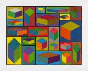
Distorted Cubes #2 is a prime example of LeWitt’s interest in the line, cubes and seriality. LeWitt experiments with the illusion of volume on a two-dimensional surface. The cubes are examined through the lens of physical space. Each one highlighted by different perspectives of distance, height and lighting.
Each of the 21 distorted cubes is placed within one delineated square box, making up an uneven grid. The grid’s appeal lies in that it can extend in all directions infinitely into a space beyond the frame, but it also functions as a frame, which implies structure. The grid is modern through its non-decorative structure and order but also in its non-narrative qualities.
Sol Lewitt played a pivotal role driving art into a new and unchartered direction. His focus on space, form, line, volume, and color, created the Minimalist Movement. Along with other artists such as Frank Stella, and Ellsworth Kelly, the minimalists achieved a new philosophy in art theory, that although reactive to abstract expressionism, furthered the progression of art breaking away from traditional, representational art.