WOW – Work Of the Week – Francis Bacon “Study For Bullfight #1”

Study For Bullfight 1

FRANCIS BACON
Study For Bullfight #1
1971
Lithograph
62 3/4 x 46 7/8 in.
Edition of 150

Signed and numbered

About This Work:

This dynamic print by Francis Bacon is based on the first of three bullfight studies that Bacon painted in 1969 following several trips to South of France and Spain.
In these works, the artist explores the subject of the corrida, after he had the opportunity of encountering the bullfight first hand. This subject became more and more significant for the artist, and a large number of books and postcards on bullfighting were found among the items in Francis Bacon’s studio.

In Study For Bullfight #1, one can see several elements typical of Francis Bacon’s style. One among others, the disfigured head of the bullfighter, which conveys pain and the hectic movement of this cruel fight. Bacon’s great admiration for Picasso’s work, especially the Tauromachie (Guernica), is visible not only in the cubistic style head, but also in the body of the bull, depicted as knot of lines and shadows, in which just one horn, the tail and the bull’s rear legs are recognizable.
His style is also characterized by flat backgrounds and sense of motion, derived from the frequent use of photography and film stills as sources for portraiture. Here we can see a very unsettling orange background, used in several subsequent works, and some curved lines around the bull, indicating the rotatory movements of the fight. On the right, an open panel reveals a crowd of onlookers witnessing the violent scene.

Bacon frequently contemplates the fragility and suffering of the human condition. Bacon’s Study For Bullfight #1 is a work in which the artist speaks of an unalterable condition of human struggle through the visual allegory of a bullfight. Bacon was actually influenced by the violence and drama of the sport.

Francis Bacon was a dominant figure of postwar art, and his artworks remain unmistakable for their contorted emotion and visceral physicality. “I would like my pictures to look as if a human being had passed between them, leaving a sort of human presence” he once said.
Mostly self-taught, Bacon nonetheless drew influence from an wide range of artists, from Vincent van Gogh to Diego Velázquez, making explicit visual references to many of their works in his art. His lasting influence can be seen among Young British Artists, in particular Damien Hirst.

Click here to see Damien Hirst speaking of Francis Bacon’s work


WOW – Work Of the Week – Andy Warhol “Louis Brandeis”

10 Potraits Of Jews - Louis Brandeis

ANDY WARHOL
Louis Brandeis, from 10 Portraits Of Jews Of The 20th Century
1980
Screenprint on Lenox Museum Board
40 x 32 in.
Artist’s Proof (A.P.) of 30

Pencil signed and numbered lower left

About This Work:

In 1980 Andy Warhol produced a suite called Ten Portraits of Jews of the 20th Century. This series appeared at the Jewish Museum that year for the first time.
The idea for this series came from the art dealer Ronald Feldman, after an Israeli dealer asked for a series of portraits of Golda Meir.

To create this portfolio, Warhol followed his usual procedure for portraits, silk-screening a photograph over previously applied colors and tracing crayon-like lines over the photograph’s contours. The underlying vivid colors are broken up into flat, geometric compositions, creating a mild tension between abstraction and photographic representation.

The ten subjects of the series were more than just celebrities. They were all people of great accomplishment. But the real subject in this portraits is Fame. Warhol was obsessed with the concepts of fame and publicity and he was interested in famous people because they were famous. What the series reflects is the distinctively modern experience of knowing many famous people but rarely knowing in any depth what they are famous for. For example, lots of people know the name Gertrude Stein, but how many have actually read anything she wrote?

The Ten Portraits Of Jews Of The 20th Century are renowned luminaries of Jewish culture. They are:

  • Franz Kafka (1883-1924): the eminent novelist.
  • Gertrude Stein (1874-1946): the avant-garde American writer, poet and playwright.
  • Martin Buber (1878-1965): a renowned philosopher and educator.
  • Albert Einstein (1897-1955): the theoretical physicist, widely regarded as the greatest scientist of the twentieth century.
  • Louis Brandeis (1856-1941): the first Jewish judge of the United States Supreme Court.
  • George Gershwin (1898-1937): the distinguished American composer.
  • Marx Brothers Chico (1887-1961), Groucho (1890-1977), and Harpo (1888-1964): the famous vaudeville, stage and film comedians.
  • Golda Meir (1898-1978): Israel’s fourth Prime Minister and one of the founders of the State of Israel.
  • Sigmund Freud (1856-1939): the hugely influential founder of the psychoanalytic school of psychology.
  • Sarah Bernhardt (1844 – 1923): the renowned stage and film actress.

The collective achievements of this group changed the course of the twentieth century and may be said to have influenced every aspect of human experience.

About Louis Brandeis:

Louis Brandeis was an American lawyer. He was born in Louisville, Kentucky, to Jewish immigrant parents.
He attended Harvard Law School, graduating at the age of twenty with the highest grade average in the law school’s history. Brandeis settled in Boston, where he founded a law firm that is still in practice today as Nutter McClennen & Fish, and became a recognized lawyer through his work on progressive social causes.

He was the first jewish lawyer to enter the Supreme Court and his work has been fundamental in building some of the most important legal concept of all times, such us the right to privacy, the freedom of speech and the regulation of big corporations and monopolies. Being heavily socially involved and sincerely willing to help people, he used to work for free a lot of times and for this reason he eventually gained the name of “People’s Lawyer”.

10 portraits of jews

WOW – Work Of the Week – Joan Miro’ “Barbare Dans La Neige”

Barbare Dans La Neige

JOAN MIRO’
Barbare Dans La Neige
1976
Etching with aquatint in colors
29 3/4 x 42 in.
Edition of 50

Pencil signed and numbered

About This Work:

Most people consider Joan Miro’ as being part of the Fauvism, also known as the Naive movement. This artistic movement used a variety of bright colors and looked at the Primitives as artists unaware of the law of harmony and balance and, for this reason, free from any form of artistic constriction. However, Miro’ went through multiple influences during his career. He always gave great importance to shapes, which was common in the Cubism art form, and he was open to the unexpected, like Dadaists and Surrealists.

These influences led him to elaborate a very personal concept, a way of looking at Art that eventually became the core of all his artistic work. The concept that representational painting no longer corresponded to artistic truth, nor that the previous artistic movements were able to express adequately the world in which we live, weighted heavily on Miro’. For example to Miro’ war was part of his life and his art. He felt that the current movements of art did not show the effects that World War I and World War II had on the world.

For Miro’ to convey his own artistic style and message, he started to research and experiment with many different techniques. Eventually he realized his own identity. Breaking away from the classical thinking and the “rules” that bound his artistic expression, Miro’s technique was a manipulation of reality, in a sense, and its influence is visible in the fragmented and apparently non-organized shapes of this work Barbare Dans La Neige and many others of Miro’s artworks.

Barbare Dans La Neige is characterized by the use of pure primary tones with a thick black border, big simple forms and exceptional poetic expression. The artist often worked with a limited palette, yet the colors he used were bold and expressive, emphasizing the potential of fields of unblended color.

This whimsical and fanciful subject appears to be quite harmless against the white background and circled by colorful stars, a green crescent moon (a very important element in his iconography) and a bright red accenting mark in the upper margin  – maybe a sun.  Amorphous amoebic shapes alternate with sharply drawn lines, spots, and curlicues, all positioned on the print seeming nonchalance.

This work has a childlike simplicity and playfulness to it, showing how Miro’ sought an essential pictorial vocabulary in primitive sources, particularly prehistoric cave paintings of his native Spain. These painting were formed by signs, symbols and basic linear ingredients. Miro’ invented a new kind of pictorial space in which objects issuing strictly from the artist’s imagination are juxtaposed with basic, recognizable forms.

Barbare Dans La Neige is a perfect example of this.

WOW – Work Of the Week – Lichtenstein “Reflections On Minerva”

Reflections On Minerva

LICHTENSTEIN
Reflections On Minerva
1990
Lithograph, screenprint, relief and metalized PVC collage with embossing on mold-made Somerset paper
42 x 51 3/4 in.
Edition of 100

Pencil signed, dated and numbered

About This Work:

Pop Art draws upon the style and imagery of advertising and popular culture to challenge our preconceptions about the nature of art itself. Roy Lichtenstein not only was a New York Pop Art painter, but also one of the first American Pop artists to achieve widespread notoriety.

His very personal and unique style derived from comic strips which portray the trivialization of culture, endemic in contemporary American life. Using bright, strident colors and techniques borrowed from the printing industry, he ironically incorporates mass-produced emotions and objects into highly sophisticated references to art history. This is the case of Reflections On Minerva.

Lichtenstein has often explored the theme of Reflections, incorporating them in various paintings and several print series. In 1988 Lichtenstein began working on a group of Reflections paintings, in which the central image is partly obscured by reflective streaks, as if behind glass or reflected in a mirror.

Reflections On Minerva can be considered an iconic work, since it is a perfect example of Lichtenstein’s style. A style made of primary colors – red, yellow and blue, heavily outlined in black. Instead of shades of color, he used the ben-day dot, a method by which an image is created, and its density of tone modulated, through the position and size of a myriad of dots during the printing process.

The original source for this Reflections print was the November-December 1948 edition of the comic book ‘Wonder Woman’, illustrated by Harry G. Peter. The eponymous super-heroine is shown with a speech bubble exclaiming her catchphrase, ‘Merciful Minerva!’. Wonder Woman regularly invoked the Roman goddess Minerva, who was traditionally known as the goddess of wisdom but also encompassed the arts, trade, poetry, and later, war and power.

Despite the title of this work, Reflections On Minerva, the “reflections” are the real protagonists of this work. They are formed by portions of the print striped or dotted and layered upon the image of Minerva, which is drawn with the simple lines typical of comic strips. The theme of reflection is a very important one for Lichtenstein.

Other works by this artist:

Landscape With Boats

Landscape With Boats

Painting on Blue and Yellow Wall

Painting On Blue And Yellow Wall

Mirror 7

Mirror #7

WOW – Work Of the Week – David Hockney “Hat On Chair”

Hat on Chair

DAVID HOCKNEY
Hat On Chair, from The Gedzahler Portfolio
1998
Etching aquatint
29 1/2 x 22 3/8 in.
Edition of 100

Pencil signed, dated and numbered

About This Work:

David Hockney is considered not only an important contributor to the Pop Art movement of the 1960s, but also one of the most influential British artists of the 20th century.

During his artistic career, Hockney has produced a wide range of artworks making use of several techniques, but he has always worked on portraits. From 1968, and for the next few years, he painted friends, lovers, and relatives. 

This is the case of Henry Geldzahler. Henry Geldzahler was the first curator of 20th-century art at the Metropolitan Museum and New York City’s Commissioner of Cultural Affairs. His personal relationships with many of the artists selected for his exhibitions gave him special insight into their works. Andy Warhol himself produced a 90-minute film consisting nothing more than Geldzahler smoking a cigar. His written work focused exclusively on contemporary artists and much of his writing is more criticism than art history.

Hockney’s Hat On Chair is one of ten works in the The Geldzahler Portfolio, published in 1998. Other artists that contributed to this portfolio are Jasper Johns, Roy Lichtenstein, James Rosenquist, David Salle, and Frank Stella among others. Dennis Hopper even contributed a photograph of Geldzahler, Warhol, and Hockney smoking.

Hockney’s Hat On Chair is one of the most interesting. It is an etching of a Panama hat and bow tie on a chair. Hockney often painted chairs. To Hockney, the Panama hat and bow tie represented the most iconic images Henry Geldzahler, so he preferred to realize such a portrait instead of a “regular” face. In this sense Hockney’s own presence is implied here, since this very personal way to portrait Henry Geldzahler suggests the artist’s unique point of view and sensitivity.

WOW – Work Of the Week – Nate Lowman “Bullet Holes”

Bullet Holes

NATE LOWMAN
Bullet Holes
2010
Screenprint on silver metallic paper
35 x 25 in.
Edition of 50

Pencil signed, dated and numbered

About This Work:

Nate Lowman is an American artist, well-known for being part of a group of New York artists who called themselves “Warhol’s children”.
His art, indeed, is interdisciplinary and contemporary, with a focus on pop and trash culture, very much influenced by Andy Warhol.

The main theme of his work lies in creating connections from the detritus of pop culture to its spectators. Lowman states: “I don’t have a great imagination to share something with you that I don’t know, so it’s about interpreting things, a dialogue”.
Brilliantly juxtaposing the raw appeal of familiar cultural debris and an energetic re-examination of Pop Art, the images he gathers often come from the news cycle or the crime police blotter. The result is a critique of culture that reflects upon issues such as the cult of celebrity, material consumption and violence.

Lowman brought downtown nonconformity to the mainstream art world with his “bullet holes” paintings. Bullet Holes, although resembling a very simple artwork, hides a lot of different references and has its roots in the American Pop Art.
Based on images of bullet holes, identical and reflected in the opposite way through a print on metallic paper, this work conceptualizes violence in popular culture as a direct successor to the remarkable Death And Disaster series of Andy Warhol.
Reminiscences of Lichtenstein are also visible when it comes to the cartoonish pop aesthetic.

Metaphorically, the deafening shot of the gun refers to the nonchalant prevalence of violence in media culture and America’s obsession with guns. “America is built on violence “ Lowman has said. The destructive force of the bullets culminates in a bottomless black hole at the center of the two images, resulting in a powerful yet playfully hopeful message of culture awareness.

Lowman came to prominence in the New York art scene during the early 2000s. He has has solo exhibitions in New York, London, Greenwich, Greece and many other places. His work has also been exhibited by the Museum Of Modern Art in New York, the Palazzo Grassi in Venice, the Palais De Tokyo in Paris and the Whitney Museum Of American Art in New York. He lives and works in New York City, NY.

WOW – Work Of the Week – Lichtenstein “Two Figures With Teepee”

Two Figures With Teepee

LICHTENSTEIN
Two Figures With Teepee
1980
Soft-ground etching, aquatint and engraving on mold-made Lana paper
23 5/8 x 20 5/8 in.
Edition of 32

Pencil signed, dated and numbered

About This Work:

When one thinks of Roy Lichtenstein, one does not think of American Indian Art. However, Lichtenstein was interested in the people of the Old West, particularly Native American Indians. Lichtenstein’s engagement with American Indian art is reflected in two periods: his earliest work and his Surrealist series of the late 1970’s-1980’s.

His interest in American Indian art began during the days of his childhood in New York, during several visits to the American Museum of Natural History. In 1950, he began a series of jokey takeoffs on heroic myths and legends. His interest was also partly stimulated by his experiences in Southampton during the late 1970s when he and his wife resided near a Shinnecock Indian reservation, and by the collections of friends such as Jasper Johns, Frank Stella and Donald Judd, all of whom were known to have acquired Native American blankets and other objects to use in their work.

Some of the themes that Lichtenstein used in his works are American Indian symbols, specific designs for mythical animals found on pottery and in books, and the hatched lines from Southwestern pottery, textiles and ceramics, just to name a few.

Lichtenstein’s Two Figures With Teepee is part of a series of six small intaglios, all of which are soft-ground etching, aquatint and engravings about the American Indian theme. This series was accompanied by another series of six woodcuts, larger in size and different in style. This particular phase of Lichtenstein’s American Indian-inspired work occurred from 1979 to 1981, long after he had established his familiar Pop style.

This work has a classic Native American palette formed by saturated reddish-brown, green, yellow and black pigments, with the mold-made Lana paper constituting the rest of the image. The tones refer to the earth and the colors that American Indians use for their textiles and handcrafted items.

In Two Figures With Teepee several important elements are present, all recalling the American Indians’ lifestyle and traditions: lightning-like zigzags and crosses symbolizing the four directions, arrow-like triangles, graphic patterns that symbolize wood and leather textures, and a strong component of geometrical abstraction through which the artist reshuffled, stripped and reworked the elements in the flat planes and geometry of Synthetic Cubism.

The first figure is formed by a blue eye with and eyebrow and a braid, like the long braids of the American Indian women. The second figure is formed by a squared eye – a type of eye that Lichtenstein often used for this series – and a group of feathers that resembles the typical American Indian headress, almost always decorated with feathers. Both figures make reference to the larger woodcut series.

Two Figures With Teepee is formally and iconographically very interesting, a perfect example of the spatial dislocation, proper of the Cubist movement, that unifies all the elements instead of dividing them. Some critics have also stated that the powerfully graphic nature of Native American art most likely appealed to Lichtenstein due to its visual similarity to his own style at this time.

Other works by this artist:

Landscape With Boats

Landscape With Boats

Mirror #7

Mirror #7

Painting On Blue And Yellow Wall

Painting On Blue And Yellow Wall

WOW – Work Of the Week – Coinslot “Jobs Vs The FBI”

Jobs vs the FBI

COINSLOT
Jobs Vs The FBI
2016
Water based ink on paper
22 x 30 in.
Signed in ink

About This Work:

Alexander Perez, known as Coinslot, is a Miami based artist/satirist.
Drawing upon random thoughts, strange things that he has witnessed, and his biggest source, the media, he meticulously draws and paints scenes that can be taken right out of the “Twilight Zone”.
A student of New World School of the Arts in Miami, Coinslot has definitely mastered the technical aspect and capabilities to become a world class artist, but it is the way he creates his images and art work in his mind that sets him apart from the rest.

Coinslot not only has the remarkable ability to view a situation and create a ‘sick and twisted’ version of it in his mind, but also has the incredible talent to take what he sees in his mind and put the pen to paper creating this ‘sick and twisted’ masterpiece in the most fullest and complex detail you’ve ever seen” – Gregg Shienbaum.

To view his works properly, one must stand in front of his art for at least 20-30 minutes to see all the minute and incredible details of wit, humor and absurdity that is poured onto the canvas directly from his mind.
Jobs Vs The FBI is the perfect example of this. In this work Coinslot takes a news related relevant issue, in this case Apple versus the United States, in which a federal court judge has ordered Apple to assist the FBI with unlocking an iPhone used by one of the attackers responsible for the massacre in San Bernardino, California. Apple, for its part, is still fighting the court order, arguing that the FBI is asking for something that will lead to the invasion of the privacy of millions of people.

Here Jobs’ grave, as in real life, is unmarked. Coinslot cleverly places the old Apple logo on the grave marker, which is surrounded by FBI men asking for his permission to give Apple the go ahead to write the code that will eventually unlock all of the world deepest darkest secrets.

It is just like Adam taking a bit of the Apple unleashing an uproar upon the world. The FBI men take Jobs silence as him giving them permission. This is Coinslot’s way of telling us that the government is going to do it any way with or without him.

Aside from making the viewer think or in some cases making the viewer uncomfortable, Coinslot’s attention to detail is the other important aspect of his work. Everything is in the details. His attention to details can be seen in all the leaves in the trees and the blades of grass, but it is the details that you don’t notice at first that make this piece. The inclusion of a tiny man in the background visiting someone’s grave and the other names and sayings on the grave markers. He even places his name on a grave marker with fallen leaves on it. All these painstaking meticulous details, add to the WOW of the piece and it is these details that raise the most smiles and eyebrows.

WOW – Work Of the Week – Ed Ruscha “Cash For Tools 2”

Cash for Tools 2

ED RUSCHA
Cash For Tools 2, from Rusty Signs
2014
Mixograph on handmade paper
24 x 24 in.
Edition of 50
Pencil signed, dated and numbered

About This Work:

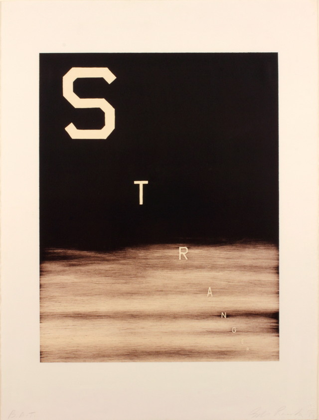
Ed Ruscha is a well-known American artist who achieved recognition for artworks incorporating words and phrases, all influenced by the deadpan irreverence of the Pop Art movement. Indeed his textual art can be linked with the Pop Art movement but also with the Beat Generation as well.

During the Cold War era, the rise of commercial advertising was a dominant force in American life. Consequently, the increasing importance of graphic design, the popularity of Hollywood and American cinema as well as the lights and the landscapes of the West Coast, provided the backdrop against which Ruscha developed his highly original iconography.

Since the early sixties, Ed Ruscha has wittily explored language by channeling words and the act of communication to represent American culture. Language, in particular the written word, has pervaded the visual arts, but no other artist has the command over words as Ruscha. His works are not to be understood as pictures of words, but instead words treated as visual constructs. His idea plays into the very essence of Pop Art.

Cash For Tools 2 is part of the Rusty Signs, series in which Ruscha uses words, that he considers as “neglected and forgotten signs from neglected and forgotten landscapes”. These Rusty Signs are reproduced in uncanny detail that blurs the line between the fictitious and the real.

This artwork, as well as the whole series, is further expression of a consistent theme that runs throughout his work: the passage of time. We are confronted with the physical effect of time upon them, a blunt reminder of its inescapability, even on steel.

Once again filtered through the language of common American objects, these prints appear to be rusted signs that read “DEAD END,” “CASH FOR TOOLS,” and “FOR SALE 17 ACRES.”

Ruscha has chosen to produce multiple variations of these signs, giving the impression that they have been weathered by time in varying ways, as if they came from different locations or were subjected to a different set of circumstances. For example there are two versions of Cash For Tools and Cash For Tools 2 is more ruined and consumed than Cash For Tools 1. Some have gunshots and some are missing sections, while others appear to have acquired thick layers of rust and grime. In this way, each piece of the series seems to contain an independent story, their histories having literally formed their present state. 

The Rusty Signs series also marks a transformation of some of Ruscha’s aesthetic concerns; having painted and photographed signs and signage throughout his career, works such as Cash For Tools 2 signify the first time in which he is not merely representing the image of the sign, but actually recreating the sign itself. We no longer see a fictionalized representation but we actually see the sign itself, and its physicality is a part of its essence. At the same time, having been removed from context, they still share the sense of disconnection that permeates in many of his depictions of signs.

Ruscha asks us to consider these components of visual culture as independent objects, as if their introduction into the world was not merely an accident or result of inevitable forces, but an act of creation, a work of art.

Other works by this artist:


For Sale

  For Sale 17 Acres, by Ed Ruscha  


Stranger

Stranger, by Ed Ruscha