 |
||
|
SHEPARD FAIREY About This Work: Tomorrow, finally, will be Election Day. Both candidates have very high unfavorable poll numbers. Both candidate are flawed. Questions about politicians and just how ethical they are, and how ethical the whole system is, have been raised. Charges of unlawful and unjust “dealings” have been tossed around for the whole world to see just how much of a mockery this election is. Due to tomorrow’s elections, we feel that this particular artwork is very fitting and we found its message very appropriate for this occasion. This weeks work of the week is called Power Bidder, by Shepard Fairey At the bottom of the work it reads “Democracy sold to the highest bidder”. With all the craziness, and nonsense that has surrounded this election cycle, it seem that truer have never been spoken! — Frank Shepard Fairey (born February 15, 1970) is an American contemporary graphic designer and illustrator who emerged from the skateboarding scene. He first became known for his “Andre the Giant Has a Posse” Fairey created the “André the Giant Has a Posse” sticker campaign in 1989, while attending the Rhode Island School of Design (RISD). This later evolved into the “Obey Giant” campaign. As with most street artists, the Obey Giant was intended to inspire curiosity and cause the masses to question their relationship with their surroundings. His work became more widely known in the 2008 U.S. presidential election, specifically his Barack Obama “Hope” poster. The New Yorker art critic Peter Schjeldahl called the poster “the most efficacious American political illustration since ‘Uncle Sam Wants You'”. The Institute of Contemporary Art, Boston calls him one of today’s best known and most influential street artists. His work is included in the collections at The Smithsonian, the Los Angeles County Museum of Art, the Museum of Modern Art in New York, the Museum of Contemporary Art San Diego, the National Portrait Gallery in Washington, the Virginia Museum of Fine Art in Richmond, and the Victoria and Albert Museum in London. In 2011 Time Magazine commissioned Fairey to design its cover to honor “The Protester” as Person of the Year in the wake of the Arab Spring, Occupy Wall Street and other social movements around the world. This was Fairey’s second Person of the Year cover for Time, his first being of Barack Obama in 2008. |
Tag Archives: wynwoodmiami
WOW – Work Of the Week – Jim Dine “Zein Robe”
 |
||
|
JIM DINE About This Work: Jim Dine was born in Cincinnati, Ohio in 1935. He studied at the University of Cincinnati, the Boston Museum School, and in 1957 he received a bachelor of fine arts degree from Ohio University. In 1962 Dine’s work was included, along with Roy Lichtenstein, Andy Warhol, Ed Ruscha, Wayne Thiebaud and many more, in the historically important and ground-breaking New Painting of Common Objects, curated by Walter Hopps at the Norton Simon Museum. This exhibition is historically considered one of the first “Pop Art” exhibitions in America. Often associated with the Pop art movement, Jim Dine features everyday objects and imagery in his paintings, drawings, and prints. His works focuses on certain subject matter, bathrobes and hearts amongst them. However, unlike many Pop artists, he focuses on the autobiographical and emotive connotations of his motifs. Dine began painting bathrobes in 1964; some of them were titled or subtitled “self-portrait”. The bathrobe became a motif in his repertoire which he has returned to on many occasions, in prints as well as paintings. Though he claimed never to wear a bathrobe, nonetheless these are all, in a way, portraits and self-portraits. Zein Robe illustrates the enduring importance of the bathrobe motif in Dine’s work, a motif that he has been using over the years in countless printed works to depict mostly himself, but also his wife and people around him. This lithograph depicts a belted robe that features casual, painterly strokes, hand painted in deep reds and oranges. This robe, once again, represents the alias of a person. This robe faces us, with the invisible hands over the hips, affirming Zein’s presence and personality. After a 1984 trip to The Glyptothek in Munich, Jim Dine was inspired to create a series of figurative drawings based on Greek and Roman antiquities, the so-called Glyptotek Drawings. This project required a lot of technical work, a process that would ultimately end in the production of heliogravure prints. When elaborating the Glyptotek Drawings, Kurt Zein, a master printer in Vienna, was fundamental in the production of this project. An accomplished printmaker, Dine remains one the most famous American artists of today. His work is part of numerous public collections all over the world. He still lives and works in New York City. |
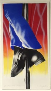
Work Of the Week – James Rosenquist “Firepole”
 |
||
|
JAMES ROSENQUIST About This Work: Born on November 29, 1933 in Grand Forks, ND, James Rosenquist attended the University of Minnesota, before earning a scholarship to the Art Students League in New York in 1955. James Rosenquist is one of the key figures in America’s Pop Art movement. Rosenquist takes fragmented, oddly disproportionate images and combines and overlaps them in his works to create visual stories, in the most abstract and provocative ways. Rosenquist’s paintings and prints are often made in unusual proportions and giant dimensions. For example, one of his prints, called Time Dust (1992), is thought to be the largest print in the world, measuring approximately 7 x 35 feet. In 1967, Rosenquist painted Firepole, a monumental mural commissioned for the American Pavilion at the Montreal World Exposition. This mural featured gargantuan blue-uniformed legs wrapped around a fireman’s pole. Firepole refers to Rosenquist’s idea “that it was unnecessary for U.S. to police the world or be the fireman of it“. Indeed, Rosenquist has always been very much involved with political and social issues of that time, especially criticizing the Vietnam war and the political positions of the US government in terms of global relationships and conflicts. Today Rosenquist is considered one of the greatest American artists still alive. |
Work Of the Week – Tom Wesselmann “Wildflower Bouquet”
 |
||
|
TOM WESSELMANN About This Work: Tom Wesselmann was born on February 23, 1931 in Cincinnati, OH. In New York, he started earning his living by working as a cartoonist for several journals and magazines as well as by teaching at a high school in Brooklyn. Even though he disagreed with being labeled a “Pop” artist, Wesselmann’s work is considered belonging to the Pop art movement. During his artistic career, he experimented with materials and imagery; both collage and sculpture found their way into his assemblages. When he was not working on stylized female nudes (these works are actually what he is best known for), common objects were the main theme of his art work. This is the case of this work of the week, Wildflower Bouquet. Wildflower Bouquet is one of Wesselmann’s famous so-called Steel Drawings. With the invention of the Steel Drawings, Wesselmann began to focus more on drawing for the sake of drawing. For the first time he was approaching art on a new basis, where the scribble was the final product. The drawings that would be transferred into steel were selected carefully and their crisp outlines resonated with the immediacy of a neon sign. The drawings were usually the preliminary sketches to his other works, like paintings or prints. However, when making a comparison between the same image done in two different media, for example a steel cut-out and a painting, one can notice how the artist subtly played changes on his formal language in the treatment of the outlines, or in the spaces in between. Wesselmann was also deeply influenced by Matisse, who had long been a source of inspiration for him. In the metal works, Wesselmann can be understood to have devised his own equivalent to the paper cut-outs that had marked Matisse’s equally bold and life-affirming last phase. The steel drawings represent Wesselmann’s best-known technical innovation. Wesselmann’s Steel Drawings caused both excitement and confusion in the art world. After acquiring a piece in 1985, the Whitney Museum of American Art wrote to Wesselmann asking why he had labeled the work a drawing and not a sculpture. His response was that while he considered it a pure drawing, it was “an example of life not necessarily being as simple as one might wish”. |
WOW – Work Of the Week – KAWS “Chum Running Pink”
 |
||
|
KAWS About This Work: Brian Donnelly, born in 1974, is a New York – based artist, professionally known as KAWS. In 1999 KAWS began to design and produce his first limited-edition vinyl toys with Japanese clothing brands and companies. That seemed to be the right country for the beginning of his career, because in Japan, the toys genre is well respected and widespread. KAWS’ work is characterized by repeating images, all meant to be universally understood, surpassing languages and cultures. He is greatly influenced by iconic characters from modern pop culture. KAWS uses four main characters: Companion, Accomplice, Chum and Bendy. They riff on Mickey Mouse, Bugs Bunny, the Michelin Man and a giant spermatozoa. Their relationship to Donnelly hovers somewhere between avatar, id, conscience and inner child. KAWS’ work treads the fine line between art, commerce, cartoons, and commercials. It distorts, yet at the same time, pays homage to, all the popular objects and icons produced, bought, sold, exchanged, desired, and cherished; the essence of American consumerism. His artworks transform iconic pop culture characters into thought-provoking works of art. His work possesses a sophisticated humor while employing a refined graphic language that revitalizes figuration with bold gestures, playful and cartoonish images. A graffiti artist, illustrator, toy-maker, sculptor and painter, KAWS is now a world-renowned artist, who exhibits in museums and galleries internationally. |
WOW – Work Of the Week – Jasper Johns “Voice 2”
 |
||
|
JASPER JOHNS About This Work: Born in Georgia in 1930 and raised in Allendale, South Carolina, Jasper Johns grew up wanting to be an artist. He studied briefly at the University of South Carolina before moving to New York in early 1950’s. Working in New York in the 1950s, Johns became part of a community of artists, including Robert Rauschenberg, that was seeking an alternative to the emotional nature of Abstract Expressionism. In the mid-1960’s, Johns executed a large painting and lithograph, both entitled Voice. He then returned to this theme in a very large, three-part painting called Voice 2, which he worked on from 1968 through 1971. With several different print versions of the canvas – this work, Voice 2, among them – Johns varied the colors and experimented with the placement of the rectangles making up each composition. The title of the work, which forms the imagery, can be read in a rotating cylindrical pattern. Johns has always been fascinated with numbers, letters and words. In this work, he plays with the letters of the word VOICE in a very personal way, superimposing the figures to create a multiple image, so that each time the eye adjusts to focus on a letter the spectator perceives a slightly different picture. These kind of works by Jasper Johns were extremely new to the museum goers and art lovers, especially at a time in which the art world was searching for new ideas. Johns is still one of most significant and influential American painters of the twentieth century, and also considered as one of the greatest printmakers of any era. |
WOW – Work Of the Week – Shelter Serra “Roley”
 |
||
|
SHELTER SERRA About This Work: Shelter Serra is an artist born in Bolinas, California, in 1972, nephew of post minimalist artist Richard Serra. Shelter Serra studied art at the University of California and then earned his MFA from the Rhode Island School of Design. His eccentric and nonconformist style gained attention in the New York art scene in 2009, when he started to transform objects into multimedia works that investigate the cultural status symbol. Although made in a wide range of materials and media, Shelter Serra’s work is based on only two core concepts: that art should be accessible to everyone and that art should reflect the desires and concerns of everyday people in everyday life. With his work, Serra tries to question our system of values, particularly concentrating on the concept of luxury and high-end society. He is known for his thought-provoking recreation of iconic objects that symbolize a cultural status, such as the Hermes Birkin bag or the Rolex, one of his most famous subjects, as seen here. Roley is an object that carries a determined cultural status. The image of the Roley is nothing but an irreverent representation of luxury, materialism, and consumption. By representing this seemingly mundane watch, Serra tries to question the functionality and the meaning, or lack there of, behind an expensive object. Serra created a plastic ‘Fake Rolex’, to be worn on the wrist. A homage to the ultimate watch of status. These Fake Rolex watches are basically the idea of replicating something and making it available to the everyday consumer. They can be bought for less than $40, clearly mocking the real Rolex and all its social and cultural meanings. The image of the Roley is one built on questions rather than based on ideas. By representing this worldwide recognizable object in a neutralized and homogenous form, the artist urges the spectators to rethink, and question their values, to discover the absence in an object that we value, and to reflect on the deeper cultural meaning of things and their social, economical or environmental aspects. |
Gregg Shienbaum Fine Art featured on Widewalls
Click on the image below to read the article
Gregg Shienbaum Fine Art featured as one of the best Miami galleries on Widewalls
Click on the image below to read the article

WOW – Work Of the Week – Andy Warhol “Sidewalk FS II.304”
 |
||
|
ANDY WARHOL About This Work: Much has been said about Andy Warhol, his art and his decadent personality. Warhol’s fascination for fame and celebrities shows up in this work, that he masterfully simply calls Sidewalk. The image of this work is from a series of photographs taken by Andy Warhol himself. This image displays the handprints and signatures of Cary Grant, Judy Garland, Jack Nicholson and Shirley Temple, that are on the Hollywood Walk of Fame. |