WOW! – Work of the Week – Keith Haring – Untitled C & D


Keith Haring
Untitled C
1987
Lithograph
11 x 14 3/4 in.
Edition of 100
Pencil signed, dated and numbered
Keith Haring
Untitled D
1987
Lithograph
11 x 14 3/4 in.
Edition of 100
Pencil signed, dated and numbered

About the work:
1987
The nation of South Africa was in a state of emergency. Serious political violence had arisen over Apartheid and the National Party had won an election, yet again.
41,027 people had died of AIDS complications in America, and another 71,176 people were diagnosed with the disease. After 6 years of silence, then-president Ronald Reagan finally used the word “AIDS” in public for the first time.
Crack-cocaine incidents in the US had increased to 94,000 from 23,500 only 2 years prior – a 300% jump.
_______________________________
Keith Haring’s work sums up New York cool. He was friends with Madonna, Andy Warhol, David Bowie, among many others who represented the 80’s culture boom. By the start of the decade, the artist had developed a fresh aesthetic, with roots in punk, hip-hop and graffiti. His strong lexicon of caricature-like images in flat, bold colors, are so deceivingly simple and joyful that it is easy to be blinded to its political and activist content.
Keith Haring was a fierce and tireless socio-political activist throughout his life, and had a rational of intervention and standing up for oppressed communities. He was opposed to the institutionalized racial segregation in South Africa, fought for increased sexual education for the gay population in the face of the AIDS epidemic and was determined to raise awareness of the effects of crack-cocaine which ravaged the disenfranchised black society of the US.
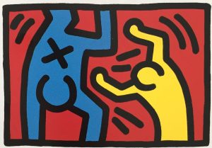
This week’s Work of the Week! WOW! is Untitled C & D, from the untitled suite of 4 lithographs created in 1987. This suite was purposely done as a lithograph and not a silkscreen, the dimensions of the works are slightly smaller, and the edition size is smaller. It is limited to only 100 pieces. This was done so as not to be confused with the Pop Shop series, which were released on a more commercialized level. As with the vast majority of Haring’s work, this 4 piece suite of lithograph references deep commentary on societal unease.
Throughout Keith Haring’s work, the image of a television represents the mass media. The character depicted in Untitled C is on TV covering his eyes. At first, the saying “See no evil,” comes to mind. This is quite the opposite. Haring wants us to open our eyes and speak out against these evil atrocities, and not to cover our eyes, or turn a blind eye to it. Thanks to Haring’s repetitive use of symbols referencing different ailments of society, we know what he is critiquing.
In Untitled D, the yellow character seems to be tossing, or pushing away, another figure in blue that bears an X on his belly. The X is symbolic of the crack-cocaine epidemic that ravaged mostly impoverished segments of the country. Today, it is widely accepted that this particular pandemic was ignored by the media, at the time, in light of the people it was affecting. This is something that Haring was acutely aware of, and through this work, he gently provides a humanizing context that not only speaks to the situation, but also to his position.
Despite being one of the most influential and sought after artists of the 20th century, Keith Haring always remained true to his beliefs and humanity. He used his voice and platform for those who needed a supporter and champion. Untitled C & D are a clear wake-up call to the public to be aware of the problems society at large. This is what Haring’s art was about, it is not only colorful, whimsical characters that makes people smile. His entire body of work spoke volumes of the socio-political issues plaguing the world at the time.

WOW! – Work of the Week – Julian Opie – Walking Statuettes


Julian Opie
Walking Statuettes
2017
Series of seven hand-painted statuettes
Various sizes
Edition of 30
Signed and numbered


“I don’t invent or imagine things, just notice and record them.”
Julian Opie is a master in the reductive style. He expertly captures the essence and individuality of each of his subjects with minimal line-work and flat, solid colors. His highly stylized works can be characterized as a blend of Pop Art, Minimalism with contemporary sensibility that capture the world around us precisely.
Employing a variety of media and technologies, Opie distills everyday experiences into concise but evocative renditions, and his clean, thickly outlined figures have made an iconic impression on the contemporary art world.
Opie’s figures are typically drawn from photographs of people walking in the streets. He has admittedly gone through hundreds of pictures of passers-by and picks a select few to draw, which he saves as a palette of characters to use for his creations. According to the artist, each personage gives him surprises and opportunities to create individuality, that he could not invent, such as clothing or hairstyles. He then arranges them back into a crowd, and, like any crowd on the street, the composition is made up of strangers who walk distractedly, never interacting with one another. By making groups of walkers, Opie
composes a street crowd.
This week’s Work of the Week! WOW! is Walking Statuettes.
These 7 Walking Statuettes displayed together form exactly that, a group of walkers forming a “street or sidewalk crowd”
Opie’s inspiration for his statuettes stemmed from his grandfather’s walnut and leather desk, upon which, as a child, items sat at his eye-level – Bakelite lamps and stone pen holders, leather-bound books and glass bottles of ink. These items turned the desk into their own surface. In turn, the Walking Statuettes by Opie, turn their surface into a pavement, such as a busy road populated with people checking their phones and shifting their balance and bags. His creations are models, stand-ins, that can be placed and played with.
Julian Opie observes people closely, and like a caricaturist, he has a formidable eye for foibles idiosyncrasies and character. The paradox is that he renders these nuances in a flattened, abstract style that seems at first glance to be uniform and cold, yet, each statuette seems individual and real.
The entire series of resin statuettes are hand-painted front and back. Each statuette stands approximately 14 -16 inches in height, and 5 – 8 inches wide individually. Each figurine features the artist’s signature and edition number on the bottom of each figurine. Arrange them anyway you like to create your own street scene.
Drawing influence from classical portraiture, as well as public life in today’s modern society, the artist connects the clean visual language of modern life, with the fundamentals of art history. His themes have been described as “engagement with art history, use of new technology, obsession with the human body.”

WOW! – Work of the Week – James Rosenquist – Sky Hole, from Welcome to the Water Planet


James Rosenquist
Sky Hole, from Welcome to the Water Planet
1989
Pressed Paper Pulp in colors wth lithographic collage on Rives BFK and TGL handmade paper
106 x 65 in.
Edition of 56
Pencil signed, dated, titled and numbered

About the work:
“I’m the one who gave steroids to Pop art”
James Rosenquist
James Rosenquist’s larger than life brand of Pop is not the literal Pop Art of Warhol, Lichtenstein or Indiana. Rosenquist’s work, seemingly irrational owed a debt to Surrealism through large-scale, mysterious pictorial combinations. As his works evolved, he continued to employ a juxtaposition of elements and materials, creating complex compositions as a means of exploring design and narrative. His work from the 1980s through to the end of his career is still on steroids – vibrantly colorful, abstract compositions that explore perceptions of time and space, in addition to our environment.
In the mid-1970s, Rosenquist moved his studio from Manhattan to Aripeka, Florida where his aesthetic was affected by the flora and fauna of his new surroundings. His interests shifted from the culture of consumerism to an exploration of humankind’s place in the environment. The lusher paintings of the ’80s suit their time with their candied colors. Rosenquist, in short, is one of the few former pop artists whose work continues unabatedly to have something to say. However, unlike most political art, Rosenquist’s work seems non-polemical at first, and that is the source of its power.
This week’s Work of the Week! WOW! is from the series Welcome to the Water Planet – Sky Hole.
The series came to be after Ken Tyler of Tyler Graphics Ltd (TGL) invited Rosenquist to work at his new purpose-built workshop at Mount Kisco in upstate New York. Rosenquist, who started his career as a billboard artist, was always drawn to larger than life size compositions, accepted the offer when Tyler promised him that he would provide handmade paper as big as the artist could imagine. For the project, Tyler devised a huge deckle box to make hand-made papers about 60 by 120 inches, including a giant printing press for lithography and etching measuring 120 by 240 inches.
Tyler had a deep seeded interest in hand-made papers and started experimenting with Pulp Paper projects in the 70’s, working on projects with Rauschenberg, Kelly and Hockney, among others, and by the time work started with Rosenquist, he had brought paper works to new heights in terms of scale, color and texture.
This blended perfectly with James Rosenquist’s desire to develop his idea of an image of slow-heating popcorn tied together with his concerns about the state of planet Earth – the only water planet known in existence in the universe at the time. Rosenquist included imagery that evoked the colorful and sensual riches of the earth and brilliant flora from Florida, set within a wondrous star-lit universe. ‘We all live on the water planet’, the artist stated in an interview. Rosenquist’s series of paper works were intended to act both as a celebration and a warning to what might happen to our planet.
The first idea that came to form for Sky Hole was birds of paradise approaching the water planet. The image was deconstructed into its component parts, made with curved lines of cross-hatching that would then be printed in color lithography. These lithographic elements form a collage that is laid on the brilliantly colored paper pulp sheet. The separate colors were made by filling different moulds with paper pulp placed on top of the large sheets of handmade paper. The method, was one of trial and error.
At the initial stages of the project, the method of using metal moulds, or ‘cookie cutters’, resulted in problems with translating Rosenquist’s designs into paper form due to inconsistencies of the pulp paper. But, always seeking to experiment and innovate, Tyler was able to perfect the system while Rosenquist developed the templates for each piece. For the large areas of graded color, impossible to achieve using mould shapes, Tyler proposed the use of a spray gun, used for applying stucco to walls in houses, which could spray the gradations of color across the pulp on which the lithographic elements were collaged. The technique was successful and resulted in a look of apparent spontaneity and effortlessness, contrary to the hours of preparation and a technique born of experimentation.
The collaboration between the artist and master printmaker created revolutionary works, Rosenquist, himself noting that ‘The wonderful thing about paper pulp is the color. If you take a magnifying glass, you’ll see a little fuzz rising like smoke off the surface of this handmade paper – like doing giant watercolors and letting this watercolor seep together at the perfect moment …’

WOW! – Work of the Week – Roberto Matta – Hours of the Day


8am

8pm

10pm

Roberto Matta
Hours of the Day Series
1975
Etching with aquatints
25 x 36 in.
Edition of 125
Pencil signed and numbered
About the work:
“I am interested only in the unknown and I work for my own astonishment.”
Roberto Matta
Chilean-born artist Roberto Matta was an international figure whose worldview represented a synthesis of European, American, and Latin American cultures of the 20th century. He was a classically trained architect and moved to Paris in the early 30s to apprentice with famed modernist Le Corbusier. During his two-year tutorship, he met and developed friendships with many of the leading international writers and artists who had made Paris the intellectual capital after World War I.
By 1937, he had moved away from architecture to focus solely on visual arts and became an important member of the Surrealist group. The movement was focally concerned with releasing the potential of the unconscious mind and was acutely disdained with the rational world. While he certainly shared stylistic and intellectual similarities with the Surrealist group, Matta was never able to completely reconcile his strong social conscience with the movement’s inward-looking practices. Instead, Matta balanced his interest in the human psyche with an active engagement with the external world. In the process, he provided early and crucial inspiration for the Abstract Expressionists during the War years, when he lived and worked in New York. Matta eventually broke with both groups to pursue a highly personal artistic vision.
This week’s Work of the Week! WOW! is Matta’s ‘Hours of the Day’ series.
Each work in the series is rich with Matta’s classic visual lexicon of blended abstraction, figuration, and multi-dimensional space, forming complex and cosmic landscapes inhabited by anthropomorphic figures. This particular style of Matta’s has been called inscape. Inscape works represent and evoke the human psyche in visual form, as filtered through the writings of Freud and the psychoanalytic view that the mind is three-dimensional.
Each landscape in the series is representative of each hour of the day. This is masterfully accomplished through the different lighting, meant to capture time passing. The etchings are works of expert control, exuberant with color and inventiveness. Although more joyful than many of his earlier works, they continue the artist’s exploration of duality.
Matta’s artistic oeuvre overflows with persistent oppositions: structured architecture and vast cosmos, figuration and abstraction, scientific inquiry and invisible imaginings, social consciousness and interior reflection—all of these complex, sometimes contrary, impulses stem from his international education spanning three continents and a career rich with encounters and friendships.
Matta’s artistic legacy was also a deeply personal one, as four of his six children became notable artists as well. Most celebrated among his progeny was the contemporary artist Gordon Matta-Clark, who followed in his fathers footsteps by creating socially conscious work with a distinctively architectural bent.

WOW! – Work of the Week – John Baldessari – Money with Space Between


John Baldessari
Money with Space Between
1994
Lithograph and screenprint on 2 panels
48 x 22 in. each
Edition of 45
Pencil signed and numbered
About the work:
John Baldessari is often endearingly referred to as “the guy that puts dots over people’s faces.” He is considered the godfather of conceptualism, having made a career out of defying expectations. Over 50 years, his inquisitive approach to making art has expanded the parameters of what we consider to be “art.” His work certainly succeeds in making people stop, look and reflect rather than simply taking it in passively. His sharp insights into the nature of perception and relationships between images are engaging, highlighted by his trademark deadpan humor.
Baldessari pledged, in a 1970 groundbreaking work “I will not make anymore boring art.” This pledge was addressed to both his viewers but also to himself. He has remained true to his word, never shying away from new media, allowing his works to always retain a freshness and relevance that many younger artists struggle to match. Through his experimentations, he became responsible for the way many artists use appropriation in their work today. Kruger, Sherman and Salle are among the many that cite him as an influence. He is a giant of contemporary art.
This week’s Work of the Week! WOW! is named Money with Space Between.
Baldessari has spent his entire life living and working in California. It is therefore not surprising that much of his works incorporate Hollywood film stills and other cinematic imagery. The artist never addresses the source of his images, considering the copy itself the true source. Money with Space Between has all the visual and narrative qualities of a film still – an action is taking place between two men dressed in suits, their faces obscured by Baldessari’s famous dots.
Baldessari came upon colored stickers on produce at grocery stores and found the simple method of demarkation and concealment fascinating. The dots hide from view areas of interest and force the viewer to refocus their attention on other elements. In placing dots over the faces of the two men in Money with Space Between, the action that taking place – an exchange of money – becomes the focal point. Through eliminating all additional information, such as the expressions on the protagonist’s faces, Baldessari gives the viewer the freedom to interpret the situation and make their own assumptions.
Despite that the dots can be challenging or startling to the viewer, this is not a work that requires deep reflection. It is simple and straightforward. The title says it all: money with space between. What is complex about this work is the presentation. There are specific instructions on how to frame the piece, provided by artist. Both panels are framed separately. The top and bottom margins are 2 1/2 inches wide, the left margin on panel A (the left panel), is 1 1/2 inches wide, and the right margin 1/2 an inch wide. Conversely, panel B is a mirror opposite, the left margin being 1/2 inches and the right margin 1 1/2 inches. The frame itself is specified to be a black matte finish, with the face measuring 3/4 in, and 2 inches deep. The space between the two sheets (not the frames) is to measure 4 1/2 inches. When looking at the work as a whole, the specifications of the framework create an illusion of it being one whole piece, as opposed to two separate panels.
In a 2013 interview with David Salle, Baldessari said: “I go back and forth between wanting to be abundantly simple and maddeningly complex. I always compare what I do to the work of a mystery writer—like, you don’t want to know the end of the book right away. What a good writer does is give you false clues. You go here, no, that’s not right; you go here, no, that’s not right, and then … I much prefer that kind of game. But then you get tired of yourself and you just want to be forthright.” In Money with Space Between Baldessari manages to capture both simplicity and complexity in a manner that is truly unique to him.

WOW! – Work of the Week – Alex Katz – Laura 1


Alex Katz
Laura 1
2017
Archival pigment inks on Crane Museo Max 365 gsm fine art paper
46 x 30 1/2 in.
Edition of 100
Pencil signed and numbered

About the work:

Portraits are one of the great subjects of Alex Katz’s oeuvre. With his signature approach and style, he transforms his circle of family, friends and New York society figures into unforgettable icons. His works are defined by their flatness of color and form, their economy of line, and cool yet seductive emotional detachment. 

Katz is the ultimate master of the flat style. His works may appear simple, but rather they are complex studies of color and shading. A student of color theory, he expertly captures depth and dimension with contrasting and complimentary hues like no other artist. 

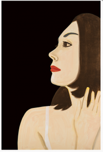
This week’s Work of the Week! WOW! is one of Katz’s most recent portraits, Laura 1. This work is the portrait of Laura Halzack, prima ballerina of the Paul Taylor Dance Company based in New York City. Alex Katz met Laura through Paul Taylor with whom he has collaborated with on over a dozen set and costume designs since 1960. 

Laura, as many of Katz’s portrait subjects is presented without context. In the compressed visual plane, she is placed against a background of a single dark hue, which contrasts with the delicate peach tone of her skin. No additional narrative is provided other than her first name. This lack of narrative heightens the enigmatic qualities of the dancer, and allows Laura to exist in and of herself. 

Influenced by film, television and billboard advertising, the composition of Laura 1 is like a cinematic close-up. The cropped view of the dancer’s profile is perfectly balanced with the black background. The work is cropped in a way that it seems Katz has captured a sincere, temporal moment, which he indeed has, given the ephemeral nature of dance. 

Katz’s distinction as an artist lies in the fascinating reductive, flat style. His mastery of color and minimalism is timeless. His portraits, also have a distinctive quality in that he always represents the society of which he is a part of and, as a whole, can almost be experienced as a family photo album. 
WOW! – Work of the Week – Richard Anuszkiewicz – Temple of the Golden Red


Richard Anuszkiewicz
Temple of the Golden Red
1985
Screenprint
32 x 24 in.
Edition of 175
Pencil signed, dated and numbered

About the work:

“I’m interested in making something romantic out of a very, very mechanistic geometry. Geometry and color represent to me an idealized, classical place that’s very clear and very pure.“ Richard Anuszkiewicz

Richard Anuszkiewicz was a central figure, along with Briget Riley and Victor Vasarely, in the Op Art movement. As a graduate student at Yale, he was mentored by the color theorist Josef Albers who would steer him on a course toward pure abstraction, grounded in the power of color. Most of his work trends away from personal emotion and drama, seeking rather visual investigations of formal structural and color effects. He made extensive use of ‘simultaneous contrast’ – where two colors, side by side, interact with one another to change our perception of them accordingly.

Among his most famed suites is the Temple Series; mesmerizing works, saturated with vibrant color arranged in geometric abstract compositions. The Temple Series originated after a 1981 trip to Egypt. He was inspired by the geometries of sacred temples,specifically those located in the Valley of the Kings. As is characteristic of most of his works, there are no specific references to individual structures, instead he uses the geometric framework as a space of color experimentation. The works in the series have been interpreted as illustrating visionary architect Buckminster Fuller’s notion of ‘Tensegrity’ – the balance between the forces of tension and integrity inherent in a physical structure. 

This week’s Work of the Week! WOW! from the Temple Series is Temple of the Golden Red

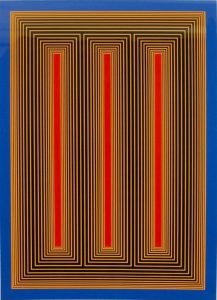
Temple of the Golden Red is a quintessential example of Anuszkiewicz’s mature style. Incorporating a repeating pattern of vertically oriented rectangles surrounded by concentric lines of startlingly different color. It contains three central rectangles of saturated crimson surrounded by lines of alternating but as equally saturated yellow and black. Symmetry is essential in Anuszkiewicz’s work, and by juxtaposing opposite colors of equal saturation, he accomplishes a visual fluctuation between figure and ground, creating a vibrating or pulsating sensation in the eye. The result is a release of energy, a transformation of color into motion. Like all great work that depends in large measure on color for its impact, the intensity lays in the way the eye and brain interpret visual information.

As with most artworks, Anuszkiewicz’s work is much more powerful in person. From Temple of the Golden Red emanates a profound luminosity, appearing as if lit from an inner source. New York Times art critic Holland Cotter described Anuszkiewicz’s works by stating, “The drama – and that feels like the right word – is in the subtle chemistry of complementary colors, which makes the geometry glow as if light were leaking out from behind it.” The artwork also packs a powerful monumentality, a result of its architectonic framing that gives the illusion of standing in front of a physical temple. Despite that the work is inspired from a trip to Egypt, the ‘fluting’ can seem to have more in common with classical ancient Greek columns. 

Within the boundaries Anuszkiewicz set for himself—vertical bars of color surrounded by the pinstriped framework, the range of effects achieved is remarkable. The colors appear to blaze forth or recede into the distance and the choice of colors projects a mood, in this case, a jazzy up-tempo. Despite the restless optical power of the piece, it is thoroughly classical.
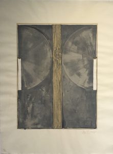
WOW! – Work of the Week – Jasper Johns – Device


Jasper Johns
Device
1971-72
Lithograph
33 1/2 x 29 in.
Edition of 62
Pencil signed, dated and numbered

About the work:

“I tend to like things that already exist.” Jasper Johns

Jasper Johns is the world’s most critically acclaimed living artist. His work bridges the immediate post-World War II modernist trends of Surrealism and Abstract Expressionism with subsequent movements of Pop art, Minimalism, and Conceptual art. 

Johns was ushered into the New York art scene in 1953, when he met Robert Rauschenberg. The two artists shared an intense relationship, both romantic and artistic, from 1954 to 1961. They had neighboring studio spaces and deeply influenced each other’s artwork, exchanging ideas and techniques that would allow them to break from Abstract Expressionism. Their relationship would lead to Johns’ discovery by famed art dealer Leo Castelli, who, while visiting Rauschenberg’s studio met Johns and saw his work. Castelli offered the young Jasper Johns his first solo show on the spot. It was during his first exhibition that Alfred Barr, the founding director of the MoMA, purchased a number pieces that were on display, instantly making Jasper Johns a force in the art world.

Johns’ breakthrough style was to appropriate popular iconography in his works with a rich treatment of  the surface as lush and painterly. By representing common objects and images in the realm of fine art, Johns broke down the boundaries traditionally separating fine art and everyday life. However, rather than direct representation or abstraction, Johns made signs, like flags and targets, iconic images in his works. The “things the mind already knows” were his ideal subject because of the varied meanings each carried with it. This would lay the foundation for the Pop art movement’s aesthetic embrace of commodity culture, paving the path for Andy Warhol, James Rosenquist among many, many other post-war artists. 

While Johns continued to produce paintings that incorporated Abstract Expressionism’s gestures and color blocking, he shifted his focus from the finished image to the concept behind it. His process, which he believed to be the actual art, took on greater importance. The artist made a seamless transition into print making. For Johns, printmaking was a medium that encouraged experimentation through the ease with which it allowed for repeat endeavors. His innovations in screen printing, lithography, and etching revolutionized the field. 

As the Pop art movement grew around him, Johns left behind the colorful works filled with familiar gestures and images and turned to a darker palette. Some critics attribute the shift away from color and toward the grays, blacks, and whites that dominate many of his canvases from the early 1960s to the rocky end of his relationship with Rauschenberg. 

This week’s Work of the Week! WOW! is Jasper Johns’ Device.

Created in 1971-72, Device masterfully plays with different tones of grey, white and beige. The works that use what Johns called “the device,” were made from two stretcher bars attached to a canvas frame with butterfly screws, creating a mechanical arm, that would be used to scrape the paint on the surface in a circular shape. All of these elements from the “real” world undercut the traditional idea of a painting as an illusion. The development of the device theme in Johns’ work progressed to incorporate other themes, such as the abundant use of text. His techniques stress conscious control rather than spontaneity.

Over the past fifty years Johns has created a body of rich and complex work. His rigorous attention to the themes of popular imagery and abstraction has set the standards for American art. Constantly challenging the technical possibilities of printmaking, Johns laid the groundwork for a wide range of experimental artists that came after him.

WOW! – Work of the Week – Andy Warhol – The Shadow


Andy Warhol
The Shadow, from Myths (FS II.267)
1981
Screenprint on Lenox Museum Board
38 x 38 in.
Edition of 200
Pencil signed and numbered

About the work:

As a keen observer of the emergence of America as the global superpower it is today, Andy Warhol captured deep American truths and fantasies. “Everybody has their own America, and then they have pieces of a fantasy America that they think is out there but they can’t see,” he once observed. Nowhere is this national fantasy clearer than in Warhol’s Myths Series of 1981.

The suite, composed of 10 iconic representations of recognizable figures of American film, history and culture encompass Warhol’s own life and the magic of 20th century American Pop Culture, or American Mythology. The term ‘Mythology’ (or ‘Myth’) often-times evokes the collected stories of the Ancient Greeks and Romans, however, Mythology is a feature of every culture. The collection of myths of any society defines its spirit and soul. 

In the Myths Series, Warhol selected a range of 10 uniquely American personas, from Santa Claus to Uncle Sam, each artwork revealing facets of Warhol’s personality and desires. As a sick child, he was inspired by the duality of Clark Kent/Superman and famously wanted to be regarded as strong an american symbol as Mickey Mouse. Warhol so ardently wanted to be a part of American Mythology that he used his own self-portrait to take on the role of one of the characters in the Myths suite. Overtly self-referential, the artist placed himself among his idols.

This week’s Work of the Week! WOW! is The Shadow, from Myths, in which Andy Warhol used his own face to personify a fictional American icon.

While many of the referenced characters of the suite require no introduction, today ‘The Shadow’ is a more niche symbol of American Pop Culture. ‘The Shadow’ was a fictional pulp-novel character of the 1930’s, a crime-fighting hero of Warhol’s childhood. He wore a wide-brimmed black hat and a black, crimson-lined cloak with an upturned collar over a standard black business suit.
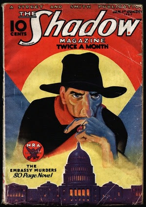
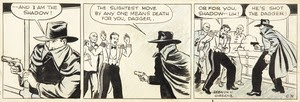
The Shadow - Pulp NovelThe popular series was also adapted into a Radio Show and a comic strip during Warhol’s lifetime.
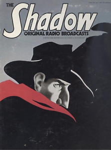
Shadow - Radio Broad Cast poster The Shadow Comic Strip

The portrait is based on a photograph of Warhol as the fictional character and although he doesn’t wear The Shadow’s black cloak or broad-rimmed hat, the crimson lighting illuminating Warhol’s face, which references the red lining of The Shadow’s cloak, causes a strong shadow to be cast of his profile in the background. While peering at the viewer, Andy Warhol crafts a personification of himself masquerading as a hero. 

Andy Warhol exhibited an unerring sense for the powerful motifs of his time – contemporary images that capture the modern imagination as completely as the gods and goddesses of ancient mythology once did. The images presented in Myths are nostalgic representations of America, each theatrically reflecting American fantasies, hopes, fears and dreams. Warhol gives these already established icons his signature pop-style treatment, inserting his own image into the narrative of pop culture. 

The Shadow from Myths is a screenprint on Lenox Museum board with Diamond Dust covering the full sheet. The Diamond Dust, heavily applied, adds a luster to the work, but also lends to its mysteriousness, thus accentuating The Shadow. It its a very impressive work.

WOW! – Work of the Week – Frank Stella – Benjamin Moore Series


Frank Stella
Hampton Roads, from Benjamin Moore
1972
Lithograph
16 x 22 in.
Edition of 100
Pencil signed and numbered
Frank Stella
Palmito Ranch, from Benjamin Moore
1972
Lithograph
16 x 22 in.
Edition of 100
​Pencil signed and numbered

About the work:

Frank Stella is one of the most highly regarded post-war American artists still working today. He is a rule-breaker, interested in furthering the History of Art by constantly and deliberately taking us down new paths. 

Upon moving to New York after his studies at Princeton, Stella was first inspired by the Abstract Expressionists, but also by the ‘flat’ works of Barnett Newman. It was however, the paintings of Jasper Johns, exhibited at Leo Castelli’s famed gallery in 1958, that lead Stella to start using his now-trademark stripes as a compositional tool. The controlled minimalist works are among his most recognizable. Stella didn’t change the course of Art History simply through his study and use of a radically different style, he also approached diverse materials in a revolutionary way. 

Frank Stella’s first experience in painting was re-coating houses and boats, and he would continue to paint houses after his move to NY to make ends meet. Over the course of his 60-plus-year career, Stella would regularly revisit unmixed house and car paint in addition to using house-painter brushes. Stella’s process was documented in Hollis Frampton’s photo essay “The Secret World of Frank Stella” which showed the artist’s approach to canvas as being the same as he would a house – filling a space with increasingly proximate concentric lines. In his striped works, Frank Stella never used masking tape. He would never even measure out the lines, rather the works are free-hand.

This week’s Work of the Week! WOW! is the Benjamin Moore Series. This series is one of Stella’s most iconic. Andy Warhol recognized the genius of Stella and purchased the complete set of originals himself.

All the titles of Stella’s works are significant. The Benjamin Moore Series makes reference to the type and brand of paint that was used in the creation of the works. The use of store-bought house paints is significant in that it roots his art in the post-war commodity culture. In naming the series after a company, he also explored the rise of advertising and branding. The titles of each individual piece are also important to note – they are all named after historical battles fought during the Civil War. 

The two works featured at Gregg Shienbaum Fine Art are Palmito Ranch and Hampton Roads. Both battles were of great significance. The Battle of Hampton Roads, often called either the Battle of the Monitor and Merrimack or the Battle of Ironclads, fought on March 9, 1862, was the most important naval battle of the Civil War from the perspective of naval development. It was History’s first duel between ironclad warships. The Battle of Palmito Ranch is regarded as the final battle of the war, fought May 12 and 13, 1865, on the banks of the Rio Grande in Texas. Despite that Robert Lee had surrendered a month prior to Ulysses Grant, the attack was ordered on the Confederate Army for unknown reasons. Anecdotes suggest that Union Colonel Theodore Barrett wanted to see combat before the end of the war. The names of Stella’s works are significant, loading abstract images with meaning. The complete series is a historical narrative composed of abstract works. 

The works in the series are among Stella’s most reductive compositions. It is the formal rather than the thematic matter that Stella engages in. The set plays with maze-like patterns, simple diagonals,  and understated and stacked compositions, where the painted line creates an even, horizontal rhythm. Stella shows us the environment of the battles of the Civil War with paint straight from a can – intense and flat. The saturated palette, measured proportions, and glowing presence are at once immediately vibrant and classically timeless.

As Adam D. Weinberg, director of the Whitney has said “Frank is a radical innovator who has, from the beginning, absorbed the lessons of art history and then remade the world on his own artistic terms. He is a singular American master.”