%20stock.jpg "Intersection Series (Person On Horse Person Falling From Horse with Audience) stock") |
||
|
JOHN BALDESSARI About This Work: Known as the Godfather of Conceptual Art, John Baldessari has defied formalist categories by working in a variety of media — creating films, videotapes, prints, photographs, texts, drawings, and multiple combinations of these. In his use of media imagery, Baldessari is a pioneer “image appropriator”, and as such has had a profound impact on post-modern art production. Born on June 17, 1931 in National City, CA, John Baldessari has been instrumental in the West Coast art scene. His artwork has influenced a generation of conceptual artists like Cindy Sherman, Barbara Kruger, David Salle and many other younger artists. He may be best known as the artist that “Put dots over people’s faces”, but through his diverse practice that includes paintings, sculpture, and installations, the artist shaped the Conceptual Art landscape. By blending photography, painting, and text, Baldessari’s work examined the plastic nature of artistic media while offering commentary on our contemporary culture. What John Baldessari does, is he fuses photography, montage, painting and text to create complex compositions that explore the several interpretations of cultural iconography. He sources his wide range imagery from the larger visual world, primarily finding inspiration in advertising and film. This work, Person On Horse And Person Falling From Horse (With Audience), from the Intersection Series, is a perfect example of the manner in which Baldessari deconstructs found images of action and perception stereotypes of the mass media. This series features contrasting collaged images enclosed in rectangles and juxtaposed, each one with a different theme and title. The superposition of several image sections results in a complete “cinematic” sequence: under the eyes of two applauding spectators a cowboy falls from his horse, while the Indians remains firmly in power. In order to subvert common associations, John Baldessari brings one’s attention to minute details, absurd juxtapositions, and obscured or fragmented portions of such imagery. His artistic process focuses on the perception and interpretation of visual elements and text, while often employing irony to make playful assertions about how meanings and interpretations are formed. The Intersection Series work blends photographic materials such as these film stills, which Baldessari takes out of their original context, and rearranges their form. We have also attached a link to a video Called the “History of John Baldessari”. It is a 5 minute video narrated by muscian Tom Waits. It is very entertaining, informative, and very funny!!! Please have a look and enjoy! |
Tag Archives: WOW!
WOW – Work Of the Week – Alexander Calder “Our Unfinished Revolution” Portfolio
 |
||
|
ALEXANDER CALDER About This Work: Alexander Calder (1898 – 1976) is one of the most celebrated artists of the 20th century. Subsequently, upon moving to Paris in 1926, Calder began creating large-scale mechanical installations of intricate circus scenes, featuring wire sculptures with moving parts that he would operate over a two-hour performance session. Building off of his so-called Cirque Calder, he began sculpting portraits and figures out of wire, and received critical attention, exhibiting these works in gallery shows in New York, Paris, and Berlin. While in Paris, he befriended several important Abstract artists, including Joan Miró and Piet Mondrian, and was invited to join the group Abstraction-Création in 1931. Many of Calder’s works on paper and his printwork are studies, tests and theories about his sculptures. As Calder’s sculptures moved into the realm of pure abstraction in the early 1930s, so did his works on paper and prints. The thin lines used to define figures in the earlier prints and drawings began delineating groups of geometric shapes, often in motion. This work from the portfolio Our Unfinished Revolution, is a two-dimensional insight into Calder’s three-dimensional world. Alexander Calder has had several retrospectives, and, among many other awards, was honored with the Presidential Medal of Freedom and the Bicentennial Artist Award from the Whitney Museum of American Art in New York City in 1976. The Guggenheim Museum showed a retrospective of his work in 1964. |
WOW – Work Of the Week – Andy Warhol “Portraits Of The Artists”
 |
||
|
ANDY WARHOL About This Work: Andy Warhol was the most successful and highly paid commercial illustrator in New York even before he began to make art destined for galleries. Neverthless, his screenprinted images of Marilyn Monroe, soup cans, and sensational newspaper stories, quickly became synonymous with Pop Art. Pop Art marked an important new stage in the breakdown between high and low art forms. Warhol’s paintings from the early 1960s were important in pioneering these developments, but it is arguable that the diverse activities of his later years were just as influential in expanding the implications of Pop Art into other spaces, and further eroding the borders between the worlds of high art and popular culture. Andy Warhol is now considered one of the most influential artists of the second half of the 20th century, who created some of the most recognizable images ever produced. Warhol was part of a very exclusive group of artists that the famous and influential New York dealer, Leo Castelli, represented. In 1967 Warhol created Portraits of the Artists, a work that depicts the portraits of 10 artists chosen and represented by Castelli. Sticking with Warhol’s signature style of repetition, he multiplied the artists’ portraits ten times in ten different colors on 3-D polystyrene boxes, each measuring at approximately 2 x 2 inches. The 100 boxes totaled to approximately 20” x 20” when lined up. The artists include Robert Morris, Jasper Johns, Roy Lichtenstein, Larry Poons, James Rosenquist, Frank Stella, Lee Bontecou, Donald Judd, Robert Rauschenberg and Andy Warhol himself. Warhol used the power of the portrait to bring forth the idea of America’s infatuation with celebrity, and the effects of the celebrity in our culture. Pop culture was not only just about Coca Cola bottles, Campbell’s Soup Cans, and Brillo boxes, but also about taking TV, film, music, or literary personalities and exploiting the concept of celebrity. What a better way to pay homage and respect to the most important artists of the time by having Andy Warhol create a work of art that said so much about the artist’s influence on our culture, with just their portraits. No words were needed. The use of repetition is also typical of Andy Warhol. Warhol used silkscreen as his medium of choice. It served as a way to remove the hand of the artist in art, a concept Marcel Duchamp introduced to the art world in the early part of the century. Warhol’s biggest influence in art was Duchamp. Repetition also allowed the artists to further their concepts, by reaching a greater amount of people. Printmaking was the best way to achieve this. By making multiples of a work, more people can own the work, sell the work, and are exposed to the work. It was this marketing that led to Andy Warhol becoming a celebrity himself. |
WOW! – Work Of the Week – Claes Oldenburg “Typewriter Eraser”
 |
||
|
CLAES OLDENBURG About This Work: Claes Oldenburg is an American sculptor, best known for his public art installations typically featuring very large replicas of everyday objects. This beautiful drawing represents a typewriter eraser, a recurring object in Oldenburg’s work. Why a typewriter eraser? Many of Oldenburg’s works depict mundane objects and, at first, they were ridiculed before being accepted by the art world – but they were also defined “brilliant”, due to the reaction that the pop artist brought to a “dull” abstract expressionist period. Oldenburg creates a distinctive order of objects. First, they are things made and utilized by human beings. Used, out-of-date or simply banal, they look rescued from oblivion by the artist. Isolated in a landscape or interior space and inflated in size, they are vulnerable giants. But they are not actual objects elevated to the status of art in the Duchampian tradition of the readymade. While recreating objects, Oldenburg alters their specifics, transforming them through changes in material, scale, context and exaggerations of forms that lend them more than one identity. A typewriter becomes also a tornado. When turned up right we see the eraser rolling towards us with the whiskers rustling in the air resembling a tornado. In this particular drawing of the typewriter eraser we see the subject in motion sweeping down the street like a tornado. Drawings like this are rare “little gems”, hard to find and representative of the soul of Oldenburg’s objects. Oldenburg’s drawings are continuous files of ideas from which major themes have developed. Drawings that he devotes to sculptural projects, imagined or real, appear as “proposals”. These drawings have an anecdotal character in cases where the sculpture is placed in new contexts. They chronicle the further adventures of a subject and track the creative and artistic process of this great artist. This drawing can be considered a generative tool for the large scale Typewriter Eraser, Scale X, constructed in 1999 and now located at the National Gallery Of Art Sculpture Garden, in Washington D.C. |
WOW! – Work of the Week – Ellsworth Kelly “Blue Green Black Red” 10/13/15
Ellsworth Kelly – Blue Green Black Red

Ellsworth Kelly
Blue Green Black Red
1971
Offset lithograph
29 3/4 x 27 1/4 in.
Edition of 100
Pencil signed & numbered
About This Work:
For more than fifty years, Ellsworth Kelly has worked to refine elements of the observed world into rigorous abstraction with a bold clarity and elegance. “My work has always been about vision, the process of seeing,” he notes. “Each work of art is a fragment of a larger context… . I’ve always been interested in things that I see that don’t make sense out of context, that lead you into something else.”
Maintaining a persistent focus on the dynamic relationships between shape, form and color, Kelly challenges viewers’ conceptions of space. He intends for viewers to experience his artwork with instinctive, physical responses to the work’s structure, color, and surrounding space, rather than with contextual or interpretive analysis.
His flat, immaculate compositions of pure line, simple forms, and saturated, unmodulated color are, in essence, found images, distillations of architectural details, shadows, plants, and other subtle forms that often might be overlooked. The contour of a leaf, the arch of a bridge and its reflection in water, and the soft curve of a hillside seen from the road have inspired paintings, sculptures, and prints alike. His art work represent a subjective interpretation of reality, rather than a descriptive copy of it.
Kelly’s arrangement of the complementary colors, which work to intensify one another at their intersections, is also an essential component of the work. In the 1971 lithograph Blue, Green, Black, and Red rectangles are laid, one on top of the other, in arrangements that suggest fragments of a remembered landscape. Perhaps it is several stories of a building, or perhaps a billboard looked, from a certain angle, or the way a shadow once fell.
Ordinary memories such as these, Kelly has said, prompt many of his works. ”As we move, looking at hundreds of different things, we see many different kinds of shapes. Roofs, walls, ceilings are all rectangles, but we don’t see them that way. In reality they’re very elusive forms. The way the view through the rungs of a chair changes when you move even the slightest bit – I want to capture some of that mystery in my work.”
About The Artist:
“I have worked to free shape from its ground, and then to work the shape so that it has a definite relationship to the space around it; so that it has a clarity and a measure within itself of its parts (angles, curves, edges and mass); and so that, with color and tonality, the shape finds its own space and always demands its freedom and separateness.” – Ellswoth Kelly
Ellsworth Kelly is an American painter, sculptor, and printmaker associated with Hard-edge painting, Color Field painting and the Minimalist school. His works demonstrate unassuming techniques emphasizing the simplicity of form.
Although Kelly can now be considered an essential innovator and contributor to the American abstraction art movement, he was not always seen in such a positive light. It was hard for many to find the connection between Kelly’s art and the dominant stylistic trends For Example, observing how light fragmented on the surface of water, he painted Seine (1950), made of black and white rectangles arranged by chance.
He created a new freedom of painterly expression. He began working in extremely large formats and explored the concepts of seriality and monochrome paintings. As a painter he worked in an exclusively abstract mode. By the late 1950s his painting stressed shape and planar masses (often assuming non-rectilinear formats). His work of this period also provided a useful bridge from the vanguard American geometric abstraction of the 1930s and early 1940s to the Minimalism and reductive art of the mid-1960s and 1970s.
Kelly has distilled his palette and introduced forms never before. He starts with a rectangular canvas that he carefully paints with many coats of white paint; a shaped canvas, usually painted in a single bright color, is placed on top. The quality of line seen in his paintings and in the form of his shaped canvases is very subtle. The use of form and shadow, as well as the construction and deconstruction of the visible implies perfection.
For more information and price please contact the gallery at info@gsfineart.com
WOW! – Work of the Week – Clandestine Culture “I Came Back” 10/05/15
Clandestine Culture, I Came Back
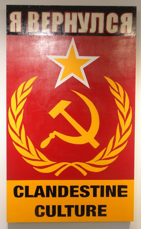
Clandestine Culture
я вернулся, (I CAME BACK)
2014
Acrylic on Wood
81 x 48
Signed on verso
About This Work:
This work titled “I Came Back” or “я вернулся” (in Russian), by Miami Street Artist CLANDESTINE CULTURE,could not be more relevant today then ever before. “For those 25 years of age or younger, the Soviet Union symbol of the Hammer and Sickle, mean nothing. There is an age group that has never seen that symbol, or even knew of a Soviet Union” says the artist.
What this work represents is exactly what the artist wants that age group, 25 years or younger, to understand. That message is that history repeats itself. Painted in 2014, during Russia’s invasion into Crimea, and aggressive military intervention in Ukraine, this painting forewarns the world of what is to come. Russian President Putin flexes his political muscles, and lets the world know that he, and Russia are coming back. They are not the weakened Russia, that perhaps the world sees them as.
Fast forward to 2015, and we see President Putin is at it again, aligning himself with Syria, and positioning his stronghold in the Middle East. Showing that Russia is still a “super power”, and standing up to America
Painted in the old Soviet Union colors of red and gold, this painting is rather simple, but very powerful in its message. Depicting the iconic Hammer and Sickle, with star and olive branches as the main focal point, they symbol says it all. The words “I Came back” written in Russian lets us know, that this is a message about the present, and a warning about the future.
This is exactly what street art intends to do. Historically, street art has always contained a social, a political, and an environmental message. The art challenges the viewer to react not only to the artwork, but to the substantive issues, and surroundings that is being discussed.
Make no mistake, Street Art is not just pretty paintings on a wall. That would be simply called a mural. Street Art is much more important than that. Street Art has substance, context, and a concept. Whether it is Haring talking about AIDS, or Apartheid, Basquiat discussing issues of racism, drugs, and struggle of daily life, or Banksy’s witty paradoxical installations and wall drawings, Street Art has become a depiction and a reaction to the world most important issues, and struggles. Its “in your face” style, is arguably the most reactionary art movement that the art world has yet to witness.
Never before has an art movement, been so literal, and purposeful. Like his predecessors Haring and Basquiat, and his contemporaries Banksy and Shepard Fairey, CLANDESTINE CULTURE focuses on the world’s issues around us, and challenges us to acknowledge, question, and react.
About The Artist:
The artist chooses to remain anonymous. He hits the street with his face and head completely covered. He believes that the painting and the message is more important then the artist. He uses everyday people, images and words, to show that in the end, we are all part of one world wide culture…A CLANDESTINE CULTURE
For more information and price please contact the gallery at info@gsfineart.co
WOW! – Work of the Week – Roy Lichtenstein “Shipboard Girl” 9/28/15
Roy Lichtenstein, Shipboard Girl

Roy Lichtenstein
Shipboard Girl
1965
Offset lithograph
27 3/16 x 20 1/4 in.
Pencil signed
This work was not produced in a numbered edition.
About This Work:
Roy Lichtenstein, like many of his pop art contemporaries, was at first an abstract expressionist. Gradually, however, during the decade following his discharge from the army, he turned his attention increasingly to imagery drawn from such popular cultural sources as commercial advertising, romance and war comics, and cartooning in general.
Not only was Lichtenstein interested in the look of comic books, but also in the way they were produced. He carefully studied the way in which small dots of ink, known as Ben Day dots, were printed. He then enlarged these dots in his art to give his works the appearance of mechanically printed commercial products. Ben Day dots are the pattern of dots used in commercial printing to cheaply reproduce shading.
In the print Shipboard girl of 1965, we see Lichtenstein’s mature style in its rudimentary form. The image exemplifies all the qualities that his many paintings and prints of young women culled from romance comics exhibit — a girl, usually blonde, in extreme close-up, lips parted, her head tilted at an angle, with enormous, soft, liquid eyes, depicted at a moment of emotional climax.
Perhaps the woman in Shipboard girl is just enjoying the sun, or perhaps she is thinking of a shipboard romance that has soured. The life bouy lounging in the background is a visual pun suggesting that she is longing for a boy to rescue her from the as-yet-unreached turbulent seas of love. This sly humor is characteristically Lichtenstein.
What is salient about this work, however, is that here in its developmental stage, we have all the formal features which will come to characterize Lichtenstein’s subsequent output. Lichtenstein’s visual vocabulary, the characteristic elements of his style, are flat areas of unmodulated color, a schematized cartoon-like outline, the removal of anecdotal detail, and more importantly, the use of the Benday dots. Here we see him working towards a style which will become uniquely identifiable as his, and which ironically, over time and in its final formulation will replace the original in the very cartoon context from which it was derived.
About The Artist:
Roy Lichtenstein (October 27, 1923 – September 29, 1997) was a prominent American pop artist. His work defined the basic premise of pop art better than any other through parody. Favoring the old-fashioned comic strip as subject matter, Lichtenstein produced hard-edged, precise compositions that documented while it parodied often in a tongue-in-cheek humorous manner.
In 1961, Lichtenstein began his first pop paintings using cartoon images and techniques derived from the appearance of commercial printing. This phase would continue to 1965, and included the use of advertising imagery suggesting consumerism and homemaking. His first work to feature the large-scale use of hard-edged figures and Ben-Day dots was Look Mickey in 1961. This piece came from a challenge from one of his sons, who pointed to a Mickey Mouse comic book and said; “I bet you can’t paint as good as that, eh, Dad?”
Lichtenstein had his first one-man show at the Castelli gallery in 1962; the entire collection was bought by influential collectors before the show even opened. It was at this time, that Lichtenstein began to find fame not just in America, but worldwide. His work featured thick outlines, bold colors and Ben-Day dots to represent certain colors, as if created by photographic reproduction. However, rather than attempt to reproduce his subjects, his work tackled the way mass media portrays them.
In the 1970s and 1980s, his style began to loosen and he expanded on what he had done before. His style was replaced with more surreal works. His “mirror” paintings consist of sphere-shaped canvases with areas of color and dots. Lichtenstein also created a series of still lifes (paintings that show inanimate objects) in different styles during the 1970s. In the 1980s and 1990s, Lichtenstein began to mix and match styles. Often his works relied on optical (relating to vision) tricks, drawing his viewers into a debate over the nature of “reality.”
Lichtenstein’s work is included in numerous museums, such as the Albright-Knox Art Gallery, Buffalo, NY; Art Institute of Chicago, Chicago; Denver Art Museum, Denver; Metropolitan Museum of Art, NY; Foundation Beyeler, Basel, Switzerland; Museum of Contemporary Art, Los Angeles, Museum of Modern Art, New York; National Gallery of Art, Washington D.C.; Philadelphia Museum of Art, Philadelphia; Solomon R. Guggenheim Museum, New York; Stedelijk Museum, Amsterdam; and Whitney Museum of American Art, New York.
For more information and price please contact the gallery at info@gsfineart.com
WOW! – Work of the Week 9/21/15

Robert Rauschneberg, Signs, 1970
Robert Rauschenberg
Signs
1970
Screenprint
43 x 34 in.
Edition of 250 Pencil signed & numbered
About This Work:
Robert Rauschenberg’s “Signs” 1970, is one of the most sought after Rauschenberg screenprints because of the artwork’s incredible iconographic imagery and historical significance. Signs was originally commissioned by Time Magazine, with the intention that it would be used as the January edition cover for the year 1970. After considering the final composition, the executives at Time Magazine found the piece was more politically charged than they had hoped and decided against using it. It was felt that the composition, though stunning, was more of a recapitulation of the 1960’s than a welcome to the new decade.
After the dismissal by Time Magazine, Robert Rauschenberg’s trusted dealer Leo Castelli convinced him to print a limited edition screenprint of Signs. The edition was published by Leo Castelli in New York in an edition of 250; each signed, dated ‘70’, and numbered in pencil.
Signs is an astounding collage encompassing the monumental events and people of 1960’s America. Rauschenberg masterfully juxtaposes scenes of innovation like the moon landing with the destructive violence of the war in Vietnam and the civil rights movement. The revolutionary nature of the era is pronounced through the images of peace protestors at the top, whose rallies for change and peace are echoed by the voice of Janis Joplin deeply singing into her microphone. The iconic leaders of the era including JFK and his brother Bobbie Kennedy challenge the divisive violence of the wars and civil unrest, even as their forms and images transition into the faces of martyrs. The “Signs” of this transformative decade are woven seamlessly by Rauschenberg, and this screen print is known as one of his most important works of art.
About The Artist:
Robert Rauschenberg began what was to be an artistic revolution. Rauschenberg’s enthusiasm for popular culture and his rejection of the angst and seriousness of the Abstract Expressionists led him to search for a new way of painting. He found his signature mode by embracing materials traditionally outside of the artist’s reach. He would cover a canvas with house paint, or ink the wheel of a car and run it over paper to create a drawing, while demonstrating rigor and concern for formal painting.
By 1958, at the time of his first solo exhibition at the Leo Castelli Gallery, his work had moved from abstract painting to drawings like “Erased De Kooning” (which was exactly as it sounds) to what he termed “combines.” These combines (meant to express both the finding and forming of combinations in three-dimensional collage) cemented his place in art history.
This pioneering altered the course of modern art. The idea of combining and of noticing combinations of objects and images has remained at the core of Rauschenberg’s work.
As Pop Art emerged in the ’60s, Rauschenberg turned away from three-dimensional combines and began to work in two dimensions, using magazine photographs of current events to create silk-screen prints. Rauschenberg transferred prints of familiar images, such as JFK or baseball games, to canvases and overlapped them with painted brushstrokes. They looked like abstractions from a distance, but up close the images related to each other, as if in conversation.
These collages were a way of bringing together the inventiveness of his combines with his love for painting. Using this new method he found he could make a commentary on contemporary society using the very images that helped to create that society.
In 1998 The Guggenheim Museum put on its largest exhibition ever with four hundred works by Rauschenberg, showcasing the breadth and beauty of his work, and its influence over the second half of the century.
For more information and price please contact the gallery at info@gsfineart.com
WOW! – Work of the Week 9/14/15
Tom Wesselmann, Fast Sketch Red Stockinged Nude

Tom Wesselmann, Fast Sketch Red Stockinged Nude, 1991
Tom Wesselmann
Fast Sketch Red Stockinged Nude
1991
Screenprint
26 x 36 5/8 in.
Edition of 100 Pencil signed & numbered
About This Work:
Considered by many to be a Pop artist, Tom Wesselmann would rather be called an artist of the post-Matisse era, according to his wife Claire. Nothing can be truer, as evidence by his screenprint entitled Fast Sketch RedStockinged Nude. This work screams of Matisse, in a contemporary setting.
After a dream concerning the phrase “red, white, and blue”, Wesselmann spent his entire career trying to depict the Great American Nude. Many of these nudes show an accentuated, more explicit, sensuality. Often times, Wesselmann did not even need to paint the entire female body to exude sensuality. He would simply depict a woman’s mouth with intensely red painted lips with cigarette smoke coming out of it, or red painted fingernails holding a smoking cigarette to imply or suggest sexual fulfillment. At the same time, Wesselmannincorporated the use of negative space (the white or colorless area) as the image, and the positive (use of color) to direct our eyes to this negative space.
Fast Sketch Red Stockinged Nude is a perfect example of Wesselmann’s concept. Here the viewer is drawn to this modern day Odalisque, by her vibrant red stockings, but the main image is that of the negative space. The choice of the color red for her stockings suggest sensuality, as well as her reclining position. Is she just relaxing with her hand on her breast, or does he suggest a form of titillation? Lets leave that for the viewer to interpret.
In the early 1980’s Wasselmann was consumed with the idea of creating a drawing by using steel. These were know as his “steelcuts” His fast sketched designs would be the basis for these works. These fast sketches would enable him to form, and cut his images out of steel, while still maintaining a resembled gestural brush stroke, or a drawn line.
Again, Fast Sketch Red Stockinged Nude is created with this technique in mind. The simplistic clean lines reduces the work, where it could be considered pop art, but the real intention of the artist was to simplify the work enough just to accentuate the sensuality and sexuality of his women.
About The Artist:
Tom Wesselmann was born in Cincinnati in 1931, and studied art first in Cincinnati, then in New York at the Cooper Union. When he was a student at Cooper Union, he was much influenced by Abstract Expressionism, especially Willem de Kooning and Jackson Pollock. However, he turned away from that style because he determined these artists had become so introspective that there was little room for creative exploration by others.
His reaction took him to Pop Art, the other extreme of action painting to a tightly controlled style and subject matter that was mundane–the antithesis of psychological complexities. Wesselmann, like Andy Warhol and Wayne Thiebaud, asserted that everyday objects had significance unto themselves and that they were worthy of depiction because of a common understanding about what they were. Wesselmann was one of the contributors to the three original portfolios that launched the Pop Art Movement
Thus, along with Andy Warhol, Roy Lichtenstein and Claes Oldenburg, Wesselmann started experiments in 1959 with small, abstract collages. Then, in 1960, he adopted advertising images to make bold amusing still lifes and interiors, collages and assemblages using commonplace household items, and often, a highly stylized female nude. This is what brought him fame and notoriety as a founder of American POP ART.
In the late 1960s an increasingly dominant eroticism emerged in works, with its more literal but still intense colours and tight, formal composition. The pictorial elements, exaggerated in their arabesque forms and arbitrary coloring, became significantly larger in scale in his works of the 1970s. Enormous, partially free-standing still-lifes moved into sculptural space, and finally became discrete sculptures of sheet metal. In the 1980s he returned to works for the wall with cut-out steel or aluminium drawings.
He has pioneered a number of art forms now strongly associated with him, namely his ‘drop outs’ where negative shapes become positive shapes and his ‘cutouts’ which utilize laser cut metal to create extraordinary three-dimensional drawings. He too, has been a remarkable printmaker having created large, spectacular silkscreens and lithographs.
His works are in most major museums around the world, including the Museum of Modern Art and the Whitney Museum in New York, the Hirshhorn Museum in Washington D.C., the Walker ArtCenter and the Minneapolis Institute of Fine Arts in Minneapolis, the Chrysler Museum in Norfolk, the Philadelphia Museum of Art, the Dallas Museum of Fine Arts, the Worcester Art Museum, the Princeton University Art Museum, the Atkins Museum of Fine Arts in Kansas City MO, the Albright-Knox Art Gallery in Buffalo, the Cincinnati Art Museum, and many others. His works can also be seen in important public museums in Germany, France, Denmark.
For more information and price please contact the gallery at info@gsfineart.com
WOW! – Work of the Week 9/8/15
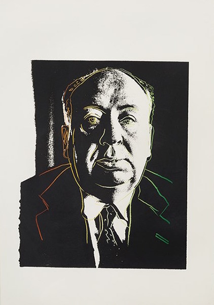
Andy Warhol, Alfred Hitchcock, 1983
Andy Warhol
Alfred Hitchcock
1983
Unique color screenprint
30 1/2 x 20 3/4 in.
Authenticated by The Andy Warhol Foundation and stamped by The Andy Warhol Estate on verso
About This Work:
This work is a unique proof, based on a publicity photograph of the famed film director, Alfred Hitchcock. It is part of one of Warhol’s many commissioned projects, all of which reflect his avid interest in advertising and celebrity images. Warhol was asked to create the image for the Vanity Fair, March 1983 article, “The Trouble with Alfred” by Walter Clemons. The article’s basis detailed the contradictory sentiments of the director, which Warhol was able to illustrate by contrasting a black and white image of the director with gradated colored lines outlining his distinct round face and suit and tie. This unique proof however was not the final image selected by Vanity Fair for the magazine spread.
Warhol also made quite a few paintings with Alfred Hitchcock as his portrait subject. Warhol’s portraits of Hitchcock have been described by Christie’s as “a variation on the doubled self-image that Hitchcock played with in his title sequence, layering his own expressive line-drawing over the director’s silhouette, suggesting the mischievous defacement of graffiti as much as the canonization of a hero through the timelessness of the inscribed profile.” There is an apparent duality motif in all of Warhol’s renderings of the director as seen by Hitchcock’s stoic demeanor and monochrome complexion with Warhol’s playful sarcasm in the details of his tie.
At first thought, it would seem Warhol and Hitchcock had little in common. Rather they both directed films, but more over, began as visual artists – Warhol as a commercial illustrator and Hitchcock creating illustrations for title cards in silent movies. Much like Warhol’s artworks, Hitchcock’s films are renowned for their accessibility as well as their complexity. Viewers enjoy both as entertainment, while critics and scholars study both as layered works of cinematic and visual artistry. The concept of duality also pertains to themselves. Warhol and Hitchcock created public personas – Warhol as the vunderkind of the New York art scene and Hitchcock as ‘The Master of Suspense,’ but both were rather private men. Such contradiction comments on their two poles of creative energy as both the artist and the artwork. in this work, Warhol is able to show us through a unique gaze, Hitchcock himself as the masterpiece.
About The Artist:
He was one of the most enigmatic figures in American art. His work became the definitive expression of a culture obsessed with images. He was surrounded by a coterie of beautiful bohemians with names like Viva, Candy Darling, and Ultra Violet. He held endless drug- and sex-filled parties, through which he never stopped working. He single-handedly confounded the distinctions between high and low art. His films are pivotal in the formation of contemporary experimental art and pornography. He spent the final years of his life walking around the posh neighborhoods of New York with a plastic bag full of hundred dollar bills, buying jewelry and knick knacks. His name was Andy Warhol, and he changed the nature of art forever.
Andy Warhol was born Andrew Warhola on August 6, 1928, in Pittsburgh. He received his B.F.A. from the Carnegie Institute of Technology, Pittsburgh, in 1949. That same year, he moved to New York, where he soon became successful as a commercial artist and illustrator. During the 1950s, Warhol’s drawings were published in Glamour and other magazines and displayed in department stores. He became known for his illustrations of I. Miller shoes. In 1952, the Hugo Gallery in New York presented a show of Warhol’s illustrations for Truman Capote’s writings.
During this time, Warhol had also been working on a series of pictures separate from the advertisements and illustrations. It was this work that he considered his serious artistic endeavor. Though the paintings retained much of the style of popular advertising, their motivation was just the opposite. The most famous of the paintings of this time are the thirty-two paintings of Campbell soup cans. With these paintings, and other work that reproduced Coca-Cola bottles, Superman comics, and other immediately recognizable popular images, Warhol was mirroring society’s obsessions. Where the main concern of advertising was to slip into the unconscious and unrecognizably evoke a feeling of desire, Warhol’s work was meant to make the viewer actually stop and look at the images that had become invisible in their familiarity. These ideas were similarly being dealt with by artists such as Jasper Johns, Roy Lichtenstein, and Robert Rauschenberg — and came to be known as Pop Art.
Throughout the late 1950s and 1960s, Warhol produced work at an amazing rate. He embraced a mode of production similar to that taken on by the industries he was mimicking, and referred to his studio as “The Factory.” The Factory was not only a production center for Warhol’s paintings, silk-screens, and sculptures, but also a central point for the fast-paced high life of New York in the ’60s. Warhol’s obsession with fame, youth, and personality drew the most wild and interesting people to The Factory throughout the years. Among the regulars were Mick Jagger, Martha Graham, Lou Reed, and Truman Capote. For many, Warhol was a work of art in himself, reflecting back the basic desires of an consumerist American culture. He saw fame as the pinnacle of modern consumerism and reveled in it the way artists a hundred years before reveled in the western landscape. His oft-repeated statement that “every person will be world-famous for fifteen minutes” was an incredible insight into the growing commodification of everyday life.
By the mid-’60s, Warhol had become one of the most famous artists, in the world. He continued, however, to baffle the critics with his aggressively groundbreaking work. His paintings were primarily concerned with getting the viewer to look at something for longer than they otherwise would.
Throughout the ’70s and ’80s, Warhol produced hundreds of portraits, mostly in silk screen. His images of Liza Minnelli, Jimmy Carter, Albert Einstein, Elizabeth Taylor, and Philip Johnson express a more subtle and expressionistic side of his work.
Following routine gall bladder surgery, Andy Warhol died February 22, 1987. After his burial in Pittsburgh, his friends and associates organized a memorial mass at St. Patrick’s Cathedral in New York that was attended by more than 2,000 people.
For more information and price please contact the gallery at info@gsfineart.com