Tag Archives: WOW
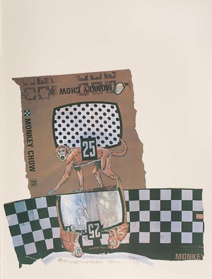
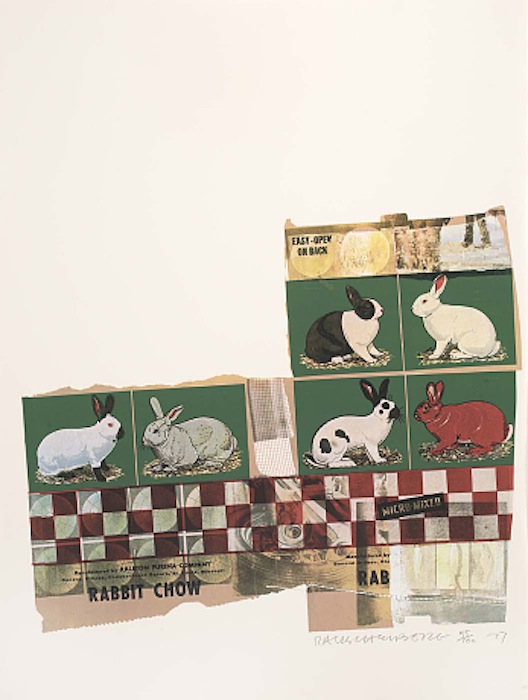
WOW – Work Of the Week – Robert Rauschenberg “Chow Bags Series”
WOW! – Work Of the Week – Tom Wesselmann “Blonde Vivienne”
 |
||
|
TOM WESSELMANN About This Work: Considered by many to be a Pop artist, Tom Wesselmann would rather be called an artist of the post-Matisse era. His works recall Matisse, in a contemporary setting. It’s not hard to understand why categorizing Wesselmann is difficult. The use of erotic images against familiar backgrounds in his work, clean lines and the feel of kitsch exemplifies Pop art, but Wesselmann really never felt like his artwork was part of this artistic movement. Many people know Wesselmann for his nudes. He spent his whole life trying to paint and capture the Great American Nude. However, according to him, he was never able to achieve his goal. He started the Great American Nude series in 1961, where the nude becomes a depersonalized sex symbol set in a commonplace environment. As we can see by Blonde Vivienne, he emphasizes the woman’s hair, mouth neck collar and nipples of her breast, while the rest of the body is usually depicted in flat, unmodulated color or – this is the case – as an empty or negative space. The background is painted in the positive, supplies context and accentuates the negative. There are many different nudes by this artist but they all have one thing in common: when Wesselmann depicts a nude he is not clearly and loudly representing a subject, but he is alluding to and “sketching” a situation, a little gesture or a moment in time. The artist wants us to read into the situation and draw a conclusion for ourselves. Is the Blonde Vivienne sleeping? Is she feeling some kind of pleasure or is she just resting on the couch? The observer is free to choose a personal interpretation of the subject. This also may be the reason why he was so interested in the spaces in and around his drawings. He shifts the focus and scale of the standing objects around a nude; these objects are relatively small in relation to the nude, but sometimes they become major, even dominant elements. To add more mystery, every work is also painted at a particular and/or an unusual angle or point of view. By focusing on the situation, the angle and the details of the background, the viewer is able to imagine what the subject is going through or feeling. For example, in this particular work the viewer is looking at the Blonde Vivienne through a peephole, giving us a sort of voyeuristic point of view. Thus, Blonde Vivienne is a perfect example of showcasing the complexities of a Wesselmann painting. Pop elements occupying space in the positive giving focus to a Matisse like, modern day Odalisque in the negative, captured at a particular view or moment in time, causing the viewer to put it all into one context that he or she can envision for themselves. For more information and price please contact the gallery at info@gsfineart.com |
WOW! – Work Of the Week – Keith Haring “Free South Africa #2”
Untitled (Free South Africa #2)
1985
Lithograph
32 x 40 in.
Edition of 60
Signed, dated and numbered in pencil
__
ABOUT THIS WORK:
Though many associate the artist Keith Haring with his seemingly innocuous images of barking dogs, crawling babies, beating hearts and flying saucers, his work often tackled social justice issues – from nuclear proliferation, to AIDS, to the environment to racial and income inequality. He was very political and engaged in many of the relevant questions and issues of his time and talked about heavy themes such as racism and apartheid, which Haring tirelessly rallied against— notably printing and distributing 20,000 “Free South Africa” posters in Central Park in 1985.
This work, titled Free South Africa #2, is part of a trilogy which shows us the relationship between black and white people (actually black majority and white minority) in South Africa, during years of repression and inequality, when racial segregation was the rule: it was called “apartheid” (literally “separation”). The black figure in this picture is bigger than the white one, symbolizing the great disparity between the black majority and a few white people that had the power to rule the country during those years. To convey the inequality of the white minority’s powerful grasp on the black majority, the white figure has tied a rope around the black man’s neck. To show hope and signs of defeat, Haring depicts the gigantic black figure, crushing or stomping out this inequality, marked by a red X.
The figures are placed within the rectangle with Haring’s typical balance and sense of the space, the relationship between the busy and the empty space in the image is tempered, despite of the too different sizes of the figures. The lines stemming from the figures inform us of the movement and the rage of the black man and the worry and inevitable destiny of the white figure, who is about to be crushed.
Using the words of Julia Gruen, a friend of Haring’s and executive director of the Keith Haring Foundation, “…we can feel that image really in the simplest possible way spoke to a kind of political activism. . . It’s really about fighting against oppression. It’s about bucking the system. It’s about questioning authority”.
Haring’s genius was his ability to communicate very directly, very immediately through his chosen symbols and iconography, he could reduce a work to the fewest forms possible to make his point, and racism was an issue that was of paramount concern to Haring. Activism was at the heart of his artistic practice. This is something that is often forgotten or overlooked because the typical whimsical images that have saturated pop culture, and are the ones that are easiest for the masses to consume. However, the joyfulness and a wonderful lightheartedness in his work, is a message of his vision and strong hope of a better world to come.
ABOUT THE ARTIST:
Keith Haring found a thriving alternative art community that was developing outside the gallery and museum system, in the downtown streets, the subways and spaces in clubs and former dance halls. Here he became friends with fellow artists Kenny Scharf and Jean-Michel Basquiat, as well as the musicians, performance artists and graffiti writers that comprised the burgeoning art community. Haring was swept up in the energy and spirit of this scene and began to organize and participate in exhibitions and performances at Club 57 and other alternative venues.
Haring was able to push his own youthful impulses toward a singular kind of graphic expression based on the primacy of the line.
In 1980, Haring found a highly effective medium that allowed him to communicate with the wider audience he desired, when he noticed the unused advertising panels covered with matte black paper in a subway station. He began to create drawings in white chalk upon these blank paper panels throughout the subway system. Between 1980 and 1985, Haring produced hundreds of these public drawings in rapid rhythmic lines, sometimes creating as many as forty “subway drawings” in one day. This seamless flow of images became familiar to New York commuters, who often would stop to engage the artist when they encountered him at work. The subway became, as Haring said, a “laboratory” for working out his ideas and experimenting with his simple lines.
Between 1980 and 1986, Haring achieved international recognition and participated in numerous group and solo exhibitions. His first solo exhibition in New York, held at the Tony Shafrazi Gallery in 1982, was immensely popular and received critical acclaim. During this period, he participated in highly renowned international survey exhibitions such as Documenta 7 in Kassel Germany, the São Paulo Biennial and the Whitney Biennial. Haring completed numerous public projects in the first half of the 80’s.
Throughout his career, Haring devoted much of his time to public works, which often carried social messages. He produced more than 50 public artworks between 1982 and 1989, in dozens of cities around the world, many of which were created for charities, hospitals, children’s day care centers and orphanages
Haring was diagnosed with AIDS in 1988. Haring enlisted his imagery during the last years of his life to speak about his own illness and generate activism and awareness about AIDS.
During a brief but intense career that spanned the 1980s, Haring’s work was featured in over 100 solo and group exhibitions. By expressing universal concepts of birth, death, love, sex and war, using a primacy of line and directness of message, Haring was able to attract a wide audience and assure the accessibility and staying power of his imagery, which has become a universally recognized visual language of the 20th century.
Keith Haring died of AIDS related complications at the age of 31 on February 16, 1990.
Since his death, he has been the subject of several international retrospectives. The work of Keith Haring can be seen today in the exhibitions and collections of major museums around the world.


