James Rosenquist
House of Fire
1989
Pressed paper pulp in colors with lithographic collage elements
54 1/2 x 119 3/4 in.
Edition of 54
Pencil signed, dated, titled and numbered
About the work:
In 1982 The Metropolitan Museum bought its first painting by James Rosenquist. The painting was House of Fire. Museum director Philippe de Montebello said of the work “[It is] not only a major monument to American Painting but an icon of its sort.”
From September 1988 to November 1989, Rosenquist spent over 100 days at Tyler Graphics Studio. During that time, he created ten paper pulp images with collaged lithographs. In the process, he used 27,000 gallons of paper pulp; drew seventy stencils to create 720 sheets of handmade colored papers, one relief plate, and forty-four separate lithographic sections which utilized 139 colors. All images include printed elements; however, in their effect: in the saturation of their color, and in the size and scale achieved, they come closer to paintings than prints. They are most precisely described as paperworks with collaged lithographs.
All images belong to the series Welcome to the Water Planet with the exception of House of Fire, which is after the1978 painting.
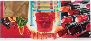
This week’s WORK OF THE WEEK! (WOW!) is Rosenquist’s massive collaged lithograph on hand made pulp paper House of Fire, measuring 54 3/8 x 119 3/4 in. (just over 4 1/2 feet in height and almost 10 feet in width). It is arguably one of his top three most important graphic works.
Rosenquist’s paintings directly allude to the cultural and political tenor of the times in which they were created. Since early paintings in which he depicted the debris of a consumer culture, Rosenquist’s images have reflected man’s fate and natures in an age determined by advertising, technology, and science. When speaking of House of Fire, Rosenquist states, “This painting is a metaphor for this country.”
House of Fire is a triptych of three images with order, balance and proportion.
The heart of this remarkable work is a bucket of molten metal throbbing like a smashed thumb in the middle of an open window with the venetian blind hovering above it, showing the contradiction between the industrial element and domestic architecture.
To the left, a brown bag of groceries reminiscent of food, succor, nurturing, domestic peace, fruitfulness, and the plentitudes of suburban America. The bag hangs upside down, however, suggesting aggression infiltrating the domestic sphere. The upside down groceries threaten to drop like bombs.
Balancing out the work to the right is the three dimensional “flying lipsticks” evoking multiple references not only to sex and sensuality with its phallic shape, and the hint of a women’s moist lips, but also aggression, violence, and war doubling as missiles, anti-aircraft guns, bullets, and even a sense of futuristic designs of car tail lights, rockets, and space ships.
These two images of which objects and incidents from the every day world take on a heightened life, surrounding the glowing heart of the bucket of molten metal, thus creating the whole singular image of the “House of Fire”. It is the disruption of the calmness of society, the molten force of violence and eroticism breaking through the frame of domestic bliss.
One is awed by Rosenquist’s technical skills, and mightily impressed by his intellectuality. We are smacked in the face by the blatant commerciality of his commentaries on advertising and at the same time inspired to conjure derivative images ourselves. Rosenquist’s best work is provocative in the best sense.


 Tom Wesselmann


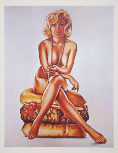 Mel Ramos