 |
|||||
|
COINSLOT About This Work: Alexander Perez, known as Coinslot, is a Miami based artist/satirist. “Coinslot not only has the remarkable ability to view a situation and create a ‘sick and twisted’ version of it in his mind, but also has the incredible talent to take what he sees in his mind and put the pen to paper creating this ‘sick and twisted’ masterpiece in the most fullest and complex detail you’ve ever seen” – Gregg Shienbaum. To view his works properly, one must stand in front of his art for at least 20-30 minutes to see all the minute and incredible details of wit, humor and absurdity that is poured onto the canvas directly from his mind. Here Jobs’ grave, as in real life, is unmarked. Coinslot cleverly places the old Apple logo on the grave marker, which is surrounded by FBI men asking for his permission to give Apple the go ahead to write the code that will eventually unlock all of the world deepest darkest secrets. It is just like Adam taking a bit of the Apple unleashing an uproar upon the world. The FBI men take Jobs silence as him giving them permission. This is Coinslot’s way of telling us that the government is going to do it any way with or without him. Aside from making the viewer think or in some cases making the viewer uncomfortable, Coinslot’s attention to detail is the other important aspect of his work. Everything is in the details. His attention to details can be seen in all the leaves in the trees and the blades of grass, but it is the details that you don’t notice at first that make this piece. The inclusion of a tiny man in the background visiting someone’s grave and the other names and sayings on the grave markers. He even places his name on a grave marker with fallen leaves on it. All these painstaking meticulous details, add to the WOW of the piece and it is these details that raise the most smiles and eyebrows. |
|||||
Tag Archives: wallart
Ahol Sniffs Glue In The News!
Congratulations to Ahol Sniffs Glue!
Vimeo says: “Biscayne World is among the world’s best videos”
Click here or on the picture to read the full article

Click here or on the picture to read the full article
For inquiries on Ahol Sniffs Glue artworks, contact the gallery at info@gsfineart.com
WOW – Work Of the Week – Basquiat “Hollywood Africans In Front Of The Chinese Theater With Footprints Of Movie Stars”
 |
||
|
JEAN-MICHEL BASQUIAT Hollywood Africans In Front Of The Chinese Theater With Footprints Of Movie Stars1983/201523 color screenprint38 1/2 x 84 in.Artist’s Proof (A.P.) of 15Certified authentic, signed, dated and numbered on verso by Lisane Basquiat and Jeanine Heriveaux of the Jean-Michel Basquiat Estate
About This Work: In less than a decade the painter Jean-Michel Basquiat went from being a teenage graffiti writer to an international art star; he was dead of a drug overdose at age twenty-seven. A legend in his own lifetime. Basquiat’s meteoric success and overnight burnout were an instant art-world myth; his brief career spanned the giddy ’80s art boom and epitomized its outrageous excess, from its art dealers to its drug dealers, from its clubs to its galleries, from Madonna to Warhol. Basquiat was very fearful of the unfavorable racial reality in America, and saw himself as in no small amount of danger. These feelings often presented themselves in Basquiat’s work, which was typically socially and politically charged. His paintings were highly symbolic in nature and often focused on what he saw as intrinsic dichotomies, such as the wealthy versus the impoverished or integration versus segregation. The subject of this impressive artwork is related to the widely known 1983 artwork Hollywood Africans, currently owned by the Whitney Museum of American Art. It depicts Basquiat with friends, the artists Toxic and Rammellzee. Toxic is the figure on the left, Rammellzee is the central face (as it can be seen by the green letters RMLZ on top of the head) and Basquiat is the right figure, as it can also be deduced from the typical shape of Basquiat’s hair. Hollywood Africans represents a commentary on the stereotyping and marginalizing of African Americans in the entertainment industry. This theme led these three artists to coin the term and refer to themselves as the “Hollywood Africans”. Furthermore, this is a very current theme, it has even been the controversy of last night’s Oscars ceremonies, where several black actors and actresses have emphasized the necessity of equal rights and wages in the movie industry. In this work, Basquiat challenges the art world by merging academic and “primitive” through his neo-expressionist style, which is recognizable by some stylistic choices: for example, when he chooses to represent his teeth not by drawing them but by writing the word TEETH, which is graphically very similar to what can be a a set of teeth. We can also notice his typical calligraphy, tough gesture and shrill colors. This is a very important work. It is a very large, moving, biographical, historical account based on the artist’s life and the recurrent issues that surrounded him during his time, and which continue to linger on in today’s time.  Jean-Michel Basquiat, Hollywood Africans, 1983, acrylic and oil stick on canvas, 84 1/16 x 84 in.  NBA all star of the Miami Heat and renown art collector Amare Stoudemire with Basquiat’s Hollywood Africans In Front Of The Chinese Theater With Footprints Of Movie Stars in his new Miami home.
|
Gregg Shienbaum Fine Art’s “Keith Haring Narrated” Show features On ArtNet
Click on the image below to read the article
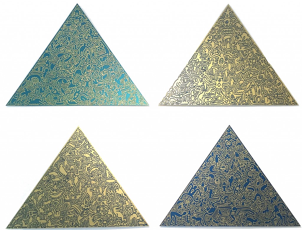
Keith Haring, Pyramids #1 – #4, anodized aluminum, Edition of 30, signature etched on verso
Gregg Shienbaum Fine Art’s “Keith Haring Narrated” Show features in Los Bandidos De L’Arte
WOW! – Work Of the Week – Shepard Fairey “Obey ’04 (Wage Peace)”

Shepard Fairey aka OBEY
OBEY ’04 (Wage Peace)
2006
Screenprint
42 x 30 in.
Edition of 89
Pencil signed and numbered
—
ABOUT THIS WORK:
Shepard Fairey’s background is rooted in American skate and punk rock culture, with his work born out of a combination of a graffiti aesthetic and Pop art sensibilities. Straddling the divide between the fine art world and the street art world, Fairey—despite his massive popularity—has had to wait to be accepted by the more traditional art world. His higher profile has also, in turn, gotten him into some serious problems with law enforcement (he recently faced felony charges in Detroit, despite eighteen prior arrests for illegal tagging). Fairey said of this conflict: “To some people street art is vandalism, to others it’s gentrification, and either of those could be considered more legit than the other depending on your perspective“.
His artwork stands out in both the street and in a gallery setting. Although he is still viewed primarily as a street artist despite his indisputable commercial success. Fairey’s use of powerful, accessible images and messages display an influence from early advertising, alternative culture, and Pop artists like Andy Warhol. This combination of clear messaging and graphic compositions gives his work a broad appeal that speaks to a wide cross section of society. “Street art has to stand out from the static, and contend with the metabolism of the city“. He evokes communist propaganda, Barbara Kruger style advertorials and Jasper Johns subversion.
Fairey’s work also has a strong political component. He was already well known for his OBEY Andre the Giant tags and stickers before he created the image Obama Hope in 2008, a block-colored portrait of the presidential hopeful Barack Obama. The image, now world-famous, was subsequently adopted as the official presidential campaign image and became probably his most famous image. In addition, he also created a poster in support of Ai Weiwei’s—now successful—campaign to regain his passport in 2014.
Early in his career, during the OBEY sticker campaign that made him famous, Fairey seriously questioned the nature of his imagery, firmly establishing himself as an outspoken counter-culture figure, often addressing issues of war, human rights, ecology, and politics.
His art can be explained as an experiment in Phenomenology. Heidegger describes Phenomenology as “the process of letting things manifest themselves.” Phenomenology attempts to enable people to see clearly something that is right before their eyes but obscured; things that are so taken for granted that they are muted by abstract observation. Because people are not used to seeing advertisements or propaganda for which the product or motive is not obvious, frequent and novel encounters with this art provoke thought and possible frustration, nevertheless revitalizing the viewer’s perception and attention to detail.
A perfect example of this is the work entitled Obey ’04, from the Retro Series. The silhouette of the soldier is a strong graphic form against the red background. Here we can see all the typical elements that characterize Fairey’s art: red, beige and black colors, modern and current subjects and the predominant presence of the graphic element.
Also present is the image Fairey became known for, the Andre The Giant face. This is represented by the soldier holding up this iconic image. We also see it in that sort of mandala shaped like a star in the upper right, a true symbol of the artist.
Fairey, who is definitely a pacifist, creates work that speak of peace and war, conveying his concern with politics.Here we can see the words “wage peace” instead of the typical “wage war”, and a flower inside the rifle instead of bullets.
The Obey ’04 from the Retro Series was created to commemorate the 20 year anniversary of the artwork of OBEY. The series was first released for the opening of Shepard’s 20 years Retrospective at the ICA Boston.
Gregg Shienbaum Fine Art’s “Keith Haring Narrated” Show features in Art Of Miami

WOW! – Work Of the Week – Keith Haring “Free South Africa #2”
 Keith Haring
Untitled (Free South Africa #2)
1985
Lithograph
32 x 40 in.
Edition of 60
Signed, dated and numbered in pencil
__
ABOUT THIS WORK:
Though many associate the artist Keith Haring with his seemingly innocuous images of barking dogs, crawling babies, beating hearts and flying saucers, his work often tackled social justice issues – from nuclear proliferation, to AIDS, to the environment to racial and income inequality. He was very political and engaged in many of the relevant questions and issues of his time and talked about heavy themes such as racism and apartheid, which Haring tirelessly rallied against— notably printing and distributing 20,000 “Free South Africa” posters in Central Park in 1985.
This work, titled Free South Africa #2, is part of a trilogy which shows us the relationship between black and white people (actually black majority and white minority) in South Africa, during years of repression and inequality, when racial segregation was the rule: it was called “apartheid” (literally “separation”). The black figure in this picture is bigger than the white one, symbolizing the great disparity between the black majority and a few white people that had the power to rule the country during those years. To convey the inequality of the white minority’s powerful grasp on the black majority, the white figure has tied a rope around the black man’s neck. To show hope and signs of defeat, Haring depicts the gigantic black figure, crushing or stomping out this inequality, marked by a red X.
The figures are placed within the rectangle with Haring’s typical balance and sense of the space, the relationship between the busy and the empty space in the image is tempered, despite of the too different sizes of the figures. The lines stemming from the figures inform us of the movement and the rage of the black man and the worry and inevitable destiny of the white figure, who is about to be crushed.
Using the words of Julia Gruen, a friend of Haring’s and executive director of the Keith Haring Foundation, “…we can feel that image really in the simplest possible way spoke to a kind of political activism. . . It’s really about fighting against oppression. It’s about bucking the system. It’s about questioning authority”.
Haring’s genius was his ability to communicate very directly, very immediately through his chosen symbols and iconography, he could reduce a work to the fewest forms possible to make his point, and racism was an issue that was of paramount concern to Haring. Activism was at the heart of his artistic practice. This is something that is often forgotten or overlooked because the typical whimsical images that have saturated pop culture, and are the ones that are easiest for the masses to consume. However, the joyfulness and a wonderful lightheartedness in his work, is a message of his vision and strong hope of a better world to come.
ABOUT THE ARTIST:
Keith Haring found a thriving alternative art community that was developing outside the gallery and museum system, in the downtown streets, the subways and spaces in clubs and former dance halls. Here he became friends with fellow artists Kenny Scharf and Jean-Michel Basquiat, as well as the musicians, performance artists and graffiti writers that comprised the burgeoning art community. Haring was swept up in the energy and spirit of this scene and began to organize and participate in exhibitions and performances at Club 57 and other alternative venues.
Haring was able to push his own youthful impulses toward a singular kind of graphic expression based on the primacy of the line.
In 1980, Haring found a highly effective medium that allowed him to communicate with the wider audience he desired, when he noticed the unused advertising panels covered with matte black paper in a subway station. He began to create drawings in white chalk upon these blank paper panels throughout the subway system. Between 1980 and 1985, Haring produced hundreds of these public drawings in rapid rhythmic lines, sometimes creating as many as forty “subway drawings” in one day. This seamless flow of images became familiar to New York commuters, who often would stop to engage the artist when they encountered him at work. The subway became, as Haring said, a “laboratory” for working out his ideas and experimenting with his simple lines.
Between 1980 and 1986, Haring achieved international recognition and participated in numerous group and solo exhibitions. His first solo exhibition in New York, held at the Tony Shafrazi Gallery in 1982, was immensely popular and received critical acclaim. During this period, he participated in highly renowned international survey exhibitions such as Documenta 7 in Kassel Germany, the São Paulo Biennial and the Whitney Biennial. Haring completed numerous public projects in the first half of the 80’s.
Throughout his career, Haring devoted much of his time to public works, which often carried social messages. He produced more than 50 public artworks between 1982 and 1989, in dozens of cities around the world, many of which were created for charities, hospitals, children’s day care centers and orphanages
Haring was diagnosed with AIDS in 1988. Haring enlisted his imagery during the last years of his life to speak about his own illness and generate activism and awareness about AIDS.
During a brief but intense career that spanned the 1980s, Haring’s work was featured in over 100 solo and group exhibitions. By expressing universal concepts of birth, death, love, sex and war, using a primacy of line and directness of message, Haring was able to attract a wide audience and assure the accessibility and staying power of his imagery, which has become a universally recognized visual language of the 20th century.
Keith Haring died of AIDS related complications at the age of 31 on February 16, 1990.
Since his death, he has been the subject of several international retrospectives. The work of Keith Haring can be seen today in the exhibitions and collections of major museums around the world.
WOW! – Work of the Week
Gregg Shienbaum Fine Art is proud to announce its first published edition with Ron English
Ron English, Combrat Boy
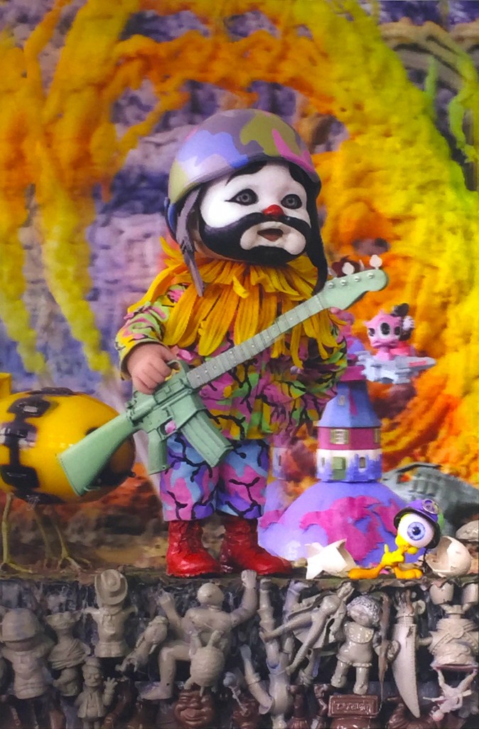
Ron English, Combrat Boy 3D Lenticular, 2015
Ron English
Combrat Boy
2015
3D Lenticular archival ink on acrylic
36 x 24 in.
Edition of 10
This piece is signed and numbered on verso.
About This Work:
A long admirer of his work and the message behind his art, Gregg Shienbaum has always wanted to work with Ron English. Together they did not want to publish a silkscreen on paper, but instead opted for a 3D lenticular. By publishing the piece in a small edition of 10, the piece is very limited, We expect to publish more editions of this caliber in the future.
About Ron English:
Ron English is an American contemporary artist who explores popular brand imagery and advertising. His signature style employs a mash-up of high and low cultural touchstones, including comic superhero mythology and totems of art history, to create a visual language of evolution. He is also widely considered a seminal figure in the advancement of street art away from traditional wild-style lettering and into clever statement and masterful trompe l’oeil based art. He has created illegal murals and billboards that blend stunning visuals with biting political, consumerist and surrealist statements, hijacking public space worldwide for the sake of art since the 1980s.
Culture jamming is one aspect of his work, involving ‘liberating’ commercial billboards with his own messages. Frequent targets of his work include Joe Camel, McDonald’s, and Mickey Mouse. Ron English can be considered the “celebrated prankster father of dollar-pop”, who wrangles carefully created corporate icons so that they are turned upside down, and are used against the very corporation they are meant to represent. Ron English is considered one of the fathers of modern street art. Some of his extralegal murals include one on the Berlin Wall’s Checkpoint Charlie in 1989 and one on the Palestinian separation wall in the West Bank in 2007, with fellow street artists Banksy and Swoon.
English is as well known for his photorealist technique and inventive use of color and comic book collage as he is for his unique cast of characters, including sexualized animals, skeletal figures, Marilyn Monroe with Mickey Mouse breasts, the corpulent fast food spokesman MC Supersized, and one of his most significant creations, Abraham Obama, a fusion of America’s 16th and 44th Presidents.
English takes inspiration from Andy Warhol and references him in his work. He also references the band KISS, and various cartoons. Also inspiration comes from the large billboards and posters he sees outside his Jersey City apartment, usually fast food companies.
English also references Picasso’s Guernica. He has created dozens of versions, transforming the original Spanish civilian characters into Disney characters, Peanuts characters, soccer players, schoolchildren, and many others. He also painted the world’s largest version of Guernica at the Station Museum in Houston. It is one foot longer and one foot wider than Picasso’s original and features schoolchildren playacting the violent scene of the original.