Ed Ruscha
Bliss Bucket
2010
Lithograph
28 3/4 x 28 in.
Edition of 50
Pencil signed, dated and numbered
About the work:
One of the most important postwar artists, Ed Ruscha came into prominence during the 1960s pop art movement. First recognized for his associations to graphic design and commercial art, Ruscha became admired for his mediations on word and image, where a word literally becomes an object.
Language has often invaded the visual arts during the past century, but no other artist uses it the way Ruscha does. His early paintings are not pictures of words but words treated as visual constructs. “I like the idea of a word becoming a picture, almost leaving its body, then coming back and becoming a word again,” he once said. “I see myself working with two things that don’t even ask to understand each other.”
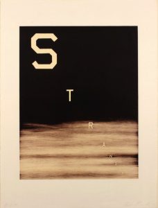
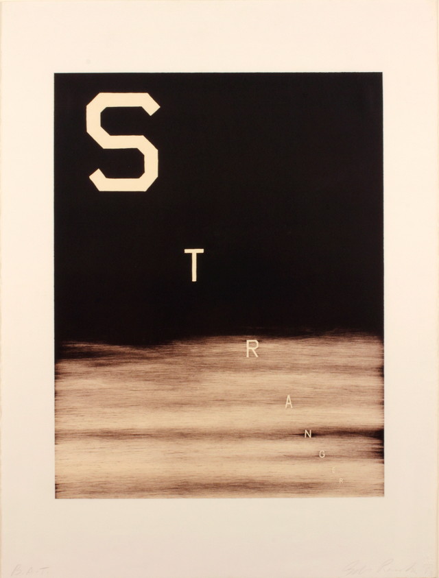
This weeks WORK OF THE WEEK – WOW!!! is Bliss Bucket, a snowcapped mountain scene, bearing the words, with his self invented font.
Since the late 1990s the mountain has become one of Ruscha’s most consistent motifs. He produces classic mountains, taken either from images of the Himalayas or from his own imagination.
Ruscha has said, ‘It’s not a celebration of nature. I’m not trying to show beauty. The concept came to me as a logical extension of the landscapes that I’ve been painting for a while – horizontal landscapes, flatlands, the landscape I grew up in. Mountains like this were only ever a dream to me; they meant Canada or Colorado. I’m not really painting mountains, but an idea of mountains. picturing some kind of unobtainable bliss or glory … tall, dangerous, beautiful.”
He has used these epic backdrops to support a range of ambiguous or bland phrases such as this one here. The deliberately neutral typeface in this work has now become his trademark font, with squared off letters recalling those in the Hollywood sign. He describes it as ‘no-style’ or Boy Scout Utility Modern’
Actually, the words aren’t so much written on top of the depiction of the mountain as inscribed within the work, the crisp lettering clear, clean and as virgin as the snow itself. Each word has the momentous authority of an alp; they shout, as though to start an avalanche.
Ruscha would stumble upon these words, considering them to be his own version of Duchampian readymades. When the words began to invade his mountain paintings the result was boldly striking and beautifully absurd. The mountains receded to the background while statements such as BLISS BUCKET threw themselves at the front of the plane with big, look-at-me lettering making it impossible not to enjoy these clever combinations.
Inspired by the text based works of fellow Pop artists Jasper Johns and Robert Rauschenberg, Ruscha pursued a lifelong artistic exploration into the formal elements of printed text and its fluid relationship to the visual image. By culling words, images and phrases that have been imprinted in his memory and that are found in mass media (print culture, advertising billboards, etc.), his work often serves as a visual encyclopedia of American culture. These symbols of consumer culture are as deeply rooted in the American vernacular as the mountains Ruscha paints.
His clever word associations pop off brightly colored canvases daring the viewer to react. For Ruscha words are also images, in that they provoke the imagination of the viewer.
Ruscha’a mounting paintings speak to how commercialism and consumerism are slowly encroaching on the natural world. This work is about before and after and the passage of time. The presence of commercialism and consumerism is unnatural and harsh, yet they accurately reflect the effect that our consumer driven culture has on the dwindling unspoiled natural world.
Mass media, billboards, and megastores are empires in their own right and have left an indelible imprint on our world. The unblemished views of these pristine monuments are slowly being encroached upon by sprawling suburban strip malls and colossal super stores. “The buildings violate the beauty of these mountains,” The abstraction with which he renders is classic Ruscha – he doesn’t give us too much but just enough to trigger our imaginations and associations. The subtlety of this rendering allows this painting to leave a far more substantial imprint on the viewer and make a much stronger statement on the condition of our world.