Work of the Week! WOW! Banksy – Grin Reaper (Red Reaper)


Banksy
Grin Reaper (Red Reaper)
2005
Screenprint
30 3/8 x 19 5/8 in.
Unique Artist Proof (A.P.) outside of the regular edition of 300
Pencil signed, dated and annotated A.P.

*Accompanied with a COA by Pest Control


This week’s Work of the Week – WOW!!! is the Grin Reaper. Only this work is a rare one of a kind unique Artist’s Proof.

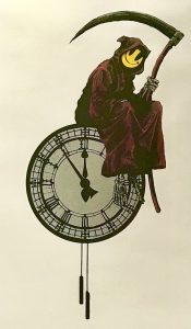
There are quite a few differences between this version of Banksy’s Grin Reaper, and the regular edition version. (See photos below). This version of Banksy’s Grin Reaper, is an extremely rare unique one of a kind screenprint.

The differences are:

– The Reaper’s cloak is red, instead of black

– His scythe is red, instead of black, and the blade has metallic silver highlights

– The clock is metallic silver, instead of white

– The Reaper’s bones (skeleton) is also silver instead of white

– There is a matching silver border around the print

– This work is untrimmed, and larger measuring 30 3/8 x 19 5/8 in. (77 x 50 cm)
– The regular edition is 27 1/2 x 17 5/8 in. (70 x 44 cm)

This work is certified authentic by Pest Control, and is even titled the “Red Reaper” on the COA. It is an Artist’s Proof (AP), outside of the edition.

This is a rare, unique, one of a kind print

Unique Artist Proof
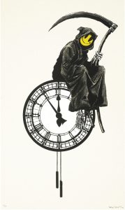
Regular Edition of 300

Banksy’s “Grin Reaper” is one of the artist’s most iconic images. Banksy’s original regular edition print was first released in 2005, as an edition of 300 pieces, and existed as a graffiti piece on Old Street, London. The work was originally part of ‘pop up shop’ exhibitions by Banksy.

This screen print by Banksy shows a grim reaper, with a comical twist. The reaper holds his traditional scythe, and he is sitting, casually on the top of a clock. It is five minutes to midnight, presumably the reaper is awaiting for the clock to strike twelve, before enacting his grim duties! However, instead of the usual skeletal features associated with the reaper, his face has been replaced with a bright yellow smiley face.

This piece plays with the boundaries between good and evil, by taking a typical symbol of something ‘bad’ (the reaper) and countering that with something considered to be good… a smiley face. The bringer of Doom, is now perhaps, not so bad after all. Almost welcoming you to your fate.

Work of the Week! WOW! Ellsworth Kelly – Red, Yellow, Blue


Ellsworth Kelly
Red Yellow Blue
1999-2000
Lithograph
31 x 30 1/2 in.
Edition of 40
Pencil signed and numbered


About the work:

Ellsworth Kelly’s works emphasize the basics of color, form, and shape. He is considered one of the great American artists of the 20th century for his pioneering works in hard-edge minimalism and colorful abstraction that explored the essence of their subjects.

Kelly spent time in Paris in the late 40s where he became influenced by Picasso and Matisse. Upon his return to New York, he carved out his own niche, paring down architecture, images and other visuals, turning them into abstractions. Using basic colors, he created statements that were “less descriptive than evocative.” Compared to other artists of his generation, Kelly’s works are far simpler.

His works take time to look at because what they portray is reduced to the basics, but they are all depictions of something we have already seen, and Kelly invites us to see what he sees.

This week’s Work of the Week! WOW! is Red Yellow Blue.

Red Yellow Blue is based on a painting created in 1963 which is part of the Marguerite and Amié Maeght Foundation collection. The Galerie Maeght was an avid supporter of Kelly’s work, giving him his first solo exhibition in 1958. The artist spent the summer of 1963 with the Maeght family at their residence in Saint-Paul de Vence and Red Yellow Blue is inspired from his walks in the flower and vegetable gardens of the estate. The colors are reduced to the three primary colors, flatly applied without any nuance or value. Once the subject of the work is identified, it is easy to see that the work is a bird’s eye view of a well-manicured French garden.

Work of the Week! WOW! In Memory of Mel Ramos


California Pop Icon, Mel Ramos has passed away at the age of 83 of heart failure, on Sunday Oct. 14, 2018.

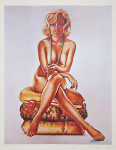
As a tribute to Mel Ramos, this week’s Work of the Week! WOW! is Verna Burger, Ramos’ first print, created in 1965.

Mel Ramos
Verna Burger
1965
Lithograph
21 1/2 x 17 in.
Edition of 500
Pencil signed and numbered


About the work:

Few things are more appealing to a man than a sexy seductive pinup model and a good old fashion cheeseburger.

In his own way, Mel Ramos, a pioneer of American Pop Art on the west coast, captured American thought, fervor, and society of the times.

To the outsider looking in, Ramos’ art was nothing more than a hot naked woman coming out of an unwrapped candy bar, lying with an exotic animal, or in this case, sitting on a cheeseburger. However to the insider, Mel Ramos’ art is the juxtaposition of naked women with larger than life commercial products, and represents issues of the times.

The 1950’s and 1960’s brought innovation, and commercialization, tied with consumerism to America, and on the flip side brought a break with traditional values and a loss of innocence, a “breaking out of its shell” if you will. The birth of television, and movies, helped bring about both consumerism, and sexuality to the forefront of every American.

Advertisements shaped our culture of what society “needs” and “wants”. The rise of pinup calendars, Playboy Magazine, and the Hollywood sex symbols in the movies, shaped our youth, moving them forward into a more rebellious and break from traditional thinking as a society as a whole.

Many of the Pop Artists, like Johns, Rauschenberg, Rosenquist, and Lichtenstein, all painted about the same topics as Ramos, but Mel Ramos’ art was more direct, and less abstract. There was no room for interpretation. It was what it was! And that is perhaps why Ramos never achieved the same level of appreciation of fame as his contemporaries. However, Ramos was one of 12 artists, along with Andy Warhol, and Roy Lichtenstein, in the Los Angeles County Museum, of the Arts 1963 Pop art show that showcased the burgeoning new movement.

Verna Burger is the prime example of Ramos’ brand of Pop. The work has all the allure of a pinup with the vintage 1960’s look and sexual undertones. There is a delicate femininity to Verna in the way she is seated, playing with a long string of pearls and her 1960’s inspired bob hairdo. While the sex appeal is obvious, it is more coquettish than images we may see today.

Mel Ramos’ work did evolve to be more flashy or showy over the years, but Verna Burger brings viewers back to different era and represents the epitome of what Ramos collectors are after: a style of subtle suggestiveness and innuendo, paired with a commercial product that is nostalgic of a different time.

WOW! – Work of the Week – Robert Rauschenberg – Soviet/American Array VI


Robert Rauschenberg
Soviet/American Array
1988-1990
Intaglio in 16 colors on Saunders paper
88 1/2 x 52 in.
Edition of 59
Pencil signed and numbered


About the work:

Robert Rauschenberg was endlessly curious, creative and politically-minded. He is one of most influential artists of the post-war era and is credited with a revival and redefinition of printmaking. His aesthetic strategy included assemblage and collage of images of the everyday world, the juxtaposition of which, enhances their effects on each other to form a narrative.

Rauschenberg used his art as a means to depict political experiences of the time, which in turn allowed him to process them internally. Much of his political work is not only a meditation on the state of the nation but also on the state of the nation in relationship to the world.

For a conscientious citizen like Rauschenberg, who served in World War II, the overwhelming rise of the Cold War between post-war superpowers America and Soviet Union could not be ignored. He later explained that he had felt assaulted by current events. His resolution to this was undertaking and fostering cultural exchange through his ROCI (Rauschenberg Overseas Culture Interchange) initiative. Among his projects for the initiative was the Soviet/American Array series.

This week’s Work of the Week! WOW! is Soviet/American Array VI.

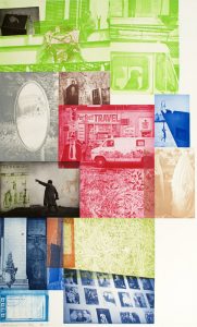
For Rauschenberg, current events directed his thinking and emotions of the time. Despite seemingly different worlds on opposite sides of the Iron Curtain, Soviet/American Array VI reveals a surprising display of visual similarities across the Cold War divide. The piece was most likely inspired by Russia poet Andrei Voznesensky’s 1981 work entitled “Russian-American Romance:”

In my land and yours they do hit the hay
and sleep the whole night in a similar way.
There’s the golden Moon with a double shine.
It lightens your land and it lightens mine.
At the same low price, that is for free,
there’s the sunrise for you and the sunset for me.
The wind is cool at the break of day,
it’s neither your fault nor mine, anyway.
Behind your lies and behind my lies
there is pain and love for our Motherlands.
I wish in your land and mine some day
we’d put all idiots out of the way.

This work interweaves images of American life and Soviet life through the intaglio process in 16 colors. The work is very large, standing 88 1/2 in. high by 52 in. wide and was done in a very limited edition of 59 pieces. Some images are obvious such as the silhouette of a statue of Lenin and other, less recognizable images were taken from Rauschenberg’s travels throughout the Soviet Union and America. What is most interesting about the work is how difficult it is to discern which images represent the USSR and which represent the U.S.A.

In this piece Rauschenberg turns images from the two Cold War nations, which stressed their differences for over forty years, into a montage of an inextricably interconnected life, neither Soviet nor American, but an array of both.

Rauschenberg’s effort was to break through the pain. He stated in 1989: “My goal is to open people’s eyes to the surrounding reality, to deepen mutual understanding between people and to aspire for peace.” The aim of these works was “to shake people awake,” to the fact that despite ideological differences, people across the world are not all that different.

WOW! – Work of the Week – John Baldessari – Zorro (Two Gestures and One Mark)


John Baldessari
Zorro (Two gestures One Mark)
1998
Offset lithograph with screenprint and offset flip book
Sheet: 10 x 8 in.
Book: 3 7/8 x 5 7/8 in.
Edition of 60
Pencil signed and numbered


About the work:

John Baldessari pledged, in a 1970 groundbreaking work “I will not make anymore boring art.” This pledge was addressed to both his viewers but also to himself. He has remained true to his word, never shying away from new media, allowing his works to always retain a freshness and relevance that many younger artists struggle to match. Through his experimentations, he became responsible for the way many artists use appropriation in their work today. Kruger, Sherman and Salle are among the many that cite him as an influence. He is a giant of contemporary art.

This week’s Work of the Week! WOW! is Baldessari’s Zorro (Two Gestures and One Mark).

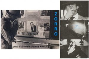
Zorro (Two Gestures and One Mark) is a lithograph with screenprinting accompanied by an artist flip book without commentary. The combination of the two brings to life trademark Hollywood imagery.

Baldessari is best known for works that blend photographic materials which are taken out of their original context and rearranged. He has spent his entire life living and working in California so it is not surprising that much of his works incorporate Hollywood film stills and other cinematic references. This particular piece features actors Jean-Paul Belmondo and Humphrey Bogart and the character Zorro.

This work requires the participation of the viewer, to take the book and flip it, which in turn reanimates the gestures of Humphrey Bogart and Jean-Paul Belmondo from movie stills. It is not a static piece.

The end result of flipping through the book is the actual artwork of art in which we see the imagery of Belmondo smoking a cigarette, and rubbing his lips with his thumb, Humphrey Bogart laughing before slowly becoming serious, and Zorro marking the Z on a wall with his sword.

Thus the work becomes two-part. The genius of the work is that it is a combination of film stills that the viewer has to flip through the book to get to the end result image, which is the artwork itself. A remarkably smart conceptual piece!

WOW! – Work of the Week – Frank Stella – Jasper’s Dilemma


Frank Stella
Jasper’s Dilemma, from Jasper’s Dilemma
1973
Offset Lithograph
16 x 22 in.
Edition of 100
Pencil signed and numbered


About the work:

Frank Stella defiantly departed from Abstract Expressionism through a complete restructuring of the idea of painting. He revolutionized the field and inspired changes still felt today.

This week’s Work of the Week! WOW! is Stella’s Jasper’s Dilemma, an homage to fellow artist Jasper Johns who he admired greatly.

Jasper’s Dilemma is formed of two “mitered” mazes as Stella called them. Mitered joints are joints that are beveled, usually at a 45 degree angle to form a corner, such as standard picture frame edges. Both mazes seem identical in structure, divided into 4 triangles whose points don’t quite meet at the center, however, the colored maze spirals outward in a counter-clockwise path from the center and the black, while the black and white maze follows a clockwise route.

Stella eliminated subjectivity in his work through using arbitrary mathematical measurements, forcing the viewer to think about the relationship between color and form. Johns on the other hand, created compositions of recognizable items, closing the gap between the object and its representation, transforming an object into art.

Johns would often create a work in color, then reexamine it in shades of grey. This “dilemma” is posed in Stella’s tributary work (which holds both the representation in color and in grey), between the “seduction of the spectrum against the rigors of the grey scale.” The title of this work and its color scheme make explicit reference to Johns’s statement that the more he worked in color, the more he saw gray.

For Johns, the use of grey was a means to think about color through its absence. Johns initially used grey tones as a statement of skepticism or anticipation, but it evolved into a profound examination of the meaning of color itself. Grey was the most appropriate hue with which to present “conceptual” art since it is less stimulating, allowing for more space for ideas.

In removing color, the artists refocus the viewer’s attention to consider the means of representation, over what is represented and, to consider how does something come to have meaning, rather than what does it mean.

WOW! – Work of the Week – Andy Warhol – Dollar Sign FS II.278


Andy Warhol
Dollar Sign FS II.278
1982
Screenprint on Lenox Museum Board
19 5/8 x 15 5/8 in.
Edition of 60 unique works
Pencil signed and numbered


About the work:

Power, Greed, Wealth, Success, Strength, Capitalism, Consumerism, Materialism; what symbol represents all these better than the US $ (Dollar Sign)?

“It’s all about the Benjamins!!!”

This weeks Work Of the Week (WOW!) is Andy Warhol’s Dollar Sign ($), FS II 278. When it comes to a symbol of a world currency, none is more iconic the the US $ (Dollar Sign). No one thinks of the British Pound, the Euro, or the Yen. It is the US Dollar, and the dollar sign $, that is known and desired all over the world.

Art is always a extension and representation of the times. Andy Warhol began creating money imagery as early as the 1950’s. After WWII, America had solidified her position, strength, and power in the world. Here at home, America was entering the most financially sound period in her short history. Americans were experiencing a modern industrial revolution in manufacturing, home buying was at the highest level in history, television was new and advertisements were pitching the latest and greatest to a ripe audience, who for the first time had money to buy, and the growing middle class was the strongest it has ever been. American was flying high, and money was flowing.

The pop artists saw this, and their art reflected exactly what was going on. Jasper Johns’ American flag was an artistic symbol of patriotism. Robert Rauschenberg’s photo-journalistic style artistically documented the times, and Roy Lichtenstein, Robert Indiana, James Rosenquist, and Andy Warhol used their advertising backgrounds to create art that represented the influx of money, capitalism, consumerism that the American culture was experiencing at the time.

Yet it is timeless, just as it rang true over 50 years ago, it holds true today. Warhol’s Dollar Sign ($), is not just a cool image that was meant to hang behind the desk of some important CEO. It’s a statement. It’s an abstract statement, or concept if you will, on what money represents, and how this tiny piece of paper rules the world, (for better or for worse). Abstract in the sense that Warhol does not come right out and list the positives and negatives of money, he leaves that up to the viewer to form his or her own interpretations. To some who see the genius of Warhol it may seem deeper that what is looks like on the surface, and to some it may seem simple or obvious. But after all, Warhol’s take on Pop Art is in many ways, overstating the obvious.

WOW! – Work of the Week – Roy Lichtenstein – Nude, from Brushstroke Figures


Roy Lichtenstein
Nude, from Brushstroke Figures
1989
Lithograph, Waxtype, Woodcut and Screenprint
56 1/4 x 32 1/2 in.
Edition of 60
Pencil signed, dated and numbered


About the work:

The Nude and the Brushstroke are two classic and timeless pillars of Art History. The Nude figure has been used throughout time in art to express the ideals of the female and male bodies. The theme might evoke Boticelli’s The Birth of Venus or Michelangelo’s David, masterpieces for their representation of anatomical proportions as well as the technical skill required to produce them. The Brushstroke can be deemed the most basic and central element in two-dimensional art, yet it is hardly the first technique that comes to mind when considering Pop Art.

Roy Lichtenstein, one of Pop Art greats, strove to leave as little a trace of his hand in his work. His works carry a distinctive, mechanical style derived from mass printing, leading to his name becoming synonymous with popular comic-book imagery, Ben-Day dots and a primary color palette. Ironically, Lichtenstein began his career exploring abstract expressionism, a movement he would revisit at great length.

Abstract expressionism employed the brushstroke as a vehicle to communicate feelings with spontaneous motion. Lichtenstein, who always approached his art-making with humor, turned the spontaneous brushstroke on its head.

In 1989, the artist released his Brushstroke Figures series, from which this week’s Work of the Week! (WOW!) Nude stems.

Nude, from Brushstroke Figures is a playful balance between Abstract Expressionism and Lichtenstein’s brand of Pop, making the techniques used to be the focal point of the work over the subject. The center piece of Nude is composed of brushstroke-like elements, depicted as though created with a brush. These strokes, however, are the complete opposite of the abstract expressionist stroke. They are a methodically planned artistic operation, a time-consuming task made to appear as if produced in an instant. The painterly-like strokes lend to the piece a dense abstract complexity, which emphasizes the brushstroke over the subject it is used to depict.

The work also carries the unmistakable trademark characteristics of a Lichtenstein: Ben-Day dots and slanted, alternating white and red lines, in addition to Lichtenstein’s interpretation of the brushstroke, simulated in a uniform color and flat finish.

Lichtenstein takes away from the subject matter through the painterly brushstrokes, but simultaneously brings our attention back to it through his use of the slanted red and white lines as a background. This feature has an optical effect of making the subject appear as though it is floating in a three-dimensional space, entirely detached from from its setting. Every element of this work is calculated and placed.

Lichtenstein was a was very innovative printmaker, and never shied away from experimenting. Nude, from Brushstroke Figures makes use of a variety of printing methods, lithography, woodcut, screenprinting, and waxtype, a process similar to screenprinting, where beeswax is used, rather than traditional printers ink. Lichtenstein experimented with materials to create more depth and interest, and in this case, asks the viewer to reconsider their preconceived notion of the nude.

WOW! – Work of the Week – Damien Hirst – Ala-Met


Damein Hirst
Ala-Met
2011
Woodcut
31 1/2 x 25 in.
Edition of 55
Pencil signed and numbered


About the work:

“To create that structure, to do those colours, and do nothing. I suddenly got what I wanted. It was just a way of pinning down the joy of colour.”

Damien Hirst started his ‘Pharmaceutical’ spot painting series in 1986, when he painted two almost identical arrangements of colored spots on the wall of his warehouse. Today, the spot works are amongst his most widely recognized pieces.

The spot series follows a formula. Every work is created without any physical evidence of human intervention, appearing to be constructed mechanically. Each color is unique, never repeated and complimentary to the surrounding ones. The formula of the spot paintings also dictates that the spaces between the spots are always equal to the diameter of the spots themselves. Hirst explains that, “mathematically, with the spot paintings, I probably discovered the most fundamentally important thing in any kind of art. Which is the harmony of where colour can exist on its own, interacting with other colours in a perfect format.”

The titles for the works also follow a specification, and are taken from the chemical company Sigma-Aldrich’s catalogue ‘Biochemicals for Research and Diagnostic Reagents.’

This week’s Work of the Week! WOW! is Ala-Met.

The name for Ala-Met is derived from two amino acids, Alanine and Methionine, organic compounds that participate in a number of processes such as neurotransmitter transport and biosynthesis.

Although created in the deceptively simple polk-dot motif, the work is hypnotic and disorienting, inducing the sort of hazy effects one might get from powerful mind and body altering pharmaceutical substances. Some colors seem to jump out from the white background, while others recede, highlighting Hirst’s expert control of color.

Ala-Met is also faithful to the mechanical and detached appearance of the spot paintings, despite that it is a work created by woodcut. The woodcut is a relief printing technique, in which a block of wood is carved along the woodgrain. This technique typically leaves woodgrain marks on the printed product, whereas Ala-Met achieves a uniform and seamless finish in each spot.

Throughout his body of work, Hirst has demonstrated a fascination with mortality. His work calls into question our awareness and convictions about the boundaries that separate desire and fear, life and death, reason and faith, love and hate. Hirst uses the tools and iconography of science and religion, creating works of art whose beauty and intensity offer the viewer insight into art that transcends our familiar understanding of those domains.

The spot paintings, with their titles tied to the pharmaceutical industry play on the fact that we have become a drug induced society, yet at the same time these paintings speak volumes about the art itself, as a work of art. Hirst’s work is post expressionism. “I wanted to find a way to use colour in paintings that wasn’t expressionism.” However Hirst does use color and the placement of these colors to express certain ideas or emotions. Each spot painting will have a different meaning or feeling to each viewer coming from different cultures, with a whole different set of life experiences.

Damien Hirst has often been a polarizing figure in the art world. His often provokes outrage as well as mystified shrugs. In addition to keeping up with the Warholian tradition of repetitive, consistent images, the spot artworks bring up cultural and contemporary questions. Upon seeing these spot paintings, the lay person will ask “Is that art?” or “That painting cost that much for spots?” This was also said about Warhol’s Campbell’s Soup Can paintings. Time has proven the importance of the Campbell’s Soup Can painting to the art world, as will Hirst’s Spot paintings.

WOW! – Work of the Week – James Rosenquist – 1, 2, 3 Outside


James Rosenquist
1, 2, 3 Outside
1971
6 color lithograph with embossing and debossing
40 1/2 x 31 in.
Edition of 70
Pencil signed, dated, titled and numbered


About the work:

“Popular culture isn’t a freeze-frame; it is images zapping by in rapid-fire succession, which is why collage is such an effective way of representing contemporary life. The blur between images creates a kind of motion in the mind.”

James Rosenquist is best known for his colossal collage paintings of enigmatically juxtaposed fragmentary images. These images, brought together and enlarged overwhelm the viewer,  through their sheer scale which makes them difficult to discern at first glance. They are mostly fragments of enlarged, photo-realistic images done in the advertising style of the emergence of consumer culture in America during the 1960’s. This is no accident, Rosenquist started out his career as a billboard painter, and was among this first of the classic pop-artists to directly address the persuasive powers of advertising, highlighting the omnipresence of ads.

This week’s Work of the Week! WOW! is Rosenquist’s 1, 2, 3 Outside

1, 2, 3 Outside was originally painted in 1963 in a manner that denies each of the three panels immediate recognition due to the scale of each fragmented image, so enlarged that they are each removed from their original context. This is where Rosenquist’s fascination with subliminal persuasion through advertising becomes evident. Each image is artistically packaged based on defining characteristics and incorporates as much visual imagery as possible onto the picture plane. Together, however, they form a bombardment of information without any kind of visual relief.

The imagery is on such a monumental scale that it gives the impression that it is coming straight at the viewer and suggests a strong socio-economic commentary, implying that the work itself is a starting point for deeper reflection. “I wanted the space to be more important than the imagery,” James Rosenquist said. “I wanted to use images as tools.”

Rosenquist used generic imagery, no brand names, and created a new kind of picture. He described the effect: “People can remember their childhood, but events from four or five years ago are in a never-never land. That was the imagery I was concerned with—things that were a little bit familiar but not things you feel nostalgic about. Hot dogs and typewriters—generic things people sort of recognize.” Rosenquist reminds us to observe more intently and become more self-reflective, taking our time with the experience of looking.

As such, 1, 2, 3 Outside exemplifies Rosenquist’s contribution to Pop art: grand scale, fragmented composition that encompass an amalgamation of consumer imagery and evokes visual memory flashes of consciousness.