Tag Archives: prints
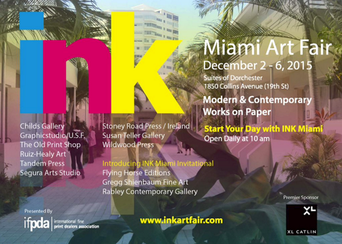
Gregg Shienbaum Fine Art will participate at Ink Miami Fair 2015
| Gregg Shienbaum Fine Art is proud to announce its participation at Ink Miami Art Fair 2015 | |||
| The show will be open December 2 to 6 | |||
| Come visit us at Booth 160 |
Click here for Miami Ink Art Fair press release
Pictures and news from the Fair will be coming soon!
Admission Hours:
Wednesday 11:00 am to 5:00 pm
Thursday 10:00 am to 5:00 pm
Friday 10:00 am to 7:00 pm
Saturday 10:00 am to 7:00 pm
Sunday 10:00 am t 3:00 pm
For any information or to know what we will be showing at the Fair, please send us an email at info@gsfineart.com or call us at 305 456 5478
WOW! – Work of the Week – Roy Lichtenstein “Shipboard Girl” 9/28/15
Roy Lichtenstein, Shipboard Girl
Roy Lichtenstein
Shipboard Girl
1965
Offset lithograph
27 3/16 x 20 1/4 in.
Pencil signed
This work was not produced in a numbered edition.
About This Work:
Roy Lichtenstein, like many of his pop art contemporaries, was at first an abstract expressionist. Gradually, however, during the decade following his discharge from the army, he turned his attention increasingly to imagery drawn from such popular cultural sources as commercial advertising, romance and war comics, and cartooning in general.
Not only was Lichtenstein interested in the look of comic books, but also in the way they were produced. He carefully studied the way in which small dots of ink, known as Ben Day dots, were printed. He then enlarged these dots in his art to give his works the appearance of mechanically printed commercial products. Ben Day dots are the pattern of dots used in commercial printing to cheaply reproduce shading.
In the print Shipboard girl of 1965, we see Lichtenstein’s mature style in its rudimentary form. The image exemplifies all the qualities that his many paintings and prints of young women culled from romance comics exhibit — a girl, usually blonde, in extreme close-up, lips parted, her head tilted at an angle, with enormous, soft, liquid eyes, depicted at a moment of emotional climax.
Perhaps the woman in Shipboard girl is just enjoying the sun, or perhaps she is thinking of a shipboard romance that has soured. The life bouy lounging in the background is a visual pun suggesting that she is longing for a boy to rescue her from the as-yet-unreached turbulent seas of love. This sly humor is characteristically Lichtenstein.
What is salient about this work, however, is that here in its developmental stage, we have all the formal features which will come to characterize Lichtenstein’s subsequent output. Lichtenstein’s visual vocabulary, the characteristic elements of his style, are flat areas of unmodulated color, a schematized cartoon-like outline, the removal of anecdotal detail, and more importantly, the use of the Benday dots. Here we see him working towards a style which will become uniquely identifiable as his, and which ironically, over time and in its final formulation will replace the original in the very cartoon context from which it was derived.
About The Artist:
Roy Lichtenstein (October 27, 1923 – September 29, 1997) was a prominent American pop artist. His work defined the basic premise of pop art better than any other through parody. Favoring the old-fashioned comic strip as subject matter, Lichtenstein produced hard-edged, precise compositions that documented while it parodied often in a tongue-in-cheek humorous manner.
In 1961, Lichtenstein began his first pop paintings using cartoon images and techniques derived from the appearance of commercial printing. This phase would continue to 1965, and included the use of advertising imagery suggesting consumerism and homemaking. His first work to feature the large-scale use of hard-edged figures and Ben-Day dots was Look Mickey in 1961. This piece came from a challenge from one of his sons, who pointed to a Mickey Mouse comic book and said; “I bet you can’t paint as good as that, eh, Dad?”
Lichtenstein had his first one-man show at the Castelli gallery in 1962; the entire collection was bought by influential collectors before the show even opened. It was at this time, that Lichtenstein began to find fame not just in America, but worldwide. His work featured thick outlines, bold colors and Ben-Day dots to represent certain colors, as if created by photographic reproduction. However, rather than attempt to reproduce his subjects, his work tackled the way mass media portrays them.
In the 1970s and 1980s, his style began to loosen and he expanded on what he had done before. His style was replaced with more surreal works. His “mirror” paintings consist of sphere-shaped canvases with areas of color and dots. Lichtenstein also created a series of still lifes (paintings that show inanimate objects) in different styles during the 1970s. In the 1980s and 1990s, Lichtenstein began to mix and match styles. Often his works relied on optical (relating to vision) tricks, drawing his viewers into a debate over the nature of “reality.”
Lichtenstein’s work is included in numerous museums, such as the Albright-Knox Art Gallery, Buffalo, NY; Art Institute of Chicago, Chicago; Denver Art Museum, Denver; Metropolitan Museum of Art, NY; Foundation Beyeler, Basel, Switzerland; Museum of Contemporary Art, Los Angeles, Museum of Modern Art, New York; National Gallery of Art, Washington D.C.; Philadelphia Museum of Art, Philadelphia; Solomon R. Guggenheim Museum, New York; Stedelijk Museum, Amsterdam; and Whitney Museum of American Art, New York.
For more information and price please contact the gallery at info@gsfineart.com
WOW! – Work of the Week 9/21/15
Robert Rauschenberg
Signs
1970
Screenprint
43 x 34 in.
Edition of 250 Pencil signed & numbered
About This Work:
Robert Rauschenberg’s “Signs” 1970, is one of the most sought after Rauschenberg screenprints because of the artwork’s incredible iconographic imagery and historical significance. Signs was originally commissioned by Time Magazine, with the intention that it would be used as the January edition cover for the year 1970. After considering the final composition, the executives at Time Magazine found the piece was more politically charged than they had hoped and decided against using it. It was felt that the composition, though stunning, was more of a recapitulation of the 1960’s than a welcome to the new decade.
After the dismissal by Time Magazine, Robert Rauschenberg’s trusted dealer Leo Castelli convinced him to print a limited edition screenprint of Signs. The edition was published by Leo Castelli in New York in an edition of 250; each signed, dated ‘70’, and numbered in pencil.
Signs is an astounding collage encompassing the monumental events and people of 1960’s America. Rauschenberg masterfully juxtaposes scenes of innovation like the moon landing with the destructive violence of the war in Vietnam and the civil rights movement. The revolutionary nature of the era is pronounced through the images of peace protestors at the top, whose rallies for change and peace are echoed by the voice of Janis Joplin deeply singing into her microphone. The iconic leaders of the era including JFK and his brother Bobbie Kennedy challenge the divisive violence of the wars and civil unrest, even as their forms and images transition into the faces of martyrs. The “Signs” of this transformative decade are woven seamlessly by Rauschenberg, and this screen print is known as one of his most important works of art.
About The Artist:
Robert Rauschenberg began what was to be an artistic revolution. Rauschenberg’s enthusiasm for popular culture and his rejection of the angst and seriousness of the Abstract Expressionists led him to search for a new way of painting. He found his signature mode by embracing materials traditionally outside of the artist’s reach. He would cover a canvas with house paint, or ink the wheel of a car and run it over paper to create a drawing, while demonstrating rigor and concern for formal painting.
By 1958, at the time of his first solo exhibition at the Leo Castelli Gallery, his work had moved from abstract painting to drawings like “Erased De Kooning” (which was exactly as it sounds) to what he termed “combines.” These combines (meant to express both the finding and forming of combinations in three-dimensional collage) cemented his place in art history.
This pioneering altered the course of modern art. The idea of combining and of noticing combinations of objects and images has remained at the core of Rauschenberg’s work.
As Pop Art emerged in the ’60s, Rauschenberg turned away from three-dimensional combines and began to work in two dimensions, using magazine photographs of current events to create silk-screen prints. Rauschenberg transferred prints of familiar images, such as JFK or baseball games, to canvases and overlapped them with painted brushstrokes. They looked like abstractions from a distance, but up close the images related to each other, as if in conversation.
These collages were a way of bringing together the inventiveness of his combines with his love for painting. Using this new method he found he could make a commentary on contemporary society using the very images that helped to create that society.
In 1998 The Guggenheim Museum put on its largest exhibition ever with four hundred works by Rauschenberg, showcasing the breadth and beauty of his work, and its influence over the second half of the century.
For more information and price please contact the gallery at info@gsfineart.com
WOW! – Work of the Week
Gregg Shienbaum Fine Art is proud to announce its first published edition with Ron English
Ron English, Combrat Boy

Ron English, Combrat Boy 3D Lenticular, 2015
Ron English
Combrat Boy
2015
3D Lenticular archival ink on acrylic
36 x 24 in.
Edition of 10
This piece is signed and numbered on verso.
About This Work:
A long admirer of his work and the message behind his art, Gregg Shienbaum has always wanted to work with Ron English. Together they did not want to publish a silkscreen on paper, but instead opted for a 3D lenticular. By publishing the piece in a small edition of 10, the piece is very limited, We expect to publish more editions of this caliber in the future.
About Ron English:
Ron English is an American contemporary artist who explores popular brand imagery and advertising. His signature style employs a mash-up of high and low cultural touchstones, including comic superhero mythology and totems of art history, to create a visual language of evolution. He is also widely considered a seminal figure in the advancement of street art away from traditional wild-style lettering and into clever statement and masterful trompe l’oeil based art. He has created illegal murals and billboards that blend stunning visuals with biting political, consumerist and surrealist statements, hijacking public space worldwide for the sake of art since the 1980s.
Culture jamming is one aspect of his work, involving ‘liberating’ commercial billboards with his own messages. Frequent targets of his work include Joe Camel, McDonald’s, and Mickey Mouse. Ron English can be considered the “celebrated prankster father of dollar-pop”, who wrangles carefully created corporate icons so that they are turned upside down, and are used against the very corporation they are meant to represent. Ron English is considered one of the fathers of modern street art. Some of his extralegal murals include one on the Berlin Wall’s Checkpoint Charlie in 1989 and one on the Palestinian separation wall in the West Bank in 2007, with fellow street artists Banksy and Swoon.
English is as well known for his photorealist technique and inventive use of color and comic book collage as he is for his unique cast of characters, including sexualized animals, skeletal figures, Marilyn Monroe with Mickey Mouse breasts, the corpulent fast food spokesman MC Supersized, and one of his most significant creations, Abraham Obama, a fusion of America’s 16th and 44th Presidents.
English takes inspiration from Andy Warhol and references him in his work. He also references the band KISS, and various cartoons. Also inspiration comes from the large billboards and posters he sees outside his Jersey City apartment, usually fast food companies.
English also references Picasso’s Guernica. He has created dozens of versions, transforming the original Spanish civilian characters into Disney characters, Peanuts characters, soccer players, schoolchildren, and many others. He also painted the world’s largest version of Guernica at the Station Museum in Houston. It is one foot longer and one foot wider than Picasso’s original and features schoolchildren playacting the violent scene of the original.
WOW! – Work of the Week
Alexander Calder, Pinwheel
Alexander Calder
Pinwheel
c. 1970
Lithograph
62 x 46 in.
Edition of 30
This piece is pencil signed and numbered.
About This Work:
Alexander Calder is best known for creating mobiles—sculptures composed of abstract shapes moving through spaces. Many of his lithographs can be seen as studies of movement for his mobiles, as well as the capturing of movement for his stabiles — stationary sculptures. Pinwheel is one of the larger prints Calder made to view and chronicle how the shapes would move on the mobile from an anterior view. With the primary colored shapes starting in one place and moving to an alternative axis only when the other shapes were in a particular place in space.
About Alexander Calder:
In a time of constant artistic upheaval, Alexander Calder’s aesthetic revolution concerned itself with a somewhat taboo topic in the art world — fun. His prolific and passionate output brought with it a humor and sense of play unlike any before. From a wire animal the size of a match box to a fountain filled with mercury to a seventy foot representation of a man in metal, Calder ignored the formal structures of art and in so doing redefined what art could be.
Born in 1898 in Philadelphia, Calder came from a family of artists. Both his father and grandfather were well-known sculptors, and his mother was a painter. Throughout his young life, Calder was more interested in mechanics and engineering than art. After graduating high school he attended the Stevens Institute of Technology, receiving his degree in 1919. Within a short while, however, his creative energies turned toward art and he enrolled in the Art Student’s League in New York. Working as a freelance illustrator, Calder began to paint and sculpt. Soon after his first one man show in New York, Calder left for Paris.
It was then that he began work on one of his most famous projects, the “Calder Circus”. The “Circus” was a miniature reproduction of an actual circus. Made from wire, cork, wood, cloth and other easily found materials, the “Circus” was a working display that Calder would show regularly. A mix between a diorama, a child’s toy, and a fair game, Calder’s “Circus” found many eager fans among the avant-garde. One of the methods used to create the “Circus” was the bending of wire to form realistic figures. Drawn to the ease and simplicity of it, Calder began to make wire portraits. A combination of a line drawing and of sculpture, these instant portraits represented a new possibility in three dimensional art.
By the early 1930s Calder had brought his “Circus” to the United States and back, and was living in Paris off the proceeds of his regular performances. While regularly fixing and adding to the “Circus”, Calder began to show and work on wire and wood sculpture as well as painting. It was around this time that he became interested in the work of the Surrealist painter Joan Miró and the modernist painter Piet Mondrian. Both men had gone beyond abstraction and were making paintings of colors and shapes with no direct reference to the outside world. Enthusiastic about this embrace of form and color, Calder began to make moving sculptures in a similar vane.
Beginning with painted aluminum and wire, Calder created motored objects that could move to create different visual effects. In a short while, however, he realized that the mechanized movement didn’t have the fluidity or the surprise he wanted in his work. He decided to let them hang and have the wind or a slight touch begin their movement. When the experimental French artist Marcel Duchamp saw them, he named them “mobiles” (a pun on the French for “to move” and “motive”). These new sculptures, arranged by the chance operations of the wind, went against everything that sculpture had been. They were not monumental, nor were they sober. They were simply about form and color and the joy in creating both. So, in his early thirties Alexander Calder had not only found a project he would continue for the rest of his life, he had created a unique form of art, the mobile.
In 1933, Calder and his wife, Louisa James, moved to Roxbury, Connecticut, where they would spend the rest of their lives. Working on hundreds of small mobiles, Calder became interested in making large, more substantial works as well. Using similar colorful abstract forms, he made giant metal structures whose shapes and colors stood out bravely in both rural and urban settings. Known as “stabiles,” these works often had a similar whimsical quality to the smaller kinetic pieces. By the time of his first major show at the Museum of Modern Art in 1943, Calder’s quiet revolution was known internationally. Throughout the 1940s and 1950s he was commissioned to create site specific “stabiles” and had major retrospectives in a number of cities including Amsterdam, Berne, and Rio de Janiero.
By 1970, Calder had reached the height of his fame. He had worked regularly creating thousands upon thousands of objects—everything from jewelry to children’s toys to major monuments for the Lincoln Center in New York and UNESCO in Paris. That same year his gifts were honored again with a comprehensive show at the Guggenheim Museum and a smaller one at the Museum of Modern Art. In 1976, Alexander Calder died. Throughout his life, his commitment to creating work free from the pretensions of the art world and accessible to all, never stopped him from making exquisitely beautiful and important sculpture. In a century that saw the forms of art and literature reinvented regularly, Alexander Calder stands out as one of the great pioneers of his time. Adapted from PBS.


