|
||
|
TOM WESSELMANN About This Work: Tom Wesselmann was born on February 23, 1931 in Cincinnati, OH. In New York, he started earning his living by working as a cartoonist for several journals and magazines as well as by teaching at a high school in Brooklyn. Even though he disagreed with being labeled a “Pop” artist, Wesselmann’s work is considered belonging to the Pop art movement. During his artistic career, he experimented with materials and imagery; both collage and sculpture found their way into his assemblages. When he was not working on stylized female nudes (these works are actually what he is best known for), common objects were the main theme of his art work. This is the case of this work of the week, Wildflower Bouquet. Wildflower Bouquet is one of Wesselmann’s famous so-called Steel Drawings. With the invention of the Steel Drawings, Wesselmann began to focus more on drawing for the sake of drawing. For the first time he was approaching art on a new basis, where the scribble was the final product. The drawings that would be transferred into steel were selected carefully and their crisp outlines resonated with the immediacy of a neon sign. The drawings were usually the preliminary sketches to his other works, like paintings or prints. However, when making a comparison between the same image done in two different media, for example a steel cut-out and a painting, one can notice how the artist subtly played changes on his formal language in the treatment of the outlines, or in the spaces in between. Wesselmann was also deeply influenced by Matisse, who had long been a source of inspiration for him. In the metal works, Wesselmann can be understood to have devised his own equivalent to the paper cut-outs that had marked Matisse’s equally bold and life-affirming last phase. The steel drawings represent Wesselmann’s best-known technical innovation. Wesselmann’s Steel Drawings caused both excitement and confusion in the art world. After acquiring a piece in 1985, the Whitney Museum of American Art wrote to Wesselmann asking why he had labeled the work a drawing and not a sculpture. His response was that while he considered it a pure drawing, it was “an example of life not necessarily being as simple as one might wish”. |
Tag Archives: pop
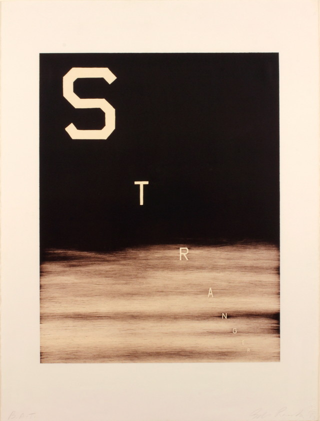
WOW – Work Of the Week – Jasper Johns “Voice 2”
 |
||
|
JASPER JOHNS About This Work: Born in Georgia in 1930 and raised in Allendale, South Carolina, Jasper Johns grew up wanting to be an artist. He studied briefly at the University of South Carolina before moving to New York in early 1950’s. Working in New York in the 1950s, Johns became part of a community of artists, including Robert Rauschenberg, that was seeking an alternative to the emotional nature of Abstract Expressionism. In the mid-1960’s, Johns executed a large painting and lithograph, both entitled Voice. He then returned to this theme in a very large, three-part painting called Voice 2, which he worked on from 1968 through 1971. With several different print versions of the canvas – this work, Voice 2, among them – Johns varied the colors and experimented with the placement of the rectangles making up each composition. The title of the work, which forms the imagery, can be read in a rotating cylindrical pattern. Johns has always been fascinated with numbers, letters and words. In this work, he plays with the letters of the word VOICE in a very personal way, superimposing the figures to create a multiple image, so that each time the eye adjusts to focus on a letter the spectator perceives a slightly different picture. These kind of works by Jasper Johns were extremely new to the museum goers and art lovers, especially at a time in which the art world was searching for new ideas. Johns is still one of most significant and influential American painters of the twentieth century, and also considered as one of the greatest printmakers of any era. |
WOW – Work Of the Week – Andy Warhol “Sidewalk FS II.304”
 |
||
|
ANDY WARHOL About This Work: Much has been said about Andy Warhol, his art and his decadent personality. Warhol’s fascination for fame and celebrities shows up in this work, that he masterfully simply calls Sidewalk. The image of this work is from a series of photographs taken by Andy Warhol himself. This image displays the handprints and signatures of Cary Grant, Judy Garland, Jack Nicholson and Shirley Temple, that are on the Hollywood Walk of Fame. |
WOW – Work Of the Week – Andy Warhol “Ingrid Bergman, The Nun FS.II 314”
 |
||
|
ANDY WARHOL About This Work: Andy Warhol was the most successful and highly paid commercial illustrator in New York even before he began to make art destined for galleries. Neverthless, his screenprinted images of Marilyn Monroe, soup cans, movie stars and sensational newspaper stories, quickly became synonymous with Pop Art. Pop Art marked an important new stage in the breakdown between high and low art forms. Warhol’s paintings from the early 1960s were important in pioneering these developments, but it is arguable that the diverse activities of his later years were just as influential in expanding the implications of Pop Art into other spaces, and further eroding the borders between the worlds of high art and popular culture. Andy Warhol is now considered one of the most influential artists of the second half of the 20th century, who created some of the most recognizable images ever produced. After the the success of the Campbell’s Soup Series in the early 1960s, indeed, Warhol began creating screenprints of movie star portraits including Marilyn Monroe, Elvis Presley, Elizabeth Taylor and Ingrid Bergman. The Ingrid Bergman Series is made up of three types of screen prints. The source images used for these portrait pieces include a publicity photo (Herself), and movie stills from her role in Casablanca (With Hat) and from the movie The Bell of St. Mary’s (The Nun). Of course, when we think of Ingrid Bergman, we think of her playing Ilsa, the long lost love interest of Rick, played by Humphrey Bogart. No one can ever forget Bergman standing on the runway, all teary eyed and wearing the famous hat, as Bogart makes her get on that plane. However, many people do not realize that the movie The Bell Of St. Mary’s was enormously popular, the highest-grossing movie of 1945 in the USA. In this movie, Ingrid Bergman is the leading female role and stars together with famous actor and singer Bing Crosby, who plays the unconventional Father Charles “Chuck” O’Malley, assigned to St. Mary’s parish. The parish includes a school building on the verge of being condemned; but the sisters of the parish feel that God will provide for them. Father O’Malley and the dedicated but stubborn Sister Superior, Mary Benedict (Ingrid Bergman), both wish to save the school, but they have different views and methods. This portrait of Ingrid Bergman in her most severe role is made even more dramatic in this iconic print. The vibrant color palette is made dynamic through Warhol’s exciting element of abstraction, the yellow lines making her figure and makeup pop, with her hands clasped in prayer and only sketched with yellow lines. Like the majority of his works, once again, this print is indicative of Warhol’s obsession with all things relating to fame, especially movie stars. For this reason, his artwork can also be considered as a sort of visual recording of the culture of his time. |
WOW – Work Of the Week – Robert Rauschenberg “Chow Bags Series”
  |
||
|
ROBERT RAUSCHENBERG About These Works: Robert Rauschenberg’s Chow Bags portfolio (1977) consists of six screen prints with graphite and plastic thread, each featuring a different domesticated animal. The prints are based on paper collages that Rauschenberg created from actual bags of animal feed manufactured by Ralston Purina (now Purina Mills), a company best known for its Dog Chow and Cat Chow brands. He chose the packaging for the less common feeds, based on bags for a livestock feed. They all share the distinctive red-and-white checkered pattern (except Monkey Chow, which has the green and white checkered pattern), made famous by Purina’s more familiar products. By incorporating this pattern and other prominent design elements of the bags, Rauschenberg’s Chow Bags call attention to the simultaneous familiarity and strangeness of Purina’s graphic identity. Photographs of the finished collages were used as the basis for the screen prints. Although Rauschenberg selectively cut and partially flattened the paper feed bags to create his collages, he retained their rectangular shape and allowed this form to dictate the overall configuration of each print. The bold, graphic renderings of the animals at the center of these works are surrounded by various arrangements of fainter transfer images such as flowers and leaves, cars stuck in traffic, Coca-Cola bottles, and a woman’s glossy, manicured finger. The resulting compositions present the animals gazing out as in traditional portraiture, playfully framed by colorful graphics and strong geometric shapes. After the silkscreen process, additional collage elements were applied to each print, including small pieces of fabric and plastic stitching that mimics the pull-strings used to open feed bags. The Chow Bags series was printed by Styria Studio in New York, and issued in an edition of 100. Rauschenberg was impressed by the history of Purina Mills. Founded by William Danforth in 1884, the company produced Purina Chow, a line of food for animals that prospered for well over a century. The name of the product has an explanation. The word Purina (from pure) was coined to describe the purity of the grain made by the Danforth mills, and Chow is the name that soldiers during World War I used to refer to food. The Chow Bags series embraces the very essence of what Robert Rauschenberg has been trying to capture and convey in his art, and in the Pop Art movement in general. Rauschenberg’s Chow Bags series seemingly embraced the post World War II manufacturing and media boom. His choice of Purina Chow as imagery is an enthusiastic endorsement of the capitalist market and the goods it circulated, while at the same time denotes an element of cultural critique, playing on the concept of consumerism that was at an all time high after the war, and also elevating the everyday to high art: tying the commodity status of the goods represented to the status of the art objects themselves. Which is exactly what the Pop Art movement is about. |
WOW – Work Of the Week – Robert Indiana “American Dream #5”
 |
||
|
ROBERT INDIANA About This Work: “Among the rain Robert Indiana is one of the original 6 American Pop artists who, back in the 1970s, literally changed the world of art. Subsequently, he moved to Vinalhaven, a place that has acquired an allure of almost mystical isolation, throughout the years. Here Indiana has retired from the world since 1978, although still actively working and producing art. In 1964, when he was still living in New York City, Indiana moved from his first place, a building called Coenties Slip, to a five-story building in the Bowery. In 1969, he began renting the upstairs of a building called “The Star of Hope”, in the island town of Vinalhaven, Maine, as a seasonal studio, from the photographer Eliot Elisofon. This place was wider and very functional for his big works. Half a century earlier, Marsden Hartley, the main source of inspiration for Indiana’s Hartley Elegies suite, had made his escape to the same island. When Elisofon died, Indiana moved in full-time. Indiana’s work often consists of bold, simple, iconic images, especially numbers and short words. His best known example is LOVE, used in countless paintings, prints and sculptures. American Dream #5 is not only referring specifically – through its title – to another painting by another major American painter, Charles Demuth, but it is also a pictorial hymn to a poem by William Carlos Williams, that inspired Demuth himself. Charles Demuth painted a work titled I Saw The Figure 5 In Gold, inspired by Williams’ poem The Great Figure. The poet, in turn, was inspired by seeing a fire truck passing down the street at full speed, with a big gold silhouette of a 5 on the background. One can clearly see the shades of gray that make stand out the other bright and strong colors. The geometrical shapes of stars and circles, and the progressive size of the figure 5, create an optical illusion of movement and speed, making the figure 5 pop and vibrate off the paper as the view stares at it. This chain of poetical and pictorial allusions is enriched in this work by a whole other chain of references to birth or death dates that form a web of intricate numerological references based on various coincidences: Demuth’s painting is dated 1928 – also the year of Indiana’s birth. Indiana’s painting is dated 1963 – also the year of Carlos Williams’ death. The succession of rows of three 5s suggests the figure 35: Demuth died in 1935. This succession of 5s is also describing the sudden progression of the firetruck in the poet’s experience. American Dream #5 itself is composed like a poem, and its cruciform shape remains Indiana’s unmistakable mark. The monosyllabic words like EAT, HUG, ERR, DIE, also belong to Indiana’s own poetry. Again, here autobiography occupies an important role as well: EAT & DIE refer to his mother’s last word before she died. American Dream #5 is Indiana’s most impressive and important work. The poetical, numerological, biographical associations embedded in this work make this jazzy though straightforward artwork one of the most complex works of Indiana’s career and in American Pop art. |
WOW – Work Of the Week – Andy Warhol “Portraits Of The Artists”
 |
||
|
ANDY WARHOL About This Work: Andy Warhol was the most successful and highly paid commercial illustrator in New York even before he began to make art destined for galleries. Neverthless, his screenprinted images of Marilyn Monroe, soup cans, and sensational newspaper stories, quickly became synonymous with Pop Art. Pop Art marked an important new stage in the breakdown between high and low art forms. Warhol’s paintings from the early 1960s were important in pioneering these developments, but it is arguable that the diverse activities of his later years were just as influential in expanding the implications of Pop Art into other spaces, and further eroding the borders between the worlds of high art and popular culture. Andy Warhol is now considered one of the most influential artists of the second half of the 20th century, who created some of the most recognizable images ever produced. Warhol was part of a very exclusive group of artists that the famous and influential New York dealer, Leo Castelli, represented. In 1967 Warhol created Portraits of the Artists, a work that depicts the portraits of 10 artists chosen and represented by Castelli. Sticking with Warhol’s signature style of repetition, he multiplied the artists’ portraits ten times in ten different colors on 3-D polystyrene boxes, each measuring at approximately 2 x 2 inches. The 100 boxes totaled to approximately 20” x 20” when lined up. The artists include Robert Morris, Jasper Johns, Roy Lichtenstein, Larry Poons, James Rosenquist, Frank Stella, Lee Bontecou, Donald Judd, Robert Rauschenberg and Andy Warhol himself. Warhol used the power of the portrait to bring forth the idea of America’s infatuation with celebrity, and the effects of the celebrity in our culture. Pop culture was not only just about Coca Cola bottles, Campbell’s Soup Cans, and Brillo boxes, but also about taking TV, film, music, or literary personalities and exploiting the concept of celebrity. What a better way to pay homage and respect to the most important artists of the time by having Andy Warhol create a work of art that said so much about the artist’s influence on our culture, with just their portraits. No words were needed. The use of repetition is also typical of Andy Warhol. Warhol used silkscreen as his medium of choice. It served as a way to remove the hand of the artist in art, a concept Marcel Duchamp introduced to the art world in the early part of the century. Warhol’s biggest influence in art was Duchamp. Repetition also allowed the artists to further their concepts, by reaching a greater amount of people. Printmaking was the best way to achieve this. By making multiples of a work, more people can own the work, sell the work, and are exposed to the work. It was this marketing that led to Andy Warhol becoming a celebrity himself. |
WOW – Work Of the Week – Alex Katz “Julia And Alexandra”
 |
||
| ALEX KATZ Julia And Alexandra 1983 Screenprint 37 x 74 in. Edition of 75 Pencil signed and numbered
About This Work: Alex Katz is an American painter of portraits and landscapes. He started working on these themes during years dominated by non-figurative art, which he always strongly avoided. Alex Katz’s portraits are always very recognizable. They are all characterized by an unmistakable flatness and lack of detail. To represent a shadow or light, he uses slight variations of colors. Many times, monochrome backgrounds represent another defining characteristic of his style. This work, Julia And Alexandra, represents a perfect example of Katz’s style. The flatness and lack of details are juxtaposed by the gradual shading of colors, creating a sense of dimensionality and a conceptual complexity. One important factor that makes his simplistic works more complex is the representation of fashion. It may seem minimal – a couple of lines for a necklace, some polka dots on a scarf – but these details of fashion are most important. As we can see, in this particular work, Julia And Alexandra, Katz not only depicts this portrait in his unique style made of monochromatic colors, flatness and lack of details, but also ties them together with this unifying element of fashion. Despite their apparent simplicity, these details make the faces extremely expressive and perfectly capture the essence of the subjects. It is this element of detail in his work that the artist has always been passionate about. His interest in fashion increased in 1960s, when he began designing sets and costumes for choreographer Paul Taylor as well as theater and dance shows. Costumes, hairstyles, glasses, clothes, shoes, scarves or bathing caps are meticulously considered, as well as the gaze of the subject and his/her position; whether sitting or standing. The genius of Alex Katz’s style is derived directly from one of Katz’s biggest influences, the Master Japanese woodblock artist Kitagawa Utamaro (1753 – 1806). Utamaro’s woodcuts are in the Ukiyo-e tradition, which means “pictures of the floating world” and represent everyday life scenes, capturing a specific person or a particular moment. Utamaro is one of the most highly regarded practitioners of the genre of woodblock prints. He is known for his portraits of beautiful women. This Japanese aesthetic is typically flat and bi-dimensional. He influenced Katz particularly with his use of partial views and his emphasis on light and shade. As with all of Katz’s works, Julia And Alexandra definitely follows along the style and influence of Utamaro’s artworks. Below are a few examples of Utamaro woodblock prints.  Takashima Ohisa Using Two Mirrors To Observe Her Coiffure  A Beauty After Her Bath
|
WOW – Work Of the Week – Lichtenstein “Reflections On Minerva”
 |
||
|
LICHTENSTEIN About This Work: Pop Art draws upon the style and imagery of advertising and popular culture to challenge our preconceptions about the nature of art itself. Roy Lichtenstein not only was a New York Pop Art painter, but also one of the first American Pop artists to achieve widespread notoriety. His very personal and unique style derived from comic strips which portray the trivialization of culture, endemic in contemporary American life. Using bright, strident colors and techniques borrowed from the printing industry, he ironically incorporates mass-produced emotions and objects into highly sophisticated references to art history. This is the case of Reflections On Minerva. Lichtenstein has often explored the theme of Reflections, incorporating them in various paintings and several print series. In 1988 Lichtenstein began working on a group of Reflections paintings, in which the central image is partly obscured by reflective streaks, as if behind glass or reflected in a mirror. Reflections On Minerva can be considered an iconic work, since it is a perfect example of Lichtenstein’s style. A style made of primary colors – red, yellow and blue, heavily outlined in black. Instead of shades of color, he used the ben-day dot, a method by which an image is created, and its density of tone modulated, through the position and size of a myriad of dots during the printing process. The original source for this Reflections print was the November-December 1948 edition of the comic book ‘Wonder Woman’, illustrated by Harry G. Peter. The eponymous super-heroine is shown with a speech bubble exclaiming her catchphrase, ‘Merciful Minerva!’. Wonder Woman regularly invoked the Roman goddess Minerva, who was traditionally known as the goddess of wisdom but also encompassed the arts, trade, poetry, and later, war and power. Despite the title of this work, Reflections On Minerva, the “reflections” are the real protagonists of this work. They are formed by portions of the print striped or dotted and layered upon the image of Minerva, which is drawn with the simple lines typical of comic strips. The theme of reflection is a very important one for Lichtenstein.
Other works by this artist:
 Landscape With Boats  Painting On Blue And Yellow Wall  Mirror #7
|
WOW – Work Of the Week – Ed Ruscha “Cash For Tools 2”
 |
||||
|
ED RUSCHA About This Work: Ed Ruscha is a well-known American artist who achieved recognition for artworks incorporating words and phrases, all influenced by the deadpan irreverence of the Pop Art movement. Indeed his textual art can be linked with the Pop Art movement but also with the Beat Generation as well. During the Cold War era, the rise of commercial advertising was a dominant force in American life. Consequently, the increasing importance of graphic design, the popularity of Hollywood and American cinema as well as the lights and the landscapes of the West Coast, provided the backdrop against which Ruscha developed his highly original iconography. Since the early sixties, Ed Ruscha has wittily explored language by channeling words and the act of communication to represent American culture. Language, in particular the written word, has pervaded the visual arts, but no other artist has the command over words as Ruscha. His works are not to be understood as pictures of words, but instead words treated as visual constructs. His idea plays into the very essence of Pop Art. Cash For Tools 2 is part of the Rusty Signs, series in which Ruscha uses words, that he considers as “neglected and forgotten signs from neglected and forgotten landscapes”. These Rusty Signs are reproduced in uncanny detail that blurs the line between the fictitious and the real. This artwork, as well as the whole series, is further expression of a consistent theme that runs throughout his work: the passage of time. We are confronted with the physical effect of time upon them, a blunt reminder of its inescapability, even on steel. Once again filtered through the language of common American objects, these prints appear to be rusted signs that read “DEAD END,” “CASH FOR TOOLS,” and “FOR SALE 17 ACRES.” Ruscha has chosen to produce multiple variations of these signs, giving the impression that they have been weathered by time in varying ways, as if they came from different locations or were subjected to a different set of circumstances. For example there are two versions of Cash For Tools and Cash For Tools 2 is more ruined and consumed than Cash For Tools 1. Some have gunshots and some are missing sections, while others appear to have acquired thick layers of rust and grime. In this way, each piece of the series seems to contain an independent story, their histories having literally formed their present state. The Rusty Signs series also marks a transformation of some of Ruscha’s aesthetic concerns; having painted and photographed signs and signage throughout his career, works such as Cash For Tools 2 signify the first time in which he is not merely representing the image of the sign, but actually recreating the sign itself. We no longer see a fictionalized representation but we actually see the sign itself, and its physicality is a part of its essence. At the same time, having been removed from context, they still share the sense of disconnection that permeates in many of his depictions of signs. Ruscha asks us to consider these components of visual culture as independent objects, as if their introduction into the world was not merely an accident or result of inevitable forces, but an act of creation, a work of art. Other works by this artist:
|
||||