WOW! – Work of the Week – Alex Katz – Laura 1


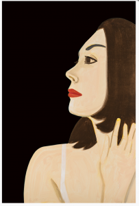
Alex Katz
Laura 1
2017
Archival pigment inks on Crane Museo Max 365 gsm fine art paper
46 x 30 1/2 in.
Edition of 100
Pencil signed and numbered

About the work:

Portraits are one of the great subjects of Alex Katz’s oeuvre. With his signature approach and style, he transforms his circle of family, friends and New York society figures into unforgettable icons. His works are defined by their flatness of color and form, their economy of line, and cool yet seductive emotional detachment. 

Katz is the ultimate master of the flat style. His works may appear simple, but rather they are complex studies of color and shading. A student of color theory, he expertly captures depth and dimension with contrasting and complimentary hues like no other artist. 

This week’s Work of the Week! WOW! is one of Katz’s most recent portraits, Laura 1. This work is the portrait of Laura Halzack, prima ballerina of the Paul Taylor Dance Company based in New York City. Alex Katz met Laura through Paul Taylor with whom he has collaborated with on over a dozen set and costume designs since 1960. 

Laura, as many of Katz’s portrait subjects is presented without context. In the compressed visual plane, she is placed against a background of a single dark hue, which contrasts with the delicate peach tone of her skin. No additional narrative is provided other than her first name. This lack of narrative heightens the enigmatic qualities of the dancer, and allows Laura to exist in and of herself. 

Influenced by film, television and billboard advertising, the composition of Laura 1 is like a cinematic close-up. The cropped view of the dancer’s profile is perfectly balanced with the black background. The work is cropped in a way that it seems Katz has captured a sincere, temporal moment, which he indeed has, given the ephemeral nature of dance. 

Katz’s distinction as an artist lies in the fascinating reductive, flat style. His mastery of color and minimalism is timeless. His portraits, also have a distinctive quality in that he always represents the society of which he is a part of and, as a whole, can almost be experienced as a family photo album. 

WOW! – Work of the Week – Jasper Johns – Device


Jasper Johns
Device
1971-72
Lithograph
33 1/2 x 29 in.
Edition of 62
Pencil signed, dated and numbered

About the work:

“I tend to like things that already exist.” Jasper Johns

Jasper Johns is the world’s most critically acclaimed living artist. His work bridges the immediate post-World War II modernist trends of Surrealism and Abstract Expressionism with subsequent movements of Pop art, Minimalism, and Conceptual art. 

Johns was ushered into the New York art scene in 1953, when he met Robert Rauschenberg. The two artists shared an intense relationship, both romantic and artistic, from 1954 to 1961. They had neighboring studio spaces and deeply influenced each other’s artwork, exchanging ideas and techniques that would allow them to break from Abstract Expressionism. Their relationship would lead to Johns’ discovery by famed art dealer Leo Castelli, who, while visiting Rauschenberg’s studio met Johns and saw his work. Castelli offered the young Jasper Johns his first solo show on the spot. It was during his first exhibition that Alfred Barr, the founding director of the MoMA, purchased a number pieces that were on display, instantly making Jasper Johns a force in the art world.

Johns’ breakthrough style was to appropriate popular iconography in his works with a rich treatment of  the surface as lush and painterly. By representing common objects and images in the realm of fine art, Johns broke down the boundaries traditionally separating fine art and everyday life. However, rather than direct representation or abstraction, Johns made signs, like flags and targets, iconic images in his works. The “things the mind already knows” were his ideal subject because of the varied meanings each carried with it. This would lay the foundation for the Pop art movement’s aesthetic embrace of commodity culture, paving the path for Andy Warhol, James Rosenquist among many, many other post-war artists. 

While Johns continued to produce paintings that incorporated Abstract Expressionism’s gestures and color blocking, he shifted his focus from the finished image to the concept behind it. His process, which he believed to be the actual art, took on greater importance. The artist made a seamless transition into print making. For Johns, printmaking was a medium that encouraged experimentation through the ease with which it allowed for repeat endeavors. His innovations in screen printing, lithography, and etching revolutionized the field. 

As the Pop art movement grew around him, Johns left behind the colorful works filled with familiar gestures and images and turned to a darker palette. Some critics attribute the shift away from color and toward the grays, blacks, and whites that dominate many of his canvases from the early 1960s to the rocky end of his relationship with Rauschenberg. 

This week’s Work of the Week! WOW! is Jasper Johns’ Device.

Created in 1971-72, Device masterfully plays with different tones of grey, white and beige. The works that use what Johns called “the device,” were made from two stretcher bars attached to a canvas frame with butterfly screws, creating a mechanical arm, that would be used to scrape the paint on the surface in a circular shape. All of these elements from the “real” world undercut the traditional idea of a painting as an illusion. The development of the device theme in Johns’ work progressed to incorporate other themes, such as the abundant use of text. His techniques stress conscious control rather than spontaneity.

Over the past fifty years Johns has created a body of rich and complex work. His rigorous attention to the themes of popular imagery and abstraction has set the standards for American art. Constantly challenging the technical possibilities of printmaking, Johns laid the groundwork for a wide range of experimental artists that came after him.

WOW! – Work of the Week – Andy Warhol – The Shadow


Andy Warhol
The Shadow, from Myths (FS II.267)
1981
Screenprint on Lenox Museum Board
38 x 38 in.
Edition of 200
Pencil signed and numbered

About the work:

As a keen observer of the emergence of America as the global superpower it is today, Andy Warhol captured deep American truths and fantasies. “Everybody has their own America, and then they have pieces of a fantasy America that they think is out there but they can’t see,” he once observed. Nowhere is this national fantasy clearer than in Warhol’s Myths Series of 1981.

The suite, composed of 10 iconic representations of recognizable figures of American film, history and culture encompass Warhol’s own life and the magic of 20th century American Pop Culture, or American Mythology. The term ‘Mythology’ (or ‘Myth’) often-times evokes the collected stories of the Ancient Greeks and Romans, however, Mythology is a feature of every culture. The collection of myths of any society defines its spirit and soul. 

In the Myths Series, Warhol selected a range of 10 uniquely American personas, from Santa Claus to Uncle Sam, each artwork revealing facets of Warhol’s personality and desires. As a sick child, he was inspired by the duality of Clark Kent/Superman and famously wanted to be regarded as strong an american symbol as Mickey Mouse. Warhol so ardently wanted to be a part of American Mythology that he used his own self-portrait to take on the role of one of the characters in the Myths suite. Overtly self-referential, the artist placed himself among his idols.

This week’s Work of the Week! WOW! is The Shadow, from Myths, in which Andy Warhol used his own face to personify a fictional American icon.

While many of the referenced characters of the suite require no introduction, today ‘The Shadow’ is a more niche symbol of American Pop Culture. ‘The Shadow’ was a fictional pulp-novel character of the 1930’s, a crime-fighting hero of Warhol’s childhood. He wore a wide-brimmed black hat and a black, crimson-lined cloak with an upturned collar over a standard black business suit.

The Shadow - Pulp NovelThe popular series was also adapted into a Radio Show and a comic strip during Warhol’s lifetime.

Shadow - Radio Broad Cast poster The Shadow Comic Strip

The portrait is based on a photograph of Warhol as the fictional character and although he doesn’t wear The Shadow’s black cloak or broad-rimmed hat, the crimson lighting illuminating Warhol’s face, which references the red lining of The Shadow’s cloak, causes a strong shadow to be cast of his profile in the background. While peering at the viewer, Andy Warhol crafts a personification of himself masquerading as a hero. 

Andy Warhol exhibited an unerring sense for the powerful motifs of his time – contemporary images that capture the modern imagination as completely as the gods and goddesses of ancient mythology once did. The images presented in Myths are nostalgic representations of America, each theatrically reflecting American fantasies, hopes, fears and dreams. Warhol gives these already established icons his signature pop-style treatment, inserting his own image into the narrative of pop culture. 

The Shadow from Myths is a screenprint on Lenox Museum board with Diamond Dust covering the full sheet. The Diamond Dust, heavily applied, adds a luster to the work, but also lends to its mysteriousness, thus accentuating The Shadow. It its a very impressive work.

WOW! – Work of the Week – Frank Stella – Benjamin Moore Series


Frank Stella
Hampton Roads, from Benjamin Moore
1972
Lithograph
16 x 22 in.
Edition of 100
Pencil signed and numbered
Frank Stella
Palmito Ranch, from Benjamin Moore
1972
Lithograph
16 x 22 in.
Edition of 100
​Pencil signed and numbered

About the work:

Frank Stella is one of the most highly regarded post-war American artists still working today. He is a rule-breaker, interested in furthering the History of Art by constantly and deliberately taking us down new paths. 

Upon moving to New York after his studies at Princeton, Stella was first inspired by the Abstract Expressionists, but also by the ‘flat’ works of Barnett Newman. It was however, the paintings of Jasper Johns, exhibited at Leo Castelli’s famed gallery in 1958, that lead Stella to start using his now-trademark stripes as a compositional tool. The controlled minimalist works are among his most recognizable. Stella didn’t change the course of Art History simply through his study and use of a radically different style, he also approached diverse materials in a revolutionary way. 

Frank Stella’s first experience in painting was re-coating houses and boats, and he would continue to paint houses after his move to NY to make ends meet. Over the course of his 60-plus-year career, Stella would regularly revisit unmixed house and car paint in addition to using house-painter brushes. Stella’s process was documented in Hollis Frampton’s photo essay “The Secret World of Frank Stella” which showed the artist’s approach to canvas as being the same as he would a house – filling a space with increasingly proximate concentric lines. In his striped works, Frank Stella never used masking tape. He would never even measure out the lines, rather the works are free-hand.

This week’s Work of the Week! WOW! is the Benjamin Moore Series. This series is one of Stella’s most iconic. Andy Warhol recognized the genius of Stella and purchased the complete set of originals himself.

All the titles of Stella’s works are significant. The Benjamin Moore Series makes reference to the type and brand of paint that was used in the creation of the works. The use of store-bought house paints is significant in that it roots his art in the post-war commodity culture. In naming the series after a company, he also explored the rise of advertising and branding. The titles of each individual piece are also important to note – they are all named after historical battles fought during the Civil War. 

The two works featured at Gregg Shienbaum Fine Art are Palmito Ranch and Hampton Roads. Both battles were of great significance. The Battle of Hampton Roads, often called either the Battle of the Monitor and Merrimack or the Battle of Ironclads, fought on March 9, 1862, was the most important naval battle of the Civil War from the perspective of naval development. It was History’s first duel between ironclad warships. The Battle of Palmito Ranch is regarded as the final battle of the war, fought May 12 and 13, 1865, on the banks of the Rio Grande in Texas. Despite that Robert Lee had surrendered a month prior to Ulysses Grant, the attack was ordered on the Confederate Army for unknown reasons. Anecdotes suggest that Union Colonel Theodore Barrett wanted to see combat before the end of the war. The names of Stella’s works are significant, loading abstract images with meaning. The complete series is a historical narrative composed of abstract works. 

The works in the series are among Stella’s most reductive compositions. It is the formal rather than the thematic matter that Stella engages in. The set plays with maze-like patterns, simple diagonals,  and understated and stacked compositions, where the painted line creates an even, horizontal rhythm. Stella shows us the environment of the battles of the Civil War with paint straight from a can – intense and flat. The saturated palette, measured proportions, and glowing presence are at once immediately vibrant and classically timeless.

As Adam D. Weinberg, director of the Whitney has said “Frank is a radical innovator who has, from the beginning, absorbed the lessons of art history and then remade the world on his own artistic terms. He is a singular American master.”

WOW! – Work of the Week – Robert Indiana – Liberty ’76


Robert Indiana
Liberty ’76
1974-75
Screenprint
39 7/8 x 36 in.
Edition of 10 Artist Proofs (A.P.)
Pencil signed, dated and numbered

About the work:

“The American dream is that dream of a land in which life should be better and richer and fuller for everyone, with opportunity for each according to ability or achievement.”
– James Truslow Adams, 1931

The July 4th, 1776, American Declaration of Independence proclaims that “all men are created equal” with the right to “life, liberty and the pursuit of happiness.” This founding document, outlining the set of ideals of our nation has been the basis of the national ethos known as The American Dream. This Dream has attracted people from all over the world, lured by the promise of a better way of life, and is deeply rooted in the collective psyche of the American population. 

Many artists have been inspired by this great dream, however, Robert Indiana distinguishes himself from his peers through a highly original body of work that explores this American Identity. He addresses important social and political issues, incorporating profound historical and literary references into his works. This is why, in 1974, Stephen Lion, an arts and design consultant, approached Indiana to participate in a tribute portfolio for the 1976 American Bicentennial celebrations. Along with 11 other of his contemporaries such as Alex Katz, Ed Ruscha and Larry Rivers, Indiana would take part in the “Kent Bicentennial Portfolio Spirit of Independence.”

This week’s Work of the Week! WOW! is Robert Indiana’s Liberty ’76 from the Kent portfolio. 

A self proclaimed “American painter of signs,” Indiana was introduced to Hard Edge painting by the already well-known painter Ellsworth Kelly. Robert Indiana forged his unique style working with a minimal palette of flat color and using Kelly’s technique of isolating elements from one another. The geometric figures, which, individually seem flat, combined, accomplish great dimension. The placement of each shape is complimented with the use of pure color that gives depth and a sense of motion to his work. 

In Liberty ’76, Indiana delivers, through vernacular signage, numbers and symbols a dazzling composition reflecting quintessential Americana in his trademark style. The stars, stripes and a large, red number “76” reference freedom and liberty and pop to the foreground. His bold style can at first glance seem simple, however, this is misleading. He is an underrated and undervalued artistic genius, who created his art with masterful skill and perfection, understanding and manipulating the power of shape and color to create perfectly balanced compositions such as Liberty ’76

Liberty ’76 perfectly captures the symbolisms of the American Dream and American Identity with a direct and positive outlook. Indiana himself would say: “Pop Art is the American Dream, optimistic, generous and naive!” It is, however, difficult to place Indiana’s body of work into a preset artistic classification because his art transcends and bridges many artistic movements. His work is simultaneously Pop, Hard-Edge, Geometric, Color Field, Textual, Minimalist and Reductive, and therein lies his brilliance. He also provides an example of work that is both deeply personal and universal. His works reflect events of the times while also carrying messages to future generations, adding the element of activism to his oeuvre. He has paved the way for many contemporary artists such as Jenny Holzer and Shepard Fairey, among many others. 

Of the 125 Kent Portfolio sets created, 110 were gifted to American museums, 4 to the American Federation of the Arts and 3 to the United States Information Agency. The piece featured at Gregg Shienbaum Fine Art is a rare Artist Proof from a small edition run of 10. 

WOW! – Work of the Week – Robert Motherwell – Harvest with Blue Bottom


Robert Motherwell
Harvest with Blue Bottom
1973
Lithograph with Collage
36 x 18 in.
Edition of 55
Pencil signed and numberedAbout the work:

Robert Motherwell is known as one of the most important and influential artists of the 20th century. In 1940, as a promising young painter, he moved from California to New York City, joined a group of artists (including Jackson Pollock, Willem de Kooning, Mark Rothko) and set out to change the face of American art. The artists renounced the prevalent American style, believing Realism depicted only the surface of American life. Motherwell was a key figure in the group to establish America’s first major original art style: Abstract Expressionism, or what he called the New York School, a movement that would place New York at the center of the international art world.

Strongly influenced by the European Surrealists, many of whom had emigrated to New York during World War II, the Abstract Expressionists sought to create essential images that revealed emotional truth and authenticity of feeling through the removal of the inessentials and showing only what was necessary.

Motherwell who was a fervent admirer of Matisse became a colorist seeking out earthy ochres, brilliant yellows and oranges, blues and violets. He also adopted the Matissian technique of collage, the most radical form of drawing developed in the twentieth century.

Motherwell’s collage works were not simply aesthetically pleasing forms and colors, but related to the world in some way. In his collages, he took a personal, lyrical approach, combining fragments of colored paper, labels, letters and stamps in evocative compositions. Incorporating material from his studio such as cigarette packets and labels, the works ultimately became records of his daily life.

This week’s Work of the Week! WOW! is Harvest with Blue Bottom, from the Summer Light series, in which Motherwell created elegantly playful collages. 

The Summer of Light series was made up of some of the most elaborate print-work that Motherwell produced during his career. Each piece was realized using lithography, collage and hand-ripping of different types of paper.  

Continuing a tradition established by Picasso and Braque of incorporating the detritus of daily life and its simple pleasures, the Summer Light series from 1973 integrates two of Motherwell’s favorite pastimes– drinking and smoking. 

The title of this image, Harvest with Blue Bottom, derives from the collaged element of the Ernte 23 cigarette label. “Ernte” is the German translation for harvest. The Summer Light series features six images of the Ernte 23 label and four of Château Latour wine labels. Practically, these materials were laying about his studio and were immediate and on hand, but invariably they were autobiographical, serving as a kind of documentation of his daily life and habits.

Although he is by no means an ”autobiographical” artist, it’s in his collages that fragments of his life reveal themselves. While viewing a collage retrospective of his in the 1970’s, he was ”astounded that, like Proust eating the madeleine, in these abstract compositions all kinds of personal memories would surface that I’d completely forgotten about – not about painting, but about my daily life, my marriage, where I was living at the time, or who I was particularly friendly with and so on. But the autobiography in them wouldn’t be clear to an outside person.” 

Beyond autobiographical, the Summer of Light series and all of the artist’s collage work take on the status of the artist’s own diary evoking intimate memories. 


WOW! – Work of the Week – Ed Ruscha – Stranger


Ed Ruscha
Stranger
1983
Lithograph
30 X 22 1/2 in.
Bon à Tirer (B.A.T.), from an Edition of 7
Pencil signed and annotated B.A.T.

About the work:

“Huh? Wow!”

Language has often be inserted into visual art, yet no other artist uses it the way Ed Ruscha (roo-SHAY) does. His works are not pictures of words but words treated as visual compositions. “I like the idea of a word becoming a picture, almost leaving its body, then coming back and becoming a word again,” he once said.

Through his textual works, the artist has made his mark in a universe somewhere between Pop and Conceptual art. Over his six-decade-long career, critics have always had trouble classifying Ruscha because his oeuvre doesn’t fall into any predisposed category. As with Andy Warhol and Roy Lichtenstein, his East Coast counterparts, Ed Ruscha’s artistic training in Los Angeles was rooted in commercial art. Ruscha’s style and subject matter, however, and the deadpan humor with which he executed them truly set him apart. 

This week’s Work of the Week! WOW! is Ruscha’s Stranger, dating from 1983. It is a prime example of the techniques and style of the artist, and is part of a series of artworks of words over sunsets and night skies (which many refer to as landscapes) that Rsucha started producing in the early 80’s.

This particular example is the B.A.T. (bon à tirer, which translates as “good to pull”). The B.A.T. is the final trial proof, the one that the artist has approved, telling the printer that this is the way he wants the edition to look. Bon à tirer means ready for press.  

The edition size of this work is extremely small of only 7 pieces produced. To have the B.A.T. is very rare.  

Set against the backdrop of a dark night, the word “stranger” is depicted in an all-caps lettering of Ed Ruscha’s own invention named ”Boy Scout Utility Modern.” The font is a boldface print type with squared-off curves. Inspired by the truncated edges of the Hollywood sign, the typeface is transformed as letters take the place of characters on a stage, hovering in middle distance with a three-dimensionality all their own. The result? Images that land somewhere between clarity and mystery, symbol and signifier, art and poetry.

In using “stranger” as a visual, with a newly created typeface, the artist glorified it as an object rather than a mere piece of text, thus dignifying “stranger” as an object, bestowed with iconic status.

The influence of Hollywood and advertising are ever-present in the work of this LA artist and Stranger is no exception. This is highlighted in the way Ruscha placed his subject, covering the overall space of the plane. His bold “stranger” floats on a vast background, and mimics the opening screen of movies or fleeting glimpses of roadside billboards that must catch an audience’s attention in one compelling instant. The cinematic perspective of “Stranger” has a dramatic, raked perspective which can be traced to classic Hollywood black-and-white films. This unique diagonal positioning of the letters is disruptive and encourages the viewer to look at something ordinary in a different light. 

The words Ruscha chooses for his creations have a multiplicity of meaning, which push the viewer to consider each connotation of the word. What is the first meaning that comes to mind when faced with the word “stranger?” It can be read as either noun or adjective. This ambiguity adds to the power of the work. Ruscha has always insisted that he never intends to instruct his audience, there is no hidden agenda, leaving each of us free to interpret the word. 

Ruscha has said that “Art has to be something that makes you scratch your head,” but it doesn’t need to take itself too seriously either. His works are as playful as they are thought provoking. According to the artist, there is a simple rule for distinguishing between bad and good art. Bad art makes you say ‘Wow! Huh?’ Good art makes you say ‘Huh? Wow!’ It’s a good rule. ‘Huh? Wow!’ is most revealing when considered in terms of Ruscha’s own work. When observing his work in that context, the ‘Huh? Wow!” is what makes his art so enduringly great.

“WOW! – Work of the Week – Roy Lichtenstein – Painting on Blue and Yellow Wall


Roy Lichtenstein
Painting on Blue and Yellow Wall
1984
Woodcut and lithograph
47 3/16 x 31 9/16 in.
Edition of 60
Pencil signed, dated and numbered

About the work:

“My work isn’t about form, it’s about seeing. I’m excited about seeing things, and I’m interested in the way I think other people saw things.”

Roy Lichtenstein was no overnight sensation, the art establishment in the early 60’s was not prepared to be faced with his then heretical blending of high and low art. Departing from the intellectual, nonfigurative style of Abstract Expressionism, Lichtenstein depicted everyday objects and drew inspiration from comics, advertisements, and children’s books. By integrating popular imagery into the realm of fine art, he invited viewers to recognize the world around them in his work. The use of parody and eye-popping comic images gives his creations a sense of familiarity that observers can relate to. 

Over the course of a month and half in 1984, at his studio in Southampton, Lichtenstein created a series of eight works entitled “Paintings.”The works are derived from collages which combined hand-painted and printed papers, a printed enlargement of unprimed canvas, directly painted brushstrokes and cut-out variations of the artist’s famous schematic image of an abstract brushstroke.

This week’s Work of the Week! WOW! is entitled Painting on Blue and Yellow Wall from the Paintings Series. This work is a parody and self parody made up of juxtapositions. It is the representation of an image and an image in itself, where “high art” and “low art” collide in a single setting. Painterly abstract expressionistic brushstrokes are interwoven with Lichtenstein’s own interpretation of abstract expressionist brushstrokes in a balanced composition. The positioning of the portrayed canvas is interesting in itself. The represented canvas is almost denied full attention as it competes with the vibrant yellow and blue wall-field of simulated wood grain. The frame of the depicted Abstract Expressionist image is unleveled and cropped. 

As a technique consistent with comics, the cropping of forms was a method Lichtenstein employed throughout his career. Based on the Gestalt theory of perception that incomplete forms are mentally completed by the perceiver, Painting on Blue and Yellow Wall encourages the viewer to complete the depicted frame. Surprisingly, cropping is also consistent with Abstract Expressionism. Edges of a work on canvas were often determined by stretching upon completion, thus cropping out the borders of a finished piece. Most importantly in the case ofPainting on Blue and Yellow Wall, the act of cropping is fundamentally “Pop,” as it insists on the object-quality of a work of art rather than the illusion of the work of art as a window on the world.

Painting on Blue and Yellow Wall embodies different ways of representing reality and is characteristic of the way Roy Lichtenstein’s art combines detached representation with dynamic perception. Lichtenstein’s art is much more demanding than it seems at first glance, he questions how we determine the way we view our surroundings. 

WOW! – Work of the Week – Victor Vasarely, Tri-Vega


Victor Vasarely

Tri-Vega

1975

Silkscreen on Arches Paper

33 1/4 x 30 1/8 in.

Pencil signed and numbered

“Movement does not rely on composition nor a specific subject, but on the apprehension of the act of looking, which by itself is considered as the only creator.”
—From Victor Vasarely’s Yellow Manifesto

We don’t always see what we think we see.

Saying that Victor Vasarely was ahead of his time is an understatement. Art historians credit Vasarely with creating some of the earliest examples of Op Art in the 1930s. He experimented with techniques decades before the establishment of the movement in the 60s, and is widely regarded as the “Father of the Op Art movement,”

“Op Art” is short for Optical Art, which was coined by Time Magazine in a 1964. It is a style known for creating optical illusions from extremely precise repeating patterns, interlocking shapes and vivid yet strictly defined color palettes.

The genre marked the first time in Art History that the Theory of Visual Perception would be systematically studied and applied by artists. In this theory, psychologists distinguish between two types of processes in perception; the first caused by our purely physical optical sense and the second by our subjectively learned world view. Op Art was therefore driven by artists who were interested in investigating various perceptual effects; effects that confuse and fascinate.

In 1968, Victor Vasarely started work on his hugely popular Vega Series. Vega is the brightest star in the constellation of Lyra and the fifth brightest star in the night sky. In this series, the artist manipulated the lines of square grids to create the illusion of bulges and depressions in perspective distortion.

This week’s Work Of the Week! WOW! is Tri-Vega.

In this work, Vasarely expertly draws his viewer into his geometric cosmos. In a grid-like composition, the picture plane appears to warp. A central form swells as a pronounced spherical distortion, and the viewer is given the feeling that the orb is either trying to break out of the surface or recede back inwards. In this case ambiguity arises, and our eye and brain oscillate between two possibilities. 

The feeling of movement and depth are created by Vasarely’s use of lines increasing in scale towards the center of the canvas. Vasarely’s masterful use of warm and cool colors across the field also serves to provide the viewer with the feeling of kinetic energy, depth and space. These optical games physically affect the viewer.

The Vega series is arguably Vasarely’s signature work. The results are timeless, exciting and innovative as they engage and captivate the viewer with depth perception and spatial distortion.

Vasarely truly created “an art for all.” An art that the viewer can appreciate without the knowledge of art history, an art in which the final image is the product of the viewer’s own eye without contemplation.

As Vasarely stated: “What is at stake is no longer the ‘heart’ but the retina, and the connoisseur has now become a study object for experimental psychology. Harsh contrasts, the unbearable vibration of complementary colors, the flickering of linear networks and per mutated structures…all these are elements in my work whose task is no longer to plunge the viewer into a sweet melancholy but to stimulate him.”

WOW! – Work of the Week – Alexander Calder, Seascape


Alexander Calder
Seascape
c. 1960
Lithograph
16 1/4 x 17 1/4 in.
Edition of 60
Pencil signed and numbered

About the work:

Despite hailing from a lineage of sculptors, Alexander Calder did not originally intend on becoming one himself. After high school, he enrolled at the Stevens Institute of Technology and graduated in 1919 with a degree in mechanical engineering. 

In June 1922, he found work as a mechanic on the passenger ship H. F. Alexander. The ship sailed from San Francisco to New York City, and Calder slept on deck. Early one morning, as the ship was just off the Guatemalan Coast, he witnessed both the sun rising in the East and the full moon setting on the opposite horizon. He described in his autobiography, “on a calm sea, off Guatemala, I saw the beginning of a fiery red sunrise on one side and the moon looking like a silver coin on the other.” This image remained with Calder, and would appear years later in his works.

Calder is known for his sculpture, however, he was also talented painter, engraver, and printmaker. Throughout the 1940s and 1950s, Calder produced gouache paintings depicting the same swirling, abstract forms found in his mobiles and stabiles. Numerous lithographs were produced from these paintings, and many of these works on paper were studies for his 3-dimensional works. 

This week’s Work of the Week! WOW! is Seascape. Seascape is almost the perfect representation of the early morning scene Calder witnessed off the Guatemalan coast in 1922. The fiery red sun that Calder never forgot was still fresh in his mind almost 4 decades later. The bold colors and flat but soft shapes are distinctly representative of Calder’s visual lexicon and it is easy to imagine the forms balancing and swaying on a mobile. 

However, if Seascape served as a study, Calder had much grander plans for it than a mobile. 

In the 60’s, Calder was invited by the Mexican Cultural Olympiad Committee to produce a monumental stabile outside the “Estadio Azteca” (Aztec Stadium) in Mexico City. At over 84 feet high, his tallest creation, “El Sol Rojo” (The Red Sun) is a 3-dimensional replica of Seascape. The sculpture has remained at the stadium since its installation, greeting fans at the 1968 Olympic games, but also those attending the 1970 and 1986 World Cup finals. 

Views from different angles: