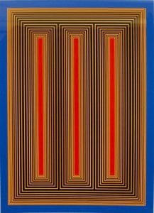
| Richard Anuszkiewicz Temple of the Golden Red 1985 Screenprint 32 x 24 in. Edition of 175 Pencil signed, dated and numbered |
About the work:
“I’m interested in making something romantic out of a very, very mechanistic geometry. Geometry and color represent to me an idealized, classical place that’s very clear and very pure.“ Richard Anuszkiewicz
Richard Anuszkiewicz was a central figure, along with Briget Riley and Victor Vasarely, in the Op Art movement. As a graduate student at Yale, he was mentored by the color theorist Josef Albers who would steer him on a course toward pure abstraction, grounded in the power of color. Most of his work trends away from personal emotion and drama, seeking rather visual investigations of formal structural and color effects. He made extensive use of ‘simultaneous contrast’ – where two colors, side by side, interact with one another to change our perception of them accordingly.
Among his most famed suites is the Temple Series; mesmerizing works, saturated with vibrant color arranged in geometric abstract compositions. The Temple Series originated after a 1981 trip to Egypt. He was inspired by the geometries of sacred temples,specifically those located in the Valley of the Kings. As is characteristic of most of his works, there are no specific references to individual structures, instead he uses the geometric framework as a space of color experimentation. The works in the series have been interpreted as illustrating visionary architect Buckminster Fuller’s notion of ‘Tensegrity’ – the balance between the forces of tension and integrity inherent in a physical structure.
This week’s Work of the Week! WOW! from the Temple Series is Temple of the Golden Red.
Temple of the Golden Red is a quintessential example of Anuszkiewicz’s mature style. Incorporating a repeating pattern of vertically oriented rectangles surrounded by concentric lines of startlingly different color. It contains three central rectangles of saturated crimson surrounded by lines of alternating but as equally saturated yellow and black. Symmetry is essential in Anuszkiewicz’s work, and by juxtaposing opposite colors of equal saturation, he accomplishes a visual fluctuation between figure and ground, creating a vibrating or pulsating sensation in the eye. The result is a release of energy, a transformation of color into motion. Like all great work that depends in large measure on color for its impact, the intensity lays in the way the eye and brain interpret visual information.
As with most artworks, Anuszkiewicz’s work is much more powerful in person. From Temple of the Golden Red emanates a profound luminosity, appearing as if lit from an inner source. New York Times art critic Holland Cotter described Anuszkiewicz’s works by stating, “The drama – and that feels like the right word – is in the subtle chemistry of complementary colors, which makes the geometry glow as if light were leaking out from behind it.” The artwork also packs a powerful monumentality, a result of its architectonic framing that gives the illusion of standing in front of a physical temple. Despite that the work is inspired from a trip to Egypt, the ‘fluting’ can seem to have more in common with classical ancient Greek columns.
Within the boundaries Anuszkiewicz set for himself—vertical bars of color surrounded by the pinstriped framework, the range of effects achieved is remarkable. The colors appear to blaze forth or recede into the distance and the choice of colors projects a mood, in this case, a jazzy up-tempo. Despite the restless optical power of the piece, it is thoroughly classical.

