 |
||
|
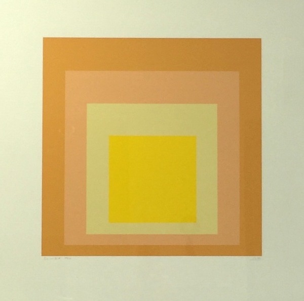
JOSEF ALBERS About This Work: Kn |
Tag Archives: minimalism
WOW! – Work of the Week – Ellsworth Kelly “Blue Green Black Red” 10/13/15
Ellsworth Kelly – Blue Green Black Red
Ellsworth Kelly
Blue Green Black Red
1971
Offset lithograph
29 3/4 x 27 1/4 in.
Edition of 100
Pencil signed & numbered
About This Work:
For more than fifty years, Ellsworth Kelly has worked to refine elements of the observed world into rigorous abstraction with a bold clarity and elegance. “My work has always been about vision, the process of seeing,” he notes. “Each work of art is a fragment of a larger context… . I’ve always been interested in things that I see that don’t make sense out of context, that lead you into something else.”
Maintaining a persistent focus on the dynamic relationships between shape, form and color, Kelly challenges viewers’ conceptions of space. He intends for viewers to experience his artwork with instinctive, physical responses to the work’s structure, color, and surrounding space, rather than with contextual or interpretive analysis.
His flat, immaculate compositions of pure line, simple forms, and saturated, unmodulated color are, in essence, found images, distillations of architectural details, shadows, plants, and other subtle forms that often might be overlooked. The contour of a leaf, the arch of a bridge and its reflection in water, and the soft curve of a hillside seen from the road have inspired paintings, sculptures, and prints alike. His art work represent a subjective interpretation of reality, rather than a descriptive copy of it.
Kelly’s arrangement of the complementary colors, which work to intensify one another at their intersections, is also an essential component of the work. In the 1971 lithograph Blue, Green, Black, and Red rectangles are laid, one on top of the other, in arrangements that suggest fragments of a remembered landscape. Perhaps it is several stories of a building, or perhaps a billboard looked, from a certain angle, or the way a shadow once fell.
Ordinary memories such as these, Kelly has said, prompt many of his works. ”As we move, looking at hundreds of different things, we see many different kinds of shapes. Roofs, walls, ceilings are all rectangles, but we don’t see them that way. In reality they’re very elusive forms. The way the view through the rungs of a chair changes when you move even the slightest bit – I want to capture some of that mystery in my work.”
About The Artist:
“I have worked to free shape from its ground, and then to work the shape so that it has a definite relationship to the space around it; so that it has a clarity and a measure within itself of its parts (angles, curves, edges and mass); and so that, with color and tonality, the shape finds its own space and always demands its freedom and separateness.” – Ellswoth Kelly
Ellsworth Kelly is an American painter, sculptor, and printmaker associated with Hard-edge painting, Color Field painting and the Minimalist school. His works demonstrate unassuming techniques emphasizing the simplicity of form.
Although Kelly can now be considered an essential innovator and contributor to the American abstraction art movement, he was not always seen in such a positive light. It was hard for many to find the connection between Kelly’s art and the dominant stylistic trends For Example, observing how light fragmented on the surface of water, he painted Seine (1950), made of black and white rectangles arranged by chance.
He created a new freedom of painterly expression. He began working in extremely large formats and explored the concepts of seriality and monochrome paintings. As a painter he worked in an exclusively abstract mode. By the late 1950s his painting stressed shape and planar masses (often assuming non-rectilinear formats). His work of this period also provided a useful bridge from the vanguard American geometric abstraction of the 1930s and early 1940s to the Minimalism and reductive art of the mid-1960s and 1970s.
Kelly has distilled his palette and introduced forms never before. He starts with a rectangular canvas that he carefully paints with many coats of white paint; a shaped canvas, usually painted in a single bright color, is placed on top. The quality of line seen in his paintings and in the form of his shaped canvases is very subtle. The use of form and shadow, as well as the construction and deconstruction of the visible implies perfection.
For more information and price please contact the gallery at info@gsfineart.com
WOW! – Work of the Week 8/10/15
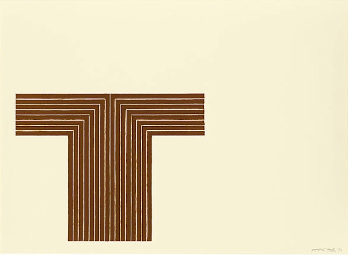
Frank Stella, Telluride
Frank Stella
Telluride, from Copper Series
1970
Lithograph in colors on Arjomari paper
16 x 22 in.
Edition of 75
Pencil signed and numbered
About This Work:
Frank Stella’s seven Copper Series prints are based on his Copper Series paintings of 1960-61. Titles of the individual works refer to towns near the San Juan Mountains in Colorado which had active copper and silver mines at the turn of the century, but whose reserves have since been depleted. Like his Aluminum Series prints, the lithographic inks and over-varnishes of the Copper Series were printed on paper that was first screenprinted.
The other 6 works of the Copper Series are titled Creede I, Creede II, Lake City, Pagosa Springs, Ouray and Ophir.
About Frank Stella:
Frank Stella is an American painter and printmaker, significant in the art movements of minimalism and post-painterly abstraction.
He is one of the most well-regarded postwar American painters still working today. Notably, he is heralded for creating abstract paintings that bear no pictorial illusions or psychological or metaphysical references in twentieth-century painting.
Early visits to New York art galleries influenced his artist development, and his work was influenced by the abstract expressionism of Jackson Pollock and Franz Kline. Upon moving to New York City, he reacted against the expressive use of paint by most painters of the abstract expressionist movement, instead finding himself drawn towards the “flatter” surfaces of Barnett Newman’s work and the “target” paintings of Jasper Johns. He began to produce works which emphasized the picture-as-object, rather than the picture as a representation of something, be it something in the physical world, or something in the artist’s emotional world.
“A picture is a flat surface with paint on it – nothing more”.
Many of Stella’s works are created by simply using the path of the brush stroke, very often using common house paint, in which regular bands of paint were separated by very thin pinstripes of unpainted canvas. Stella’s art was recognized for its innovations before he was twenty-five.
In the 1960s, Stella began to use a wider range of colors, typically arranged in straight or curved lines. Later he began his Protractor Series (71) of paintings, in which arcs, sometimes overlapping, within square borders are arranged side-by-side to produce full and half circles painted in rings of concentric color.
In 1970, The Museum of Modern Art in New York presented a retrospective of Stella’s work, making him the youngest artist to receive one. During the 1970’s Stella introduced relief into his art, which he came to call “maximalist” painting for its sculptural qualities. It is ironic that these paintings were completely, the opposite of what had brought him fame, the decade before. His work also became more three-dimensional to the point where he started producing large, free-standing metal pieces, which, although they are painted upon, might well be considered sculpture.
In the 1980’s & 1990’s, the increasingly deep relief of Stella’s paintings gave way to full three-dimensionality, with sculptural forms derived from cones, pillars, French curves, waves, and decorative architectural elements. In the 1990s, Stella began making free-standing sculpture for public spaces and developing architectural projects.
Stella’s work was included in several important exhibitions that defined 1960s art, among them the Solomon R. Guggenheim Museum’s The Shaped Canvas (1965) and Systemic Painting (1966). His art has been the subject of several retrospectives in the United States, Europe, and Japan.
For more information and price please contact the gallery at info@gsfineart.com
WOW! – Work of the Week 8/3/15
Robert Mangold, Ring Image B
Robert Mangold
Ring Image B
2008
Screenprint
30 3/4 x 29 1/2 in.
Edition of 35
Pencil signed and numbered
About This Work:
In Ring Image B, Robert Mangold uses shape, line, and color to explore formal relationships. While this work may appear simple, it is rather a complex abstract work of architectural scale with thick and thin graphite lines. Mangold has drawn upon abstract minimalist forms in this curvilinear composition of a ring where he provokes the consideration of the idea of a painting without a center, which also reflects ancient pottery and formal studies by Renaissance masters.
About Robert Mangold:
“Robert Mangold’s paintings, are more complicated to describe than they seem, which is partly what’s good about them: the way they invite intense scrutiny, which, in the nature of good art, is its own reward.” – Michael Kimmelmann, New York Times
Robert Mangold is an American minimalist artist. His works are comprised often of simple elements which are put together through complex means. He renders the surface of each canvas with subtle color modulations and sinewy, hand drawn graphite lines. While his focus on formal considerations may seem paramount, he also delights in thwarting those considerations—setting up problems for the viewer. Over the course of years and in multiple series of shaped canvases that explore variations on rings, columns, trapezoids, arches, and crosses, he has also provoked viewers to consider the idea of paintings without centers.
Mangold’s work challenges the typical connotations of what a painting is or could be, and his works often appear as objects rather than images. Elements refer often to architectural elements or have the feeling of an architect’s hands.
In 1967, he won a National Endowment for the Arts grant and in 1969, a Guggenheim Fellowship. In 1971, he had his first solo museum exhibition at the Guggenheim Museum. He has been featured in the Whitney Biennial four times, in 1979, 1983, 1985, and 2004.
His work is in many museum collections, including the Museum of Modern Art and the Whitney Museum of American Art in New York, the San Francisco Museum of Modern Art, and the Tate Collection in London.
For more information and price please contact the gallery at info@gsfineart.com
WOW! – Work of the Week
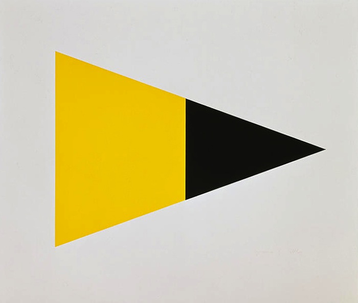
Ellsworth Kelly, Black Yellow
Ellsworth Kelly
Black Yellow
1972
Lithograph
34 x 39 3/4 in.
Edition of 55
This piece is pencil signed and numbered.
About This Work:
Ellsworth Kelly assembles his art’s constitute parts until they cohere to some point of emotional or intellectual satisfaction, much like an architect does. Its goal is to have the viewer moved by the purely visual.
This work by Kelly is a perfect example of how the artist juxtaposes discrete colored shapes. The colors lead our eye around the image in a kind of syncopated dance without ever allowing the shape to pop forward or sink back into a recessional space. This print is a “tour de force of restrained geometry and exuberant color.”
About Ellsworth Kelly:
“I have worked to free shape from its ground, and then to work the shape so that it has a definite relationship to the space around it; so that it has a clarity and a measure within itself of its parts (angles, curves, edges and mass); and so that, with color and tonality, the shape finds its own space and always demands its freedom and separateness.”- Ellsworth Kelly
Ellsworth Kelly is an American painter, sculptor, and printmaker associated with Hard-edge painting, Color Field painting and the Minimalist school. His works demonstrate unassuming techniques emphasizing the simplicity of form.
Although Kelly can now be considered an essential innovator and contributor to the American abstraction art movement, he was not always seen in such a positive light. It was hard for many to find the connection between Kelly’s art and the dominant stylistic trends For Example, observing how light fragmented on the surface of water, he painted Seine (1950), made of black and white rectangles arranged by chance.
He created a new freedom of painterly expression. He began working in extremely large formats and explored the concepts of seriality and monochrome paintings. As a painter he worked in an exclusively abstract mode. By the late 1950s his painting stressed shape and planar masses (often assuming non-rectilinear formats). His work of this period also provided a useful bridge from the vanguard American geometric abstraction of the 1930s and early 1940s to the Minimalism and reductive art of the mid-1960s and 1970s.
Kelly has distilled his palette and introduced forms never before. He starts with a rectangular canvas that he carefully paints with many coats of white paint; a shaped canvas, usually painted in a single bright color, is placed on top. The quality of line seen in his paintings and in the form of his shaped canvases is very subtle. The use of form and shadow, as well as the construction and deconstruction of the visible implies perfection.


