WOW! – Work of the Week – WESSELMANN, Still Life with Liz


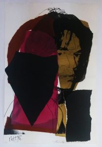
Tom Wesselmann
Still Life with Liz
1993
Screenprint
59 1/2 x 57 in.
Edition of 90
Pencil signed and numbered

Tom Wesselmann never considered himself a Pop artist. He would point out that he made aesthetic use of everyday objects, rather than critique them as consumer objects. He once said: “I dislike labels in general and ‘Pop’ in particular, especially because it overemphasizes the material used. There does seem to be a tendency to use similar materials and images, but the different ways they are used denies any kind of group intention.”

The artist, however, was clearly in dialogue with his Pop predecessors and contemporaries, among them Lichtenstein and Warhol, with whom he shared an interest in the commodification of the female form and still life.

In addition to being widely known for his paintings of “The Great American Nude”, Tom Wesselmann was a master of the still life. The creation of settings in his works, as opposed to the representation of a lone object is primarily what sets him apart from the other pop artists, and the pop movement. He was a modern-day Matisse who made use of Pop imagery.

In this week’s Work Of the Week! (WOW), Still Life with Liz, Tom Wesselman is taking Andy Warhol’s Liz Taylor and placing it in his painting as nothing more than an object in a room,   He is creating a familiar and recognizable setting, in which you can imagine yourself walking into a home, and seeing a console with a vase positioned next to a painting.

By using Warhol’s Liz Taylor, Wesselmann is not only affirming Andy Warhol’s place in art history as a pop artist, but also using Warhol’s iconic pop art image as an everyday object, solidifying Andy Warhol’s artwork as a work of art.  In other words (in a reversed or opposite sort of way), Tom Wesselmann is applying the very same concept to his art work that Andy Warhol did.

Warhol took everyday objects and turned them into art.  We call his style of art “pop art’.  Tom Wesselmann took Warhol’s image of Liz Taylor and turned it into an everyday object by placing this image in his artwork.  The image of Liz in this still life is no different than a 7up bottle or a package of Wonder Bread in other still life works by Wesselmann.

Andy Warhol made Liz Taylor accessible by allowing us to hang her on our wall.  He is credited with democratizing art.  Tom Wesselmann affirms this concept showing us just that.  He has taken a pop art painting and turned it into a painting of pop art.

WOW! – Work of the Week – HINMAN, Triangles


Charles Hinman
Lavender Triangle
2012
Screenprint
38 x 38 in.
Edition of 15
Pencil signed, dated and numbered

Charles Hinman
Orange Triangle
2012
Screenprint
38 x 38 in.
Edition of 15
Pencil signed, dated and numbered

“My concept of my work is dynamic, never static. I think of my paintings as occupying a 6-dimensional space – the three dimensions of space and one each of time, light and color.”  Charles Hinman

Charles Hinman played a significant role in redefining the physical shape of paintings. His desire to break away from the traditional square or rectangular frame of painting lead him to the shaped canvas. In the 60’s several abstract minimalist artists were experimenting with new canvas shapes, but none drove the concept further than Hinman. His canvases were a form of hybrid between painting, sculpture and wall relief.

Until the early 1970s, Hinman examined the possibilities offered by this new medium: strongly protruding canvases, geometric and sensual profiles, color contrasts, color reflections on the adjacent wall, shadows, monochrome canvases.

Since working on primarily flat surfaces was not Charles Hinman’s primary medium, his exploration of print-making started only when he met master-printer Gary Lichtenstein. these two worked on numerous projects together. in 2012, they collaborated on a set of screenprints entitled Triangles, which is this week’s Work Of the Week – WOW.

Prints are 2 dimensional works, however, through his mastery of color, angles and shapes, Hinman is able to give Lavender Triangle and Orange Triangle the strong illusion of a 3rd dimension. On the flat surface of the paper, he applied bright colors, which cause an area to move forward, in contrast with darker colors that recede, which tricks the eye into believing the silkscreen has actual depth. The choice of adjacent colors causes a sensation of motion of the surfaces. The defining particularity of Hinman’s Triangle silkscreens are his focus on the illusion of space and suggested volume. As with his paintings, Hinman is able to apply 6 dimensional features to his prints as well.

WOW! – Work of the Week – WARHOL, Mick Jagger


                                             Mick Jagger FS II. 139  

                                               Mick Jagger FS II. 141


Andy Warhol
Mick Jagger FS II. 139
1975
Screenprint
43 1/2 x 29 in.
Edition of 250
Pencil signed and numbered, also signed by Mick Jagger

Andy Warhol
Mick Jagger FS II. 141
1975
Screenprint
43 1/2 x 29 in.
Edition of 250
Pencil signed and numbered, also signed by Mick Jagger

About the works:

“The thing that he seemed to be able to do was to capture society, whatever part of it he wanted to portray, pretty accurately. That’s one of the things artists do, is show people later on what it was like. If you want to be reminded of a certain period, you can look at what Andy was doing then. He was very much in tune with what was going on. Of course, he was criticized for that, for being sort of trendy. But I think some people’s great forte is being so in touch.”

Mick Jagger at the time of Andy Warhol’s passing

One was the world’s greatest pop artist, the other was the signer and face of one of the most successful bands in history. Andy Warhol and Mick Jagger met at a party in 1964, when the Rolling Stones were on their first US tour. At this time, both idols were rising to fame and establishing their images. The Rolling Stones were viewed as the dirty alternative to the clean-cut Beatles and art collectors may have viewed Andy Warhol in a similar way compared to other artists of the time, such as Wayne Thiebaud, Japer Johns and Roy Lichtenstein. 

The first collaboration between the two artists was for the iconic “Sticky Fingers” album cover in 1971. Today, it is regarded as one of modern music’s more striking pieces of graphic art. The album, which went to number one immediately in both the US and the UK, resulted in a long-lasting business and personal relationship between the two icons who had a great understanding of both art and commerce. 

sticky-fingers-460x460
                                 Sticky Fingers – album cover

Portraits became big business for Andy Warhol around the time of the album release. He was a modern-day portrait painter who could capture all the high society and celebrity personalities of the time, and Jagger, who embodied the sex, drugs and rock and roll world was the perfect subject. At the request of Seabird Editions Company in London, who offered to publish the screen prints, Andy Warhol created a series of 10 portraits of Mick Jagger.

In the summer of 1975, while Mick and his wife, Bianca where staying at Andy’s house in Montauk, Andy and Mick started work on the project. Andy took the photographs of Mick himself. All 10 of the final artworks were head and bare-chested torso shots of Jagger. Andy was interested in capturing the different emotions and personas of Mick; happy, thoughtful, seductive, tough, arrogant, etc. 

Once back in the studio, Andy created the screen prints from the photographs and added hand drawn stylized lines and color patches to enhance the mood of each piece. Both Andy Warhol and Mick Jagger signed the final prints as a savvy marketing move. Jagger’s audience was much larger than Warhol’s collector base, so having Mick’s signature would help increase exposure of his work. For Mick, the portraits would help enhance his image.

Today, the portraits are as iconic as the two men themselves, immortalizing a moment in time. 

WOW – Work of the Week – BASQUIAT, Rinso


Jean-Michel Basquiat
Rinso
1983
Screenprint on wove paper
40 x 40 in.
Edition of 85
Pencil signed by Gerard Basquiat and stamped by the Jean-Michel Basquiat estate on verso, numbered in pencil on front

About the work:

Art or Black Art?

Reluctant to involve himself in black politics, and despite Jean-Michel Basquiat’s own insistence that his work be evaluated in the context of all art, and himself in the context of all artists, critics have consistently focused upon race in his works, making it almost impossible to separate the artwork, and the artist from his message.

Basquiat’s work is known for its primitivist motives, combining anatomical diagrams, commercial art, Black pop cultural history and figures, charged phrases and words, and representations of the body in an emotional and psychologically explosive mixture. His use of bright colors and his line drawings brought to life his experiences in the urban landscapes.

Jean-Michel Basquiat was born in Brooklyn in 1960.  His mother was of Afro-Puerto Rican descent, his father was Haitian. He grew up in a middle class family, and in a middle class environment.  But Basquiat sought to conceal his less than underprivileged background, by not wanting to create artwork that had any reference to black disempowerment, however, the opposite seems to have been more the case. 

Basquiat himself observed: “I get my facts from books, stuff on atomizers, the blues, ethyl alcohol, geese in the Egyptian style … I put what I like from them in my paintings.”   However, other influences for Basquiat also included the work of Picasso, African masks, children’s art, hip-hop and jazz. The outcome itself has been described as a type of visual syncopation, or “eye rap.”

His paintings are both childlike and menacing, described as “raw”. Frenzied assemblages of crudely drawn figures, symbols like arrows, grids and crowns, recurring words in bold and vibrant colors, and depictions of violence and racial subjugation cover his canvases that is more often than not concealed beneath the competing interpretations that circulate about Basquiat as a figure.  This irony is one that has been applied to the situation of Basquiat himself in relation to a white-dominated art industry.

Borrowing elements of everyday language (brand names, trade marks, consumer clichés, political and racial slogans, etc.), Basquiat created juxtapositions that reveal latent power structures, whose realignment in turn produces ironies suggesting a fundamental arbitrariness within the institutions of social discourse. 

This week’s Work Of the Week (WOW), Rinso, a classic racist metaphor is exposed in the form of a reference to a popular washing powder. The words NEW RINSO(c), appearing above and beside three stylized renderings of Negroes, seem to point towards the word SLOGAN(c) in the centre of the artwork, which in turn gives on to an actual slogan-1950 RINSO: THE GREATEST DEVELOPMENT IN SOAP HISTORY-with an arrow pointing to the words WHITEWASHING ACTION at the bottom. In case the viewer misses the implications of this text, or the possible references to the violence of the 1950s civil rights movements, the words NO SUH, NO SUH written on the left of the work serve to lessen any ambiguity

Inevitably, it seems, these subjects became less and less distinguishable from the autobiographical elements Basquiat worked into his paintings. Success for Basquiat was always fraught with contradictions.  There is no doubt that such criticisms were fueled by the fact that Basquiat was the first black American artist to achieve international fame.  Not to play the role of noble savage or idiot savant could only reveal, to the art establishment, that Jean-Michel Basquiat would assume the position of a successful American artist, usually reserved for whites.  

Basquiat refused this role, even if at times he could be said to have exploited it. He was resented for his success, trivialized and slandered by critics. He sought fame, and like many who have achieved it, he found himself isolated in an often hostile and unpredictable environment.

Other works by Jean-Michel Basquiat available in the gallery:

WOW – Work of the Week – INVADER, Hypnosis


Invader
Hypnosis
2011
Woodcut
9 7/8 x 11 7/8 in.
Artist’s Proof, edition of 50
Pencil signed, numbered and dated

About This Work:

“Little by little, I organized a detailed process by which I explore international densely populated urban areas and “invade” them.”

Invader is the pseudonym of a French urban artist, born in 1969, whose work is modeled on the crude pixellation of 1970s–1980s 8-bit video games. He took his name from the 1978 arcade game Space Invaders, and much of his work is composed of square ceramic tiles inspired by video game characters.

Although he prefers to remain incognito, and guards his identity carefully, his distinctive creations can be seen in many highly-visible locations in more than 75 cities in 33 countries. He documents each intervention in a city as an “Invasion”, and has published books and maps of the location of each of his street mosaics.

Invader likes tiles for their robustness and permanence.  Video games of the era were constructed with 8-bit graphics, and so it lends themselves well to the mosaic treatment, with each tile representing one pixel.

“In my own eyes, they are the perfect icons of our time, a time where digital technologies are the heartbeat of our world. As these creatures are made of pixels they are in some sorts ready-made for tile reproduction. Finally, their names are literally predestined for the project I have pioneered: they are “Space Invaders!”

Invader’s idea is to bring the virtual world into reality.  He sees himself as a hacker of public space, spreading a virus of mosaics;[the streets are his canvas, his invasions are gifts to the city and its people. One can see many things in it, but it refers to the early days of digital and the video game.

His first mosaic was installed in the mid 1990s in his home city. It was a sleeper for several years before the full “invasion” program was conceived in 1996.  This was the first wave of the “invasion”.  By 1998, it had spread to 31 other cities in France.

Today, 77 cities have been invaded, 2,692 Space Invaders placed comprising some 1.5 million ceramic tiles; 19 invasion maps have been published.  He has invaded New York five times, Miami twice, and Hong Kong on three separate occasions.

This week’s Work of the Week (WOW) is called Hypnosis.

In this work, Invader channels the work of the Norwegian painter and printmaker, Edvard Munch.  Munch was greatly influenced by the German Expressionists in the early 20th century.  Many artist in this genre used the woodblock process in print form, to capture the angst of the times.

Hypnosis is a woodblock print done is Munch’s German Expressionist style. Here we see Munch’s typical figure and his familiar wavy lined background. The work is very dark, as is the work of the German Expressionists.  We see the effects of war through the eyes of these artists.

Here is where Invader starts to have fun with this work.  He uses the dark, depressed like image of Munch’s work, and inputs his space invader figures  making this work fun. However, upon further examination, we see the play on the idea that the space invaders are invading these villagers or the village.

This is, and has always been his concept, THE INVASION.  This is a great example of an extreme and obvious invasion.

WOW – Work of the Week – KAWS, Warm Regards


KAWS
Warm Regards
2005
Screenprint
20 x 16 in.
Edition of 200
Pencil signed and numbered

About This Work:

“When I’m making work, I’m always thinking how can I communicate within these avenues [of art] to make those bridges for kids and pull them out of their holes into other worlds?”

– Brian Donnelly aka KAWS

Brian Donnelly aka KAWS is a is a pop artist and designer who started his career as a graffiti artist in New York. moving on to subvertising.  Subvertising is a portmanteau of subvert and advertising. It refers to the practice of making spoofs or parodies of corporate and political advertisements.  Subvertisements may take the form of a new image or an alteration to an existing image or icon, often in a satirical manner.
It cuts through the hype and glitz of our mediated reality and, momentarily, reveals a deeper truth within.

Fascinated with how cartoon shows, such as The Simpsons or Sponge Bob Square Pants, can have such an impact on people’s lives and minds, Kaws’ imagery are subverts of American Icons and cartoon characters.  They are universally understood and go above and beyond language and culture.
The Kimpsons
The Kimpsons
For example, Kaws has a painted a series called The Kimpsons a subvert of the popular cartoon The Simpsons. Kaws explains that he “found it weird how infused a cartoon could become in people’s lives; the impact it could have, compared to regular politics.

This week’s Work Of the Week (WOW), Warm Regards is another example of a subvertisement that speaks to society’s use of emojis, as an every day visual language, in which people communicate and express emotions and feelings.  Emojis have replaced our words.  Can we write a story with emojis?  Can we read a book filled with emojis?  Is that what’s next?

Kaws’ point is further brought out by the specific use of one emoji in particular, the Poop emoji, with a very witty title, Warm Regards.  It is left up to your interpretation.   The simplicity of this image of just the emoji centrally located on the paper, with Kaws’ iconic “XX” for eyes really says it all.

The effectiveness of this simplistic style to make a statement about society is not one that we have not seen before.  Kaws‘ artistic idol is Andy Warhol.  Warhol’s use of a single pop image on a canvas or sheet of paper, to convey a message on society was not only groundbreaking, but also extremely effective in getting its point across.

A few perfect examples of this are the Electric Chair, Mao and Marilyn
One simple image, can say some many things.
Warm Regards 2    Andy Warhol - MM Pink

KAWS – Warm Regards                                           Andy Warhol – Marliyn Monroe – FS II.31 

Kaws not only recognizes this, but employs this technique with admiration, as he carries the torch continuing to create art in a manner that speaks volumes about the world and its societies.

WOW – Work Of the Week – John Baldessari “Large Door”

Hegel s Cellar Portfolio -  Large Door

John Baldessari
Large Door
1986
Photogravure and aquatint on torn Rives BFK aper
20 x 38 in.
Edition of 35

Pencil signed and numbered

About This Work:

“Fingerprints and footprints can be repeated, and that’s why I make prints endlessly”  – John Baldessari

John Baldessari has created a formidable body of editions and artist’s books in his lifetime. His irreverent and playful prints require an intellectual workout as rigorous as any other medium in which he chooses to work.

A self-described “failed writer” who “builds with images the way a writer builds with words”, Baldessari’s work is concerned with the idea of visual information as signifier and a means of communication, combining stock imagery, colors, and text to create intricate and taut visual ambiguities. His aim is to create enough “tension” between found images in order to illicit questions and curiosity.

Using found photographs as source material – primarily stock images from early Hollywood films, newspaper photographs, and postwar advertising –  Baldessari was drawn to the generic nature of such images, their role in creating a shared visual culture, and the power they have to reveal subconscious thoughts and uncover the viewer’s “emotional baggage”.

In 1986, Baldessari created a series of 10 prints, to do just that. This series, entitled Hegel’s Cellar, used stock imagery in montages to examine Hegel’s theory of an “abyss (or cellar) as a psychic space where one preserve[s] images unconsciously” (Wendy Weitman in The Prints of John Baldessari: A Catalogue Raisonne 1971–2007, pp. 23-24).

The idea was brought out while Baldessari was in psychotherapy at the time, and he had started to let emotion (but not his own emotions) into his work. The presence of fear, anxiety, lust, horror, and other states was a new element, but their frequently jarring context was not; he was on the lookout for the unexpected associations generated by random images in close proximity.

This week’s Work Of the Week (WOW) is Large Door, from Hegel’s Cellar.

Faced with the dilemma or option of either being killed or stepping into the abyss, represented by a large black rectangle of equal proportion as the men on both sides carrying pistols, Baldessari is challenging the viewer to fill in the blanks.

WOW – Work Of the Week – Shepard Fairey “Ramone Canvas”

Ramone Canvas

Shepard Fairey
Ramone Canvas
2002
Screenprint on canvas
24 x 18 in.
Artist’s Proof (A.P.)

Pencil signed and numbered

About This Work:

“Most of my heroes don’t appear on stamps or in art galleries.  No matter how much I love art, or try to convince myself of its relevance in society the fact remains that music is a lot cooler and way more able to reach people’s hearts and minds”  – Shepard Fairey

Music has always had a huge influence on pop culture. Every generation had a defining genre of music.  Music, like art speaks volumes about the times in which we live in. Just as art, music is constantly changing.  Shepard Fairey’s brand of art is Street Art. Real street art touches upon the pulse of the everyday person, whose perception of what art is about is not in a museum, but rather on the street. Music touches the everyday person, much like the street art of Shepard Fairey and his contemporaries.

Society emulates musicians, society hums their music, society sings their lyrics. Fairey’s art is an extension of what music does to society. His work talks about the social, environmental, political, and every day issues that concern the everyday person.

His work became more widely known in the 2008 U.S. presidential election, specifically his Barack Obama “Hope” poster. The New Yorker art critic Peter Schjeldahl called the poster “the most efficacious American political illustration since ‘Uncle Sam Wants You‘”.

This week’s Work Of the Week (WOW) is a very rare silkscreen on canvas of one of Shepard Fairey’s favorite Punk Rock icons, Joey Ramone. The Ramone Canvas as it has come to be known, was done in 2002. There are only 2 of these pieces ever made, plus 1 AP (artist’s proof) and 1 PP (printer’s proof).

Needless to say, this work is extremely rare.

In 2002 – 2003 Fairey produced a Punk Pioneers suite. The first piece of this series was Joey Ramone, lead singer of the Ramones. Despite others that had come before him setting the stage for the punk rock genre, such as Iggy Pop or the Stooges, the Ramones, according to Fairey “really set the wheels in motion” in the realm of punk music.

The other icons in Punk Pioneers suite are Johnny Rotten, Joe Strummer, Glenn Danzig, Henry Rollins, and Ian MacKaye. However, the only work on canvas was of Joey Ramone. All the other icons were silkscreen on paper and in an edition of 300.

The whereabouts of the 2 editioned Ramone Canvas are unknown. The printer’s proof has been found, and archived, but has a tear to the canvas. Thus, leaving the Artist’s Proof left, which belongs to Gregg Shienbaum Fine Art, the only known work in mint condition.

WOW – Work Of the Week – Mel Ramos “Zebra”

Zebra 2

Mel Ramos
Zebra
1979
6 color lithograph
25 1/2 x 20 1/2 in.
Edition of 250

Pencil signed and numbered

About This Work:

Mel Ramos (born 1935) has been an American Pop master of the erotic nude female figure since the 1960’s. Mr. Ramos’ art captures the enticing ideals of femininity through bright saturated colors in the aesthetics of pin-up magazines and famous nude paintings from art history. As many of his Pop artist contemporaries, Mel Ramos started his career in commercial art, making neon signs and also took courses in typography. Under the wing of his mentor, Wayne Thiebaud, Mel Ramos eventually dedicated himself fully to fine art. 

Wonder Woman, Sheena – Queen of the Jungle, Camilla, Roma, Cave Girl, and Nile Queen were the female inspirations for the artist. Strong women from distant times and exotic places endowed with magical powers and overt physical charm were the heroines of body of work. 

As his East Coast contemporaries, the artist also featured the branding of products and advertising in his works, addressing American post war consumerism but in a lighter, more playful manner. The woman figure, however, always remained the centerpiece and focus of the paintings. 
Mel Ramos’ first solo exhibition took place at Bianchini Gallery in 1964 and soon thereafter, in 1967 had his first museum show at the San Francisco Museum of Modern Art. 

In 1979, the artist produced a series of fine art lithographs based on a suite of “Animal Paintings”, which depicted a nude woman with an animal. In each of these paintings, the artist chose strong, exotic, and erotic animals, such as a rhinoceros, curassow or ocelot to feature alongside the nude female.

This week’s Work Of the Week is entitled Zebra, and it was part of the “Animal Paintings” suite. It is a fine example of the playful imagery of Mel Ramos’ work. A sexy,  young, nude woman sits atop a zebra, looking directly at the viewer. Her hairstyle, yellow ribbon and tan lines add to the cheekiness of the image and also depict a more innocent era in which women were more coy and demure, leaving more to the imagination. The later works of Mel Ramos are more revealing and “in your face,” which reflect the shift of society’s acceptance of a more sexualized culture today.
The charm of the artist’s earlier work bring us back to a more innocent, nostalgic, flirtatious time. 

WOW – Work Of the Week – Banksy “Grannies”

Grannies close up

Banksy
Grannies
2006
Screenprint
19 3/4 x 27 1/2 in.
Edition of 150

Pencil signed and numbered; accompanied with COA by PEST Control

About This Work:

Banksy is a British street artist and activist who, despite worldwide fame, has maintained anonymity. Although details of the artist’s life are largely unknown, it is thought that Banksy was born in Bristol more or less around 1974, and started his career in this city as a graffiti artist. 

Whether plastering cities with his trademark gangsta rat, painting imagined openings and building hotels in the West Bank barrier in Israel, or stenciling “we’re bored of fish” above a penguins’ zoo enclosure, Banksy creates street art with an irreverent wit and an international reputation that precedes his anonymous identity. “TV has made going to the theatre seem pointless, photography has pretty much killed painting” he says, “but graffiti has remained gloriously unspoilt by progress”.

Banksy’s work features striking and humorous images, occasionally combined with slogans. The message is usually anti-war, anti-capitalist or anti-establishment. Subjects often include rats, apes, policemen, soldiers, children, and the elderly.
As all Banksy fans know, the artist can be extremely edgy, political, satirical, and in the case of this Work Of the Week, Grannies, humorous as well. A humor that plays upon the evident contrast and contradiction that lays in the image of two old, extremely British ladies knitting sweaters that say PUNK IS NOT DEAD or THUG FOR LIFE.

Banksy’s works need no explanation. Through his crafted signature and his immediately identifiable graphic style, he critically examines contemporary issues of consumerism, political authority, terrorism, and the status of art and its display. Grannies is another perfect example of how Banksy’s work can be thought-provoking, intense, shocking, intriguing and funny.