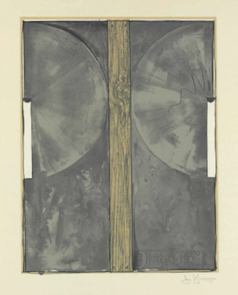
WOW! – Work Of the Week – Andy Warhol “Life Savers”

Life Savers


Andy Warhol

Life Savers, from Ads FS II.353

1985

Screenprint on Lenox Museum Board

38 x 38 in.

Edition of 190

Pencil signed and numbered

__

ABOUT THIS WORK:

Although Pop Art began in Great Britain in the late 1950s, in America it was given its greatest impetus during the 1960s. The term “Pop Art” was officially introduced in December 1962: the occasion was a “Symposium on Pop Art” organized by the Museum of Modern Art.

As the British viewed American popular culture imagery from a somewhat removed perspective, their views were often instilled with romantic, sentimental and humorous overtones. By contrast, American artists, bombarded every day with the diversity of mass-produced imagery, produced work that was generally more bold and aggressive.

Pop Art presented a challenge to traditions of fine art by including imagery from popular culture such as advertising and news. In pop art, material is sometimes visually removed from its known context, isolated, and/or combined with unrelated material. The concept of “popular art” refers not as much to the art itself as to the attitudes behind the art.

Pop Art employs aspects of mass culture, such as advertising, comic books and mundane cultural objects. One of its aims is to use images of popular culture in art, emphasizing the banal or kitschy elements of any culture, most often through the use of irony. It is also associated with the use of mechanical means of reproduction or rendering techniques such as screenprints or silkscreens.

Among the early and most famous artists that shaped the Pop Art movement, the most iconic certainly is Andy Warhol. He has been the greatest pop artist and the one who best developed this concept in his work.

His beginnings as a product marketer heavily influenced his artistic career, in which he glamorized and transformed everyday objects, like soup cans and cleaning supplies, into works of art. So in the 1980’s when Feldman Fine Arts commissioned Warhol to create his “ADS” series, Warhol was in his element. The Ads Portfolio of prints by Andy Warhol is one of his most sought after and iconic sets of prints and it contains the “Life Savers”. This Andy Warhol portfolio includes images of James Dean and the Paramount Logo. The Ads portfolio is made up of ten screen prints on Lenox Museum Board by Andy Warhol. These images that make up Warhol’s ADS Series reflect Warhol’s fascination with American consumerism.

This is a particularly colorful original work of art by this legendary artist. The five flavors candies were first introduced in 1912, coming in different colors and flavors but same shape and size. These candies are still sold today. This screenprint is a summary of Pop Art: bright colors, use of advertising, screenprint technique, presence of slogans and everyday life goods, a transformation of something normal and banal in a high-quality artwork.

The essence of Andy Warhol’s art was to make no distinction between fine art and commercial art used in magazine illustrations, comic books, record albums or advertising campaigns. Warhol once expressed his thinking in one sentence: “When you think about it, department stores are kind of like museums”.


ABOUT THE ARTIST:

He was one of the most enigmatic figures in American art. His work became the definitive expression of a culture obsessed with images. He was surrounded by a coterie of beautiful bohemians with names like Viva, Candy Darling, and Ultra Violet. He held endless drug- and sex-filled parties, through which he never stopped working. He single-handedly confounded the distinctions between high and low art. His films are pivotal in the formation of contemporary experimental art and pornography. He spent the final years of his life walking around the posh neighborhoods of New York with a plastic bag full of hundred dollar bills, buying jewelry and knick knacks. His name was Andy Warhol, and he changed the nature of art forever.

Andy Warhol was born Andrew Warhola on August 6, 1928, in Pittsburgh. He received his B.F.A. from the Carnegie Institute of Technology, Pittsburgh, in 1949. That same year, he moved to New York, where he soon became successful as a commercial artist and illustrator. During the 1950s, Warhol’s drawings were published in Glamour and other magazines and displayed in department stores. He became known for his illustrations of I. Miller shoes. In 1952, the Hugo Gallery in New York presented a show of Warhol’s illustrations for Truman Capote’s writings.

During this time, Warhol had also been working on a series of pictures separate from the advertisements and illustrations. It was this work that he considered his serious artistic endeavor. Though the paintings retained much of the style of popular advertising, their motivation was just the opposite. The most famous of the paintings of this time are the thirty-two paintings of Campbell soup cans. With these paintings, and other work that reproduced Coca-Cola bottles, Superman comics, and other immediately recognizable popular images, Warhol was mirroring society’s obsessions. Where the main concern of advertising was to slip into the unconscious and unrecognizably evoke a feeling of desire, Warhol’s work was meant to make the viewer actually stop and look at the images that had become invisible in their familiarity. These ideas were similarly being dealt with by artists such as Jasper Johns, Roy Lichtenstein, and Robert Rauschenberg – and came to be known as Pop Art.

Throughout the late 1950s and 1960s, Warhol produced work at an amazing rate. He embraced a mode of production similar to that taken on by the industries he was mimicking, and referred to his studio as “The Factory.” The Factory was not only a production center for Warhol’s paintings, silk-screens, and sculptures, but also a central point for the fast-paced high life of New York in the ’60s. Warhol’s obsession with fame, youth, and personality drew the most wild and interesting people to The Factory throughout the years. Among the regulars were Mick Jagger, Martha Graham, Lou Reed, and Truman Capote. For many, Warhol was a work of art in himself, reflecting back the basic desires of an consumerist American culture. He saw fame as the pinnacle of modern consumerism and reveled in it the way artists a hundred years before reveled in the western landscape. His oft-repeated statement that “every person will be world-famous for fifteen minutes” was an incredible insight into the growing commodification of everyday life.

By the mid-’60s, Warhol had become one of the most famous artists, in the world. He continued, however, to baffle the critics with his aggressively groundbreaking work. His paintings were primarily concerned with getting the viewer to look at something for longer than they otherwise would.

Throughout the ’70s and ’80s, Warhol produced hundreds of portraits, mostly in silk screen. His images of Liza Minnelli, Jimmy Carter, Albert Einstein, Elizabeth Taylor, and Philip Johnson express a more subtle and expressionistic side of his work.

 Following routine gall bladder surgery, Andy Warhol died February 22, 1987. After his burial in Pittsburgh, his friends and associates organized a memorial mass at St. Patrick’s Cathedral in New York that was attended by more than 2,000 people.

2015-11-17

WOW! – Work of the Week – Ellsworth Kelly “Blue Green Black Red” 10/13/15

Ellsworth KellyBlue Green Black Red

Ellsworth Kelly
Blue Green Black Red
1971
Offset lithograph
29 3/4  x 27 1/4 in.
Edition of 100
Pencil signed & numbered

About This Work:

For more than fifty years, Ellsworth Kelly has worked to refine elements of the observed world into rigorous abstraction with a bold clarity and elegance.  “My work has always been about vision, the process of seeing,” he notes. “Each work of art is a fragment of a larger context… . I’ve always been interested in things that I see that don’t make sense out of context, that lead you into something else.”  

Maintaining a persistent focus on the dynamic relationships between shape, form and color, Kelly challenges viewers’ conceptions of space. He intends for viewers to experience his artwork with instinctive, physical responses to the work’s structure, color, and surrounding space, rather than with contextual or interpretive analysis.  

His flat, immaculate compositions of pure line, simple forms, and saturated, unmodulated color are, in essence, found images, distillations of architectural details, shadows, plants, and other subtle forms that often might be overlooked. The contour of a leaf, the arch of a bridge and its reflection in water, and the soft curve of a hillside seen from the road have inspired paintings, sculptures, and prints alike.  His art work represent a subjective interpretation of reality, rather than a descriptive copy of it.

Kelly’s arrangement of the complementary colors, which work to intensify one another at their intersections, is also an essential component of the work.  In the 1971 lithograph Blue, Green, Black, and Red rectangles are laid, one on top of the other, in arrangements that suggest fragments of a remembered landscape.   Perhaps it is several stories of a building, or perhaps a billboard looked, from a certain angle, or the way a shadow once fell.

Ordinary memories such as these, Kelly has said, prompt many of his works. ”As we move, looking at hundreds of different things, we see many different kinds of shapes. Roofs, walls, ceilings are all rectangles, but we don’t see them that way. In reality they’re very elusive forms. The way the view through the rungs of a chair changes when you move even the slightest bit – I want to capture some of that mystery in my work.”


About The Artist:

“I have worked to free shape from its ground, and then to work the shape so that it has a definite relationship to the space around it; so that it has a clarity and a measure within itself of its parts (angles, curves, edges and mass); and so that, with color and tonality, the shape finds its own space and always demands its freedom and separateness.” – Ellswoth Kelly

Ellsworth Kelly is an American painter, sculptor, and printmaker associated with Hard-edge painting, Color Field painting and the Minimalist school. His works demonstrate unassuming techniques emphasizing the simplicity of form.

Although Kelly can now be considered an essential innovator and contributor to the American abstraction art movement, he was not always seen in such a positive light. It was hard for many to find the connection between Kelly’s art and the dominant stylistic trends  For Example, observing how light fragmented on the surface of water, he painted Seine (1950), made of black and white rectangles arranged by chance.

He created a new freedom of painterly expression.  He began working in extremely large formats and explored the concepts of seriality and monochrome paintings.  As a painter he worked in an exclusively abstract mode. By the late 1950s his painting stressed shape and planar masses (often assuming non-rectilinear formats). His work of this period also provided a useful bridge from the vanguard American geometric abstraction of the 1930s and early 1940s to the Minimalism and reductive art of the mid-1960s and 1970s.

Kelly has distilled his palette and introduced forms never before.  He starts with a rectangular canvas that he carefully paints with many coats of white paint; a shaped canvas, usually painted in a single bright color, is placed on top.  The quality of line seen in his paintings and in the form of his shaped canvases is very subtle.  The use of form and shadow, as well as the construction and deconstruction of the visible implies perfection.

For more information and price please contact the gallery at info@gsfineart.com

WOW! – Work of the Week – Clandestine Culture “I Came Back” 10/05/15

Clandestine Culture, I Came Back

Clandestine Culture
я вернулся, (I CAME BACK)
2014
Acrylic on Wood
81 x 48
Signed on verso

About This Work:

This work titled “I Came Back” or  “я вернулся” (in Russian), by Miami Street Artist CLANDESTINE CULTURE,could not be more relevant today then ever before.  “For those 25 years of age or younger, the Soviet Union symbol of the Hammer and Sickle, mean nothing.  There is an age group that has never seen that symbol, or even knew of a Soviet Union”  says the artist.

What this work represents is exactly what the artist wants that age group, 25 years or younger, to understand.  That message is that history repeats itself.  Painted in 2014, during Russia’s invasion into Crimea, and aggressive military intervention in Ukraine, this painting forewarns the world of what is to come.  Russian President Putin flexes his political muscles, and lets the world know that he, and Russia are coming back.  They are not the weakened Russia, that perhaps the world sees them as.

Fast forward to 2015, and we see President Putin is at it again, aligning himself with Syria, and positioning his stronghold in the Middle East.  Showing that Russia is still a “super power”, and standing up to America

Painted in the old Soviet Union colors of red and gold, this painting is rather simple, but very powerful in its message.  Depicting the iconic Hammer and Sickle, with star and olive branches as the main focal point, they symbol says it all. The words “I Came back” written in Russian lets us know, that this is a message about the present, and a warning about the future.  

This is exactly what street art intends to do.  Historically, street art has always contained a social, a political, and an environmental message.  The art challenges the viewer to react not only to the artwork, but to the substantive issues, and surroundings that is being discussed.  

Make no mistake, Street Art is not just pretty paintings on a wall.  That would be simply called a mural.  Street Art is much more important than that.  Street Art has substance, context, and a concept.  Whether it is Haring talking about AIDS, or Apartheid, Basquiat discussing issues of racism, drugs, and struggle of daily life, or Banksy’s witty paradoxical installations and wall drawings, Street Art has become a depiction and a reaction to the world most important issues, and struggles.  Its “in your face” style, is arguably the most reactionary art movement that the art world has yet to witness.

Never before has an art movement, been so literal, and purposeful.  Like his predecessors Haring and Basquiat, and his contemporaries Banksy and  Shepard Fairey, CLANDESTINE CULTURE focuses on the world’s issues around us, and challenges us to acknowledge, question, and react.


About The Artist:

The artist chooses to remain anonymous.  He hits the street with his face and head completely covered. He believes that the painting and the message is more important then the artist.  He uses everyday people, images and words, to show that in the end, we are all part of one world wide culture…A CLANDESTINE CULTURE

For more information and price please contact the gallery at info@gsfineart.co

WOW! – Work of the Week – Roy Lichtenstein “Shipboard Girl” 9/28/15

Roy Lichtenstein, Shipboard Girl

Roy Lichtenstein
Shipboard Girl
1965
Offset lithograph
27 3/16  x 20 1/4 in.
Pencil signed
This work was not produced in a numbered edition.

About This Work:

Roy Lichtenstein, like many of his pop art contemporaries, was at first an abstract expressionist. Gradually, however, during the decade following his discharge from the army, he turned his attention increasingly to imagery drawn from such popular cultural sources as commercial advertising, romance and war comics, and cartooning in general.

Not only was Lichtenstein interested in the look of comic books, but also in the way they were produced. He carefully studied the way in which small dots of ink, known as Ben Day dots, were printed. He then enlarged these dots in his art to give his works the appearance of mechanically printed commercial products. Ben Day dots are the pattern of dots used in commercial printing to cheaply reproduce shading.

In the print Shipboard girl of 1965, we see Lichtenstein’s mature style in its rudimentary form. The image exemplifies all the qualities that his many paintings and prints of young women culled from romance comics exhibit — a girl, usually blonde, in extreme close-up, lips parted, her head tilted at an angle, with enormous, soft, liquid eyes, depicted at a moment of emotional climax.

Perhaps the woman in Shipboard girl is just enjoying the sun, or perhaps she is thinking of a shipboard romance that has soured.  The life bouy lounging in the background is a visual pun suggesting that she is longing for a boy to rescue her from the as-yet-unreached turbulent seas of love. This sly humor is characteristically Lichtenstein.

 What is salient about this work, however, is that here in its developmental stage, we have all the formal features which will come to characterize Lichtenstein’s subsequent output. Lichtenstein’s visual vocabulary, the characteristic elements of his style, are flat areas of unmodulated color, a schematized cartoon-like outline, the removal of anecdotal detail, and more importantly, the use of the Benday dots. Here we see him working towards a style which will become uniquely identifiable as his, and which ironically, over time and in its final formulation will replace the original in the very cartoon context from which it was derived.


About The Artist:

Roy Lichtenstein (October 27, 1923 – September 29, 1997) was a prominent American pop artist. His work defined the basic premise of pop art better than any other through parody.  Favoring the old-fashioned comic strip as subject matter, Lichtenstein produced hard-edged, precise compositions that documented while it parodied often in a tongue-in-cheek humorous manner.

In 1961, Lichtenstein began his first pop paintings using cartoon images and techniques derived from the appearance of commercial printing. This phase would continue to 1965, and included the use of advertising imagery suggesting consumerism and homemaking.  His first work to feature the large-scale use of hard-edged figures and Ben-Day dots was Look Mickey  in 1961.  This piece came from a challenge from one of his sons, who pointed to a Mickey Mouse comic book and said; “I bet you can’t paint as good as that, eh, Dad?”  

Lichtenstein had his first one-man show at the Castelli gallery in 1962; the entire collection was bought by influential collectors before the show even opened.  It was at this time, that Lichtenstein began to find fame not just in America, but worldwide.  His work featured thick outlines, bold colors and Ben-Day dots to represent certain colors, as if created by photographic reproduction.  However, rather than attempt to reproduce his subjects, his work tackled the way mass media portrays them.

In the 1970s and 1980s, his style began to loosen and he expanded on what he had done before.  His style was replaced with more surreal works.  His “mirror” paintings consist of sphere-shaped canvases with areas of color and dots.  Lichtenstein also created a series of still lifes (paintings that show inanimate objects) in different styles during the 1970s. In the 1980s and 1990s, Lichtenstein began to mix and match styles. Often his works relied on optical (relating to vision) tricks, drawing his viewers into a debate over the nature of “reality.”

Lichtenstein’s work is included in numerous museums, such as the Albright-Knox Art Gallery, Buffalo, NY; Art Institute of Chicago, Chicago; Denver Art Museum, Denver; Metropolitan Museum of Art, NY; Foundation Beyeler, Basel, Switzerland; Museum of Contemporary Art, Los Angeles, Museum of Modern Art, New York; National Gallery of Art, Washington D.C.; Philadelphia Museum of Art, Philadelphia; Solomon R. Guggenheim Museum, New York; Stedelijk Museum, Amsterdam; and Whitney Museum of American Art, New York. 

For more information and price please contact the gallery at info@gsfineart.com

WOW! – Work of the Week 9/21/15

Robert Rauschenberg, Signs


Robert Rauschneberg, Signs, 1970


Robert Rauschenberg
Signs
1970
Screenprint
43 x 34 in.
Edition of 250                                                                                                                                     Pencil signed & numbered


About This Work:

Robert Rauschenberg’s “Signs” 1970, is one of the most sought after Rauschenberg screenprints because of the artwork’s incredible iconographic imagery and historical significance. Signs was originally commissioned by Time Magazine, with the intention that it would be used as the January edition cover for the year 1970. After considering the final composition, the executives at Time Magazine found the piece was more politically charged than they had hoped and decided against using it. It was felt that the composition, though stunning, was more of a recapitulation of the 1960’s than a welcome to the new decade.

After the dismissal by Time Magazine, Robert Rauschenberg’s trusted dealer Leo Castelli convinced him to print a limited edition screenprint of Signs. The edition was published by Leo Castelli in New York in an edition of 250; each signed, dated ‘70’, and numbered in pencil.

Signs is an astounding collage encompassing the monumental events and people of 1960’s America. Rauschenberg masterfully juxtaposes scenes of innovation like the moon landing with the destructive violence of the war in Vietnam and the civil rights movement. The revolutionary nature of the era is pronounced through the images of peace protestors at the top, whose rallies for change and peace are echoed by the voice of Janis Joplin deeply singing into her microphone. The iconic leaders of the era including JFK and his brother Bobbie Kennedy challenge the divisive violence of the wars and civil unrest, even as their forms and images transition into the faces of martyrs. The “Signs” of this transformative decade are woven seamlessly by Rauschenberg, and this screen print is known as one of his most important works of art.


About The Artist:

Robert Rauschenberg began what was to be an artistic revolution. Rauschenberg’s enthusiasm for popular culture and his rejection of the angst and seriousness of the Abstract Expressionists led him to search for a new way of painting. He found his signature mode by embracing materials traditionally outside of the artist’s reach. He would cover a canvas with house paint, or ink the wheel of a car and run it over paper to create a drawing, while demonstrating rigor and concern for formal painting.

By 1958, at the time of his first solo exhibition at the Leo Castelli Gallery, his work had moved from abstract painting to drawings like “Erased De Kooning” (which was exactly as it sounds) to what he termed “combines.” These combines (meant to express both the finding and forming of combinations in three-dimensional collage) cemented his place in art history.

This pioneering altered the course of modern art. The idea of combining and of noticing combinations of objects and images has remained at the core of Rauschenberg’s work.

As Pop Art emerged in the ’60s, Rauschenberg turned away from three-dimensional combines and began to work in two dimensions, using magazine photographs of current events to create silk-screen prints. Rauschenberg transferred prints of familiar images, such as JFK or baseball games, to canvases and overlapped them with painted brushstrokes. They looked like abstractions from a distance, but up close the images related to each other, as if in conversation.

These collages were a way of bringing together the inventiveness of his combines with his love for painting. Using this new method he found he could make a commentary on contemporary society using the very images that helped to create that society.

In 1998 The Guggenheim Museum put on its largest exhibition ever with four hundred works by Rauschenberg, showcasing the breadth and beauty of his work, and its influence over the second half of the century.

For more information and price please contact the gallery at info@gsfineart.com

WOW! – Work of the Week 8/17/15

Jasper Johns, Device

Jasper Johns, Device, 1971-72

Jasper Johns, Device, 1971-72

Jasper Johns
Device
1971-72
Lithograph
38 1/2 x 29 in.
Edition of 62
This piece is signed and numbered in pencil.

About This Work:

Device is an important work from Japser Johns’ gray period, as it is derived from his famous painting Device (1962-63), which shows his experimentation with mechanism and its relation to the artist’s hand.

In the early 1960s, Johns introduced a new process-driven motif referred to as “device” that he used to make his works. He would apply paint with a studio or household object rather than a paint brush, and then often affix those objects to the canvas. For Johns, the “device”  whether ruler, wooden slat or broom is an extension of the artist’s hand, much like the paint brush.

Works from John’s gray period are highly sought after. For Johns, the color gray, serves as a means of emphasizing the physical properties of an object by draining it of color. However, his use of gray as a color draws attention to the condition of gray itself, elevating it to more than a color, but also as an idea and material.


About The Artist:

In the late 1950’s, Jasper Johns emerged as force in the American art scene. His richly worked paintings of maps, flags, and targets led the artistic community away from Abstract Expressionism toward a new emphasis on the concrete. Johns laid the groundwork for both Pop Art and Minimalism. Today, his prints and paintings set record prices at auction.

Born and raised in Allendale, South Carolina, Jasper Johns grew up wanting to be an artist.  He studied briefly at the University of South Carolina before moving to New York in the early fifties.

After a visit to Philadelphia, with his good friend Robert Rauschenberg, to see Marcel Duchamp’s painting, The Large Glass (1915-23), Johns became very interested in his work. Duchamp had revolutionized the art world with his “readymades” — a series of found objects presented as finished works of art. This irreverence for the fixed attitudes toward what could be considered art was a substantial influence on Johns. 

The modern art community was searching for new ideas to succeed the pure emotionality of the Abstract Expressionists. Johns’ paintings of targets, and maps, invited both the wrath and praise of critics. Johns’ early work combined a serious concern for the craft of painting with an everyday, almost absurd, subject matter. The meaning of the painting could be found in the painting process itself. It was a new experience for gallery goers to find paintings solely of such things as flags and numbers. 

The simplicity and familiarity of the subject matter piqued viewer interest in both Johns’ motivation and his process.   Johns explains, “There may or may not be an idea, and the meaning may just be that the painting exists.” 

In 1958, gallery owner Leo Castelli visited Rauschenberg’s studio and saw Johns’ work for the first time. Castelli was so impressed with the 28-year-old painter’s ability and inventiveness that he offered him a show on the spot. At that first exhibition, the Museum of Modern Art purchased three pieces, making it clear that at Johns was to become a major force in the art 

Over the past fifty years Johns has created a body of rich and complex work. His rigorous attention to the themes of popular imagery and abstraction has set the standards for American art. Constantly challenging the technical possibilities of printmaking, painting and sculpture, Johns laid the groundwork for a wide range of experimental artists. Today, he remains at the forefront of American art, with work represented in nearly every major museum collection.

Opening Night at Art Aspen 2015

Gregg Shienbaum Fine Art is happy to announce a great opening night at Art Aspen 2015
The show will be open August 13th through August 16th
Come visit us at Booth B16

Art Aspen


Gregg Shienbaum Fine Art Booth B16 exhibiting at Art Aspen 2015

Gregg Shienbaum Fine Art Booth B16 exhibiting at Art Aspen 2015


Opening night at Art Aspen 2015

Opening night at Art Aspen 2015


WOW! – Work of the Week 8/10/15

Frank Stella, Telluride

Frank Stella,     Telluride, from Copper Series,     1970

Frank Stella, Telluride, from Copper Series, 1970


Frank Stella
Telluride, from Copper Series
1970
Lithograph in colors on Arjomari paper
16 x 22 in.
Edition of 75
Pencil signed and numbered

About This Work:

Frank Stella’s seven Copper Series prints are based on his Copper Series paintings of 1960-61. Titles of the individual works refer to towns near the San Juan Mountains in Colorado which had active copper and silver mines at the turn of the century, but whose reserves have since been depleted. Like his Aluminum Series prints, the lithographic inks and over-varnishes of the Copper Series were printed on paper that was first screenprinted.

The other 6 works of the Copper Series are titled Creede I, Creede II, Lake City, Pagosa Springs, Ouray and Ophir.


About Frank Stella:

Frank Stella is an American painter and printmaker, significant in the art movements of minimalism and post-painterly abstraction.

He is one of the most well-regarded postwar American painters still working today. Notably, he is heralded for creating abstract paintings that bear no pictorial illusions or psychological or metaphysical references in twentieth-century painting.

Early visits to New York art galleries influenced his artist development, and his work was influenced by the abstract expressionism of Jackson Pollock and Franz Kline.  Upon moving to New York City, he reacted against the expressive use of paint by most painters of the abstract expressionist movement, instead finding himself drawn towards the “flatter” surfaces of Barnett Newman’s work and the “target” paintings of Jasper Johns. He began to produce works which emphasized the picture-as-object, rather than the picture as a representation of something, be it something in the physical world, or something in the artist’s emotional world.

“A picture is a flat surface with paint on it – nothing more”.

Many of Stella’s works are created by simply using the path of the brush stroke, very often using common house paint, in which regular bands of paint were separated by very thin pinstripes of unpainted canvas.  Stella’s art was recognized for its innovations before he was twenty-five.

In the 1960s, Stella began to use a wider range of colors, typically arranged in straight or curved lines. Later he began his Protractor Series (71) of paintings, in which arcs, sometimes overlapping, within square borders are arranged side-by-side to produce full and half circles painted in rings of concentric color.

In 1970, The Museum of Modern Art in New York presented a retrospective of Stella’s work, making him the youngest artist to receive one.  During the 1970’s Stella introduced relief into his art, which he came to call “maximalist” painting for its sculptural qualities.  It is ironic that these paintings were completely, the opposite of what had brought him fame, the decade before.  His work also became more three-dimensional to the point where he started producing large, free-standing metal pieces, which, although they are painted upon, might well be considered sculpture.

In the 1980’s & 1990’s, the increasingly deep relief of Stella’s paintings gave way to full three-dimensionality, with sculptural forms derived from cones, pillars, French curves, waves, and decorative architectural elements.  In the 1990s, Stella began making free-standing sculpture for public spaces and developing architectural projects.

Stella’s work was included in several important exhibitions that defined 1960s art, among them the Solomon R. Guggenheim Museum’s The Shaped Canvas (1965) and Systemic Painting (1966). His art has been the subject of several retrospectives in the United States, Europe, and Japan.

For more information and price please contact the gallery at info@gsfineart.com

WOW! – Work of the Week 8/3/15

Robert Mangold, Ring Image B

Robert Mangold,     Ring Image B,     2008

Robert Mangold, Ring Image B, 2008


Robert Mangold
Ring Image B
2008
Screenprint
30 3/4 x 29 1/2 in.
Edition of 35
Pencil signed and numbered

About This Work:

In Ring Image B, Robert Mangold uses shape, line, and color to explore formal relationships. While this work may appear simple, it is rather a complex abstract work of architectural scale with thick and thin graphite lines.  Mangold has drawn upon abstract minimalist forms in this curvilinear composition of a ring where he provokes the consideration of the idea of a painting without a center, which also reflects ancient pottery and formal studies by Renaissance masters.


About Robert Mangold:

“Robert Mangold’s paintings, are more complicated to describe than they seem, which is partly what’s good about them: the way they invite intense scrutiny, which, in the nature of good art, is its own reward.”  – Michael Kimmelmann, New York Times

Robert Mangold is an American minimalist artist.  His works are comprised often of simple elements which are put together through complex means.  He renders the surface of each canvas with subtle color modulations and sinewy, hand drawn graphite lines. While his focus on formal considerations may seem paramount, he also delights in thwarting those considerations—setting up problems for the viewer. Over the course of years and in multiple series of shaped canvases that explore variations on rings, columns, trapezoids, arches, and crosses, he has also provoked viewers to consider the idea of paintings without centers.

Mangold’s work challenges the typical connotations of what a painting is or could be, and his works often appear as objects rather than images. Elements refer often to architectural elements or have the feeling of an architect’s hands.

In 1967, he won a National Endowment for the Arts grant and in 1969, a Guggenheim Fellowship. In 1971, he had his first solo museum exhibition at the Guggenheim Museum. He has been featured in the Whitney Biennial four times, in 1979, 1983, 1985, and 2004.

His work is in many museum collections, including the Museum of Modern Art and the Whitney Museum of American Art in New York, the San Francisco Museum of Modern Art, and the Tate Collection in London.

For more information and price please contact the gallery at info@gsfineart.com

WOW! – Work of the Week 7/27/15

John Baldessari, Two Unfinished Letters

Two Unfinished LettersJohn Baldessari
Two Unfinished Letters
1992-93
Screenprint and lithograph on Arches 88 paper with slight deckle
33 1/2 x 21 in.
Edition of 80
This piece is signed and numbered in ink.

About This Work:

John Baldessari makes art that forces people to think. He presents the viewers with enigmatic compositions that suggest manifold interpretations but dictate none. Perhaps his most consistent objective over a half-century of work has been his desire to redirect ways of seeing, challenge how we look at the world, by proposing unexpected scenes or spotlighting the mundane and underrecognized.

In Two Unfinished Letters, John Baldessari depicts eight movies scenes where people are holding pieces of paper, bringing our attention to the various ways people both handle and read letters. Something that more often than not goes unnoticed, but has been integral in the way we communicate.


About John Baldessari:

Throughout his career, John Baldessari has defied formalist categories by working in a variety of media—creating films, videotapes, prints, photographs, texts, drawings, and multiple combinations of these. In his use of media imagery, Baldessari is a pioneer “image appropriator,” and as such has had a profound impact on post-modern art production. 

Born in 1931, John Baldessari studied art, literature, and art history at San Diego State College and the University of California, Berkeley.  Baldessari initially studied to be an art critic at the University of California, Berkeley during the mid 1950s, but growing dissatisfied with his studies, he turned to painting. Inspired by Dada and Surrealist literary and visual ideas, he began incorporating photographs, notes, texts, and fragments of conversation into his paintings. Baldessari remains fundamentally interested in de-mystifying artistic processes, and uses video to record his performances, which function as “deconstruction experiments.” These illustrative exercises target prevailing assumptions about art and artists, focusing on the perception, language, and interpretation of artistic images.  

Allowing pop-cultural artifacts to function as “information,” as opposed to “form,” Baldessari’s works represented a radical departure from, and often a direct critique of, the modernist sensibility that dominated painting for decades.