 |
|||||
|
COINSLOT About This Work: Alexander Perez, known as Coinslot, is a Miami based artist/satirist. “Coinslot not only has the remarkable ability to view a situation and create a ‘sick and twisted’ version of it in his mind, but also has the incredible talent to take what he sees in his mind and put the pen to paper creating this ‘sick and twisted’ masterpiece in the most fullest and complex detail you’ve ever seen” – Gregg Shienbaum. To view his works properly, one must stand in front of his art for at least 20-30 minutes to see all the minute and incredible details of wit, humor and absurdity that is poured onto the canvas directly from his mind. Here Jobs’ grave, as in real life, is unmarked. Coinslot cleverly places the old Apple logo on the grave marker, which is surrounded by FBI men asking for his permission to give Apple the go ahead to write the code that will eventually unlock all of the world deepest darkest secrets. It is just like Adam taking a bit of the Apple unleashing an uproar upon the world. The FBI men take Jobs silence as him giving them permission. This is Coinslot’s way of telling us that the government is going to do it any way with or without him. Aside from making the viewer think or in some cases making the viewer uncomfortable, Coinslot’s attention to detail is the other important aspect of his work. Everything is in the details. His attention to details can be seen in all the leaves in the trees and the blades of grass, but it is the details that you don’t notice at first that make this piece. The inclusion of a tiny man in the background visiting someone’s grave and the other names and sayings on the grave markers. He even places his name on a grave marker with fallen leaves on it. All these painstaking meticulous details, add to the WOW of the piece and it is these details that raise the most smiles and eyebrows. |
|||||
Tag Archives: gsfineart
WOW – Work Of the Week – Ed Ruscha “Cash For Tools 2”
 |
||||
|
ED RUSCHA About This Work: Ed Ruscha is a well-known American artist who achieved recognition for artworks incorporating words and phrases, all influenced by the deadpan irreverence of the Pop Art movement. Indeed his textual art can be linked with the Pop Art movement but also with the Beat Generation as well. During the Cold War era, the rise of commercial advertising was a dominant force in American life. Consequently, the increasing importance of graphic design, the popularity of Hollywood and American cinema as well as the lights and the landscapes of the West Coast, provided the backdrop against which Ruscha developed his highly original iconography. Since the early sixties, Ed Ruscha has wittily explored language by channeling words and the act of communication to represent American culture. Language, in particular the written word, has pervaded the visual arts, but no other artist has the command over words as Ruscha. His works are not to be understood as pictures of words, but instead words treated as visual constructs. His idea plays into the very essence of Pop Art. Cash For Tools 2 is part of the Rusty Signs, series in which Ruscha uses words, that he considers as “neglected and forgotten signs from neglected and forgotten landscapes”. These Rusty Signs are reproduced in uncanny detail that blurs the line between the fictitious and the real. This artwork, as well as the whole series, is further expression of a consistent theme that runs throughout his work: the passage of time. We are confronted with the physical effect of time upon them, a blunt reminder of its inescapability, even on steel. Once again filtered through the language of common American objects, these prints appear to be rusted signs that read “DEAD END,” “CASH FOR TOOLS,” and “FOR SALE 17 ACRES.” Ruscha has chosen to produce multiple variations of these signs, giving the impression that they have been weathered by time in varying ways, as if they came from different locations or were subjected to a different set of circumstances. For example there are two versions of Cash For Tools and Cash For Tools 2 is more ruined and consumed than Cash For Tools 1. Some have gunshots and some are missing sections, while others appear to have acquired thick layers of rust and grime. In this way, each piece of the series seems to contain an independent story, their histories having literally formed their present state. The Rusty Signs series also marks a transformation of some of Ruscha’s aesthetic concerns; having painted and photographed signs and signage throughout his career, works such as Cash For Tools 2 signify the first time in which he is not merely representing the image of the sign, but actually recreating the sign itself. We no longer see a fictionalized representation but we actually see the sign itself, and its physicality is a part of its essence. At the same time, having been removed from context, they still share the sense of disconnection that permeates in many of his depictions of signs. Ruscha asks us to consider these components of visual culture as independent objects, as if their introduction into the world was not merely an accident or result of inevitable forces, but an act of creation, a work of art. Other works by this artist:
|
||||

WOW – Work Of the Week – Ahol Sniffs Glue “Untitled Layered #13”
 |
||||
|
AHOL SNIFFS GLUE About This Work: Ahol Sniffs Glue is a South Florida native street artist, well-known for his murals in the Wynwood neighborhood and on several buildings and walls in Miami. The main theme of Ahol’s work is based on the eyes. Eyes are the windows to the soul. The artist says that “The eyes tell all, they tear up and droop when sad, and light up when excited and happy. You can tell a lot about a person by looking into their eyes”. Getting inspiration from the urban environment, Ahol depicts expansive fields of drowsy eyes, reflecting his unique vision of life, labor and torn love of the streets of Miami. This topic is in line with the true concept of street art, which often tackles political, economic, social and every day issues that people face. Furthermore, Ahol’s artwork deals with his daily life of not just the hardships, but of the city he loves and calls home: Miami, a rich and complex tapestry of contrasting cultures. In Ahol’s work the use of pattern is, indeed, fundamental. The pattern is a combination of elements or shapes repeated in a recurring and regular arrangement. Since patterns can be considered a non-figurative representation, they can be used to convey spiritual principles or general concepts, in which they become potentially universal, as the meaning of the eyes. Untitled Layered #13 is the very first diptych by Ahol Sniffs Glue and it takes his eyes to a whole other dimension. The work is more abstract expressionistic. This work’s theme is developed through complex patterns, which can be divided in different categories based on the position of the eyes. This diptych is what is called Layered, since the eyes are depicted through different juxtaposed layers one on top of the other. In Untitled Layered #13, we have two panels worked with acrylics. The different colors, size and thickness of the eyes seem to be scattered randomly on the canvases, but they hide a precise order and a well thought out, balanced composition. A composition much like the streets of Miami and the people of this city. Ahol doesn’t like to give precise references to his artworks, leaving to the viewer a democratic freedom of interpretation. That is the reason why all his artworks are “Untitled”. Ahol’s work can be seen publicly throughout the streets of Miami. Countless murals of eyes adorn the buildings that inhabit the Magic City. His hypnotic expanses of sleepy eyes represent a landmark in the Miami street art scene and a symbol for all the people living in the city. His work is engaging, raw and represents a bridge between fine art and street art. But most of all, he represents Miami to the fullest.
Other works by this artist:  Untitled Layered #12, by Ahol Sniffs Glue  Untitled Overlay #18, by Ahol Sniffs Glue  Untitled Layered 17, by Ahol Sniffs Glue |
||||
Ahol Sniffs Glue In The News!
Congratulations to Ahol Sniffs Glue!
Vimeo says: “Biscayne World is among the world’s best videos”
Click here or on the picture to read the full article

Click here or on the picture to read the full article
For inquiries on Ahol Sniffs Glue artworks, contact the gallery at info@gsfineart.com
WOW – Work Of the Week – Indiana “Love Cross”
 |
||
|
ROBERT INDIANA About This Work: With his calculated use of specific words and numbers – the elements on which most of his work is based on, Robert Indiana’s art is often very complex, introspective, intellectual and cerebral. Indiana captures the complexity of life in the enigmatic intricacies of his compositions. He is a Pop artist but, from this particular point of view, he can also be considered fully conceptual for his hermetic style, which represents a little more than a way stop from the “lack of message and superficiality” of the Pop Art movement. Although the complexity of the meaning and the aesthetic of his work is simple and timeless, mathematics or geometry are the most important elements of inspiration both for his work and his life. Indiana’s art seems to state that his reasons and themes can not be contested, since he bases his work on such logical and unbiased elements. When talking about the aspect of the works, we can not ignore the role that colors play in his compositions. They vibrate to attract each other into a reconciliation of opposite forces. Indiana likes to create endless variations of his works and early themes, experimenting with different color schemes and compositional formats to achieve a wide range of visual and emotional effects. Bright colors, often basic and primary, and the use of words, make his artworks almost monotonous to the eye, but there is plenty of significance underneath. The beauty of Indiana’s is the beauty of taking one’s time to quietly look at something that is not new, but just part of someone’s daily life. It is the beauty of balance and harmony, contemplation and knowledge, the beauty of pure reflections translated in conceptual images. Robert Indiana’s Love Cross embodies all these concepts and features. His choice of the word “Love” recalls his memories of the motto “God is Love“, that he saw emblazoned on the Christian Science church of his youth. Containing both a universal meaning and a visually concise quality, “LOVE” provides him with the perfect synthesis of word and image. The Love Cross was made as an announcement for Indiana’s first one-man museum show at the Institute of Contemporary Art in Philadelphia, the City of Brotherly Love. The theme of Love has achieved recognition as universally familiar as the star and the cross (other two recurring elements in Indiana’s work), eventually becoming the most famous artwork by Indiana who, for this reason, has even been called “the man who invented Love“. This work reflects the artist’s involvement with the formal concerns of the Sixties abstraction, like the use of large areas of pure color, visual power of optical effects, serialization and consciousness of the edge. Indiana’s long-standing involvement with sculptural forms is clear in this cross-shaped work. A cross that is also, not by chance, symmetrical. Furthermore, since the square was his favorite symbol and a square is like a cross with extended borders, it is not difficult to imagine that this shape has been choose for a specific stylistic reason. This non-figurative composition is formed by the symbol/word LOVE, reflected in all the directions. The razor-sharp, hard-edge rigid lines help the viewer to focus not only on the red words, but also on the blue spaces between the letters, which create a visual pattern themselves. Indiana captures the complexity of life itself with simple lines, letters or numbers and flat colors. He helps us to decode life by emphasizing the most important things in it – like love. |
WOW – Work Of the Week – Basquiat “Hollywood Africans In Front Of The Chinese Theater With Footprints Of Movie Stars”
 |
||
|
JEAN-MICHEL BASQUIAT Hollywood Africans In Front Of The Chinese Theater With Footprints Of Movie Stars1983/201523 color screenprint38 1/2 x 84 in.Artist’s Proof (A.P.) of 15Certified authentic, signed, dated and numbered on verso by Lisane Basquiat and Jeanine Heriveaux of the Jean-Michel Basquiat Estate
About This Work: In less than a decade the painter Jean-Michel Basquiat went from being a teenage graffiti writer to an international art star; he was dead of a drug overdose at age twenty-seven. A legend in his own lifetime. Basquiat’s meteoric success and overnight burnout were an instant art-world myth; his brief career spanned the giddy ’80s art boom and epitomized its outrageous excess, from its art dealers to its drug dealers, from its clubs to its galleries, from Madonna to Warhol. Basquiat was very fearful of the unfavorable racial reality in America, and saw himself as in no small amount of danger. These feelings often presented themselves in Basquiat’s work, which was typically socially and politically charged. His paintings were highly symbolic in nature and often focused on what he saw as intrinsic dichotomies, such as the wealthy versus the impoverished or integration versus segregation. The subject of this impressive artwork is related to the widely known 1983 artwork Hollywood Africans, currently owned by the Whitney Museum of American Art. It depicts Basquiat with friends, the artists Toxic and Rammellzee. Toxic is the figure on the left, Rammellzee is the central face (as it can be seen by the green letters RMLZ on top of the head) and Basquiat is the right figure, as it can also be deduced from the typical shape of Basquiat’s hair. Hollywood Africans represents a commentary on the stereotyping and marginalizing of African Americans in the entertainment industry. This theme led these three artists to coin the term and refer to themselves as the “Hollywood Africans”. Furthermore, this is a very current theme, it has even been the controversy of last night’s Oscars ceremonies, where several black actors and actresses have emphasized the necessity of equal rights and wages in the movie industry. In this work, Basquiat challenges the art world by merging academic and “primitive” through his neo-expressionist style, which is recognizable by some stylistic choices: for example, when he chooses to represent his teeth not by drawing them but by writing the word TEETH, which is graphically very similar to what can be a a set of teeth. We can also notice his typical calligraphy, tough gesture and shrill colors. This is a very important work. It is a very large, moving, biographical, historical account based on the artist’s life and the recurrent issues that surrounded him during his time, and which continue to linger on in today’s time.  Jean-Michel Basquiat, Hollywood Africans, 1983, acrylic and oil stick on canvas, 84 1/16 x 84 in.  NBA all star of the Miami Heat and renown art collector Amare Stoudemire with Basquiat’s Hollywood Africans In Front Of The Chinese Theater With Footprints Of Movie Stars in his new Miami home.
|
WOW! – Work Of the Week – Claes Oldenburg “Typewriter Eraser”
 |
||
|
CLAES OLDENBURG About This Work: Claes Oldenburg is an American sculptor, best known for his public art installations typically featuring very large replicas of everyday objects. This beautiful drawing represents a typewriter eraser, a recurring object in Oldenburg’s work. Why a typewriter eraser? Many of Oldenburg’s works depict mundane objects and, at first, they were ridiculed before being accepted by the art world – but they were also defined “brilliant”, due to the reaction that the pop artist brought to a “dull” abstract expressionist period. Oldenburg creates a distinctive order of objects. First, they are things made and utilized by human beings. Used, out-of-date or simply banal, they look rescued from oblivion by the artist. Isolated in a landscape or interior space and inflated in size, they are vulnerable giants. But they are not actual objects elevated to the status of art in the Duchampian tradition of the readymade. While recreating objects, Oldenburg alters their specifics, transforming them through changes in material, scale, context and exaggerations of forms that lend them more than one identity. A typewriter becomes also a tornado. When turned up right we see the eraser rolling towards us with the whiskers rustling in the air resembling a tornado. In this particular drawing of the typewriter eraser we see the subject in motion sweeping down the street like a tornado. Drawings like this are rare “little gems”, hard to find and representative of the soul of Oldenburg’s objects. Oldenburg’s drawings are continuous files of ideas from which major themes have developed. Drawings that he devotes to sculptural projects, imagined or real, appear as “proposals”. These drawings have an anecdotal character in cases where the sculpture is placed in new contexts. They chronicle the further adventures of a subject and track the creative and artistic process of this great artist. This drawing can be considered a generative tool for the large scale Typewriter Eraser, Scale X, constructed in 1999 and now located at the National Gallery Of Art Sculpture Garden, in Washington D.C. |
WOW! – Work Of the Week – Andy Warhol “Life Savers”

Andy Warhol
Life Savers, from Ads FS II.353
1985
Screenprint on Lenox Museum Board
38 x 38 in.
Edition of 190
Pencil signed and numbered
__
ABOUT THIS WORK:
Although Pop Art began in Great Britain in the late 1950s, in America it was given its greatest impetus during the 1960s. The term “Pop Art” was officially introduced in December 1962: the occasion was a “Symposium on Pop Art” organized by the Museum of Modern Art.
As the British viewed American popular culture imagery from a somewhat removed perspective, their views were often instilled with romantic, sentimental and humorous overtones. By contrast, American artists, bombarded every day with the diversity of mass-produced imagery, produced work that was generally more bold and aggressive.
Pop Art presented a challenge to traditions of fine art by including imagery from popular culture such as advertising and news. In pop art, material is sometimes visually removed from its known context, isolated, and/or combined with unrelated material. The concept of “popular art” refers not as much to the art itself as to the attitudes behind the art.
Pop Art employs aspects of mass culture, such as advertising, comic books and mundane cultural objects. One of its aims is to use images of popular culture in art, emphasizing the banal or kitschy elements of any culture, most often through the use of irony. It is also associated with the use of mechanical means of reproduction or rendering techniques such as screenprints or silkscreens.
Among the early and most famous artists that shaped the Pop Art movement, the most iconic certainly is Andy Warhol. He has been the greatest pop artist and the one who best developed this concept in his work.
His beginnings as a product marketer heavily influenced his artistic career, in which he glamorized and transformed everyday objects, like soup cans and cleaning supplies, into works of art. So in the 1980’s when Feldman Fine Arts commissioned Warhol to create his “ADS” series, Warhol was in his element. The Ads Portfolio of prints by Andy Warhol is one of his most sought after and iconic sets of prints and it contains the “Life Savers”. This Andy Warhol portfolio includes images of James Dean and the Paramount Logo. The Ads portfolio is made up of ten screen prints on Lenox Museum Board by Andy Warhol. These images that make up Warhol’s ADS Series reflect Warhol’s fascination with American consumerism.
This is a particularly colorful original work of art by this legendary artist. The five flavors candies were first introduced in 1912, coming in different colors and flavors but same shape and size. These candies are still sold today. This screenprint is a summary of Pop Art: bright colors, use of advertising, screenprint technique, presence of slogans and everyday life goods, a transformation of something normal and banal in a high-quality artwork.
The essence of Andy Warhol’s art was to make no distinction between fine art and commercial art used in magazine illustrations, comic books, record albums or advertising campaigns. Warhol once expressed his thinking in one sentence: “When you think about it, department stores are kind of like museums”.
ABOUT THE ARTIST:
He was one of the most enigmatic figures in American art. His work became the definitive expression of a culture obsessed with images. He was surrounded by a coterie of beautiful bohemians with names like Viva, Candy Darling, and Ultra Violet. He held endless drug- and sex-filled parties, through which he never stopped working. He single-handedly confounded the distinctions between high and low art. His films are pivotal in the formation of contemporary experimental art and pornography. He spent the final years of his life walking around the posh neighborhoods of New York with a plastic bag full of hundred dollar bills, buying jewelry and knick knacks. His name was Andy Warhol, and he changed the nature of art forever.
Andy Warhol was born Andrew Warhola on August 6, 1928, in Pittsburgh. He received his B.F.A. from the Carnegie Institute of Technology, Pittsburgh, in 1949. That same year, he moved to New York, where he soon became successful as a commercial artist and illustrator. During the 1950s, Warhol’s drawings were published in Glamour and other magazines and displayed in department stores. He became known for his illustrations of I. Miller shoes. In 1952, the Hugo Gallery in New York presented a show of Warhol’s illustrations for Truman Capote’s writings.
During this time, Warhol had also been working on a series of pictures separate from the advertisements and illustrations. It was this work that he considered his serious artistic endeavor. Though the paintings retained much of the style of popular advertising, their motivation was just the opposite. The most famous of the paintings of this time are the thirty-two paintings of Campbell soup cans. With these paintings, and other work that reproduced Coca-Cola bottles, Superman comics, and other immediately recognizable popular images, Warhol was mirroring society’s obsessions. Where the main concern of advertising was to slip into the unconscious and unrecognizably evoke a feeling of desire, Warhol’s work was meant to make the viewer actually stop and look at the images that had become invisible in their familiarity. These ideas were similarly being dealt with by artists such as Jasper Johns, Roy Lichtenstein, and Robert Rauschenberg – and came to be known as Pop Art.
Throughout the late 1950s and 1960s, Warhol produced work at an amazing rate. He embraced a mode of production similar to that taken on by the industries he was mimicking, and referred to his studio as “The Factory.” The Factory was not only a production center for Warhol’s paintings, silk-screens, and sculptures, but also a central point for the fast-paced high life of New York in the ’60s. Warhol’s obsession with fame, youth, and personality drew the most wild and interesting people to The Factory throughout the years. Among the regulars were Mick Jagger, Martha Graham, Lou Reed, and Truman Capote. For many, Warhol was a work of art in himself, reflecting back the basic desires of an consumerist American culture. He saw fame as the pinnacle of modern consumerism and reveled in it the way artists a hundred years before reveled in the western landscape. His oft-repeated statement that “every person will be world-famous for fifteen minutes” was an incredible insight into the growing commodification of everyday life.
By the mid-’60s, Warhol had become one of the most famous artists, in the world. He continued, however, to baffle the critics with his aggressively groundbreaking work. His paintings were primarily concerned with getting the viewer to look at something for longer than they otherwise would.
Throughout the ’70s and ’80s, Warhol produced hundreds of portraits, mostly in silk screen. His images of Liza Minnelli, Jimmy Carter, Albert Einstein, Elizabeth Taylor, and Philip Johnson express a more subtle and expressionistic side of his work.
Following routine gall bladder surgery, Andy Warhol died February 22, 1987. After his burial in Pittsburgh, his friends and associates organized a memorial mass at St. Patrick’s Cathedral in New York that was attended by more than 2,000 people.
2015-11-17
WOW! – Work of the Week – Ellsworth Kelly “Blue Green Black Red” 10/13/15
Ellsworth Kelly – Blue Green Black Red

Ellsworth Kelly
Blue Green Black Red
1971
Offset lithograph
29 3/4 x 27 1/4 in.
Edition of 100
Pencil signed & numbered
About This Work:
For more than fifty years, Ellsworth Kelly has worked to refine elements of the observed world into rigorous abstraction with a bold clarity and elegance. “My work has always been about vision, the process of seeing,” he notes. “Each work of art is a fragment of a larger context… . I’ve always been interested in things that I see that don’t make sense out of context, that lead you into something else.”
Maintaining a persistent focus on the dynamic relationships between shape, form and color, Kelly challenges viewers’ conceptions of space. He intends for viewers to experience his artwork with instinctive, physical responses to the work’s structure, color, and surrounding space, rather than with contextual or interpretive analysis.
His flat, immaculate compositions of pure line, simple forms, and saturated, unmodulated color are, in essence, found images, distillations of architectural details, shadows, plants, and other subtle forms that often might be overlooked. The contour of a leaf, the arch of a bridge and its reflection in water, and the soft curve of a hillside seen from the road have inspired paintings, sculptures, and prints alike. His art work represent a subjective interpretation of reality, rather than a descriptive copy of it.
Kelly’s arrangement of the complementary colors, which work to intensify one another at their intersections, is also an essential component of the work. In the 1971 lithograph Blue, Green, Black, and Red rectangles are laid, one on top of the other, in arrangements that suggest fragments of a remembered landscape. Perhaps it is several stories of a building, or perhaps a billboard looked, from a certain angle, or the way a shadow once fell.
Ordinary memories such as these, Kelly has said, prompt many of his works. ”As we move, looking at hundreds of different things, we see many different kinds of shapes. Roofs, walls, ceilings are all rectangles, but we don’t see them that way. In reality they’re very elusive forms. The way the view through the rungs of a chair changes when you move even the slightest bit – I want to capture some of that mystery in my work.”
About The Artist:
“I have worked to free shape from its ground, and then to work the shape so that it has a definite relationship to the space around it; so that it has a clarity and a measure within itself of its parts (angles, curves, edges and mass); and so that, with color and tonality, the shape finds its own space and always demands its freedom and separateness.” – Ellswoth Kelly
Ellsworth Kelly is an American painter, sculptor, and printmaker associated with Hard-edge painting, Color Field painting and the Minimalist school. His works demonstrate unassuming techniques emphasizing the simplicity of form.
Although Kelly can now be considered an essential innovator and contributor to the American abstraction art movement, he was not always seen in such a positive light. It was hard for many to find the connection between Kelly’s art and the dominant stylistic trends For Example, observing how light fragmented on the surface of water, he painted Seine (1950), made of black and white rectangles arranged by chance.
He created a new freedom of painterly expression. He began working in extremely large formats and explored the concepts of seriality and monochrome paintings. As a painter he worked in an exclusively abstract mode. By the late 1950s his painting stressed shape and planar masses (often assuming non-rectilinear formats). His work of this period also provided a useful bridge from the vanguard American geometric abstraction of the 1930s and early 1940s to the Minimalism and reductive art of the mid-1960s and 1970s.
Kelly has distilled his palette and introduced forms never before. He starts with a rectangular canvas that he carefully paints with many coats of white paint; a shaped canvas, usually painted in a single bright color, is placed on top. The quality of line seen in his paintings and in the form of his shaped canvases is very subtle. The use of form and shadow, as well as the construction and deconstruction of the visible implies perfection.
For more information and price please contact the gallery at info@gsfineart.com
WOW! – Work of the Week – Clandestine Culture “I Came Back” 10/05/15
Clandestine Culture, I Came Back
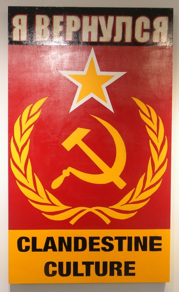
Clandestine Culture
я вернулся, (I CAME BACK)
2014
Acrylic on Wood
81 x 48
Signed on verso
About This Work:
This work titled “I Came Back” or “я вернулся” (in Russian), by Miami Street Artist CLANDESTINE CULTURE,could not be more relevant today then ever before. “For those 25 years of age or younger, the Soviet Union symbol of the Hammer and Sickle, mean nothing. There is an age group that has never seen that symbol, or even knew of a Soviet Union” says the artist.
What this work represents is exactly what the artist wants that age group, 25 years or younger, to understand. That message is that history repeats itself. Painted in 2014, during Russia’s invasion into Crimea, and aggressive military intervention in Ukraine, this painting forewarns the world of what is to come. Russian President Putin flexes his political muscles, and lets the world know that he, and Russia are coming back. They are not the weakened Russia, that perhaps the world sees them as.
Fast forward to 2015, and we see President Putin is at it again, aligning himself with Syria, and positioning his stronghold in the Middle East. Showing that Russia is still a “super power”, and standing up to America
Painted in the old Soviet Union colors of red and gold, this painting is rather simple, but very powerful in its message. Depicting the iconic Hammer and Sickle, with star and olive branches as the main focal point, they symbol says it all. The words “I Came back” written in Russian lets us know, that this is a message about the present, and a warning about the future.
This is exactly what street art intends to do. Historically, street art has always contained a social, a political, and an environmental message. The art challenges the viewer to react not only to the artwork, but to the substantive issues, and surroundings that is being discussed.
Make no mistake, Street Art is not just pretty paintings on a wall. That would be simply called a mural. Street Art is much more important than that. Street Art has substance, context, and a concept. Whether it is Haring talking about AIDS, or Apartheid, Basquiat discussing issues of racism, drugs, and struggle of daily life, or Banksy’s witty paradoxical installations and wall drawings, Street Art has become a depiction and a reaction to the world most important issues, and struggles. Its “in your face” style, is arguably the most reactionary art movement that the art world has yet to witness.
Never before has an art movement, been so literal, and purposeful. Like his predecessors Haring and Basquiat, and his contemporaries Banksy and Shepard Fairey, CLANDESTINE CULTURE focuses on the world’s issues around us, and challenges us to acknowledge, question, and react.
About The Artist:
The artist chooses to remain anonymous. He hits the street with his face and head completely covered. He believes that the painting and the message is more important then the artist. He uses everyday people, images and words, to show that in the end, we are all part of one world wide culture…A CLANDESTINE CULTURE
For more information and price please contact the gallery at info@gsfineart.co