 |
||
|
JEAN-MICHEL BASQUIAT Hollywood Africans In Front Of The Chinese Theater With Footprints Of Movie Stars1983/201523 color screenprint38 1/2 x 84 in.Artist’s Proof (A.P.) of 15Certified authentic, signed, dated and numbered on verso by Lisane Basquiat and Jeanine Heriveaux of the Jean-Michel Basquiat Estate
About This Work: In less than a decade the painter Jean-Michel Basquiat went from being a teenage graffiti writer to an international art star; he was dead of a drug overdose at age twenty-seven. A legend in his own lifetime. Basquiat’s meteoric success and overnight burnout were an instant art-world myth; his brief career spanned the giddy ’80s art boom and epitomized its outrageous excess, from its art dealers to its drug dealers, from its clubs to its galleries, from Madonna to Warhol. Basquiat was very fearful of the unfavorable racial reality in America, and saw himself as in no small amount of danger. These feelings often presented themselves in Basquiat’s work, which was typically socially and politically charged. His paintings were highly symbolic in nature and often focused on what he saw as intrinsic dichotomies, such as the wealthy versus the impoverished or integration versus segregation. The subject of this impressive artwork is related to the widely known 1983 artwork Hollywood Africans, currently owned by the Whitney Museum of American Art. It depicts Basquiat with friends, the artists Toxic and Rammellzee. Toxic is the figure on the left, Rammellzee is the central face (as it can be seen by the green letters RMLZ on top of the head) and Basquiat is the right figure, as it can also be deduced from the typical shape of Basquiat’s hair. Hollywood Africans represents a commentary on the stereotyping and marginalizing of African Americans in the entertainment industry. This theme led these three artists to coin the term and refer to themselves as the “Hollywood Africans”. Furthermore, this is a very current theme, it has even been the controversy of last night’s Oscars ceremonies, where several black actors and actresses have emphasized the necessity of equal rights and wages in the movie industry. In this work, Basquiat challenges the art world by merging academic and “primitive” through his neo-expressionist style, which is recognizable by some stylistic choices: for example, when he chooses to represent his teeth not by drawing them but by writing the word TEETH, which is graphically very similar to what can be a a set of teeth. We can also notice his typical calligraphy, tough gesture and shrill colors. This is a very important work. It is a very large, moving, biographical, historical account based on the artist’s life and the recurrent issues that surrounded him during his time, and which continue to linger on in today’s time.  Jean-Michel Basquiat, Hollywood Africans, 1983, acrylic and oil stick on canvas, 84 1/16 x 84 in.  NBA all star of the Miami Heat and renown art collector Amare Stoudemire with Basquiat’s Hollywood Africans In Front Of The Chinese Theater With Footprints Of Movie Stars in his new Miami home.
|
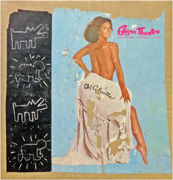
Tag Archives: greggshienbaumfineart
WOW! – Work Of the Week – Tom Wesselmann “Blonde Vivienne”
 |
||
|
TOM WESSELMANN About This Work: Considered by many to be a Pop artist, Tom Wesselmann would rather be called an artist of the post-Matisse era. His works recall Matisse, in a contemporary setting. It’s not hard to understand why categorizing Wesselmann is difficult. The use of erotic images against familiar backgrounds in his work, clean lines and the feel of kitsch exemplifies Pop art, but Wesselmann really never felt like his artwork was part of this artistic movement. Many people know Wesselmann for his nudes. He spent his whole life trying to paint and capture the Great American Nude. However, according to him, he was never able to achieve his goal. He started the Great American Nude series in 1961, where the nude becomes a depersonalized sex symbol set in a commonplace environment. As we can see by Blonde Vivienne, he emphasizes the woman’s hair, mouth neck collar and nipples of her breast, while the rest of the body is usually depicted in flat, unmodulated color or – this is the case – as an empty or negative space. The background is painted in the positive, supplies context and accentuates the negative. There are many different nudes by this artist but they all have one thing in common: when Wesselmann depicts a nude he is not clearly and loudly representing a subject, but he is alluding to and “sketching” a situation, a little gesture or a moment in time. The artist wants us to read into the situation and draw a conclusion for ourselves. Is the Blonde Vivienne sleeping? Is she feeling some kind of pleasure or is she just resting on the couch? The observer is free to choose a personal interpretation of the subject. This also may be the reason why he was so interested in the spaces in and around his drawings. He shifts the focus and scale of the standing objects around a nude; these objects are relatively small in relation to the nude, but sometimes they become major, even dominant elements. To add more mystery, every work is also painted at a particular and/or an unusual angle or point of view. By focusing on the situation, the angle and the details of the background, the viewer is able to imagine what the subject is going through or feeling. For example, in this particular work the viewer is looking at the Blonde Vivienne through a peephole, giving us a sort of voyeuristic point of view. Thus, Blonde Vivienne is a perfect example of showcasing the complexities of a Wesselmann painting. Pop elements occupying space in the positive giving focus to a Matisse like, modern day Odalisque in the negative, captured at a particular view or moment in time, causing the viewer to put it all into one context that he or she can envision for themselves. For more information and price please contact the gallery at info@gsfineart.com |
WOW! – Work Of the Week – Claes Oldenburg “Typewriter Eraser”
 |
||
|
CLAES OLDENBURG About This Work: Claes Oldenburg is an American sculptor, best known for his public art installations typically featuring very large replicas of everyday objects. This beautiful drawing represents a typewriter eraser, a recurring object in Oldenburg’s work. Why a typewriter eraser? Many of Oldenburg’s works depict mundane objects and, at first, they were ridiculed before being accepted by the art world – but they were also defined “brilliant”, due to the reaction that the pop artist brought to a “dull” abstract expressionist period. Oldenburg creates a distinctive order of objects. First, they are things made and utilized by human beings. Used, out-of-date or simply banal, they look rescued from oblivion by the artist. Isolated in a landscape or interior space and inflated in size, they are vulnerable giants. But they are not actual objects elevated to the status of art in the Duchampian tradition of the readymade. While recreating objects, Oldenburg alters their specifics, transforming them through changes in material, scale, context and exaggerations of forms that lend them more than one identity. A typewriter becomes also a tornado. When turned up right we see the eraser rolling towards us with the whiskers rustling in the air resembling a tornado. In this particular drawing of the typewriter eraser we see the subject in motion sweeping down the street like a tornado. Drawings like this are rare “little gems”, hard to find and representative of the soul of Oldenburg’s objects. Oldenburg’s drawings are continuous files of ideas from which major themes have developed. Drawings that he devotes to sculptural projects, imagined or real, appear as “proposals”. These drawings have an anecdotal character in cases where the sculpture is placed in new contexts. They chronicle the further adventures of a subject and track the creative and artistic process of this great artist. This drawing can be considered a generative tool for the large scale Typewriter Eraser, Scale X, constructed in 1999 and now located at the National Gallery Of Art Sculpture Garden, in Washington D.C. |
WOW! – Work Of the Week – Salvador Dali “Playing Cards”

Salvador Dali, Playing Cards are currently exhibited at the Gallery
About This Work:
These wonderful Playing Cards are the lithographic version of the real decks Dali produced in 1967 with publisher Puiforcat, which are now extremely rare and difficult to find.
Dalí created these designs for the Ace, King, Queen and Jack of each suit plus a Joker. He composed his playing card figures out of geometric shapes, like a surrealist tapestry, but retaining the traditional aspects of playing cards design.
The Playing Cards contain most of Dali’s icons and are presented in a whimsical playful fashion. They have a great appeal because, like the melting clocks, the visual aspect and content are catchy and clever. They play upon a subject which we are all familiar with. Dali takes the familiar and makes it surreal.
These cards are done masterfully and they are brilliantly arranged, offering a fantastic glimpse of Dali’s ultimate creative abilities. At first sight, the characters look like regular card figures, but looking closer it is evident that they are formed by several different objects – or partial objects. Among the pieces of the suite, we find an array of compositions, colors, traditional and non-traditional symbols. Each piece is like a puzzle that can only be put together by the greatest Surrealist of all time.
All the evident artistic references we can see in these lithographs are often intertwined with different unexpected meanings and hidden concepts.
Jack of Clubs
SALVADOR DALI
Playing Cards – Jack of Clubs
1972
Lithograph
25 3/4 x 20 in.
Edition of 150
Pencil signed and numbered
The Jack of Clubs has numerous surrealistic elements that define the meaning of “The Jack”.
Throughout the history of playing cards, the Jack has always had a sexuality identity crisis. Often depicted as an unambiguously feminine male, Dali takes note of this and creates the Jack’s hat with a royal looking swan emerging from it, as well as a weeping eye. The shield and sword stand out boldly as to hide the femininity but Dali masterfully adds one of his most iconic surrealistic elements to further his point, the bread.
“[Bread] has always been one of the oldest fetishistic and obsessive subjects in my work, the one to which I have remained the most faithful“. In his paintings, breads are most often an aspect of hard and phallic.
The Clubs are often referred to intellect, literature and education. This explains the presence of inkwells.
King of Clubs
 SALVADOR DALI
Playing Cards – King of Clubs
1972
Lithograph
25 3/4 x 20 in.
Edition of 150
Pencil signed and numbered
The King of Clubs is a king said to be one of great power but one who is not aware of this and is outwardly cheerful but inwardly reserved. Hence the bottom face is portrayed as a closed eyed-sleepy king.
The top face is made of surrealistic elements of nature. Bones for a nose, rocks for eyes and birds for eyebrows.
Another face can be seen to the left corner from the Club and lips.
The Crown has a stone castle showing strenght and royality.
Queen of Diamonds
 SALVADOR DALI
Playing Cards – Queen of Diamonds
1972
Lithograph
25 3/4 x 20 in.
Epreuve d’Artist (E.A.)
Pencil signed and numbered
Queen is painted with the classic colors of the iconic Maddalena, blue and red, and holds red roses, a classic symbol of beauty and femininity.
The Queen of Diamonds, viewed in one direction, has an interesting nose, mouth, and set of eyes – all composed, appropriately enough, of numbers: 8’s constitute her eyes, her nose is a 4, and 8’s again form her mouth.
Given his interest in alchemy and tarots, we are not able to exclude that Dali intentionally wanted to make a reference to the symbolism of numbers. The symbolism backing number Eight deals with continuation, repetition, eternity and cycles, while number Four invokes stability and the grounded nature of all things. Four is also half of Eight.
Turn the card upside down, the Queen’s eyes and mouth will be transformed into what might be described as a Picasso-like composition. Dali often nodded to other artists he admired, and Picasso was definitely one of them.
You’ll then notice a background figure of a girl skipping rope. This is a recurring, almost obsessive image in many Dali works, and it represents a reference to the famous illustrations he created for Lewis Carroll’s book “Alice In Wonderland“. It goes without saying that the artist made this reference in this particular card because one of the most important characters in the book is the Queen.
In the end, the double images were a major part of Dalí’s “paranoia-critical method”, which he put forward in his 1935 essay “The Conquest of the Irrational“. He explained his process as a “spontaneous method of irrational understanding based upon the interpretative critical association of delirious phenomena“. Dalí used this method to bring forth the hallucinatory forms, double images and visual illusions that filled his paintings. The artist termed “critical paranoia” a state in which one could cultivate delusion while maintaining one’s sanity.
Dalí’s career as a print maker lasted his entire life. In these prints we find some of Dalí’s most accomplished icons and images, and some of his best use of his imagination.
Newly Installed at Gregg Shienbaum Fine Art
FEBRUARY 2016 – NEWLY INSTALLED ARTWORKS
For information and inquiries, contact us at info@gsfineart.com

Robert Rauschenberg “Collateral” from “Ground Rules”, John Baldessari “Two Unfinished Letters”, Ahol Sniffs Glue “Untitled #16 Overlay”, Damien Hirst’s diptych “Methylamine-13c” and “3-Methylthymidine”

Roy Lichtenstein “American Indian Theme VI”, Alex Katz “Olympic Swimmer”, Andy Warhol “Life Savers”, “Alfred Hitchcock” and “Sidewalk”, Robert Indiana “The Metamorphosis Of Norma Jean”, Tom Wesselmann “Blonde Vivienne”, Damien Hirst “Ala-Met”

Ahol Sniffs Glue’s first diptych “Untitled #13 Layered”, Andy Warhol “Ingrid Bergman, Herself”, Keith Haring “Fertility #1”

Ed Ruscha “Cash For Tools 2”, Robert Rauschenberg “Trust Zone” from “Stoned Moon Series”, Jasper Johns “Device”, Robert Motherwell “Blue Gesture”, Ellsworth Kelly “Black Yellow”, Damien Hirst “Black Brilliant Utopia”, Takashi Murakami “Kiki WIth Moss” and “Reverse Double Helix”, Jean-Michel Basquiat “Leg Of A Dog”, JR “The Wrinkles Of The City Los Angeles”, Coinslot “I Shot Andy Warhol”
Gregg Shienbaum Fine Art’s “Keith Haring Narrated” Show features On ArtNet
Click on the image below to read the article
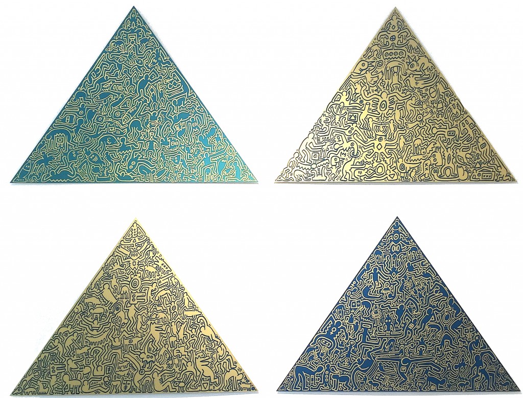
Keith Haring, Pyramids #1 – #4, anodized aluminum, Edition of 30, signature etched on verso
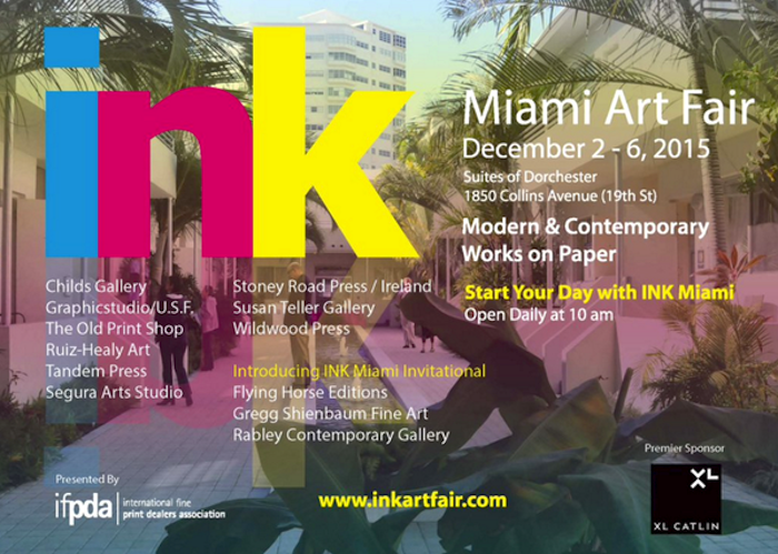
Gregg Shienbaum Fine Art will participate at Ink Miami Fair 2015
| Gregg Shienbaum Fine Art is proud to announce its participation at Ink Miami Art Fair 2015 | |||
| The show will be open December 2 to 6 | |||
| Come visit us at Booth 160 |
Click here for Miami Ink Art Fair press release
Pictures and news from the Fair will be coming soon!
Admission Hours:
Wednesday 11:00 am to 5:00 pm
Thursday 10:00 am to 5:00 pm
Friday 10:00 am to 7:00 pm
Saturday 10:00 am to 7:00 pm
Sunday 10:00 am t 3:00 pm
For any information or to know what we will be showing at the Fair, please send us an email at info@gsfineart.com or call us at 305 456 5478


Miami Artisti Ahol Sniffs Glue Signing first Gregg Shienbaum Fine Art Edition “Balls To The Walls”
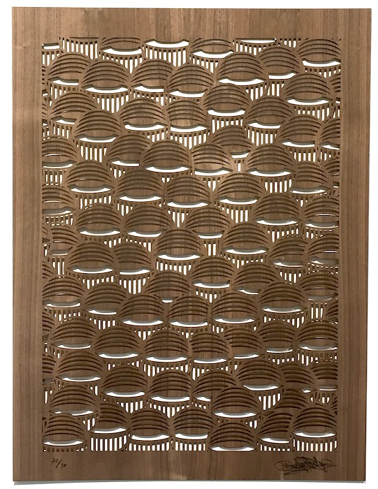
Gregg Shienbaum Fine Art is pleased to present its first edition with Miami Artist Ahol Sniffs Glue.
Limited to only 30 pieces and is laser cut on walnut wood.
The Eye Pattern is cut out all the way through. So what ever the background color of the wall you choose to hang it on is the color the eyes will be. It can also be framed as well.
We did not want to do a regular print on paper, we wanted to do something more unique and more substantial.
The details of this new edition are below as well as photos of the work and of Ahol signing the piece.
- Ahol Sniffs Glue
- Balls To The Walls
- 2015
- laser cut out on walnut wood
- 32 x 24 x 1/8 in.
- Edition of 30
- Signed and numbered
- $650
* please note that the grain of the wood varies from piece to piece.

Gregg Shienbaum Fine Art’s “Keith Haring Narrated” Show features in Los Bandidos De L’Arte
WOW! – Work Of the Week – Shepard Fairey “Obey ’04 (Wage Peace)”

Shepard Fairey aka OBEY
OBEY ’04 (Wage Peace)
2006
Screenprint
42 x 30 in.
Edition of 89
Pencil signed and numbered
—
ABOUT THIS WORK:
Shepard Fairey’s background is rooted in American skate and punk rock culture, with his work born out of a combination of a graffiti aesthetic and Pop art sensibilities. Straddling the divide between the fine art world and the street art world, Fairey—despite his massive popularity—has had to wait to be accepted by the more traditional art world. His higher profile has also, in turn, gotten him into some serious problems with law enforcement (he recently faced felony charges in Detroit, despite eighteen prior arrests for illegal tagging). Fairey said of this conflict: “To some people street art is vandalism, to others it’s gentrification, and either of those could be considered more legit than the other depending on your perspective“.
His artwork stands out in both the street and in a gallery setting. Although he is still viewed primarily as a street artist despite his indisputable commercial success. Fairey’s use of powerful, accessible images and messages display an influence from early advertising, alternative culture, and Pop artists like Andy Warhol. This combination of clear messaging and graphic compositions gives his work a broad appeal that speaks to a wide cross section of society. “Street art has to stand out from the static, and contend with the metabolism of the city“. He evokes communist propaganda, Barbara Kruger style advertorials and Jasper Johns subversion.
Fairey’s work also has a strong political component. He was already well known for his OBEY Andre the Giant tags and stickers before he created the image Obama Hope in 2008, a block-colored portrait of the presidential hopeful Barack Obama. The image, now world-famous, was subsequently adopted as the official presidential campaign image and became probably his most famous image. In addition, he also created a poster in support of Ai Weiwei’s—now successful—campaign to regain his passport in 2014.
Early in his career, during the OBEY sticker campaign that made him famous, Fairey seriously questioned the nature of his imagery, firmly establishing himself as an outspoken counter-culture figure, often addressing issues of war, human rights, ecology, and politics.
His art can be explained as an experiment in Phenomenology. Heidegger describes Phenomenology as “the process of letting things manifest themselves.” Phenomenology attempts to enable people to see clearly something that is right before their eyes but obscured; things that are so taken for granted that they are muted by abstract observation. Because people are not used to seeing advertisements or propaganda for which the product or motive is not obvious, frequent and novel encounters with this art provoke thought and possible frustration, nevertheless revitalizing the viewer’s perception and attention to detail.
A perfect example of this is the work entitled Obey ’04, from the Retro Series. The silhouette of the soldier is a strong graphic form against the red background. Here we can see all the typical elements that characterize Fairey’s art: red, beige and black colors, modern and current subjects and the predominant presence of the graphic element.
Also present is the image Fairey became known for, the Andre The Giant face. This is represented by the soldier holding up this iconic image. We also see it in that sort of mandala shaped like a star in the upper right, a true symbol of the artist.
Fairey, who is definitely a pacifist, creates work that speak of peace and war, conveying his concern with politics.Here we can see the words “wage peace” instead of the typical “wage war”, and a flower inside the rifle instead of bullets.
The Obey ’04 from the Retro Series was created to commemorate the 20 year anniversary of the artwork of OBEY. The series was first released for the opening of Shepard’s 20 years Retrospective at the ICA Boston.