  |
||
|
ROBERT RAUSCHENBERG About These Works: Robert Rauschenberg’s Chow Bags portfolio (1977) consists of six screen prints with graphite and plastic thread, each featuring a different domesticated animal. The prints are based on paper collages that Rauschenberg created from actual bags of animal feed manufactured by Ralston Purina (now Purina Mills), a company best known for its Dog Chow and Cat Chow brands. He chose the packaging for the less common feeds, based on bags for a livestock feed. They all share the distinctive red-and-white checkered pattern (except Monkey Chow, which has the green and white checkered pattern), made famous by Purina’s more familiar products. By incorporating this pattern and other prominent design elements of the bags, Rauschenberg’s Chow Bags call attention to the simultaneous familiarity and strangeness of Purina’s graphic identity. Photographs of the finished collages were used as the basis for the screen prints. Although Rauschenberg selectively cut and partially flattened the paper feed bags to create his collages, he retained their rectangular shape and allowed this form to dictate the overall configuration of each print. The bold, graphic renderings of the animals at the center of these works are surrounded by various arrangements of fainter transfer images such as flowers and leaves, cars stuck in traffic, Coca-Cola bottles, and a woman’s glossy, manicured finger. The resulting compositions present the animals gazing out as in traditional portraiture, playfully framed by colorful graphics and strong geometric shapes. After the silkscreen process, additional collage elements were applied to each print, including small pieces of fabric and plastic stitching that mimics the pull-strings used to open feed bags. The Chow Bags series was printed by Styria Studio in New York, and issued in an edition of 100. Rauschenberg was impressed by the history of Purina Mills. Founded by William Danforth in 1884, the company produced Purina Chow, a line of food for animals that prospered for well over a century. The name of the product has an explanation. The word Purina (from pure) was coined to describe the purity of the grain made by the Danforth mills, and Chow is the name that soldiers during World War I used to refer to food. The Chow Bags series embraces the very essence of what Robert Rauschenberg has been trying to capture and convey in his art, and in the Pop Art movement in general. Rauschenberg’s Chow Bags series seemingly embraced the post World War II manufacturing and media boom. His choice of Purina Chow as imagery is an enthusiastic endorsement of the capitalist market and the goods it circulated, while at the same time denotes an element of cultural critique, playing on the concept of consumerism that was at an all time high after the war, and also elevating the everyday to high art: tying the commodity status of the goods represented to the status of the art objects themselves. Which is exactly what the Pop Art movement is about. |
Tag Archives: greggshienbaum
WOW – Work Of the Week – Alexander Calder “Our Unfinished Revolution” Portfolio
 |
||
|
ALEXANDER CALDER About This Work: Alexander Calder (1898 – 1976) is one of the most celebrated artists of the 20th century. Subsequently, upon moving to Paris in 1926, Calder began creating large-scale mechanical installations of intricate circus scenes, featuring wire sculptures with moving parts that he would operate over a two-hour performance session. Building off of his so-called Cirque Calder, he began sculpting portraits and figures out of wire, and received critical attention, exhibiting these works in gallery shows in New York, Paris, and Berlin. While in Paris, he befriended several important Abstract artists, including Joan Miró and Piet Mondrian, and was invited to join the group Abstraction-Création in 1931. Many of Calder’s works on paper and his printwork are studies, tests and theories about his sculptures. As Calder’s sculptures moved into the realm of pure abstraction in the early 1930s, so did his works on paper and prints. The thin lines used to define figures in the earlier prints and drawings began delineating groups of geometric shapes, often in motion. This work from the portfolio Our Unfinished Revolution, is a two-dimensional insight into Calder’s three-dimensional world. Alexander Calder has had several retrospectives, and, among many other awards, was honored with the Presidential Medal of Freedom and the Bicentennial Artist Award from the Whitney Museum of American Art in New York City in 1976. The Guggenheim Museum showed a retrospective of his work in 1964. |
WOW – Work Of the Week – Robert Indiana “American Dream #5”
 |
||
|
ROBERT INDIANA About This Work: “Among the rain Robert Indiana is one of the original 6 American Pop artists who, back in the 1970s, literally changed the world of art. Subsequently, he moved to Vinalhaven, a place that has acquired an allure of almost mystical isolation, throughout the years. Here Indiana has retired from the world since 1978, although still actively working and producing art. In 1964, when he was still living in New York City, Indiana moved from his first place, a building called Coenties Slip, to a five-story building in the Bowery. In 1969, he began renting the upstairs of a building called “The Star of Hope”, in the island town of Vinalhaven, Maine, as a seasonal studio, from the photographer Eliot Elisofon. This place was wider and very functional for his big works. Half a century earlier, Marsden Hartley, the main source of inspiration for Indiana’s Hartley Elegies suite, had made his escape to the same island. When Elisofon died, Indiana moved in full-time. Indiana’s work often consists of bold, simple, iconic images, especially numbers and short words. His best known example is LOVE, used in countless paintings, prints and sculptures. American Dream #5 is not only referring specifically – through its title – to another painting by another major American painter, Charles Demuth, but it is also a pictorial hymn to a poem by William Carlos Williams, that inspired Demuth himself. Charles Demuth painted a work titled I Saw The Figure 5 In Gold, inspired by Williams’ poem The Great Figure. The poet, in turn, was inspired by seeing a fire truck passing down the street at full speed, with a big gold silhouette of a 5 on the background. One can clearly see the shades of gray that make stand out the other bright and strong colors. The geometrical shapes of stars and circles, and the progressive size of the figure 5, create an optical illusion of movement and speed, making the figure 5 pop and vibrate off the paper as the view stares at it. This chain of poetical and pictorial allusions is enriched in this work by a whole other chain of references to birth or death dates that form a web of intricate numerological references based on various coincidences: Demuth’s painting is dated 1928 – also the year of Indiana’s birth. Indiana’s painting is dated 1963 – also the year of Carlos Williams’ death. The succession of rows of three 5s suggests the figure 35: Demuth died in 1935. This succession of 5s is also describing the sudden progression of the firetruck in the poet’s experience. American Dream #5 itself is composed like a poem, and its cruciform shape remains Indiana’s unmistakable mark. The monosyllabic words like EAT, HUG, ERR, DIE, also belong to Indiana’s own poetry. Again, here autobiography occupies an important role as well: EAT & DIE refer to his mother’s last word before she died. American Dream #5 is Indiana’s most impressive and important work. The poetical, numerological, biographical associations embedded in this work make this jazzy though straightforward artwork one of the most complex works of Indiana’s career and in American Pop art. |
WOW – Work Of the Week – Andy Warhol “Portraits Of The Artists”
 |
||
|
ANDY WARHOL About This Work: Andy Warhol was the most successful and highly paid commercial illustrator in New York even before he began to make art destined for galleries. Neverthless, his screenprinted images of Marilyn Monroe, soup cans, and sensational newspaper stories, quickly became synonymous with Pop Art. Pop Art marked an important new stage in the breakdown between high and low art forms. Warhol’s paintings from the early 1960s were important in pioneering these developments, but it is arguable that the diverse activities of his later years were just as influential in expanding the implications of Pop Art into other spaces, and further eroding the borders between the worlds of high art and popular culture. Andy Warhol is now considered one of the most influential artists of the second half of the 20th century, who created some of the most recognizable images ever produced. Warhol was part of a very exclusive group of artists that the famous and influential New York dealer, Leo Castelli, represented. In 1967 Warhol created Portraits of the Artists, a work that depicts the portraits of 10 artists chosen and represented by Castelli. Sticking with Warhol’s signature style of repetition, he multiplied the artists’ portraits ten times in ten different colors on 3-D polystyrene boxes, each measuring at approximately 2 x 2 inches. The 100 boxes totaled to approximately 20” x 20” when lined up. The artists include Robert Morris, Jasper Johns, Roy Lichtenstein, Larry Poons, James Rosenquist, Frank Stella, Lee Bontecou, Donald Judd, Robert Rauschenberg and Andy Warhol himself. Warhol used the power of the portrait to bring forth the idea of America’s infatuation with celebrity, and the effects of the celebrity in our culture. Pop culture was not only just about Coca Cola bottles, Campbell’s Soup Cans, and Brillo boxes, but also about taking TV, film, music, or literary personalities and exploiting the concept of celebrity. What a better way to pay homage and respect to the most important artists of the time by having Andy Warhol create a work of art that said so much about the artist’s influence on our culture, with just their portraits. No words were needed. The use of repetition is also typical of Andy Warhol. Warhol used silkscreen as his medium of choice. It served as a way to remove the hand of the artist in art, a concept Marcel Duchamp introduced to the art world in the early part of the century. Warhol’s biggest influence in art was Duchamp. Repetition also allowed the artists to further their concepts, by reaching a greater amount of people. Printmaking was the best way to achieve this. By making multiples of a work, more people can own the work, sell the work, and are exposed to the work. It was this marketing that led to Andy Warhol becoming a celebrity himself. |
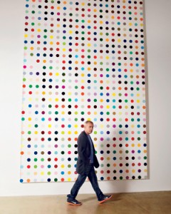
Damien Hirst rejoins Gagosian
Click here or on the picture to read the full article
WOW – Work Of the Week – Lichtenstein “Reflections On Minerva”
 |
||
|
LICHTENSTEIN About This Work: Pop Art draws upon the style and imagery of advertising and popular culture to challenge our preconceptions about the nature of art itself. Roy Lichtenstein not only was a New York Pop Art painter, but also one of the first American Pop artists to achieve widespread notoriety. His very personal and unique style derived from comic strips which portray the trivialization of culture, endemic in contemporary American life. Using bright, strident colors and techniques borrowed from the printing industry, he ironically incorporates mass-produced emotions and objects into highly sophisticated references to art history. This is the case of Reflections On Minerva. Lichtenstein has often explored the theme of Reflections, incorporating them in various paintings and several print series. In 1988 Lichtenstein began working on a group of Reflections paintings, in which the central image is partly obscured by reflective streaks, as if behind glass or reflected in a mirror. Reflections On Minerva can be considered an iconic work, since it is a perfect example of Lichtenstein’s style. A style made of primary colors – red, yellow and blue, heavily outlined in black. Instead of shades of color, he used the ben-day dot, a method by which an image is created, and its density of tone modulated, through the position and size of a myriad of dots during the printing process. The original source for this Reflections print was the November-December 1948 edition of the comic book ‘Wonder Woman’, illustrated by Harry G. Peter. The eponymous super-heroine is shown with a speech bubble exclaiming her catchphrase, ‘Merciful Minerva!’. Wonder Woman regularly invoked the Roman goddess Minerva, who was traditionally known as the goddess of wisdom but also encompassed the arts, trade, poetry, and later, war and power. Despite the title of this work, Reflections On Minerva, the “reflections” are the real protagonists of this work. They are formed by portions of the print striped or dotted and layered upon the image of Minerva, which is drawn with the simple lines typical of comic strips. The theme of reflection is a very important one for Lichtenstein.
Other works by this artist:
 Landscape With Boats  Painting On Blue And Yellow Wall  Mirror #7
|
WOW! – Work Of the Week – Tom Wesselmann “Blonde Vivienne”
 |
||
|
TOM WESSELMANN About This Work: Considered by many to be a Pop artist, Tom Wesselmann would rather be called an artist of the post-Matisse era. His works recall Matisse, in a contemporary setting. It’s not hard to understand why categorizing Wesselmann is difficult. The use of erotic images against familiar backgrounds in his work, clean lines and the feel of kitsch exemplifies Pop art, but Wesselmann really never felt like his artwork was part of this artistic movement. Many people know Wesselmann for his nudes. He spent his whole life trying to paint and capture the Great American Nude. However, according to him, he was never able to achieve his goal. He started the Great American Nude series in 1961, where the nude becomes a depersonalized sex symbol set in a commonplace environment. As we can see by Blonde Vivienne, he emphasizes the woman’s hair, mouth neck collar and nipples of her breast, while the rest of the body is usually depicted in flat, unmodulated color or – this is the case – as an empty or negative space. The background is painted in the positive, supplies context and accentuates the negative. There are many different nudes by this artist but they all have one thing in common: when Wesselmann depicts a nude he is not clearly and loudly representing a subject, but he is alluding to and “sketching” a situation, a little gesture or a moment in time. The artist wants us to read into the situation and draw a conclusion for ourselves. Is the Blonde Vivienne sleeping? Is she feeling some kind of pleasure or is she just resting on the couch? The observer is free to choose a personal interpretation of the subject. This also may be the reason why he was so interested in the spaces in and around his drawings. He shifts the focus and scale of the standing objects around a nude; these objects are relatively small in relation to the nude, but sometimes they become major, even dominant elements. To add more mystery, every work is also painted at a particular and/or an unusual angle or point of view. By focusing on the situation, the angle and the details of the background, the viewer is able to imagine what the subject is going through or feeling. For example, in this particular work the viewer is looking at the Blonde Vivienne through a peephole, giving us a sort of voyeuristic point of view. Thus, Blonde Vivienne is a perfect example of showcasing the complexities of a Wesselmann painting. Pop elements occupying space in the positive giving focus to a Matisse like, modern day Odalisque in the negative, captured at a particular view or moment in time, causing the viewer to put it all into one context that he or she can envision for themselves. For more information and price please contact the gallery at info@gsfineart.com |
WOW! – Work Of the Week – Salvador Dali “Playing Cards”

Salvador Dali, Playing Cards are currently exhibited at the Gallery
About This Work:
These wonderful Playing Cards are the lithographic version of the real decks Dali produced in 1967 with publisher Puiforcat, which are now extremely rare and difficult to find.
Dalí created these designs for the Ace, King, Queen and Jack of each suit plus a Joker. He composed his playing card figures out of geometric shapes, like a surrealist tapestry, but retaining the traditional aspects of playing cards design.
The Playing Cards contain most of Dali’s icons and are presented in a whimsical playful fashion. They have a great appeal because, like the melting clocks, the visual aspect and content are catchy and clever. They play upon a subject which we are all familiar with. Dali takes the familiar and makes it surreal.
These cards are done masterfully and they are brilliantly arranged, offering a fantastic glimpse of Dali’s ultimate creative abilities. At first sight, the characters look like regular card figures, but looking closer it is evident that they are formed by several different objects – or partial objects. Among the pieces of the suite, we find an array of compositions, colors, traditional and non-traditional symbols. Each piece is like a puzzle that can only be put together by the greatest Surrealist of all time.
All the evident artistic references we can see in these lithographs are often intertwined with different unexpected meanings and hidden concepts.
Jack of Clubs
SALVADOR DALI
Playing Cards – Jack of Clubs
1972
Lithograph
25 3/4 x 20 in.
Edition of 150
Pencil signed and numbered
The Jack of Clubs has numerous surrealistic elements that define the meaning of “The Jack”.
Throughout the history of playing cards, the Jack has always had a sexuality identity crisis. Often depicted as an unambiguously feminine male, Dali takes note of this and creates the Jack’s hat with a royal looking swan emerging from it, as well as a weeping eye. The shield and sword stand out boldly as to hide the femininity but Dali masterfully adds one of his most iconic surrealistic elements to further his point, the bread.
“[Bread] has always been one of the oldest fetishistic and obsessive subjects in my work, the one to which I have remained the most faithful“. In his paintings, breads are most often an aspect of hard and phallic.
The Clubs are often referred to intellect, literature and education. This explains the presence of inkwells.
King of Clubs
 SALVADOR DALI
Playing Cards – King of Clubs
1972
Lithograph
25 3/4 x 20 in.
Edition of 150
Pencil signed and numbered
The King of Clubs is a king said to be one of great power but one who is not aware of this and is outwardly cheerful but inwardly reserved. Hence the bottom face is portrayed as a closed eyed-sleepy king.
The top face is made of surrealistic elements of nature. Bones for a nose, rocks for eyes and birds for eyebrows.
Another face can be seen to the left corner from the Club and lips.
The Crown has a stone castle showing strenght and royality.
Queen of Diamonds
 SALVADOR DALI
Playing Cards – Queen of Diamonds
1972
Lithograph
25 3/4 x 20 in.
Epreuve d’Artist (E.A.)
Pencil signed and numbered
Queen is painted with the classic colors of the iconic Maddalena, blue and red, and holds red roses, a classic symbol of beauty and femininity.
The Queen of Diamonds, viewed in one direction, has an interesting nose, mouth, and set of eyes – all composed, appropriately enough, of numbers: 8’s constitute her eyes, her nose is a 4, and 8’s again form her mouth.
Given his interest in alchemy and tarots, we are not able to exclude that Dali intentionally wanted to make a reference to the symbolism of numbers. The symbolism backing number Eight deals with continuation, repetition, eternity and cycles, while number Four invokes stability and the grounded nature of all things. Four is also half of Eight.
Turn the card upside down, the Queen’s eyes and mouth will be transformed into what might be described as a Picasso-like composition. Dali often nodded to other artists he admired, and Picasso was definitely one of them.
You’ll then notice a background figure of a girl skipping rope. This is a recurring, almost obsessive image in many Dali works, and it represents a reference to the famous illustrations he created for Lewis Carroll’s book “Alice In Wonderland“. It goes without saying that the artist made this reference in this particular card because one of the most important characters in the book is the Queen.
In the end, the double images were a major part of Dalí’s “paranoia-critical method”, which he put forward in his 1935 essay “The Conquest of the Irrational“. He explained his process as a “spontaneous method of irrational understanding based upon the interpretative critical association of delirious phenomena“. Dalí used this method to bring forth the hallucinatory forms, double images and visual illusions that filled his paintings. The artist termed “critical paranoia” a state in which one could cultivate delusion while maintaining one’s sanity.
Dalí’s career as a print maker lasted his entire life. In these prints we find some of Dalí’s most accomplished icons and images, and some of his best use of his imagination.
Newly Installed at Gregg Shienbaum Fine Art
FEBRUARY 2016 – NEWLY INSTALLED ARTWORKS
For information and inquiries, contact us at info@gsfineart.com

Robert Rauschenberg “Collateral” from “Ground Rules”, John Baldessari “Two Unfinished Letters”, Ahol Sniffs Glue “Untitled #16 Overlay”, Damien Hirst’s diptych “Methylamine-13c” and “3-Methylthymidine”

Roy Lichtenstein “American Indian Theme VI”, Alex Katz “Olympic Swimmer”, Andy Warhol “Life Savers”, “Alfred Hitchcock” and “Sidewalk”, Robert Indiana “The Metamorphosis Of Norma Jean”, Tom Wesselmann “Blonde Vivienne”, Damien Hirst “Ala-Met”

Ahol Sniffs Glue’s first diptych “Untitled #13 Layered”, Andy Warhol “Ingrid Bergman, Herself”, Keith Haring “Fertility #1”

Ed Ruscha “Cash For Tools 2”, Robert Rauschenberg “Trust Zone” from “Stoned Moon Series”, Jasper Johns “Device”, Robert Motherwell “Blue Gesture”, Ellsworth Kelly “Black Yellow”, Damien Hirst “Black Brilliant Utopia”, Takashi Murakami “Kiki WIth Moss” and “Reverse Double Helix”, Jean-Michel Basquiat “Leg Of A Dog”, JR “The Wrinkles Of The City Los Angeles”, Coinslot “I Shot Andy Warhol”
Gregg Shienbaum Fine Art’s “Keith Haring Narrated” Show features On ArtNet
Click on the image below to read the article
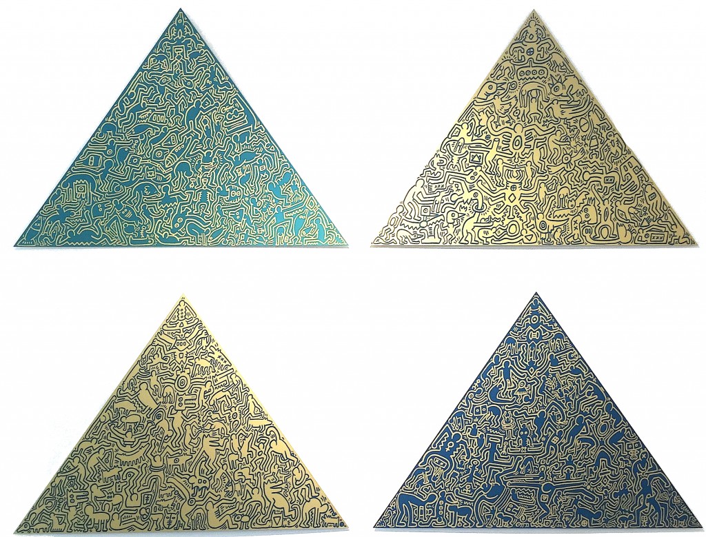
Keith Haring, Pyramids #1 – #4, anodized aluminum, Edition of 30, signature etched on verso