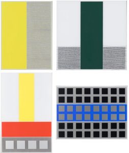
“WOW! – Work of the Week – Jesus Rafael Soto – Screenprints A, B, C & D from the Jai-Alai Series


Jesus Rafael Soto
Screenprints A, B, C & D from the Jai-Alai Series
1969
Screenprint on Perspex
24 1/4 x 19 1/2 in. each
Edition of 300
Signed and numbered, etched in perspex


Jésus Rafael Soto was a defining figure of both the Optical Art and Kinetic Sculpture movements. He was an acclaimed artist in his native Venezuela, having graduated from the Escuela de Bellas Artes y Artes Aplicadas in Caracas, and moved to Paris after the Second World War to undertake research in constructivist art. He participated in a groundbreaking exhibit at the Denise René Gallery in Paris called Le Mouvement. René’s guiding principle was that art must invent new paths in order to exist. And Soto’s art does just that.

He explored the phenomenological effects between two-dimensional and three-dimensional planes, fully engaging his viewers from every angle. He was a master at removing all subjectivity linked to personal taste, employing strictly geometric forms, squares, straight lines and primary colors, with a focus on the depiction of relationships between and movement of objects, rather than the objects themselves.

This week’s Work of the Week! WOW! is Soto’s Screenprints A, B, C & D from the Jai-Alai Series

The series takes its title from a sport in which the players and the ball remain in continuous motion, involving the ball to bounce off a walled space by accelerating it to high speeds with a hand-held device called a cesta. This continual movement transforms the relationship between space and time and are characteristics of the series that Soto explored in a conscious way. In naming the series Jai-Alai, the artist is allowing the viewer to understand his artistic research, by identifying the source. Just as in the process of observing the sport firsthand, each and every vantage point is equally as valid as it is important, and Soto has translated these distinct views into the artwork. The game does not occur from a single lens or fixed point of view, and neither does the art. It requires a process of moving through multiple states of time and space.

Working with flat lines of color and abstract geometric form, the artist stimulates optical effect through the manipulation of color theory and the dynamic between background and foreground, turing the viewer into a spectator from many different angles.

As one of the most intriguing artistic minds of his day, Jésus Rafael Soto’s quest for aesthetic representation of the immaterial, rejection of the figurative and use of traditional geometric form resulted in not only a career marked with ingenuity and success, but also of a wholly fresh and interactive experience for the viewer of his kinetic works.

“WOW! – Work of the Week – Paul Jenkins – Celestial Wink


Paul Jenkins

Celestial Wink

c. 1970

Watercolor

14 5/8 x 22 1/2 in.

Signed

About the work:

As a member of the Abstract Expressionist movement, Paul Jenkins was renowned for his technique of controlled paint pouring and use of translucent colors. He came of age during the heyday of the New York School and was deeply influenced by his interest in Eastern religions and philosophy, the writings of Carl Gustav Jung, and Goethe’s color theories.

These influences, prompted him to turn toward inward reflection and mysticism, which dominated both his aesthetic and personal life. The artist had studios and homes in New York City and in France (both Paris and St Paul de Vence), in which he displayed a vast collection of decorative items that he gathered for their mystical powers.

This mysticism translated to his work through billowy and undulating forms of color resulting in psychedelic-looking landscapes or cosmic realms, what Stuart Preston, of The New York Times, described as “Abstract Expressionist rococo.” Jenkins preferred to describe himself as an “abstract phenomenist.”

This week’s Work of the Week! WOW! is Celestial Wink.

Though his approach to paint application may seem driven by chance, and could be compared to the ancient craft of marbling – making colored paper in a tank in which liquid paints have been poured in the water – his methods were in fact very controlled. His favorite tool was an elegant ivory knife, which he used to guide the flow of paint. Of his unorthodox technique he said: “The ivory knife is an essential tool in this because it does not gouge the canvas, it allows me to guide the paint.”

Celestial Wink is a beautiful example of Jenkins’ work in watercolor. The work features every color in the rainbow with a strong balance of motion and blending. His colors seem to be moving, misty or fully liquid, billowing, surging, flaring, breaking up, capturing the semblance of shifts in direction. The composition as a whole confirms that the paint application was not left up to chance. There is a perfect amount of negative space (the white background), at angles that follow the strokes of color, allowing the work to flow harmoniously.

Jenkins also had a process when finding titles for his creations. “I try to find the identity word that will secure an attitude toward a painting rather than provoke a visual object that the eye will seek out.” The title Celestial Wink speaks to this attitude, just like the occurrence of a rainbow, only visible through reflection of water droplets directly opposite the sun, it is an ephemeral phenomenon, only possible under certain conditions. The title also echoes back to Jenkins’ interest in mysticism and suggests a surrender to the spiritual or outer-worldly. Celestial Wink does seem like a force of nature.

WOW! – Work of the Week – Keith Haring – Fertility #2


Keith Haring
Fertility #2
1983
Silkscreen
42 x 50 in.
Edition of 100
Pencil signed, dated and numbered


Throughout his work, Keith Haring was never afraid to confront the socio-political challenges of his time. He was an outspoken and ardent activist against racism, homophobia, the apartheid in South Africa and AIDS.

Despite that Haring addressed difficult topics in his work, he always approached these subjects with high energy and optimism. He was heavily influenced by graffiti writers and street art in New York City, and created what would become his signature style, composed of the heavy use of line drawing, vivid colors, and simplified humanoid and geometric forms. These glyphs that could be read, like an urban, tribal language were accessible to all, and easy to take in by a wide audience.

“Art is something that liberates the soul, provokes the imagination and encourages people to go further.”

This week’s Work of the Week! WOW! is Keith Haring’s Fertility #2.

Fertility #2 is the second work in the Fertility Suite of 5 works. Created in day-glow pigments, the piece is exceptionally bright, which conveys a warm and happy message, and evokes the New York club scene that Keith Haring was a part of.

It is a work that captures both the mysteries of ancient civilization with the representation of the pyramid, but also the imagination of extra-terrestrial civilizations through the flying saucers. The pyramid was a common theme in Haring’s work, simultaneously referring to antiquity and symbolizing eternity. It is also connected to the hieroglyphic language that Haring employs throughout his body of work, and the notion that images are a universal language. The UFO on the other hand represents a cosmic energy and suggests supernatural forces or people who were situated outside of social norms. They always symbolize positive energy and empowerment.

Lines and circles have a darker connotation in Haring’s work, they refer to the lesions of HIV and AIDS victims. These threats are surrounding a pregnant woman who is in distress, agitating her arms, trying to get attention.   

Combined, what does all this imagery stand for?

In the 1980’s there was a high prevalence of HIV infection among pregnant women in Sub-Saharan Africa. It was a terrible epidemic that devastated vast regions. The 1980’s were characterized by an insufficient response (both in the US and abroad) by government leaders in response to the AIDS epidemic. Ronald Reagan, the US president at the time, did not address the issue until over 21,000 Americans had already perished from the virus. Haring was a staunch activist and leader in promoting awareness about the virus and Fertility #2 is a centerpiece in his fight in relation to the transmission of the virus from mother to child, a particularly common problem in southern Africa.

The lesions, or dashes and circles have infected all the land in his depiction of the African landscape, and the pregnant mother is terrified for her unborn child. Keith Haring, loved the hope and innocence of children inspired. To him, they represented a better humanity: color-blind, unprejudiced and caring, uncorrupted by greed and hatred towards others. This work represents the saving of children and human kind from the evils of illness and inactive leadership.

WOW! – Work of the Week – Alex Katz – Wedding Dress


Alex Katz
Wedding Dress
1993
Etching Aquatint
52 x 22 in.
Edition of 50
Pencil signed and numbered


About the work:
Alex Katz’s body of work could be considered as a family photo album. Throughout his career, he has captured many moments depicting his friends and family, even his family dog, Sunny. As with any family photo album, some moments are ordinary and every day, but some are important life milestones.
This week’s Work of the Week! WOW! is Wedding Dress.
Wedding Dress is a work from 1993, and is one of the first portraits Alex Katz created of his daughter in law, Vivien. What is particularly interesting about this piece is his subject’s stance. There is an innocence in her body language, and an unawareness that she is being observed.
This is an atypical portrait. It is not posed or scripted. Alex Katz has captured a candid moment of his daughter is law’s wedding in a warm manner that leaves the viewer space to interpret the subject’s posture and determine her thoughts and emotions at the time.
The fact that Vivien is holding her hands behind her back is very significant. Initially, it is easy to associate the pose with shyness, especially since she is not looking upright. However, the act of holding her hands behind her back automatically exposes the full front of her body, indicating that her guard is down. She is displaying an ease and comfort in her surroundings. The serene feeling of her posture is accentuated by her head bowed slightly downwards and her eyes seemingly closed. That her eyes seem closed further attests to her comfort, she can retreat from the world to have a moment to herself, on her wedding day, a day that is traditionally centered on the bride.
Alex Katz captures the unique moment perfectly.
Through the many portraits that Alex Katz has created of Vivien, it is obvious that the pair have a very close relationship and that she is an integral part of the family. Many artists insert their life into their works, but none is as transparent as Katz, he truly let’s us in to be a part of his family’s most intimate moments.


WOW! – Work of the Week – Andy Warhol – Marilyn Monroe FS II.29


Andy Warhol
Marilyn Monroe FS II.29
1967
Screenprint on Wove paper
36 x 36 in.
Edition of 250
Pencil signed and stamp-numbered on verso


About the work:
Have you ever wondered why after more than 55 years of the death of Marilyn Monroe, she still remains the top iconic sex symbol in the world?
Monroe’s life and death are are so widely known, and read like a Shakespearean tragedy. Wanting so badly to become famous, Norma Jean Mortenson spent most of her childhood in foster homes and orphanages before she became a pin up model, and eventually the one of the biggest Hollywood movie stars to date. But this fame came at a cost. Billed by Hollywood as a “Blonde Bombshell”, by 1953 Monroe emerged as a major sex symbol and one of Hollywood’s most bankable performers.
The 1953 film noir Niagara put Marilyn on the map as a sex symbol, and was the start of the Marilyn Monroe that we know today. By now, Monroe and her make-up artist had developed the make-up look that became associated with her: dark arched brows, pale skin, “glistening” red lips and a beauty mark.
Niagara was one of the most overtly sexual films of Monroe’s career, and it included scenes in which her body was covered only by a sheet or a towel, considered shocking by contemporary audiences. Its most famous scene is a 30-second long shot behind Monroe where she is seen walking with her hips swaying, which was heavily used in the film’s marketing.
When Niagara was released in 1953, women’s clubs protested that the film was immoral, but the movie proved popular with audiences and grossed $6 million at the box office. This film, Niagara made Monroe a sex symbol and established her “look”.
This weeks Work of the Week! WOW! is Andy Warhol’s Marilyn Monroe FS II.29
Produced in 1967, five years after Monroe’s death, it is not by coincidence that the photo of Marilyn that Warhol selected for what is to be one of his most famous and iconic works of art was a publicity shot from the 1953 film Niagara.


Publicity photo from 1953 film Niagara

Many people do not fully understand the importance of Warhol’s Marilyn Monroe. Early works by Warhol were social and political commentaries on what was going in America at the time.
Warhol’s Marilyn to one who understands the work is genius, to those who do not, they ask what is the big deal? Warhol just reproduce a photo of Marilyn, and it is considered art?
Well for starters consider this: Andy Warhol immortalized Marilyn Monroe, Marilyn Monroe DID NOT immortalize Marilyn Monroe.
The most famous image of Marilyn Monroe is Warhol’s image. It has been reproduced millions of times, on countless products such as tote bags, coffee mugs, t-shirts, notebooks etc. This image is how younger generations identify Marilyn Monroe by. Artist’s of today, have appropriated Warhol’s Marilyn, after more than 55 years of her death.
So why is this work so important, and a work of genius? How come it has withstood the test of time?
In order to learn what this work is, we must first realize what this work is not. Warhol’s Marilyn is NOT just a portrait of a beautiful sexy celebrity.
Warhol’s Marilyn is a documentary, and a commentary on the life of one of the biggest stars in Hollywood, the culture of Hollywood, the power of Hollywood and film, and the culture of America at this time
“Being a sex symbol is a heavy load to carry, especially when one is tired, hurt and bewildered.”
Marilyn Monroe
Against Monroe’s wishes and demands over the years to be taken as a more serious actress, and wanting to be seen as more than just a “Dumb Blonde”, Hollywood continued to pump the sex starlet money machine, and refused to listen to Marilyn.
Although there were many other actresses before and during Marilyn’s era that have been typecast as a sex symbol, no one filled the roll better than Marilyn Monroe. The timing for Marilyn was perfect. After WWII America was coming into her own, and the innocence of the American society was slowly being ripped away. Hollywood realized that sex sells. Young men want Marilyn, and young women want to be like Marilyn.
However, this shedding of innocence of American society was the minority. Of course it was mostly a feeling of the younger generation, but conservatism still had a strong hold on American society and images of sex, and merely the suggestion of anything sex was still viewed as wrong or devilish.
Marilyn was pushing the envelope at a time when the majority of the country was not used to this type of openness towards sexuality. Yes, she was ground breaking, but this came at a grave cost.
This had taken a toll on Marilyn, and was the underlying factor of Marilyn’s tragic death. Hollywood’s greed and unwillingness to listen to one of its biggest stars led to Marilyn’s depression, ultimately her overdose of barbiturates, ruled as a “probable suicide”.
Andy Warhol had the foresight to see the whole story, and as any true artist does, created a work of art that not only details her life, but also comments on the state of the times in the country, as well as specific factors influencing American society during this era, such as commercialism, consumerism, greed, celebrity, sexuality and the innocence, growth and coming out of the American society. By definition, it is the epitome of Pop Art, and possibly the most famous work to come out of the Pop art
movement
Marilyn Monroe went from the top of her game, to the depths of hell, and overdosed at age 36. Warhol’s image of Marilyn represents her tragic story, and puts it in perspective in a way, that biographies and film documentaries do not, and frankly, can not. Warhol made Marilyn a work of art, for viewers to stop and think about her tragic life, the culture of Hollywood, the insincerities of greed towards a human life, and the attitude of America towards sexuality during this time, in the most abstract of ways. All this by just appropriating an image of Marilyn. It’s the concept of this work, and not the work itself that speaks volumes. And this is why the work is genius!

WOW! – Work of the Week – Ed Rushca – Bliss Bucket


Ed Ruscha
Bliss Bucket
2010
Lithograph
28 3/4 x 28 in.
Edition of 50
Pencil signed, dated and numbered

About the work:
One of the most important postwar artists, Ed Ruscha came into prominence during the 1960s pop art movement. First recognized for his associations to graphic design and commercial art, Ruscha became admired for his mediations on word and image, where a word literally becomes an object.
Language has often invaded the visual arts during the past century, but no other artist uses it the way Ruscha does. His early paintings are not pictures of words but words treated as visual constructs. “I like the idea of a word becoming a picture, almost leaving its body, then coming back and becoming a word again,” he once said. “I see myself working with two things that don’t even ask to understand each other.”
This weeks WORK OF THE WEEK – WOW!!! is Bliss Bucket, a snowcapped mountain scene, bearing the words, with his self invented font.
Since the late 1990s the mountain has become one of Ruscha’s most consistent motifs. He produces classic mountains, taken either from images of the Himalayas or from his own imagination.
Ruscha has said, ‘It’s not a celebration of nature. I’m not trying to show beauty. The concept came to me as a logical extension of the landscapes that I’ve been painting for a while – horizontal landscapes, flatlands, the landscape I grew up in. Mountains like this were only ever a dream to me; they meant Canada or Colorado. I’m not really painting mountains, but an idea of mountains. picturing some kind of unobtainable bliss or glory … tall, dangerous, beautiful.”
He has used these epic backdrops to support a range of ambiguous or bland phrases such as this one here. The deliberately neutral typeface in this work has now become his trademark font, with squared off letters recalling those in the Hollywood sign. He describes it as ‘no-style’ or Boy Scout Utility Modern’
Actually, the words aren’t so much written on top of the depiction of the mountain as inscribed within the work, the crisp lettering clear, clean and as virgin as the snow itself. Each word has the momentous authority of an alp; they shout, as though to start an avalanche.
Ruscha would stumble upon these words, considering them to be his own version of Duchampian readymades. When the words began to invade his mountain paintings the result was boldly striking and beautifully absurd. The mountains receded to the background while statements such as BLISS BUCKET threw themselves at the front of the plane with big, look-at-me lettering making it impossible not to enjoy these clever combinations.
Inspired by the text based works of fellow Pop artists Jasper Johns and Robert Rauschenberg, Ruscha pursued a lifelong artistic exploration into the formal elements of printed text and its fluid relationship to the visual image. By culling words, images and phrases that have been imprinted in his memory and that are found in mass media (print culture, advertising billboards, etc.), his work often serves as a visual encyclopedia of American culture. These symbols of consumer culture are as deeply rooted in the American vernacular as the mountains Ruscha paints.
His clever word associations pop off brightly colored canvases daring the viewer to react. For Ruscha words are also images, in that they provoke the imagination of the viewer.
Ruscha’a mounting paintings speak to how commercialism and consumerism are slowly encroaching on the natural world. This work is about before and after and the passage of time. The presence of commercialism and consumerism is unnatural and harsh, yet they accurately reflect the effect that our consumer driven culture has on the dwindling unspoiled natural world.
Mass media, billboards, and megastores are empires in their own right and have left an indelible imprint on our world. The unblemished views of these pristine monuments are slowly being encroached upon by sprawling suburban strip malls and colossal super stores. “The buildings violate the beauty of these mountains,” The abstraction with which he renders is classic Ruscha – he doesn’t give us too much but just enough to trigger our imaginations and associations. The subtlety of this rendering allows this painting to leave a far more substantial imprint on the viewer and make a much stronger statement on the condition of our world.

WOW! – Work of the Week – Shepard Fairey, Sedation Pill HPM


Shepard Fairey
Sedation Pill HPM
2013
HPM (hand-painted multiple), screenprint and mixed media collage on paper
40 x 30 in.
Edition of 10
Pencil signed and numbered


About the work:
IT TAKES THE SEDATION OF MILLIONS TO HOLD US BACK
It’s no secret, Shepard Fairey has always been open about controversial social and political topics, as evidenced in his artwork which promotes awareness of social issues. His aim in his work is to reawaken a sense of wonder about one’s environment.
This is exactly what this week’s Work Of the Week! WOW!, Sedation Pill HPM depicts. Shepard comments about this work, “The Sedation Pill print is inspired by the title of my favorite Public Enemy album “It Takes A Nation Of Millions To Hold Us Back”. I think the biggest problem in America is the indifference and complacency about important issues that results from much of the population being perpetually hypnotized by conspicuous consumption, social media, entertainment, and self-medication. Using sedation and escapism for relief from the rat race might make us less aware (blissfully ignorant) but also less empowered to improve our role within the rat race… a vicious cycle of cause and effect.”
However, something very interesting about this work, that many may not notice until pointed out is the influence of another social and political activist artist.
Fairey’s Sedation Pill could have been crafted 50 years ago by famed Pop artist Robert Indiana.
Using words like Stay Alert and Eyes Open as imagery to effectively convey his message, and of course the title of the work “It takes the sedation of millions to hold us back”. Fairey, creatively taking a page from Indiana’s playbook, not only uses words, but also positions them along side of geometric forms and shapes, and effective fonts to emphasize not only the word but its connotations.
Indiana brilliantly understood that words would not be enough. He had to pair them with form, shape, color, and draw the viewer in by making the work visually optical, and kinetic. Shepard Fairey did all this with Sedation Pill.
If the influence of Robert Indiana is not obvious to the viewer just on the merits of the work itself, well then Fairey let us know by adding the number 5 at the top right and bottom left of the work.
In 1963, Indiana paintied “The Figure 5”, owned by the National Museum of American Art, Smithsonian Institution, in Washington D.C.

Shepard Fairey, Sedation Pill HPM (detail)
Robert Indiana, The Figure 5

“I had seen a large retrospective of Demuth’s work and was mightily impressed. So I got off on that subject. I used the Demuth painting as a theme and, not liking to do those kinds of things, I decided to make the painting an homage to Demuth because I’m very fond of his work. There were five paintings all related to that particular theme, and those words simply came from earlier works. Some of my first word paintings were, for instance, just “EAT” “DIE”. And “EAT” “DIE” of course stem from the fact that the last word that my mother said before she died was “Eat.” But it relates to other aspects of the American scene. To complement “EAT” “DIE”– one really couldn’t go on doing that forever – I thought of the supplementary idea of “HUG” “ERR.” “HUG” was a family word for giving affection and so forth, and so it began to suggest covering some of the more formal aspects of life — existence and love and survival and sin and what have you.” — Robert Indiana
Sedation Pill HPM is a Hand Painted Multiple. This means that the entire paper that the work is printed on is all made of collaged elements of newspaper, torn stenciled patterns on paper, that Fairey is so well known for. Once the collaged paper is created, the image is then silkscreened on top of the paper. The torn elements of paper create a raw or rough look, as if this work was pasted on a wall on top of other previous works that had been there and have a worn or weathered look. After the silkscreen is placed on top Fairey then goes back and hand paints on top of the silkscreen, and margins.


WOW! – Work of the Week – Robert Indiana, American Dream #2


Robert Indiana
American Dream #2
1982
Screenprint on four separate sheets
26 3/4 x 26 3/4 each
77 1/2 x 77 1/2 overall
Edition of 100
Pencil signed, dated and numbered


About the work:
On Saturday, May 19, 2018 Robert Indiana passed away due to respiratory failure. He will be missed but his art and legacy will live on
“There have been many American SIGN painters, but there never were any American sign PAINTERS”. This sums up Robert Indiana’s position in the world of contemporary art. He has taken the everyday symbols of roadside America and made them into brilliantly colored geometric pop art. In his work he has been an ironic commentator on the American scene. Both his graphics and his paintings have made cultural statements on life and, during the rebellious 1960’s, pointed political statements as well.
Born Robert Clark in New Castle, Indiana, in 1928, he adopted the name of his native state as a pseudonymous surname early in his career. What Indiana calls “sculptural poems”, his work often consists of bold, simple, iconic images, especially numbers and short words like “EAT”, “HUG”, and “LOVE”. Rather than using symbols from the mass media, Indiana makes images of words that focus on identity. Using them in bold block letters in vivid colors, he has enticed his viewers to look at the commonplace from a new perspective.
Despite his unique methods, several important aspects of Indiana’s works clearly identify him as a Pop artist. He manages to give a direct and honest description of American culture while appearing cool and uninvolved, much as Warhol did by simply reproducing images of superstars and soup can labels.
However, what distinguishes Indiana from his “Pop” colleagues is the depth of his personal engagement with his subject matter. Indiana’s works all speak to the vital forces that have shaped American culture in the late half of the 20th century: personal and national identity, political and social upheaval and stasis, the rise of consumer culture, and the pressures of history. He uses his art it to both celebrate and criticize the national way of life.
In 1961, Indiana began a series titled the American Dream, a recurring theme in his work, which along with his other famous stenciled-text images—most notably LOVE—he has used to both celebrate and criticize American life.
The American Dream is the cornerstone of Indiana’s mature work. The roots of this powerful concept pervaded the artist’s Depression-era childhood, as well as the social and political aspirations of the United States during his formative years as an artist (1940s-1960s). It was the theme of his first major painting sold to The Museum of Modern Art in 1961. He recalls, “The first two or three dreams (there were 9 American Dream paintings in total), I would say were cynical. I was really being very critical of certain aspects of the American experience. “Dream” was used in an ironic sense.
This week’s Work of the Week! WOW! is Robert Indiana’s American Dream #2, a 4 piece set of screenprints each hung in a diamond shape, to form a 1 piece larger diamond shape.
Indiana saw the American Dream as “broken. . .no longer in effect for us and for lots of others.” In 1960, Indiana began applying highly saturated color to his geometric paintings. By the end of the year, he was adding words to them. Three of the four panels in American Dream #2 have the words EAT, JACK, and JUKE. Despite how simple Indiana’s verbal-visual amalgams seem, they contain multiple layers of meaning; deciphering them is akin to unraveling a conceptually complex puzzle.
In this work, the words suggest multiple references—for example, the word JUKE is associated with the greed of gambling and the fraud of “tilting” or cheating the pinball machine. Thus the imagery of casino tokens which gives a false promise and fantasy of American prosperity while also acknowledging the
failures of American ethics.
JACK may refer to John F. Kennedy, the great hope for America at the time, but very flawed in deed.“I think 1962 was the last year that Jack Kennedy lived, so that usually Jack refers to the president. However, if we want to keep consistent, in ’52 I met someone named Jack Curtis, who became an important friend in my life, and so it has a dual meaning.”
By presenting familiar words in new ways, he asks the viewer to reevaluate assumptions and emotions associated with those words. For example, no longer does the word “EAT” simply describe an act, but a whole set of social conditions and practices associated with that act. Viewers might see the intimacy of eating and its central role in family, community, and romantic rituals or they might understand the negative aspects of eating in a society where high-fat and gluttonous diets are the norm.
The word EAT also goes back much further and fills a large part of his life, EAT was the last word that Robert Indiana’s mother said before she died. She told him to be sure to eat.
As a child during the Depression, Indiana’s father left his mother, and in order to support him, and herself, his mother opened a restaurant, and so for several years things like eat signs also were a prominent part of Indiana’s life. The EAT aspect of this work is also a personal thing. It’s autobiographical.
What this work demonstrates, once again, is Indiana’s considerable style as a graphic designer whose manipulation of words, symbols, colors and spaces, can be pleasing and provocative. His designs reverberate, their elements bouncing off one other in dynamic relationships as they comment on the ups and downs of American life, his own included.
Robert Indiana provided an example of how to create work that was both deeply personal and universal, work with a clear message that could also be open to interpretation, work that spoke of its own time and reflected on contemporary events, but also carried a message to future generations.
The “painter of signs”, paints “signs of the times.”
WOW! – Work of the Week – Ed Ruscha, Main Street


Ed Ruscha
Main Street
1990
Lithograph
8 1/2 x 10 1/4 in.
Edition of 250
Pencil signed, dated and numbered


About the work:

Ed Ruscha can be called the Jack Kerouac of art. Since his first road trip from Oklahoma City to Los Angeles in 1956, West coast Pop artist Ed Ruscha has been influenced by themes and icons surrounding America. The drive, which he took with his life long friend, classical guitarist and composer Mason Williams took about three days in a 1950 Ford sedan.

At the time, Ruscha, who has since become an avid photographer, did not own a camera and the only record of the trip is a log that the artist has kept over the years. The two friends, who were still teenagers at the time, used the log to keep track of their expenses as they were trying to stick to a budget. The log tells the story of their journey. Ruscha has said: “My art, really my life, evolved out of that trip. […] The log took the place of photographs. I got a camera soon after arriving in L.A.” American landscapes and text are what the artist is best known for, both of which emerged from from his cross country experience.

This week’s Work of the Week! WOW! is Main Street, by Ed Ruscha.

“Main Street” is part of the iconography of American life.
The “Main Street of America” branding was used to promote U.S. Route 66 in its heyday. Main Street is a generic phrase used to denote a primary retail street of a village, town or small city.

In small towns across the United States, Main Street is not only the major road running through town but the site of all street life, a place where townspeople hang out and watch the annual parades go by. In the general sense, the term “Main Street” refers to a place of traditional values. However, in the America of later decades, “Main Street” represents the interests of everyday people and small business owners, in contrast with “Wall Street”, symbolizing the interests of large national corporations.

Ruscha treats words as visual compositions which are typically categorized between pop and conceptual art. Works feature a word with strong connotations and a powerful visual impact. Ruscha uses the multiplicity of meaning to encourage the viewer to consider all the subconscious connotations of the word. This could be expanded to an exploration of the subconscious meanings hidden in all forms of language. The words elicits a mixed response within the viewer in which preconceived ideas about the subject are confronted and either validated or challenged.

Noting the transformation of Main Streets in American cities from small “mom and pop” businesses, ice cream parlours, and public square gatherings, to big box stores, chain restaurants, and consumers jay walking across the street, while burying their heads in their cell phones, the words Main Street takes on a much diff erent meaning than it once did. Ruscha’s Main Street, not only takes us back to the days of nostalgia, but also to modern times where Main Street meets and flirts with Wall Street. Innocence and American values are overshadowed by greed and technology. Overshadowed is the key word, because not only is Ruscha’s Main Street a sign of modernism replacing the past, but it also implies a sense of hope, that one day the traces of the past will lead to a happy memory, and a wanting to inject the future with the values of the days of old.

Rather than simply painting a word, Ruscha considered the particular font that might add an elevated emotion to the meaning much like the way a poet considers a phrase. By painting a word as a visual, he felt he was marking it as offi cial, glorifying it as an object rather than a mere piece of text.

The typography of the words in Main Street sets this piece apart from the majority of his work because it is not done in “Boy Scout Utility Modern.” Inspired by the Hollywood sign, the artist invented “Boy Scout Utility Modern” in 1980, and uses it regularly in his works. In this case, rather, the font seems closer in nature to “Times.” “Times” is a classic font, designed for its legibility so it is an obvious choice for a representation of the most famous street name in America: Main Street. Main Street is an ode and textual portrait of an American symbol.

Ed Ruscha is fascinated with the streetscape as a subject matter, and over the span of his six-decade career, Ed Ruscha has shaped the way we see it – depicting gas stations, signs or continuous photographs of Hollywood Boulevard. His works convey a distinct and bold brand of Americana. Ruscha explains. “I take things as I find them. A lot of these things come from the noise of everyday life.”

WOW! – Work of the Week – Christo, Wrapped Woman


Christo
Wrapped Woman
1997
Lithograph with collage of polyethylene and twine, with pencil additions
22 x 28 in.
Edition of 125
Pencil signed and numbered


About the work:
For over 50 years, the art duo Christo and Jeanne-Claude wrapped buildings, trees, bridges and Islands with distinctive materials.
Although they worked as creative equals on most of their art projects, only Christo’s name appeared on the finished products. This was a conscious decision by the pair because of the prejudices against women artists. Jeanne-Claude said, “The decision to use only the name Christo was made deliberately when we were young because it was difficult for one artist to be established and we wanted to put all the chances on our side.” This changed in 1994, when their works were retroactively credited to both of them.
Although their work is visually impressive and at times controversial, the artists have repeatedly denied that their projects contain any deeper meaning than immediate aesthetic impact. They simply create works of art for joy and beauty and to create new ways of seeing that which is familiar. However, art critic David Bourdon has described Christo’s wrappings as a “revelation through concealment.”
This week’s Work of the Week! WOW! is Wrapped Woman, a lithograph with collage of polyethylene and twine.
Like his contemporaries, Christo rebelled against abstraction. It was too theoretical for his taste so he proposed instead a physical art composed of real things. He would transform objects into aesthetic presences by wrapping them. Typically, he would use everyday objects, including tin cans and bottles, stacks of magazines and furniture but, for a short time, he wrapped people. With industrial materials like polypropylene sheeting, canvas & ropes, the artist would obscure the object’s contours and remove its function.
The objects were never wrapped to make them completely unrecognizable. In Wrapped Woman, the model is wrapped with collaged polyethylene, and while little is left to the imagination, the material instantly gives her a sculptural quality.
The work is part of a whole series in which Christo wrapped shop-window mannequins, which was inspired by a visit to the studio of the sculptor Alberto Giacometti. Christo spoke about the experience enthusiastically: “All of his working sculptures were covered to prevent drying. The cloth made the figures anonymous, ambiguous. That fascinated me. I was impressed that the forms were no longer male or female. They became unknown. I used many layers of clear plastic. It made some forms visible, some less visible. You would look and think, is it a man or a woman? Where is the mouth? Fabric makes everything invisible, but plastic makes you want to see what is inside.”
Through visual limitation is revealed instant curiosity.
Christo’s work carries no hidden message. “The work can absorb all kinds of interpretations, and all these interpretations are legitimate,’ he says. Yet, like all great art, it is captivating and encourages the viewer to experience the world in a slightly different way.