 |
||
|
NATE LOWMAN About This Work: Nate Lowman is an American artist, well-known for being part of a group of New York artists who called themselves “Warhol’s children”. The main theme of his work lies in creating connections from the detritus of pop culture to its spectators. Lowman states: “I don’t have a great imagination to share something with you that I don’t know, so it’s about interpreting things, a dialogue”. Lowman brought downtown nonconformity to the mainstream art world with his “bullet holes” paintings. Bullet Holes, although resembling a very simple artwork, hides a lot of different references and has its roots in the American Pop Art. Metaphorically, the deafening shot of the gun refers to the nonchalant prevalence of violence in media culture and America’s obsession with guns. “America is built on violence “ Lowman has said. The destructive force of the bullets culminates in a bottomless black hole at the center of the two images, resulting in a powerful yet playfully hopeful message of culture awareness. Lowman came to prominence in the New York art scene during the early 2000s. He has has solo exhibitions in New York, London, Greenwich, Greece and many other places. His work has also been exhibited by the Museum Of Modern Art in New York, the Palazzo Grassi in Venice, the Palais De Tokyo in Paris and the Whitney Museum Of American Art in New York. He lives and works in New York City, NY. |
Tag Archives: artgallery
WOW – Work Of the Week – Lichtenstein “Two Figures With Teepee”
 |
||
|
LICHTENSTEIN About This Work: When one thinks of Roy Lichtenstein, one does not think of American Indian Art. However, Lichtenstein was interested in the people of the Old West, particularly Native American Indians. Lichtenstein’s engagement with American Indian art is reflected in two periods: his earliest work and his Surrealist series of the late 1970’s-1980’s. His interest in American Indian art began during the days of his childhood in New York, during several visits to the American Museum of Natural History. In 1950, he began a series of jokey takeoffs on heroic myths and legends. His interest was also partly stimulated by his experiences in Southampton during the late 1970s when he and his wife resided near a Shinnecock Indian reservation, and by the collections of friends such as Jasper Johns, Frank Stella and Donald Judd, all of whom were known to have acquired Native American blankets and other objects to use in their work. Some of the themes that Lichtenstein used in his works are American Indian symbols, specific designs for mythical animals found on pottery and in books, and the hatched lines from Southwestern pottery, textiles and ceramics, just to name a few. Lichtenstein’s Two Figures With Teepee is part of a series of six small intaglios, all of which are soft-ground etching, aquatint and engravings about the American Indian theme. This series was accompanied by another series of six woodcuts, larger in size and different in style. This particular phase of Lichtenstein’s American Indian-inspired work occurred from 1979 to 1981, long after he had established his familiar Pop style. This work has a classic Native American palette formed by saturated reddish-brown, green, yellow and black pigments, with the mold-made Lana paper constituting the rest of the image. The tones refer to the earth and the colors that American Indians use for their textiles and handcrafted items. In Two Figures With Teepee several important elements are present, all recalling the American Indians’ lifestyle and traditions: lightning-like zigzags and crosses symbolizing the four directions, arrow-like triangles, graphic patterns that symbolize wood and leather textures, and a strong component of geometrical abstraction through which the artist reshuffled, stripped and reworked the elements in the flat planes and geometry of Synthetic Cubism. The first figure is formed by a blue eye with and eyebrow and a braid, like the long braids of the American Indian women. The second figure is formed by a squared eye – a type of eye that Lichtenstein often used for this series – and a group of feathers that resembles the typical American Indian headress, almost always decorated with feathers. Both figures make reference to the larger woodcut series. Two Figures With Teepee is formally and iconographically very interesting, a perfect example of the spatial dislocation, proper of the Cubist movement, that unifies all the elements instead of dividing them. Some critics have also stated that the powerfully graphic nature of Native American art most likely appealed to Lichtenstein due to its visual similarity to his own style at this time. Other works by this artist:  Landscape With Boats  Mirror #7  Painting On Blue And Yellow Wall |
WOW – Work Of the Week – Coinslot “Jobs Vs The FBI”
 |
|||||
|
COINSLOT About This Work: Alexander Perez, known as Coinslot, is a Miami based artist/satirist. “Coinslot not only has the remarkable ability to view a situation and create a ‘sick and twisted’ version of it in his mind, but also has the incredible talent to take what he sees in his mind and put the pen to paper creating this ‘sick and twisted’ masterpiece in the most fullest and complex detail you’ve ever seen” – Gregg Shienbaum. To view his works properly, one must stand in front of his art for at least 20-30 minutes to see all the minute and incredible details of wit, humor and absurdity that is poured onto the canvas directly from his mind. Here Jobs’ grave, as in real life, is unmarked. Coinslot cleverly places the old Apple logo on the grave marker, which is surrounded by FBI men asking for his permission to give Apple the go ahead to write the code that will eventually unlock all of the world deepest darkest secrets. It is just like Adam taking a bit of the Apple unleashing an uproar upon the world. The FBI men take Jobs silence as him giving them permission. This is Coinslot’s way of telling us that the government is going to do it any way with or without him. Aside from making the viewer think or in some cases making the viewer uncomfortable, Coinslot’s attention to detail is the other important aspect of his work. Everything is in the details. His attention to details can be seen in all the leaves in the trees and the blades of grass, but it is the details that you don’t notice at first that make this piece. The inclusion of a tiny man in the background visiting someone’s grave and the other names and sayings on the grave markers. He even places his name on a grave marker with fallen leaves on it. All these painstaking meticulous details, add to the WOW of the piece and it is these details that raise the most smiles and eyebrows. |
|||||
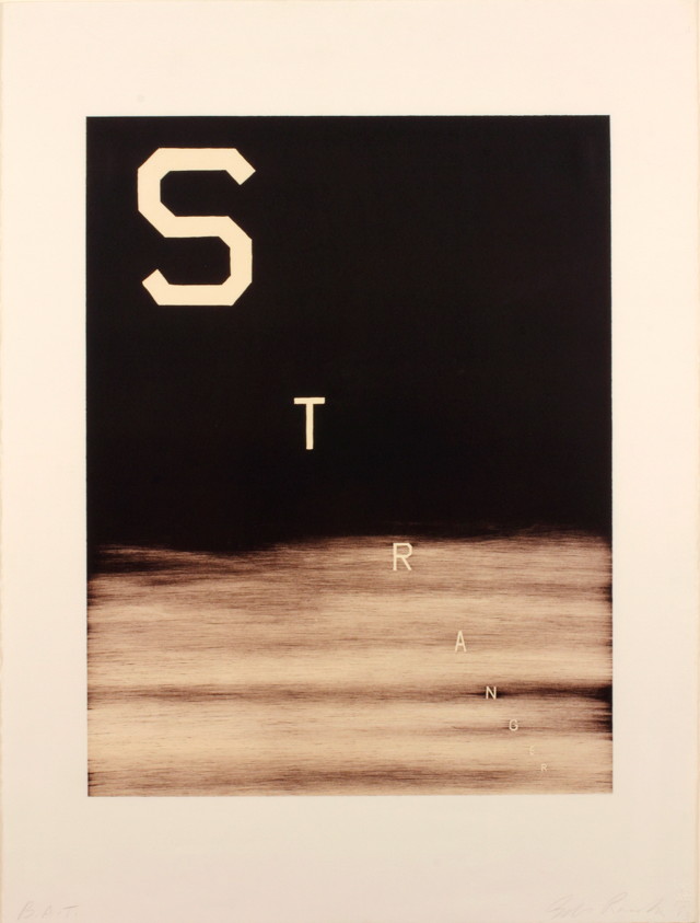
WOW – Work Of the Week – Ed Ruscha “Cash For Tools 2”
 |
||||
|
ED RUSCHA About This Work: Ed Ruscha is a well-known American artist who achieved recognition for artworks incorporating words and phrases, all influenced by the deadpan irreverence of the Pop Art movement. Indeed his textual art can be linked with the Pop Art movement but also with the Beat Generation as well. During the Cold War era, the rise of commercial advertising was a dominant force in American life. Consequently, the increasing importance of graphic design, the popularity of Hollywood and American cinema as well as the lights and the landscapes of the West Coast, provided the backdrop against which Ruscha developed his highly original iconography. Since the early sixties, Ed Ruscha has wittily explored language by channeling words and the act of communication to represent American culture. Language, in particular the written word, has pervaded the visual arts, but no other artist has the command over words as Ruscha. His works are not to be understood as pictures of words, but instead words treated as visual constructs. His idea plays into the very essence of Pop Art. Cash For Tools 2 is part of the Rusty Signs, series in which Ruscha uses words, that he considers as “neglected and forgotten signs from neglected and forgotten landscapes”. These Rusty Signs are reproduced in uncanny detail that blurs the line between the fictitious and the real. This artwork, as well as the whole series, is further expression of a consistent theme that runs throughout his work: the passage of time. We are confronted with the physical effect of time upon them, a blunt reminder of its inescapability, even on steel. Once again filtered through the language of common American objects, these prints appear to be rusted signs that read “DEAD END,” “CASH FOR TOOLS,” and “FOR SALE 17 ACRES.” Ruscha has chosen to produce multiple variations of these signs, giving the impression that they have been weathered by time in varying ways, as if they came from different locations or were subjected to a different set of circumstances. For example there are two versions of Cash For Tools and Cash For Tools 2 is more ruined and consumed than Cash For Tools 1. Some have gunshots and some are missing sections, while others appear to have acquired thick layers of rust and grime. In this way, each piece of the series seems to contain an independent story, their histories having literally formed their present state. The Rusty Signs series also marks a transformation of some of Ruscha’s aesthetic concerns; having painted and photographed signs and signage throughout his career, works such as Cash For Tools 2 signify the first time in which he is not merely representing the image of the sign, but actually recreating the sign itself. We no longer see a fictionalized representation but we actually see the sign itself, and its physicality is a part of its essence. At the same time, having been removed from context, they still share the sense of disconnection that permeates in many of his depictions of signs. Ruscha asks us to consider these components of visual culture as independent objects, as if their introduction into the world was not merely an accident or result of inevitable forces, but an act of creation, a work of art. Other works by this artist:
|
||||

WOW – Work Of the Week – Ahol Sniffs Glue “Untitled Layered #13”
 |
||||
|
AHOL SNIFFS GLUE About This Work: Ahol Sniffs Glue is a South Florida native street artist, well-known for his murals in the Wynwood neighborhood and on several buildings and walls in Miami. The main theme of Ahol’s work is based on the eyes. Eyes are the windows to the soul. The artist says that “The eyes tell all, they tear up and droop when sad, and light up when excited and happy. You can tell a lot about a person by looking into their eyes”. Getting inspiration from the urban environment, Ahol depicts expansive fields of drowsy eyes, reflecting his unique vision of life, labor and torn love of the streets of Miami. This topic is in line with the true concept of street art, which often tackles political, economic, social and every day issues that people face. Furthermore, Ahol’s artwork deals with his daily life of not just the hardships, but of the city he loves and calls home: Miami, a rich and complex tapestry of contrasting cultures. In Ahol’s work the use of pattern is, indeed, fundamental. The pattern is a combination of elements or shapes repeated in a recurring and regular arrangement. Since patterns can be considered a non-figurative representation, they can be used to convey spiritual principles or general concepts, in which they become potentially universal, as the meaning of the eyes. Untitled Layered #13 is the very first diptych by Ahol Sniffs Glue and it takes his eyes to a whole other dimension. The work is more abstract expressionistic. This work’s theme is developed through complex patterns, which can be divided in different categories based on the position of the eyes. This diptych is what is called Layered, since the eyes are depicted through different juxtaposed layers one on top of the other. In Untitled Layered #13, we have two panels worked with acrylics. The different colors, size and thickness of the eyes seem to be scattered randomly on the canvases, but they hide a precise order and a well thought out, balanced composition. A composition much like the streets of Miami and the people of this city. Ahol doesn’t like to give precise references to his artworks, leaving to the viewer a democratic freedom of interpretation. That is the reason why all his artworks are “Untitled”. Ahol’s work can be seen publicly throughout the streets of Miami. Countless murals of eyes adorn the buildings that inhabit the Magic City. His hypnotic expanses of sleepy eyes represent a landmark in the Miami street art scene and a symbol for all the people living in the city. His work is engaging, raw and represents a bridge between fine art and street art. But most of all, he represents Miami to the fullest.
Other works by this artist:  Untitled Layered #12, by Ahol Sniffs Glue  Untitled Overlay #18, by Ahol Sniffs Glue  Untitled Layered 17, by Ahol Sniffs Glue |
||||
Ahol Sniffs Glue In The News!
Congratulations to Ahol Sniffs Glue!
Vimeo says: “Biscayne World is among the world’s best videos”
Click here or on the picture to read the full article

Click here or on the picture to read the full article
For inquiries on Ahol Sniffs Glue artworks, contact the gallery at info@gsfineart.com
WOW – Work Of the Week – Indiana “Love Cross”
 |
||
|
ROBERT INDIANA About This Work: With his calculated use of specific words and numbers – the elements on which most of his work is based on, Robert Indiana’s art is often very complex, introspective, intellectual and cerebral. Indiana captures the complexity of life in the enigmatic intricacies of his compositions. He is a Pop artist but, from this particular point of view, he can also be considered fully conceptual for his hermetic style, which represents a little more than a way stop from the “lack of message and superficiality” of the Pop Art movement. Although the complexity of the meaning and the aesthetic of his work is simple and timeless, mathematics or geometry are the most important elements of inspiration both for his work and his life. Indiana’s art seems to state that his reasons and themes can not be contested, since he bases his work on such logical and unbiased elements. When talking about the aspect of the works, we can not ignore the role that colors play in his compositions. They vibrate to attract each other into a reconciliation of opposite forces. Indiana likes to create endless variations of his works and early themes, experimenting with different color schemes and compositional formats to achieve a wide range of visual and emotional effects. Bright colors, often basic and primary, and the use of words, make his artworks almost monotonous to the eye, but there is plenty of significance underneath. The beauty of Indiana’s is the beauty of taking one’s time to quietly look at something that is not new, but just part of someone’s daily life. It is the beauty of balance and harmony, contemplation and knowledge, the beauty of pure reflections translated in conceptual images. Robert Indiana’s Love Cross embodies all these concepts and features. His choice of the word “Love” recalls his memories of the motto “God is Love“, that he saw emblazoned on the Christian Science church of his youth. Containing both a universal meaning and a visually concise quality, “LOVE” provides him with the perfect synthesis of word and image. The Love Cross was made as an announcement for Indiana’s first one-man museum show at the Institute of Contemporary Art in Philadelphia, the City of Brotherly Love. The theme of Love has achieved recognition as universally familiar as the star and the cross (other two recurring elements in Indiana’s work), eventually becoming the most famous artwork by Indiana who, for this reason, has even been called “the man who invented Love“. This work reflects the artist’s involvement with the formal concerns of the Sixties abstraction, like the use of large areas of pure color, visual power of optical effects, serialization and consciousness of the edge. Indiana’s long-standing involvement with sculptural forms is clear in this cross-shaped work. A cross that is also, not by chance, symmetrical. Furthermore, since the square was his favorite symbol and a square is like a cross with extended borders, it is not difficult to imagine that this shape has been choose for a specific stylistic reason. This non-figurative composition is formed by the symbol/word LOVE, reflected in all the directions. The razor-sharp, hard-edge rigid lines help the viewer to focus not only on the red words, but also on the blue spaces between the letters, which create a visual pattern themselves. Indiana captures the complexity of life itself with simple lines, letters or numbers and flat colors. He helps us to decode life by emphasizing the most important things in it – like love. |
WOW! – Work Of the Week – Tom Wesselmann “Blonde Vivienne”
 |
||
|
TOM WESSELMANN About This Work: Considered by many to be a Pop artist, Tom Wesselmann would rather be called an artist of the post-Matisse era. His works recall Matisse, in a contemporary setting. It’s not hard to understand why categorizing Wesselmann is difficult. The use of erotic images against familiar backgrounds in his work, clean lines and the feel of kitsch exemplifies Pop art, but Wesselmann really never felt like his artwork was part of this artistic movement. Many people know Wesselmann for his nudes. He spent his whole life trying to paint and capture the Great American Nude. However, according to him, he was never able to achieve his goal. He started the Great American Nude series in 1961, where the nude becomes a depersonalized sex symbol set in a commonplace environment. As we can see by Blonde Vivienne, he emphasizes the woman’s hair, mouth neck collar and nipples of her breast, while the rest of the body is usually depicted in flat, unmodulated color or – this is the case – as an empty or negative space. The background is painted in the positive, supplies context and accentuates the negative. There are many different nudes by this artist but they all have one thing in common: when Wesselmann depicts a nude he is not clearly and loudly representing a subject, but he is alluding to and “sketching” a situation, a little gesture or a moment in time. The artist wants us to read into the situation and draw a conclusion for ourselves. Is the Blonde Vivienne sleeping? Is she feeling some kind of pleasure or is she just resting on the couch? The observer is free to choose a personal interpretation of the subject. This also may be the reason why he was so interested in the spaces in and around his drawings. He shifts the focus and scale of the standing objects around a nude; these objects are relatively small in relation to the nude, but sometimes they become major, even dominant elements. To add more mystery, every work is also painted at a particular and/or an unusual angle or point of view. By focusing on the situation, the angle and the details of the background, the viewer is able to imagine what the subject is going through or feeling. For example, in this particular work the viewer is looking at the Blonde Vivienne through a peephole, giving us a sort of voyeuristic point of view. Thus, Blonde Vivienne is a perfect example of showcasing the complexities of a Wesselmann painting. Pop elements occupying space in the positive giving focus to a Matisse like, modern day Odalisque in the negative, captured at a particular view or moment in time, causing the viewer to put it all into one context that he or she can envision for themselves. For more information and price please contact the gallery at info@gsfineart.com |
WOW! – Work Of the Week – Claes Oldenburg “Typewriter Eraser”
 |
||
|
CLAES OLDENBURG About This Work: Claes Oldenburg is an American sculptor, best known for his public art installations typically featuring very large replicas of everyday objects. This beautiful drawing represents a typewriter eraser, a recurring object in Oldenburg’s work. Why a typewriter eraser? Many of Oldenburg’s works depict mundane objects and, at first, they were ridiculed before being accepted by the art world – but they were also defined “brilliant”, due to the reaction that the pop artist brought to a “dull” abstract expressionist period. Oldenburg creates a distinctive order of objects. First, they are things made and utilized by human beings. Used, out-of-date or simply banal, they look rescued from oblivion by the artist. Isolated in a landscape or interior space and inflated in size, they are vulnerable giants. But they are not actual objects elevated to the status of art in the Duchampian tradition of the readymade. While recreating objects, Oldenburg alters their specifics, transforming them through changes in material, scale, context and exaggerations of forms that lend them more than one identity. A typewriter becomes also a tornado. When turned up right we see the eraser rolling towards us with the whiskers rustling in the air resembling a tornado. In this particular drawing of the typewriter eraser we see the subject in motion sweeping down the street like a tornado. Drawings like this are rare “little gems”, hard to find and representative of the soul of Oldenburg’s objects. Oldenburg’s drawings are continuous files of ideas from which major themes have developed. Drawings that he devotes to sculptural projects, imagined or real, appear as “proposals”. These drawings have an anecdotal character in cases where the sculpture is placed in new contexts. They chronicle the further adventures of a subject and track the creative and artistic process of this great artist. This drawing can be considered a generative tool for the large scale Typewriter Eraser, Scale X, constructed in 1999 and now located at the National Gallery Of Art Sculpture Garden, in Washington D.C. |
WOW! – Work Of the Week – Salvador Dali “Playing Cards”

Salvador Dali, Playing Cards are currently exhibited at the Gallery
About This Work:
These wonderful Playing Cards are the lithographic version of the real decks Dali produced in 1967 with publisher Puiforcat, which are now extremely rare and difficult to find.
Dalí created these designs for the Ace, King, Queen and Jack of each suit plus a Joker. He composed his playing card figures out of geometric shapes, like a surrealist tapestry, but retaining the traditional aspects of playing cards design.
The Playing Cards contain most of Dali’s icons and are presented in a whimsical playful fashion. They have a great appeal because, like the melting clocks, the visual aspect and content are catchy and clever. They play upon a subject which we are all familiar with. Dali takes the familiar and makes it surreal.
These cards are done masterfully and they are brilliantly arranged, offering a fantastic glimpse of Dali’s ultimate creative abilities. At first sight, the characters look like regular card figures, but looking closer it is evident that they are formed by several different objects – or partial objects. Among the pieces of the suite, we find an array of compositions, colors, traditional and non-traditional symbols. Each piece is like a puzzle that can only be put together by the greatest Surrealist of all time.
All the evident artistic references we can see in these lithographs are often intertwined with different unexpected meanings and hidden concepts.
Jack of Clubs
SALVADOR DALI
Playing Cards – Jack of Clubs
1972
Lithograph
25 3/4 x 20 in.
Edition of 150
Pencil signed and numbered
The Jack of Clubs has numerous surrealistic elements that define the meaning of “The Jack”.
Throughout the history of playing cards, the Jack has always had a sexuality identity crisis. Often depicted as an unambiguously feminine male, Dali takes note of this and creates the Jack’s hat with a royal looking swan emerging from it, as well as a weeping eye. The shield and sword stand out boldly as to hide the femininity but Dali masterfully adds one of his most iconic surrealistic elements to further his point, the bread.
“[Bread] has always been one of the oldest fetishistic and obsessive subjects in my work, the one to which I have remained the most faithful“. In his paintings, breads are most often an aspect of hard and phallic.
The Clubs are often referred to intellect, literature and education. This explains the presence of inkwells.
King of Clubs
 SALVADOR DALI
Playing Cards – King of Clubs
1972
Lithograph
25 3/4 x 20 in.
Edition of 150
Pencil signed and numbered
The King of Clubs is a king said to be one of great power but one who is not aware of this and is outwardly cheerful but inwardly reserved. Hence the bottom face is portrayed as a closed eyed-sleepy king.
The top face is made of surrealistic elements of nature. Bones for a nose, rocks for eyes and birds for eyebrows.
Another face can be seen to the left corner from the Club and lips.
The Crown has a stone castle showing strenght and royality.
Queen of Diamonds
 SALVADOR DALI
Playing Cards – Queen of Diamonds
1972
Lithograph
25 3/4 x 20 in.
Epreuve d’Artist (E.A.)
Pencil signed and numbered
Queen is painted with the classic colors of the iconic Maddalena, blue and red, and holds red roses, a classic symbol of beauty and femininity.
The Queen of Diamonds, viewed in one direction, has an interesting nose, mouth, and set of eyes – all composed, appropriately enough, of numbers: 8’s constitute her eyes, her nose is a 4, and 8’s again form her mouth.
Given his interest in alchemy and tarots, we are not able to exclude that Dali intentionally wanted to make a reference to the symbolism of numbers. The symbolism backing number Eight deals with continuation, repetition, eternity and cycles, while number Four invokes stability and the grounded nature of all things. Four is also half of Eight.
Turn the card upside down, the Queen’s eyes and mouth will be transformed into what might be described as a Picasso-like composition. Dali often nodded to other artists he admired, and Picasso was definitely one of them.
You’ll then notice a background figure of a girl skipping rope. This is a recurring, almost obsessive image in many Dali works, and it represents a reference to the famous illustrations he created for Lewis Carroll’s book “Alice In Wonderland“. It goes without saying that the artist made this reference in this particular card because one of the most important characters in the book is the Queen.
In the end, the double images were a major part of Dalí’s “paranoia-critical method”, which he put forward in his 1935 essay “The Conquest of the Irrational“. He explained his process as a “spontaneous method of irrational understanding based upon the interpretative critical association of delirious phenomena“. Dalí used this method to bring forth the hallucinatory forms, double images and visual illusions that filled his paintings. The artist termed “critical paranoia” a state in which one could cultivate delusion while maintaining one’s sanity.
Dalí’s career as a print maker lasted his entire life. In these prints we find some of Dalí’s most accomplished icons and images, and some of his best use of his imagination.