 |
||
|
TOM WESSELMANN About This Work: Tom Wesselmann was born on February 23, 1931 in Cincinnati, OH. In New York, he started earning his living by working as a cartoonist for several journals and magazines as well as by teaching at a high school in Brooklyn. Even though he disagreed with being labeled a “Pop” artist, Wesselmann’s work is considered belonging to the Pop art movement. During his artistic career, he experimented with materials and imagery; both collage and sculpture found their way into his assemblages. When he was not working on stylized female nudes (these works are actually what he is best known for), common objects were the main theme of his art work. This is the case of this work of the week, Wildflower Bouquet. Wildflower Bouquet is one of Wesselmann’s famous so-called Steel Drawings. With the invention of the Steel Drawings, Wesselmann began to focus more on drawing for the sake of drawing. For the first time he was approaching art on a new basis, where the scribble was the final product. The drawings that would be transferred into steel were selected carefully and their crisp outlines resonated with the immediacy of a neon sign. The drawings were usually the preliminary sketches to his other works, like paintings or prints. However, when making a comparison between the same image done in two different media, for example a steel cut-out and a painting, one can notice how the artist subtly played changes on his formal language in the treatment of the outlines, or in the spaces in between. Wesselmann was also deeply influenced by Matisse, who had long been a source of inspiration for him. In the metal works, Wesselmann can be understood to have devised his own equivalent to the paper cut-outs that had marked Matisse’s equally bold and life-affirming last phase. The steel drawings represent Wesselmann’s best-known technical innovation. Wesselmann’s Steel Drawings caused both excitement and confusion in the art world. After acquiring a piece in 1985, the Whitney Museum of American Art wrote to Wesselmann asking why he had labeled the work a drawing and not a sculpture. His response was that while he considered it a pure drawing, it was “an example of life not necessarily being as simple as one might wish”. |
Tag Archives: art
WOW – Work Of the Week – KAWS “Chum Running Pink”
 |
||
|
KAWS About This Work: Brian Donnelly, born in 1974, is a New York – based artist, professionally known as KAWS. In 1999 KAWS began to design and produce his first limited-edition vinyl toys with Japanese clothing brands and companies. That seemed to be the right country for the beginning of his career, because in Japan, the toys genre is well respected and widespread. KAWS’ work is characterized by repeating images, all meant to be universally understood, surpassing languages and cultures. He is greatly influenced by iconic characters from modern pop culture. KAWS uses four main characters: Companion, Accomplice, Chum and Bendy. They riff on Mickey Mouse, Bugs Bunny, the Michelin Man and a giant spermatozoa. Their relationship to Donnelly hovers somewhere between avatar, id, conscience and inner child. KAWS’ work treads the fine line between art, commerce, cartoons, and commercials. It distorts, yet at the same time, pays homage to, all the popular objects and icons produced, bought, sold, exchanged, desired, and cherished; the essence of American consumerism. His artworks transform iconic pop culture characters into thought-provoking works of art. His work possesses a sophisticated humor while employing a refined graphic language that revitalizes figuration with bold gestures, playful and cartoonish images. A graffiti artist, illustrator, toy-maker, sculptor and painter, KAWS is now a world-renowned artist, who exhibits in museums and galleries internationally. |
WOW – Work Of the Week – Jasper Johns “Voice 2”
 |
||
|
JASPER JOHNS About This Work: Born in Georgia in 1930 and raised in Allendale, South Carolina, Jasper Johns grew up wanting to be an artist. He studied briefly at the University of South Carolina before moving to New York in early 1950’s. Working in New York in the 1950s, Johns became part of a community of artists, including Robert Rauschenberg, that was seeking an alternative to the emotional nature of Abstract Expressionism. In the mid-1960’s, Johns executed a large painting and lithograph, both entitled Voice. He then returned to this theme in a very large, three-part painting called Voice 2, which he worked on from 1968 through 1971. With several different print versions of the canvas – this work, Voice 2, among them – Johns varied the colors and experimented with the placement of the rectangles making up each composition. The title of the work, which forms the imagery, can be read in a rotating cylindrical pattern. Johns has always been fascinated with numbers, letters and words. In this work, he plays with the letters of the word VOICE in a very personal way, superimposing the figures to create a multiple image, so that each time the eye adjusts to focus on a letter the spectator perceives a slightly different picture. These kind of works by Jasper Johns were extremely new to the museum goers and art lovers, especially at a time in which the art world was searching for new ideas. Johns is still one of most significant and influential American painters of the twentieth century, and also considered as one of the greatest printmakers of any era. |
WOW – Work Of the Week – Shelter Serra “Roley”
 |
||
|
SHELTER SERRA About This Work: Shelter Serra is an artist born in Bolinas, California, in 1972, nephew of post minimalist artist Richard Serra. Shelter Serra studied art at the University of California and then earned his MFA from the Rhode Island School of Design. His eccentric and nonconformist style gained attention in the New York art scene in 2009, when he started to transform objects into multimedia works that investigate the cultural status symbol. Although made in a wide range of materials and media, Shelter Serra’s work is based on only two core concepts: that art should be accessible to everyone and that art should reflect the desires and concerns of everyday people in everyday life. With his work, Serra tries to question our system of values, particularly concentrating on the concept of luxury and high-end society. He is known for his thought-provoking recreation of iconic objects that symbolize a cultural status, such as the Hermes Birkin bag or the Rolex, one of his most famous subjects, as seen here. Roley is an object that carries a determined cultural status. The image of the Roley is nothing but an irreverent representation of luxury, materialism, and consumption. By representing this seemingly mundane watch, Serra tries to question the functionality and the meaning, or lack there of, behind an expensive object. Serra created a plastic ‘Fake Rolex’, to be worn on the wrist. A homage to the ultimate watch of status. These Fake Rolex watches are basically the idea of replicating something and making it available to the everyday consumer. They can be bought for less than $40, clearly mocking the real Rolex and all its social and cultural meanings. The image of the Roley is one built on questions rather than based on ideas. By representing this worldwide recognizable object in a neutralized and homogenous form, the artist urges the spectators to rethink, and question their values, to discover the absence in an object that we value, and to reflect on the deeper cultural meaning of things and their social, economical or environmental aspects. |
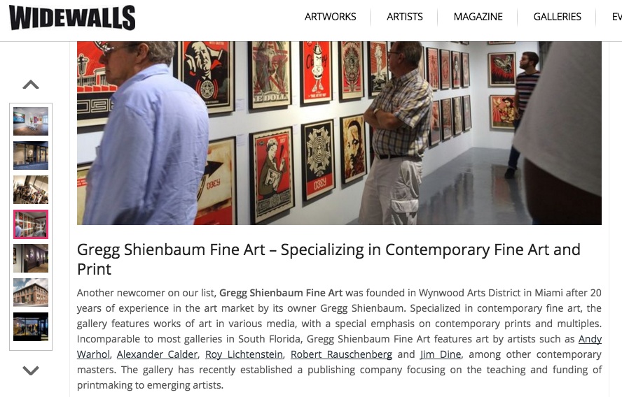
Gregg Shienbaum Fine Art featured on Widewalls
Click on the image below to read the article
Gregg Shienbaum Fine Art featured as one of the best Miami galleries on Widewalls
Click on the image below to read the article

WOW – Work Of the Week – Andy Warhol “Sidewalk FS II.304”
 |
||
|
ANDY WARHOL About This Work: Much has been said about Andy Warhol, his art and his decadent personality. Warhol’s fascination for fame and celebrities shows up in this work, that he masterfully simply calls Sidewalk. The image of this work is from a series of photographs taken by Andy Warhol himself. This image displays the handprints and signatures of Cary Grant, Judy Garland, Jack Nicholson and Shirley Temple, that are on the Hollywood Walk of Fame. |
WOW – Work Of the Week – Julian Opie “Walking In The Rain, Seoul”
 |
||
|
JULIAN OPIE About This Work: Julian Opie was born in London, where he currently lives and works. Movement has always been central to Opie’s full body of work, whether it is movement around and through the artworks or the movement of the artworks themselves. In 2015 Julian Opie was invited to participate in a show in South Korea, when he created Walking In The Rain, Seoul. “With the umbrellas included, the images became large and complicated with a layering of different movement from top to bottom. This was probably the most complicated picture I had managed to compose so far. The rainy season was over and when the rain came it was light and the weather was warm. The resulting image is very personal and unique in feel, mood and color. I usually make paintings in two or more sizes […] but I could not imagine such a complex image being small so instead of a smaller size I decided to make an editioned silkscreen print on paper“. The humongous size and the strong color palette create a Pop allure, while the bold black contour lines make each element of the composition stand out. Depicting human figures has always been a challenge for artists. However, Opie managed to find a new, original, personal way to represent people. His extremely recognizable style have gained him a place among the most famous contemporary artists of our time. |
WOW – Work Of the Week – Frank Stella “Del Mar”
 |
||
|
FRANK STELLA About This Work: Frank Stella first emerged on the scene in the late 1950s, when his Minimalist Black Paintings heralded a new era in postwar art. In the years since then, he has worked consistently in series, pioneering new approaches to form, color, narrative, and abstraction with innovative paintings, prints, sculptures and architectural installations. Stella moved to New York in 1958, after his graduation at Princeton University. He still lives and works in New York, and he is one of the most well-regarded postwar American painters still working today. In 1970, at the age of 34, Frank Stella became the youngest artist ever to receive a full-scale retrospective exhibition at the Museum of Modern Art, New York. He received a second retrospective at the same institution in 1987 — an unprecedented occurrence in the museum’s history. The story of Stella’s artistic development is the story of ever-increasing visual complexity. When he burst upon the art world at the end of 1959, it was with a series of large rectangular canvases painted entirely in a dull black enamel. The surface of each painting consisted of a simple geometric pattern — uniform chevrons, for example, or interlocking rectangles — that was formed by thin, slightly wavering lines of unpainted canvas. There was no color, no contrast of forms or materials, no illusionistic depth or drawing. As Stella put it in an often-quoted interview from 1964, in those paintings “what you see is what you see”. Stella creates abstract artworks that bear no pictorial illusions or psychological or metaphysical references. He began to produce works which emphasized the picture-as-object, rather than the picture as a representation of something, be it something in the physical world, or something in the artist’s emotional world. His controlled colors, flat surfaces and rigid forms are once again the main features of his Race Track Series. This work, as well as his others from this period of Stella’s career, can be seen to have inaugurated the Minimalist movement in art. Stella’s attempt to pare down painting, to purge it of extraneous gesture, warmth, and emotion made his work appear almost as a species of anti-painting, an inversion of everything that painting stood for and expressed. Del Mar is part of a set of three large-scale, oblong prints, from the Race Track Series. These screen prints are named after two horse-racing tracks in Los Angeles, titled “Del Mar” and “Los Alamitos”, and one in Mexico, titled “Agua Caliente”. Printed on heavy rag paper, the centered, concentric tracks receive their visual immediacy and variety from lively color harmonies, saturated deposits of inks and contrasts of matte, glossy and standard ink surfaces. With a career extended across more than half a century, Stella both holds an important place in the history of American art and maintains contemporary relevance as his work continues to influence younger generations of artists. The art market has seen an increase in demand and in auction prices in the print work of Frank Stella over the last few years. Much of this is due to the nature and importance of his work conceptually as a response to the art movement before him. His retrospective at the Whitney Museum of American Art in New York earlier this year, and the fact that he is 80 years old, have also brought more attention to his print work as well. |
WOW – Work Of the Week – Damien Hirst “Methyl Phenylsufoxide”
 |
||
|
DAMIEN HIRST About This Work: “There are four important things in life: religion, love, art and science. Of them all, science seems to be the one right now. Like religion, it provides the glimmer of hope that maybe it will be all right in the end” – Damien Hirst Damien Hirst has become one of the most prominent artists of our times. Throughout his work, Hirst investigates and challenges contemporary belief systems, and dissects the tensions and uncertainties at the heart of human experience. Hirst explores the complex relationship between art, life, death and religion. His work calls into question our awareness and convictions about the boundaries that separate desire and fear, reason and faith, love and hate. Methyl Phenylsufoxide is part of the spots series. The idea behind this work is completely based on color. Hirst studied color theory as every art student does. Color theory began in the 18th century with Issac Newton, who came up with a practical guidance to color mixing and the visual effects of a specific color combination. Hirst applies Newton’s theory of color to the spots and pairs them with the effect of the specific drug, by arranging the colors in a well calculated pattern and combination. The result is that, when viewed, the viewer subconsciously feels like he/she would feel if he/she took that specific drug. Hirst explains that “…mathematically, with the spot paintings, I probably discovered the most fundamentally important thing in any kind of art. Which is the harmony of where color can exist on its own, interacting with other colors in a perfect format”. Hirst’s spots are amongst his most widely recognized works, with the Pharmaceutical Series being the first and most prolific of the 13 spots sub-series. After having started with paintings, Hirst slowly refined his creative process. Any physical evidence of human intervention – such as the compass point left at the centre of each spot – was removed, until the works appeared to have been constructed mechanically. This is the reason why the printing process suits the spots even better than the painting technique. It is pretty incredible how the images of the spots seem so simple, at the same time representing the product of such complex artistic concept and study. In 2012, Gagosian gallery exhibited over 300 spot paintings in all their 13 galleries worldwide. The artist explained that the idea of an installation of multiple spot paintings, “it’s an assault on your senses. They grab hold of you and give you a good shaking. As adults, we’re not used to it. It’s an amazing fact that all objects leap beyond their own dimension”. |