|
||
|
ALEXANDER CALDER About This Work: Alexander Calder (1898 – 1976) is one of the most celebrated artists of the 20th century. Subsequently, upon moving to Paris in 1926, Calder began creating large-scale mechanical installations of intricate circus scenes, featuring wire sculptures with moving parts that he would operate over a two-hour performance session. Building off of his so-called Cirque Calder, he began sculpting portraits and figures out of wire, and received critical attention, exhibiting these works in gallery shows in New York, Paris, and Berlin. While in Paris, he befriended several important Abstract artists, including Joan Miró and Piet Mondrian, and was invited to join the group Abstraction-Création in 1931. Many of Calder’s works on paper and his printwork are studies, tests and theories about his sculptures. As Calder’s sculptures moved into the realm of pure abstraction in the early 1930s, so did his works on paper and prints. The thin lines used to define figures in the earlier prints and drawings began delineating groups of geometric shapes, often in motion. This work from the portfolio Our Unfinished Revolution, is a two-dimensional insight into Calder’s three-dimensional world. Alexander Calder has had several retrospectives, and, among many other awards, was honored with the Presidential Medal of Freedom and the Bicentennial Artist Award from the Whitney Museum of American Art in New York City in 1976. The Guggenheim Museum showed a retrospective of his work in 1964. |
Tag Archives: americanart
WOW – Work Of the Week – Robert Indiana “American Dream #5”
 |
||
|
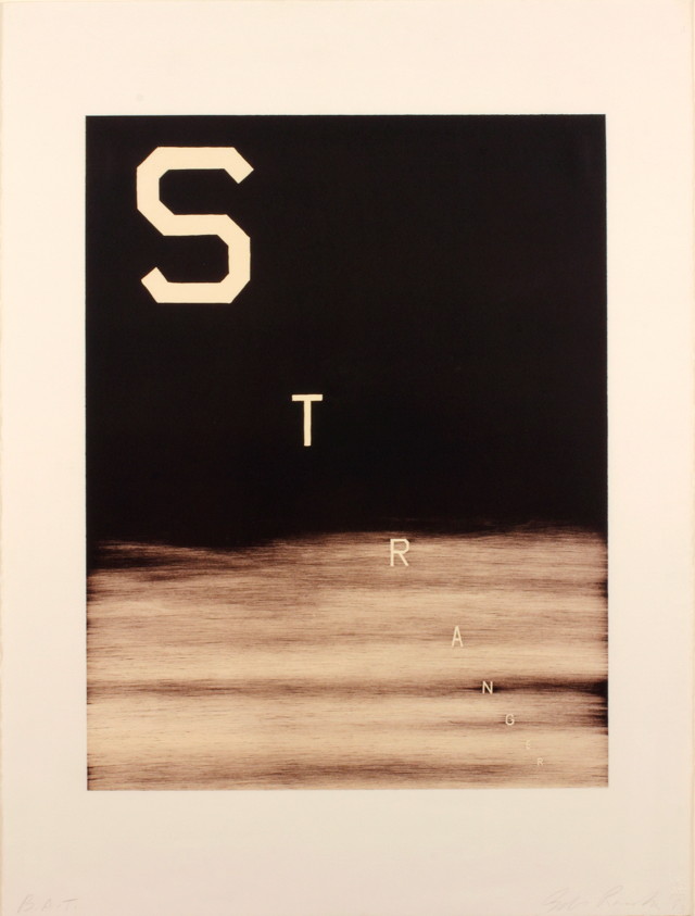
ROBERT INDIANA About This Work: “Among the rain Robert Indiana is one of the original 6 American Pop artists who, back in the 1970s, literally changed the world of art. Subsequently, he moved to Vinalhaven, a place that has acquired an allure of almost mystical isolation, throughout the years. Here Indiana has retired from the world since 1978, although still actively working and producing art. In 1964, when he was still living in New York City, Indiana moved from his first place, a building called Coenties Slip, to a five-story building in the Bowery. In 1969, he began renting the upstairs of a building called “The Star of Hope”, in the island town of Vinalhaven, Maine, as a seasonal studio, from the photographer Eliot Elisofon. This place was wider and very functional for his big works. Half a century earlier, Marsden Hartley, the main source of inspiration for Indiana’s Hartley Elegies suite, had made his escape to the same island. When Elisofon died, Indiana moved in full-time. Indiana’s work often consists of bold, simple, iconic images, especially numbers and short words. His best known example is LOVE, used in countless paintings, prints and sculptures. American Dream #5 is not only referring specifically – through its title – to another painting by another major American painter, Charles Demuth, but it is also a pictorial hymn to a poem by William Carlos Williams, that inspired Demuth himself. Charles Demuth painted a work titled I Saw The Figure 5 In Gold, inspired by Williams’ poem The Great Figure. The poet, in turn, was inspired by seeing a fire truck passing down the street at full speed, with a big gold silhouette of a 5 on the background. One can clearly see the shades of gray that make stand out the other bright and strong colors. The geometrical shapes of stars and circles, and the progressive size of the figure 5, create an optical illusion of movement and speed, making the figure 5 pop and vibrate off the paper as the view stares at it. This chain of poetical and pictorial allusions is enriched in this work by a whole other chain of references to birth or death dates that form a web of intricate numerological references based on various coincidences: Demuth’s painting is dated 1928 – also the year of Indiana’s birth. Indiana’s painting is dated 1963 – also the year of Carlos Williams’ death. The succession of rows of three 5s suggests the figure 35: Demuth died in 1935. This succession of 5s is also describing the sudden progression of the firetruck in the poet’s experience. American Dream #5 itself is composed like a poem, and its cruciform shape remains Indiana’s unmistakable mark. The monosyllabic words like EAT, HUG, ERR, DIE, also belong to Indiana’s own poetry. Again, here autobiography occupies an important role as well: EAT & DIE refer to his mother’s last word before she died. American Dream #5 is Indiana’s most impressive and important work. The poetical, numerological, biographical associations embedded in this work make this jazzy though straightforward artwork one of the most complex works of Indiana’s career and in American Pop art. |
WOW – Work Of the Week – Andy Warhol “Portraits Of The Artists”
 |
||
|
ANDY WARHOL About This Work: Andy Warhol was the most successful and highly paid commercial illustrator in New York even before he began to make art destined for galleries. Neverthless, his screenprinted images of Marilyn Monroe, soup cans, and sensational newspaper stories, quickly became synonymous with Pop Art. Pop Art marked an important new stage in the breakdown between high and low art forms. Warhol’s paintings from the early 1960s were important in pioneering these developments, but it is arguable that the diverse activities of his later years were just as influential in expanding the implications of Pop Art into other spaces, and further eroding the borders between the worlds of high art and popular culture. Andy Warhol is now considered one of the most influential artists of the second half of the 20th century, who created some of the most recognizable images ever produced. Warhol was part of a very exclusive group of artists that the famous and influential New York dealer, Leo Castelli, represented. In 1967 Warhol created Portraits of the Artists, a work that depicts the portraits of 10 artists chosen and represented by Castelli. Sticking with Warhol’s signature style of repetition, he multiplied the artists’ portraits ten times in ten different colors on 3-D polystyrene boxes, each measuring at approximately 2 x 2 inches. The 100 boxes totaled to approximately 20” x 20” when lined up. The artists include Robert Morris, Jasper Johns, Roy Lichtenstein, Larry Poons, James Rosenquist, Frank Stella, Lee Bontecou, Donald Judd, Robert Rauschenberg and Andy Warhol himself. Warhol used the power of the portrait to bring forth the idea of America’s infatuation with celebrity, and the effects of the celebrity in our culture. Pop culture was not only just about Coca Cola bottles, Campbell’s Soup Cans, and Brillo boxes, but also about taking TV, film, music, or literary personalities and exploiting the concept of celebrity. What a better way to pay homage and respect to the most important artists of the time by having Andy Warhol create a work of art that said so much about the artist’s influence on our culture, with just their portraits. No words were needed. The use of repetition is also typical of Andy Warhol. Warhol used silkscreen as his medium of choice. It served as a way to remove the hand of the artist in art, a concept Marcel Duchamp introduced to the art world in the early part of the century. Warhol’s biggest influence in art was Duchamp. Repetition also allowed the artists to further their concepts, by reaching a greater amount of people. Printmaking was the best way to achieve this. By making multiples of a work, more people can own the work, sell the work, and are exposed to the work. It was this marketing that led to Andy Warhol becoming a celebrity himself. |
WOW – Work Of the Week – Andy Warhol “Louis Brandeis”
 |
||
|
ANDY WARHOL About This Work: In 1980 Andy Warhol produced a suite called Ten Portraits of Jews of the 20th Century. This series appeared at the Jewish Museum that year for the first time. To create this portfolio, Warhol followed his usual procedure for portraits, silk-screening a photograph over previously applied colors and tracing crayon-like lines over the photograph’s contours. The underlying vivid colors are broken up into flat, geometric compositions, creating a mild tension between abstraction and photographic representation. The ten subjects of the series were more than just celebrities. They were all people of great accomplishment. But the real subject in this portraits is Fame. Warhol was obsessed with the concepts of fame and publicity and he was interested in famous people because they were famous. What the series reflects is the distinctively modern experience of knowing many famous people but rarely knowing in any depth what they are famous for. For example, lots of people know the name Gertrude Stein, but how many have actually read anything she wrote? The Ten Portraits Of Jews Of The 20th Century are renowned luminaries of Jewish culture. They are:
The collective achievements of this group changed the course of the twentieth century and may be said to have influenced every aspect of human experience. About Louis Brandeis: Louis Brandeis was an American lawyer. He was born in Louisville, Kentucky, to Jewish immigrant parents. He was the first jewish lawyer to enter the Supreme Court and his work has been fundamental in building some of the most important legal concept of all times, such us the right to privacy, the freedom of speech and the regulation of big corporations and monopolies. Being heavily socially involved and sincerely willing to help people, he used to work for free a lot of times and for this reason he eventually gained the name of “People’s Lawyer”.
|

WOW – Work Of the Week – Lichtenstein “Reflections On Minerva”
 |
||
|
LICHTENSTEIN About This Work: Pop Art draws upon the style and imagery of advertising and popular culture to challenge our preconceptions about the nature of art itself. Roy Lichtenstein not only was a New York Pop Art painter, but also one of the first American Pop artists to achieve widespread notoriety. His very personal and unique style derived from comic strips which portray the trivialization of culture, endemic in contemporary American life. Using bright, strident colors and techniques borrowed from the printing industry, he ironically incorporates mass-produced emotions and objects into highly sophisticated references to art history. This is the case of Reflections On Minerva. Lichtenstein has often explored the theme of Reflections, incorporating them in various paintings and several print series. In 1988 Lichtenstein began working on a group of Reflections paintings, in which the central image is partly obscured by reflective streaks, as if behind glass or reflected in a mirror. Reflections On Minerva can be considered an iconic work, since it is a perfect example of Lichtenstein’s style. A style made of primary colors – red, yellow and blue, heavily outlined in black. Instead of shades of color, he used the ben-day dot, a method by which an image is created, and its density of tone modulated, through the position and size of a myriad of dots during the printing process. The original source for this Reflections print was the November-December 1948 edition of the comic book ‘Wonder Woman’, illustrated by Harry G. Peter. The eponymous super-heroine is shown with a speech bubble exclaiming her catchphrase, ‘Merciful Minerva!’. Wonder Woman regularly invoked the Roman goddess Minerva, who was traditionally known as the goddess of wisdom but also encompassed the arts, trade, poetry, and later, war and power. Despite the title of this work, Reflections On Minerva, the “reflections” are the real protagonists of this work. They are formed by portions of the print striped or dotted and layered upon the image of Minerva, which is drawn with the simple lines typical of comic strips. The theme of reflection is a very important one for Lichtenstein.
Other works by this artist:
 Landscape With Boats  Painting On Blue And Yellow Wall  Mirror #7
|
WOW – Work Of the Week – David Hockney “Hat On Chair”
 |
||
|
DAVID HOCKNEY About This Work: David Hockney is considered not only an important contributor to the Pop Art movement of the 1960s, but also one of the most influential British artists of the 20th century. During his artistic career, Hockney has produced a wide range of artworks making use of several techniques, but he has always worked on portraits. From 1968, and for the next few years, he painted friends, lovers, and relatives. This is the case of Henry Geldzahler. Henry Geldzahler was the first curator of 20th-century art at the Metropolitan Museum and New York City’s Commissioner of Cultural Affairs. His personal relationships with many of the artists selected for his exhibitions gave him special insight into their works. Andy Warhol himself produced a 90-minute film consisting nothing more than Geldzahler smoking a cigar. His written work focused exclusively on contemporary artists and much of his writing is more criticism than art history. Hockney’s Hat On Chair is one of ten works in the The Geldzahler Portfolio, published in 1998. Other artists that contributed to this portfolio are Jasper Johns, Roy Lichtenstein, James Rosenquist, David Salle, and Frank Stella among others. Dennis Hopper even contributed a photograph of Geldzahler, Warhol, and Hockney smoking. Hockney’s Hat On Chair is one of the most interesting. It is an etching of a Panama hat and bow tie on a chair. Hockney often painted chairs. To Hockney, the Panama hat and bow tie represented the most iconic images Henry Geldzahler, so he preferred to realize such a portrait instead of a “regular” face. In this sense Hockney’s own presence is implied here, since this very personal way to portrait Henry Geldzahler suggests the artist’s unique point of view and sensitivity. |
WOW – Work Of the Week – Ed Ruscha “Cash For Tools 2”
 |
||||
|
ED RUSCHA About This Work: Ed Ruscha is a well-known American artist who achieved recognition for artworks incorporating words and phrases, all influenced by the deadpan irreverence of the Pop Art movement. Indeed his textual art can be linked with the Pop Art movement but also with the Beat Generation as well. During the Cold War era, the rise of commercial advertising was a dominant force in American life. Consequently, the increasing importance of graphic design, the popularity of Hollywood and American cinema as well as the lights and the landscapes of the West Coast, provided the backdrop against which Ruscha developed his highly original iconography. Since the early sixties, Ed Ruscha has wittily explored language by channeling words and the act of communication to represent American culture. Language, in particular the written word, has pervaded the visual arts, but no other artist has the command over words as Ruscha. His works are not to be understood as pictures of words, but instead words treated as visual constructs. His idea plays into the very essence of Pop Art. Cash For Tools 2 is part of the Rusty Signs, series in which Ruscha uses words, that he considers as “neglected and forgotten signs from neglected and forgotten landscapes”. These Rusty Signs are reproduced in uncanny detail that blurs the line between the fictitious and the real. This artwork, as well as the whole series, is further expression of a consistent theme that runs throughout his work: the passage of time. We are confronted with the physical effect of time upon them, a blunt reminder of its inescapability, even on steel. Once again filtered through the language of common American objects, these prints appear to be rusted signs that read “DEAD END,” “CASH FOR TOOLS,” and “FOR SALE 17 ACRES.” Ruscha has chosen to produce multiple variations of these signs, giving the impression that they have been weathered by time in varying ways, as if they came from different locations or were subjected to a different set of circumstances. For example there are two versions of Cash For Tools and Cash For Tools 2 is more ruined and consumed than Cash For Tools 1. Some have gunshots and some are missing sections, while others appear to have acquired thick layers of rust and grime. In this way, each piece of the series seems to contain an independent story, their histories having literally formed their present state. The Rusty Signs series also marks a transformation of some of Ruscha’s aesthetic concerns; having painted and photographed signs and signage throughout his career, works such as Cash For Tools 2 signify the first time in which he is not merely representing the image of the sign, but actually recreating the sign itself. We no longer see a fictionalized representation but we actually see the sign itself, and its physicality is a part of its essence. At the same time, having been removed from context, they still share the sense of disconnection that permeates in many of his depictions of signs. Ruscha asks us to consider these components of visual culture as independent objects, as if their introduction into the world was not merely an accident or result of inevitable forces, but an act of creation, a work of art. Other works by this artist:
|
||||