Work of the Week! WOW! Damien Hirst – Mickey and Minnie Mouse


Damien Hirst
Mickey & Minnie
2016
Silkscreen and glitter
Available in the following sizes:
34 1/2 x 27 1/2 in. each
Edition of 150
60 x 48 1/4 in. each
Edition of 50
Pencil signed and numbered on verso


About the work:

Mickey and Minnie Mouse are probably the most iconic duo of Pop culture. Developed as the official mascot of the Walt Disney Company, in the 1920’s, Mickey’s celebrated status and universal appeal has inspired many artists to depict his likeness, very few however, have also created Minnie.

This week’s Work of the Week! WOW! are Mickey and Minnie by Damien Hirst.

The key defining factors of both Mickey and Minnie Mouse are the three circles that form their head and ears. It seems only fitting then, that the Walt Disney Company would approach Damien Hirst, widely known for his spot paintings, to create his own take on the beloved characters.

Hirst initially painted Mickey in household gloss on canvas in 2012, with a white background, auctioned at Christies to raise money for Kids Company, a children’s charity. The work sold for close to 1 Million Pounds and led to the creation of “blue glitter” Mickey and “pink glitter” Minnie.

Both figures are created solely by the use of circles, striking compositions reducing the mischievous mice to their basic elements, capturing their essence through shape and color. Even in their reductive states, Mickey and Minnie are such powerful icons that they remain highly identifiable and universally recognized. Mickey only required 12 spots and Minnie 19, attesting to the power of Hirst’s style and composition.

Both pieces are entirely covered in glitter which enhances the timeless star-power of the enduring and beloved personalities of Mickey and Minnie.

Work of the Week! WOW! SHEPARD FAIREY – Love Unites


Shepard Fairey
Love Unites
2008
Screenprint
36 x 24 in.
Edition of 450
Pencil signed and numbered


About the work:

Shepard Fairey is a known activist. He became a household name in 2008 for the Hope image he created for then-candidate Obama. In California, on the same ballot that elected President Obama, Proposition 8 (commonly referred to as Prop 8), a state constitutional amendment, was passed. The passing of Prop 8 overturned the California Supreme Court’s ruling, from the same year, that same-sex couples “have a constitutional right to marry.” As an activist, Fairey became swiftly engaged in the cause to “Defend Equality.”

This week’s Work of the Week! WOW! is Love Unites.

Love Unites was specifically designed for the marriage equality movement called “Defend Equality” and became a symbol of the post-Proposition 8 struggle. The work was released by Shepard Fairey’s studio only 13 days after the November 4, 2008 vote, and just one day ahead of the rallies held in Hollywood and Highland. All of the proceeds from the sales were donated towards efforts to achieve marriage and LGBTQ equality. The image Fairey created was inspired by the work of Aaron Harvey, a campaign image to promote a “No” vote to Prop 8.

Aaron Harvey Campaign Poster

California first explicitly defined marriage as a state between a man and woman in 1977. In 2004, San Francisco Mayor Gavin Newsom allowed same-sex marriages in his city, which were subsequently annulled. This led to the May 2008 California Supreme Court ruling, by a 4-3 vote, that same-sex couples had the “constitutional right to marry,” which was overturned by Prop 8.

Numerous lawsuits, protests and demonstrations challenged the proposition’s validity. It wasn’t until August 4, 2010 that United States District Court Judge Walker, ruled in the case of Perry v. Schwarzenegger, that Prop 8 violated both the “due process” and “equal protection” clauses of the US Constitution. The appeals process continued the stay until February 7, 2012, when the Ninth Circuit Court of Appeals panel affirmed Walker’s ruling of Prop 8 to be unconstitutional.

Love Unites is the symbol of the almost 8 year process from the time that Mayor Newsom allowed same-sex marriages, through to the Appeals Court ruling the Prop 8 constitutional amendment void.

Work of the Week! WOW! WIFREDO LAM – Lune Haute, from Pleni Luna


Wifredo Lam
Lune Haute, from Pleni Luna
1974
Lithograph
25 1/2 x 19 3/4 in.
68/262
Pencil signed and numbered


About the work:

“My painting is an act of decolonization, not in a physical sense, but in a mental one” the Cuban artist Wifredo Lam stated in 1980.

Lam belonged to an extraordinary generation of artists who examined the place of the individual within twentieth-century society, marked by political conflict and the legacy of colonialism. His work was revolutionary in defying cultural hierarchies and classifications through its emphasis on Afro-Caribbean culture. He was part of the surrealist movement, which encompassed visual and written art forms exploring the creative potential of the unconscious mind.

In his later years Lam was a prolific printmaker, often collaborating with poets who were longstanding friends. This week’s Work of the Week! WOW! is the Lune Haute, from Pleni Luna, inspired by poet Jose Pierre’s poem Lune Haute.

From his transatlantic experiences, Lam derives elements of Cubism, Surrealism, the fantastic images from Caribbean voodoo, African sculpture, and images of Santeria. These are all features which can be seen in his Lune Haute.

Lune Haute reflects Lam’s genius with line and shape, evocative of his friend Picasso’s strong influence on his work. This work explores the transformation of the human figure into a fantastic entity, a powerful psychological tension, reflective of twentieth century socio-geo-political tensions.

Lam combined his influences and created a unique style, characterized by the prominence of hybrid figures. He sought to portray and revive the Afro-Cuban spirit and culture by overlapping the numerous styles that he encountered through his extensive travels, all blended in a Surrealist atmosphere, as an act of decolonization.

Work of the Week! WOW! JASPER JOHNS – Untitled 1977-1980


Jasper Johns
Untitled 1977-1980
Lithograph
34 1/4 x 30 1/4 in.
Edition of 60
Pencil signed, dated and numbered


About the work:

In the mid 1950s Jasper Johns, one of America’s most renowned artists, began experimenting with symbolism in the form of flags, targets, numbers and text in his work. His use of symbols was in stark contrast to the predominant introspective abstract style at the time. Johns’ formula examined representation, revealing the ways in which the art object itself expresses meaning.

In representing symbols, that were not usually represented in high-art, Johns challenged the viewer to see something new, to question accepted conventions and be inquisitive as opposed to complacent, transforming the ordinary into rich visual objects. He explored the impact of changes in color, scale, sequence, and medium, favoring subjects that “the mind already knows” but overlooks.

This week’s Work of the Week! WOW! is Untitled 1977-1980, a work that encompasses 3 recurring symbols of Johns’ body of work: the device, text and numbers.

This work came to be by Johns’ famously use of Savarin cans to hold his paintbrushes. One day while looking at the can, Johns realized that the label printed and affixed to the cylindrical can, transformed from a flat sheet when wrapped around the form. The label runs around the form in a continuous band suggesting that some of Johns’ work can be seen from the same perspective.

Starting with the two half circles that create most of this image, the easiest interpretation can be that these half circles represent the actual Savarin can, which in one way it does. However, upon a deeper interpretation of work, we come to see many different representations of these half circles.

These circles were created by a device that Johns invented by which he attached rulers to each side of a wood frame, and used the rulers as a pendulum which will spread the paint over the work in a semi-circle. This device removes the hand of the artist, and forces us to see the artwork for what is it, and not for who painted it. It bears a Duchamp like quality, an idol and huge influence on Johns.

The two-dimensional nature of the sheet, plays into what the mind already knows, but overlooks. Although divided in half, appearing in reverse order in the representation, the stroke that the rulers create look like the bottom of the cylinder Savarin can, and when the paper is rolled with the two edges touching, the two half circles create the single image of the cylinder. The composition of the piece is extracted from an everyday object transformed into art.

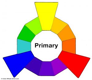
Written words are where the worlds of thought and representation meet. The use of text automatically invites the viewer to read from top, left to right, downwards (which “the mind already knows”), giving the work the preconceived notion of direction. The words and colors red, yellow and blue take on meaning of their own, as primary colors they are the foundation on which all other colors are created.

This is addressed in the lower portion of the work. As previously stated, in considering this work as a flat cylinder the edges are supposed to connect as if three-dimensional. In connecting the two edges of the sheet, the color wheel takes shape. In the numerals portion, the blue at the extreme left is separated form the green at the extreme right. In between, we have the additional colors and shades completing the color wheel.

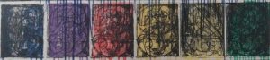
The numbers represented in the color wheel at the bottom of the work address perception and representation. Each number from 0 to 9 is superimposed one over the other, scaled to fill the delineated space in 6 rectangles. While each number is visible, each is difficult to discern individually. Their forms are created from stencils, further challenging perceptions between the connection of high-art with the banal.

Johns’ transformation of everyday symbols into art objects reflects his interest in the nature and connections between “what the mind knows” and what the eye sees. His technical expertise in exploring these concepts results in this stunning and captivating work.

In the Fall of 2020, both the Whitney Museum of American Art and the Philadelphia Museum of art will be collaborating with the artist in an unprecedented joint retrospective of Jasper Johns’ career.

Work of the Week! WOW! FRANK STELLA – Polar Coordinates VII Hand-Painted Trial Proof


Frank Stella
Polar Coordinates VII (hand-painted trial proof)
1980
Mixed media – lithograph and screenprint in colors with hand-coloring in tempera, acrylic metallic paint, gouache and crayon
38 x 38 1/2 in.
Unique
Pencil signed & dated


About the work:

Frank Stella is widely known for his concern with geometry, precision and rationality that characterize Minimalism. By the late 1970’s, his work had evolved to become more complex with visible brushstrokes and experimentation with combinations of shapes, colors and printing techniques. Despite his progression towards more dynamic work, the grid base of Stella’s earlier creations remained an integral element of his style.

This week’s Work of the Week! WOW! is Polar Coordinate for Ronnie Peterson – VII, a hand-painted, mixed media unique work, of which only 5 unique pieces were ever made.

The Polar Coordinates series is dedicated to his friend Ronnie Peterson who was a Swedish auto racer. During the time Stella was working on the series, Ronnie Peterson died at the Grand prix at Monza in September 1978. The theme of racing is one that would appear again in Stella’s Circuits series and Race Track series.

In his reinterpretation of the polar coordinates, Stella activates the graph paper to become lively and vibrant, a spinning energy evocative of the momentum of racing.

The title of the series stems from mathematical polar coordinates graph paper, which consists of lines emanating from a central point. Each print from the Polar Coordinates series was created from multiple layers of screenprinting and lithography. The lithographic plates determined the grids, outlines of the shapes and rapid line drawing in the form of superimposed netting. Photoscreens created from washes and crayon drawings on Myalr were used for the tonal backgrounds and flatter colors, including the metallic inks and GitterFlex.

This hand-painted mixed media version, available from Gregg Shienbaum Fine Art, differs from the regular edition in various ways. Firstly, the metallic silver is hand-applied by the artist without certain of the superimposed lithographic rapid line drawing elements. Secondly, the two bisected quatrefoils which create the image, are hand-painted in different colors and with differing elements of rapid line drawing. In some instances, Stella removed some of the rapid line drawing and in other instances added them to this image. These mixed-media hand-painted versions were Stella’s color trial proofs and studies that eventually led to the regular edition of Polar Coordinate VII.

An interesting addition to the series and further tribute to Ronnie Peterson is a BMW which was hand painted by Stella in 1979 as a custom work for another race car driver and close friend, Peter Gregg.

Work of the Week! WOW! DINO MARTENS – Oriente Olaf Vase, Model 3122


Dino Martens
Oriente Olaf Vase, model 3122
Aureliano Toso
Italy, 1952-61
internally decorated polychrome patchwork glass with copper inclusions, pinwheel and filigrana
15 h x 6 dia in.

Literature: Dino Martens: Muranese Glass Designer, Heiremans, pg. 70 illustrates model

Private Collection of Gregg and Jennifer Shienbaum


About the work:

Art glass created by Dino Martens is some of the most recognizable Murano glass from 20th century Italian art. His innovative use of bright metallic colors using huge murrini (glass rods with colors or images in them) and fantastical shapes make Dino Martens one of the great creators of modern art.

Martens was born in Venice in 1894. He went on to study at the Accademia di Belle Art, where he developed his skills as a painter. He exhibited in Venice as a young man in the 1920’s and by the end of the decade was a designer for Salviati & Co, a leading glass maker. After fighting in the African War, he took up the position of artistic director at Aureliano Toso. They were a famous Venetian glass maker where Dino became a legend. There he experimented with creating astounding designs that pushed the boundaries of what was possible with glass.

A great example of one of these legendary designs is his Oriente series. A vase from this series encapsulates the energy and vibrancy of his work and life. He played with form and color, putting unusual colors close together and playing them off each other. All the while intriguing the eye with almost biological shapes.

This weeks WORK OF THE WEEK (WOW!), is the Olaf Vase model 3122, from the Oriente series.

When he designed the series “Oriente”, Martens seems to have been inspired by bright African patterns and colors. He combined bold, asymmetrical shapes with adventurous patterns requiring the highest glass making skills: aventurine copper or gold inclusions, spiraling “Zanfirico” glass canes, and murrains.

The Oriente series, making its first appearance at the Biennial of 1952, form the culmination of numerous experiments diffusing the borders between a painting and a glass vase.

The first step of the the Oriente technique is the cold alignment on a flat surface of the ground glass, the colored square pieces, a number of short zanfirico canes, and in the majority of instances, a star shaped glass piece. The star is typically made of black and white canes.

The resulting arrangement is then slightly heated, and picked up with a colorless glass bubble, incorporating the decoration in the glass wall. This technique and design was a tremendous commercial success, and brought Dino Martens’ reputation as a glass maker to the forefront of Italian glass making.

The Olaf Vase stands 15 inches tall, and has a large bulbous bottom of 6 inches in diameter. It is a very impressive work combining and fusing hot bright colors with specs of aventurine, and various canes competing against each other, creating a sense of a fast paced motion in a stationary vase. Its shape lends to this sense of motion.

The Oriente design is is one of Dino Martens’ most recognizable, and most important design, that has remained timeless over the years.

Work of the Week! WOW – Claes Oldenburg – Miniature Soft Drum Set


Claes Oldenburg
Miniature Soft Drum Set
1969
The complete set of 9 sewn screenprinted elements on canvas, some with washline, wood, plastic buttons, rope, metal eye screws and spray enamel with wood base covered with screenprinted paper in colors
9 3/4 x 19 x 13 3/4 in.
29/200
Initialed and numbered in black ink on the bass drum


About the work:

Deeply inspired by Duchamp, Claes Oldenburg made radical contributions to sculpture. “I like to work with very simple ideas,” he once said, and while his ideas were simple, the results were groundbreaking. In rethinking scale, form and material as methods of disrupting the functionality of regular everyday objects, Oldenburg challenges us to reconsider our perceptions by way of his unconventional take through provoking our expectations of how ordinary objects “behave.”

In the early 1960’s the artist started to experiment with soft medium, defying the traditional rigid and static nature of the sculpture. With these works, Oldenburg proposed an alternate form, the “soft sculpture” which exists in a state of constant change. The “soft sculpture” has no fixed form, it is subjected to the forces of movement and gravity and configurations can be changed at any time. This innovative approach transformed the very definition of the sculpture.

This week’s Work of the Week! is Oldenburg’s Miniature Soft Drum Set.

Oldenburg might be most famous for his monumental structures, however, he worked with scale in all capacities. The soft drum set was originally designed in 1967 as a large sculpture, inspired by the architecture of the Guggenheim Museum, but the small-scale model, created as the prototype for the project, became the basis for the miniature edition.

The notion of enlarging or diminishing everyday objects such as the drum set takes from the Surrealist movement and the concept of the absurd. In dramatically shifting the scale in his works, Oldenburg transforms the relationship between the viewer and the object through shrinking us or, in this case, enlarging us.

Another absurd element of the artwork is that while the it depicts a drum set, the soft material entirely removes the function of the musical instrument. With the rigidity necessary for percussion absent, the drums cannot make a sound, instead, we are faced with a flaccid, unstructured canvas – a gentle commentary on our material world of object fetishism and our relationship to consumer goods.

The Miniature soft drum set is comprised of 9 hend-sewn, screenprinted canvas “drums” with additional collaged elements such as wood, plastic and rope. It is presented on a wooden base, created specifically by the artist, and accompanied by a set of six suggestions for display positions. The instruction manual allows the viewer to creatively participate in reassembling the work into various configurations which simultaneously gives the work multiple identities.

Work of the Week! WOW! James Rosenquist – House of Fire


James Rosenquist
House of Fire
1989
Pressed paper pulp in colors with lithographic collage elements
54 1/2 x 119 3/4 in.
Edition of 54
Pencil signed, dated, titled and numbered


About the work:

In 1982 The Metropolitan Museum bought its first painting by James Rosenquist. The painting was House of Fire. Museum director Philippe de Montebello said of the work “[It is] not only a major monument to American Painting but an icon of its sort.”

From September 1988 to November 1989, Rosenquist spent over 100 days at Tyler Graphics Studio. During that time, he created ten paper pulp images with collaged lithographs. In the process, he used 27,000 gallons of paper pulp; drew seventy stencils to create 720 sheets of handmade colored papers, one relief plate, and forty-four separate lithographic sections which utilized 139 colors. All images include printed elements; however, in their effect: in the saturation of their color, and in the size and scale achieved, they come closer to paintings than prints. They are most precisely described as paperworks with collaged lithographs.

All images belong to the series Welcome to the Water Planet with the exception of House of Fire, which is after the1978 painting.

This week’s WORK OF THE WEEK! (WOW!) is Rosenquist’s massive collaged lithograph on hand made pulp paper House of Fire, measuring 54 3/8 x 119 3/4 in. (just over 4 1/2 feet in height and almost 10 feet in width). It is arguably one of his top three most important graphic works.

Rosenquist’s paintings directly allude to the cultural and political tenor of the times in which they were created. Since early paintings in which he depicted the debris of a consumer culture, Rosenquist’s images have reflected man’s fate and natures in an age determined by advertising, technology, and science. When speaking of House of Fire, Rosenquist states, “This painting is a metaphor for this country.”

House of Fire is a triptych of three images with order, balance and proportion.

The heart of this remarkable work is a bucket of molten metal throbbing like a smashed thumb in the middle of an open window with the venetian blind hovering above it, showing the contradiction between the industrial element and domestic architecture.

To the left, a brown bag of groceries reminiscent of food, succor, nurturing, domestic peace, fruitfulness, and the plentitudes of suburban America. The bag hangs upside down, however, suggesting aggression infiltrating the domestic sphere. The upside down groceries threaten to drop like bombs.

Balancing out the work to the right is the three dimensional “flying lipsticks” evoking multiple references not only to sex and sensuality with its phallic shape, and the hint of a women’s moist lips, but also aggression, violence, and war doubling as missiles, anti-aircraft guns, bullets, and even a sense of futuristic designs of car tail lights, rockets, and space ships.

These two images of which objects and incidents from the every day world take on a heightened life, surrounding the glowing heart of the bucket of molten metal, thus creating the whole singular image of the “House of Fire”. It is the disruption of the calmness of society, the molten force of violence and eroticism breaking through the frame of domestic bliss.

One is awed by Rosenquist’s technical skills, and mightily impressed by his intellectuality. We are smacked in the face by the blatant commerciality of his commentaries on advertising and at the same time inspired to conjure derivative images ourselves. Rosenquist’s best work is provocative in the best sense.

Work of the Week! WOW! Red Grooms – Los Aficionados


Red Grooms
Los Aficionados
1990
3D lithograph construction in original plexiglass box
23h x 35w x 14d in.
Edition of 90
Pencil signed and numbered


About the work:

Red Grooms is renowned for his dedication to printmaking and experimentation with non-traditional techniques.

By his own account, Red Grooms was always drawn to drama and spectacle. The multimedia artist is known for his lively and colorful three dimensional pop-up, pop-art pieces portraying busy urban life scenes, characterized by his strong talent for stylization and a sharp sense of humor.

In 1973, after purchasing a hot-glue gun he started creating “sculpto-pictoramas.” These constructions are elaborate three-dimensional lithographs, pieced together into a believable space. The “sculpto-pictoramas” would eventually become the artist’s signature works.

This week’s Work of the Week! (WOW!) is Grooms’ sculpto-pictorama, entitled Los Aficionados.

Printmaking for Grooms, became a vehicle to disseminate his vision of urban life as a site of invigorating chaos. Many of his works are composed as if they were stage sets. Red Grooms clearly “sees” from several points of view and wants viewers to experience scenes from noticeably unusual angles. Every print features a different aspect of the image Grooms is portraying, which is underscored by the different vantage points:

Los Aficionados is a dynamic piece depicting a fictional bullfighting scene at a bullring in Spain, attempting to recapture the motion lost in still images. The work is a warmhearted parody and satirical observation paying homage to Spain and its culture while celebrating some of the artist’s idols.

In this case (starting from the back of the Stadium), we see the cobble stone street leading up to the bullring, with food vendors, and spectators around the arena. Grooms even takes the viewer down the stretch of the passage way where you enter the stadium, and the viewer can see the other side of the bull ring with the spectators, and the bull fight with the matador, which is the image on the front. So in other words, he puts the same image that we see from the front on the back.

The work is even curved into a circle to represent the three dimensionality of the bullring

As for the front of the work, the main focus of the work, Grooms incorporates “cameo” appearances of important art historical figures and even includes his printmaker comically in harms way.

“Los Aficionados” in Spanish means The Fans.

In the audience the spectators include (from left to right) Pierre Levai of New York’s Marlborough Gallery, artist Francisco Goya, Ernest Hemingway, Francisco Goya, Pablo Picasso, and first wife Olga Khoklova, and famous Spanish poet Federico Garcia Lorca. As for the Matador, that is Bud Shark, Red Grooms’ long time print maker and friend, whom Grooms puts in most of his sculpto-pictoramas. Here we see the funny comical side of the artist, having a laugh at his friend’s expense.

Work of the Week! WOW! Tom Wesselmann – Monica Lying on One Elbow


Tom Wesselmann
Monica Lying on One Elbow
1986-1998
Alkyd oil on cutout steel
8 x 13 in.
Edition of 25
Signed and numbered on verso


About the work:

Considered by many to be a Pop artist, Tom Wesselmann would rather be called an artist of the post-Matisse era, according to his wife Claire. His works recall Matisse, in a contemporary setting.

Nothing can be truer, as evidence by this week’s Work of the Week! WOW! Monica Lying on One Elbow with Robe by Tom Wesselmann is a steel cut out painted alkyd oils created in 1986, and the edition was completed in 1997. We can see how it can be compared to Matisse’s Odalisques.

In the 80’s, Wesslemann started toying with the idea of capturing the spontaneity of his sketches, complete with false lines and errors, and realize them in the permanence of metal. He called these cut outs “Steel Drawings”. When the first steel cut was realized, Wesselmann commented, “I anticipated how exciting it would be for me to get a drawing back in steel. I could hold it in my hands. I could pick it up by the lines, off the paper. It was so exciting. It was like suddenly I was a whole new artist.”

Odalisques were the most popular subject of Matisse’s Nice period, during the 1920s. They appear in diverse poses in innumerable canvases: reclining, lounging, seated, or standing, frequently with their arms raised or folded behind the head. Dressed or semi-dressed in exotic attire, they are placed against a decorative background of richly patterned fabrics and oriental rugs and surrounded by oriental accoutrements. Matisse’s primary model for these depictions, from 1920 to 1927, was Henriette Darricarrière, a young woman skilled in the arts of ballet, piano, violin, and painting who lived near Matisse’s studio.

The model’s sculpturesque body, languorously stretching across a couch, exudes sensuality and carnality, enhanced by her seductive attire or painterly patterned backgrounds. The mood is clearly palpable. Yet, contemplating the work, one gets the impression that the artist somehow distanced himself from the erotic content of the picture while leaving the excitement of recognition to the viewer.

All this can be said of Wesselmann’s images of Monica, who was Tom Wesselmann’s favorite muse. This steel drawing cut out, Monica Lying on One Elbow with Robe, is a modern day Odalisque.

Here the viewer is drawn to Monica, by her seductive reclining position, and her half opened robe, exposing just enough, suggesting sensuality. Leaving no attention to detail behind, Wesselmann goes through great length to make sure that Monica’s robe is a full of little details such as the multicolored flowers on the lapels, and cuffs. This can be thought of as a contemporary tip of the hat to Matisse’s patterned backgrounds in his painting.

It is this detail that makes this particular steel cut the most rare and desirable of all the editioned steel cutouts. Monica Lying on One Elbow with Robe is considered the most sought after steel cut.