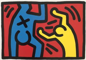
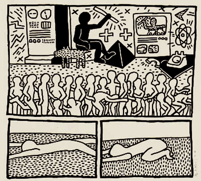
WOW! – Work of the Week – Keith Haring – Fertility #2


Keith Haring
Fertility #2
1983
Silkscreen
42 x 50 in.
Edition of 100
Pencil signed, dated and numbered


Throughout his work, Keith Haring was never afraid to confront the socio-political challenges of his time. He was an outspoken and ardent activist against racism, homophobia, the apartheid in South Africa and AIDS.

Despite that Haring addressed difficult topics in his work, he always approached these subjects with high energy and optimism. He was heavily influenced by graffiti writers and street art in New York City, and created what would become his signature style, composed of the heavy use of line drawing, vivid colors, and simplified humanoid and geometric forms. These glyphs that could be read, like an urban, tribal language were accessible to all, and easy to take in by a wide audience.

“Art is something that liberates the soul, provokes the imagination and encourages people to go further.”

This week’s Work of the Week! WOW! is Keith Haring’s Fertility #2.

Fertility #2 is the second work in the Fertility Suite of 5 works. Created in day-glow pigments, the piece is exceptionally bright, which conveys a warm and happy message, and evokes the New York club scene that Keith Haring was a part of.

It is a work that captures both the mysteries of ancient civilization with the representation of the pyramid, but also the imagination of extra-terrestrial civilizations through the flying saucers. The pyramid was a common theme in Haring’s work, simultaneously referring to antiquity and symbolizing eternity. It is also connected to the hieroglyphic language that Haring employs throughout his body of work, and the notion that images are a universal language. The UFO on the other hand represents a cosmic energy and suggests supernatural forces or people who were situated outside of social norms. They always symbolize positive energy and empowerment.

Lines and circles have a darker connotation in Haring’s work, they refer to the lesions of HIV and AIDS victims. These threats are surrounding a pregnant woman who is in distress, agitating her arms, trying to get attention.   

Combined, what does all this imagery stand for?

In the 1980’s there was a high prevalence of HIV infection among pregnant women in Sub-Saharan Africa. It was a terrible epidemic that devastated vast regions. The 1980’s were characterized by an insufficient response (both in the US and abroad) by government leaders in response to the AIDS epidemic. Ronald Reagan, the US president at the time, did not address the issue until over 21,000 Americans had already perished from the virus. Haring was a staunch activist and leader in promoting awareness about the virus and Fertility #2 is a centerpiece in his fight in relation to the transmission of the virus from mother to child, a particularly common problem in southern Africa.

The lesions, or dashes and circles have infected all the land in his depiction of the African landscape, and the pregnant mother is terrified for her unborn child. Keith Haring, loved the hope and innocence of children inspired. To him, they represented a better humanity: color-blind, unprejudiced and caring, uncorrupted by greed and hatred towards others. This work represents the saving of children and human kind from the evils of illness and inactive leadership.

WOW! – Work of the Week – Keith Haring – Untitled C & D


Keith Haring
Untitled C
1987
Lithograph
11 x 14 3/4 in.
Edition of 100
Pencil signed, dated and numbered
Keith Haring
Untitled D
1987
Lithograph
11 x 14 3/4 in.
Edition of 100
Pencil signed, dated and numbered

About the work:
1987
The nation of South Africa was in a state of emergency. Serious political violence had arisen over Apartheid and the National Party had won an election, yet again.
41,027 people had died of AIDS complications in America, and another 71,176 people were diagnosed with the disease. After 6 years of silence, then-president Ronald Reagan finally used the word “AIDS” in public for the first time.
Crack-cocaine incidents in the US had increased to 94,000 from 23,500 only 2 years prior – a 300% jump.
_______________________________
Keith Haring’s work sums up New York cool. He was friends with Madonna, Andy Warhol, David Bowie, among many others who represented the 80’s culture boom. By the start of the decade, the artist had developed a fresh aesthetic, with roots in punk, hip-hop and graffiti. His strong lexicon of caricature-like images in flat, bold colors, are so deceivingly simple and joyful that it is easy to be blinded to its political and activist content.
Keith Haring was a fierce and tireless socio-political activist throughout his life, and had a rational of intervention and standing up for oppressed communities. He was opposed to the institutionalized racial segregation in South Africa, fought for increased sexual education for the gay population in the face of the AIDS epidemic and was determined to raise awareness of the effects of crack-cocaine which ravaged the disenfranchised black society of the US.
This week’s Work of the Week! WOW! is Untitled C & D, from the untitled suite of 4 lithographs created in 1987. This suite was purposely done as a lithograph and not a silkscreen, the dimensions of the works are slightly smaller, and the edition size is smaller. It is limited to only 100 pieces. This was done so as not to be confused with the Pop Shop series, which were released on a more commercialized level. As with the vast majority of Haring’s work, this 4 piece suite of lithograph references deep commentary on societal unease.
Throughout Keith Haring’s work, the image of a television represents the mass media. The character depicted in Untitled C is on TV covering his eyes. At first, the saying “See no evil,” comes to mind. This is quite the opposite. Haring wants us to open our eyes and speak out against these evil atrocities, and not to cover our eyes, or turn a blind eye to it. Thanks to Haring’s repetitive use of symbols referencing different ailments of society, we know what he is critiquing.
In Untitled D, the yellow character seems to be tossing, or pushing away, another figure in blue that bears an X on his belly. The X is symbolic of the crack-cocaine epidemic that ravaged mostly impoverished segments of the country. Today, it is widely accepted that this particular pandemic was ignored by the media, at the time, in light of the people it was affecting. This is something that Haring was acutely aware of, and through this work, he gently provides a humanizing context that not only speaks to the situation, but also to his position.
Despite being one of the most influential and sought after artists of the 20th century, Keith Haring always remained true to his beliefs and humanity. He used his voice and platform for those who needed a supporter and champion. Untitled C & D are a clear wake-up call to the public to be aware of the problems society at large. This is what Haring’s art was about, it is not only colorful, whimsical characters that makes people smile. His entire body of work spoke volumes of the socio-political issues plaguing the world at the time.

WOW! – Work of the Week – Keith Haring, Dog


Keith Haring
Dog
1981
Collage cut-out on paper
12 x 9 in.
Signed and dated in ink

About the work:

A leading figure of the American art scene of the eighties, Keith Haring embraced the world of art thanks to his father who was an amateur comics artist. By the time Haring moved to New York in 1978, he had already developed his style of simple outline drawing, inspired by his father, which would continue to be his s

ignature style throughout his career.

In New York City, Haring adopted and contributed to the downtown culture of Manhattan, tagging subway cars or East-Village buildings with Jean-Michel Basquiat along with other artists. While prolific in his street art endeavors, Keith Haring was much more than just a graffiti artist. His drawings, which feature seemingly simplistic, vividly-colored shapes are actually the product of a solid artistic and cultural education.

Haring attended the School of Visual Arts in NYC and in addition to art classes, he also took courses in semiotics. Semiotics is the study of signs and symbols and their use or interpretation. This discipline had a profound impact on Haring’s works. Haring combined his learnings with his contour drawing style, and created a visual lexicon of icons and symbol-like figures. These images, easily remembered and akin to a signature, became identifiers, characterizing  his work. 

Having started out capturing the New York City street culture in his art, his icons read like an urban, tribal language. However, as Haring matured, along with the influence of the New York art scene, Haring’s work became more intricate and more social / political. Everything in his works took on meaning. 

Aside from the Radiant Baby, Haring’s Dog is his most famous tag. The Dog, is portrayed in many different manners, and as an icon, generally has more than one explicit meaning or symbolism. 

This week’s Work of the Week! WOW! is Keith Haring’s Dog.  This work is a collage cut-out on gold foiled paper. It is a unique work inspired by Matisse’s cut-outs. One of the tallest of the giants on whose shoulders Haring set his feet was Matisse, who inspired his combinations of flat tints of color and his decomposition of planes-characteristics. Haring did a number of cut-outs and collages in this manner. This work is signed and dated ’81.

The Barking Dog, for example, can indicate action or suspicion. The Dog as a character, sometimes represented as a standing figure (combined with a human form), represents authoritarian government, abuse of power, police states, and oppressive regimes.

In addition to these two representations, the other dogs in the art of Keith Haring are all anthropomorphic. Certain Dogs are depicted dancing, laughing, DJing, etc. in these personifications, it is almost as though they take on the role of an alter ego of the artist. 

Throughout Art History, Dogs have been portrayed in paintings as the personification of fidelity. Dogs also imply loyalty, guidance, protection and love. As a student of semiotics, none of these implications would have been lost on haring and it is not surprising that this would be one of his most-used icons. 

WOW – Work Of the Week – Keith Haring “Pop Shop II”

Pop Shop II quad

Keith Haring
Pop Shop II
1988
Silkscreen
12 x 15 in. each
Edition of 200; matched number set

Pencil signed, dated and numbered

This must be sold as a set of 4 only.

About This Work:

Keith Haring was born on May 4, 1958 in Reading, Pennsylvania. He started developing a love for drawing at a very early age, learning basic cartooning skills from his father and from the popular culture around him, such as Dr. Seuss and Walt Disney.
Upon graduation from high school, Haring moved to New York City and enrolled in the School of Visual Arts.
In New York, Haring found a thriving alternative art community that was developing outside the gallery and museum system, in the downtown streets, the subways, the clubs and former dance halls. Here he became friends with fellow artists Kenny Scharf and Jean-Michel Basquiat, as well as other musicians, performance artists and graffiti writers, all together forming the New York art community. Haring was swept up in the energy and spirit of this scene and began to organize and participate in exhibitions and performances at Club 57 and other alternative venues.

Though many associate the artist Keith Haring with his seemingly innocuous images of barking dogs, crawling babies, beating hearts and flying saucers, his work often tackled social justice issues – from nuclear proliferation, to AIDS, to the environment to racial and income inequality.

In April 1986, Haring opened his first Pop Shop, a retail store in Soho selling T-shirts, toys, posters, buttons and magnets bearing his images.
Haring considered the shop to be an extension of his work, intended to allow people greater access to his work, at a lower cost. The shop received criticism from many in the art world, however Haring remained committed to his desire to make his artwork available to an audience as wide as possible, and received strong support for his project from friends, fans and mentors, including Andy Warhol. This is the origin of the Pop Shop series, that at the time could be acquired for what could be considered an affordable price back then, and that now are one of his most iconic and recognized works.

Pop Shop prints were released as a set of four individual pieces or one quad of the different images.
This work of the week is called Pop Shop II, a set of four individual works, all pencil signed and all matching numbers.
Haring was a child of Pop. In his Pop Shops, he used his iconic symbols and characters in a playful and joyful way, with bright colors and bold contours of cartoonish figures.

While his human figures generally depict people and players in society, human figures depicted upside-down, like the one in Pop Shop II, are usually B-boys and B-girls, the dancers of hip-hop, doing the iconic move in which they spin on their head. Figures contorting in backbends or jumps are also depictions of break dancers, some of the most iconic cultural figures of the New York City of the 1980’s.

In the Pop Shops, Keith Haring always kept imagery accessible and easy to understand, in order to grab the eyes and minds of viewers and get them both to enjoy themselves and to engage with important concerns.
Haring’s genius was his ability to communicate very directly, very immediately through his chosen symbols and iconography. The joyfulness and a wonderful lightheartedness in his work, is a message of his vision and strong hope of a better world to come.

Gregg Shienbaum Fine Art will participate at Ink Miami Fair 2015

Gregg Shienbaum Fine Art is proud to announce its participation at Ink Miami Art Fair  2015
The show will be open December 2 to 6
Come visit us at Booth 160

Click here for Miami Ink Art Fair press release

ink


Pictures and news from the Fair will be coming soon!


Admission Hours:

Wednesday 11:00 am to 5:00 pm

Thursday 10:00 am to 5:00 pm

Friday 10:00 am to 7:00 pm

Saturday 10:00 am to 7:00 pm

Sunday 10:00 am t 3:00 pm


For any information or to know what we will be showing at the Fair, please send us an email at info@gsfineart.com or call us at 305 456 5478

IMG_4103


image8


image6


image5


image4


image3

Opening Night at Art Aspen 2015

Gregg Shienbaum Fine Art is happy to announce a great opening night at Art Aspen 2015
The show will be open August 13th through August 16th
Come visit us at Booth B16

Art Aspen


Gregg Shienbaum Fine Art Booth B16 exhibiting at Art Aspen 2015

Gregg Shienbaum Fine Art Booth B16 exhibiting at Art Aspen 2015


Opening night at Art Aspen 2015

Opening night at Art Aspen 2015


WOW! – Work of the Week

Keith Haring, Blueprint Drawing #15

Keith Haring  Blueprint Drawing #15 1990

Keith Haring Blueprint Drawing #15 1990


Keith Haring
Blueprint Drawing #15
1990
Silkscreen
42 1/2 x 47 in.
Edition of 33

This piece is pencil signed and numbered.

About This Work:

There are many iconic works by Haring, however the Blueprint Drawing series is the more narrative, where he talks about his life, his sexual preferences, how the world was infected and affected by the realization of mortality based on life choice and the alienation that occurred at the time. In a sense, this series was his autobiography and his outlook on the world around him.  Thus, he created this series at the end of his life. It actually is the last series he signed before he passed. There are certain series that artists create where you see and feel them in their work. For Andy Warhol and Jasper Johns, you see the artist in their early works. However for Haring,  you really see him and get a sense of knowing him in his later work. This could be because he was approaching death at such a young age.


About Keith Haring:

Keith Haring found a thriving alternative art community that was developing outside the gallery and museum system, in the downtown streets, the subways and spaces in clubs and former dance halls. Here he became friends with fellow artists Kenny Scharf and Jean-Michel Basquiat, as well as the musicians, performance artists and graffiti writers that comprised the burgeoning art community. Haring was swept up in the energy and spirit of this scene and began to organize and participate in exhibitions and performances at Club 57 and other alternative venues.

Haring was able to push his own youthful impulses toward a singular kind of graphic expression based on the primacy of the line. 

In 1980, Haring found a highly effective medium that allowed him to communicate with the wider audience he desired, when he noticed the unused advertising panels covered with matte black paper in a subway station. He began to create drawings in white chalk upon these blank paper panels throughout the subway system. Between 1980 and 1985, Haring produced hundreds of these public drawings in rapid rhythmic lines, sometimes creating as many as forty “subway drawings” in one day. This seamless flow of images became familiar to New York commuters, who often would stop to engage the artist when they encountered him at work. The subway became, as Haring said, a “laboratory” for working out his ideas and experimenting with his simple lines. 

Between 1980 and 1986, Haring achieved international recognition and participated in numerous group and solo exhibitions. His first solo exhibition in New York, held at the Tony Shafrazi Gallery in 1982, was immensely popular and received critical acclaim. During this period, he participated in highly renowned international survey exhibitions such as Documenta 7 in Kassel Germany, the São Paulo Biennial and the Whitney Biennial. Haring completed numerous public projects in the first half of the 80’s. 

Throughout his career, Haring devoted much of his time to public works, which often carried social messages. He produced more than 50 public artworks between 1982 and 1989, in dozens of cities around the world, many of which were created for charities, hospitals, children’s day care centers and orphanages

Haring was diagnosed with AIDS in 1988.  Haring enlisted his imagery during the last years of his life to speak about his own illness and generate activism and awareness about AIDS. 

During a brief but intense career that spanned the 1980s, Haring’s work was featured in over 100 solo and group exhibitions.  By expressing universal concepts of birth, death, love, sex and war, using a primacy of line and directness of message, Haring was able to attract a wide audience and assure the accessibility and staying power of his imagery, which has become a universally recognized visual language of the 20th century.

Keith Haring died of AIDS related complications at the age of 31 on February 16, 1990. 

Since his death, he has been the subject of several international retrospectives. The work of Keith Haring can be seen today in the exhibitions and collections of major museums around the world.